> ## Documentation Index
> Fetch the complete documentation index at: https://docs.digifist.com/llms.txt
> Use this file to discover all available pages before exploring further.
# Footer
> Configure Everest's footer columns, utility content, localization controls, and footer block types.
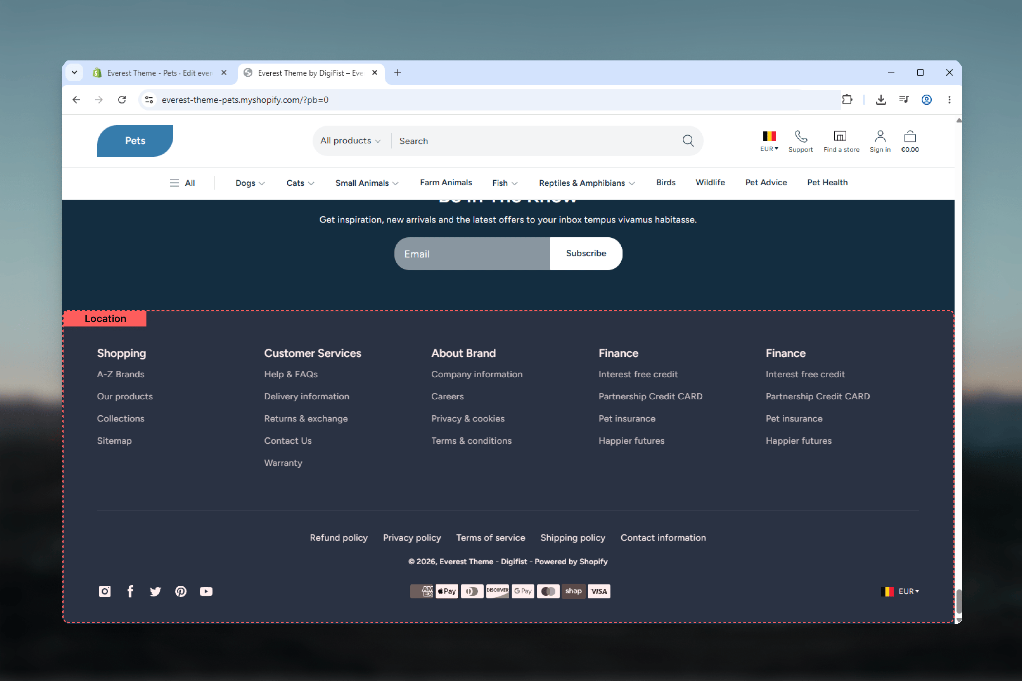
The footer controls the global bottom area of the Everest storefront. It combines shared footer settings with reusable blocks, so the main decisions are about information density, utility links, branding, localization, payment methods, and overall footer styling.
Everest's footer also depends on global brand and social settings. That means logo, brand text, description, and social profile links can all affect the final footer output even when the section settings stay the same.
 ## What this section controls
* Footer column structure on desktop
* Copyright text and policy link output
* Follow on Shop, social icons, and localization selectors
* Payment icon visibility and custom payment icon names
* Footer color, width, spacing, and border treatment
* Link list and information block content
## Getting started
In Shopify admin, go to **Online Store** -> **Themes** -> **Customize**.
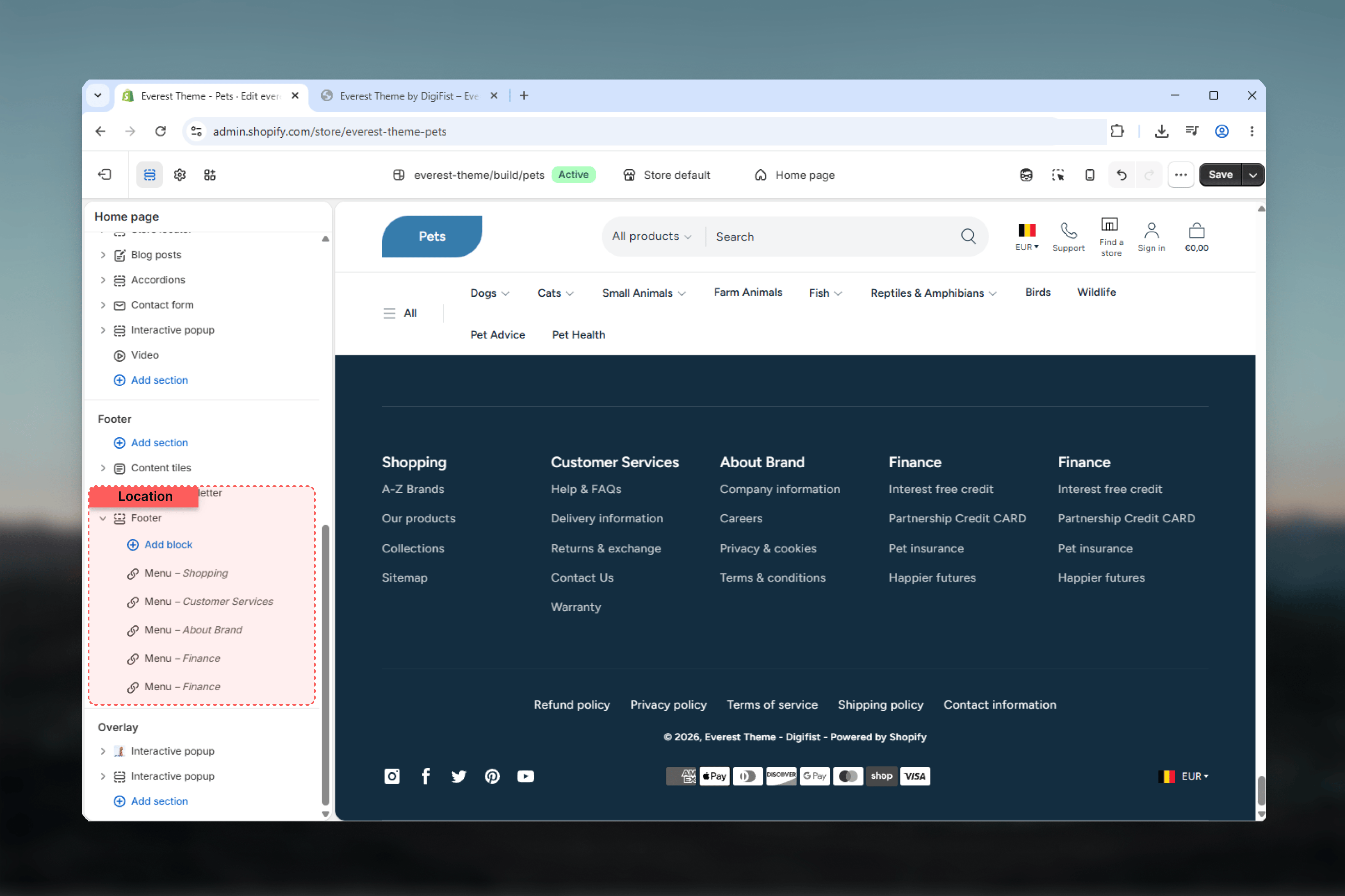
In the footer group, select **Footer** to review the global footer settings and blocks.
Start with columns, width, color scheme, and spacing so the footer layout feels balanced before you refine block content.
Finish by checking localization, payment icons, social output, and the content inside each footer block.
## What this section controls
* Footer column structure on desktop
* Copyright text and policy link output
* Follow on Shop, social icons, and localization selectors
* Payment icon visibility and custom payment icon names
* Footer color, width, spacing, and border treatment
* Link list and information block content
## Getting started
In Shopify admin, go to **Online Store** -> **Themes** -> **Customize**.
In the footer group, select **Footer** to review the global footer settings and blocks.
Start with columns, width, color scheme, and spacing so the footer layout feels balanced before you refine block content.
Finish by checking localization, payment icons, social output, and the content inside each footer block.
 ## Section settings
### Structure
## Section settings
### Structure
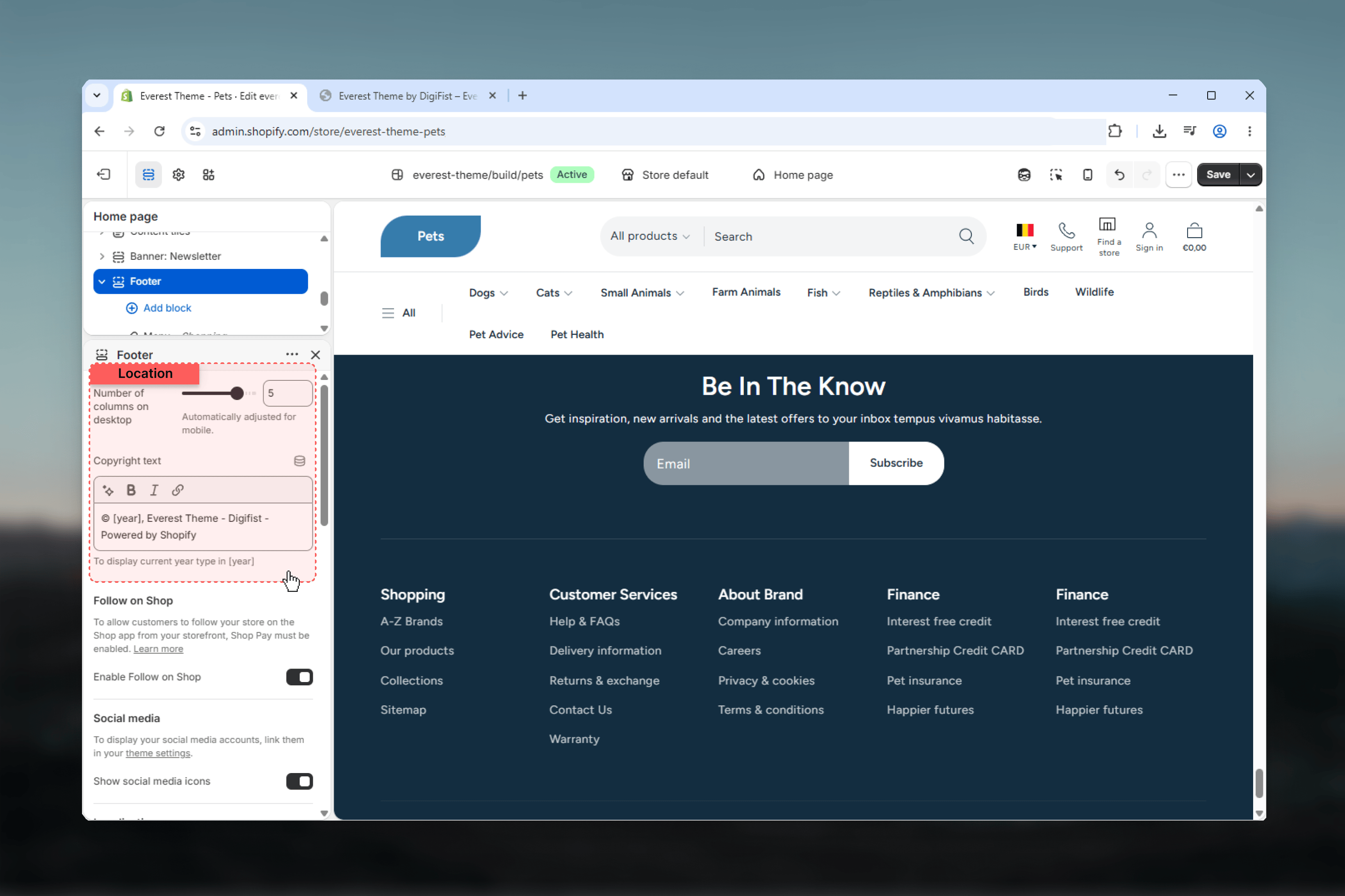 Controls how many columns the footer grid uses on larger screens.
**Range:** `1` to `6`\
**Default:** `5`
Everest automatically adjusts the layout on smaller screens, so this setting matters most for desktop balance and content density.
Controls the copyright line shown in the bottom area of the footer.
The default text includes the `[year]` token, which Everest replaces with the current year automatically.
Displays links to the store policies available in Shopify, such as refund, privacy, shipping, or terms pages.
### Utility Features
Controls how many columns the footer grid uses on larger screens.
**Range:** `1` to `6`\
**Default:** `5`
Everest automatically adjusts the layout on smaller screens, so this setting matters most for desktop balance and content density.
Controls the copyright line shown in the bottom area of the footer.
The default text includes the `[year]` token, which Everest replaces with the current year automatically.
Displays links to the store policies available in Shopify, such as refund, privacy, shipping, or terms pages.
### Utility Features
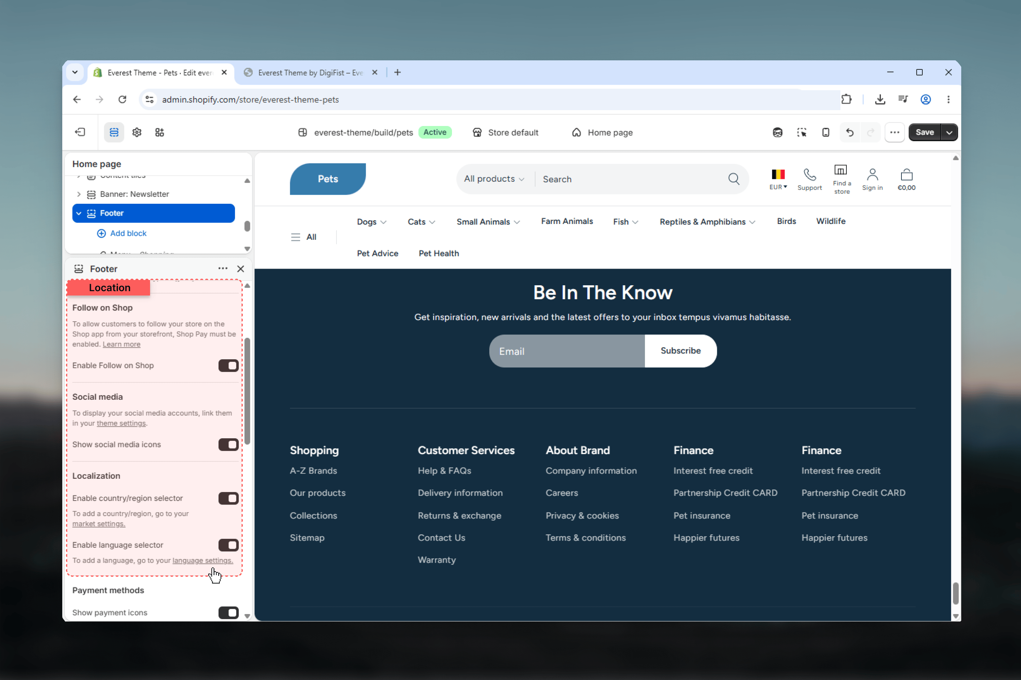 Shows Shopify's **Follow on Shop** button when the store and sales channel support it.
Displays the shared social profile icons in the footer utility area.
The icons only appear when the related social links are filled in **Theme settings -> Social Media**.
Shows the country selector in the footer when Shopify Markets data includes more than one available country.
Shows the language selector in the footer when the store has more than one available language.
### Payment Methods
Shows Shopify's **Follow on Shop** button when the store and sales channel support it.
Displays the shared social profile icons in the footer utility area.
The icons only appear when the related social links are filled in **Theme settings -> Social Media**.
Shows the country selector in the footer when Shopify Markets data includes more than one available country.
Shows the language selector in the footer when the store has more than one available language.
### Payment Methods
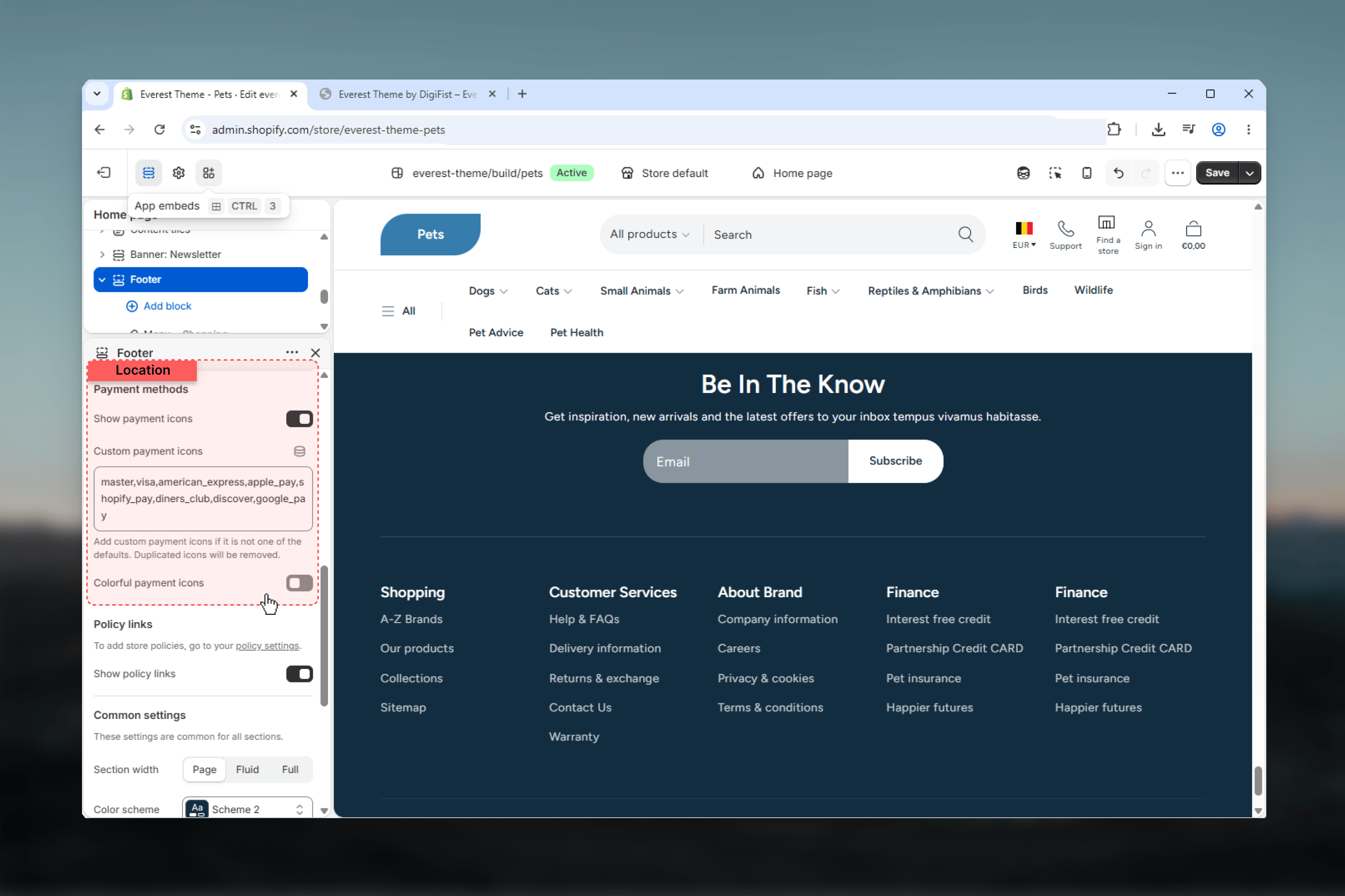 Displays the payment method icons in the footer utility area.
Lets you define the payment icons that Everest should render.
The default value includes common providers such as `master`, `visa`, `american_express`, `apple_pay`, `shopify_pay`, `diners_club`, `discover`, and `google_pay`.
Controls whether payment icons use their full color versions or a grayscale treatment.
### Styling
Displays the payment method icons in the footer utility area.
Lets you define the payment icons that Everest should render.
The default value includes common providers such as `master`, `visa`, `american_express`, `apple_pay`, `shopify_pay`, `diners_club`, `discover`, and `google_pay`.
Controls whether payment icons use their full color versions or a grayscale treatment.
### Styling
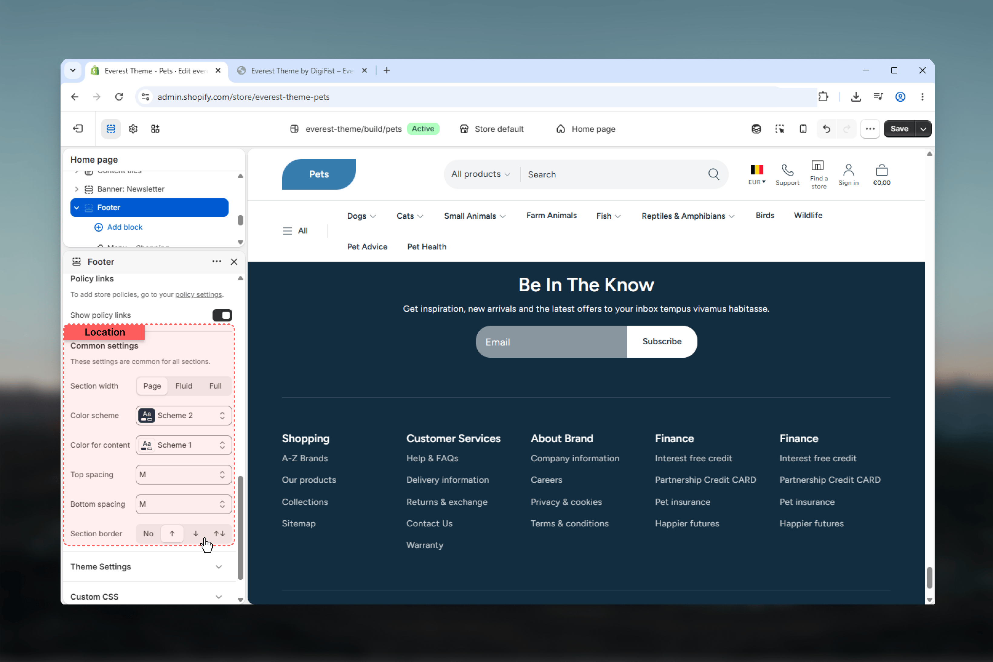 Controls the width of the footer container.
**Page** keeps the footer aligned to the standard content width.\
**Fluid** gives the footer a wider but still padded layout.\
**Full** stretches the footer edge to edge.
Controls the main footer background and text treatment.
Controls the color scheme used for footer content surfaces inside the main footer area.
Controls the spacing above the footer content area.
Controls the spacing below the footer content area.
Adds border styling to the footer wrapper.
**Available options:** None, Top, Bottom, Both.
## Block settings
### Link List
Controls the width of the footer container.
**Page** keeps the footer aligned to the standard content width.\
**Fluid** gives the footer a wider but still padded layout.\
**Full** stretches the footer edge to edge.
Controls the main footer background and text treatment.
Controls the color scheme used for footer content surfaces inside the main footer area.
Controls the spacing above the footer content area.
Controls the spacing below the footer content area.
Adds border styling to the footer wrapper.
**Available options:** None, Top, Bottom, Both.
## Block settings
### Link List
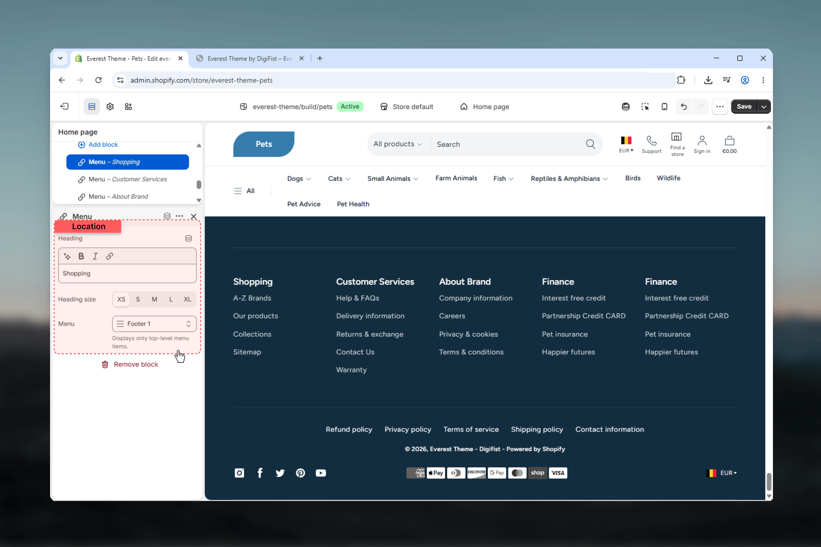 The **Link list** block creates an accordion-style footer menu with Shopify navigation links.
Controls the heading shown above the footer link list.
Sets the display size of the footer menu heading.
Selects the Shopify menu used for the footer link list.
Everest renders the chosen menu as a structured footer navigation group and collapses it into accordion behavior where needed.
### Information
The **Link list** block creates an accordion-style footer menu with Shopify navigation links.
Controls the heading shown above the footer link list.
Sets the display size of the footer menu heading.
Selects the Shopify menu used for the footer link list.
Everest renders the chosen menu as a structured footer navigation group and collapses it into accordion behavior where needed.
### Information
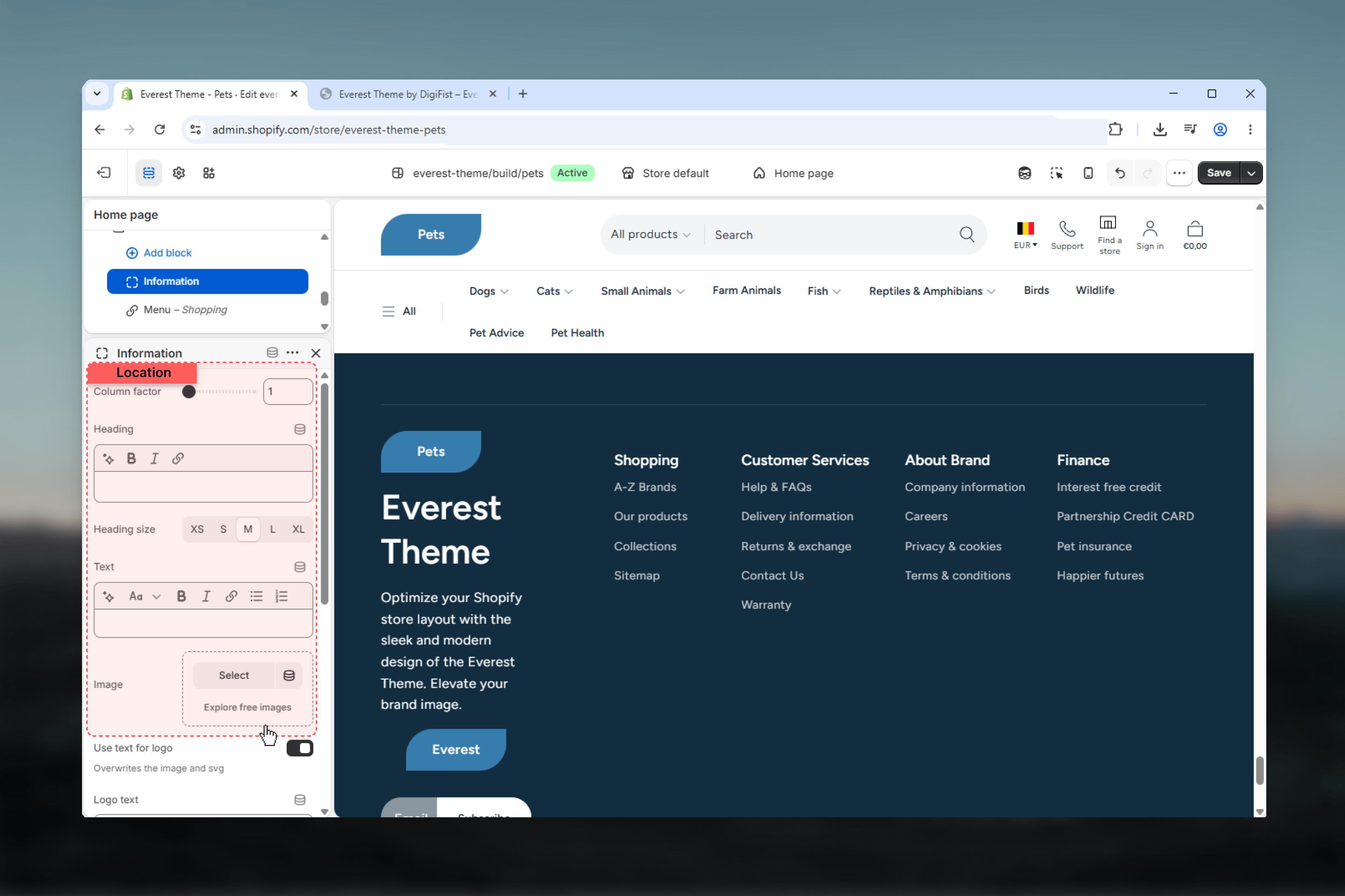 The **Information** block is the flexible content block in Everest's footer. It can combine editorial text, images, newsletter signup, and shared brand details inside a single column.
Controls how much width the information block takes relative to other footer blocks.
Controls the main heading shown inside the information block and its display size.
Adds supporting rich text content such as contact information, store details, or a short brand message.
Adds an optional image to the information block and controls its maximum display width.
Controls how the optional image aligns on larger screens.
Displays shared brand content from theme settings, including the logo or text logo, brand headline, and brand description.
This block reads from **Theme settings -> Brand**, so the visible output depends on your global brand setup.
Adds the footer newsletter signup form inside the information block.
## Important dependencies
Footer branding uses the global brand settings. Depending on the setup, Everest can show the uploaded logo, SVG logo, text logo, brand headline, and brand description.
Social icons only render when the related profile URLs are filled in the global social media settings.
Country and language selectors only appear when the store has multiple available countries or languages.
## Best practices
* Keep the footer information hierarchy clear by mixing one broader information block with smaller link columns.
* Review desktop and mobile layouts together when you change the column count or block mix.
* Use shared brand and social settings before troubleshooting missing footer content.
* Keep footer menus concise so the lower part of the storefront stays easy to scan.
## Related guides
* [Everest Theme Overview](/themes/everest/index)
* [Brand Settings](/themes/everest/theme-settings/brand)
* [Social Media Settings](/themes/everest/theme-settings/social-media)
The **Information** block is the flexible content block in Everest's footer. It can combine editorial text, images, newsletter signup, and shared brand details inside a single column.
Controls how much width the information block takes relative to other footer blocks.
Controls the main heading shown inside the information block and its display size.
Adds supporting rich text content such as contact information, store details, or a short brand message.
Adds an optional image to the information block and controls its maximum display width.
Controls how the optional image aligns on larger screens.
Displays shared brand content from theme settings, including the logo or text logo, brand headline, and brand description.
This block reads from **Theme settings -> Brand**, so the visible output depends on your global brand setup.
Adds the footer newsletter signup form inside the information block.
## Important dependencies
Footer branding uses the global brand settings. Depending on the setup, Everest can show the uploaded logo, SVG logo, text logo, brand headline, and brand description.
Social icons only render when the related profile URLs are filled in the global social media settings.
Country and language selectors only appear when the store has multiple available countries or languages.
## Best practices
* Keep the footer information hierarchy clear by mixing one broader information block with smaller link columns.
* Review desktop and mobile layouts together when you change the column count or block mix.
* Use shared brand and social settings before troubleshooting missing footer content.
* Keep footer menus concise so the lower part of the storefront stays easy to scan.
## Related guides
* [Everest Theme Overview](/themes/everest/index)
* [Brand Settings](/themes/everest/theme-settings/brand)
* [Social Media Settings](/themes/everest/theme-settings/social-media)