> ## Documentation Index
> Fetch the complete documentation index at: https://docs.digifist.com/llms.txt
> Use this file to discover all available pages before exploring further.
# Announcement Bar
> Configure Everest's slim header utility bar for rotating announcements, a secondary link menu, and social icons.
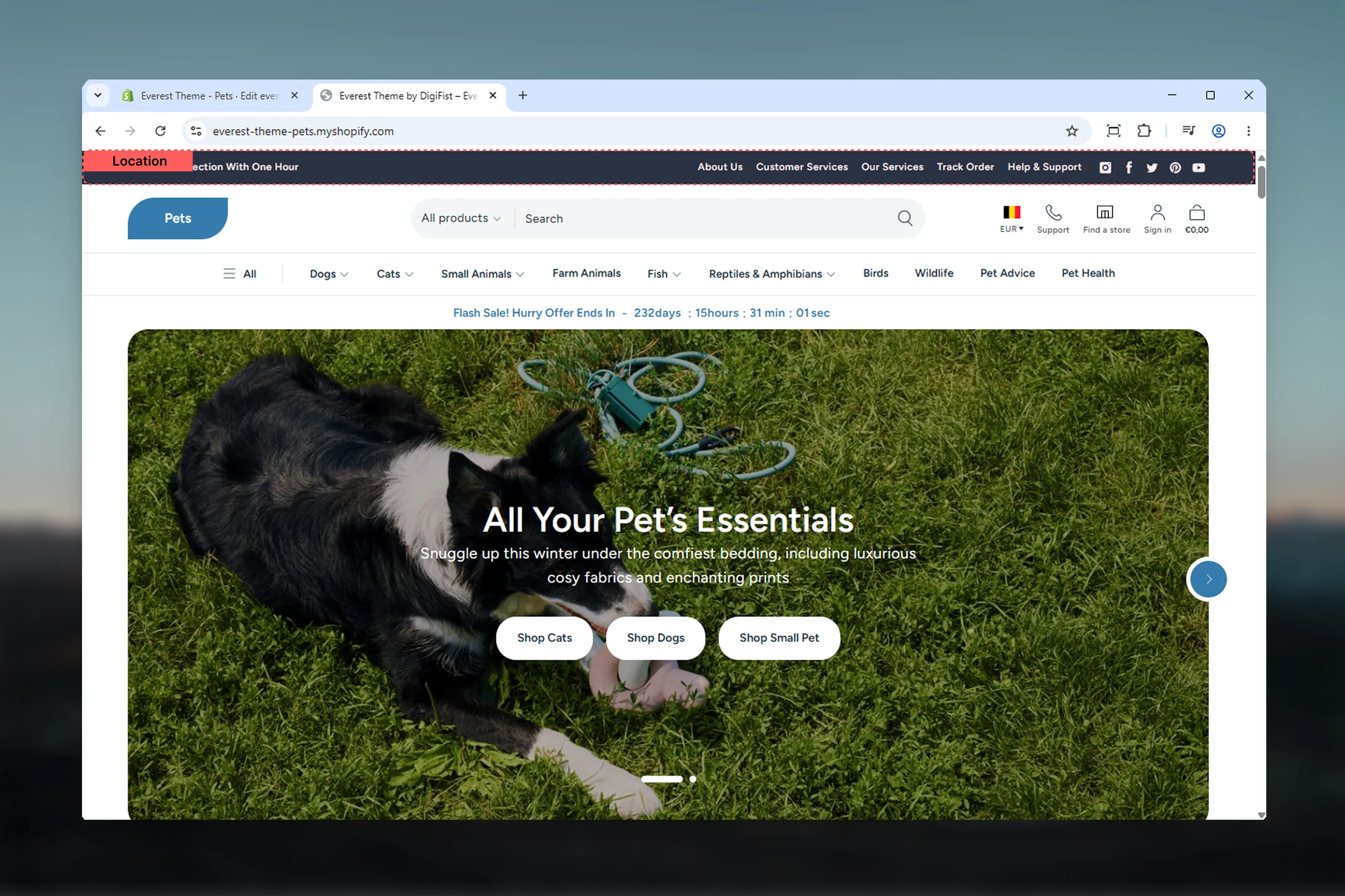
The announcement bar controls the compact utility strip above Everest's main header. It is designed for short promotional messages, a simple secondary menu, and optional social icons without adding too much visual weight to the top of the store.
This implementation is intentionally lighter than some other themes. Everest does not add countdowns, standalone CTA blocks, or a separate localization block here, so the main decisions are about message rotation, device visibility, width, and supporting utility content.
 ## What this section controls
* The overall width and color treatment of the announcement bar
* Rotating message behavior through the announcements slider block
* Individual announcement slides inside that slider
* A simple top-level utility menu
* Social icon output tied to global theme settings
* Desktop and mobile visibility for each top-level block
## How Everest announcement bar works
The section itself only controls the outer wrapper. The actual content comes from three supported block types:
* **Announcements** for the rotating message area
* **Menu** for a simple inline link list
* **Social** for social media icons
In the default Everest header group preset, the announcements slider appears first, followed by a desktop-only menu and desktop-only social icons.
Everest always uses the announcements slider structure for message content. Disabling autoplay stops automatic rotation, but the message area still uses the same slider-based block.
## Getting started
In Shopify admin, go to **Online Store** -> **Themes** -> **Customize**.
In the header group, select **Announcement bar** to access the section settings and block list.
Choose the section width and color scheme before adjusting content blocks so you can judge spacing and contrast more accurately.
Configure the announcements slider first, then add or refine the menu and social blocks based on how much utility content you want in the bar.
## What this section controls
* The overall width and color treatment of the announcement bar
* Rotating message behavior through the announcements slider block
* Individual announcement slides inside that slider
* A simple top-level utility menu
* Social icon output tied to global theme settings
* Desktop and mobile visibility for each top-level block
## How Everest announcement bar works
The section itself only controls the outer wrapper. The actual content comes from three supported block types:
* **Announcements** for the rotating message area
* **Menu** for a simple inline link list
* **Social** for social media icons
In the default Everest header group preset, the announcements slider appears first, followed by a desktop-only menu and desktop-only social icons.
Everest always uses the announcements slider structure for message content. Disabling autoplay stops automatic rotation, but the message area still uses the same slider-based block.
## Getting started
In Shopify admin, go to **Online Store** -> **Themes** -> **Customize**.
In the header group, select **Announcement bar** to access the section settings and block list.
Choose the section width and color scheme before adjusting content blocks so you can judge spacing and contrast more accurately.
Configure the announcements slider first, then add or refine the menu and social blocks based on how much utility content you want in the bar.
 ## Section settings
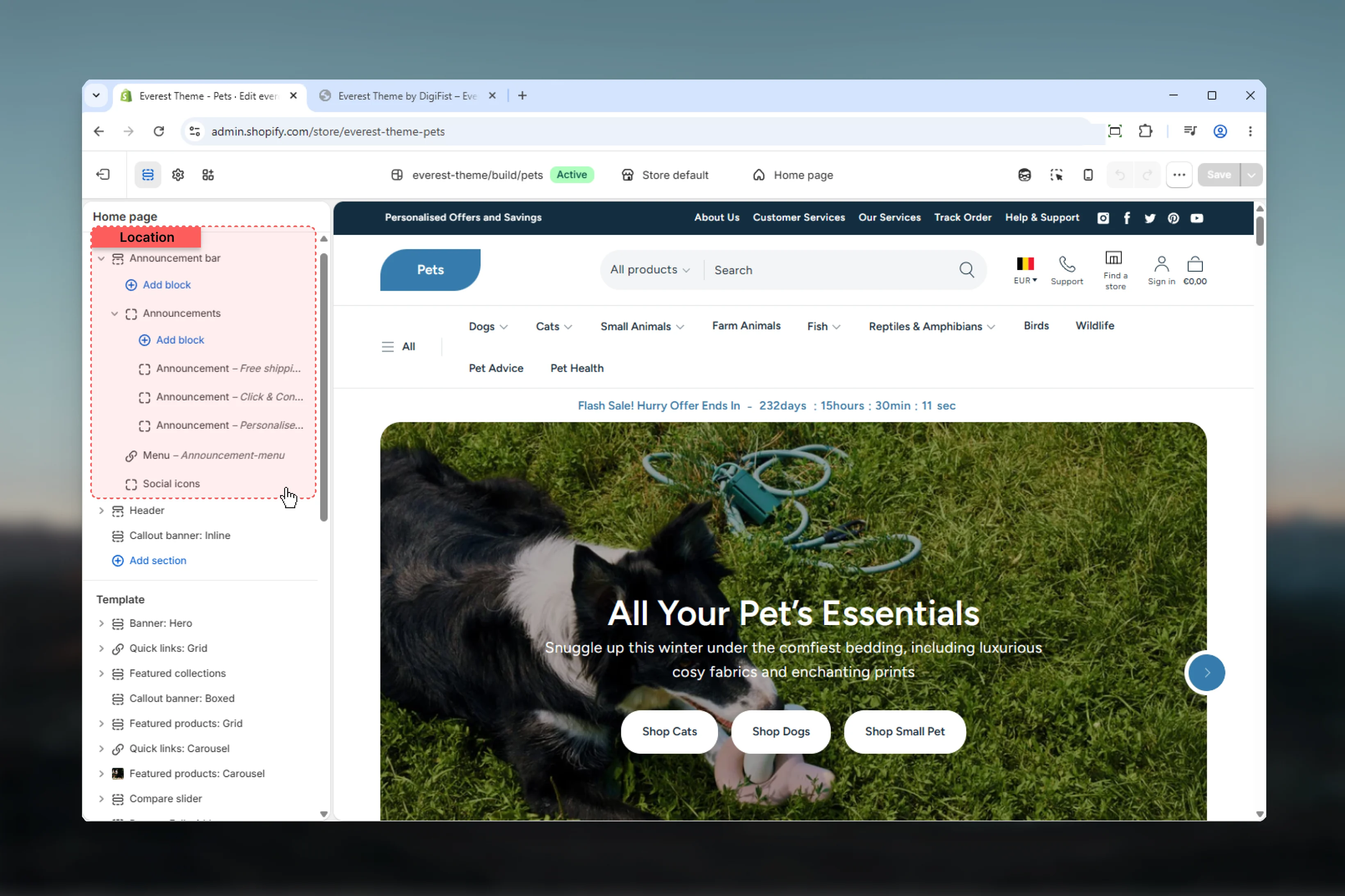
Controls the maximum width of the inner announcement bar container.
**Page** keeps the bar aligned to Everest's standard page width.
**Fluid** gives the content a wider container while still respecting page gutters.
**Full** stretches the bar edge to edge.
The schema default is **Full**, while the default header-group preset uses **Page**.
Controls the overall background and foreground treatment of the announcement bar wrapper.
Use this to keep the bar visually connected to the header or intentionally separate it as its own utility layer.
## Section settings
Controls the maximum width of the inner announcement bar container.
**Page** keeps the bar aligned to Everest's standard page width.
**Fluid** gives the content a wider container while still respecting page gutters.
**Full** stretches the bar edge to edge.
The schema default is **Full**, while the default header-group preset uses **Page**.
Controls the overall background and foreground treatment of the announcement bar wrapper.
Use this to keep the bar visually connected to the header or intentionally separate it as its own utility layer.
 ## Block settings
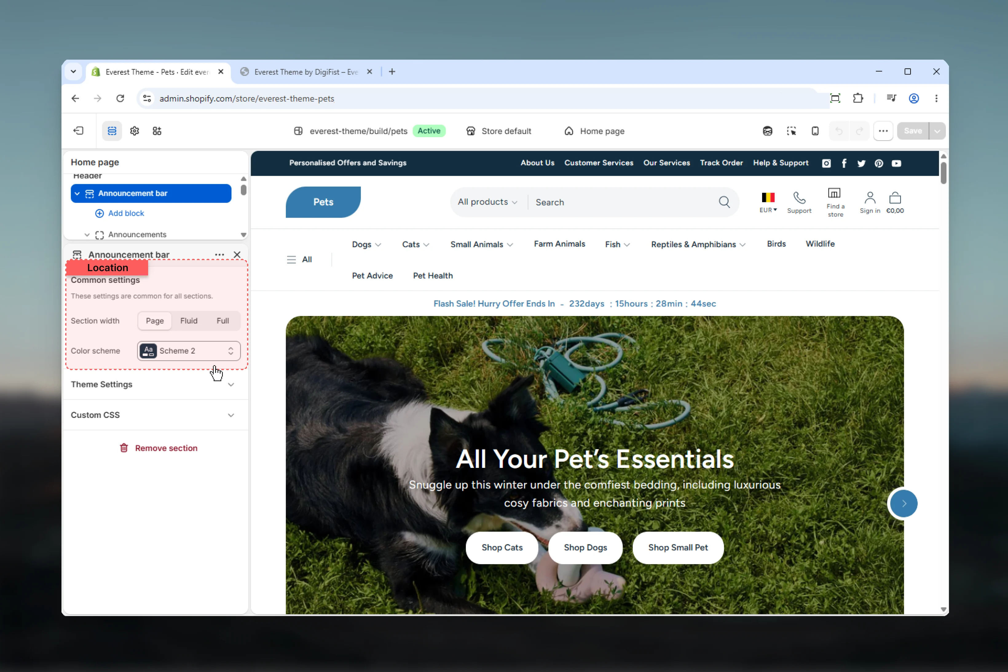
This is the parent slider block for all rotating messages in the bar.
## Block settings
This is the parent slider block for all rotating messages in the bar.
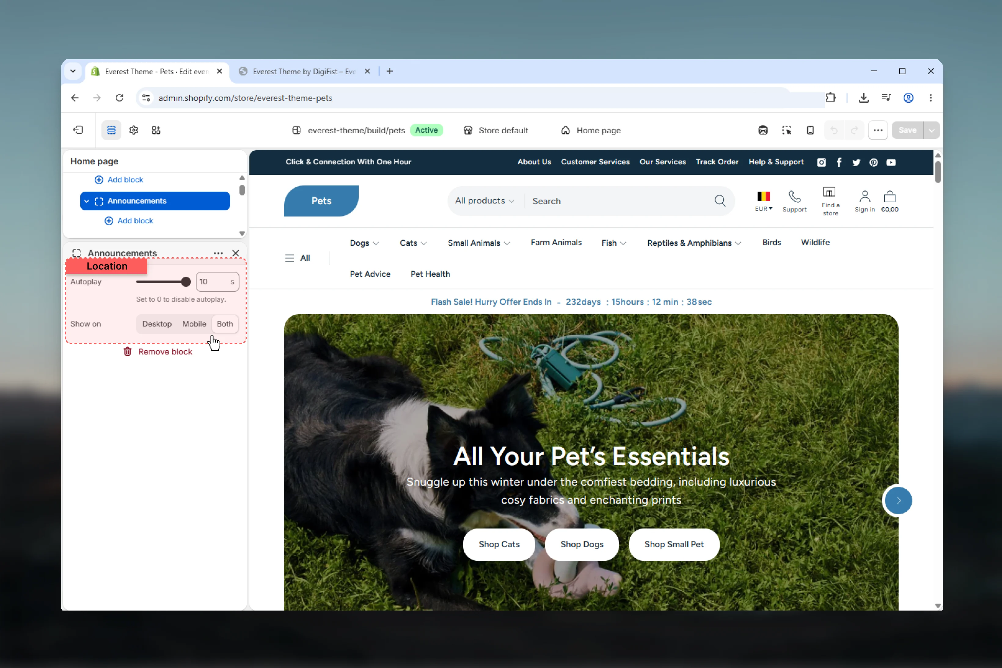 Controls how quickly the slider rotates through messages.
**Range:** `0` to `10` seconds
**0 seconds** disables automatic rotation.
In Everest's swiper implementation, autoplay only activates when there is more than one announcement slide.
Controls where the announcements slider appears.
**Desktop** shows the block only on larger screens.
**Mobile** shows the block only on smaller screens.
**Both** shows the block across devices.
In Everest, device visibility also affects section spacing because the announcement bar CSS adjusts padding based on which block visibility classes are present.
Each nested **Announcement** block becomes one slide inside the parent announcements slider.
Controls how quickly the slider rotates through messages.
**Range:** `0` to `10` seconds
**0 seconds** disables automatic rotation.
In Everest's swiper implementation, autoplay only activates when there is more than one announcement slide.
Controls where the announcements slider appears.
**Desktop** shows the block only on larger screens.
**Mobile** shows the block only on smaller screens.
**Both** shows the block across devices.
In Everest, device visibility also affects section spacing because the announcement bar CSS adjusts padding based on which block visibility classes are present.
Each nested **Announcement** block becomes one slide inside the parent announcements slider.
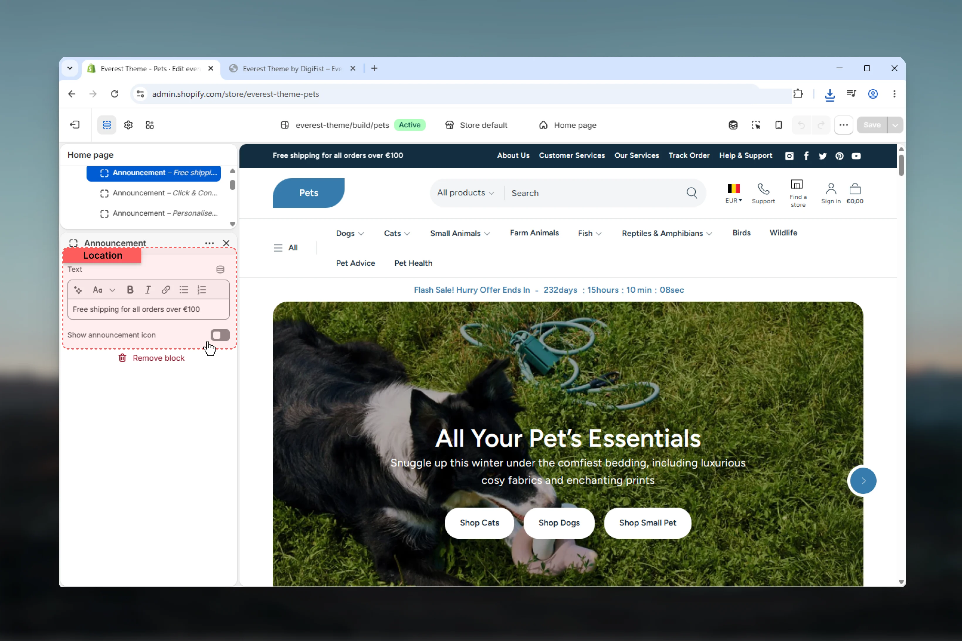 Controls the message content for an individual slide.
The field uses rich text, so you can add light formatting when needed, but this block works best with short, easily scannable copy.
Displays an icon before the message text on that specific slide.
This is useful for adding a small visual cue to shipping updates, promotions, or store notices.
Accepts raw SVG markup for the announcement icon.
If **Show icon** is disabled, this field has no visible effect.
Everest renders this field directly as SVG markup. Invalid, oversized, or inconsistent SVG code can affect alignment and visual quality.
The menu block adds a simple inline utility navigation area to the announcement bar.
Controls the message content for an individual slide.
The field uses rich text, so you can add light formatting when needed, but this block works best with short, easily scannable copy.
Displays an icon before the message text on that specific slide.
This is useful for adding a small visual cue to shipping updates, promotions, or store notices.
Accepts raw SVG markup for the announcement icon.
If **Show icon** is disabled, this field has no visible effect.
Everest renders this field directly as SVG markup. Invalid, oversized, or inconsistent SVG code can affect alignment and visual quality.
The menu block adds a simple inline utility navigation area to the announcement bar.
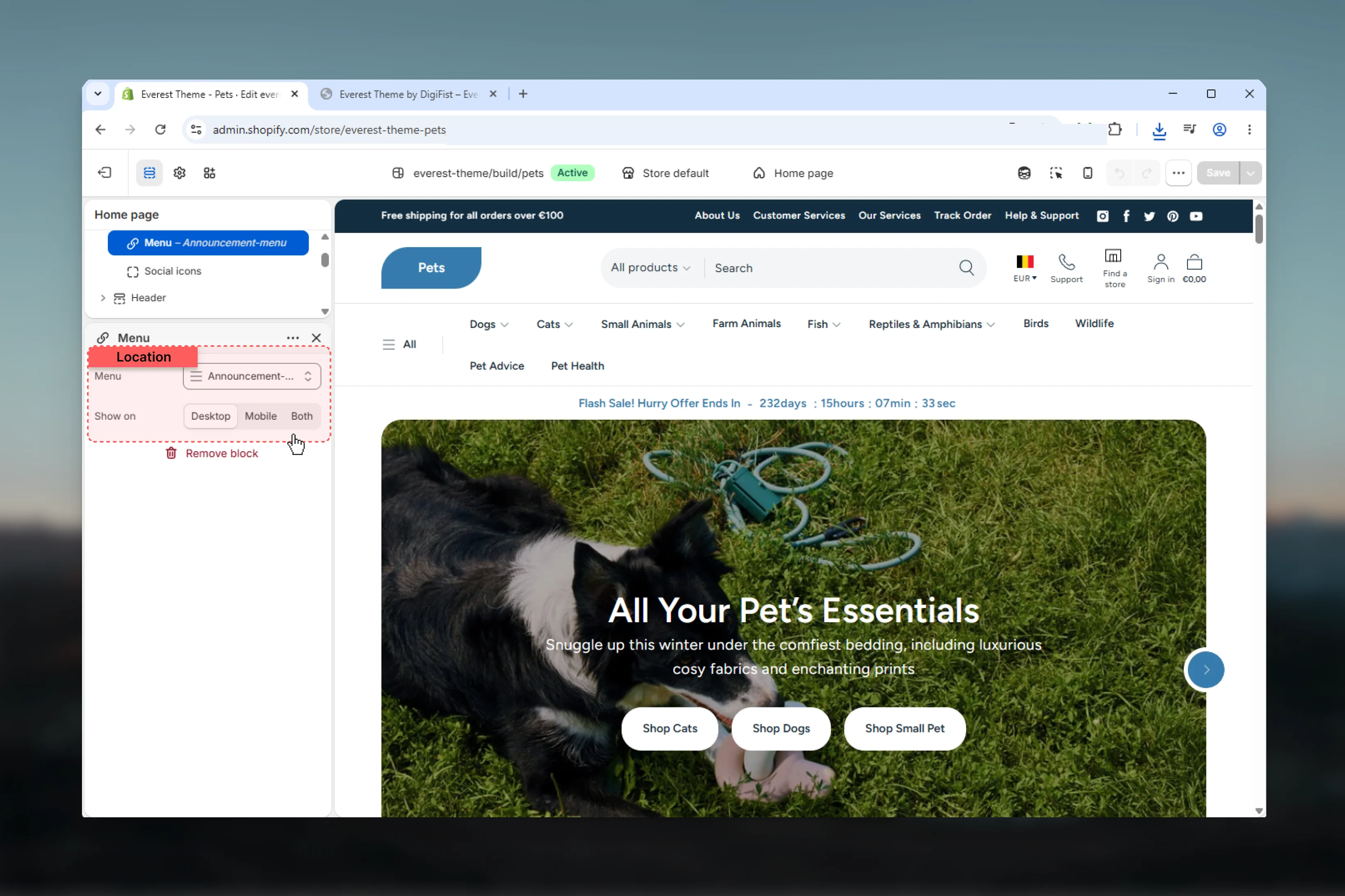 Selects the Shopify menu used for the announcement bar link list.
Everest renders only the top-level links from the selected menu in this block.
Controls whether the utility menu appears on desktop, mobile, or both.
This block works best with short menus that contain only a few high-priority links.
This is not a dropdown navigation block. It renders a flat inline list of top-level links only.
The social block outputs social media icons using Everest's shared social-media snippet.
Selects the Shopify menu used for the announcement bar link list.
Everest renders only the top-level links from the selected menu in this block.
Controls whether the utility menu appears on desktop, mobile, or both.
This block works best with short menus that contain only a few high-priority links.
This is not a dropdown navigation block. It renders a flat inline list of top-level links only.
The social block outputs social media icons using Everest's shared social-media snippet.
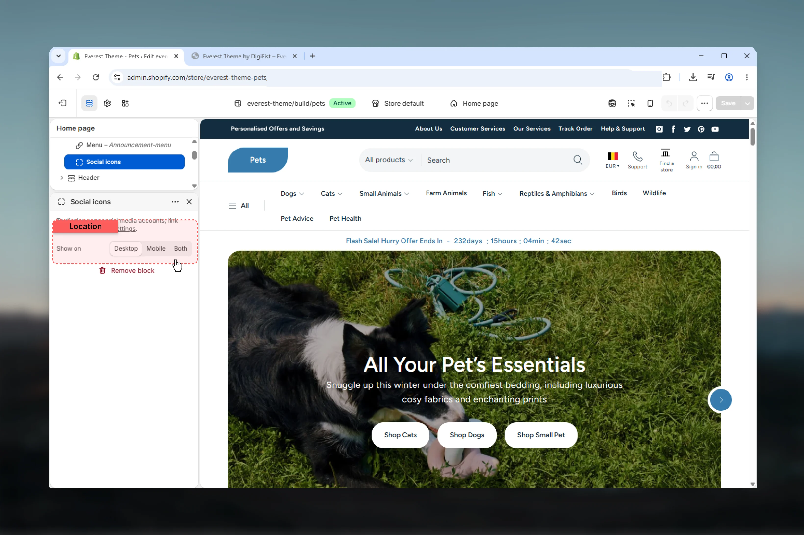 The block does not store platform URLs directly.
Instead, it reads the global social link fields from **Theme settings**, such as Instagram, Facebook, YouTube, TikTok, X, LinkedIn, Snapchat, Pinterest, and Vimeo.
Controls where the social icon list appears.
Use desktop-only visibility when the bar already feels dense on mobile.
If the related global social link fields are blank, this block may show little or no visible output.
## Important behavior and limitations
The announcement bar wrapper still contains a conditional reference to localization-related classes, but the current section schema does not expose country or language selector settings here.
In practice, Everest's announcement bar should be documented as a message, menu, and social utility bar rather than a localization bar.
Everest's global header script measures the visible announcement bar height and stores CSS variables used by desktop menu overlays.
Taller announcement bar content can therefore influence menu positioning and the available height for large desktop navigation panels.
On smaller screens, the announcement bar container switches to a column layout and centers announcement slide content.
This is another reason to keep message text brief and utility content limited.
## Best practices
Everest's announcement bar is strongest when each slide is brief, scannable, and easy to read in a single line.
Use the menu block for a few supporting links such as shipping, help, or store policies rather than a full navigation set.
Rotation helps when you have two or three important messages, but faster timing can reduce readability.
Add platform URLs in theme settings before relying on the social block, otherwise the bar may feel incomplete.
Start with the announcements block only, then add the menu or social block only if the bar still feels clean on both desktop and mobile.
## Related guides
* [Everest Theme Overview](/themes/everest/index)
* [Everest Header](/themes/everest/header/header)
The block does not store platform URLs directly.
Instead, it reads the global social link fields from **Theme settings**, such as Instagram, Facebook, YouTube, TikTok, X, LinkedIn, Snapchat, Pinterest, and Vimeo.
Controls where the social icon list appears.
Use desktop-only visibility when the bar already feels dense on mobile.
If the related global social link fields are blank, this block may show little or no visible output.
## Important behavior and limitations
The announcement bar wrapper still contains a conditional reference to localization-related classes, but the current section schema does not expose country or language selector settings here.
In practice, Everest's announcement bar should be documented as a message, menu, and social utility bar rather than a localization bar.
Everest's global header script measures the visible announcement bar height and stores CSS variables used by desktop menu overlays.
Taller announcement bar content can therefore influence menu positioning and the available height for large desktop navigation panels.
On smaller screens, the announcement bar container switches to a column layout and centers announcement slide content.
This is another reason to keep message text brief and utility content limited.
## Best practices
Everest's announcement bar is strongest when each slide is brief, scannable, and easy to read in a single line.
Use the menu block for a few supporting links such as shipping, help, or store policies rather than a full navigation set.
Rotation helps when you have two or three important messages, but faster timing can reduce readability.
Add platform URLs in theme settings before relying on the social block, otherwise the bar may feel incomplete.
Start with the announcements block only, then add the menu or social block only if the bar still feels clean on both desktop and mobile.
## Related guides
* [Everest Theme Overview](/themes/everest/index)
* [Everest Header](/themes/everest/header/header)