> ## Documentation Index
> Fetch the complete documentation index at: https://docs.digifist.com/llms.txt
> Use this file to discover all available pages before exploring further.
# Header
> Configure Everest's primary navigation, desktop and mobile menus, localization controls, and header utilities.
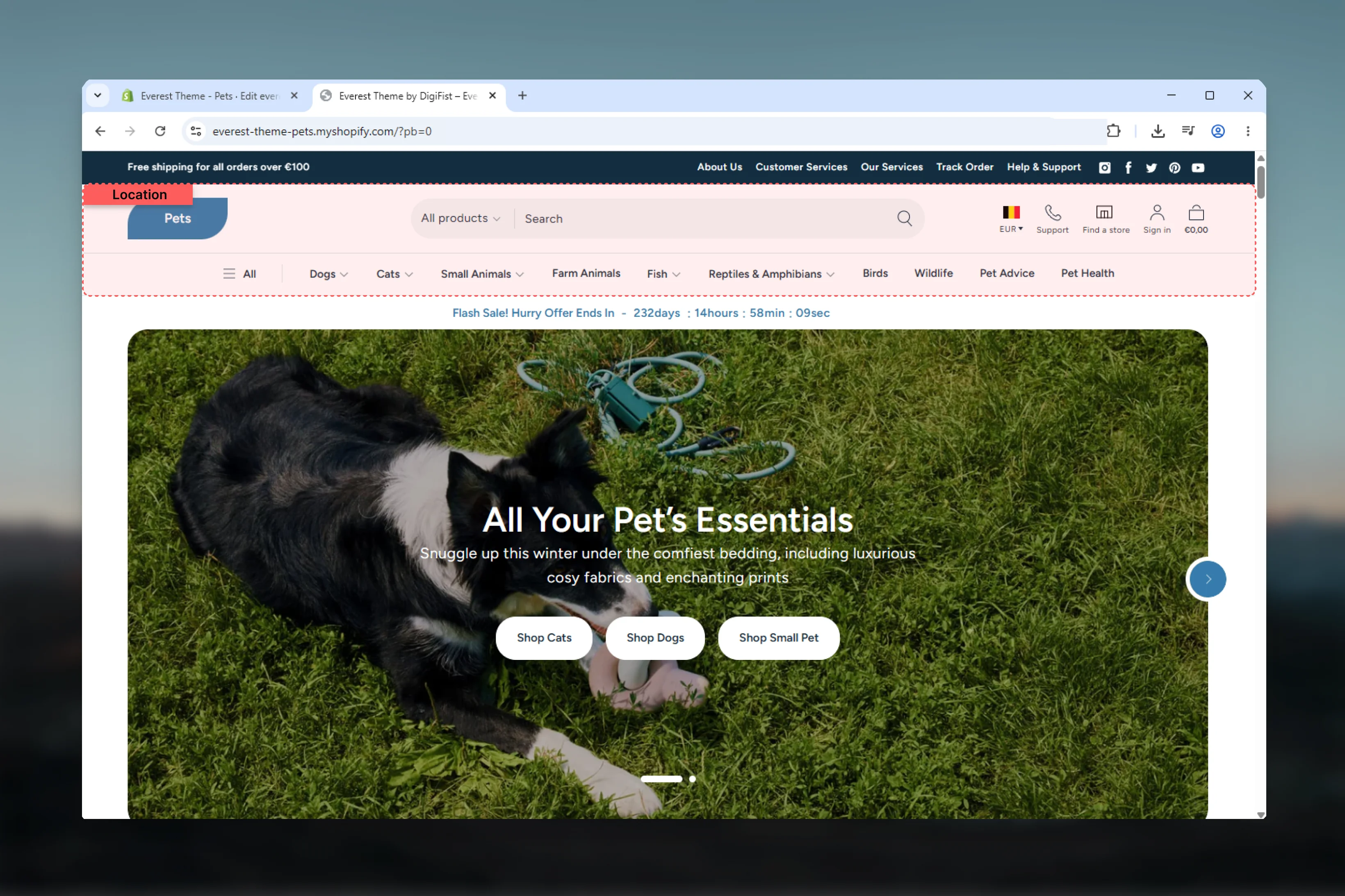
The header controls the primary navigation experience across your store. In Everest, it also acts as the connection point for search, customer account access, localization controls, extra utility icons, and mega menu promotions.
Several visible header elements also depend on global theme settings such as your logo, search behavior, cart type, and social links. Once those dependencies are clear, the header becomes much easier to customize confidently.
 ## What this section controls
* Desktop header layout and menu placement
* Sticky header behavior
* Desktop dropdown or mega menu behavior
* Menu trigger mode for desktop navigation
* Country and language selectors
* Customer avatar display
* Two optional additional icon links
* Header width, colors, and border treatment
* Static mobile and slideout menu blocks
* Mega menu promotion blocks
## How Everest header works
The section renders three main zones:
* **Start area**: mobile menu trigger and search
* **Center area**: logo or text-based brand mark
* **End area**: localization, additional icons, account, app blocks, and cart
Desktop navigation can render as either a **dropdown menu** or a **mega menu**. Mobile navigation uses a dedicated drawer block, while desktop also includes a separate slideout menu block for an additional drawer-style navigation experience.
The header also reads several global theme settings, especially for logo, search, cart, and social links. Those controls are documented later on this page so you can tell which behavior belongs to the section and which comes from theme settings.
## Getting started
In Shopify admin, go to **Online Store** -> **Themes** -> **Customize**.
In the header group, select **Header** to access the main section settings.
Start with header layout, menu trigger, and desktop menu type so the main navigation structure is in place first.
Open the built-in mobile and slideout menu blocks, then configure promotion blocks only if you are using the mega menu layout.
## What this section controls
* Desktop header layout and menu placement
* Sticky header behavior
* Desktop dropdown or mega menu behavior
* Menu trigger mode for desktop navigation
* Country and language selectors
* Customer avatar display
* Two optional additional icon links
* Header width, colors, and border treatment
* Static mobile and slideout menu blocks
* Mega menu promotion blocks
## How Everest header works
The section renders three main zones:
* **Start area**: mobile menu trigger and search
* **Center area**: logo or text-based brand mark
* **End area**: localization, additional icons, account, app blocks, and cart
Desktop navigation can render as either a **dropdown menu** or a **mega menu**. Mobile navigation uses a dedicated drawer block, while desktop also includes a separate slideout menu block for an additional drawer-style navigation experience.
The header also reads several global theme settings, especially for logo, search, cart, and social links. Those controls are documented later on this page so you can tell which behavior belongs to the section and which comes from theme settings.
## Getting started
In Shopify admin, go to **Online Store** -> **Themes** -> **Customize**.
In the header group, select **Header** to access the main section settings.
Start with header layout, menu trigger, and desktop menu type so the main navigation structure is in place first.
Open the built-in mobile and slideout menu blocks, then configure promotion blocks only if you are using the mega menu layout.
 ## Layout options
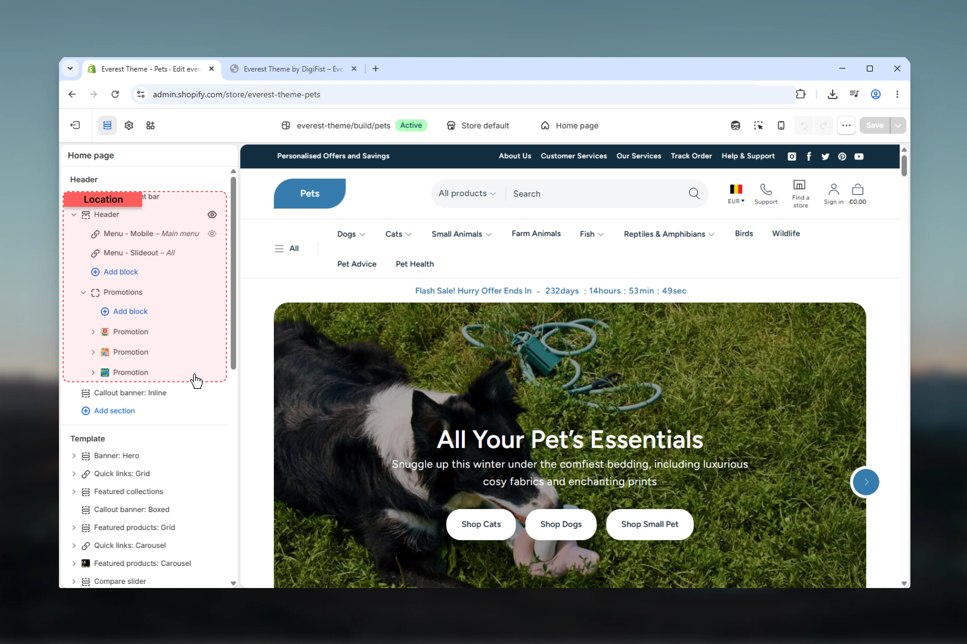
Logo stays on the left and the main menu moves to a dedicated row below it.
This layout gives longer menus more room and creates a clearer separation between branding and navigation.
## Layout options
Logo stays on the left and the main menu moves to a dedicated row below it.
This layout gives longer menus more room and creates a clearer separation between branding and navigation.
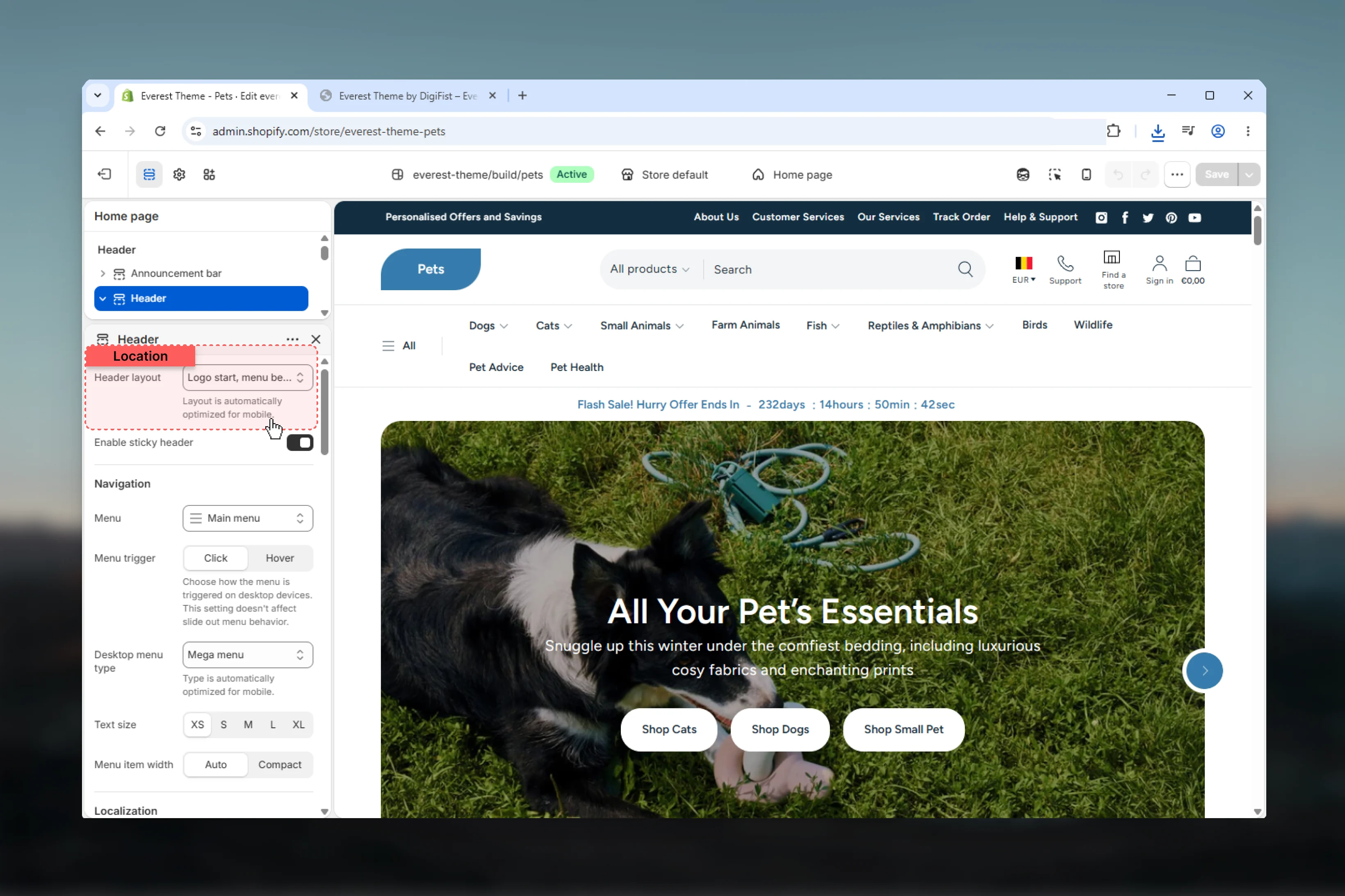 Logo stays centered while the navigation sits on its own row below.
This works well when brand presence should feel more prominent without compressing the menu into the top row.
Logo stays centered while the navigation sits on its own row below.
This works well when brand presence should feel more prominent without compressing the menu into the top row.
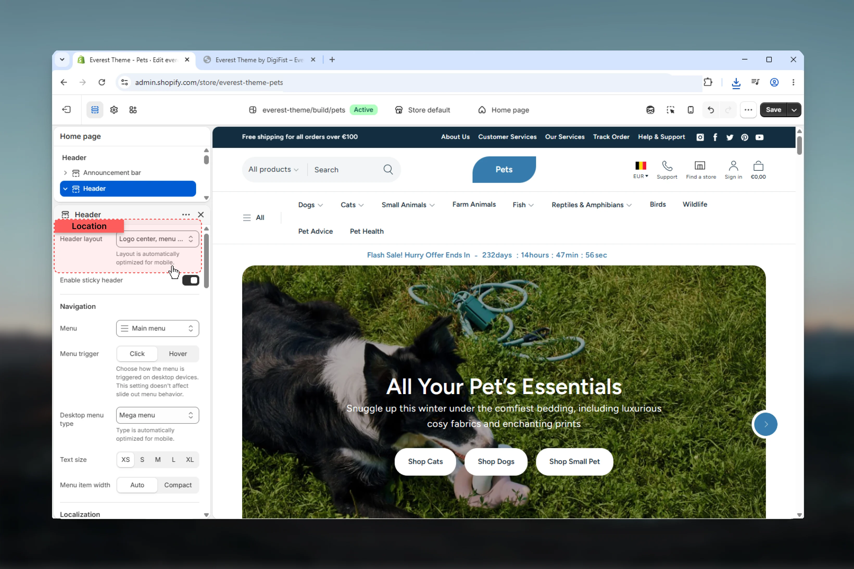 Logo and desktop navigation share the same row.
This is the most compact layout and works best when your top-level navigation is short and easy to scan.
Logo and desktop navigation share the same row.
This is the most compact layout and works best when your top-level navigation is short and easy to scan.
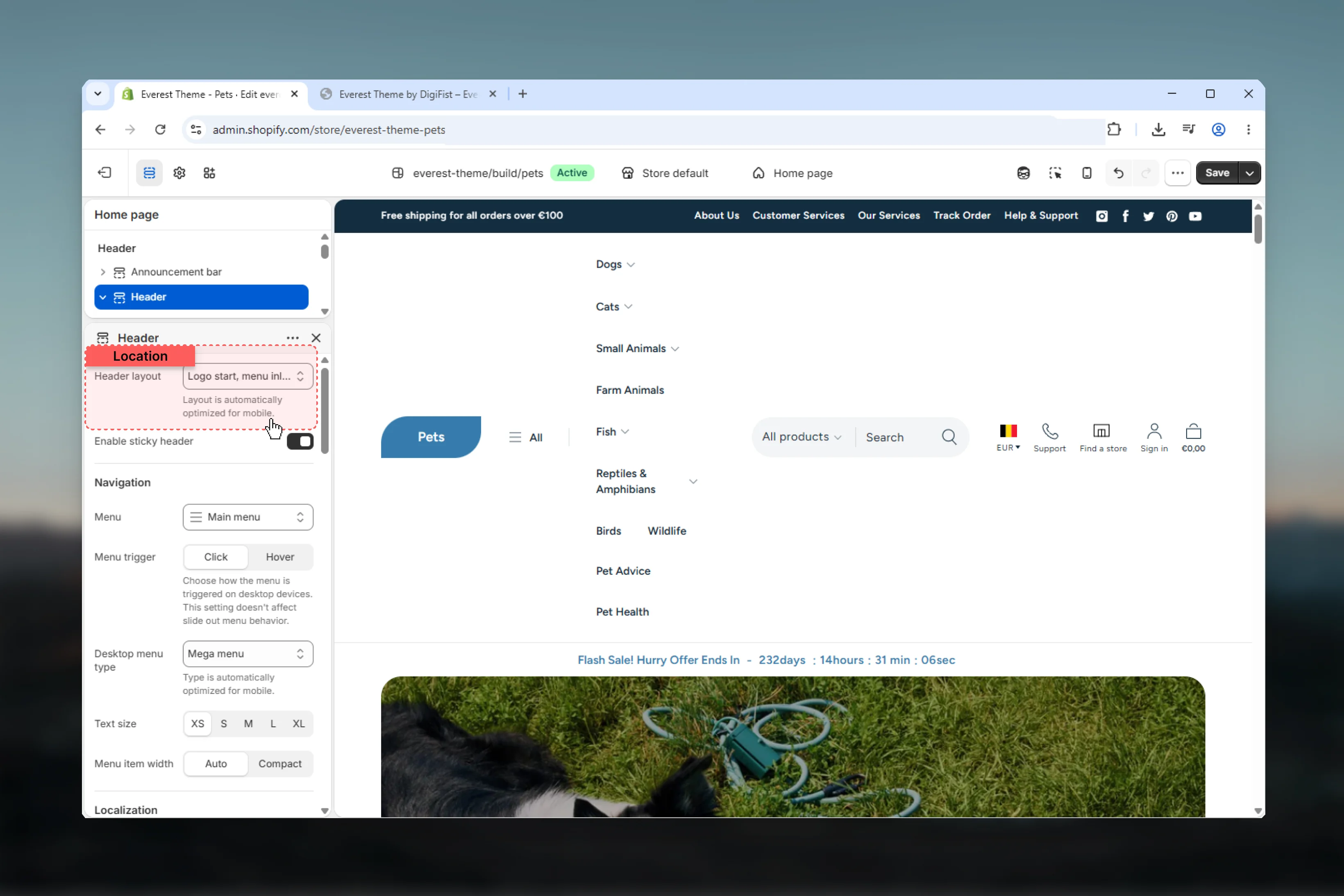 ## Navigation settings
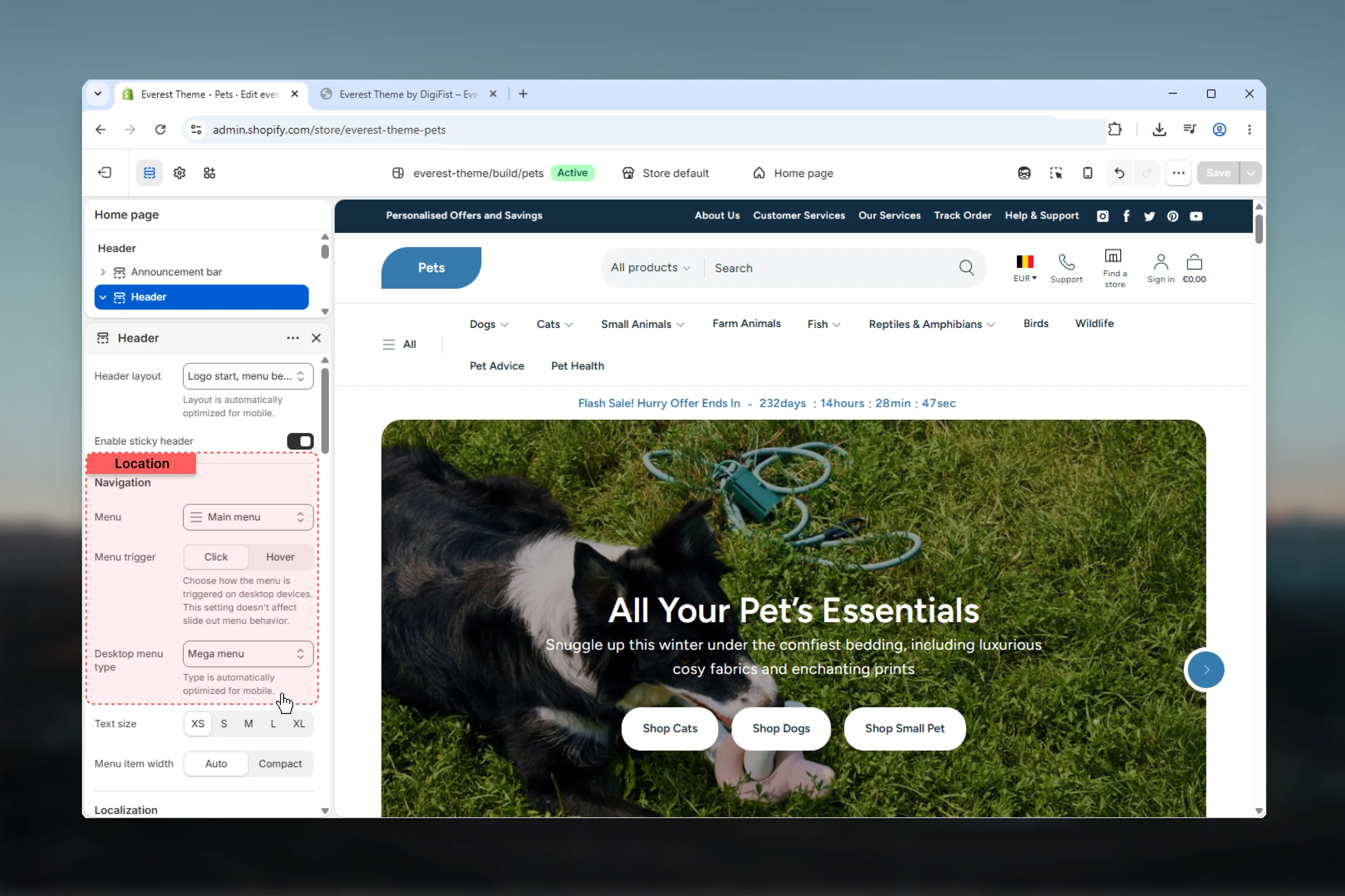 Select the main Shopify menu used by the header.
This menu drives the desktop dropdown or mega menu, acts as the default source for the mobile menu, and also becomes the practical source of truth for the main slideout navigation.
Choose how desktop menus open.
**Click** opens menus on click and closes them when visitors click outside the menu.
**Hover** opens menus on pointer hover and uses a short close delay to reduce flicker when moving across the menu boundary.
Choose the desktop navigation style.
**Dropdown** uses stacked disclosure menus and works well for simpler navigation trees.
**Mega** uses a full-width panel with grouped child links and can include promotion blocks tied to top-level menu items.
Select the main Shopify menu used by the header.
This menu drives the desktop dropdown or mega menu, acts as the default source for the mobile menu, and also becomes the practical source of truth for the main slideout navigation.
Choose how desktop menus open.
**Click** opens menus on click and closes them when visitors click outside the menu.
**Hover** opens menus on pointer hover and uses a short close delay to reduce flicker when moving across the menu boundary.
Choose the desktop navigation style.
**Dropdown** uses stacked disclosure menus and works well for simpler navigation trees.
**Mega** uses a full-width panel with grouped child links and can include promotion blocks tied to top-level menu items.
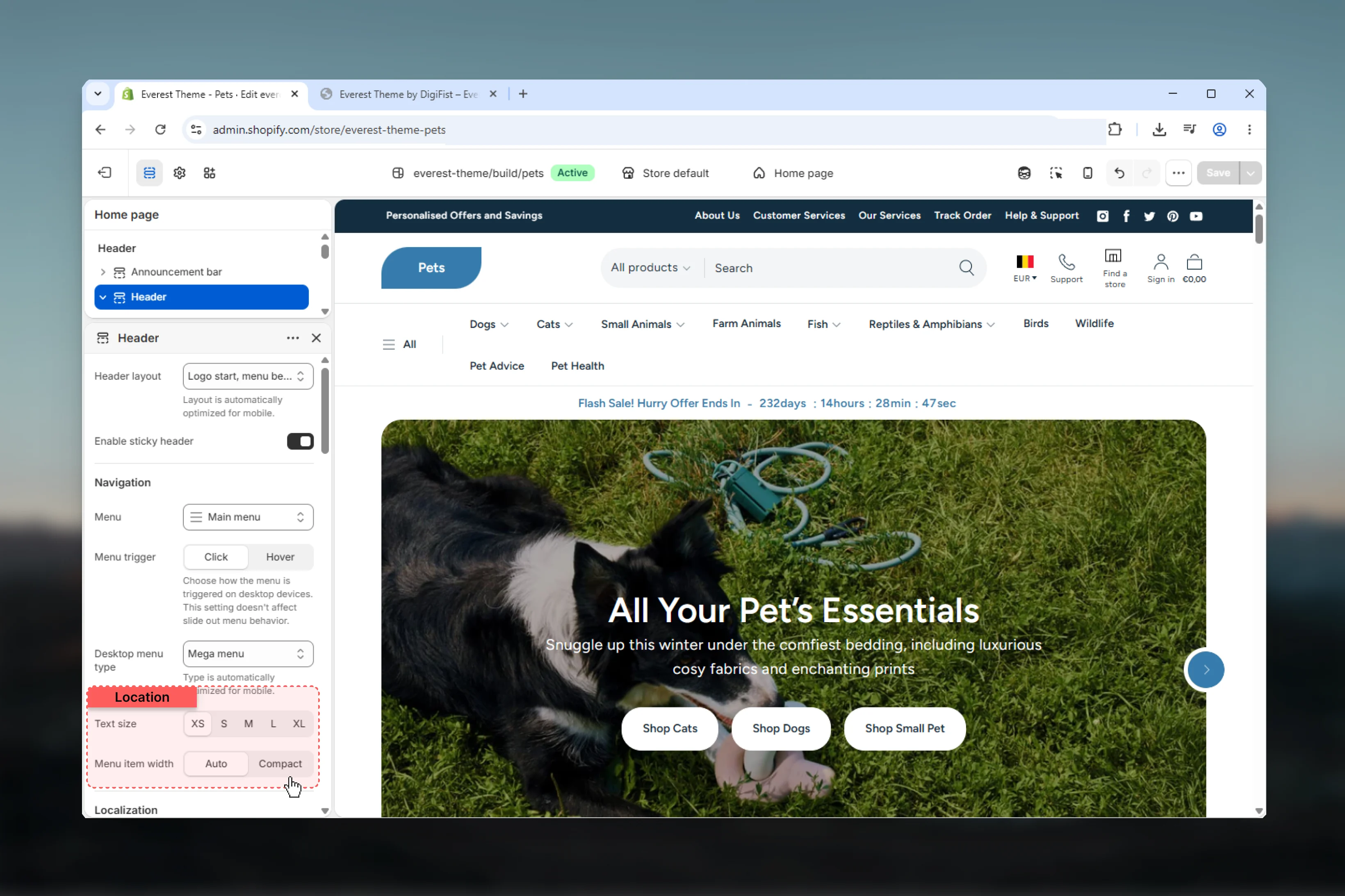 Controls the desktop top-level menu label size.
Available presets are **XS**, **S**, **M**, **L**, and **XL**.
Controls the width of desktop dropdown panels.
**Range:** `10rem` to `32rem`\
**Default:** `22.4rem`
This setting only appears when **Menu type** is set to **Dropdown**.
Controls how top-level menu items size horizontally.
**Auto** keeps the natural width of each item.
**Min content** shrinks items to their tightest content width, which can make long labels wrap more aggressively.
### Enable sticky header
Keeps the header attached to the top of the viewport while visitors move through the page.
In Everest's current implementation, sticky mode behaves as a scroll-aware header that hides while scrolling down and returns while scrolling up.
Controls the desktop top-level menu label size.
Available presets are **XS**, **S**, **M**, **L**, and **XL**.
Controls the width of desktop dropdown panels.
**Range:** `10rem` to `32rem`\
**Default:** `22.4rem`
This setting only appears when **Menu type** is set to **Dropdown**.
Controls how top-level menu items size horizontally.
**Auto** keeps the natural width of each item.
**Min content** shrinks items to their tightest content width, which can make long labels wrap more aggressively.
### Enable sticky header
Keeps the header attached to the top of the viewport while visitors move through the page.
In Everest's current implementation, sticky mode behaves as a scroll-aware header that hides while scrolling down and returns while scrolling up.
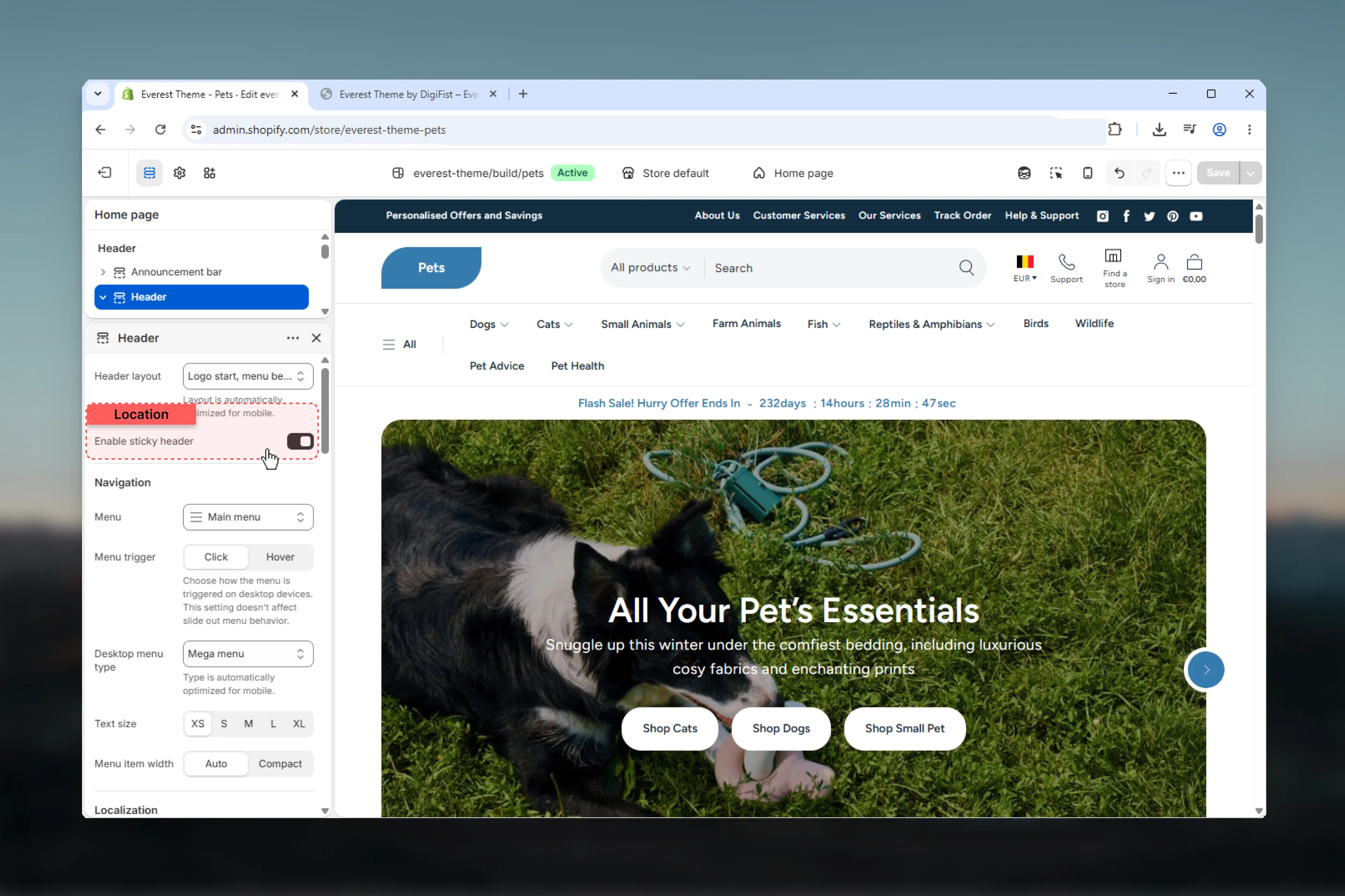 The section exposes sticky mode as a simple on/off control. The underlying code also supports internal sticky variants, but those modes are not available as separate section settings in the current schema.
## Localization and account
The section exposes sticky mode as a simple on/off control. The underlying code also supports internal sticky variants, but those modes are not available as separate section settings in the current schema.
## Localization and account
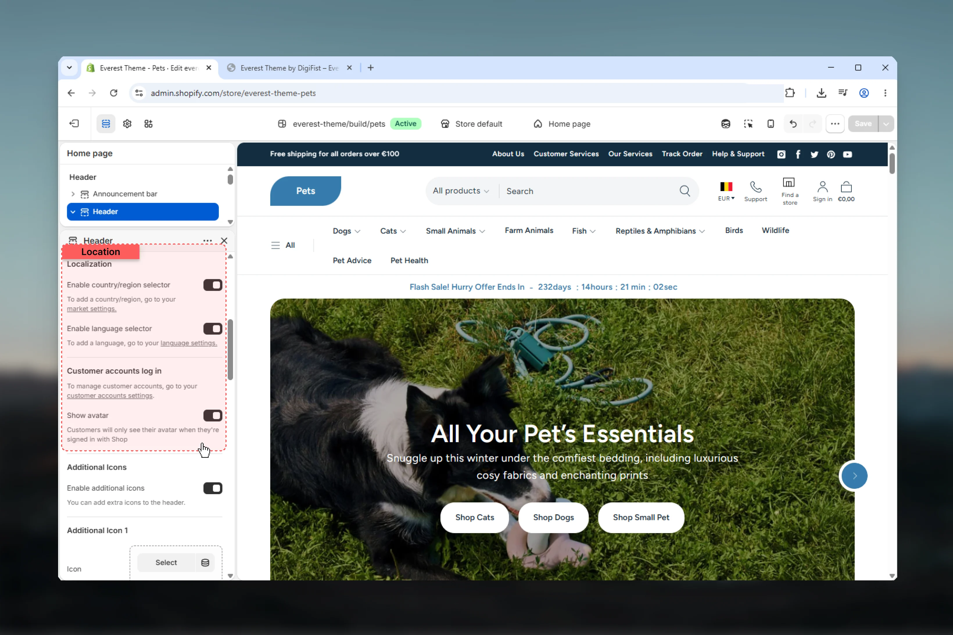 Displays the country selector in the header icon area when your store has more than one available country.
The selector uses Shopify Markets data and renders a searchable country list when enough countries are available.
In the current header implementation, the country selector is rendered only on desktop screens.
Displays the language selector in the header icon area when your store has more than one available language.
In the current header implementation, the language selector is also desktop-only.
Changes how the account icon behaves when Shopify customer accounts are enabled.
If enabled and the signed-in customer has an avatar, the avatar is shown. Otherwise the standard user icon is displayed.
## Additional icons
Displays the country selector in the header icon area when your store has more than one available country.
The selector uses Shopify Markets data and renders a searchable country list when enough countries are available.
In the current header implementation, the country selector is rendered only on desktop screens.
Displays the language selector in the header icon area when your store has more than one available language.
In the current header implementation, the language selector is also desktop-only.
Changes how the account icon behaves when Shopify customer accounts are enabled.
If enabled and the signed-in customer has an avatar, the avatar is shown. Otherwise the standard user icon is displayed.
## Additional icons
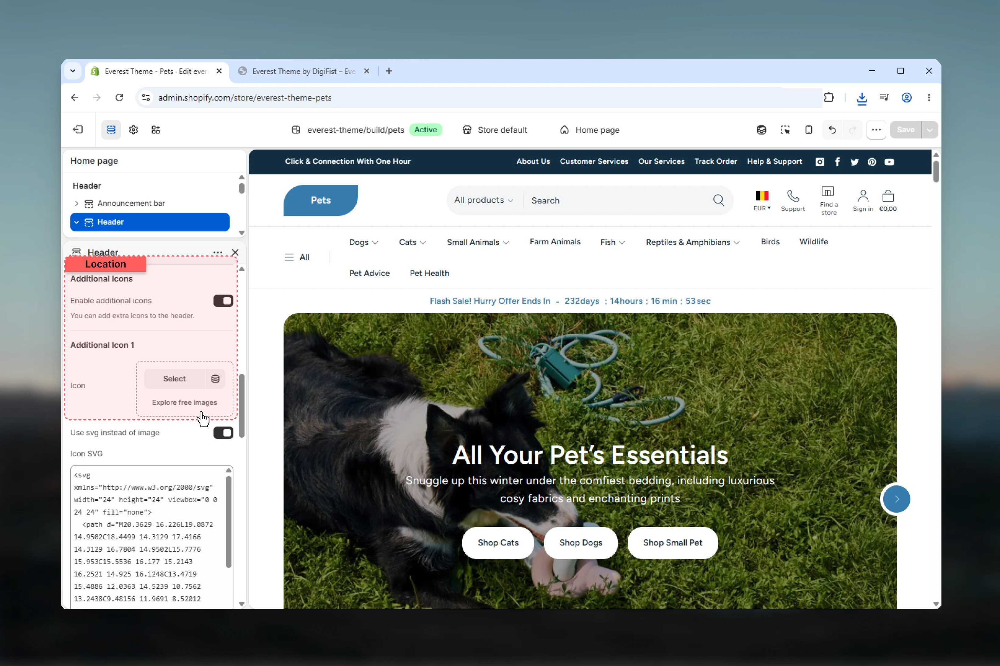 Turns on two optional desktop-only quick-link slots inside the header.
These work well for actions such as **Track order**, **Help center**, or **Store locator**.
Each icon slot supports:
* image icon
* optional SVG override
* text label
* destination link
If SVG mode is enabled and SVG code is provided, the SVG overrides the uploaded image.
The second icon slot uses the same structure as the first one.
Empty icon slots are skipped automatically, so you do not need to fill both.
Keep additional icons limited to one or two high-value actions. Too many icon links reduce the clarity of the header's main navigation.
## Design settings
Turns on two optional desktop-only quick-link slots inside the header.
These work well for actions such as **Track order**, **Help center**, or **Store locator**.
Each icon slot supports:
* image icon
* optional SVG override
* text label
* destination link
If SVG mode is enabled and SVG code is provided, the SVG overrides the uploaded image.
The second icon slot uses the same structure as the first one.
Empty icon slots are skipped automatically, so you do not need to fill both.
Keep additional icons limited to one or two high-value actions. Too many icon links reduce the clarity of the header's main navigation.
## Design settings
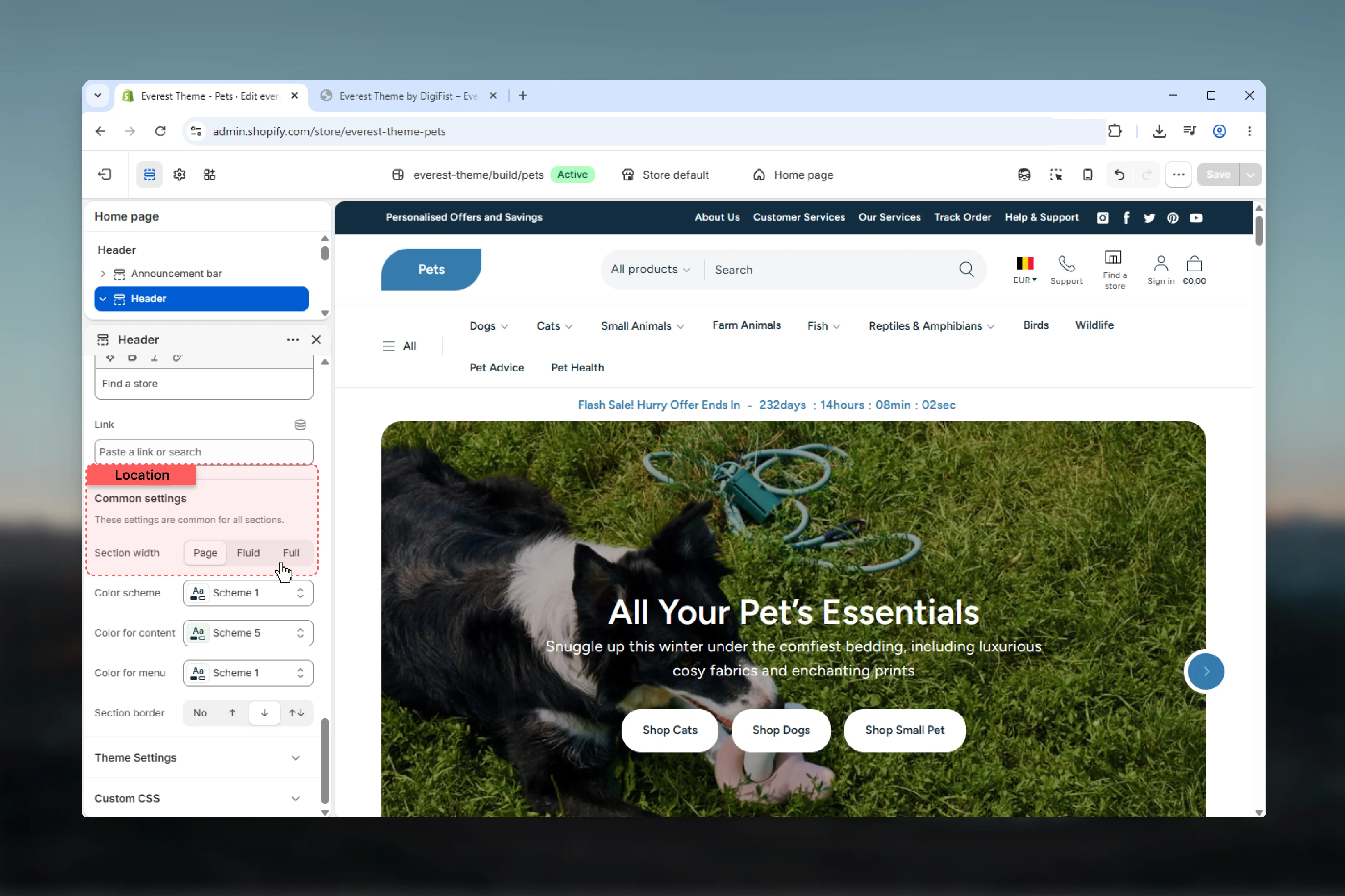 Controls the header container width.
**Page** keeps the header aligned to the theme's standard content width.
**Fluid** expands the header more generously while still respecting page gutters.
**Full** stretches the header edge to edge.
Adds top, bottom, or dual borders using the shared section styling system.
Available options are **None**, **Top**, **Bottom**, and **Both**.
Controls the header container width.
**Page** keeps the header aligned to the theme's standard content width.
**Fluid** expands the header more generously while still respecting page gutters.
**Full** stretches the header edge to edge.
Adds top, bottom, or dual borders using the shared section styling system.
Available options are **None**, **Top**, **Bottom**, and **Both**.
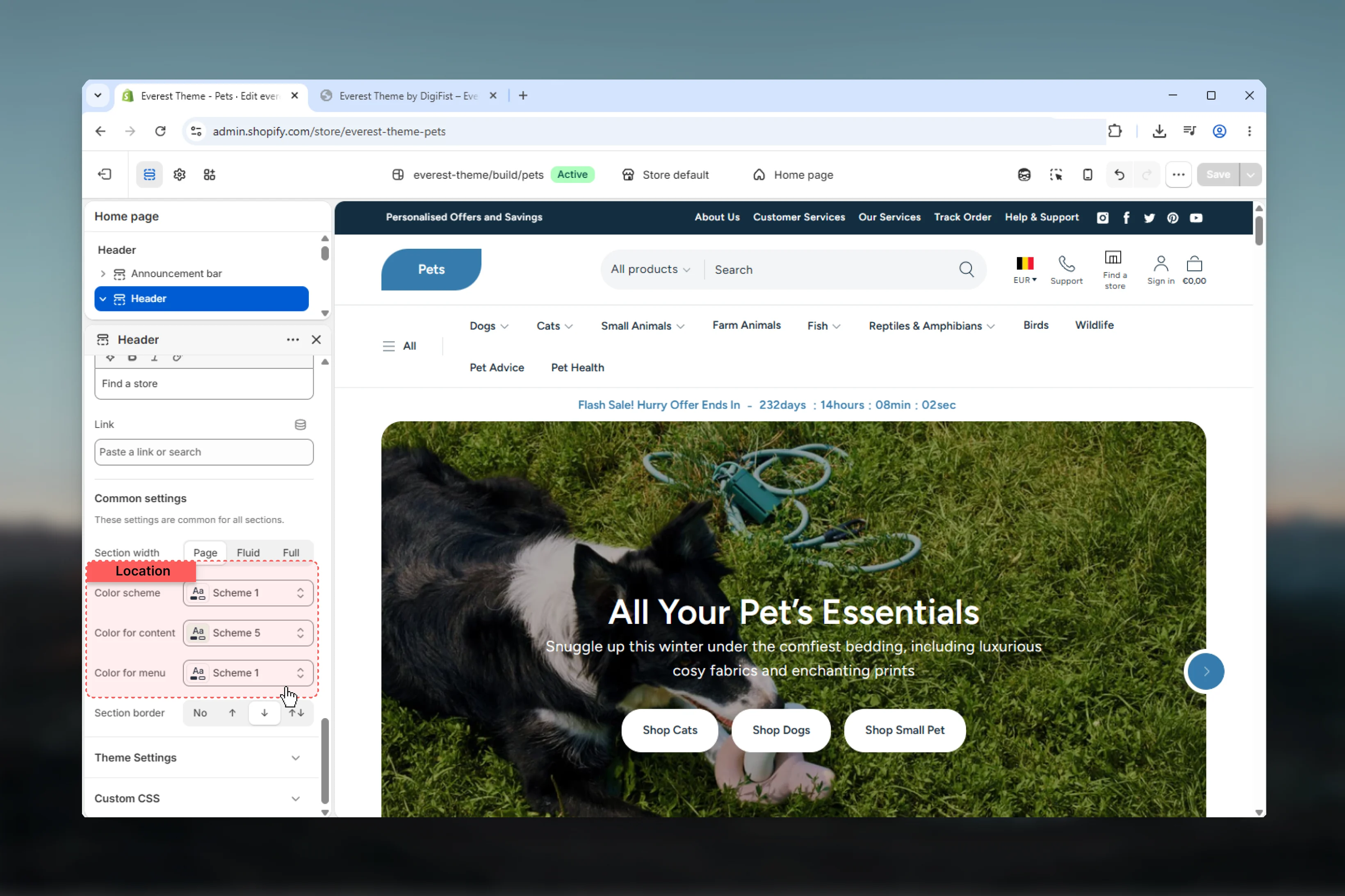 Controls the main header wrapper color scheme.
This is the primary background and text treatment for the visible header bar itself.
Controls the color scheme used for dropdown panels and mega menu overlays.
Use this when the desktop menu surface should feel visually distinct from the main header bar.
This setting appears in the header schema, but the current header markup does not use it for visible output.
In the current theme code, **Color scheme for content** has no visible effect on the main header output. You can treat it as an inactive setting unless a future theme update connects it to rendered header content.
## Block settings
Controls the mobile and tablet drawer navigation.
Controls the main header wrapper color scheme.
This is the primary background and text treatment for the visible header bar itself.
Controls the color scheme used for dropdown panels and mega menu overlays.
Use this when the desktop menu surface should feel visually distinct from the main header bar.
This setting appears in the header schema, but the current header markup does not use it for visible output.
In the current theme code, **Color scheme for content** has no visible effect on the main header output. You can treat it as an inactive setting unless a future theme update connects it to rendered header content.
## Block settings
Controls the mobile and tablet drawer navigation.
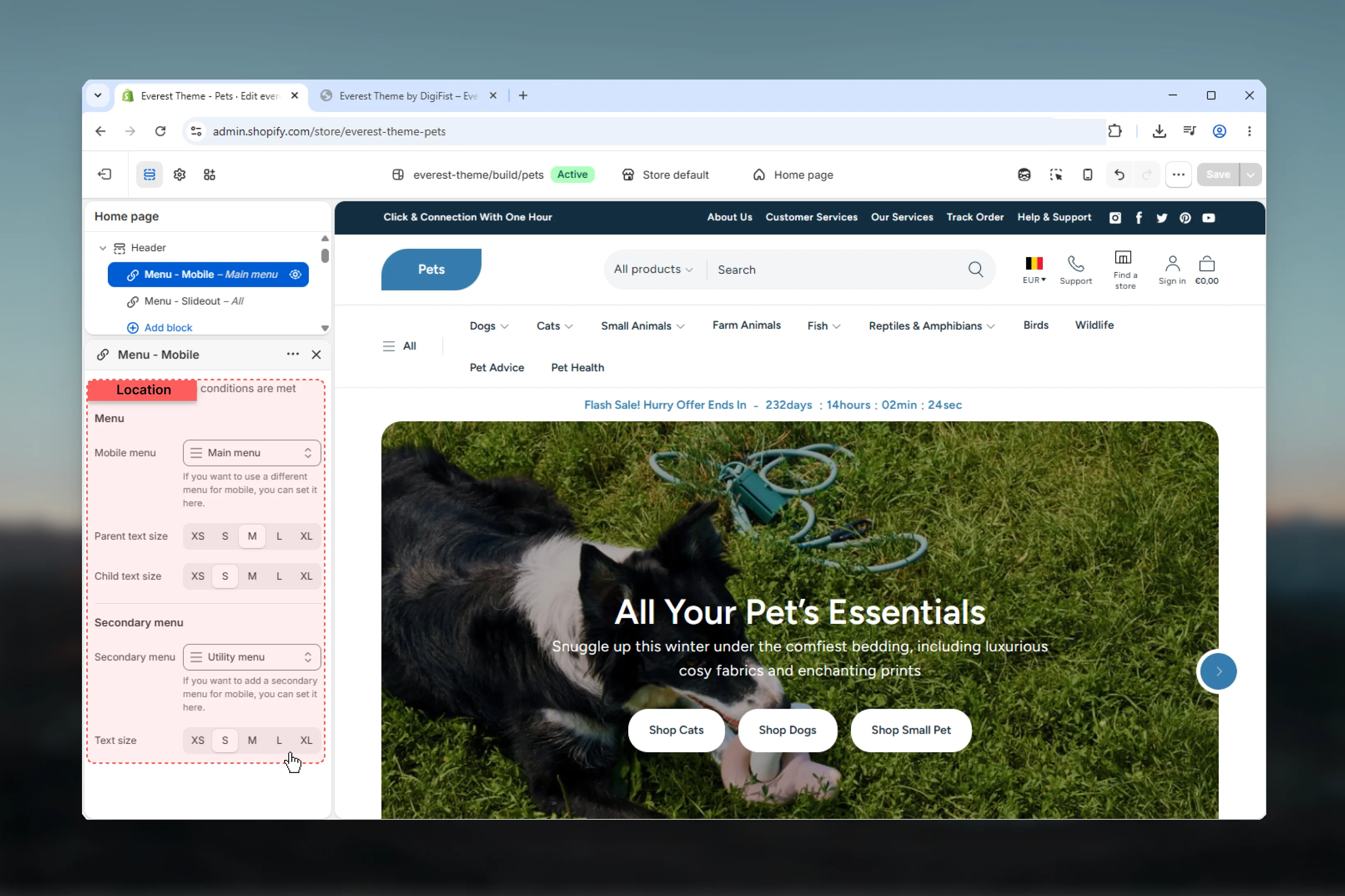 Select a dedicated menu for mobile navigation.
If left empty, the block falls back to the header section's main **Menu** setting.
Use **Parent text size** for top-level drawer links and **Child text size** for nested links.
This helps preserve hierarchy in deeper mobile menu structures.
Adds a second list of links below the main mobile menu.
This is useful for support pages, policies, or utility links that should stay separate from the main navigation.
Controls the text size of the secondary menu list.
The mobile drawer also renders social links in its utility area when those links are configured in global theme settings.
Controls the additional desktop slideout navigation drawer.
Select a dedicated menu for mobile navigation.
If left empty, the block falls back to the header section's main **Menu** setting.
Use **Parent text size** for top-level drawer links and **Child text size** for nested links.
This helps preserve hierarchy in deeper mobile menu structures.
Adds a second list of links below the main mobile menu.
This is useful for support pages, policies, or utility links that should stay separate from the main navigation.
Controls the text size of the secondary menu list.
The mobile drawer also renders social links in its utility area when those links are configured in global theme settings.
Controls the additional desktop slideout navigation drawer.
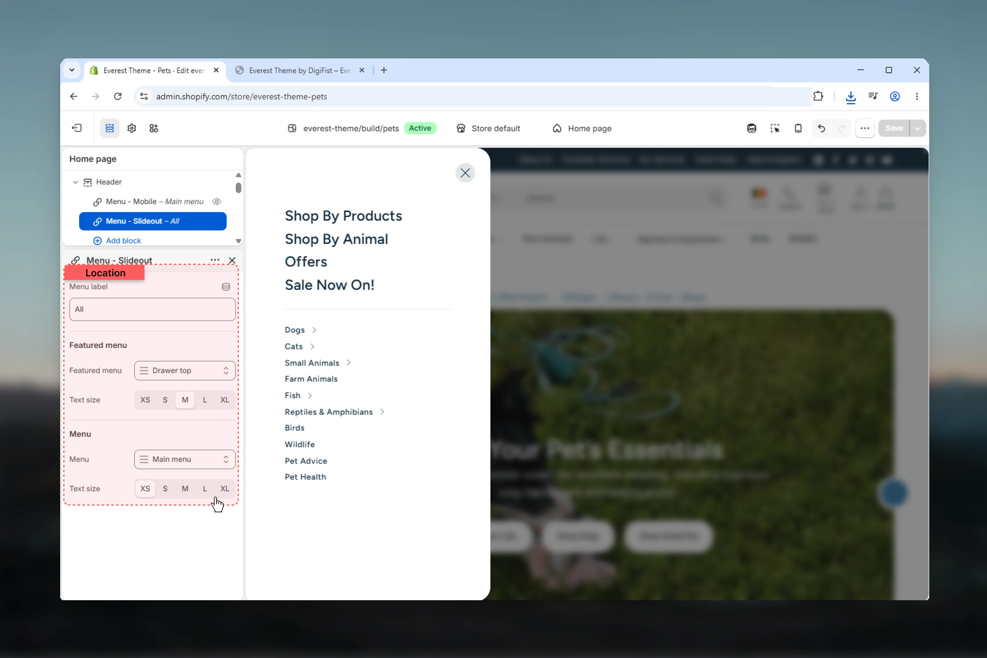 Sets the label shown beside the desktop slideout trigger.
Adds an optional menu above the main slideout navigation.
This is useful for featured collections, highlighted campaigns, or quick utility destinations.
Controls the visual weight of those featured links.
Controls the main slideout navigation text size.
The block schema includes its own **Menu** setting, but the current rendered main link list uses the header section's main **Menu** value in practice.
Treat the header section's main **Menu** setting as the source of truth for the primary slideout navigation structure in the current theme version.
Adds promotion cards inside the desktop mega menu.
Sets the label shown beside the desktop slideout trigger.
Adds an optional menu above the main slideout navigation.
This is useful for featured collections, highlighted campaigns, or quick utility destinations.
Controls the visual weight of those featured links.
Controls the main slideout navigation text size.
The block schema includes its own **Menu** setting, but the current rendered main link list uses the header section's main **Menu** value in practice.
Treat the header section's main **Menu** setting as the source of truth for the primary slideout navigation structure in the current theme version.
Adds promotion cards inside the desktop mega menu.
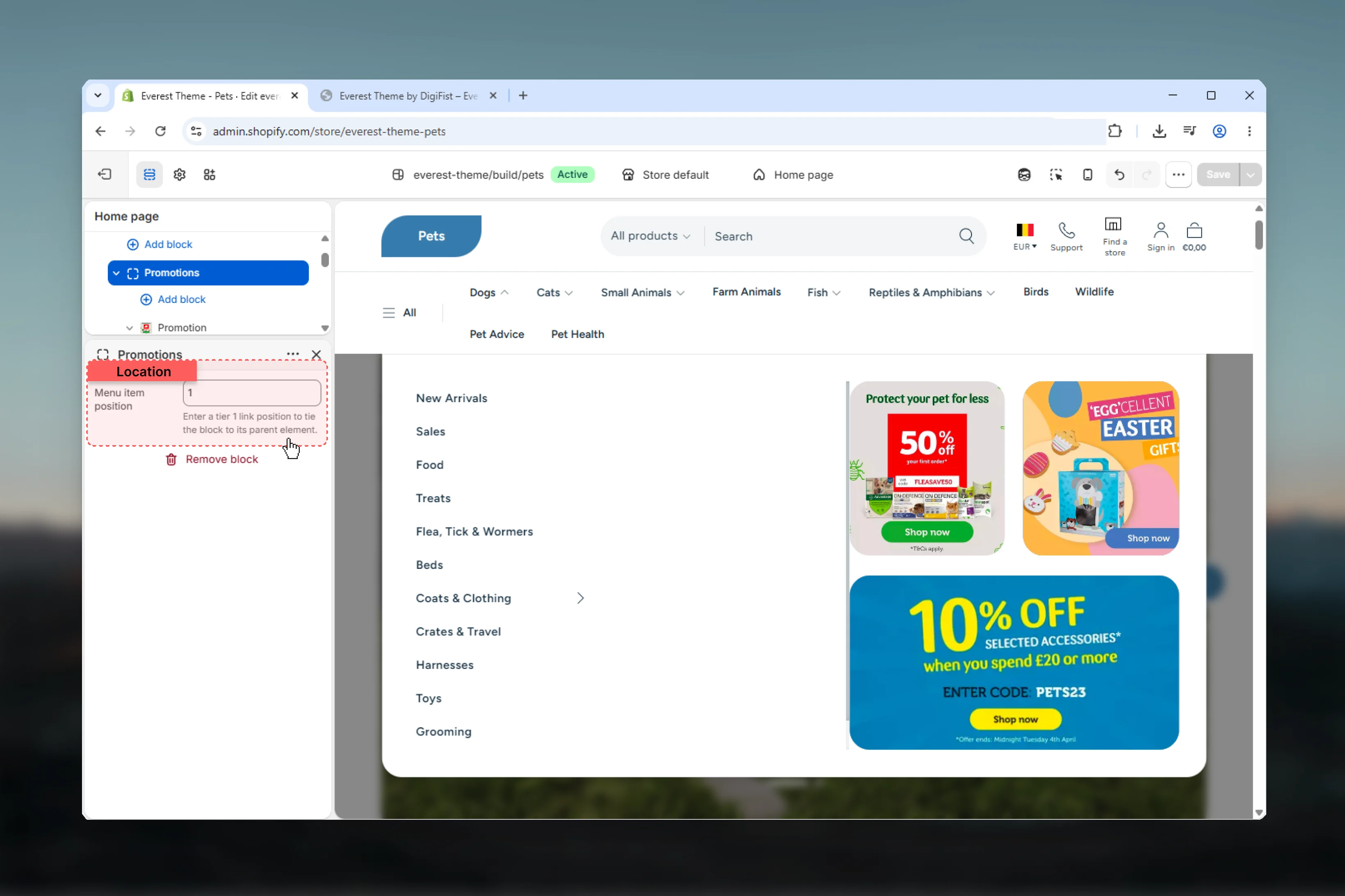 Tie the promotion group to a top-level desktop menu item by entering its position number.
For example, entering `2` connects the promotion group to the second main navigation item.
Each promotion card supports:
* its own color scheme
* half or full column width
* content alignment
* content padding
* optional image or video
* desktop/mobile media visibility
Promotion cards support nested **Heading**, **Text**, and **Button** blocks.
Header promotion blocks render only in the **Mega** menu path. If the header uses **Dropdown** menu type, promotion blocks will not appear in desktop navigation.
The header supports standard `@app` blocks.
Tie the promotion group to a top-level desktop menu item by entering its position number.
For example, entering `2` connects the promotion group to the second main navigation item.
Each promotion card supports:
* its own color scheme
* half or full column width
* content alignment
* content padding
* optional image or video
* desktop/mobile media visibility
Promotion cards support nested **Heading**, **Text**, and **Button** blocks.
Header promotion blocks render only in the **Mega** menu path. If the header uses **Dropdown** menu type, promotion blocks will not appear in desktop navigation.
The header supports standard `@app` blocks.
 App blocks render in the right-hand icon area and can be useful for wishlist, loyalty, or translation integrations.
## Global theme settings that affect the header
Everest header output depends on global brand settings for:
App blocks render in the right-hand icon area and can be useful for wishlist, loyalty, or translation integrations.
## Global theme settings that affect the header
Everest header output depends on global brand settings for:
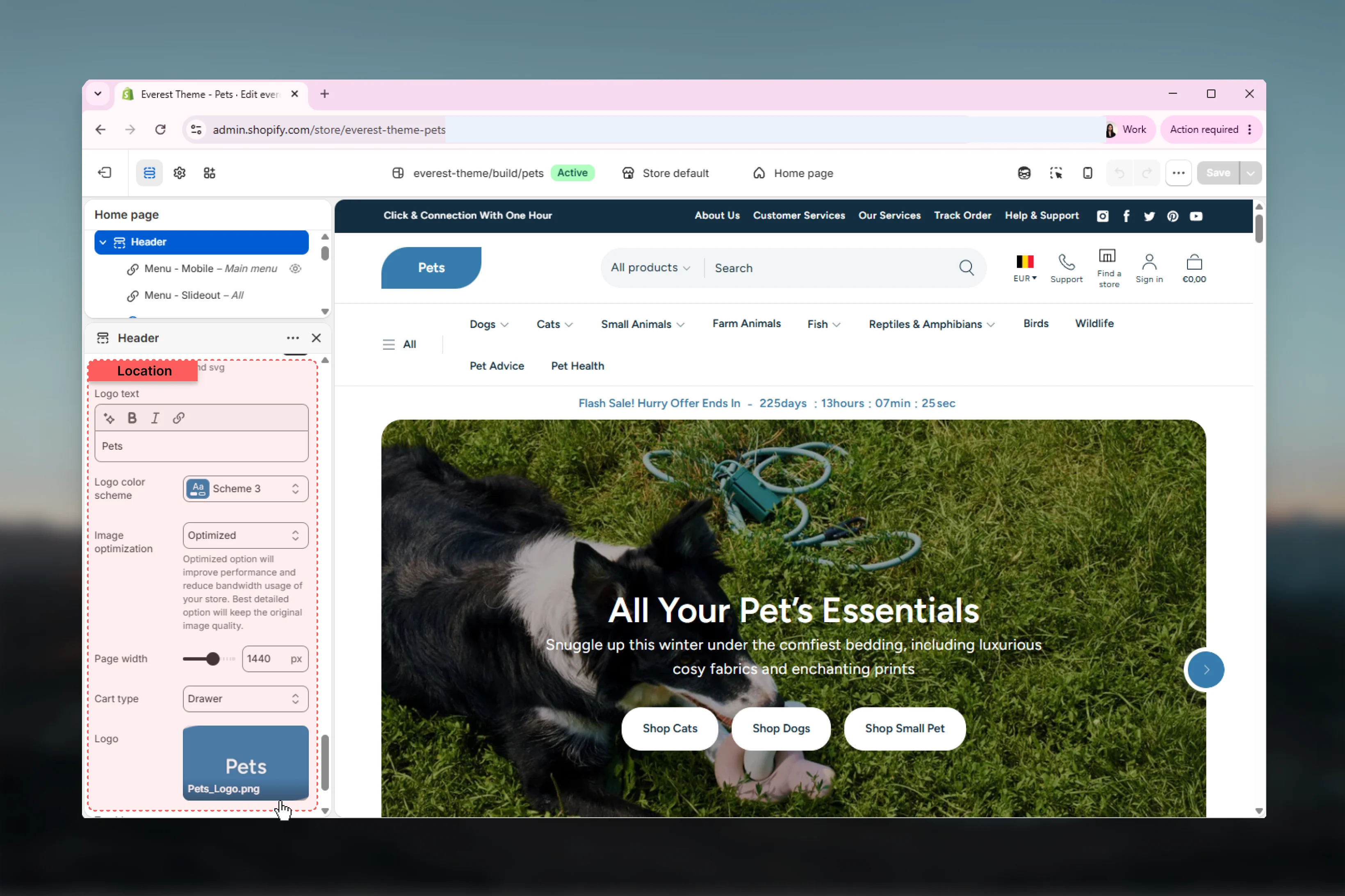 * logo image
* SVG logo
* text logo mode
* logo text
* logo color scheme
* logo width
Practical behavior:
* **Use text for logo** overrides image and SVG usage
* **SVG logo** overrides uploaded logo image when SVG code is present
* if no logo is configured, the store name is shown
Header search behavior depends on global search settings.
* logo image
* SVG logo
* text logo mode
* logo text
* logo color scheme
* logo width
Practical behavior:
* **Use text for logo** overrides image and SVG usage
* **SVG logo** overrides uploaded logo image when SVG code is present
* if no logo is configured, the store name is shown
Header search behavior depends on global search settings.
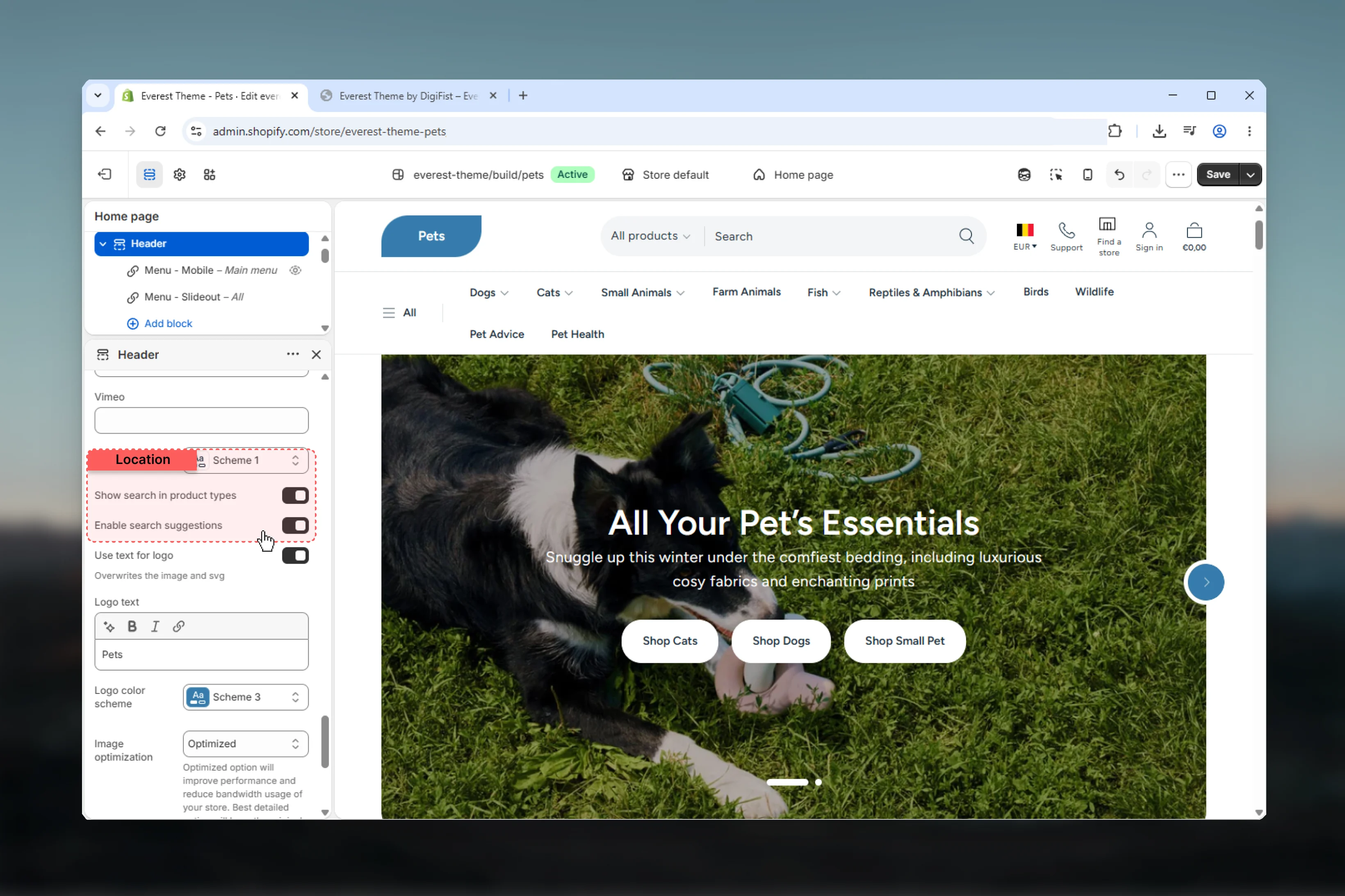 These settings control:
* whether product type filtering appears in search
* whether predictive search suggestions are enabled
* whether predictive suggestions show product vendor and price
Everest uses different search UI patterns on desktop and mobile, but both rely on these global search settings.
These settings control:
* whether product type filtering appears in search
* whether predictive search suggestions are enabled
* whether predictive suggestions show product vendor and price
Everest uses different search UI patterns on desktop and mobile, but both rely on these global search settings.
 **Cart type** changes how the header cart icon behaves:
* **Drawer** makes the cart icon act like a button that opens the cart drawer
* **Page** makes the cart icon link to the cart page
* **Notification** enables cart notification markup after the header
The header bubble displays **cart total price**, not item count, and that price label is hidden on mobile.
Social links configured in global theme settings also appear in the mobile drawer utility area.
## Best practices
Use **menu below** layouts when your store has longer top-level labels or more categories to scan.
Reserve the mega menu for categories that genuinely need multi-level navigation or promotional support.
Create a dedicated mobile menu instead of mirroring every desktop navigation choice one-to-one.
Use additional icons for one or two high-value actions so the header stays easy to parse.
Country and language selectors appear only when your Shopify Markets and language setup includes multiple options.
Unexpected logo behavior usually comes from Brand settings, not from the Header section itself.
Review sticky header behavior on real devices, especially if your first viewport is already busy with navigation, search, and icons.
Tie header promotions to the correct top-level menu position and verify them in mega menu mode before publishing.
## Related guides
Start with the theme overview and preset context before documenting other Everest sections.
Review the shared icon reference used across DigiFist theme documentation.
**Cart type** changes how the header cart icon behaves:
* **Drawer** makes the cart icon act like a button that opens the cart drawer
* **Page** makes the cart icon link to the cart page
* **Notification** enables cart notification markup after the header
The header bubble displays **cart total price**, not item count, and that price label is hidden on mobile.
Social links configured in global theme settings also appear in the mobile drawer utility area.
## Best practices
Use **menu below** layouts when your store has longer top-level labels or more categories to scan.
Reserve the mega menu for categories that genuinely need multi-level navigation or promotional support.
Create a dedicated mobile menu instead of mirroring every desktop navigation choice one-to-one.
Use additional icons for one or two high-value actions so the header stays easy to parse.
Country and language selectors appear only when your Shopify Markets and language setup includes multiple options.
Unexpected logo behavior usually comes from Brand settings, not from the Header section itself.
Review sticky header behavior on real devices, especially if your first viewport is already busy with navigation, search, and icons.
Tie header promotions to the correct top-level menu position and verify them in mega menu mode before publishing.
## Related guides
Start with the theme overview and preset context before documenting other Everest sections.
Review the shared icon reference used across DigiFist theme documentation.