> ## Documentation Index
> Fetch the complete documentation index at: https://docs.digifist.com/llms.txt
> Use this file to discover all available pages before exploring further.
# Product Badges
> Configure Everest's built-in sale and sold-out badges on product cards, search results, and product pages.
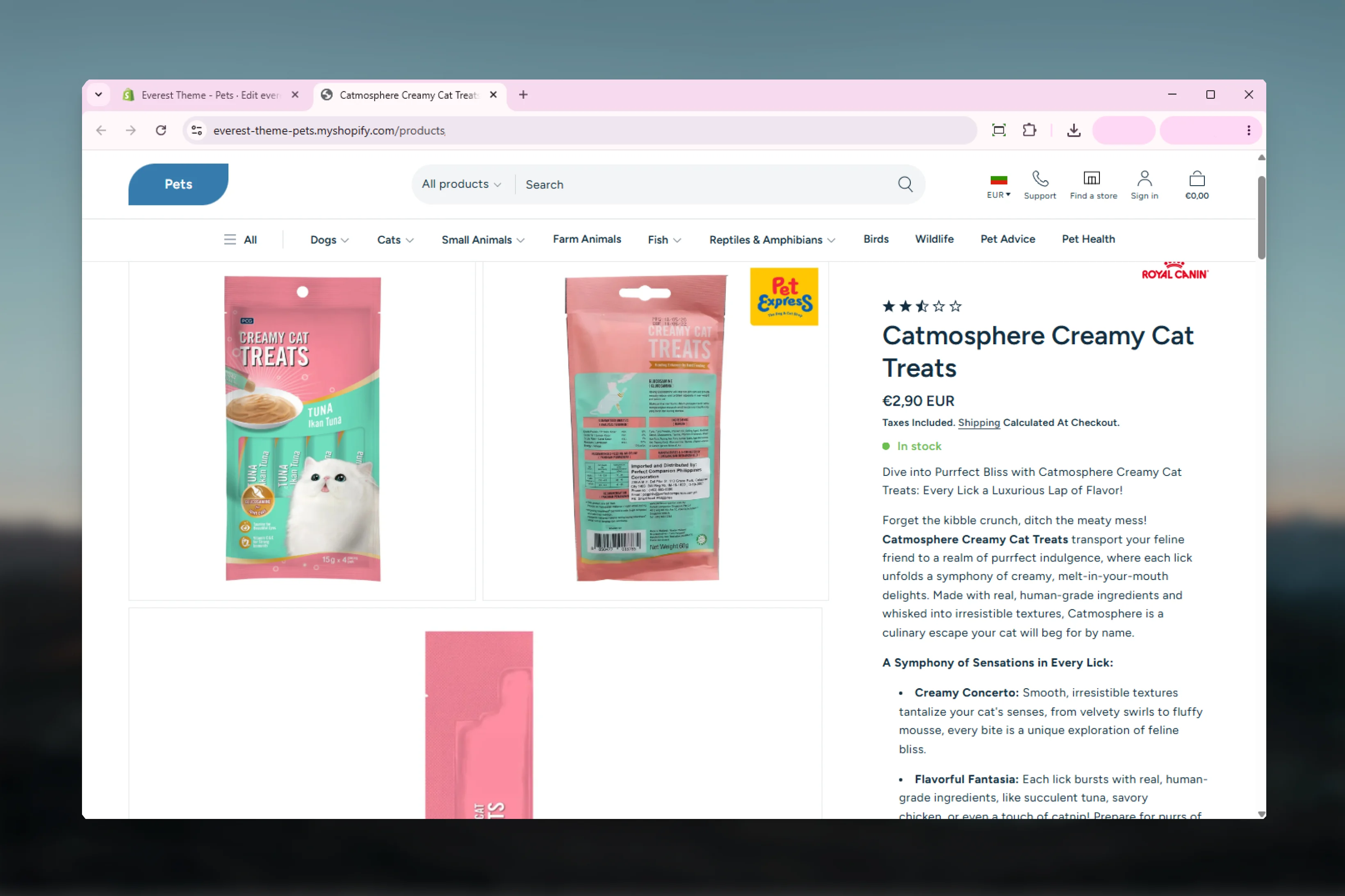
Product Badges control the small status labels Everest shows for important product states. In Everest, badge behavior is intentionally narrow and automatic: the theme shows badges for sold-out or on-sale products, and the visual styling comes from global badge settings plus an optional Product Badge block on the product page.
 ## What this feature controls
* Global badge position on product cards
* Badge corner radius styling
* Sale and sold-out badge color schemes
* Product page badge placement through the Product Badge block
* Search result badge styling for page-type results
## Getting started
In Theme Customizer, go to **Theme settings -> Badges** to configure the shared badge style first.
Check collection cards or other product-card surfaces to confirm the global position and color choices feel balanced.
On the product template, add or review the **Product Badge** block if you want the same state labels shown on the product page.
Verify badge output with at least one on-sale product and one sold-out product so both styling paths are covered.
## What this feature controls
* Global badge position on product cards
* Badge corner radius styling
* Sale and sold-out badge color schemes
* Product page badge placement through the Product Badge block
* Search result badge styling for page-type results
## Getting started
In Theme Customizer, go to **Theme settings -> Badges** to configure the shared badge style first.
Check collection cards or other product-card surfaces to confirm the global position and color choices feel balanced.
On the product template, add or review the **Product Badge** block if you want the same state labels shown on the product page.
Verify badge output with at least one on-sale product and one sold-out product so both styling paths are covered.
 ## Global badge settings
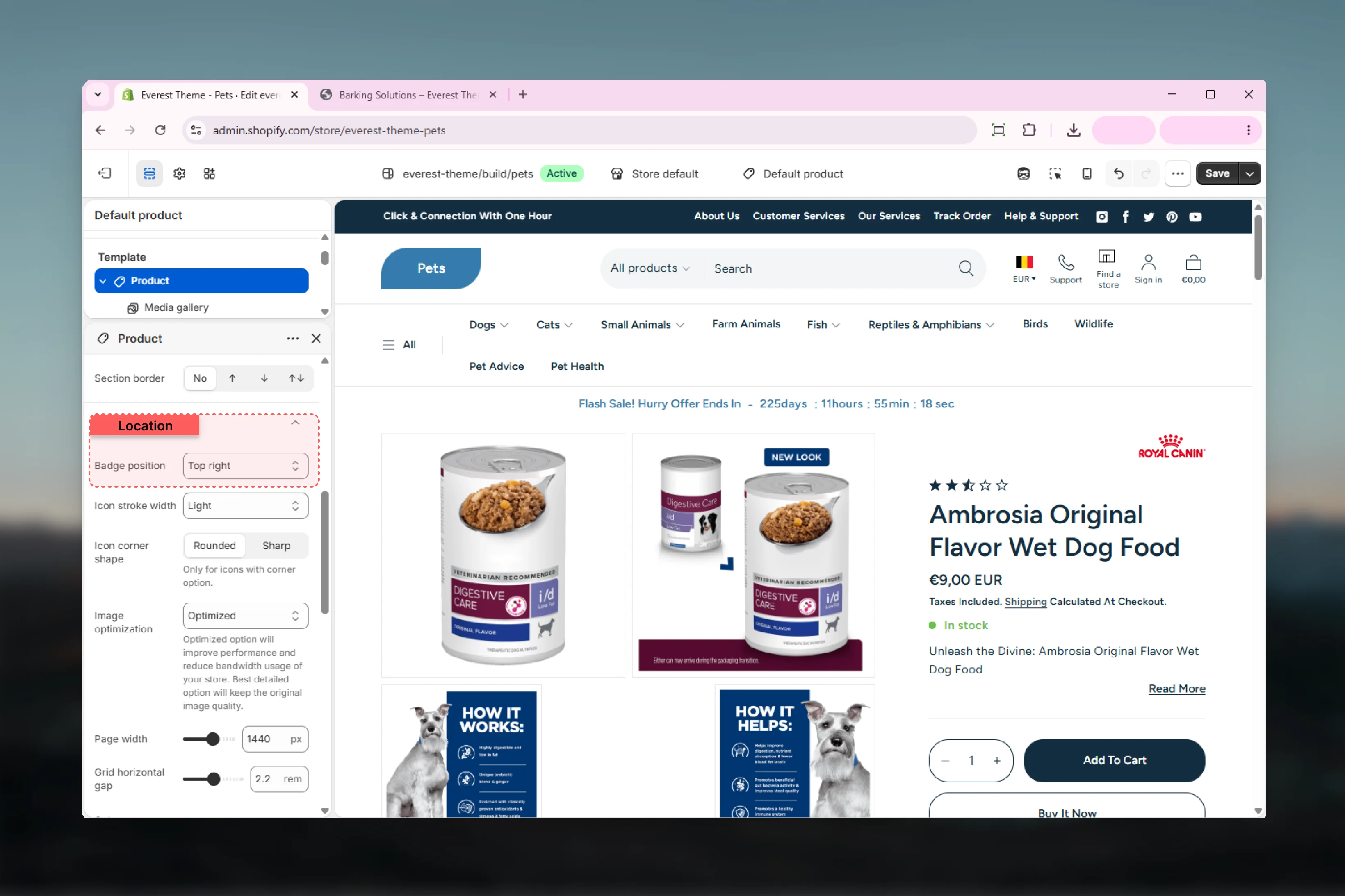
Controls the default overlay position for badges rendered on product cards.
**Available options:** `Bottom left`, `Bottom right`, `Top left`, `Top right`\
**Default:** `Top right`
Controls how rounded the badge corners appear.
**Range:** `0px` to `40px`\
**Default:** `40px`
Sets the color scheme used when a product is available and its compare-at price is higher than its selling price.
**Default:** `scheme-5`
Sets the color scheme used when a product is unavailable.
**Default:** `scheme-3`
## Product page block settings
The Product Badge block can place badges either inline with other product content or as an overlay.
**Available options:** `Inline`, `Overlay`\
**Default:** `Overlay`
Controls the space below the Product Badge block on the product page.
## Display logic
Everest shows the sold-out badge whenever the selected product is unavailable.
Everest shows the sale badge when the selected product is available and its compare-at price is greater than its current price.
On `main-search`, the badge snippet can also render a page-type label for search result cards that represent pages rather than products.
## Important limitation
Everest does not use the broader tag-based custom badge system documented in some other themes. The built-in badge snippet only handles sale and sold-out product states automatically, so custom promotional badge text is not a native Everest badge feature.
## Best practices
* Choose badge colors that remain readable over real product imagery.
* Keep badge placement consistent across cards and product pages unless there is a clear layout reason to change it.
* Test both sold-out and on-sale states because each badge can use a different color scheme.
* Avoid relying on Everest badges for custom campaign messaging unless you plan to extend the theme code.
## Related guides
* [Product Page](/themes/everest/products/product-page)
* [Theme Settings: Badges](/themes/everest/theme-settings/badges)
* [Theme Settings: Products](/themes/everest/theme-settings/products)
## Global badge settings
Controls the default overlay position for badges rendered on product cards.
**Available options:** `Bottom left`, `Bottom right`, `Top left`, `Top right`\
**Default:** `Top right`
Controls how rounded the badge corners appear.
**Range:** `0px` to `40px`\
**Default:** `40px`
Sets the color scheme used when a product is available and its compare-at price is higher than its selling price.
**Default:** `scheme-5`
Sets the color scheme used when a product is unavailable.
**Default:** `scheme-3`
## Product page block settings
The Product Badge block can place badges either inline with other product content or as an overlay.
**Available options:** `Inline`, `Overlay`\
**Default:** `Overlay`
Controls the space below the Product Badge block on the product page.
## Display logic
Everest shows the sold-out badge whenever the selected product is unavailable.
Everest shows the sale badge when the selected product is available and its compare-at price is greater than its current price.
On `main-search`, the badge snippet can also render a page-type label for search result cards that represent pages rather than products.
## Important limitation
Everest does not use the broader tag-based custom badge system documented in some other themes. The built-in badge snippet only handles sale and sold-out product states automatically, so custom promotional badge text is not a native Everest badge feature.
## Best practices
* Choose badge colors that remain readable over real product imagery.
* Keep badge placement consistent across cards and product pages unless there is a clear layout reason to change it.
* Test both sold-out and on-sale states because each badge can use a different color scheme.
* Avoid relying on Everest badges for custom campaign messaging unless you plan to extend the theme code.
## Related guides
* [Product Page](/themes/everest/products/product-page)
* [Theme Settings: Badges](/themes/everest/theme-settings/badges)
* [Theme Settings: Products](/themes/everest/theme-settings/products)