> ## Documentation Index
> Fetch the complete documentation index at: https://docs.digifist.com/llms.txt
> Use this file to discover all available pages before exploring further.
# Product Page
> Configure Everest's product template, gallery layout, product information, and supporting purchase blocks.
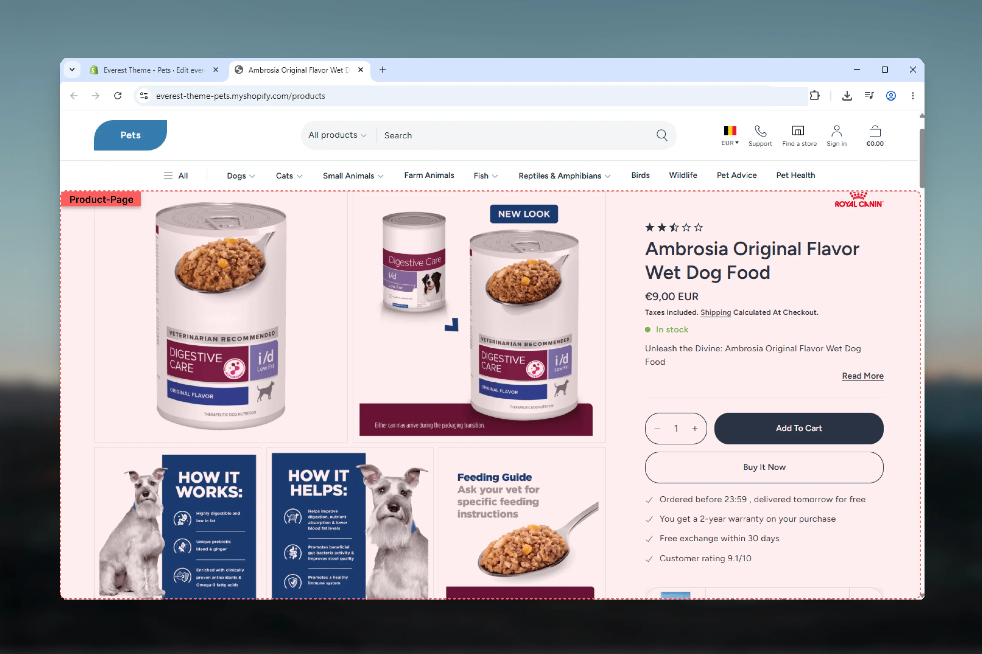
The Product Page template controls the main structure used for this page type in Everest. It combines template-specific sections with reusable content blocks, which means most storefront behavior can be adjusted in the Theme Customizer without editing theme code.
 ## What this template controls
* Layout structure, width, alignment, and spacing
* Color schemes, contrast, and shared visual styling
* Block types such as Product Media Gallery, Product Blocks Main, Product Blocks Side
* The template section order and the supporting sections included by default
## Template structure
This template uses the following main sections or related theme building blocks by default:
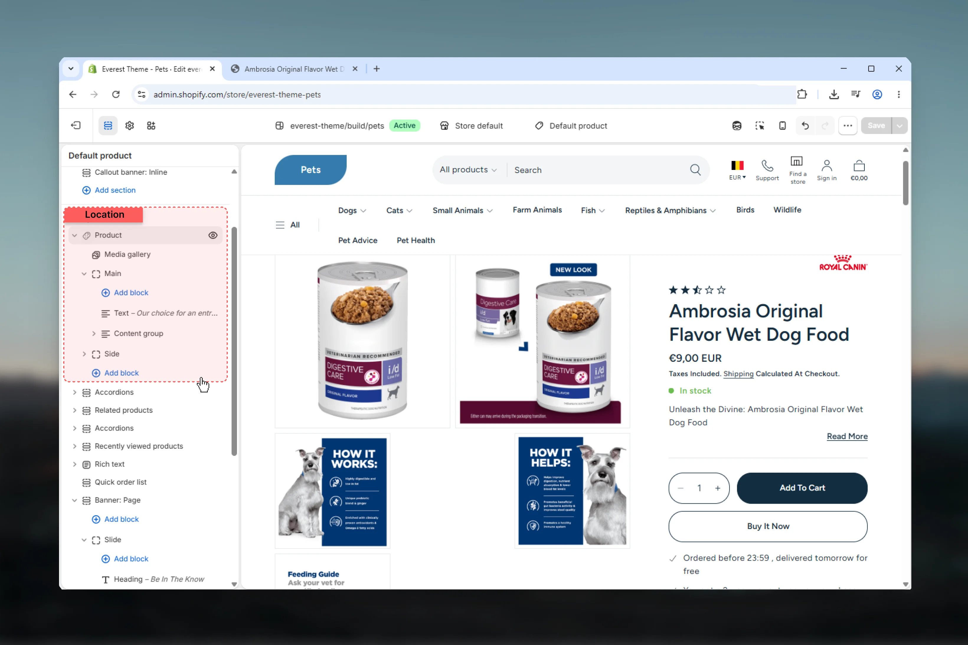
* **Product**
* **Related Products**
* **Pickup Availability**
## Getting started
Open the relevant page type or assign the template to a resource before customizing it.
Start with the primary content section so layout, filtering, gallery, or page-level behavior is defined before refining supporting content.
Review any banners, content sections, or utility sections included in the template so the full page works together as a set.
## What this template controls
* Layout structure, width, alignment, and spacing
* Color schemes, contrast, and shared visual styling
* Block types such as Product Media Gallery, Product Blocks Main, Product Blocks Side
* The template section order and the supporting sections included by default
## Template structure
This template uses the following main sections or related theme building blocks by default:
* **Product**
* **Related Products**
* **Pickup Availability**
## Getting started
Open the relevant page type or assign the template to a resource before customizing it.
Start with the primary content section so layout, filtering, gallery, or page-level behavior is defined before refining supporting content.
Review any banners, content sections, or utility sections included in the template so the full page works together as a set.
 ## Main settings
### Settings
## Main settings
### Settings
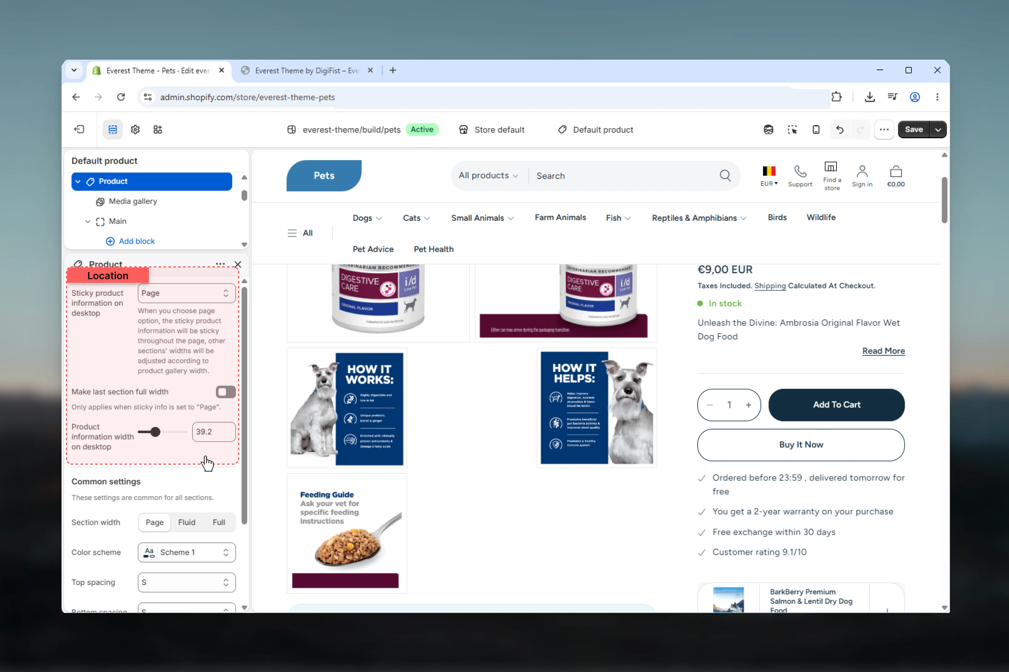 Choose how **Sticky product information on desktop** behaves in the section.
**Available options:** None, Gallery, Page.
**Default:** `gallery`
When you choose page option, the sticky product information will be sticky throughout the page, other sections' widths will be adjusted according to product gallery width.
Adjust **Product information width on desktop** with a slider-based control.
It has the strongest effect on layout balance and visual hierarchy.
**Range:** `24.0` to `72.0` **Default:** `38.4`
### Common settings
Choose how **Sticky product information on desktop** behaves in the section.
**Available options:** None, Gallery, Page.
**Default:** `gallery`
When you choose page option, the sticky product information will be sticky throughout the page, other sections' widths will be adjusted according to product gallery width.
Adjust **Product information width on desktop** with a slider-based control.
It has the strongest effect on layout balance and visual hierarchy.
**Range:** `24.0` to `72.0` **Default:** `38.4`
### Common settings
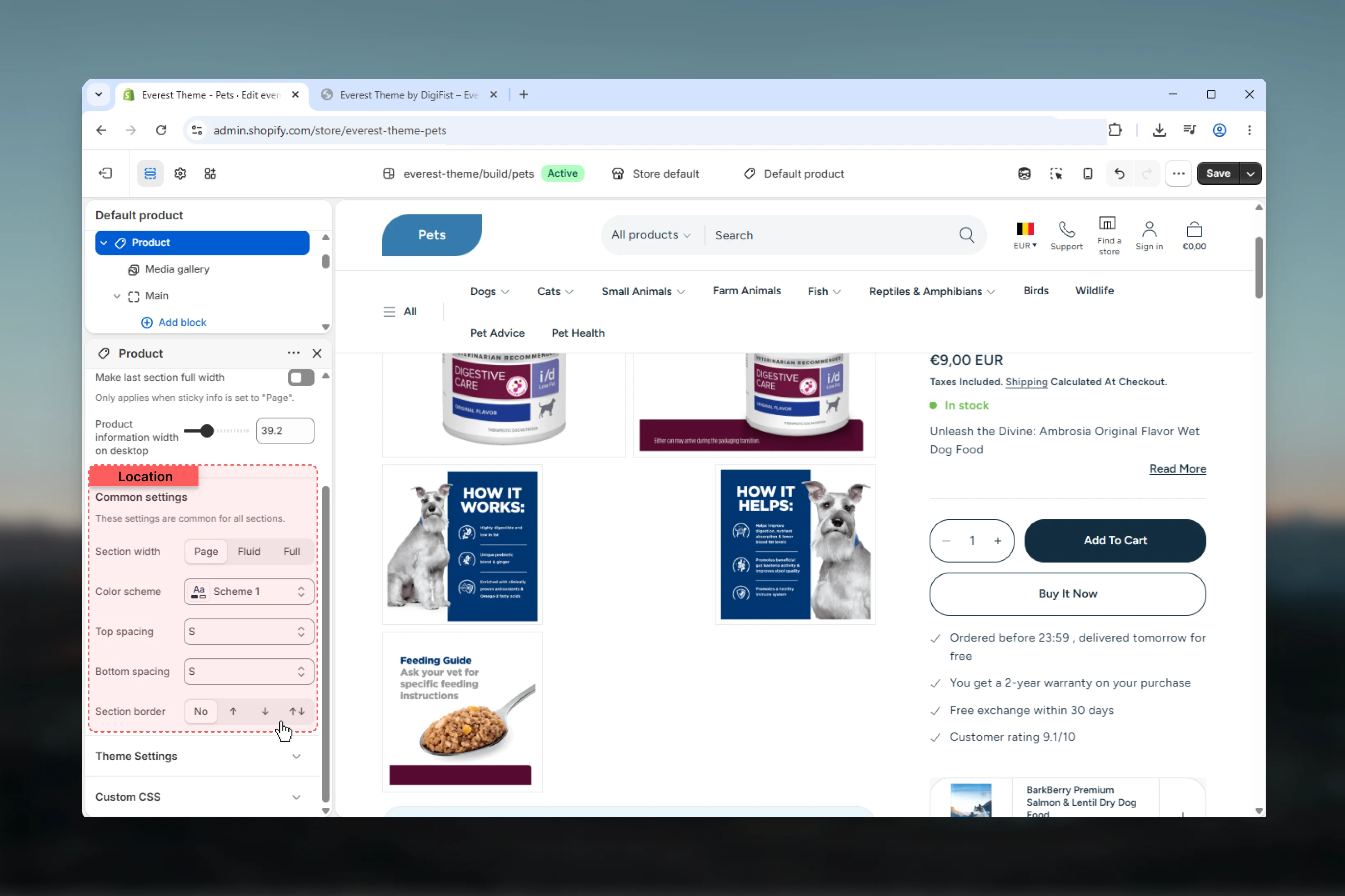 Choose how **Section width** behaves in the section.
This setting shapes the section container and how it sits against surrounding content.
**Available options:** Page, Fluid, Full.
**Default:** `page`
Select the color scheme used for **color scheme**.
Use this to keep contrast and branding consistent with the rest of the store.
**Default:** `scheme-1`
Choose how **Top spacing** behaves in the section.
This setting shapes the section container and how it sits against surrounding content.
**Available options:** No, S, M, L, XL.
**Default:** `2`
Choose how **Bottom spacing** behaves in the section.
This setting shapes the section container and how it sits against surrounding content.
**Available options:** No, S, M, L, XL.
**Default:** `2`
Choose how **Section border** behaves in the section.
This setting shapes the section container and how it sits against surrounding content.
**Available options:** None, Top, Bottom, Both.
**Default:** `none`
## Best practices
* Check contrast after changing color schemes so text and controls remain easy to read.
* Adjust layout changes alongside neighboring sections so page rhythm stays consistent.
* Test this template with real content volume so headings, cards, and filters behave as expected.
* Review supporting sections together because template defaults often work as a coordinated set.
## Related guides
* [Everest Theme Overview](/themes/everest/index)
* [Related Products](/themes/everest/sections/related-products)
* [Pickup Availability](/themes/everest/sections/pickup-availability)
Choose how **Section width** behaves in the section.
This setting shapes the section container and how it sits against surrounding content.
**Available options:** Page, Fluid, Full.
**Default:** `page`
Select the color scheme used for **color scheme**.
Use this to keep contrast and branding consistent with the rest of the store.
**Default:** `scheme-1`
Choose how **Top spacing** behaves in the section.
This setting shapes the section container and how it sits against surrounding content.
**Available options:** No, S, M, L, XL.
**Default:** `2`
Choose how **Bottom spacing** behaves in the section.
This setting shapes the section container and how it sits against surrounding content.
**Available options:** No, S, M, L, XL.
**Default:** `2`
Choose how **Section border** behaves in the section.
This setting shapes the section container and how it sits against surrounding content.
**Available options:** None, Top, Bottom, Both.
**Default:** `none`
## Best practices
* Check contrast after changing color schemes so text and controls remain easy to read.
* Adjust layout changes alongside neighboring sections so page rhythm stays consistent.
* Test this template with real content volume so headings, cards, and filters behave as expected.
* Review supporting sections together because template defaults often work as a coordinated set.
## Related guides
* [Everest Theme Overview](/themes/everest/index)
* [Related Products](/themes/everest/sections/related-products)
* [Pickup Availability](/themes/everest/sections/pickup-availability)