> ## Documentation Index
> Fetch the complete documentation index at: https://docs.digifist.com/llms.txt
> Use this file to discover all available pages before exploring further.
# Callout Banner
> Configure Everest's callout banner section and its main settings, content structure, and styling controls.
The Callout Banner section lets you control the content, layout, and presentation of this part of the Everest storefront. Most changes happen directly in the Theme Customizer, so you can adjust structure first and then refine styling, spacing, and supporting blocks with confidence.
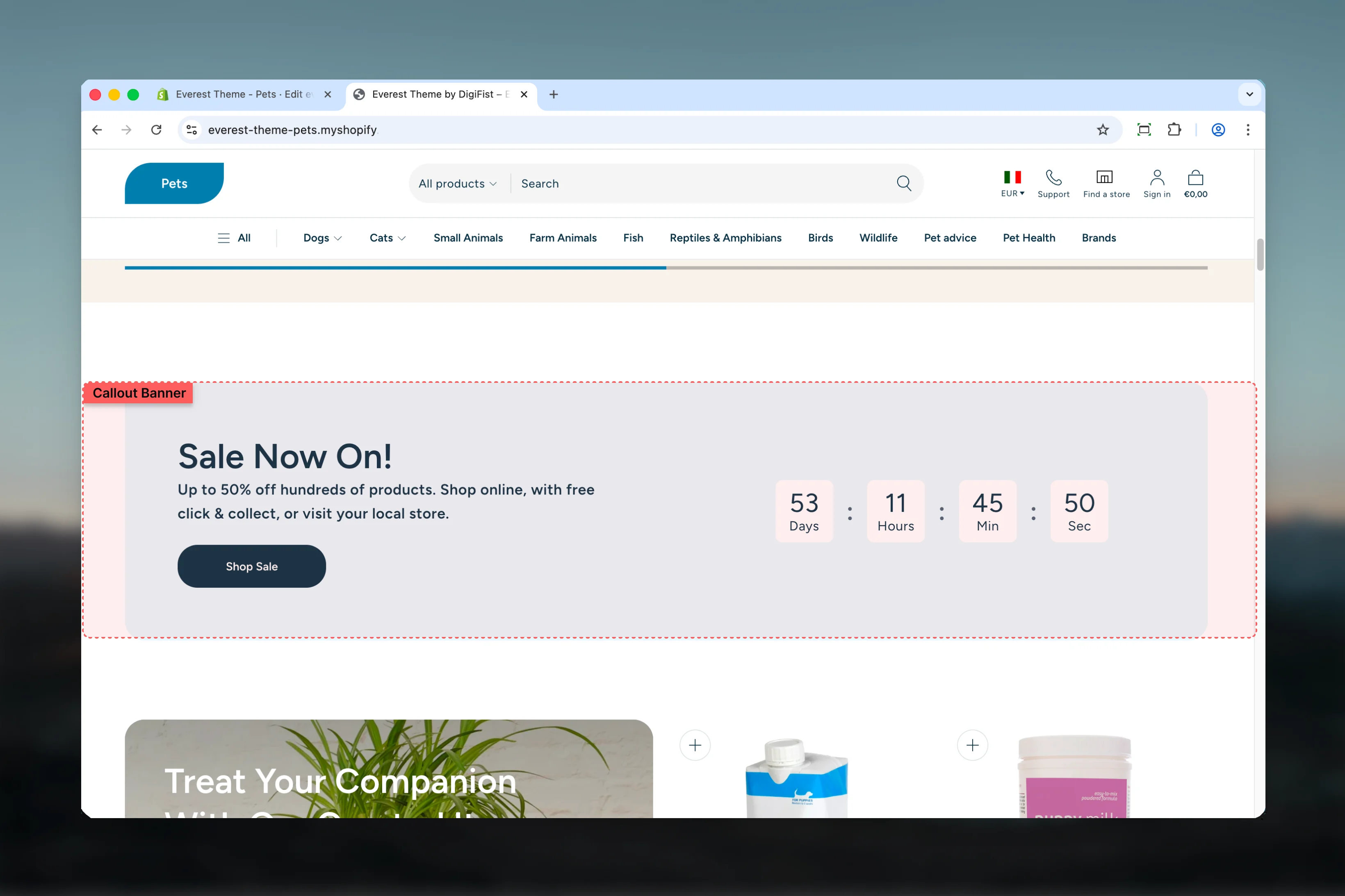 ## What this section controls
* Headings, text content, and on-page messaging
* Images, videos, and other media presentation options
* Layout structure, width, alignment, and spacing
* Calls to action, links, and navigation behavior
* Color schemes, contrast, and shared visual styling
## Getting started
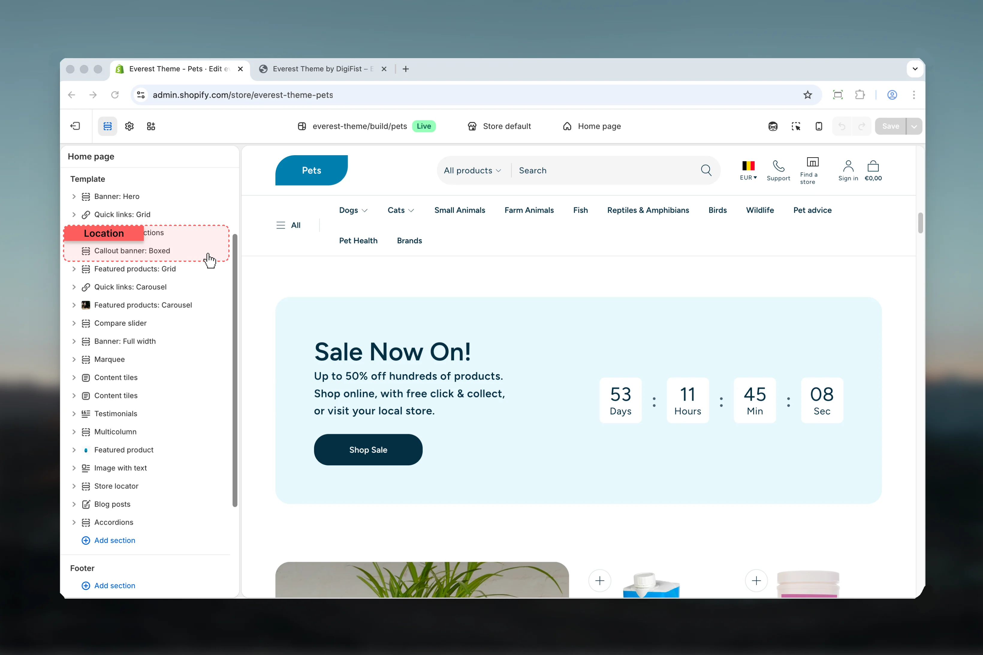
In Shopify admin, go to **Online Store** -> **Themes** -> **Customize**.
Add the **Callout Banner** section to a compatible template or select the existing section from the left sidebar.
Start with the structural settings such as layout, width, color scheme, spacing, or content source before refining smaller details.
## What this section controls
* Headings, text content, and on-page messaging
* Images, videos, and other media presentation options
* Layout structure, width, alignment, and spacing
* Calls to action, links, and navigation behavior
* Color schemes, contrast, and shared visual styling
## Getting started
In Shopify admin, go to **Online Store** -> **Themes** -> **Customize**.
Add the **Callout Banner** section to a compatible template or select the existing section from the left sidebar.
Start with the structural settings such as layout, width, color scheme, spacing, or content source before refining smaller details.
 ## Section settings
### Settings
## Section settings
### Settings
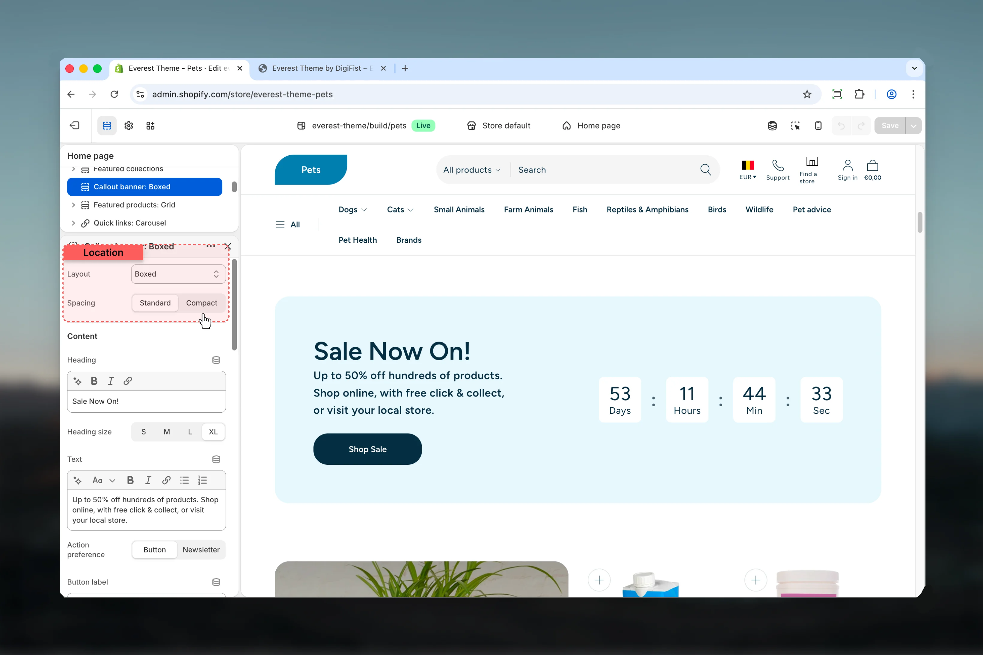 Choose how **Layout** behaves in the section.
It has the strongest effect on layout balance and visual hierarchy.
**Available options:** Boxed, Minimal, Inline.
**Default:** `1`
Choose how **Spacing** behaves in the section.
It has the strongest effect on layout balance and visual hierarchy.
**Available options:** Standard, Compact.
**Default:** `standard`
This setting only appears when its related parent option is enabled.
### Content
Choose how **Layout** behaves in the section.
It has the strongest effect on layout balance and visual hierarchy.
**Available options:** Boxed, Minimal, Inline.
**Default:** `1`
Choose how **Spacing** behaves in the section.
It has the strongest effect on layout balance and visual hierarchy.
**Available options:** Standard, Compact.
**Default:** `standard`
This setting only appears when its related parent option is enabled.
### Content
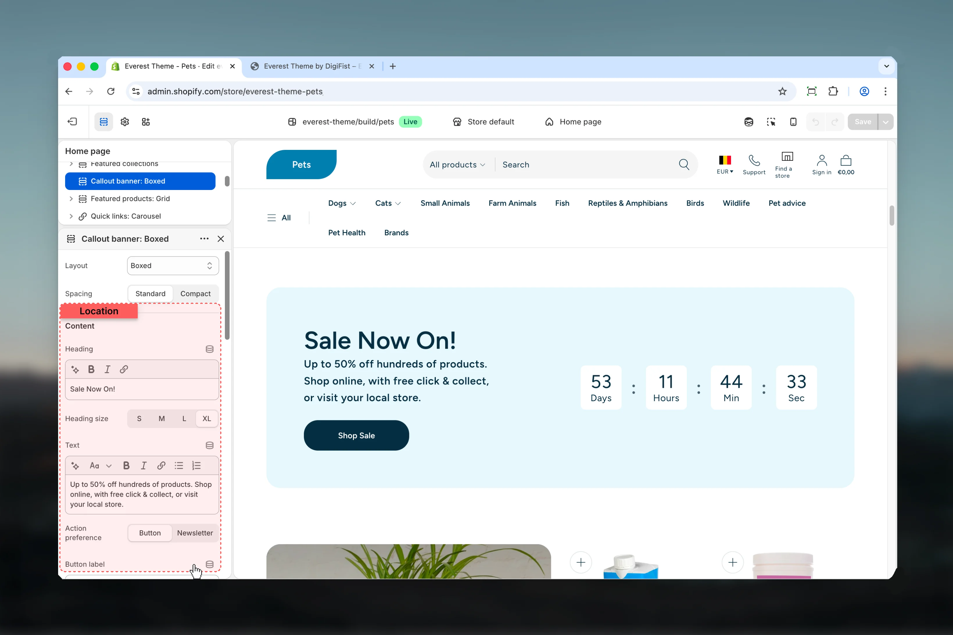 Enter the content used for **heading**.
**Default:** `Callout heading`
Choose how **Heading size** behaves in the section.
**Available options:** S, M, L, XL.
**Default:** `h2`
This setting only appears when its related parent option is enabled.
Enter the content used for **text**.
This setting only appears when its related parent option is enabled.
Choose how **Action preference** behaves in the section.
**Available options:** Button, Newsletter.
**Default:** `button`
This setting only appears when its related parent option is enabled.
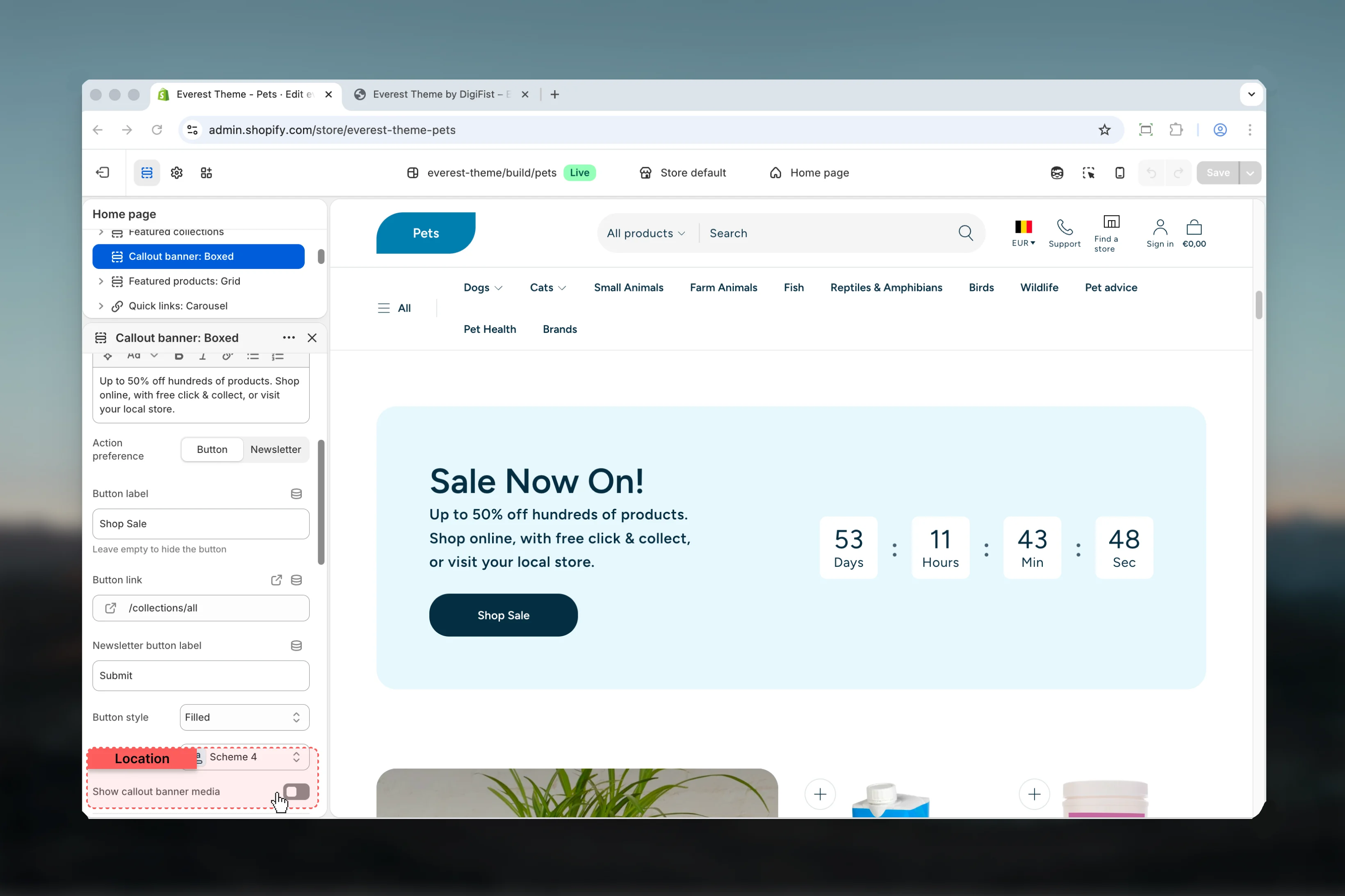
Enter the content used for **button label**.
Keep action labels short so they remain readable across devices.
This setting only appears when its related parent option is enabled.
Leave empty to hide the button
Set the destination URL for **button link**.
Keep action labels short so they remain readable across devices.
This setting only appears when its related parent option is enabled.
Enter the content used for **newsletter button label**.
Keep action labels short so they remain readable across devices.
**Default:** `Submit`
This setting only appears when its related parent option is enabled.
Choose how **Button style** behaves in the section.
Keep action labels short so they remain readable across devices.
**Available options:** Filled, Outlined, Text.
**Default:** `outlined`
This setting only appears when its related parent option is enabled.
Select the color scheme used for **color for content**.
Use this to keep contrast and branding consistent with the rest of the store.
**Default:** `scheme-4`
Enable or disable **Show callout banner media**.
Review the result on both desktop and mobile when media changes are involved.
**Default:** `disabled`
### Media
Enter the content used for **heading**.
**Default:** `Callout heading`
Choose how **Heading size** behaves in the section.
**Available options:** S, M, L, XL.
**Default:** `h2`
This setting only appears when its related parent option is enabled.
Enter the content used for **text**.
This setting only appears when its related parent option is enabled.
Choose how **Action preference** behaves in the section.
**Available options:** Button, Newsletter.
**Default:** `button`
This setting only appears when its related parent option is enabled.
Enter the content used for **button label**.
Keep action labels short so they remain readable across devices.
This setting only appears when its related parent option is enabled.
Leave empty to hide the button
Set the destination URL for **button link**.
Keep action labels short so they remain readable across devices.
This setting only appears when its related parent option is enabled.
Enter the content used for **newsletter button label**.
Keep action labels short so they remain readable across devices.
**Default:** `Submit`
This setting only appears when its related parent option is enabled.
Choose how **Button style** behaves in the section.
Keep action labels short so they remain readable across devices.
**Available options:** Filled, Outlined, Text.
**Default:** `outlined`
This setting only appears when its related parent option is enabled.
Select the color scheme used for **color for content**.
Use this to keep contrast and branding consistent with the rest of the store.
**Default:** `scheme-4`
Enable or disable **Show callout banner media**.
Review the result on both desktop and mobile when media changes are involved.
**Default:** `disabled`
### Media
 Upload or choose an image for **image**.
Review the result on both desktop and mobile when media changes are involved.
This setting only appears when its related parent option is enabled.
Upload or choose an image for **mobile image**.
Review the result on both desktop and mobile when media changes are involved.
This setting only appears when its related parent option is enabled.
If mobile image is set, it will be used on mobile devices instead of the main image.
Choose how **Media position** behaves in the section.
It has the strongest effect on layout balance and visual hierarchy.
**Available options:** Start, End, Full.
**Default:** `full`
This setting only appears when its related parent option is enabled.
### Timer
Upload or choose an image for **image**.
Review the result on both desktop and mobile when media changes are involved.
This setting only appears when its related parent option is enabled.
Upload or choose an image for **mobile image**.
Review the result on both desktop and mobile when media changes are involved.
This setting only appears when its related parent option is enabled.
If mobile image is set, it will be used on mobile devices instead of the main image.
Choose how **Media position** behaves in the section.
It has the strongest effect on layout balance and visual hierarchy.
**Available options:** Start, End, Full.
**Default:** `full`
This setting only appears when its related parent option is enabled.
### Timer
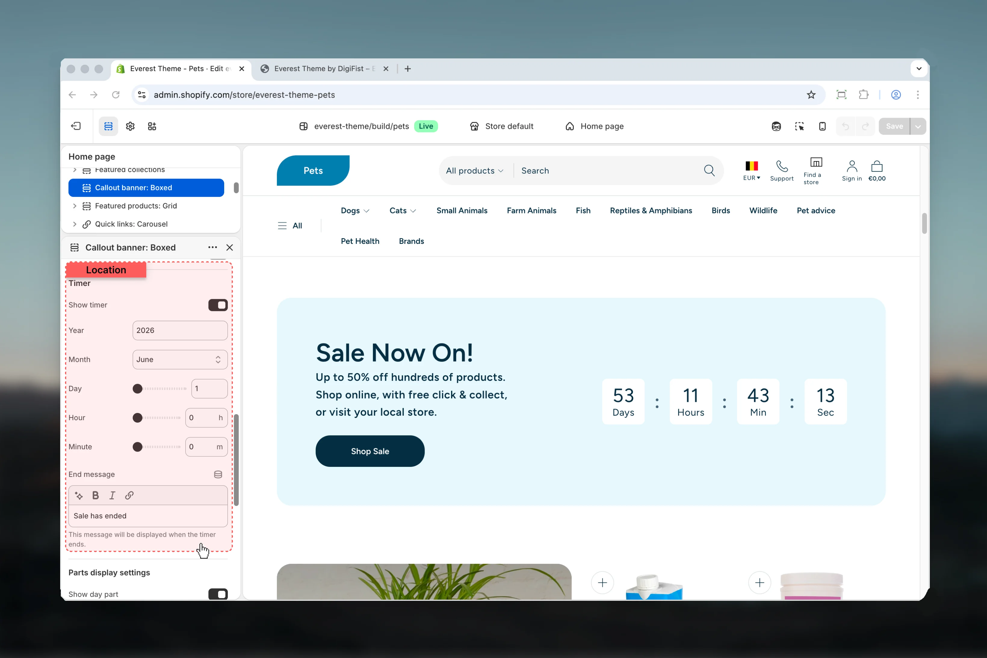 Enable or disable **Show timer**.
**Default:** `enabled`
Set the numeric value used for **year**.
**Default:** `2027`
Choose how **Month** behaves in the section.
**Available options:** January, February, March, April, May, June, July, August, September, October, November, December.
**Default:** `01`
Adjust **Day** with a slider-based control.
**Range:** `1` to `31` **Default:** `1`
Adjust **Hour** with a slider-based control.
**Range:** `0` to `23` **Default:** `0h`
Adjust **Minute** with a slider-based control.
**Range:** `0` to `59` **Default:** `0m`
Enter the content used for **end message**.
**Default:** `Sale has ended`
This message will be displayed when the timer ends.
### Parts display settings
Enable or disable **Show timer**.
**Default:** `enabled`
Set the numeric value used for **year**.
**Default:** `2027`
Choose how **Month** behaves in the section.
**Available options:** January, February, March, April, May, June, July, August, September, October, November, December.
**Default:** `01`
Adjust **Day** with a slider-based control.
**Range:** `1` to `31` **Default:** `1`
Adjust **Hour** with a slider-based control.
**Range:** `0` to `23` **Default:** `0h`
Adjust **Minute** with a slider-based control.
**Range:** `0` to `59` **Default:** `0m`
Enter the content used for **end message**.
**Default:** `Sale has ended`
This message will be displayed when the timer ends.
### Parts display settings
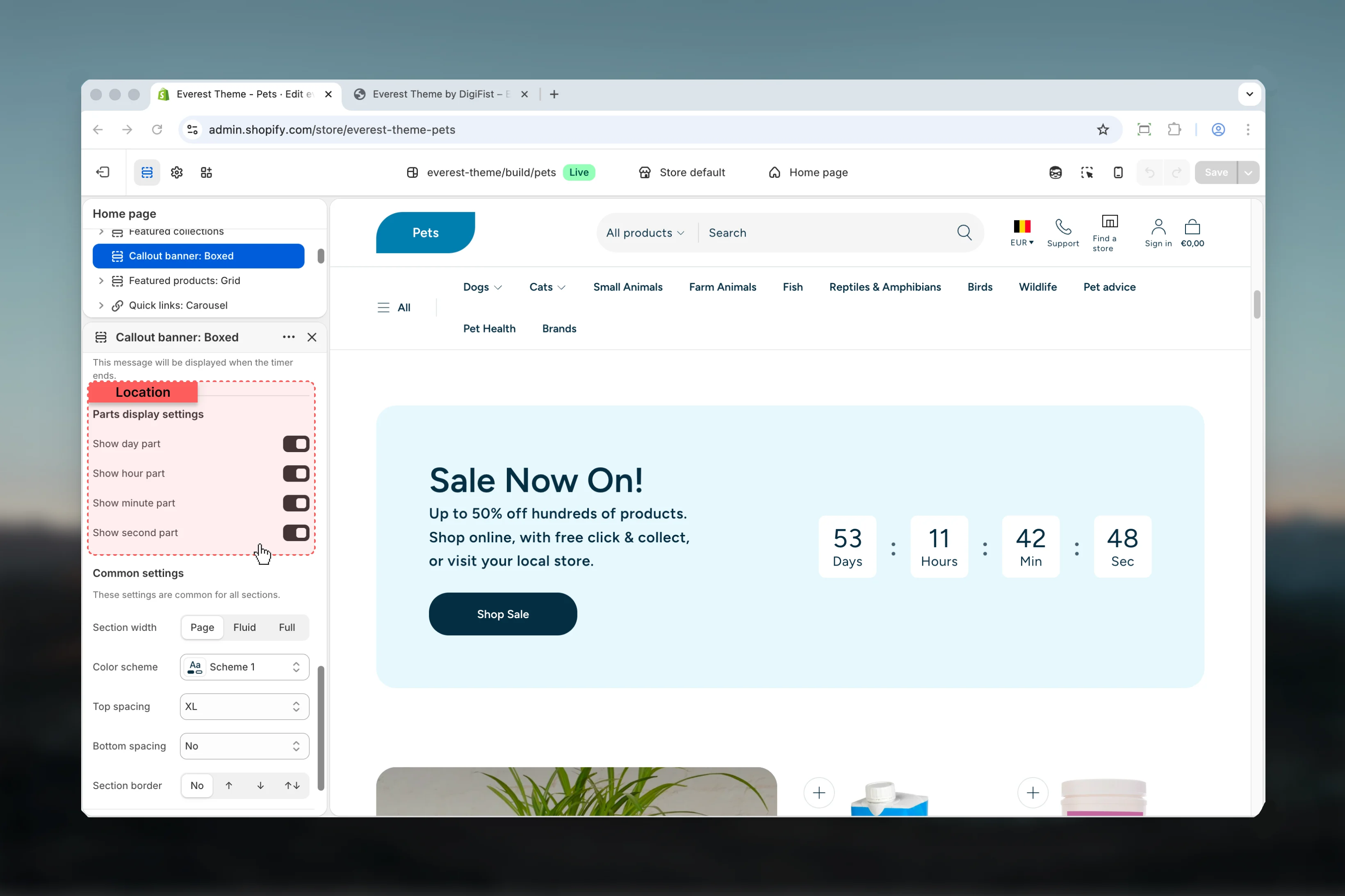 Enable or disable **Show day part**.
**Default:** `enabled`
Enable or disable **Show hour part**.
**Default:** `enabled`
Enable or disable **Show minute part**.
**Default:** `enabled`
Enable or disable **Show second part**.
**Default:** `enabled`
### Common settings
Enable or disable **Show day part**.
**Default:** `enabled`
Enable or disable **Show hour part**.
**Default:** `enabled`
Enable or disable **Show minute part**.
**Default:** `enabled`
Enable or disable **Show second part**.
**Default:** `enabled`
### Common settings
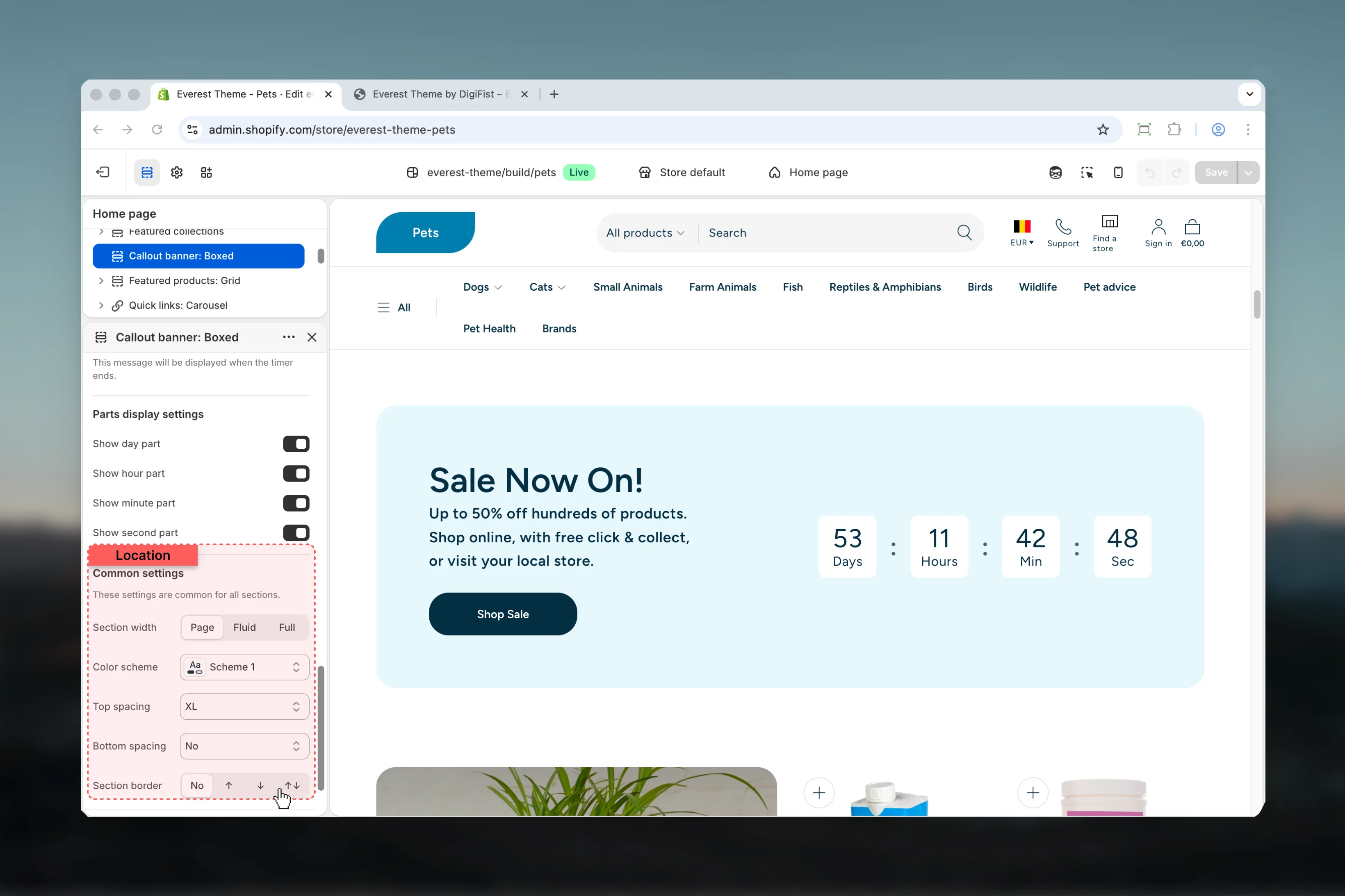 Choose how **Section width** behaves in the section.
This setting shapes the section container and how it sits against surrounding content.
**Available options:** Page, Fluid, Full.
**Default:** `full`
Select the color scheme used for **color scheme**.
Use this to keep contrast and branding consistent with the rest of the store.
**Default:** `scheme-1`
Choose how **Top spacing** behaves in the section.
This setting shapes the section container and how it sits against surrounding content.
**Available options:** No, S, M, L, XL.
**Default:** `2`
Choose how **Bottom spacing** behaves in the section.
This setting shapes the section container and how it sits against surrounding content.
**Available options:** No, S, M, L, XL.
**Default:** `2`
Choose how **Section border** behaves in the section.
This setting shapes the section container and how it sits against surrounding content.
**Available options:** None, Top, Bottom, Both.
**Default:** `none`
## Best practices
* Check contrast after changing color schemes so text and controls remain easy to read.
* Review media-heavy layouts on both desktop and mobile before publishing.
* Keep labels short and scannable, especially in tighter layouts or utility areas.
* Adjust layout changes alongside neighboring sections so page rhythm stays consistent.
* Start with the structural settings first, then refine decorative styling after the layout feels settled.
## Related guides
* [Everest Theme Overview](/themes/everest/index)
* [Everest Header](/themes/everest/header/header)
Choose how **Section width** behaves in the section.
This setting shapes the section container and how it sits against surrounding content.
**Available options:** Page, Fluid, Full.
**Default:** `full`
Select the color scheme used for **color scheme**.
Use this to keep contrast and branding consistent with the rest of the store.
**Default:** `scheme-1`
Choose how **Top spacing** behaves in the section.
This setting shapes the section container and how it sits against surrounding content.
**Available options:** No, S, M, L, XL.
**Default:** `2`
Choose how **Bottom spacing** behaves in the section.
This setting shapes the section container and how it sits against surrounding content.
**Available options:** No, S, M, L, XL.
**Default:** `2`
Choose how **Section border** behaves in the section.
This setting shapes the section container and how it sits against surrounding content.
**Available options:** None, Top, Bottom, Both.
**Default:** `none`
## Best practices
* Check contrast after changing color schemes so text and controls remain easy to read.
* Review media-heavy layouts on both desktop and mobile before publishing.
* Keep labels short and scannable, especially in tighter layouts or utility areas.
* Adjust layout changes alongside neighboring sections so page rhythm stays consistent.
* Start with the structural settings first, then refine decorative styling after the layout feels settled.
## Related guides
* [Everest Theme Overview](/themes/everest/index)
* [Everest Header](/themes/everest/header/header)