> ## Documentation Index
> Fetch the complete documentation index at: https://docs.digifist.com/llms.txt
> Use this file to discover all available pages before exploring further.
# Cards
> Configure Everest's global cards settings and the shared behavior they control across the store.
The Cards settings control shared theme behavior across Everest. Because these values affect multiple sections and templates at once, they are best used to set global design direction and core storefront behavior before adjusting individual sections.
 ## What these settings control
* Headings, text content, and on-page messaging
* Images, videos, and other media presentation options
* Color schemes, contrast, and shared visual styling
## How to access
In Shopify admin, go to **Online Store** -> **Themes** -> **Customize**.
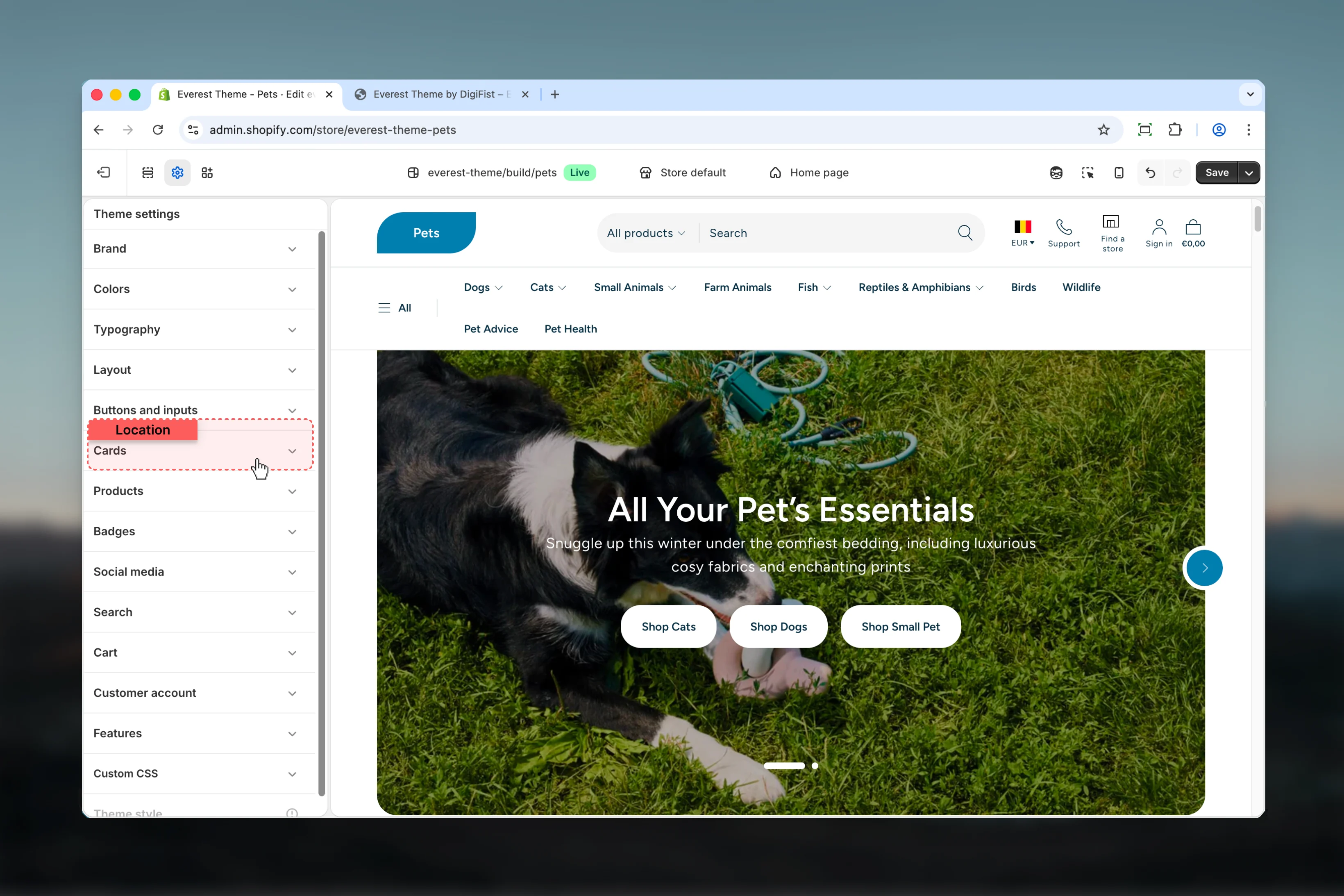
Select **Theme settings** in the customizer sidebar.
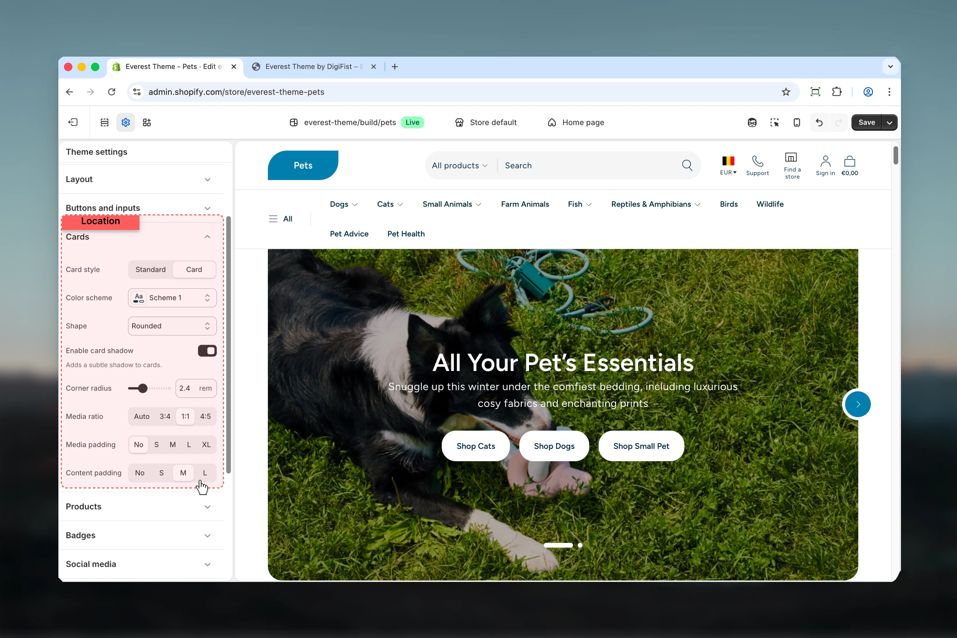
Open **Cards** to review and update the shared settings in this category.
## What these settings control
* Headings, text content, and on-page messaging
* Images, videos, and other media presentation options
* Color schemes, contrast, and shared visual styling
## How to access
In Shopify admin, go to **Online Store** -> **Themes** -> **Customize**.
Select **Theme settings** in the customizer sidebar.
Open **Cards** to review and update the shared settings in this category.
 ## Settings
### Settings
## Settings
### Settings
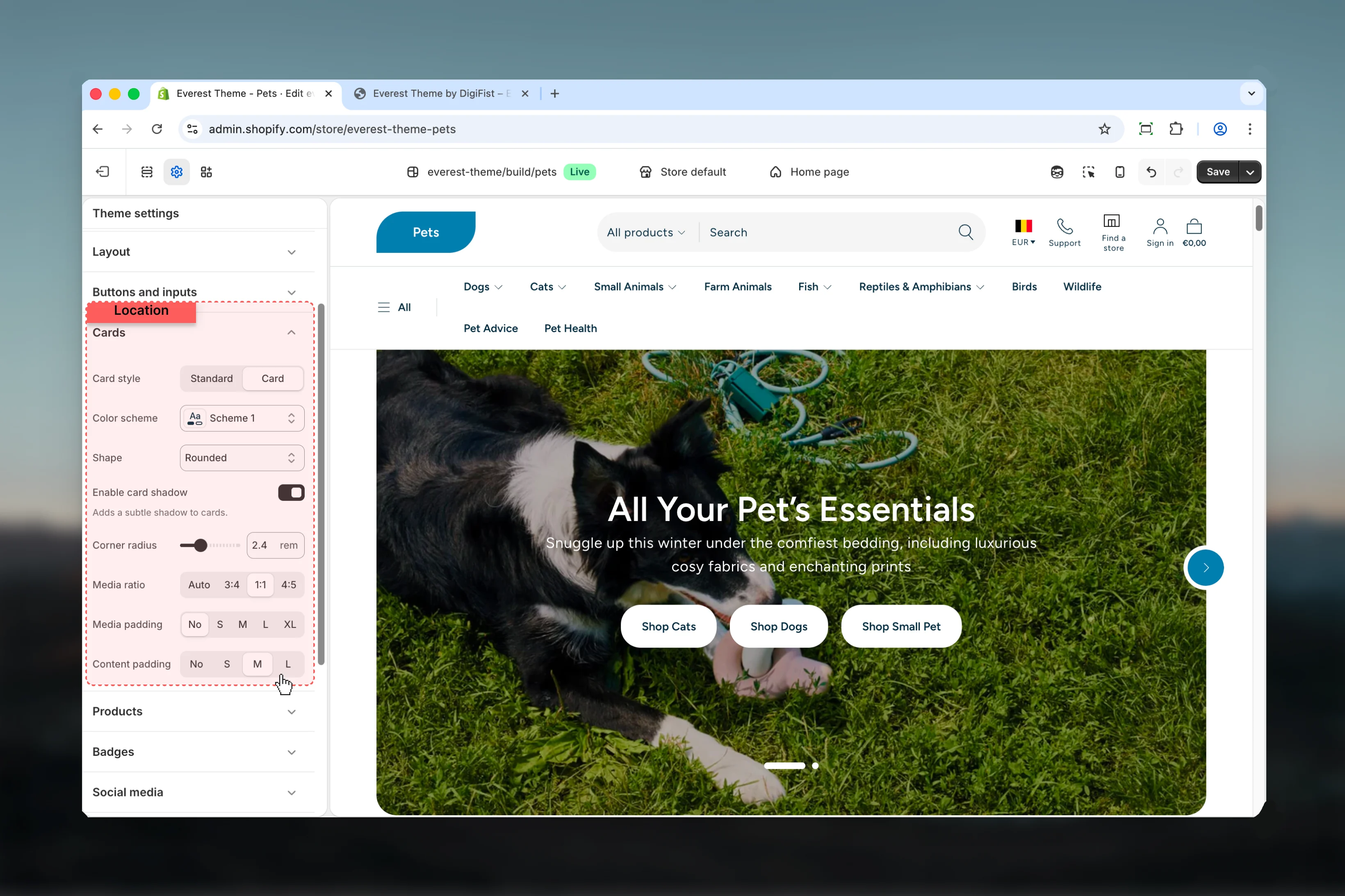 Choose how **Card style** behaves in the section.
**Available options:** Standard, Card.
**Default:** `standard`
Select the color scheme used for **color scheme**.
Use this to keep contrast and branding consistent with the rest of the store.
**Default:** `scheme-2`
Choose how **Shape** behaves in the section.
**Available options:** Square, Rounded, Diagonal.
**Default:** `rounded`
Enable or disable **Enable card shadow**.
**Default:** `enabled`
Adds a subtle shadow to cards.
Adjust **Corner radius** with a slider-based control.
**Range:** `0` to `8` **Default:** `0.8rem`
This setting only appears when its related parent option is enabled.
Choose how **Media ratio** behaves in the section.
It has the strongest effect on layout balance and visual hierarchy.
**Available options:** Auto, 3:4, 1:1, 4:5.
**Default:** `auto`
Choose how **Media padding** behaves in the section.
Review the result on both desktop and mobile when media changes are involved.
**Available options:** No, S, M, L, XL.
**Default:** `4`
Choose how **Content padding** behaves in the section.
**Available options:** No, S, M, L.
**Default:** `md`
## Best practices
* Check contrast after changing color schemes so text and controls remain easy to read.
* Review media-heavy layouts on both desktop and mobile before publishing.
* Change one global setting area at a time and preview multiple templates before publishing.
* Remember that theme settings affect many sections at once, so small adjustments can have wide impact.
## Related guides
* [Everest Theme Overview](/themes/everest/index)
Choose how **Card style** behaves in the section.
**Available options:** Standard, Card.
**Default:** `standard`
Select the color scheme used for **color scheme**.
Use this to keep contrast and branding consistent with the rest of the store.
**Default:** `scheme-2`
Choose how **Shape** behaves in the section.
**Available options:** Square, Rounded, Diagonal.
**Default:** `rounded`
Enable or disable **Enable card shadow**.
**Default:** `enabled`
Adds a subtle shadow to cards.
Adjust **Corner radius** with a slider-based control.
**Range:** `0` to `8` **Default:** `0.8rem`
This setting only appears when its related parent option is enabled.
Choose how **Media ratio** behaves in the section.
It has the strongest effect on layout balance and visual hierarchy.
**Available options:** Auto, 3:4, 1:1, 4:5.
**Default:** `auto`
Choose how **Media padding** behaves in the section.
Review the result on both desktop and mobile when media changes are involved.
**Available options:** No, S, M, L, XL.
**Default:** `4`
Choose how **Content padding** behaves in the section.
**Available options:** No, S, M, L.
**Default:** `md`
## Best practices
* Check contrast after changing color schemes so text and controls remain easy to read.
* Review media-heavy layouts on both desktop and mobile before publishing.
* Change one global setting area at a time and preview multiple templates before publishing.
* Remember that theme settings affect many sections at once, so small adjustments can have wide impact.
## Related guides
* [Everest Theme Overview](/themes/everest/index)