> ## Documentation Index
> Fetch the complete documentation index at: https://docs.digifist.com/llms.txt
> Use this file to discover all available pages before exploring further.
# Collection Page (PLP)
> Configure your collection page product grid with flexible layouts, filtering, and sorting options
The Product grid template (main-collection-product-grid) controls how products display on collection pages. It provides customization for grid layout, filtering options, and sorting controls to help customers browse and find products efficiently.
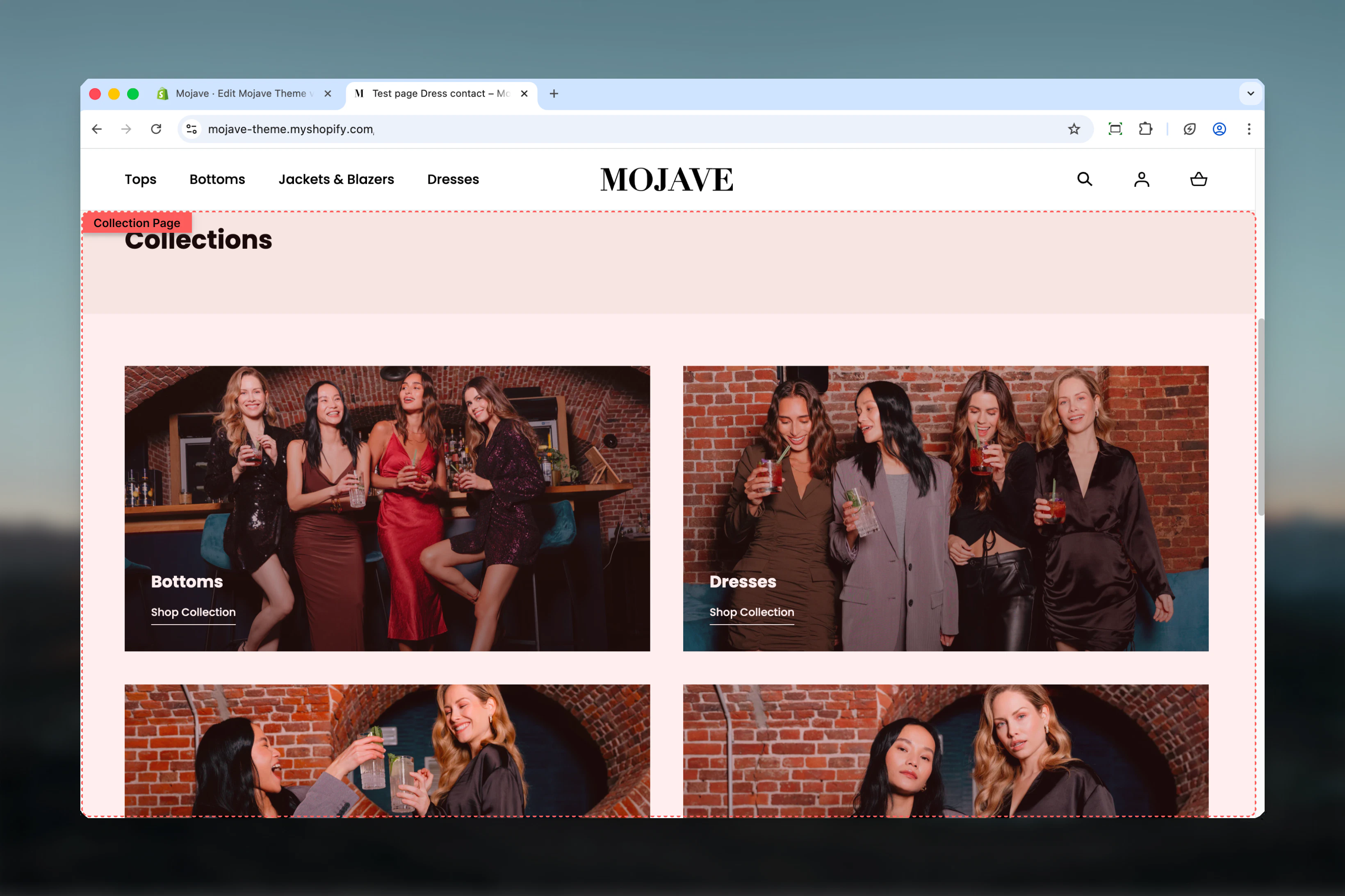 ## What this section controls
* Products per row on mobile and desktop
* Products per page before pagination
* Product filtering controls
* Sorting dropdown options
* Filter layout (horizontal bar vs. sidebar)
* Filter button styling
## Getting started
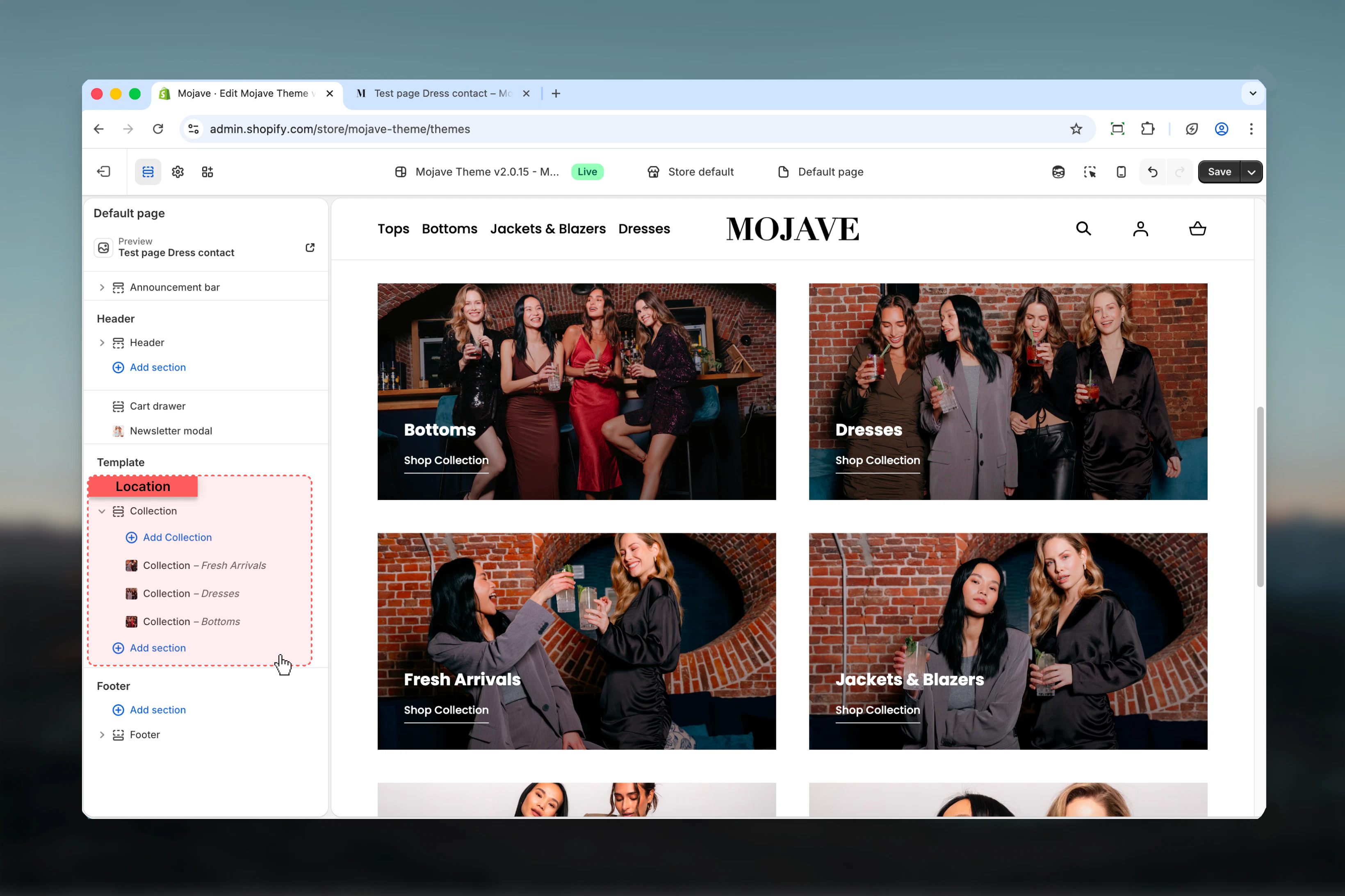
In your Shopify admin, go to **Online Store > Themes** and click **Customize** on your active theme.
Use the page selector dropdown at the top center to select **Collections** and choose any collection to preview.
The "Product grid" section controls the main collection template. Additional sections (like collection banner) can be added above it.
## What this section controls
* Products per row on mobile and desktop
* Products per page before pagination
* Product filtering controls
* Sorting dropdown options
* Filter layout (horizontal bar vs. sidebar)
* Filter button styling
## Getting started
In your Shopify admin, go to **Online Store > Themes** and click **Customize** on your active theme.
Use the page selector dropdown at the top center to select **Collections** and choose any collection to preview.
The "Product grid" section controls the main collection template. Additional sections (like collection banner) can be added above it.
 ## Filter layout options
Choose how filtering controls display on desktop:
Filters appear in a horizontal bar above the product grid, with full-width products below.
**Characteristics**:
* Compact filtering interface
* Maximizes product grid width
* Filter style setting (square/round) applies to buttons
* Modern, streamlined appearance
**Best for**: Stores with fewer filter options, clean minimal designs, or when product visibility is priority.
Filters display in a left sidebar with products to the right.
**Characteristics**:
* Traditional e-commerce layout
* Dedicated space for extensive filters
* Filter style setting doesn't apply (sidebar has fixed styling)
* Always visible filtering options
**Best for**: Stores with many filter options, detailed categorization needs, or customers who expect traditional layouts.
**Note**: On mobile devices, filters always use a vertical layout regardless of desktop setting.
## Template settings
Control how many products display side-by-side on mobile devices:
* **1 product**: Single column, vertical scrolling - Emphasizes each product with large images
* **2 products** (default): Two columns - Balances product size with browsing efficiency
**Recommendation**: Keep default 2-column layout for most stores. Use 1-column only for products requiring detailed image viewing (art, complex items).
Control desktop grid columns:
* **2 products**: Large product cards, maximum image size
* **3 products**: Balanced layout with good visibility
* **4 products** (default): Standard e-commerce grid, efficient browsing
**Selection guidance**:
* **2 columns**: Image-focused stores (art, photography, luxury goods)
* **3 columns**: Balanced approach for most product types
* **4 columns**: Efficient browsing, standard for apparel/accessories
* Consider 5-column option if you have many SKUs (requires custom CSS)
Set how many products display before pagination loads more (2-50 products, default: 12).
**Sizing recommendations**:
* **8-16 products**: Standard range, balances page load with browsing
* **24-36 products**: Power users, reduces pagination clicks
* **50 products**: Maximum, may slow page load on slower connections
**Tips**:
* Keep default 12 for most stores
* Increase for collections with extensive filtering (reduces filter re-application)
* Consider page load speed - more products = slower initial load
* Popular numbers: 12, 16, 20, 24 (divisible by common column counts)
Show/hide product filtering controls. Enabled by default.
**When enabled**: Customers can filter by availability, price, product type, vendor, tags, and custom metafields configured in the Search & Discovery app.
**When to disable**:
* Small collections where filtering isn't needed
* Curated collections where you want to control product order
* Landing pages with specific product selections
**Configure filters**: Manage filter options in **Shopify Admin → Search & Discovery app → Filters**. You can customize which filters appear, their order, and filter types (checkboxes, price range, etc.).
Show/hide the sorting dropdown. Enabled by default.
**Available sort options** (standard Shopify):
* Featured (manual collection order)
* Best Selling
* Alphabetical: A-Z
* Alphabetical: Z-A
* Price: Low to High
* Price: High to Low
* Date: Newest to Oldest
* Date: Oldest to Newest
**When to disable**:
* You want complete control over product order (featured only)
* Small curated collections where sorting doesn't add value
* Product order is part of your storytelling/merchandising
Control filter layout on desktop devices. Disabled by default (uses horizontal bar).
**Disabled (horizontal bar)**:
* Filters in compact horizontal bar above products
* Full-width product grid
* Modern, clean appearance
* Filter style (square/round) setting applies
**Enabled (sidebar)**:
* Filters in dedicated left sidebar
* Product grid uses remaining width
* Traditional e-commerce layout
* More space for extensive filter options
* Filter style setting doesn't apply
Choose based on number of filters and store aesthetic preferences.
Choose visual style for filter buttons when horizontal bar is active. Doesn't apply to sidebar layout.
* **Square** (default): Clean, modern rectangular buttons
* **Round**: Softer, rounded button edges
**Effect**: Only visible when "Show in sidebar on desktop" is disabled (horizontal bar mode).
Match filter style to your overall design system - square for modern/minimalist themes, round for softer/friendly aesthetics.
## Configuring filters
Product filters are managed through Shopify's **Search & Discovery** app, not in the Theme Customizer.
In Shopify admin, go to **Apps → Search & Discovery** (or install if not present).
Click on **Filters** in the left sidebar.
* Add/remove filter options (price, availability, product type, vendor, tags, metafields)
* Reorder filters by dragging
* Configure filter types (checkbox, swatch, price range)
* Set filter labels and display names
Save changes and test on your storefront collection pages.
Available filter types:
* **Availability**: In stock / Out of stock
* **Price**: Range slider or preset ranges
* **Product type**: Automatically from product types
* **Vendor**: Filter by brand/manufacturer
* **Tags**: Product tags as filters
* **Metafields**: Custom product properties (color swatches, materials, etc.)
## Best practices
Use 4 columns on desktop for standard browsing efficiency. Consider 3 columns for products requiring larger images (jewelry, art) or 2 columns for luxury/high-detail items.
Keep at 12-24 products for best performance. Higher values reduce clicks but slow page load. Test with your target audience's connection speed.
Most customers expect both options. Only disable when you have strong merchandising reasons to control the exact product order.
Use horizontal bar for smaller stores (5-10 filter options). Use sidebar for extensive filtering needs (15+ options) or traditional customer expectations.
In Search & Discovery, enable only relevant filters. Too many filters overwhelm customers. Focus on filters that genuinely help narrow choices (size, color, price).
Test 2-column mobile layout across devices. Single column rarely adds value unless products require extremely detailed views.
Use numbers divisible by your column count (12 for 3-4 columns, 16 for 4 columns, 18 for 3 columns) for balanced final rows.
Square filters suit modern/minimalist themes, round filters suit friendly/approachable brands. Maintain consistency with button styles elsewhere.
Use "Featured" sort (manual collection order) to highlight seasonal items, bestsellers, or high-margin products at the top of collections.
Track which filters customers use most (via analytics). Remove unused filters to reduce interface complexity and improve experience.
## Filter layout options
Choose how filtering controls display on desktop:
Filters appear in a horizontal bar above the product grid, with full-width products below.
**Characteristics**:
* Compact filtering interface
* Maximizes product grid width
* Filter style setting (square/round) applies to buttons
* Modern, streamlined appearance
**Best for**: Stores with fewer filter options, clean minimal designs, or when product visibility is priority.
Filters display in a left sidebar with products to the right.
**Characteristics**:
* Traditional e-commerce layout
* Dedicated space for extensive filters
* Filter style setting doesn't apply (sidebar has fixed styling)
* Always visible filtering options
**Best for**: Stores with many filter options, detailed categorization needs, or customers who expect traditional layouts.
**Note**: On mobile devices, filters always use a vertical layout regardless of desktop setting.
## Template settings
Control how many products display side-by-side on mobile devices:
* **1 product**: Single column, vertical scrolling - Emphasizes each product with large images
* **2 products** (default): Two columns - Balances product size with browsing efficiency
**Recommendation**: Keep default 2-column layout for most stores. Use 1-column only for products requiring detailed image viewing (art, complex items).
Control desktop grid columns:
* **2 products**: Large product cards, maximum image size
* **3 products**: Balanced layout with good visibility
* **4 products** (default): Standard e-commerce grid, efficient browsing
**Selection guidance**:
* **2 columns**: Image-focused stores (art, photography, luxury goods)
* **3 columns**: Balanced approach for most product types
* **4 columns**: Efficient browsing, standard for apparel/accessories
* Consider 5-column option if you have many SKUs (requires custom CSS)
Set how many products display before pagination loads more (2-50 products, default: 12).
**Sizing recommendations**:
* **8-16 products**: Standard range, balances page load with browsing
* **24-36 products**: Power users, reduces pagination clicks
* **50 products**: Maximum, may slow page load on slower connections
**Tips**:
* Keep default 12 for most stores
* Increase for collections with extensive filtering (reduces filter re-application)
* Consider page load speed - more products = slower initial load
* Popular numbers: 12, 16, 20, 24 (divisible by common column counts)
Show/hide product filtering controls. Enabled by default.
**When enabled**: Customers can filter by availability, price, product type, vendor, tags, and custom metafields configured in the Search & Discovery app.
**When to disable**:
* Small collections where filtering isn't needed
* Curated collections where you want to control product order
* Landing pages with specific product selections
**Configure filters**: Manage filter options in **Shopify Admin → Search & Discovery app → Filters**. You can customize which filters appear, their order, and filter types (checkboxes, price range, etc.).
Show/hide the sorting dropdown. Enabled by default.
**Available sort options** (standard Shopify):
* Featured (manual collection order)
* Best Selling
* Alphabetical: A-Z
* Alphabetical: Z-A
* Price: Low to High
* Price: High to Low
* Date: Newest to Oldest
* Date: Oldest to Newest
**When to disable**:
* You want complete control over product order (featured only)
* Small curated collections where sorting doesn't add value
* Product order is part of your storytelling/merchandising
Control filter layout on desktop devices. Disabled by default (uses horizontal bar).
**Disabled (horizontal bar)**:
* Filters in compact horizontal bar above products
* Full-width product grid
* Modern, clean appearance
* Filter style (square/round) setting applies
**Enabled (sidebar)**:
* Filters in dedicated left sidebar
* Product grid uses remaining width
* Traditional e-commerce layout
* More space for extensive filter options
* Filter style setting doesn't apply
Choose based on number of filters and store aesthetic preferences.
Choose visual style for filter buttons when horizontal bar is active. Doesn't apply to sidebar layout.
* **Square** (default): Clean, modern rectangular buttons
* **Round**: Softer, rounded button edges
**Effect**: Only visible when "Show in sidebar on desktop" is disabled (horizontal bar mode).
Match filter style to your overall design system - square for modern/minimalist themes, round for softer/friendly aesthetics.
## Configuring filters
Product filters are managed through Shopify's **Search & Discovery** app, not in the Theme Customizer.
In Shopify admin, go to **Apps → Search & Discovery** (or install if not present).
Click on **Filters** in the left sidebar.
* Add/remove filter options (price, availability, product type, vendor, tags, metafields)
* Reorder filters by dragging
* Configure filter types (checkbox, swatch, price range)
* Set filter labels and display names
Save changes and test on your storefront collection pages.
Available filter types:
* **Availability**: In stock / Out of stock
* **Price**: Range slider or preset ranges
* **Product type**: Automatically from product types
* **Vendor**: Filter by brand/manufacturer
* **Tags**: Product tags as filters
* **Metafields**: Custom product properties (color swatches, materials, etc.)
## Best practices
Use 4 columns on desktop for standard browsing efficiency. Consider 3 columns for products requiring larger images (jewelry, art) or 2 columns for luxury/high-detail items.
Keep at 12-24 products for best performance. Higher values reduce clicks but slow page load. Test with your target audience's connection speed.
Most customers expect both options. Only disable when you have strong merchandising reasons to control the exact product order.
Use horizontal bar for smaller stores (5-10 filter options). Use sidebar for extensive filtering needs (15+ options) or traditional customer expectations.
In Search & Discovery, enable only relevant filters. Too many filters overwhelm customers. Focus on filters that genuinely help narrow choices (size, color, price).
Test 2-column mobile layout across devices. Single column rarely adds value unless products require extremely detailed views.
Use numbers divisible by your column count (12 for 3-4 columns, 16 for 4 columns, 18 for 3 columns) for balanced final rows.
Square filters suit modern/minimalist themes, round filters suit friendly/approachable brands. Maintain consistency with button styles elsewhere.
Use "Featured" sort (manual collection order) to highlight seasonal items, bestsellers, or high-margin products at the top of collections.
Track which filters customers use most (via analytics). Remove unused filters to reduce interface complexity and improve experience.