> ## Documentation Index
> Fetch the complete documentation index at: https://docs.digifist.com/llms.txt
> Use this file to discover all available pages before exploring further.
# Footer
> Build a comprehensive site footer with navigation, social links, payment icons, and localization options
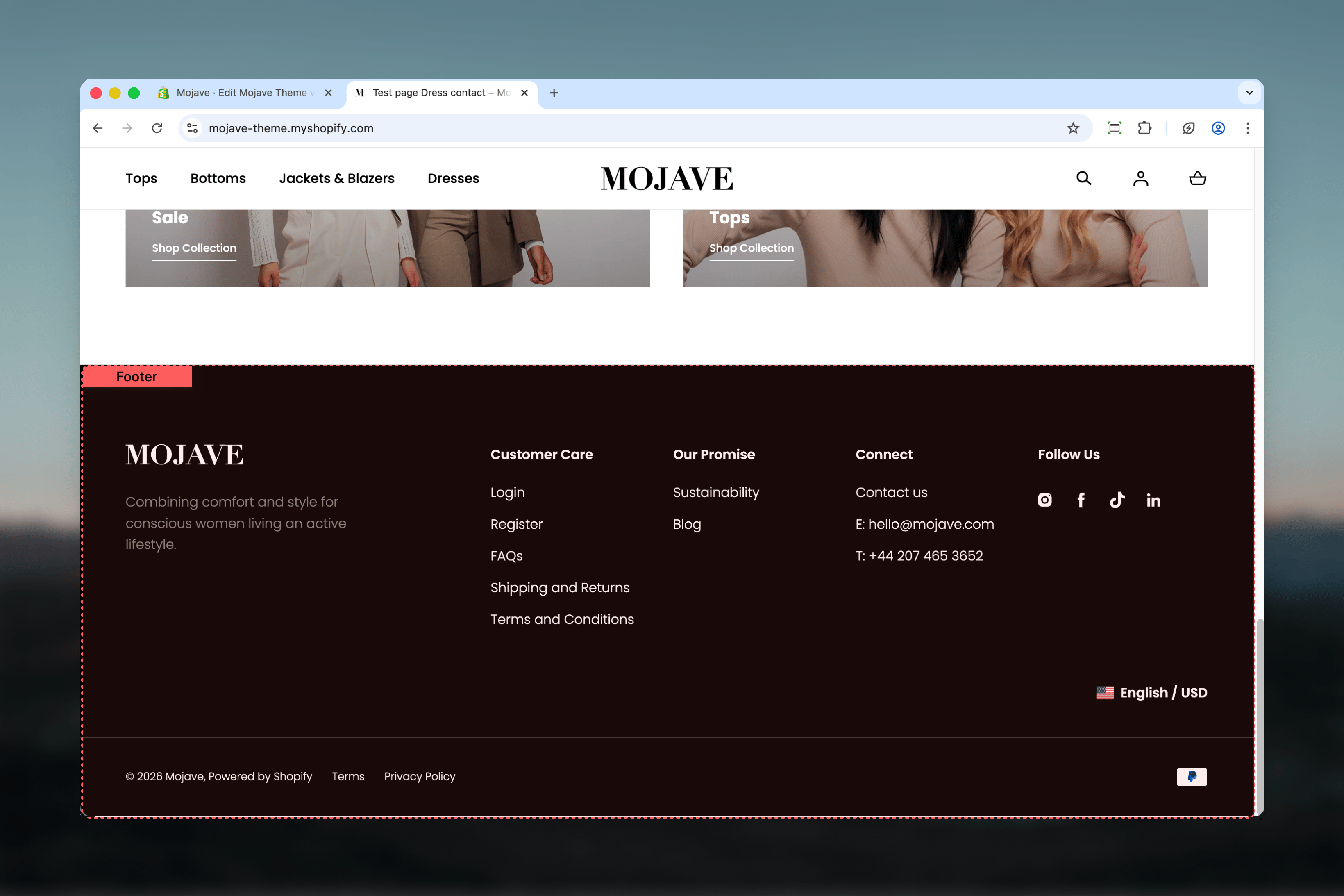
The Footer section appears at the bottom of every page on your store, providing essential navigation links, brand information, social media connections, and trust signals like payment icons. It supports up to 3 content blocks with flexible layout options.
 ## What this section controls
* Footer navigation menus with organized columns
* Brand logo and descriptive content
* Social media icon links
* Copyright information and legal links
* Payment method icons
* Language and currency selectors
* Follow on Shop integration
* Two visual style variations
## Getting started
In your Shopify admin, go to **Online Store > Themes** and click **Customize** on your active theme.
The Footer section is located at the bottom of your site and remains consistent across all pages.
## What this section controls
* Footer navigation menus with organized columns
* Brand logo and descriptive content
* Social media icon links
* Copyright information and legal links
* Payment method icons
* Language and currency selectors
* Follow on Shop integration
* Two visual style variations
## Getting started
In your Shopify admin, go to **Online Store > Themes** and click **Customize** on your active theme.
The Footer section is located at the bottom of your site and remains consistent across all pages.
 ## Footer styles
Choose between two visual style variations:
Standard footer layout with traditional styling and expanded localization controls.
**Characteristics**:
* Full-size localization selectors
* Classic visual hierarchy
* Standard spacing and typography
Alternative footer layout with compact styling and streamlined appearance.
**Characteristics**:
* Compact localization selectors
* Modified visual treatment
* Adjusted spacing and presentation
## Key settings
Extends the footer to full browser width, removing container constraints. When disabled, footer content stays within the theme's standard container width.
**Visual impact**:
* **Enabled**: Edge-to-edge footer spanning entire viewport
* **Disabled**: Footer contained within standard width, creating margins on wide screens
Select between Style 1 (default) or Style 2 for different visual presentations of your footer.
Style variants affect layout, spacing, localization display, and overall visual treatment. Test both to see which better matches your store aesthetic.
Displays copyright text in the footer bottom area, including:
* Current year (auto-updates annually)
* Your shop name with link to homepage
* "Powered by Shopify" attribution
This setting is enabled by default and recommended for legal protection and brand attribution.
Select a menu to display in the footer bottom alongside copyright text. Commonly used for legal and policy links.
**Typical links included**:
* Privacy Policy
* Terms of Service
* Refund Policy
* Shipping Policy
* Accessibility Statement
Create this menu at: **Shopify Admin → Online Store → Navigation**
Displays icons for payment methods enabled in your Shopify Payments settings. Icons automatically populate based on available payment providers.
**Benefits**:
* Builds customer trust by showing accepted payment methods
* professional appearance signaling secure checkout
* No manual updates required - syncs with your payment settings
Enabled by default. Icons only appear if you have payment methods configured in Shopify admin.
Shows "Follow on Shop" button allowing customers to follow your store in the Shop app for updates and easy reordering.
**Requirements**:
* Shop Pay must be enabled in your payment settings
* Feature must be available for your store
When customers follow your store, they receive notifications about new products, back-in-stock items, and order updates through the Shop app.
Learn more: [Follow on Shop Help](https://help.shopify.com/manual/online-store/themes/customizing-themes/follow-on-shop)
## Block settings
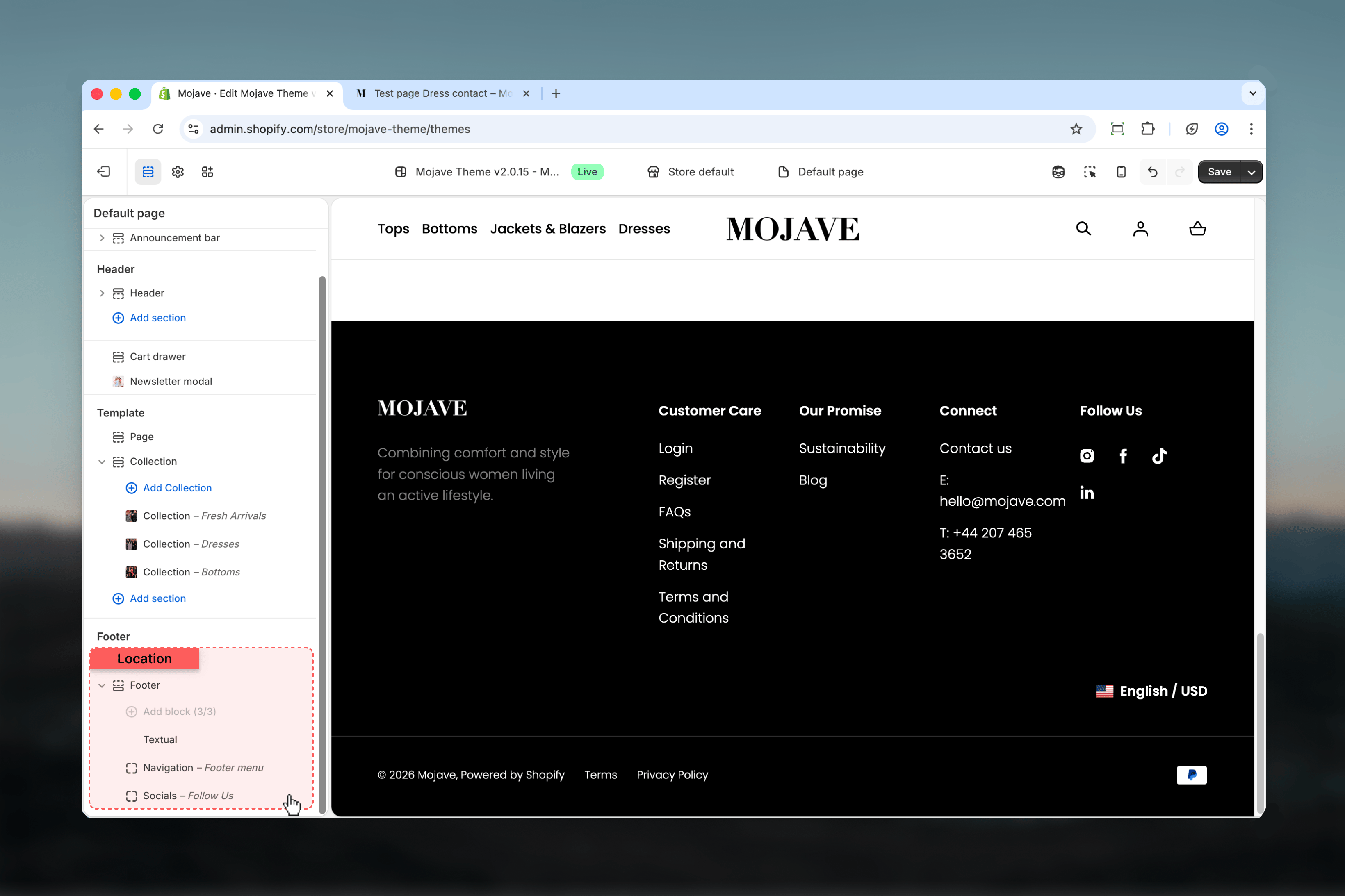
Add up to **3 blocks total** in any combination to build your footer content. Blocks can include brand content, navigation menus, and social links.
Display your brand logo and descriptive content about your store, mission, or unique value proposition.
Upload a logo image to display in the footer. The logo can be different from your header logo if desired.
**Logo considerations**:
* Often displayed in monochrome or alternative colorway in footer
* Should maintain legibility against footer background
* Can be same as header logo or a footer-specific variant
Control logo size as a percentage of the container width (25-100%). Default is 50%.
**Sizing guidance**:
* **25-40%**: Small, subtle logo presence
* **45-55%**: Balanced size (default: 50%)
* **60-75%**: Prominent logo emphasis
* **80-100%**: Maximum visibility
Adjust based on your footer layout and content density.
Add rich text describing your brand, mission statement, tagline, or unique value proposition.
**Content ideas**:
* Brief brand story or mission statement
* Unique selling points or commitments (e.g., "Sustainably sourced")
* Customer service highlights (e.g., "Free shipping over \$50")
* Quality guarantees or certifications
Keep content concise - footers are scanned quickly, not read in detail.
Add footer navigation menus with organized columns. Menu structure determines column layout automatically.
Select a menu to display in the footer. The menu structure determines how content is organized:
**Menu structure rules**:
* **Top-level links with no children**: Display as standalone column headers
* **Top-level links with children**: Column header with listed sublinks
* **Maximum 3 columns**: Footer automatically limits to 3 columns per navigation block
**Example structure**:
```
Footer Menu
├── Shop (Column 1 header)
│ ├── New Arrivals
│ ├── Best Sellers
│ └── Sale
├── About (Column 2 header)
│ ├── Our Story
│ ├── Contact Us
│ └── Careers
├── Help (Column 3 header)
├── FAQs
├── Shipping
└── Returns
```
**Responsive behavior**:
* **Desktop**: Columns always expanded and visible
* **Mobile**: Collapsible accordions for links with children, simple links for standalone items
Create and manage menus at: **Shopify Admin → Online Store → Navigation**
**Note**: You can add multiple Navigation blocks (up to the 3 block total limit) to display different menus in separate footer sections.
Display social media icon links to your social profiles. Icons automatically populate from theme settings.
Optional heading text displayed above social media icons (e.g., "Follow Us", "Connect With Us", "Stay in Touch").
Leave blank for icons without a heading.
Social icons are controlled by **Theme Settings → Social Media**. Configure your social media URLs there, and they'll automatically appear in footer social blocks.
**Supported platforms** (configure in theme settings):
* Facebook
* Instagram
* Twitter/X
* Pinterest
* TikTok
* YouTube
* Snapchat
* Tumblr
* Vimeo
Only platforms with configured URLs will display icons.
To configure: **Theme Customizer → Theme Settings → Social Media**
## Language and currency selectors
If you've enabled multiple languages or currencies for your store, localization selectors appear automatically in the footer above the bottom bar.
Appears when multiple languages are configured, allowing customers to switch between available languages.
To enable: **Shopify Admin → Settings → Languages → Add language**
Appears when multiple currencies are enabled, allowing customers to view prices in their preferred currency.
To enable: **Shopify Admin → Settings → Payments → Currency formatting**
The display style adapts based on your selected footer style (compact for Style 2, full for Style 1).
## Best practices
Group related links under clear column headers. Limit to 3-6 links per column for easy scanning. Common groups: Shop, About, Help, Legal.
Footer text should be scannable, not detailed. Aim for 1-3 sentences maximum. Save detailed content for dedicated pages.
Maximize footer value by using all 3 available blocks. Common combination: Textual + Navigation + Socials for comprehensive footer content.
Use copyright navigation menu for Privacy Policy, Terms, and other required legal pages. Protects your business and builds customer trust.
Always show payment icons to build trust and set expectations about accepted payment methods before customers reach checkout.
Set up social media URLs in theme settings before adding Socials block. Only configured platforms will display - test to avoid empty blocks.
Test both style options to see which better complements your overall store design. Style affects spacing, typography, and visual hierarchy.
Enable Follow on Shop if you use Shop Pay. It helps retain customers by making reordering and order tracking easier through the Shop app.
Footer automatically adapts for mobile with collapsible navigation. Test on mobile devices to ensure accordions work smoothly and content remains accessible.
Footer logos typically display smaller than header logos (50% default). Adjust based on content density and brand emphasis desired.
## Footer styles
Choose between two visual style variations:
Standard footer layout with traditional styling and expanded localization controls.
**Characteristics**:
* Full-size localization selectors
* Classic visual hierarchy
* Standard spacing and typography
Alternative footer layout with compact styling and streamlined appearance.
**Characteristics**:
* Compact localization selectors
* Modified visual treatment
* Adjusted spacing and presentation
## Key settings
Extends the footer to full browser width, removing container constraints. When disabled, footer content stays within the theme's standard container width.
**Visual impact**:
* **Enabled**: Edge-to-edge footer spanning entire viewport
* **Disabled**: Footer contained within standard width, creating margins on wide screens
Select between Style 1 (default) or Style 2 for different visual presentations of your footer.
Style variants affect layout, spacing, localization display, and overall visual treatment. Test both to see which better matches your store aesthetic.
Displays copyright text in the footer bottom area, including:
* Current year (auto-updates annually)
* Your shop name with link to homepage
* "Powered by Shopify" attribution
This setting is enabled by default and recommended for legal protection and brand attribution.
Select a menu to display in the footer bottom alongside copyright text. Commonly used for legal and policy links.
**Typical links included**:
* Privacy Policy
* Terms of Service
* Refund Policy
* Shipping Policy
* Accessibility Statement
Create this menu at: **Shopify Admin → Online Store → Navigation**
Displays icons for payment methods enabled in your Shopify Payments settings. Icons automatically populate based on available payment providers.
**Benefits**:
* Builds customer trust by showing accepted payment methods
* professional appearance signaling secure checkout
* No manual updates required - syncs with your payment settings
Enabled by default. Icons only appear if you have payment methods configured in Shopify admin.
Shows "Follow on Shop" button allowing customers to follow your store in the Shop app for updates and easy reordering.
**Requirements**:
* Shop Pay must be enabled in your payment settings
* Feature must be available for your store
When customers follow your store, they receive notifications about new products, back-in-stock items, and order updates through the Shop app.
Learn more: [Follow on Shop Help](https://help.shopify.com/manual/online-store/themes/customizing-themes/follow-on-shop)
## Block settings
Add up to **3 blocks total** in any combination to build your footer content. Blocks can include brand content, navigation menus, and social links.
Display your brand logo and descriptive content about your store, mission, or unique value proposition.
Upload a logo image to display in the footer. The logo can be different from your header logo if desired.
**Logo considerations**:
* Often displayed in monochrome or alternative colorway in footer
* Should maintain legibility against footer background
* Can be same as header logo or a footer-specific variant
Control logo size as a percentage of the container width (25-100%). Default is 50%.
**Sizing guidance**:
* **25-40%**: Small, subtle logo presence
* **45-55%**: Balanced size (default: 50%)
* **60-75%**: Prominent logo emphasis
* **80-100%**: Maximum visibility
Adjust based on your footer layout and content density.
Add rich text describing your brand, mission statement, tagline, or unique value proposition.
**Content ideas**:
* Brief brand story or mission statement
* Unique selling points or commitments (e.g., "Sustainably sourced")
* Customer service highlights (e.g., "Free shipping over \$50")
* Quality guarantees or certifications
Keep content concise - footers are scanned quickly, not read in detail.
Add footer navigation menus with organized columns. Menu structure determines column layout automatically.
Select a menu to display in the footer. The menu structure determines how content is organized:
**Menu structure rules**:
* **Top-level links with no children**: Display as standalone column headers
* **Top-level links with children**: Column header with listed sublinks
* **Maximum 3 columns**: Footer automatically limits to 3 columns per navigation block
**Example structure**:
```
Footer Menu
├── Shop (Column 1 header)
│ ├── New Arrivals
│ ├── Best Sellers
│ └── Sale
├── About (Column 2 header)
│ ├── Our Story
│ ├── Contact Us
│ └── Careers
├── Help (Column 3 header)
├── FAQs
├── Shipping
└── Returns
```
**Responsive behavior**:
* **Desktop**: Columns always expanded and visible
* **Mobile**: Collapsible accordions for links with children, simple links for standalone items
Create and manage menus at: **Shopify Admin → Online Store → Navigation**
**Note**: You can add multiple Navigation blocks (up to the 3 block total limit) to display different menus in separate footer sections.
Display social media icon links to your social profiles. Icons automatically populate from theme settings.
Optional heading text displayed above social media icons (e.g., "Follow Us", "Connect With Us", "Stay in Touch").
Leave blank for icons without a heading.
Social icons are controlled by **Theme Settings → Social Media**. Configure your social media URLs there, and they'll automatically appear in footer social blocks.
**Supported platforms** (configure in theme settings):
* Facebook
* Instagram
* Twitter/X
* Pinterest
* TikTok
* YouTube
* Snapchat
* Tumblr
* Vimeo
Only platforms with configured URLs will display icons.
To configure: **Theme Customizer → Theme Settings → Social Media**
## Language and currency selectors
If you've enabled multiple languages or currencies for your store, localization selectors appear automatically in the footer above the bottom bar.
Appears when multiple languages are configured, allowing customers to switch between available languages.
To enable: **Shopify Admin → Settings → Languages → Add language**
Appears when multiple currencies are enabled, allowing customers to view prices in their preferred currency.
To enable: **Shopify Admin → Settings → Payments → Currency formatting**
The display style adapts based on your selected footer style (compact for Style 2, full for Style 1).
## Best practices
Group related links under clear column headers. Limit to 3-6 links per column for easy scanning. Common groups: Shop, About, Help, Legal.
Footer text should be scannable, not detailed. Aim for 1-3 sentences maximum. Save detailed content for dedicated pages.
Maximize footer value by using all 3 available blocks. Common combination: Textual + Navigation + Socials for comprehensive footer content.
Use copyright navigation menu for Privacy Policy, Terms, and other required legal pages. Protects your business and builds customer trust.
Always show payment icons to build trust and set expectations about accepted payment methods before customers reach checkout.
Set up social media URLs in theme settings before adding Socials block. Only configured platforms will display - test to avoid empty blocks.
Test both style options to see which better complements your overall store design. Style affects spacing, typography, and visual hierarchy.
Enable Follow on Shop if you use Shop Pay. It helps retain customers by making reordering and order tracking easier through the Shop app.
Footer automatically adapts for mobile with collapsible navigation. Test on mobile devices to ensure accordions work smoothly and content remains accessible.
Footer logos typically display smaller than header logos (50% default). Adjust based on content density and brand emphasis desired.