> ## Documentation Index
> Fetch the complete documentation index at: https://docs.digifist.com/llms.txt
> Use this file to discover all available pages before exploring further.
# Header
> Configure your store's main navigation header with flexible layouts, transparent options, and megamenu capabilities
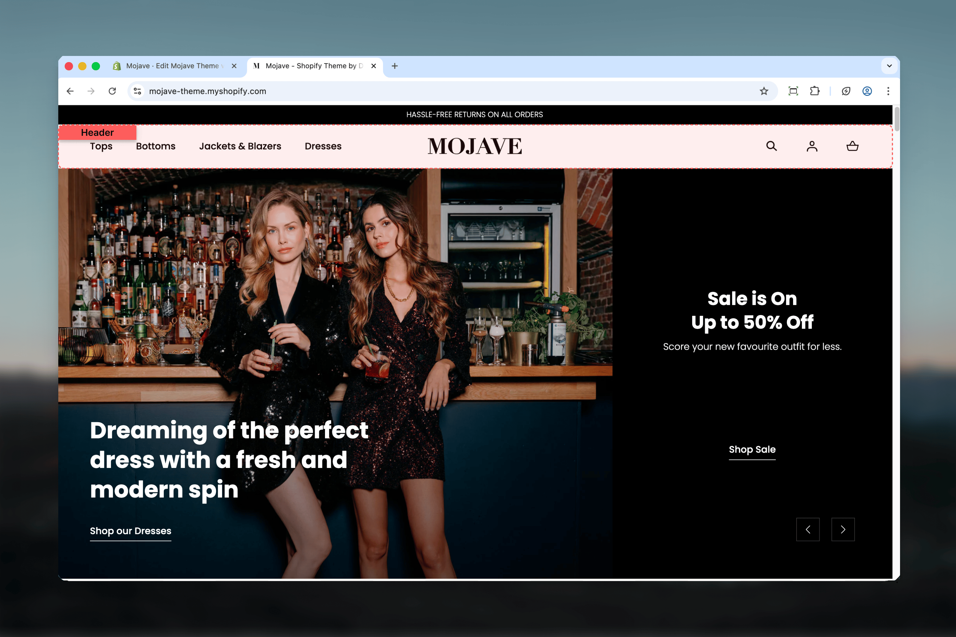
The Header section controls your store's primary navigation, branding, and utility functions. It supports multiple layout configurations including transparent header modes, powerful megamenu dropdowns with featured content, and responsive mobile navigation.
 ## What this section controls
* Logo display and positioning
* Main navigation menu and dropdown styles
* Transparent header on homepage and collection pages
* Megamenu dropdowns with multi-column layouts and featured content
* Search, account, and cart utility icons
* Sticky header behavior
* Mobile menu drawer with footer links
## Getting started
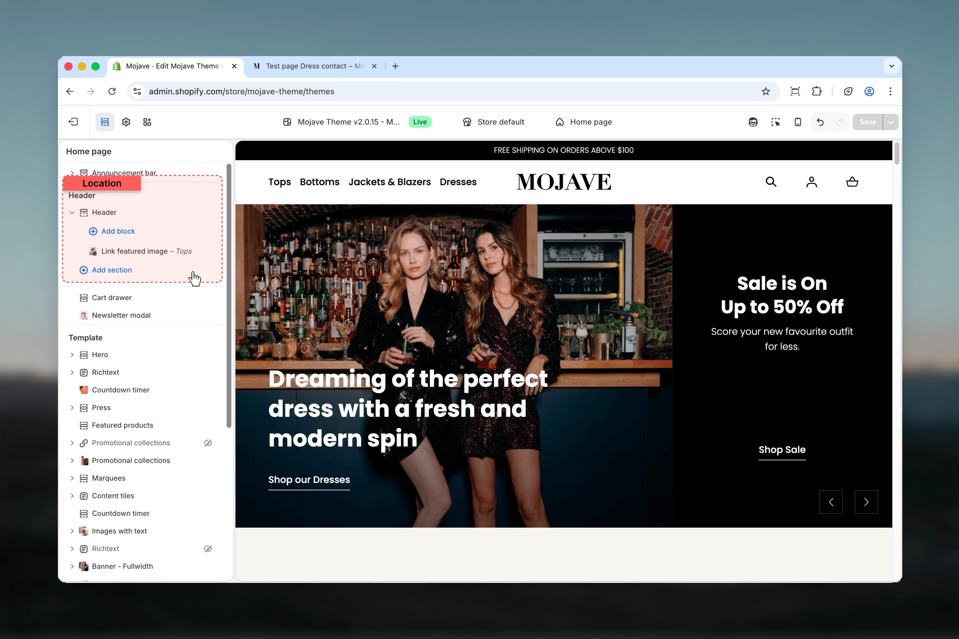
In your Shopify admin, go to **Online Store > Themes** and click **Customize** on your active theme.
The Header section is located at the very top of your site and remains consistent across all pages.
## What this section controls
* Logo display and positioning
* Main navigation menu and dropdown styles
* Transparent header on homepage and collection pages
* Megamenu dropdowns with multi-column layouts and featured content
* Search, account, and cart utility icons
* Sticky header behavior
* Mobile menu drawer with footer links
## Getting started
In your Shopify admin, go to **Online Store > Themes** and click **Customize** on your active theme.
The Header section is located at the very top of your site and remains consistent across all pages.
 ## Menu styles
Choose how navigation menus behave on desktop devices:
Dropdown menus open automatically when customers hover over navigation links. Provides quick access to submenu items with minimal interaction required.
**Best for**: Stores with organized navigation hierarchies where customers browse multiple categories.
Dropdown menus open only when customers click navigation links. Requires explicit interaction to reveal submenus.
**Best for**: Touch-enabled devices, accessibility-focused designs, or when you want deliberate navigation interaction.
Uses mobile-style drawer menu on all devices, sliding in from the side. Provides a consistent experience across desktop and mobile.
**Best for**: Minimalist designs, mobile-first stores, or navigation systems with many levels.
## Key settings
Extends the header to the full browser width, removing container constraints. When disabled, header content stays within the theme's standard container width.
**Visual impact**:
* **Enabled**: Edge-to-edge header spanning entire viewport
* **Disabled**: Header contained within standard width, creating margins on wide screens
Upload your store logo. If no image is uploaded, your shop name displays as text with automatic sizing that adapts to text length.
**Logo sizing recommendations**:
* Maximum width: 200px (desktop), 180px (mobile)
* Transparent PNG or SVG recommended for best quality
* Consider creating an alternative logo for transparent header mode
**Automatic text logo scaling**: Without an image, shop name size adjusts dynamically - shorter names display larger, longer names reduce to fit comfortably.
Control logo image width on desktop devices (50-200px). This setting only applies when a logo image is uploaded.
**Sizing tips**:
* **Small logos (50-100px)**: Subtle branding, emphasizes navigation
* **Medium logos (100-150px)**: Balanced presence (default: 145px)
* **Large logos (150-200px)**: Strong brand emphasis, prominent identity
Independently control logo size on mobile devices (50-180px). This allows optimization for smaller screens without affecting desktop appearance.
Typically set 10-20px smaller than desktop to maintain proportion on mobile viewports.
Choose logo placement and navigation layout:
* **Start**: Logo positioned at the left/start of the header with navigation alongside
* **Center**: Logo centered with navigation items distributed around it
* **Center with menu below**: Logo centered at top, full navigation menu displayed below the logo
**Note**: "Center with menu below" option only works with hover or click menu styles (not available with drawer menu).
Select which navigation menu displays in the header. Choose from menus created in **Navigation** settings. By default uses "main-menu".
Create and manage menus at: **Shopify Admin → Online Store → Navigation**
Control how dropdown menus open on desktop:
* **Hover**: Menus open on mouseover (default)
* **Click**: Menus open on click only
* **Drawer**: Mobile-style slide-out drawer on all devices
All three styles automatically use drawer navigation on mobile devices.
Adds a bottom border line to the header, visually separating it from page content below. Enabled by default.
When enabled, the header remains fixed at the top of the viewport as customers scroll down the page. This keeps navigation always accessible.
**User experience benefits**:
* Quick access to navigation without scrolling back to top
* Persistent search and cart access throughout shopping experience
* Reinforces branding with consistent logo visibility
Makes the header background transparent on your homepage, allowing hero images or videos to display beneath it. This creates an integrated, immersive homepage experience.
**Requirements for proper display**:
* First homepage section must be: Hero, Banner - Fullwidth, or Video section
* These sections need sufficient height to accommodate transparent header
* Logo and text must have sufficient contrast against background images
**Design considerations**:
* Test visibility with all hero images you use
* Consider using the transparent logo option for better contrast
* Ensure hero images have suitable composition (clear space for header content)
Activates transparent header on collection pages, integrating with collection banner sections.
**Requirement**: The first section on collection template must be a Collection banner section for proper integration.
Works similarly to homepage transparency but specifically optimized for collection page layouts.
Upload an alternative logo that displays specifically when transparent header is active. This allows you to use a different colored logo that contrasts better against hero backgrounds.
**Common use cases**:
* White logo for dark hero images
* Dark logo for light hero images
* Different color variations for brand flexibility
The default logo automatically swaps to this alternative when transparency is enabled and active on qualifying pages.
Controls the font size of top-level navigation links using preset size options: XS, S, M, L, XL (default: L).
These are the main menu items visible in your header navigation bar.
**Sizing guidance**:
* **L-XL**: Prominent navigation, easy to see and click
* **M**: Balanced presence (good for many menu items)
* **XS-S**: Subtle navigation, maximizes space
Controls font size for dropdown menu content including column headers and submenu links. Options: XS, S, M, L, XL (default: M).
This affects text within megamenus and standard dropdown menus.
Typically set smaller than top-level links to create visual hierarchy (default M vs. default L).
Select a page to link in the mobile menu footer. Appears below navigation links when customers open the mobile menu drawer.
Provides quick access to contact information from any page on mobile devices.
Select a FAQ or help page to link in the mobile menu footer, appearing alongside the contact link.
Gives mobile customers easy access to self-service support resources.
## Block settings
Add blocks to create enhanced dropdown menus with featured content. Two block types are available: featured images for standard dropdowns and megamenus for multi-column layouts.
Add promotional images to standard dropdown menus for specific navigation links.
**Critical**: Enter the exact title of a top-level navigation link to associate this featured image with that link's dropdown menu.
For example, if you have a main menu link called "Women's Clothing", enter exactly "Women's Clothing" here to attach the featured image to that dropdown.
**Title must match exactly** (case-sensitive) to function properly.
Upload the featured image to display in the dropdown menu.
**Recommended specifications**:
* Ratio: Portrait orientation
* Size: 720 x 900 pixels
* Format: JPG or PNG
The image displays alongside standard dropdown menu links.
Optional URL to make the featured image clickable. When customers click the image, they navigate to the specified link.
Typically links to featured collection, seasonal promotion, or highlighted product.
Create rich multi-column dropdown menus with organized navigation, collections, labels, and featured imagery.
**Critical**: Enter the exact title of a top-level navigation link to convert its dropdown into a megamenu.
For example, to create a megamenu for "Shop All", enter exactly "Shop All" here.
**Title must match exactly** (case-sensitive) for the megamenu to appear.
Select a menu with **at least 2 levels** of hierarchy to populate the megamenu columns.
**Structure requirements**:
* **Tier 1 links** (top level) create column headers
* **Tier 2 links** (sublinks) populate items within each column
**Example structure**:
```
Categories (Menu name)
├── New Arrivals (Column 1 header)
│ ├── Dresses (link)
│ ├── Tops (link)
│ └── Accessories (link)
├── Best Sellers (Column 2 header)
│ ├── Summer Collection (link)
│ └── Winter Collection (link)
```
Create hierarchical menus at: **Shopify Admin → Online Store → Navigation**
Optionally feature a specific collection in the megamenu. The collection can be highlighted with products or visual emphasis depending on theme implementation.
Add a badge or label text to display on the megamenu, useful for highlighting "New", "Sale", "Popular", or seasonal content.
Add a featured image to the megamenu for visual interest and promotional content.
**Recommended specifications**:
* Ratio: Portrait orientation
* Size: 720 x 800 pixels
* Format: JPG or PNG
Displays prominently within the megamenu layout alongside navigation columns.
Make the megamenu featured image clickable by adding a destination URL. Useful for directing customers to featured collections, promotions, or landing pages.
## Best practices
Keep logos between 100-150px for balanced visual weight. Too large dominates the header, too small reduces brand recognition.
When using transparent header, test with all hero images to ensure logo and navigation remain readable against various backgrounds.
Create a transparent header logo variant with inverted colors for better contrast against hero images (e.g., white logo for dark images).
Plan megamenu hierarchy carefully - tier 1 links become column headers, so organize categories logically. Aim for 3-5 columns maximum.
Featured image and megamenu blocks require exact title matches (case-sensitive) to function. Double-check spelling and capitalization.
Keep sticky header enabled for better user experience - customers can access navigation, search, and cart without scrolling to top.
Populate Contact and FAQ links in mobile menu settings to provide easy access to support resources on mobile devices.
Choose menu style based on your audience: hover for desktop-first, click for accessibility, drawer for mobile-first or minimalist designs.
Avoid overly deep menu hierarchies (more than 3 levels). Use megamenus to organize large catalogs into scannable column layouts.
Maintain visual hierarchy by keeping parent link size smaller than main navigation link size (default: M vs L).
## Menu styles
Choose how navigation menus behave on desktop devices:
Dropdown menus open automatically when customers hover over navigation links. Provides quick access to submenu items with minimal interaction required.
**Best for**: Stores with organized navigation hierarchies where customers browse multiple categories.
Dropdown menus open only when customers click navigation links. Requires explicit interaction to reveal submenus.
**Best for**: Touch-enabled devices, accessibility-focused designs, or when you want deliberate navigation interaction.
Uses mobile-style drawer menu on all devices, sliding in from the side. Provides a consistent experience across desktop and mobile.
**Best for**: Minimalist designs, mobile-first stores, or navigation systems with many levels.
## Key settings
Extends the header to the full browser width, removing container constraints. When disabled, header content stays within the theme's standard container width.
**Visual impact**:
* **Enabled**: Edge-to-edge header spanning entire viewport
* **Disabled**: Header contained within standard width, creating margins on wide screens
Upload your store logo. If no image is uploaded, your shop name displays as text with automatic sizing that adapts to text length.
**Logo sizing recommendations**:
* Maximum width: 200px (desktop), 180px (mobile)
* Transparent PNG or SVG recommended for best quality
* Consider creating an alternative logo for transparent header mode
**Automatic text logo scaling**: Without an image, shop name size adjusts dynamically - shorter names display larger, longer names reduce to fit comfortably.
Control logo image width on desktop devices (50-200px). This setting only applies when a logo image is uploaded.
**Sizing tips**:
* **Small logos (50-100px)**: Subtle branding, emphasizes navigation
* **Medium logos (100-150px)**: Balanced presence (default: 145px)
* **Large logos (150-200px)**: Strong brand emphasis, prominent identity
Independently control logo size on mobile devices (50-180px). This allows optimization for smaller screens without affecting desktop appearance.
Typically set 10-20px smaller than desktop to maintain proportion on mobile viewports.
Choose logo placement and navigation layout:
* **Start**: Logo positioned at the left/start of the header with navigation alongside
* **Center**: Logo centered with navigation items distributed around it
* **Center with menu below**: Logo centered at top, full navigation menu displayed below the logo
**Note**: "Center with menu below" option only works with hover or click menu styles (not available with drawer menu).
Select which navigation menu displays in the header. Choose from menus created in **Navigation** settings. By default uses "main-menu".
Create and manage menus at: **Shopify Admin → Online Store → Navigation**
Control how dropdown menus open on desktop:
* **Hover**: Menus open on mouseover (default)
* **Click**: Menus open on click only
* **Drawer**: Mobile-style slide-out drawer on all devices
All three styles automatically use drawer navigation on mobile devices.
Adds a bottom border line to the header, visually separating it from page content below. Enabled by default.
When enabled, the header remains fixed at the top of the viewport as customers scroll down the page. This keeps navigation always accessible.
**User experience benefits**:
* Quick access to navigation without scrolling back to top
* Persistent search and cart access throughout shopping experience
* Reinforces branding with consistent logo visibility
Makes the header background transparent on your homepage, allowing hero images or videos to display beneath it. This creates an integrated, immersive homepage experience.
**Requirements for proper display**:
* First homepage section must be: Hero, Banner - Fullwidth, or Video section
* These sections need sufficient height to accommodate transparent header
* Logo and text must have sufficient contrast against background images
**Design considerations**:
* Test visibility with all hero images you use
* Consider using the transparent logo option for better contrast
* Ensure hero images have suitable composition (clear space for header content)
Activates transparent header on collection pages, integrating with collection banner sections.
**Requirement**: The first section on collection template must be a Collection banner section for proper integration.
Works similarly to homepage transparency but specifically optimized for collection page layouts.
Upload an alternative logo that displays specifically when transparent header is active. This allows you to use a different colored logo that contrasts better against hero backgrounds.
**Common use cases**:
* White logo for dark hero images
* Dark logo for light hero images
* Different color variations for brand flexibility
The default logo automatically swaps to this alternative when transparency is enabled and active on qualifying pages.
Controls the font size of top-level navigation links using preset size options: XS, S, M, L, XL (default: L).
These are the main menu items visible in your header navigation bar.
**Sizing guidance**:
* **L-XL**: Prominent navigation, easy to see and click
* **M**: Balanced presence (good for many menu items)
* **XS-S**: Subtle navigation, maximizes space
Controls font size for dropdown menu content including column headers and submenu links. Options: XS, S, M, L, XL (default: M).
This affects text within megamenus and standard dropdown menus.
Typically set smaller than top-level links to create visual hierarchy (default M vs. default L).
Select a page to link in the mobile menu footer. Appears below navigation links when customers open the mobile menu drawer.
Provides quick access to contact information from any page on mobile devices.
Select a FAQ or help page to link in the mobile menu footer, appearing alongside the contact link.
Gives mobile customers easy access to self-service support resources.
## Block settings
Add blocks to create enhanced dropdown menus with featured content. Two block types are available: featured images for standard dropdowns and megamenus for multi-column layouts.
Add promotional images to standard dropdown menus for specific navigation links.
**Critical**: Enter the exact title of a top-level navigation link to associate this featured image with that link's dropdown menu.
For example, if you have a main menu link called "Women's Clothing", enter exactly "Women's Clothing" here to attach the featured image to that dropdown.
**Title must match exactly** (case-sensitive) to function properly.
Upload the featured image to display in the dropdown menu.
**Recommended specifications**:
* Ratio: Portrait orientation
* Size: 720 x 900 pixels
* Format: JPG or PNG
The image displays alongside standard dropdown menu links.
Optional URL to make the featured image clickable. When customers click the image, they navigate to the specified link.
Typically links to featured collection, seasonal promotion, or highlighted product.
Create rich multi-column dropdown menus with organized navigation, collections, labels, and featured imagery.
**Critical**: Enter the exact title of a top-level navigation link to convert its dropdown into a megamenu.
For example, to create a megamenu for "Shop All", enter exactly "Shop All" here.
**Title must match exactly** (case-sensitive) for the megamenu to appear.
Select a menu with **at least 2 levels** of hierarchy to populate the megamenu columns.
**Structure requirements**:
* **Tier 1 links** (top level) create column headers
* **Tier 2 links** (sublinks) populate items within each column
**Example structure**:
```
Categories (Menu name)
├── New Arrivals (Column 1 header)
│ ├── Dresses (link)
│ ├── Tops (link)
│ └── Accessories (link)
├── Best Sellers (Column 2 header)
│ ├── Summer Collection (link)
│ └── Winter Collection (link)
```
Create hierarchical menus at: **Shopify Admin → Online Store → Navigation**
Optionally feature a specific collection in the megamenu. The collection can be highlighted with products or visual emphasis depending on theme implementation.
Add a badge or label text to display on the megamenu, useful for highlighting "New", "Sale", "Popular", or seasonal content.
Add a featured image to the megamenu for visual interest and promotional content.
**Recommended specifications**:
* Ratio: Portrait orientation
* Size: 720 x 800 pixels
* Format: JPG or PNG
Displays prominently within the megamenu layout alongside navigation columns.
Make the megamenu featured image clickable by adding a destination URL. Useful for directing customers to featured collections, promotions, or landing pages.
## Best practices
Keep logos between 100-150px for balanced visual weight. Too large dominates the header, too small reduces brand recognition.
When using transparent header, test with all hero images to ensure logo and navigation remain readable against various backgrounds.
Create a transparent header logo variant with inverted colors for better contrast against hero images (e.g., white logo for dark images).
Plan megamenu hierarchy carefully - tier 1 links become column headers, so organize categories logically. Aim for 3-5 columns maximum.
Featured image and megamenu blocks require exact title matches (case-sensitive) to function. Double-check spelling and capitalization.
Keep sticky header enabled for better user experience - customers can access navigation, search, and cart without scrolling to top.
Populate Contact and FAQ links in mobile menu settings to provide easy access to support resources on mobile devices.
Choose menu style based on your audience: hover for desktop-first, click for accessibility, drawer for mobile-first or minimalist designs.
Avoid overly deep menu hierarchies (more than 3 levels). Use megamenus to organize large catalogs into scannable column layouts.
Maintain visual hierarchy by keeping parent link size smaller than main navigation link size (default: M vs L).