> ## Documentation Index
> Fetch the complete documentation index at: https://docs.digifist.com/llms.txt
> Use this file to discover all available pages before exploring further.
# Accordions
> Create expandable/collapsible FAQ sections and content panels with flexible width options and rich text support
## What this section does
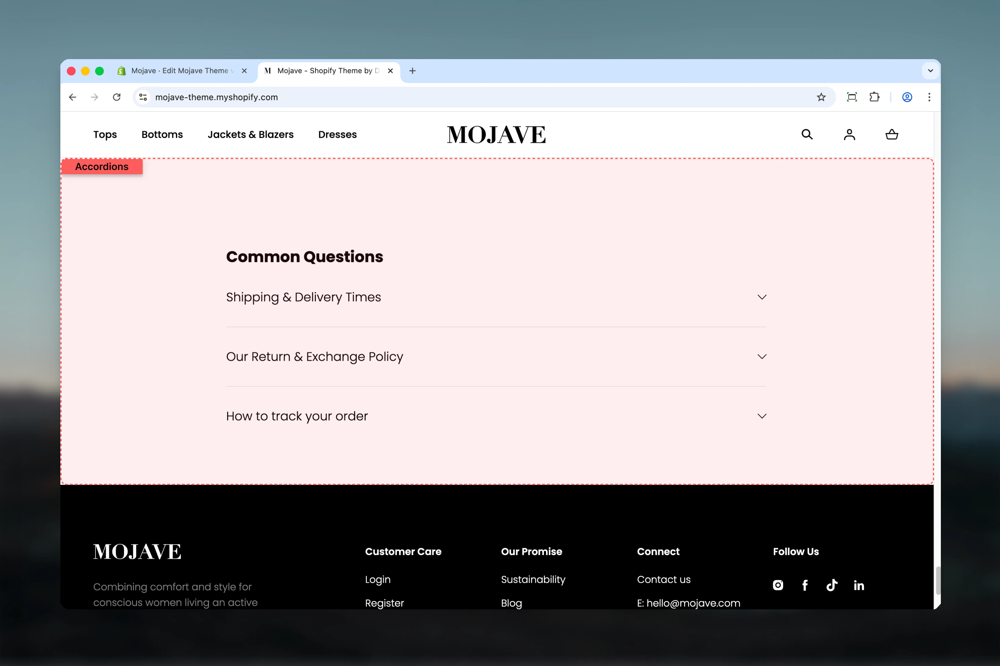
The **Accordions** section creates collapsible content panels perfect for FAQs, shipping information, product details, or any content that benefits from progressive disclosure. Features include:
* **Unlimited accordion items** with individual expand/collapse
* **Rich text content** with formatting, links, images
* **Page content integration**: Pull content directly from a Shopify page
* **Flexible section width**: Narrower (default), Page, Narrow, or Fullwidth
* Section title/heading
* Only one panel opens at a time (mutual exclusivity)
Perfect for FAQs, shipping policies, size guides, product care instructions, or any lengthy content that benefits from organization.
 ## Getting started
From the Theme Customizer, click **Add section** and select **Accordions**
Add a heading (e.g., "Frequently Asked Questions", "Shipping Information")
Click **Add accordion** block. Each block creates one collapsible panel. Add as many as needed.
For each accordion: Add title, then either write content directly OR select a page to pull content from
## Section settings
**Text field** (default: "Place title here")
Main heading displayed above all accordion items.
Examples: "Frequently Asked Questions", "Shipping & Returns", "Product Care", "Size Guide"
Leave blank for no section heading.
**Dropdown** (default: Narrower)
Controls the container width of the entire section:
* **Narrower**: Tightest width, optimal for readability (default)
* **Page**: Standard page width
* **Narrow**: Medium width
* **Fullwidth**: Edge-to-edge, full browser width
**Narrower** is recommended for text-heavy content (FAQs). It creates optimal line length for reading.
## Block: Accordion
**Type**: accordion (unlimited blocks allowed)
Each block creates one collapsible panel with a title and content area.
**Text field** (default: "Place block title here")
The clickable heading for this accordion item:
* Always visible (never hidden)
* Clicking toggles the panel open/closed
* Should be a clear question or topic label
Examples:
* "What is your return policy?"
* "How long does shipping take?"
* "What sizes do you offer?"
* "Care Instructions"
Keep titles concise (under 10 words) for better scannability.
**Rich text editor** (default: "
## Getting started
From the Theme Customizer, click **Add section** and select **Accordions**
Add a heading (e.g., "Frequently Asked Questions", "Shipping Information")
Click **Add accordion** block. Each block creates one collapsible panel. Add as many as needed.
For each accordion: Add title, then either write content directly OR select a page to pull content from
## Section settings
**Text field** (default: "Place title here")
Main heading displayed above all accordion items.
Examples: "Frequently Asked Questions", "Shipping & Returns", "Product Care", "Size Guide"
Leave blank for no section heading.
**Dropdown** (default: Narrower)
Controls the container width of the entire section:
* **Narrower**: Tightest width, optimal for readability (default)
* **Page**: Standard page width
* **Narrow**: Medium width
* **Fullwidth**: Edge-to-edge, full browser width
**Narrower** is recommended for text-heavy content (FAQs). It creates optimal line length for reading.
## Block: Accordion
**Type**: accordion (unlimited blocks allowed)
Each block creates one collapsible panel with a title and content area.
**Text field** (default: "Place block title here")
The clickable heading for this accordion item:
* Always visible (never hidden)
* Clicking toggles the panel open/closed
* Should be a clear question or topic label
Examples:
* "What is your return policy?"
* "How long does shipping take?"
* "What sizes do you offer?"
* "Care Instructions"
Keep titles concise (under 10 words) for better scannability.
**Rich text editor** (default: "Place block content here
")
The collapsible content displayed when panel is expanded:
* Supports rich text formatting (bold, italic, lists, links)
* Can include paragraphs, headings, lists, images
* Hidden by default, revealed when user clicks item title
If a **Page** is selected (below), that page's content will override this field.
Use rich text for custom answers. Use page integration for reusable content (e.g., standard shipping policy used in multiple places).
**Page picker** (optional)
Select a Shopify page to pull content from:
* **Overwrites the Content field** with selected page's content
* Useful for maintaining consistent policies across multiple locations
* Updates automatically when page content changes
**Info**: "Overwrites content field with the selected page content."
**Use cases**:
* Link to "Shipping Policy" page instead of duplicating text
* Pull content from "Returns" page
* Reference "Size Guide" page content
**Leave blank** to use the manual Content field above.
## Best practices
Use default "Narrower" width for FAQ sections. Optimal line length (50-75 characters) improves reading comprehension.
For FAQs, phrase titles as questions customers actually ask. Use "How do I...?" and "What is...?" formats for clarity.
Place most frequently asked questions first. Use analytics or customer service data to identify top concerns.
Aim for 2-4 paragraphs per answer. Long content defeats the purpose of progressive disclosure. Link to full pages if needed.
Link to pages for policies that need legal accuracy (returns, privacy). Use manual content for quick FAQs.
Too few (1-3) makes accordions unnecessary. Too many (15+) overwhelms users. Group into multiple sections if needed.
"FAQs" is vague. Use "Shipping & Returns Questions" or "Product Care Guide" to set expectations.
Use bold for emphasis, lists for steps, and links for additional resources. Formatting improves content scannability.
## Common use cases
**Homepage FAQs** — Answer common objections and questions before users reach PDP (shipping times, returns, materials)
**Product page FAQs** — Product-specific questions below product info (size guide, care instructions, materials, dimensions)
**Shipping information** — Detailed shipping methods, times, costs, and policies in collapsible format
**Return policy** — Comprehensive return/exchange process broken into logical sections (eligibility, process, timeframes)
**Size guide** — Expandable sizing information per product category (shirts, pants, shoes) with measurement instructions
**About/Company page** — Company history, values, team info as collapsible sections for lengthy content
## Layout behavior
**Desktop**:
* All accordion items stacked vertically
* Section title centered above items (if present)
* One item opens at a time (clicking new item closes previous)
* Smooth expand/collapse animation
* Section width determined by Section width setting
**Mobile**:
* Same behavior as desktop (vertical stack)
* Full-width panels regardless of Section width setting
* Touch-optimized click targets for titles
* Content stays within mobile viewport
**Interaction**:
* **Closed state**: Only title visible
* **Open state**: Title + content visible
* **Auto-close**: Opening one item automatically closes others
* **Default state**: All items closed on page load
## Accordion behavior
**Opening/closing**:
* Click any title to expand that panel
* Click same title again to collapse
* Opening a new panel automatically closes the previously open panel
* Only one panel open at a time (mutual exclusivity)
**Content display**:
* Closed: Title only (clickable)
* Open: Title + full content below
* Content appears with smooth slide-down animation
* Visual indicator (icon/chevron) shows open/closed state
**Page content integration**:
* When Page is selected, Content field is ignored
* Page content rendered with full Shopify page formatting
* Updates automatically if page content changes
* No manual synchronization needed
## Customization tips
**For product FAQs (PLP/PDP)**:
* Use "Narrower" or "Narrow" width
* Keep 5-8 questions focused on product specifics
* Place after product description on PDP
* Examples: sizing, materials, care, shipping time, warranty
**For policy pages**:
* Use "Page" width or "Fullwidth" for prominence
* Link to official policy pages via Page picker
* Groups: Shipping, Returns, Privacy, Terms
* Section titles: "Shipping & Delivery", "Return Policy Details"
**For homepage trust-building**:
* Place after hero/featured products
* 3-5 top questions that remove purchase barriers
* Section title: "Common Questions" or "Why Shop With Us"
* Focus on shipping speed, return ease, quality assurance
**For educational content**:
* Use "Narrower" for optimal reading
* Group related topics (e.g., "Care Instructions" with wash/dry/store)
* Use rich text formatting (lists, bold) for instructional steps
## Related sections
* **Rich Text** — Alternative for non-collapsible content presentation
* **Content Tiles** — Grid-based content blocks for visual FAQ alternatives
* **Multi Column Text** — Side-by-side content organization without collapse
* **Product Recommendations** — Often paired with product FAQs on PDP
## Technical notes
**One open at a time**: Accordions use mutual exclusivity—opening one item automatically closes others. This prevents content overload and maintains focus.
**Accessibility**: Accordion titles are keyboard-navigable, and screen readers announce open/closed states. Content remains accessible to assistive technology.
**SEO**: Accordion content is fully crawlable by search engines even when collapsed. No negative SEO impact from hiding content.
**Page integration**: The Page picker dynamically pulls content from Shopify pages. Changes to the source page automatically reflect in the accordion without manual updates.