> ## Documentation Index
> Fetch the complete documentation index at: https://docs.digifist.com/llms.txt
> Use this file to discover all available pages before exploring further.
# Announcement bar
> Display site-wide messages and promotional content with flexible carousel and positioning options
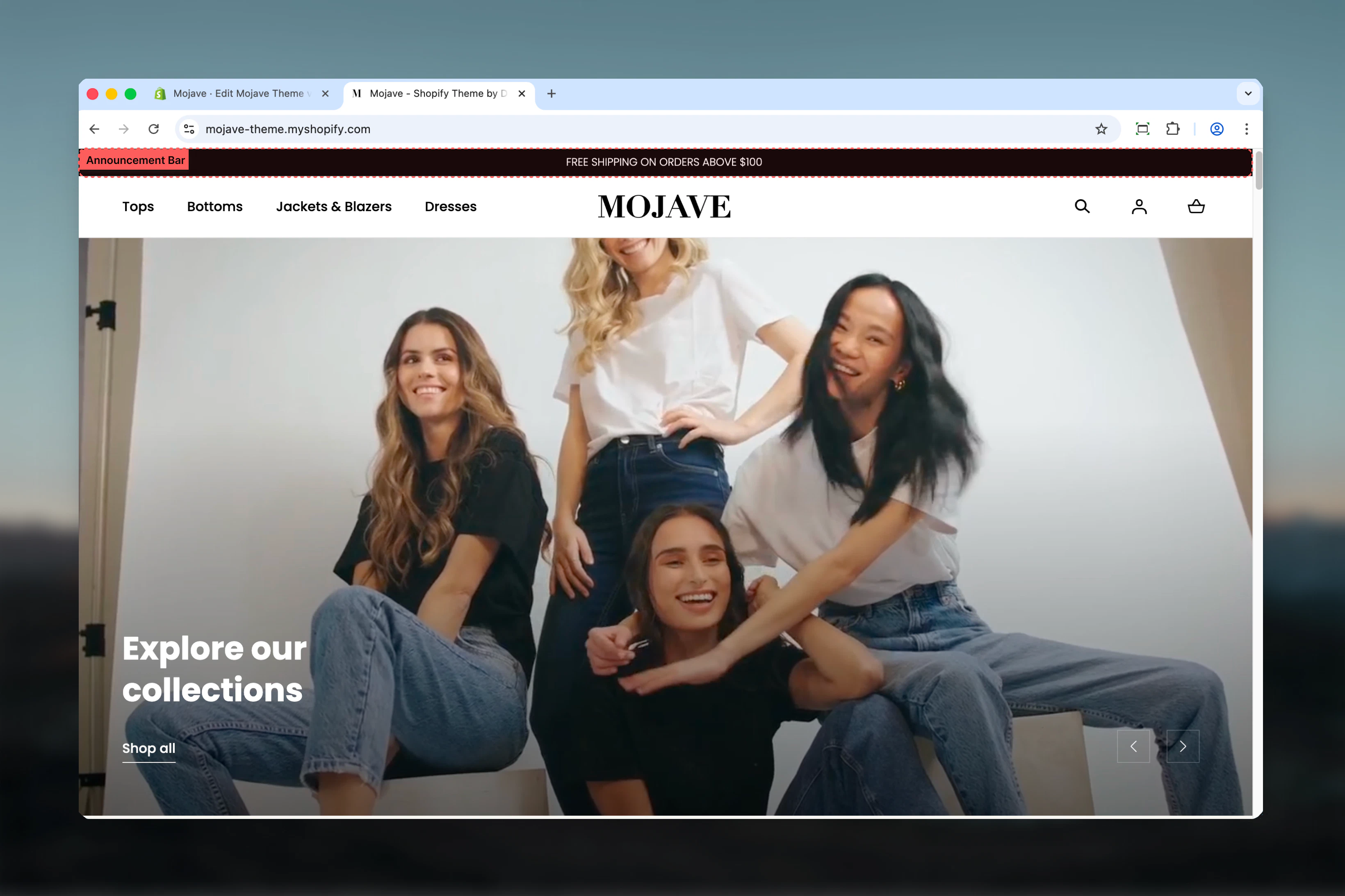
The Announcement bar displays important messages, promotions, or notifications across your entire website. It supports multiple display modes including static display and automatic carousel rotation, with unique positioning options and utility menu integration for enhanced functionality.
 ## What this section controls
* Announcement message content and styling
* Carousel behavior and autoplay timing
* Device-specific typography settings
* Bar positioning relative to header
* Utility menu integration
* Homepage transparency effects
## Getting started
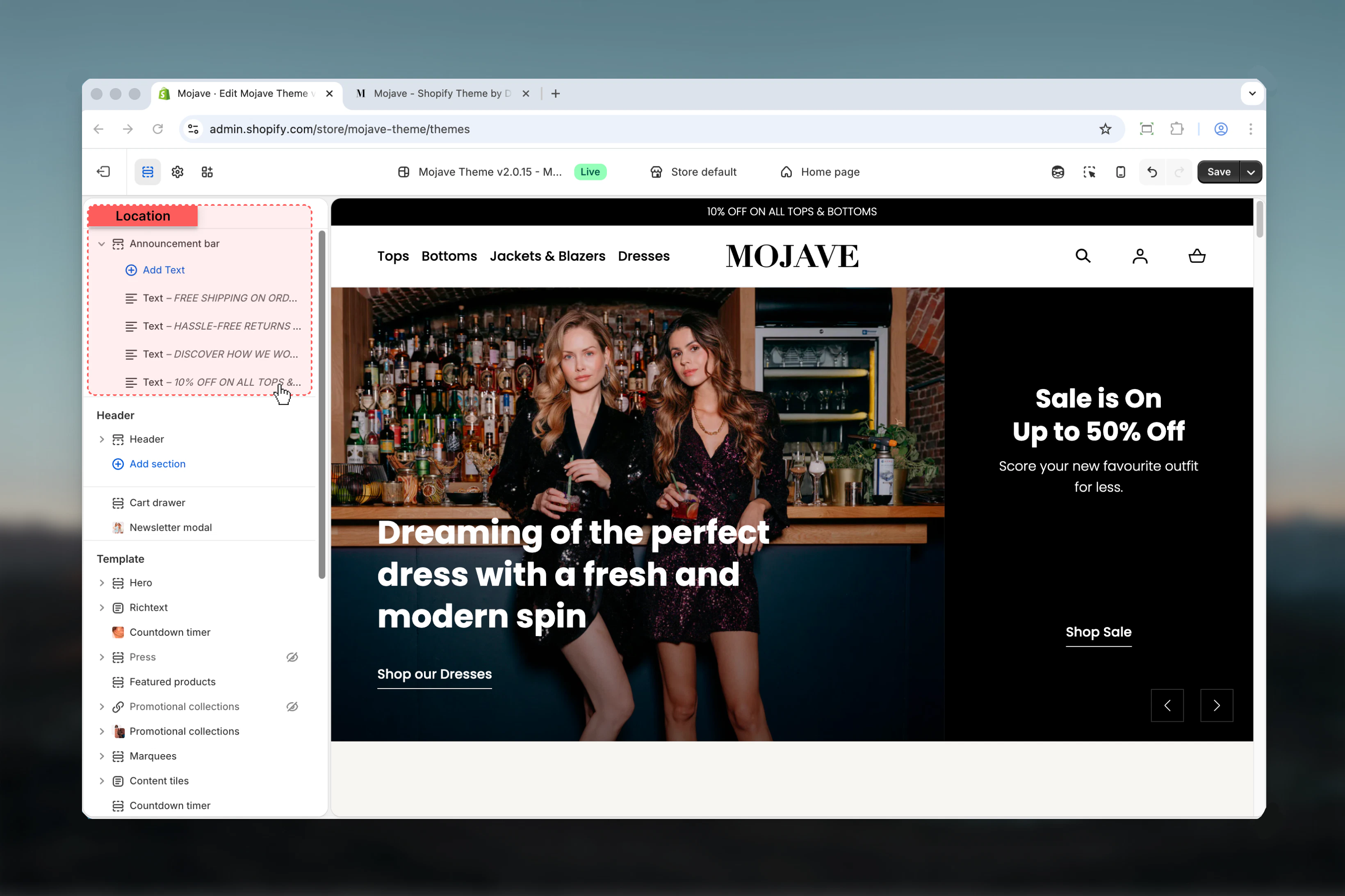
In your Shopify admin, go to **Online Store > Themes** and click **Customize** on your active theme.
The Announcement bar section is located at the very top of your site, above or below the header depending on your positioning settings.
## What this section controls
* Announcement message content and styling
* Carousel behavior and autoplay timing
* Device-specific typography settings
* Bar positioning relative to header
* Utility menu integration
* Homepage transparency effects
## Getting started
In your Shopify admin, go to **Online Store > Themes** and click **Customize** on your active theme.
The Announcement bar section is located at the very top of your site, above or below the header depending on your positioning settings.
 ## Display behavior
The announcement bar automatically adapts its display mode based on the number of messages:
When you have 3 or fewer announcement blocks, messages display side-by-side statically across the bar. You can disable this behavior with the "Disable blocks carousel on desktop" setting to force carousel mode even with fewer messages.
With 4 or more blocks, the bar automatically rotates through messages using carousel functionality. The "Carousel Interval" setting controls how long each message displays before transitioning to the next (1-10 seconds).
**Note**: When you have more than 3 blocks, carousel mode activates automatically regardless of the "Disable blocks carousel on desktop" setting.
## Key settings
Add a navigation menu to the announcement bar for quick access links, language selectors, or currency switchers. Select from your existing menus in **Navigation** settings.
This feature makes the Mojave announcement bar particularly versatile by combining promotional messaging with functional navigation elements.
Control whether messages rotate automatically on desktop devices. When enabled, all announcement messages display statically side-by-side instead of rotating.
**Important**: This setting is automatically bypassed when you have more than 3 announcement blocks - carousel mode will activate regardless to accommodate the additional content.
Set the duration (1-10 seconds) each announcement message displays before rotating to the next. Only applies when carousel mode is active.
Recommended intervals:
* **Quick messages**: 3-4 seconds for short promotional text
* **Detailed content**: 6-8 seconds for longer announcements
* **Multiple offers**: 5-6 seconds for balanced rotation
Move the announcement bar from its default position above the header to below it. This creates a different visual hierarchy and works particularly well with transparent header designs.
**Note**: You must save your theme settings after changing this option to see the results in the preview.
Makes the announcement bar background transparent on your homepage, allowing hero images or videos to show through.
**Best practices for transparency**:
* Enable transparency in Header section settings as well for cohesive design
* Position the announcement bar below the header for optimal visual integration
* Ensure sufficient contrast between announcement text and background images
* Test visibility with all hero section backgrounds you use
Control the text size of announcement messages on desktop devices using the range slider (13-24 pixels).
Recommended sizes:
* **Standard announcements**: 16-18px for comfortable reading
* **Prominent messaging**: 20-22px for high-visibility promotions
* **Subtle notifications**: 13-15px for non-intrusive updates
Independently control text size for mobile devices (10-16 pixels). This allows you to optimize readability on smaller screens without affecting desktop design.
Mobile sizing tips:
* Typically 2-4px smaller than desktop for proportional appearance
* Minimum 12px recommended for accessibility
* Test across device sizes to ensure legibility
## Block settings
Add announcement messages by adding "Text" blocks. Each block represents one announcement that will display in the bar.
The announcement message content. Supports inline rich text formatting including **bold**, *italic*, and text styling.
Keep messages concise - announcement bars are designed for brief, scannable content rather than detailed information.
Make the entire announcement message clickable by adding a URL. When visitors click the announcement, they'll navigate to the specified link.
**Link best practices**:
* Use descriptive announcement text that indicates where the link leads
* Link to relevant landing pages, collection pages, or promotional content
* Ensure linked pages provide the value promised in the announcement
* Test links after adding to verify correct destinations
## Best practices
Announcement bars work best with brief, scannable text. Aim for 5-10 words per message to ensure readability across all devices.
For 2-3 key messages, consider disabling carousel to show all simultaneously. Reserve automatic rotation for 4+ announcements or time-sensitive offers.
Balance message visibility with user experience. Very fast rotations (1-2s) can be distracting, while very slow ones (9-10s) may prevent users from seeing all messages.
When using transparent background on homepage, test with various hero images to ensure announcement text remains readable against all backgrounds.
Use the utility menu feature to combine promotions with functional links like language selection or customer service, maximizing the bar's value.
Mobile font sizes should prioritize legibility. Don't go too small - 12px is typically the minimum for comfortable reading on mobile devices.
Below-header positioning works exceptionally well for stores using transparent headers with hero sections, creating an integrated visual experience.
Keep announcement content fresh and relevant. Rotate messages seasonally or with promotional campaigns to maintain customer engagement.
## Display behavior
The announcement bar automatically adapts its display mode based on the number of messages:
When you have 3 or fewer announcement blocks, messages display side-by-side statically across the bar. You can disable this behavior with the "Disable blocks carousel on desktop" setting to force carousel mode even with fewer messages.
With 4 or more blocks, the bar automatically rotates through messages using carousel functionality. The "Carousel Interval" setting controls how long each message displays before transitioning to the next (1-10 seconds).
**Note**: When you have more than 3 blocks, carousel mode activates automatically regardless of the "Disable blocks carousel on desktop" setting.
## Key settings
Add a navigation menu to the announcement bar for quick access links, language selectors, or currency switchers. Select from your existing menus in **Navigation** settings.
This feature makes the Mojave announcement bar particularly versatile by combining promotional messaging with functional navigation elements.
Control whether messages rotate automatically on desktop devices. When enabled, all announcement messages display statically side-by-side instead of rotating.
**Important**: This setting is automatically bypassed when you have more than 3 announcement blocks - carousel mode will activate regardless to accommodate the additional content.
Set the duration (1-10 seconds) each announcement message displays before rotating to the next. Only applies when carousel mode is active.
Recommended intervals:
* **Quick messages**: 3-4 seconds for short promotional text
* **Detailed content**: 6-8 seconds for longer announcements
* **Multiple offers**: 5-6 seconds for balanced rotation
Move the announcement bar from its default position above the header to below it. This creates a different visual hierarchy and works particularly well with transparent header designs.
**Note**: You must save your theme settings after changing this option to see the results in the preview.
Makes the announcement bar background transparent on your homepage, allowing hero images or videos to show through.
**Best practices for transparency**:
* Enable transparency in Header section settings as well for cohesive design
* Position the announcement bar below the header for optimal visual integration
* Ensure sufficient contrast between announcement text and background images
* Test visibility with all hero section backgrounds you use
Control the text size of announcement messages on desktop devices using the range slider (13-24 pixels).
Recommended sizes:
* **Standard announcements**: 16-18px for comfortable reading
* **Prominent messaging**: 20-22px for high-visibility promotions
* **Subtle notifications**: 13-15px for non-intrusive updates
Independently control text size for mobile devices (10-16 pixels). This allows you to optimize readability on smaller screens without affecting desktop design.
Mobile sizing tips:
* Typically 2-4px smaller than desktop for proportional appearance
* Minimum 12px recommended for accessibility
* Test across device sizes to ensure legibility
## Block settings
Add announcement messages by adding "Text" blocks. Each block represents one announcement that will display in the bar.
The announcement message content. Supports inline rich text formatting including **bold**, *italic*, and text styling.
Keep messages concise - announcement bars are designed for brief, scannable content rather than detailed information.
Make the entire announcement message clickable by adding a URL. When visitors click the announcement, they'll navigate to the specified link.
**Link best practices**:
* Use descriptive announcement text that indicates where the link leads
* Link to relevant landing pages, collection pages, or promotional content
* Ensure linked pages provide the value promised in the announcement
* Test links after adding to verify correct destinations
## Best practices
Announcement bars work best with brief, scannable text. Aim for 5-10 words per message to ensure readability across all devices.
For 2-3 key messages, consider disabling carousel to show all simultaneously. Reserve automatic rotation for 4+ announcements or time-sensitive offers.
Balance message visibility with user experience. Very fast rotations (1-2s) can be distracting, while very slow ones (9-10s) may prevent users from seeing all messages.
When using transparent background on homepage, test with various hero images to ensure announcement text remains readable against all backgrounds.
Use the utility menu feature to combine promotions with functional links like language selection or customer service, maximizing the bar's value.
Mobile font sizes should prioritize legibility. Don't go too small - 12px is typically the minimum for comfortable reading on mobile devices.
Below-header positioning works exceptionally well for stores using transparent headers with hero sections, creating an integrated visual experience.
Keep announcement content fresh and relevant. Rotate messages seasonally or with promotional campaigns to maintain customer engagement.