> ## Documentation Index
> Fetch the complete documentation index at: https://docs.digifist.com/llms.txt
> Use this file to discover all available pages before exploring further.
# Full Width Banner
> Create edge-to-edge promotional banners with optional product hotspots, customizable height, and split-screen or background image layouts
## What this section does
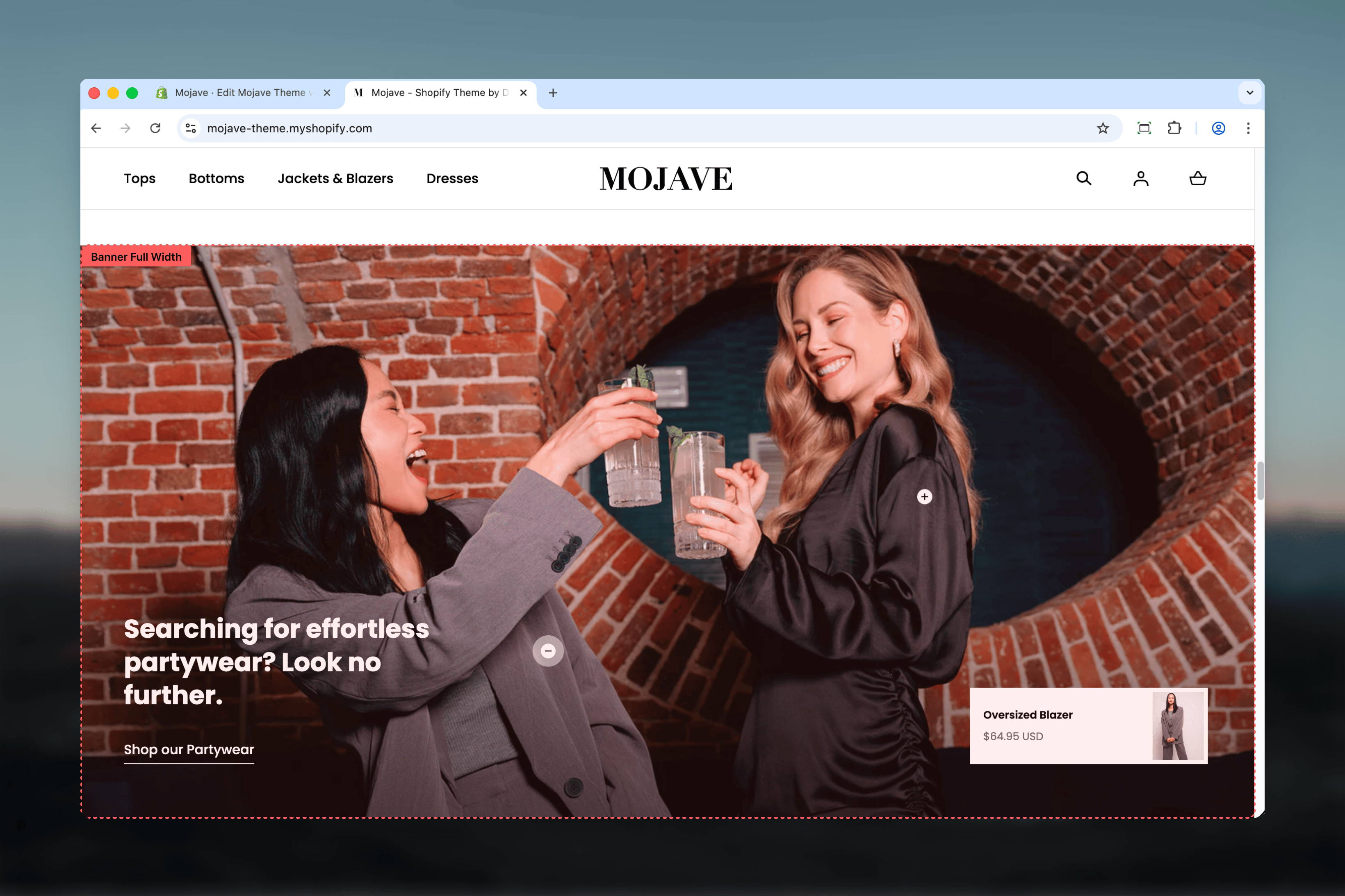
The **Banner - Fullwidth** section creates prominent fullwidth promotional banners perfect for campaigns, collections, or storytelling. Features include:
* **Edge-to-edge fullwidth** design spans entire viewport
* **Adjustable height**: 35-100% of viewport height
* **Two image styles**: Background (overlay) or Aside (split-screen)
* **Two layouts**: Content at Top or Bottom
* **Responsive images**: Separate desktop (2880x1400px) and mobile (720x1140px)
* **Overlay opacity control** for background images (0-100%)
* **Product hotspots**: Up to 3 positioned product links (x/y coordinates)
* Heading, link/CTA button
* Optional primary/secondary product references
Perfect for homepage heroes, collection promotions, campaign landings, or any fullwidth visual messaging.
 ## Getting started
From the Theme Customizer, click **Add section** and select **Banner - Fullwidth**
Add desktop (2880x1400px) and mobile (720x1140px) images for optimal quality across devices
Select **Background** for text overlay or **Aside** for split-screen layout
Configure heading, link text/URL, and adjust banner height, layout position, and overlay opacity
Add up to 3 **Link product** blocks to create clickable product hotspots on the image
## Section settings
**Range**: 35-100% (step: 5%, default: 100%)
Controls banner height as percentage of viewport height:
* **35%**: Shortest (compact banner)
* **65%**: Medium-tall (balanced)
* **100%**: Full viewport height (default, maximum impact)
**Info**: "Set the height of the banner to change the height of the slide"
Higher percentages create more dramatic, immersive banners. Use 50-75% for mid-page sections.
**Dropdown** (default: Background)
Controls how image relates to content:
* **Background**: Image fills entire banner, content overlays (default)
* **Aside**: Split-screen layout with image on one side, content on other
**Background** creates overlays/hero effects. **Aside** creates clean split-screen editorial layouts.
**Dropdown** (default: Bottom)
Controls vertical position of content:
* **Top**: Content positioned at top of banner
* **Bottom**: Content positioned at bottom of banner (default)
Most relevant for Background image style. With Aside style, determines which side content appears.
**Range**: 0-100% (step: 10%, default: 50%)
Controls darkness of overlay between image and content:
* **0%**: No overlay (content directly on image)
* **50%**: Medium overlay (default, balanced readability)
* **100%**: Full black overlay (maximum contrast)
Higher opacity improves text readability on busy images. Only affects Background image style.
**Image picker** (required)
Main banner image for desktop:
* **Recommended size**: 2880x1400px
* Fullwidth, high-resolution for edge-to-edge display
* Use high-quality lifestyle or product photography
**Info**: "Recommended sizes: 2880x1400px"
2880px width ensures sharp display on large screens and retina displays.
**Image picker** (optional)
Mobile-specific banner image:
* **Recommended size**: 720x1140px
* Portrait orientation optimized for mobile screens
* If not provided, desktop image is cropped/scaled for mobile
**Info**: "Recommended sizes: 720x1140px"
Use mobile-specific images when desktop image doesn't work well cropped (wrong focal point, horizontal composition).
**Textarea** (default: "Tell your brand's story through images")
Main banner heading/title:
* Supports multiple lines (use Shift+Enter)
* Large, prominent display
* Position determined by Layout setting (Top/Bottom)
Examples: "Summer Collection 2024", "50% Off Everything", "New Arrivals", "The Ultimate Guide To..."
**Link text** (text field, default: "Shop all")
* CTA button label
**Link URL** (URL field, default: /collections)
* Button destination
Use action-oriented link text: "Shop now", "Explore collection", "Learn more", "Get started".
**Product - primary** (product picker, optional)
* Reference to primary featured product
**Product - secondary** (product picker, optional)
* Reference to secondary featured product
These product references can be used for dynamic content or structured data. Not visually displayed unless theme includes custom functionality.
## Block: Link product
**Type**: product\_showcase (limit: 3 blocks)
Create interactive product hotspots positioned anywhere on the banner image.
**Product picker** (required)
Select product to link from this hotspot:
* Clicking hotspot navigates to product page (PDP)
* Product info (title, price) displayed in tooltip/popup on hover
Use for "Shop the Look" style banners showcasing products in lifestyle context.
**Position X** (range: 0-100%, default: 25%)
* Horizontal position from left edge (0% = far left, 100% = far right)
**Position Y** (range: 0-100%, default: 25%)
* Vertical position from top edge (0% = top, 100% = bottom)
**Header**: "Position"
Position hotspot over the product in the lifestyle image. Fine-tune coordinates to place pin exactly on product.
**Example**: Product at center-right of image → X: 75%, Y: 50%
## Best practices
Use 2880x1400px desktop images minimum. Fullwidth banners display very large—low-res images look pixelated.
Always upload mobile images (720x1140px). Desktop horizontal crops don't work well on portrait mobile screens.
Set 40-60% overlay for Background style with busy images. Ensures text remains readable across all image areas.
Use 100% height for homepage hero (first section). Use 50-75% for mid-page promotional banners.
Use Aside image style when text content is lengthy (multiple paragraphs). Provides dedicated readable space.
Limit is 3 product hotspots. More creates clutter—use Collections or Shop the Look section for more products.
Use urgent, specific link text: "Shop Spring Sale" not "Click here". "Explore Collection" not "Learn more".
Position hotspots directly over products in lifestyle images. Accurate placement creates intuitive "shop this item" experience.
## Common use cases
**Homepage hero** — Height 100%, Background style, Bottom layout, prominent heading + CTA, no hotspots
**Collection promotion** — Height 65%, Aside style, lifestyle image showing product in use + collection description + button
**Campaign landing** — Height 75%, Background style, 60% overlay, large sale messaging with urgency ("50% Off - Today Only")
**Shop the look** — Height 50-75%, Background style, lifestyle image with 2-3 product hotspots positioned over featured items
**Seasonal announcement** — Height 50%, Background style, Top layout, seasonal imagery with "New Spring Collection" messaging
**Editorial storytelling** — Height 65%, Aside style, brand story image + multi-line text about values/mission + "About Us" link
## Layout behavior
**Background image style**:
* Image fills entire banner (edge-to-edge)
* Content overlays on image with dark overlay (configurable opacity)
* Layout determines vertical position: Top (content at top) or Bottom (content at bottom, default)
* Horizontal: Content always centered
**Aside image style**:
* Split-screen layout
* Layout determines which side content appears:
* **Top**: Image right, content left (or vice versa based on theme defaults)
* **Bottom**: Image left, content right (or vice versa)
* Each side: 50% width on desktop
* No overlay (content has solid background separate from image)
**Desktop**:
* Fullwidth edge-to-edge display
* Height = Banner Height setting × viewport height
* Product hotspots displayed as interactive pins/dots
* Hover: Product title/price tooltip
**Mobile**:
* Stacks vertically (even with Aside style)
* Image at top, content below
* Uses mobile-specific image if provided, otherwise crops/scales desktop image
* Product hotspots hidden on mobile (optional theme behavior) or repositioned
## Image guidelines
**Desktop image (2880x1400px)**:
* Aspect ratio: \~2:1 (landscape)
* Focal point: Center-aware composition (content may overlay anywhere)
* High resolution: 2880px width ensures sharpness on 4K displays
* File size: Optimize to \< 500KB (use JPG, quality 80-85%)
**Mobile image (720x1140px)**:
* Aspect ratio: \~9:16 (portrait)
* Focal point: Top or center (content overlays bottom by default)
* Resolution: 720px width = 2x pixel density for 360px mobile screens
* File size: Optimize to \< 150KB for fast mobile loading
**Background style images**:
* Avoid busy/complex backgrounds where text overlays
* Ensure even lighting—high contrast areas make overlays harder
* Test with different overlay opacities (40-70% typically works)
**Aside style images**:
* Focus product/subject toward center of image half
* Less critical for text readability (content doesn't overlay)
* Can use more complex, detailed imagery
## Product hotspot behavior
**When to use**:
* Lifestyle images showing products in context
* "Shop the Look" campaigns with 2-3 featured items
* Editorial content where specific products are highlighted
**Interaction**:
* Hotspots appear as pins/dots on image
* Hover: Tooltip with product title, price, "Shop now"
* Click: Navigate to product page (PDP)
**Positioning best practices**:
* Place pin directly over product in image (use X/Y sliders)
* Test on different screen sizes—hotspots may shift slightly
* Space hotspots apart (not clustered)—easier to click
**Mobile behavior**:
* Some themes hide hotspots on mobile (ambiguous touch targets)
* Other themes show hotspots but may reposition for responsive images
* Test mobile experience—consider mobile-specific product positioning
## Customization tips
**For homepage hero**:
* Height: 100%
* Image style: Background
* Layout: Bottom (default)
* Overlay: 50-60% for readability
* Heading: Large, bold claim ("Premium Quality, Affordable Prices")
* Link: Strong CTA ("Shop Now", "Explore")
**For mid-page promotion**:
* Height: 50-65%
* Image style: Aside for text-heavy content, Background for succinct messaging
* Heading: Specific offer ("Free Shipping on Orders \$50+")
* Link: Relevant collection or page
**For shop the look**:
* Height: 65-75%
* Image style: Background
* Overlay: 30-40% (lighter, image-focused)
* Add 2-3 product hotspots positioned over products in lifestyle shot
* Heading: "Shop This Look" or "Get The Look"
**For editorial/storytelling**:
* Height: 50-75%
* Image style: Aside (provides space for longer text)
* Layout: Experiment with Top vs Bottom for visual variety
* Heading: Story-driven ("Our Commitment to Sustainability")
* Link: "Read Our Story", "Learn More"
## Related sections
* **Hero** — Multi-slide carousel alternative with more layout options
* **Featured Collections Links** — Multi-collection grid with similar hotspot functionality
* **Images with Text** — Split-screen alternative without fullwidth constraint
* **Content Tiles** — Grid-based layouts for multiple banners/content blocks
## Technical notes
**Viewport height units**: Height setting uses `vh` (viewport height). 100% = 100vh = full browser window height. Adjusts dynamically to screen size.
**Fullwidth always**: This section always spans edge-to-edge regardless of theme container settings. Designed for maximum visual impact.
**Overlay implementation**: Overlay is a semi-transparent dark layer (typically black with alpha transparency) between image and content. Improves contrast without requiring image darkening.
**Product hotspot coordinates**: X/Y positioning uses absolute percentage positioning within image container. X=0%, Y=0% = top-left corner. X=100%, Y=100% = bottom-right corner.
**Mobile image fallback**: If no mobile image provided, theme crops/scales desktop image. Cropping typically centers or uses focal point detection. Always test—provide mobile images for best results.
**Product references**: Primary/secondary product settings are metadata fields. Not automatically displayed but available for custom Liquid code, structured data, or future theme features.
**Aside layout variance**: "Aside" implementation varies by theme. Some themes flip image left/right based on Layout setting. Others use alternate methods. Test both Layout options to see behavior.
## Getting started
From the Theme Customizer, click **Add section** and select **Banner - Fullwidth**
Add desktop (2880x1400px) and mobile (720x1140px) images for optimal quality across devices
Select **Background** for text overlay or **Aside** for split-screen layout
Configure heading, link text/URL, and adjust banner height, layout position, and overlay opacity
Add up to 3 **Link product** blocks to create clickable product hotspots on the image
## Section settings
**Range**: 35-100% (step: 5%, default: 100%)
Controls banner height as percentage of viewport height:
* **35%**: Shortest (compact banner)
* **65%**: Medium-tall (balanced)
* **100%**: Full viewport height (default, maximum impact)
**Info**: "Set the height of the banner to change the height of the slide"
Higher percentages create more dramatic, immersive banners. Use 50-75% for mid-page sections.
**Dropdown** (default: Background)
Controls how image relates to content:
* **Background**: Image fills entire banner, content overlays (default)
* **Aside**: Split-screen layout with image on one side, content on other
**Background** creates overlays/hero effects. **Aside** creates clean split-screen editorial layouts.
**Dropdown** (default: Bottom)
Controls vertical position of content:
* **Top**: Content positioned at top of banner
* **Bottom**: Content positioned at bottom of banner (default)
Most relevant for Background image style. With Aside style, determines which side content appears.
**Range**: 0-100% (step: 10%, default: 50%)
Controls darkness of overlay between image and content:
* **0%**: No overlay (content directly on image)
* **50%**: Medium overlay (default, balanced readability)
* **100%**: Full black overlay (maximum contrast)
Higher opacity improves text readability on busy images. Only affects Background image style.
**Image picker** (required)
Main banner image for desktop:
* **Recommended size**: 2880x1400px
* Fullwidth, high-resolution for edge-to-edge display
* Use high-quality lifestyle or product photography
**Info**: "Recommended sizes: 2880x1400px"
2880px width ensures sharp display on large screens and retina displays.
**Image picker** (optional)
Mobile-specific banner image:
* **Recommended size**: 720x1140px
* Portrait orientation optimized for mobile screens
* If not provided, desktop image is cropped/scaled for mobile
**Info**: "Recommended sizes: 720x1140px"
Use mobile-specific images when desktop image doesn't work well cropped (wrong focal point, horizontal composition).
**Textarea** (default: "Tell your brand's story through images")
Main banner heading/title:
* Supports multiple lines (use Shift+Enter)
* Large, prominent display
* Position determined by Layout setting (Top/Bottom)
Examples: "Summer Collection 2024", "50% Off Everything", "New Arrivals", "The Ultimate Guide To..."
**Link text** (text field, default: "Shop all")
* CTA button label
**Link URL** (URL field, default: /collections)
* Button destination
Use action-oriented link text: "Shop now", "Explore collection", "Learn more", "Get started".
**Product - primary** (product picker, optional)
* Reference to primary featured product
**Product - secondary** (product picker, optional)
* Reference to secondary featured product
These product references can be used for dynamic content or structured data. Not visually displayed unless theme includes custom functionality.
## Block: Link product
**Type**: product\_showcase (limit: 3 blocks)
Create interactive product hotspots positioned anywhere on the banner image.
**Product picker** (required)
Select product to link from this hotspot:
* Clicking hotspot navigates to product page (PDP)
* Product info (title, price) displayed in tooltip/popup on hover
Use for "Shop the Look" style banners showcasing products in lifestyle context.
**Position X** (range: 0-100%, default: 25%)
* Horizontal position from left edge (0% = far left, 100% = far right)
**Position Y** (range: 0-100%, default: 25%)
* Vertical position from top edge (0% = top, 100% = bottom)
**Header**: "Position"
Position hotspot over the product in the lifestyle image. Fine-tune coordinates to place pin exactly on product.
**Example**: Product at center-right of image → X: 75%, Y: 50%
## Best practices
Use 2880x1400px desktop images minimum. Fullwidth banners display very large—low-res images look pixelated.
Always upload mobile images (720x1140px). Desktop horizontal crops don't work well on portrait mobile screens.
Set 40-60% overlay for Background style with busy images. Ensures text remains readable across all image areas.
Use 100% height for homepage hero (first section). Use 50-75% for mid-page promotional banners.
Use Aside image style when text content is lengthy (multiple paragraphs). Provides dedicated readable space.
Limit is 3 product hotspots. More creates clutter—use Collections or Shop the Look section for more products.
Use urgent, specific link text: "Shop Spring Sale" not "Click here". "Explore Collection" not "Learn more".
Position hotspots directly over products in lifestyle images. Accurate placement creates intuitive "shop this item" experience.
## Common use cases
**Homepage hero** — Height 100%, Background style, Bottom layout, prominent heading + CTA, no hotspots
**Collection promotion** — Height 65%, Aside style, lifestyle image showing product in use + collection description + button
**Campaign landing** — Height 75%, Background style, 60% overlay, large sale messaging with urgency ("50% Off - Today Only")
**Shop the look** — Height 50-75%, Background style, lifestyle image with 2-3 product hotspots positioned over featured items
**Seasonal announcement** — Height 50%, Background style, Top layout, seasonal imagery with "New Spring Collection" messaging
**Editorial storytelling** — Height 65%, Aside style, brand story image + multi-line text about values/mission + "About Us" link
## Layout behavior
**Background image style**:
* Image fills entire banner (edge-to-edge)
* Content overlays on image with dark overlay (configurable opacity)
* Layout determines vertical position: Top (content at top) or Bottom (content at bottom, default)
* Horizontal: Content always centered
**Aside image style**:
* Split-screen layout
* Layout determines which side content appears:
* **Top**: Image right, content left (or vice versa based on theme defaults)
* **Bottom**: Image left, content right (or vice versa)
* Each side: 50% width on desktop
* No overlay (content has solid background separate from image)
**Desktop**:
* Fullwidth edge-to-edge display
* Height = Banner Height setting × viewport height
* Product hotspots displayed as interactive pins/dots
* Hover: Product title/price tooltip
**Mobile**:
* Stacks vertically (even with Aside style)
* Image at top, content below
* Uses mobile-specific image if provided, otherwise crops/scales desktop image
* Product hotspots hidden on mobile (optional theme behavior) or repositioned
## Image guidelines
**Desktop image (2880x1400px)**:
* Aspect ratio: \~2:1 (landscape)
* Focal point: Center-aware composition (content may overlay anywhere)
* High resolution: 2880px width ensures sharpness on 4K displays
* File size: Optimize to \< 500KB (use JPG, quality 80-85%)
**Mobile image (720x1140px)**:
* Aspect ratio: \~9:16 (portrait)
* Focal point: Top or center (content overlays bottom by default)
* Resolution: 720px width = 2x pixel density for 360px mobile screens
* File size: Optimize to \< 150KB for fast mobile loading
**Background style images**:
* Avoid busy/complex backgrounds where text overlays
* Ensure even lighting—high contrast areas make overlays harder
* Test with different overlay opacities (40-70% typically works)
**Aside style images**:
* Focus product/subject toward center of image half
* Less critical for text readability (content doesn't overlay)
* Can use more complex, detailed imagery
## Product hotspot behavior
**When to use**:
* Lifestyle images showing products in context
* "Shop the Look" campaigns with 2-3 featured items
* Editorial content where specific products are highlighted
**Interaction**:
* Hotspots appear as pins/dots on image
* Hover: Tooltip with product title, price, "Shop now"
* Click: Navigate to product page (PDP)
**Positioning best practices**:
* Place pin directly over product in image (use X/Y sliders)
* Test on different screen sizes—hotspots may shift slightly
* Space hotspots apart (not clustered)—easier to click
**Mobile behavior**:
* Some themes hide hotspots on mobile (ambiguous touch targets)
* Other themes show hotspots but may reposition for responsive images
* Test mobile experience—consider mobile-specific product positioning
## Customization tips
**For homepage hero**:
* Height: 100%
* Image style: Background
* Layout: Bottom (default)
* Overlay: 50-60% for readability
* Heading: Large, bold claim ("Premium Quality, Affordable Prices")
* Link: Strong CTA ("Shop Now", "Explore")
**For mid-page promotion**:
* Height: 50-65%
* Image style: Aside for text-heavy content, Background for succinct messaging
* Heading: Specific offer ("Free Shipping on Orders \$50+")
* Link: Relevant collection or page
**For shop the look**:
* Height: 65-75%
* Image style: Background
* Overlay: 30-40% (lighter, image-focused)
* Add 2-3 product hotspots positioned over products in lifestyle shot
* Heading: "Shop This Look" or "Get The Look"
**For editorial/storytelling**:
* Height: 50-75%
* Image style: Aside (provides space for longer text)
* Layout: Experiment with Top vs Bottom for visual variety
* Heading: Story-driven ("Our Commitment to Sustainability")
* Link: "Read Our Story", "Learn More"
## Related sections
* **Hero** — Multi-slide carousel alternative with more layout options
* **Featured Collections Links** — Multi-collection grid with similar hotspot functionality
* **Images with Text** — Split-screen alternative without fullwidth constraint
* **Content Tiles** — Grid-based layouts for multiple banners/content blocks
## Technical notes
**Viewport height units**: Height setting uses `vh` (viewport height). 100% = 100vh = full browser window height. Adjusts dynamically to screen size.
**Fullwidth always**: This section always spans edge-to-edge regardless of theme container settings. Designed for maximum visual impact.
**Overlay implementation**: Overlay is a semi-transparent dark layer (typically black with alpha transparency) between image and content. Improves contrast without requiring image darkening.
**Product hotspot coordinates**: X/Y positioning uses absolute percentage positioning within image container. X=0%, Y=0% = top-left corner. X=100%, Y=100% = bottom-right corner.
**Mobile image fallback**: If no mobile image provided, theme crops/scales desktop image. Cropping typically centers or uses focal point detection. Always test—provide mobile images for best results.
**Product references**: Primary/secondary product settings are metadata fields. Not automatically displayed but available for custom Liquid code, structured data, or future theme features.
**Aside layout variance**: "Aside" implementation varies by theme. Some themes flip image left/right based on Layout setting. Others use alternate methods. Test both Layout options to see behavior.