> ## Documentation Index
> Fetch the complete documentation index at: https://docs.digifist.com/llms.txt
> Use this file to discover all available pages before exploring further.
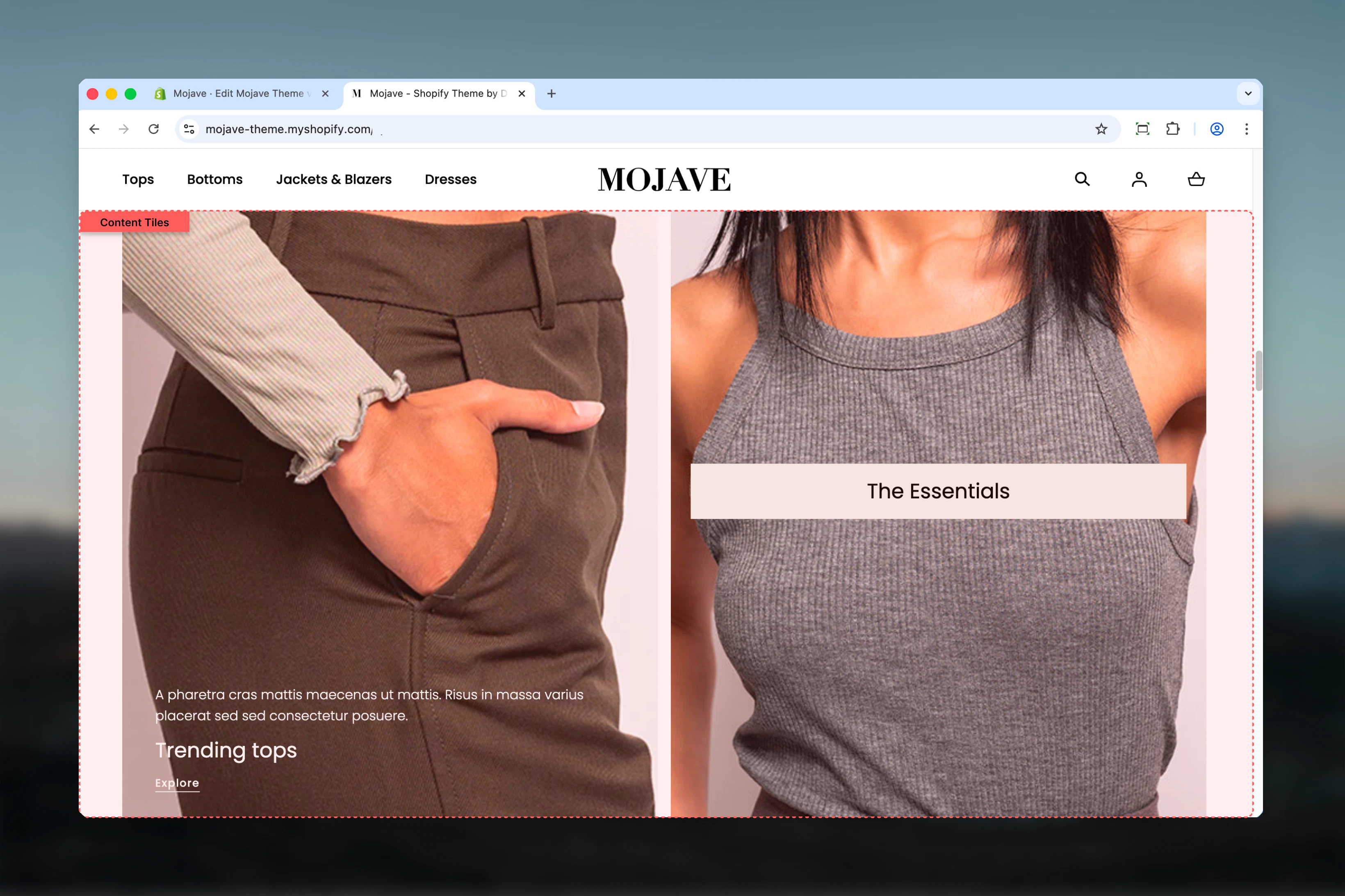
# Content Tiles
> Build custom masonry-style grid layouts with flexible tiles featuring images, videos, text, and CTAs with precise grid positioning control
## What this section does
The **Content tiles** section creates sophisticated grid-based layouts where each tile can span multiple columns and rows, perfect for magazine-style editorial content, service showcases, or visual storytelling. Features include:
* **Grid layout system**: Position tiles with column/row spanning (1-6 columns × 1-6 rows)
* **Unlimited tile blocks** with independent sizing and positioning
* **Media flexibility**: Images, self-hosted videos, or YouTube/Vimeo per tile
* **Three media positions**: Top, Bottom, or Background
* **Responsive media**: Separate desktop/mobile images and videos
* **Content overlay**: Text + heading + button over background media
* **Show on control**: Display tiles only on desktop, mobile, or both
* **Three tile styles**: Main, Accent, Transparent backgrounds
Perfect for homepage content grids, editorial layouts, service showcases, or any design requiring precise grid control.
 ## Getting started
From the Theme Customizer, click **Add section** and select **Content tiles**
Click **Add tile** block. Each block creates one grid item. Add as many as needed.
For each tile, set **Column factor** (width, 1-6) and **Row factor** (height, 1-6) to control size and positioning
Add heading, text, button, and media (image/video) to each tile. Configure media position and content alignment.
## Section settings
**Checkbox** (default: unchecked)
Reverses the order of tiles on mobile devices:
* Unchecked: Tiles display in the same order as desktop (first tile → last tile)
* Checked: Tiles display in reverse order (last tile → first tile)
Useful when desktop grid layout creates a visual hierarchy that should be reversed for mobile vertical stacking.
**Inline rich text** (optional)
Main section heading displayed above all tiles.
Examples: "Featured Content", "Our Services", "Explore", "Why Choose Us"
Leave blank for no section heading.
**Dropdown** (default: L)
Section heading size:
* XS (h6): Very small
* S (h5): Small
* M (h4): Medium
* L (h3): Large (default)
* XL (h2): Extra large
Adjust based on section prominence and page hierarchy.
**Dropdown** (default: Start)
Horizontal alignment of section heading:
* **Start**: Left-aligned
* **Center**: Centered
* **End**: Right-aligned
Desktop only—mobile heading always left-aligned.
**Dropdown** (default: Default)
Spacing between tiles in the grid:
* **Default**: Standard gap between tiles
* **Compact**: Reduced gap for denser layouts
Compact works well for image-heavy grids without text overlays.
**Dropdown** (default: Body)
Background color/style for the entire section:
* **Body**: Default body background color
* **Main**: Primary theme color
* **Accent**: Accent theme color
This sets the section background, not individual tile backgrounds (configure those per tile).
**Desktop** (default: Default) and **Mobile** (default: Compact)
Vertical spacing above and below the section:
* **Default**: Standard spacing
* **Medium**: Moderate spacing
* **Compact**: Minimal spacing
* **None**: No spacing
Mobile spacing options: Default, Compact, None.
**Dropdown** (default: Page)
Section container width:
* **Page**: Standard page width (default)
* **Fullwidth**: Edge-to-edge, full browser width
Fullwidth creates more dramatic grid layouts, especially for image-heavy content.
## Block: Tile
**Type**: tile (unlimited blocks)
Each tile block creates one grid item with independent size, content, media, and positioning.
**Dropdown** (default: Both)
Controls which devices display this tile:
* **Desktop**: Only visible on desktop/tablet
* **Mobile**: Only visible on mobile
* **Both**: Visible on all devices (default)
Use to create different layouts for mobile vs. desktop (e.g., hide complex multi-column tiles on mobile, show mobile-optimized alternatives).
**Range**: 1-6 (default: 3)
**Controls tile width** by setting how many columns (out of 6 total) this tile spans:
* 1 = 1/6 width (narrow)
* 2 = 1/3 width
* 3 = 1/2 width (default, half)
* 4 = 2/3 width
* 5 = 5/6 width
* 6 = Full width
**Info**: "The grid layout is used to divide the section into columns and rows."
Think of the section as a 6-column grid. Column factor determines horizontal span.
**Range**: 1-6 (default: 1)
**Controls tile height** by setting how many rows this tile spans:
* 1 = Single row height (default)
* 2 = Double height
* 3 = Triple height
* 4-6 = Increasingly tall tiles
Larger row factors create taller tiles, useful for hero content or vertical imagery.
**Dropdown** (default: Auto)
Sets the aspect ratio for the tile or media (behavior depends on Media position):
* **Media position = Top/Bottom**: Aspect ratio applies to the media only
* **Media position = Background**: Aspect ratio applies to the entire tile
**Options** (grouped):
* **Auto**: Auto (no constraint), Media (based on media dimensions)
* **Square**: 1:1
* **Landscape**: 4:3, 3:2, 5:4, 16:9, 2:1, 4:1, 8:1
* **Portrait**: 3:4, 2:3, 4:5, 9:16, 1:2
**Info**: "This value sets the aspect ratio based on media position: for 'top' and 'bottom', it applies to the media, and for 'background', it applies to the tile."
**Dropdown** (default: Main)
Background color/style for this tile:
* **Main**: Primary theme color
* **Accent**: Accent theme color
* **Transparent**: No background (media visible through)
Transparent works best with Background media position for text overlays on images.
**Dropdown** (default: Center)
**Vertical positioning** of content within the tile:
* **Top**: Content aligns to top of tile
* **Center**: Content vertically centered (default)
* **Bottom**: Content aligns to bottom of tile
Most relevant when using Background media position for overlays.
**Dropdown** (default: Center)
**Horizontal alignment** of content (desktop):
* **Start**: Left-aligned text and elements
* **Center**: Center-aligned (default)
* **End**: Right-aligned
Controls text alignment, button position, and overall content centering.
**Dropdown** (default: Start)
**Horizontal alignment** specific to mobile devices:
* **Start**: Left-aligned (default)
* **Center**: Center-aligned
* **End**: Right-aligned
Mobile default is Start (left) for better readability even if desktop is centered.
**Inline rich text** (default: "Heading for Content Tiles")
Tile heading/title displayed prominently:
* Supports inline formatting (bold, italic, links)
* Position determined by Content position and alignment settings
Examples: "Premium Quality", "Fast Shipping", "Learn More", "Shop Collection"
**Dropdown** (default: S)
Tile heading size:
* XS (h6), S (h5, default), M (h4), L (h3), XL (h2)
Use larger sizes for hero tiles, smaller for secondary content.
**Rich text editor** (optional)
Body text/description for the tile:
* Full rich text support (paragraphs, lists, links, formatting)
* Displayed below heading
* Position determined by alignment settings
Keep concise (2-4 sentences) for visual tiles.
**Button label** (text field, optional)
* CTA button text (e.g., "Shop now", "Learn more", "View collection")
* **Info**: "Leave empty to hide the button"
**Button link** (URL field)
* Destination for the button
Button only displays if label is provided.
**Dropdown** (default: Filled)
Button appearance:
* **Filled**: Solid background button (default)
* **Outlined**: Border-only button
* **Text**: Underlined link style
Outlined/Text styles work better over busy background images.
**Dropdown** (default: Background)
Controls where media appears relative to content:
* **Top**: Media above text content (stacked)
* **Bottom**: Media below text content (stacked)
* **Background**: Media behind text (overlay, default)
**Background** creates text overlays on images/videos. **Top/Bottom** creates distinct media + text sections.
**Image picker** (optional)
Main tile image (desktop):
* Displayed according to Media position setting
* Overwritten by video if video is provided
Recommended sizes vary based on column/row factors.
**Video upload** (optional)
Self-hosted video file:
* **Overwrites Image** if provided
* Autoplay muted, loops
* **Info**: "Overwrites image"
Use for background videos or looping product demos.
**Video URL** (YouTube/Vimeo, optional)
External video (YouTube or Vimeo):
* **Overwrites Image and Video** if provided
* **Info**: "Overwrites image and video. We recommend above video option for better performance, external videos can cause performance issues."
Prefer self-hosted Video for better performance, especially with Background position.
**Checkbox** (default: unchecked)
Shows video player controls (play/pause, volume, timeline):
* Checked: Video controls visible
* Unchecked: No controls (autoplay only)
Enable for Top/Bottom positioned videos. Disable for Background videos (cleaner overlay).
**Dropdown** (default: S)
Internal padding (spacing) inside the tile:
* **No**: 0 padding
* **S**: Small (default)
* **M**: Medium
* **L**: Large
* **XL**: Extra large
More padding creates breathing room for content. Less padding maximizes visual impact of media.
**Optional mobile-specific media**
If mobile media is provided (image, video, or external video), it replaces desktop media on mobile devices. If no mobile media is set, desktop media is used.
**Info**: "If mobile media is set, it will be used on mobile devices instead of the main media."
Use when desktop images don't work well on mobile (wrong orientation, too detailed, etc.).
**Image picker** (optional)
Mobile-specific image:
* Replaces desktop Image on mobile if provided
* Overwritten by mobile video if provided
Use portrait-oriented or cropped images optimized for mobile screens.
**Video upload** (optional)
Mobile-specific self-hosted video:
* **Overwrites mobile image** if provided
* **Info**: "Overwrites image"
Use shorter, mobile-optimized videos (portrait orientation, faster loading).
**Video URL** (YouTube/Vimeo, optional)
Mobile-specific external video:
* **Overwrites mobile image and video** if provided
* **Info**: "Overwrites image and video. We recommend above video option for better performance, external videos can cause performance issues."
Prefer self-hosted Video mobile for better mobile performance.
**Checkbox** (default: unchecked)
Shows video controls on mobile devices:
* Checked: Video controls visible on mobile
* Unchecked: No controls on mobile
Mobile users expect more control—consider enabling for non-background videos.
## Best practices
Sketch the layout first. The 6-column system requires planning: which tiles span 2, 3, 4+ columns? Which are tall (row factor 2+)?
Ensure column factors add up to 6 (or multiples) for clean rows: 3+3, 2+2+2, 4+2, 6 (full). Odd combinations create staggered layouts.
Use column factor 6 (full width) + row factor 2-3 for hero tiles at top. Creates focal point before smaller tiles.
Use Background media position with Transparent style for text overlays on images. Top/Bottom for clean separation.
All tiles stack vertically on mobile. Use "Show on" to hide complex multi-column desktop tiles, show mobile-optimized alternatives.
Use at least S padding when text overlays media (Background position). More padding improves readability on busy images.
Prefer self-hosted videos over external (YouTube/Vimeo) for background videos. External videos reduce performance, especially on mobile.
Set consistent aspect ratios for tiles with Top/Bottom media position. Creates visual rhythm and grid alignment.
## Common use cases
**Homepage hero + features grid** — First tile: column 6 × row 2 (hero), followed by 3 tiles: column 2 × row 1 (features/benefits)
**Editorial magazine layout** — Mixed column/row factors: 4+2, 3+3, 6, 2+2+2 pattern for dynamic visual storytelling
**Service showcase** — 3 tiles with column 2 × row 1, Background media position, centered text overlays
**Portfolio/Gallery** — All tiles column 3 × row 1 (2-column grid on desktop), images with Top media position
**About page storytelling** — Alternating column 4+2 and 2+4 with text + images for narrative flow
**Product feature highlights** — 4 tiles with column 3 × row 2, large icons/images, centered content
## Layout behavior
**Desktop grid system**:
* Section divided into **6 columns**
* Tiles span columns based on Column factor (1-6)
* Tiles span rows based on Row factor (1-6)
* Tiles flow left-to-right, top-to-bottom
* When column factors exceed 6, tiles wrap to next row
* Gaps between tiles controlled by Tile spacing setting
**Mobile stacking**:
* All tiles stack vertically (one per row)
* Column/Row factors ignored on mobile
* Order: First block → Last block (or reversed if "Swap order for mobile" is checked)
* Full width per tile
* Media always stacks above text on mobile (even if Background on desktop)
**Media position behavior**:
* **Top**: Media → Text → Button (vertical stack)
* **Bottom**: Text → Button → Media (vertical stack)
* **Background**: Media fills entire tile, content overlays with positioning
**Show on control**:
* Display specific tiles only on Desktop, Mobile, or Both
* Create device-specific layouts (e.g., complex grid on desktop, simplified tiles on mobile)
## Grid layout examples
**Example 1: Hero + 3 features**
```
Tile 1: Column 6, Row 2 (full-width hero)
Tile 2: Column 2, Row 1 (feature 1)
Tile 3: Column 2, Row 1 (feature 2)
Tile 4: Column 2, Row 1 (feature 3)
```
**Example 2: Magazine layout**
```
Tile 1: Column 4, Row 1 (main story)
Tile 2: Column 2, Row 1 (side story)
Tile 3: Column 2, Row 1 (side story)
Tile 4: Column 4, Row 1 (main story)
Tile 5: Column 6, Row 1 (full-width banner)
```
**Example 3: Equal grid**
```
Tile 1-6: Column 2, Row 1 (3-column grid, 2 rows)
or
Tile 1-9: Column 2, Row 1 (3-column grid, 3 rows)
```
## Customization tips
**For hero section**:
* First tile: Column 6, Row 3, Background media, Center alignment
* Heading XL, Button Filled, Padding L
* Following tiles: Column 3, Row 1 for split-screen effect
**For image gallery**:
* All tiles: Column 3, Row 1 (2 columns) or Column 2 (3 columns)
* Media position: Top (image above)
* Aspect ratio: 1:1 (square) or 3:4 (portrait) for consistency
* Minimal padding, Compact tile spacing
**For services/features**:
* Tiles: Column 2, Row 1 (3 columns)
* Media position: Background, Style: Main or Accent
* Content alignment: Center, Heading M, Padding M
* Icons or simple graphics as media
**For storytelling/editorial**:
* Mixed column factors: 4+2, 3+3, 2+4 pattern
* Alternate media position: Top, Bottom for rhythm
* Rich text with multiple paragraphs
* Row factor 2 for emphasis tiles
## Related sections
* **Multi Column Text** — Simpler text-only columns without grid complexity
* **Images with Text** — Two-area split-screen layouts (Primary + Secondary)
* **Featured Collections Links** — Product-focused grid with collections
* **Hero** — Carousel-based hero sections as alternative to grid
## Technical notes
**6-column grid system**: The section uses a 6-column CSS grid. Column factor determines how many columns a tile spans (1-6 = 1/6 to 6/6 width).
**Row factor flexibility**: Row factor is relative, not absolute pixels. Row 1 height depends on content/aspect ratio. Row 2 = double that height.
**Mobile behavior**: Grid system disabled on mobile. All tiles become full-width and stack vertically for optimal mobile experience.
**Media priority**: External video > Video > Image. If external video is set, it overwrites video and image. If video is set, it overwrites image.
**Performance**: Self-hosted videos perform significantly better than external videos, especially for Background position and mobile. External videos load iframes and external scripts, impacting page speed.
**Aspect ratio nuance**: Aspect ratio behavior changes based on media position. With Background, it constrains the tile itself. With Top/Bottom, it constrains only the media area.
## Getting started
From the Theme Customizer, click **Add section** and select **Content tiles**
Click **Add tile** block. Each block creates one grid item. Add as many as needed.
For each tile, set **Column factor** (width, 1-6) and **Row factor** (height, 1-6) to control size and positioning
Add heading, text, button, and media (image/video) to each tile. Configure media position and content alignment.
## Section settings
**Checkbox** (default: unchecked)
Reverses the order of tiles on mobile devices:
* Unchecked: Tiles display in the same order as desktop (first tile → last tile)
* Checked: Tiles display in reverse order (last tile → first tile)
Useful when desktop grid layout creates a visual hierarchy that should be reversed for mobile vertical stacking.
**Inline rich text** (optional)
Main section heading displayed above all tiles.
Examples: "Featured Content", "Our Services", "Explore", "Why Choose Us"
Leave blank for no section heading.
**Dropdown** (default: L)
Section heading size:
* XS (h6): Very small
* S (h5): Small
* M (h4): Medium
* L (h3): Large (default)
* XL (h2): Extra large
Adjust based on section prominence and page hierarchy.
**Dropdown** (default: Start)
Horizontal alignment of section heading:
* **Start**: Left-aligned
* **Center**: Centered
* **End**: Right-aligned
Desktop only—mobile heading always left-aligned.
**Dropdown** (default: Default)
Spacing between tiles in the grid:
* **Default**: Standard gap between tiles
* **Compact**: Reduced gap for denser layouts
Compact works well for image-heavy grids without text overlays.
**Dropdown** (default: Body)
Background color/style for the entire section:
* **Body**: Default body background color
* **Main**: Primary theme color
* **Accent**: Accent theme color
This sets the section background, not individual tile backgrounds (configure those per tile).
**Desktop** (default: Default) and **Mobile** (default: Compact)
Vertical spacing above and below the section:
* **Default**: Standard spacing
* **Medium**: Moderate spacing
* **Compact**: Minimal spacing
* **None**: No spacing
Mobile spacing options: Default, Compact, None.
**Dropdown** (default: Page)
Section container width:
* **Page**: Standard page width (default)
* **Fullwidth**: Edge-to-edge, full browser width
Fullwidth creates more dramatic grid layouts, especially for image-heavy content.
## Block: Tile
**Type**: tile (unlimited blocks)
Each tile block creates one grid item with independent size, content, media, and positioning.
**Dropdown** (default: Both)
Controls which devices display this tile:
* **Desktop**: Only visible on desktop/tablet
* **Mobile**: Only visible on mobile
* **Both**: Visible on all devices (default)
Use to create different layouts for mobile vs. desktop (e.g., hide complex multi-column tiles on mobile, show mobile-optimized alternatives).
**Range**: 1-6 (default: 3)
**Controls tile width** by setting how many columns (out of 6 total) this tile spans:
* 1 = 1/6 width (narrow)
* 2 = 1/3 width
* 3 = 1/2 width (default, half)
* 4 = 2/3 width
* 5 = 5/6 width
* 6 = Full width
**Info**: "The grid layout is used to divide the section into columns and rows."
Think of the section as a 6-column grid. Column factor determines horizontal span.
**Range**: 1-6 (default: 1)
**Controls tile height** by setting how many rows this tile spans:
* 1 = Single row height (default)
* 2 = Double height
* 3 = Triple height
* 4-6 = Increasingly tall tiles
Larger row factors create taller tiles, useful for hero content or vertical imagery.
**Dropdown** (default: Auto)
Sets the aspect ratio for the tile or media (behavior depends on Media position):
* **Media position = Top/Bottom**: Aspect ratio applies to the media only
* **Media position = Background**: Aspect ratio applies to the entire tile
**Options** (grouped):
* **Auto**: Auto (no constraint), Media (based on media dimensions)
* **Square**: 1:1
* **Landscape**: 4:3, 3:2, 5:4, 16:9, 2:1, 4:1, 8:1
* **Portrait**: 3:4, 2:3, 4:5, 9:16, 1:2
**Info**: "This value sets the aspect ratio based on media position: for 'top' and 'bottom', it applies to the media, and for 'background', it applies to the tile."
**Dropdown** (default: Main)
Background color/style for this tile:
* **Main**: Primary theme color
* **Accent**: Accent theme color
* **Transparent**: No background (media visible through)
Transparent works best with Background media position for text overlays on images.
**Dropdown** (default: Center)
**Vertical positioning** of content within the tile:
* **Top**: Content aligns to top of tile
* **Center**: Content vertically centered (default)
* **Bottom**: Content aligns to bottom of tile
Most relevant when using Background media position for overlays.
**Dropdown** (default: Center)
**Horizontal alignment** of content (desktop):
* **Start**: Left-aligned text and elements
* **Center**: Center-aligned (default)
* **End**: Right-aligned
Controls text alignment, button position, and overall content centering.
**Dropdown** (default: Start)
**Horizontal alignment** specific to mobile devices:
* **Start**: Left-aligned (default)
* **Center**: Center-aligned
* **End**: Right-aligned
Mobile default is Start (left) for better readability even if desktop is centered.
**Inline rich text** (default: "Heading for Content Tiles")
Tile heading/title displayed prominently:
* Supports inline formatting (bold, italic, links)
* Position determined by Content position and alignment settings
Examples: "Premium Quality", "Fast Shipping", "Learn More", "Shop Collection"
**Dropdown** (default: S)
Tile heading size:
* XS (h6), S (h5, default), M (h4), L (h3), XL (h2)
Use larger sizes for hero tiles, smaller for secondary content.
**Rich text editor** (optional)
Body text/description for the tile:
* Full rich text support (paragraphs, lists, links, formatting)
* Displayed below heading
* Position determined by alignment settings
Keep concise (2-4 sentences) for visual tiles.
**Button label** (text field, optional)
* CTA button text (e.g., "Shop now", "Learn more", "View collection")
* **Info**: "Leave empty to hide the button"
**Button link** (URL field)
* Destination for the button
Button only displays if label is provided.
**Dropdown** (default: Filled)
Button appearance:
* **Filled**: Solid background button (default)
* **Outlined**: Border-only button
* **Text**: Underlined link style
Outlined/Text styles work better over busy background images.
**Dropdown** (default: Background)
Controls where media appears relative to content:
* **Top**: Media above text content (stacked)
* **Bottom**: Media below text content (stacked)
* **Background**: Media behind text (overlay, default)
**Background** creates text overlays on images/videos. **Top/Bottom** creates distinct media + text sections.
**Image picker** (optional)
Main tile image (desktop):
* Displayed according to Media position setting
* Overwritten by video if video is provided
Recommended sizes vary based on column/row factors.
**Video upload** (optional)
Self-hosted video file:
* **Overwrites Image** if provided
* Autoplay muted, loops
* **Info**: "Overwrites image"
Use for background videos or looping product demos.
**Video URL** (YouTube/Vimeo, optional)
External video (YouTube or Vimeo):
* **Overwrites Image and Video** if provided
* **Info**: "Overwrites image and video. We recommend above video option for better performance, external videos can cause performance issues."
Prefer self-hosted Video for better performance, especially with Background position.
**Checkbox** (default: unchecked)
Shows video player controls (play/pause, volume, timeline):
* Checked: Video controls visible
* Unchecked: No controls (autoplay only)
Enable for Top/Bottom positioned videos. Disable for Background videos (cleaner overlay).
**Dropdown** (default: S)
Internal padding (spacing) inside the tile:
* **No**: 0 padding
* **S**: Small (default)
* **M**: Medium
* **L**: Large
* **XL**: Extra large
More padding creates breathing room for content. Less padding maximizes visual impact of media.
**Optional mobile-specific media**
If mobile media is provided (image, video, or external video), it replaces desktop media on mobile devices. If no mobile media is set, desktop media is used.
**Info**: "If mobile media is set, it will be used on mobile devices instead of the main media."
Use when desktop images don't work well on mobile (wrong orientation, too detailed, etc.).
**Image picker** (optional)
Mobile-specific image:
* Replaces desktop Image on mobile if provided
* Overwritten by mobile video if provided
Use portrait-oriented or cropped images optimized for mobile screens.
**Video upload** (optional)
Mobile-specific self-hosted video:
* **Overwrites mobile image** if provided
* **Info**: "Overwrites image"
Use shorter, mobile-optimized videos (portrait orientation, faster loading).
**Video URL** (YouTube/Vimeo, optional)
Mobile-specific external video:
* **Overwrites mobile image and video** if provided
* **Info**: "Overwrites image and video. We recommend above video option for better performance, external videos can cause performance issues."
Prefer self-hosted Video mobile for better mobile performance.
**Checkbox** (default: unchecked)
Shows video controls on mobile devices:
* Checked: Video controls visible on mobile
* Unchecked: No controls on mobile
Mobile users expect more control—consider enabling for non-background videos.
## Best practices
Sketch the layout first. The 6-column system requires planning: which tiles span 2, 3, 4+ columns? Which are tall (row factor 2+)?
Ensure column factors add up to 6 (or multiples) for clean rows: 3+3, 2+2+2, 4+2, 6 (full). Odd combinations create staggered layouts.
Use column factor 6 (full width) + row factor 2-3 for hero tiles at top. Creates focal point before smaller tiles.
Use Background media position with Transparent style for text overlays on images. Top/Bottom for clean separation.
All tiles stack vertically on mobile. Use "Show on" to hide complex multi-column desktop tiles, show mobile-optimized alternatives.
Use at least S padding when text overlays media (Background position). More padding improves readability on busy images.
Prefer self-hosted videos over external (YouTube/Vimeo) for background videos. External videos reduce performance, especially on mobile.
Set consistent aspect ratios for tiles with Top/Bottom media position. Creates visual rhythm and grid alignment.
## Common use cases
**Homepage hero + features grid** — First tile: column 6 × row 2 (hero), followed by 3 tiles: column 2 × row 1 (features/benefits)
**Editorial magazine layout** — Mixed column/row factors: 4+2, 3+3, 6, 2+2+2 pattern for dynamic visual storytelling
**Service showcase** — 3 tiles with column 2 × row 1, Background media position, centered text overlays
**Portfolio/Gallery** — All tiles column 3 × row 1 (2-column grid on desktop), images with Top media position
**About page storytelling** — Alternating column 4+2 and 2+4 with text + images for narrative flow
**Product feature highlights** — 4 tiles with column 3 × row 2, large icons/images, centered content
## Layout behavior
**Desktop grid system**:
* Section divided into **6 columns**
* Tiles span columns based on Column factor (1-6)
* Tiles span rows based on Row factor (1-6)
* Tiles flow left-to-right, top-to-bottom
* When column factors exceed 6, tiles wrap to next row
* Gaps between tiles controlled by Tile spacing setting
**Mobile stacking**:
* All tiles stack vertically (one per row)
* Column/Row factors ignored on mobile
* Order: First block → Last block (or reversed if "Swap order for mobile" is checked)
* Full width per tile
* Media always stacks above text on mobile (even if Background on desktop)
**Media position behavior**:
* **Top**: Media → Text → Button (vertical stack)
* **Bottom**: Text → Button → Media (vertical stack)
* **Background**: Media fills entire tile, content overlays with positioning
**Show on control**:
* Display specific tiles only on Desktop, Mobile, or Both
* Create device-specific layouts (e.g., complex grid on desktop, simplified tiles on mobile)
## Grid layout examples
**Example 1: Hero + 3 features**
```
Tile 1: Column 6, Row 2 (full-width hero)
Tile 2: Column 2, Row 1 (feature 1)
Tile 3: Column 2, Row 1 (feature 2)
Tile 4: Column 2, Row 1 (feature 3)
```
**Example 2: Magazine layout**
```
Tile 1: Column 4, Row 1 (main story)
Tile 2: Column 2, Row 1 (side story)
Tile 3: Column 2, Row 1 (side story)
Tile 4: Column 4, Row 1 (main story)
Tile 5: Column 6, Row 1 (full-width banner)
```
**Example 3: Equal grid**
```
Tile 1-6: Column 2, Row 1 (3-column grid, 2 rows)
or
Tile 1-9: Column 2, Row 1 (3-column grid, 3 rows)
```
## Customization tips
**For hero section**:
* First tile: Column 6, Row 3, Background media, Center alignment
* Heading XL, Button Filled, Padding L
* Following tiles: Column 3, Row 1 for split-screen effect
**For image gallery**:
* All tiles: Column 3, Row 1 (2 columns) or Column 2 (3 columns)
* Media position: Top (image above)
* Aspect ratio: 1:1 (square) or 3:4 (portrait) for consistency
* Minimal padding, Compact tile spacing
**For services/features**:
* Tiles: Column 2, Row 1 (3 columns)
* Media position: Background, Style: Main or Accent
* Content alignment: Center, Heading M, Padding M
* Icons or simple graphics as media
**For storytelling/editorial**:
* Mixed column factors: 4+2, 3+3, 2+4 pattern
* Alternate media position: Top, Bottom for rhythm
* Rich text with multiple paragraphs
* Row factor 2 for emphasis tiles
## Related sections
* **Multi Column Text** — Simpler text-only columns without grid complexity
* **Images with Text** — Two-area split-screen layouts (Primary + Secondary)
* **Featured Collections Links** — Product-focused grid with collections
* **Hero** — Carousel-based hero sections as alternative to grid
## Technical notes
**6-column grid system**: The section uses a 6-column CSS grid. Column factor determines how many columns a tile spans (1-6 = 1/6 to 6/6 width).
**Row factor flexibility**: Row factor is relative, not absolute pixels. Row 1 height depends on content/aspect ratio. Row 2 = double that height.
**Mobile behavior**: Grid system disabled on mobile. All tiles become full-width and stack vertically for optimal mobile experience.
**Media priority**: External video > Video > Image. If external video is set, it overwrites video and image. If video is set, it overwrites image.
**Performance**: Self-hosted videos perform significantly better than external videos, especially for Background position and mobile. External videos load iframes and external scripts, impacting page speed.
**Aspect ratio nuance**: Aspect ratio behavior changes based on media position. With Background, it constrains the tile itself. With Top/Bottom, it constrains only the media area.