> ## Documentation Index
> Fetch the complete documentation index at: https://docs.digifist.com/llms.txt
> Use this file to discover all available pages before exploring further.
# Featured Collection
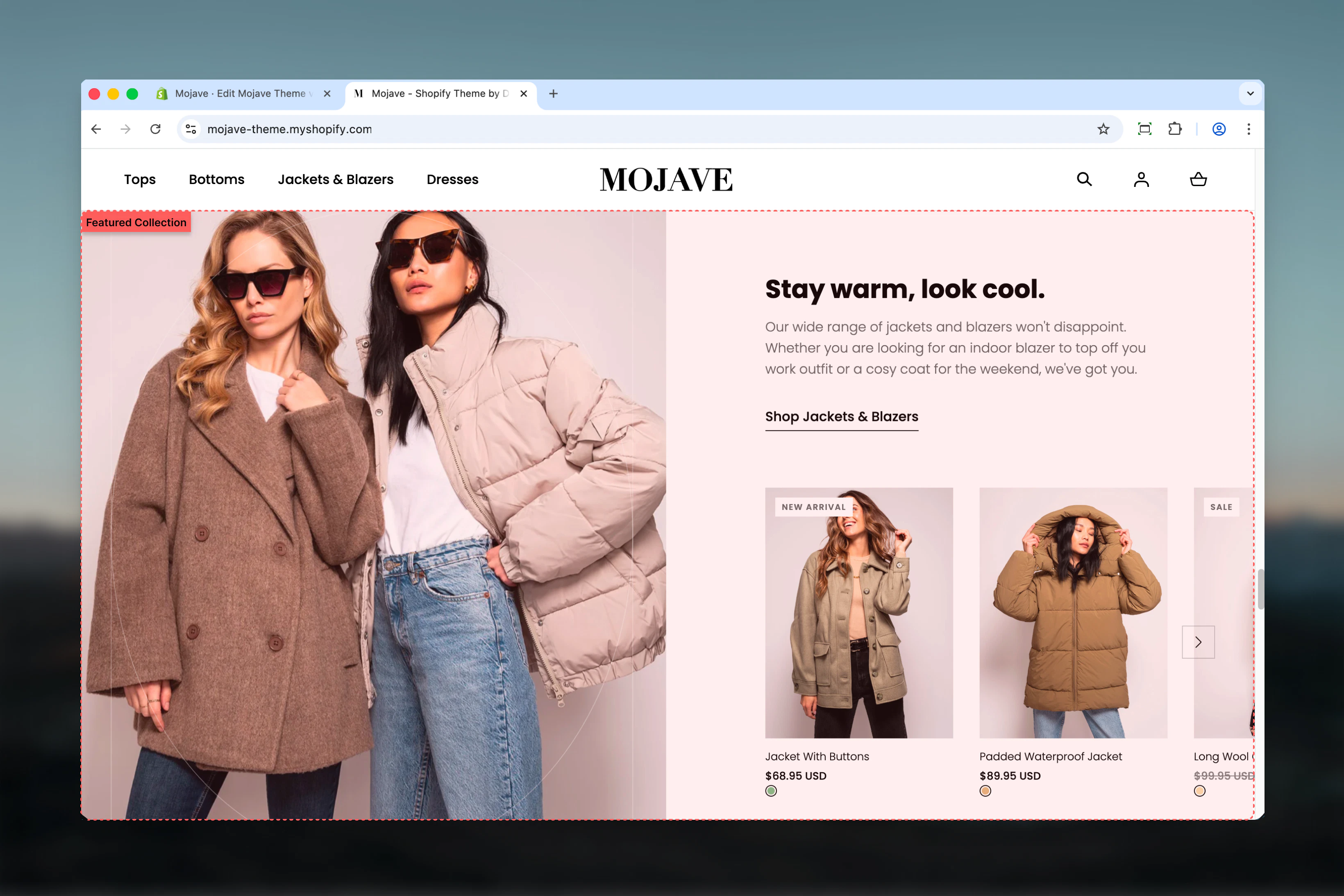
> Promote a collection with a split-screen layout featuring an image, descriptive text, and a grid of products from your selected collection
## What this section does
The **Featured Collection** section creates an editorial-style promotional display for any collection in your store. It combines:
* A large promotional image with customizable height and border effects
* Heading and subheading text to introduce the collection
* A grid of products pulled directly from the selected collection
* A call-to-action button linking to the full collection
This section is perfect for highlighting seasonal collections, new arrivals, or featured product categories on your homepage or landing pages.
 ## Getting started
From the Theme Customizer, click **Add section** and select **Featured collection**
Upload a promotional image (1440x1720px recommended), add your heading and subheading text, then select the collection to feature
Set the number of products to display (4-10) and toggle the flip setting to position content on left or right side
## Section settings
**Image picker** — Upload or select a promotional image for the collection
* Recommended size: 1440x1720px
* Appears on one side of the split-screen layout
* Should be high-quality lifestyle imagery that represents the collection
**Image Height** — Range slider: 50-100% (default: 100%)
* Controls the height of the featured image relative to section height
* 100% = image fills the full section height
* Lower values create shorter, more compact image display
**Checkbox** (default: unchecked)
Reverses the layout to swap positions of image and text content:
* Unchecked: Image on left, content on right
* Checked: Content on left, image on right
Use when stacking multiple featured sections to create visual variety.
**Checkbox** (default: checked)
Adds a decorative border effect around the featured image for enhanced visual separation.
**Textarea** (default: "Featured collection")
Main heading that introduces the collection. Keep concise (3-5 words) for maximum impact.
**Textarea** (default: "Pair text with an image to focus on your collection. Add details on availability, style, or even provide a review.")
Descriptive text that provides context about the collection—describe the style, occasion, features, or benefits.
**Text field** (default: "Shop all")
Text displayed on the call-to-action button.
**URL field** (default: /collections)
Destination URL for the button. Typically links to the full collection page.
**Collection picker** — Select which Shopify collection to display products from
Products are automatically pulled from the selected collection based on your collection's sort order.
**Range slider** — 4 to 10 products (default: 6)
Controls how many products from the collection are displayed in the grid.
* 4-6 products: Recommended for most layouts
* 7-10 products: Use when you have more vertical space
**Dropdown** (default: Default)
Controls vertical spacing above and below the section on desktop devices:
* **Default** — Standard spacing for balanced layouts
* **Medium** — Moderate spacing for tighter designs
* **Compact** — Minimal spacing when sections should sit close together
* **None** — No spacing for edge-to-edge layouts
**Dropdown** (default: Compact)
Controls vertical spacing above and below the section on mobile devices:
* **Default** — Standard mobile spacing
* **Compact** — Reduced spacing (default for mobile-optimized design)
* **None** — No spacing for seamless mobile layouts
## Best practices
Upload images at 1440x1720px for sharp display. Use lifestyle photography that represents your collection's style and appeals to your target audience.
Limit headings to 3-5 words for maximum impact. Use the subheading field for longer descriptions and collection details.
Display 6 products by default for balanced visual weight. Use fewer (4) for more focus or more (8-10) when featuring large collections.
When stacking multiple sections, alternate the flip setting to create a flowing, magazine-style layout that guides the eye.
Set the Link URL to point to the actual collection page so customers can explore all products after viewing the preview.
Use consistent spacing settings across sections for cohesive page rhythm. Compact works well for mobile, Default for desktop.
Try border enabled/disabled based on your image style. Borders work best with product photography, less so with lifestyle images.
Refresh the featured collection, image, and text with new seasonal collections to keep your homepage content current and relevant.
## Common use cases
**Homepage collection promotion** — Feature your best-selling or newest collection on the homepage with compelling imagery and a direct CTA
**Seasonal campaigns** — Highlight holiday, seasonal, or limited-time collections with timely images and copy that create urgency
**Category introduction** — Use on category landing pages to introduce and provide context for the products customers will see below
**Editorial storytelling** — Create a magazine-style brand experience by combining high-quality imagery with narrative text about your collections
## Layout behavior
**Desktop**: The section displays in a split-screen layout with the image on one side and text content (heading, subheading, CTA) on the other. Products appear in a grid below. Use the flip setting to reverse the image/content positions.
**Mobile**: The layout stacks vertically with the image at the top, followed by text content, then the product grid. The flip setting does not affect mobile layout.
## Related sections
* **Featured Products** — Display a curated list of specific products instead of pulling from a collection
* **Featured Collections Links** — Promote multiple collections at once with a tile-based layout
* **Featured Articles** — Similar editorial layout but for blog content instead of products
## Getting started
From the Theme Customizer, click **Add section** and select **Featured collection**
Upload a promotional image (1440x1720px recommended), add your heading and subheading text, then select the collection to feature
Set the number of products to display (4-10) and toggle the flip setting to position content on left or right side
## Section settings
**Image picker** — Upload or select a promotional image for the collection
* Recommended size: 1440x1720px
* Appears on one side of the split-screen layout
* Should be high-quality lifestyle imagery that represents the collection
**Image Height** — Range slider: 50-100% (default: 100%)
* Controls the height of the featured image relative to section height
* 100% = image fills the full section height
* Lower values create shorter, more compact image display
**Checkbox** (default: unchecked)
Reverses the layout to swap positions of image and text content:
* Unchecked: Image on left, content on right
* Checked: Content on left, image on right
Use when stacking multiple featured sections to create visual variety.
**Checkbox** (default: checked)
Adds a decorative border effect around the featured image for enhanced visual separation.
**Textarea** (default: "Featured collection")
Main heading that introduces the collection. Keep concise (3-5 words) for maximum impact.
**Textarea** (default: "Pair text with an image to focus on your collection. Add details on availability, style, or even provide a review.")
Descriptive text that provides context about the collection—describe the style, occasion, features, or benefits.
**Text field** (default: "Shop all")
Text displayed on the call-to-action button.
**URL field** (default: /collections)
Destination URL for the button. Typically links to the full collection page.
**Collection picker** — Select which Shopify collection to display products from
Products are automatically pulled from the selected collection based on your collection's sort order.
**Range slider** — 4 to 10 products (default: 6)
Controls how many products from the collection are displayed in the grid.
* 4-6 products: Recommended for most layouts
* 7-10 products: Use when you have more vertical space
**Dropdown** (default: Default)
Controls vertical spacing above and below the section on desktop devices:
* **Default** — Standard spacing for balanced layouts
* **Medium** — Moderate spacing for tighter designs
* **Compact** — Minimal spacing when sections should sit close together
* **None** — No spacing for edge-to-edge layouts
**Dropdown** (default: Compact)
Controls vertical spacing above and below the section on mobile devices:
* **Default** — Standard mobile spacing
* **Compact** — Reduced spacing (default for mobile-optimized design)
* **None** — No spacing for seamless mobile layouts
## Best practices
Upload images at 1440x1720px for sharp display. Use lifestyle photography that represents your collection's style and appeals to your target audience.
Limit headings to 3-5 words for maximum impact. Use the subheading field for longer descriptions and collection details.
Display 6 products by default for balanced visual weight. Use fewer (4) for more focus or more (8-10) when featuring large collections.
When stacking multiple sections, alternate the flip setting to create a flowing, magazine-style layout that guides the eye.
Set the Link URL to point to the actual collection page so customers can explore all products after viewing the preview.
Use consistent spacing settings across sections for cohesive page rhythm. Compact works well for mobile, Default for desktop.
Try border enabled/disabled based on your image style. Borders work best with product photography, less so with lifestyle images.
Refresh the featured collection, image, and text with new seasonal collections to keep your homepage content current and relevant.
## Common use cases
**Homepage collection promotion** — Feature your best-selling or newest collection on the homepage with compelling imagery and a direct CTA
**Seasonal campaigns** — Highlight holiday, seasonal, or limited-time collections with timely images and copy that create urgency
**Category introduction** — Use on category landing pages to introduce and provide context for the products customers will see below
**Editorial storytelling** — Create a magazine-style brand experience by combining high-quality imagery with narrative text about your collections
## Layout behavior
**Desktop**: The section displays in a split-screen layout with the image on one side and text content (heading, subheading, CTA) on the other. Products appear in a grid below. Use the flip setting to reverse the image/content positions.
**Mobile**: The layout stacks vertically with the image at the top, followed by text content, then the product grid. The flip setting does not affect mobile layout.
## Related sections
* **Featured Products** — Display a curated list of specific products instead of pulling from a collection
* **Featured Collections Links** — Promote multiple collections at once with a tile-based layout
* **Featured Articles** — Similar editorial layout but for blog content instead of products