> ## Documentation Index
> Fetch the complete documentation index at: https://docs.digifist.com/llms.txt
> Use this file to discover all available pages before exploring further.
# Featured Products
> Showcase a curated selection of products in a slideshow or grid layout, perfect for highlighting best sellers, new arrivals, or promotional items
## What this section does
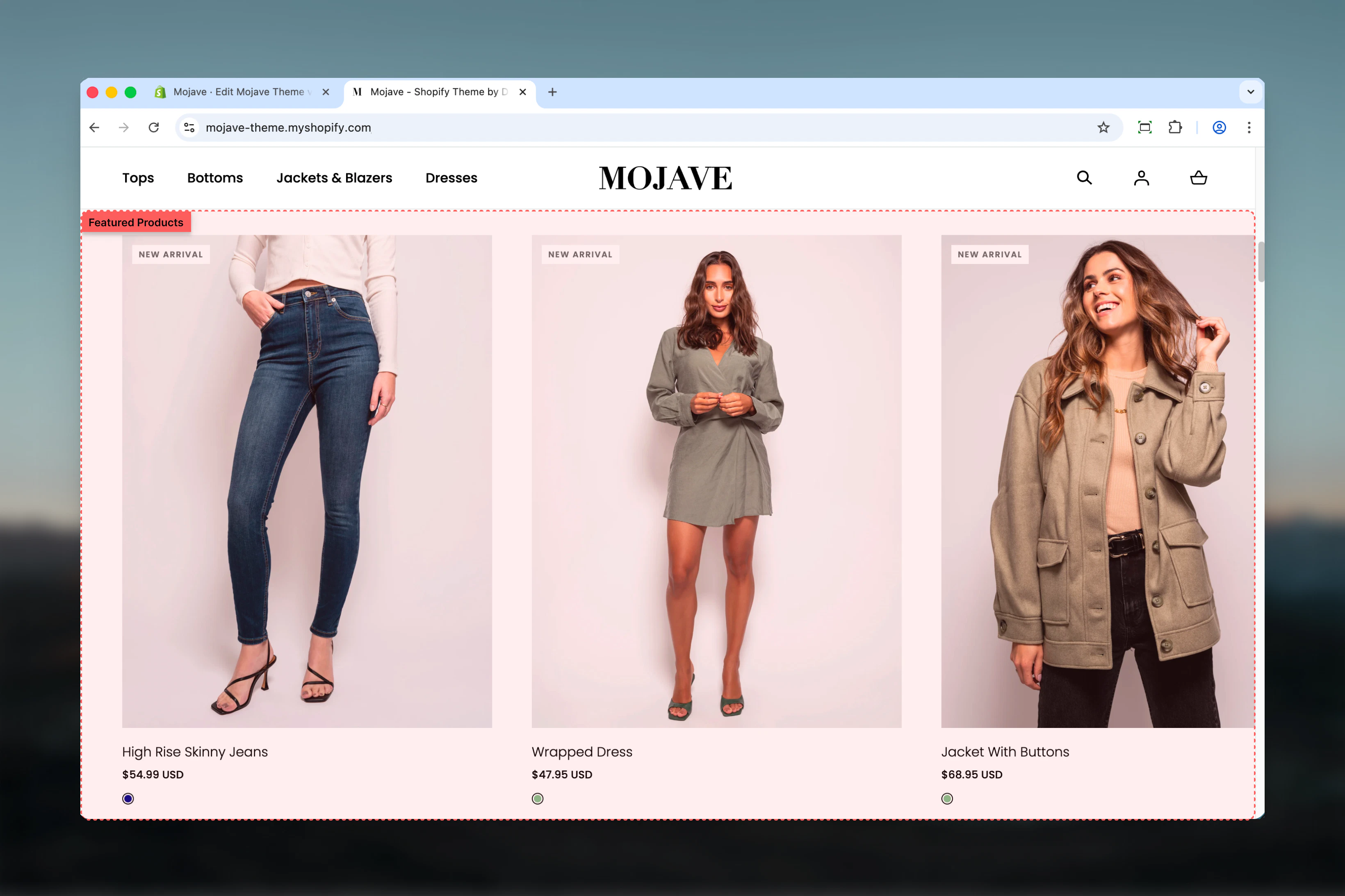
The **Featured Products** section displays a customizable set of products in your choice of slideshow or grid format. You can either:
* Pull products automatically from a selected collection (dynamic)
* Manually choose specific products to feature (curated)
This flexible section is ideal for highlighting trending products, promotional items, best sellers, or new arrivals on your homepage, landing pages, or any page in your theme.
 ## Getting started
From the Theme Customizer, click **Add section** and select **Featured products**
Either select a **Collection** to pull products automatically, OR manually select individual products using the **Products** picker (up to 12)
Choose between **Slider** (carousel) or **Grid** display style, set section width, and adjust spacing to match your page design
## Section settings
**Textarea** (default: "Featured products")
Main heading displayed above the product display. Use to describe the product selection (e.g., "Best Sellers", "New Arrivals", "Staff Picks").
**Collection picker** — Select a Shopify collection to automatically pull products from
* Products display in the collection's configured sort order
* Updates automatically when collection products change
* **Overrides manual product selection** if both are configured
**When to use**: Dynamic product displays that update as your collection changes (e.g., "Best Sellers", "New Arrivals").
**Product list picker** — Manually select up to 12 specific products
* Choose exact products to feature in exact order
* Maximum 12 products
* **Ignored if a Collection is selected above**
**When to use**: Curated, hand-picked product selections that you want full control over (e.g., promotional campaigns, editorial picks).
**Text field** (default: "Explore featured products")
Text displayed on the call-to-action button below the products.
**URL field** (default: /collections)
Destination URL for the CTA button. Typically links to:
* The source collection page (if using Collection setting)
* A relevant category or landing page
* "Shop All" collections page
**Dropdown** (default: Slideshow) — **Desktop only**
Controls how products are displayed on desktop devices:
* **Slideshow** — Products in carousel/slider format with navigation arrows
* **Grid** — Products in static grid layout, all visible at once
Mobile devices always display products as a horizontal scrollable row, regardless of this setting.
**When to use Slideshow**: 6+ products, limited vertical space, or when you want interactive browsing
**When to use Grid**: 3-4 products, when all products should be visible without interaction, or for focused attention
**Dropdown** (default: Page width)
Controls the maximum width of the section container:
* **Page width** — Standard container matching theme page width
* **Narrow** — Tighter, more focused container (medium width)
* **Full width** — Edge-to-edge display spanning entire screen width
**Best practices**:
* **Full width** works best with Slideshow style
* **Narrow** creates focus when featuring 3-4 hero products
* **Page width** balances with other standard-width sections
**Checkbox** (default: checked)
Adds additional vertical spacing between the section elements (heading, products, CTA button) for a more open, refined layout.
* Checked: Increased spacing for airier design
* Unchecked: Compact spacing for denser layouts
Useful when the section sits between other content-heavy sections.
**Dropdown** (default: Default)
Controls vertical spacing above and below the section on desktop devices:
* **Default** — Standard spacing for balanced layouts
* **Medium** — Moderate spacing for tighter designs
* **Compact** — Minimal spacing when sections should sit close together
* **None** — No spacing for seamless, edge-to-edge layouts
**Dropdown** (default: Compact)
Controls vertical spacing above and below the section on mobile devices:
* **Default** — Standard mobile spacing
* **Compact** — Reduced spacing (recommended for mobile)
* **None** — No spacing for seamless mobile layouts
## Best practices
Use **Collection** for dynamic, auto-updating displays (e.g., best sellers). Use **Products** for static, curated selections (e.g., campaign-specific products).
Use Slideshow style when featuring 6+ products to avoid overwhelming the page. Grid works best with 3-4 products for immediate visibility.
Set the Link URL to the source collection page (if using Collection) or a relevant category page so customers can explore more products.
Use Full width with Slideshow for dramatic product showcases. Use Narrow with Grid to focus attention on fewer hero products.
Display 6-8 products in Slideshow or 4 products in Grid for optimal user experience. Too many products can cause decision paralysis.
Refresh featured products or switch collections based on seasons, holidays, or promotional campaigns to keep content relevant.
Use Extra spacing when sandwiched between heavy content sections. Disable it when stacking multiple product sections for tighter layouts.
Use specific headings like "Best Sellers", "New Arrivals", or "Staff Picks" instead of generic "Featured Products" to set context.
## Common use cases
**Homepage hero products** — Feature your best-selling or newest products immediately after the hero banner to capture visitor attention
**Sale/promotional sections** — Manually select products on sale or part of a campaign using the Products picker for full control
**Category highlights** — Pull products from a specific category collection to introduce customers to that product category
**Trending items showcase** — Use a dynamic collection that auto-updates with best-selling or frequently viewed products
**Editorial product stories** — Curate specific products that tell a brand story or follow a theme (e.g., "Summer Essentials", "Gift Ideas")
## Layout behavior
**Desktop - Slideshow style**: Products display in a carousel/slider with navigation arrows. Users can click through products horizontally.
**Desktop - Grid style**: Products display in a static grid layout with all products visible simultaneously.
**Mobile**: Regardless of style setting, products always display as a horizontal scrollable row on mobile devices for optimal touch interaction.
**Product order**: Products appear in the order defined by:
* Collection sort order (if using Collection setting)
* Manual selection order (if using Products setting)
## Related sections
* **Featured Collection** — Display products from a collection with a large promotional image and split-screen layout
* **Recommended Products** — Display AI-powered product recommendations based on customer behavior
* **Recently Viewed** — Show products the customer has recently browsed
## Getting started
From the Theme Customizer, click **Add section** and select **Featured products**
Either select a **Collection** to pull products automatically, OR manually select individual products using the **Products** picker (up to 12)
Choose between **Slider** (carousel) or **Grid** display style, set section width, and adjust spacing to match your page design
## Section settings
**Textarea** (default: "Featured products")
Main heading displayed above the product display. Use to describe the product selection (e.g., "Best Sellers", "New Arrivals", "Staff Picks").
**Collection picker** — Select a Shopify collection to automatically pull products from
* Products display in the collection's configured sort order
* Updates automatically when collection products change
* **Overrides manual product selection** if both are configured
**When to use**: Dynamic product displays that update as your collection changes (e.g., "Best Sellers", "New Arrivals").
**Product list picker** — Manually select up to 12 specific products
* Choose exact products to feature in exact order
* Maximum 12 products
* **Ignored if a Collection is selected above**
**When to use**: Curated, hand-picked product selections that you want full control over (e.g., promotional campaigns, editorial picks).
**Text field** (default: "Explore featured products")
Text displayed on the call-to-action button below the products.
**URL field** (default: /collections)
Destination URL for the CTA button. Typically links to:
* The source collection page (if using Collection setting)
* A relevant category or landing page
* "Shop All" collections page
**Dropdown** (default: Slideshow) — **Desktop only**
Controls how products are displayed on desktop devices:
* **Slideshow** — Products in carousel/slider format with navigation arrows
* **Grid** — Products in static grid layout, all visible at once
Mobile devices always display products as a horizontal scrollable row, regardless of this setting.
**When to use Slideshow**: 6+ products, limited vertical space, or when you want interactive browsing
**When to use Grid**: 3-4 products, when all products should be visible without interaction, or for focused attention
**Dropdown** (default: Page width)
Controls the maximum width of the section container:
* **Page width** — Standard container matching theme page width
* **Narrow** — Tighter, more focused container (medium width)
* **Full width** — Edge-to-edge display spanning entire screen width
**Best practices**:
* **Full width** works best with Slideshow style
* **Narrow** creates focus when featuring 3-4 hero products
* **Page width** balances with other standard-width sections
**Checkbox** (default: checked)
Adds additional vertical spacing between the section elements (heading, products, CTA button) for a more open, refined layout.
* Checked: Increased spacing for airier design
* Unchecked: Compact spacing for denser layouts
Useful when the section sits between other content-heavy sections.
**Dropdown** (default: Default)
Controls vertical spacing above and below the section on desktop devices:
* **Default** — Standard spacing for balanced layouts
* **Medium** — Moderate spacing for tighter designs
* **Compact** — Minimal spacing when sections should sit close together
* **None** — No spacing for seamless, edge-to-edge layouts
**Dropdown** (default: Compact)
Controls vertical spacing above and below the section on mobile devices:
* **Default** — Standard mobile spacing
* **Compact** — Reduced spacing (recommended for mobile)
* **None** — No spacing for seamless mobile layouts
## Best practices
Use **Collection** for dynamic, auto-updating displays (e.g., best sellers). Use **Products** for static, curated selections (e.g., campaign-specific products).
Use Slideshow style when featuring 6+ products to avoid overwhelming the page. Grid works best with 3-4 products for immediate visibility.
Set the Link URL to the source collection page (if using Collection) or a relevant category page so customers can explore more products.
Use Full width with Slideshow for dramatic product showcases. Use Narrow with Grid to focus attention on fewer hero products.
Display 6-8 products in Slideshow or 4 products in Grid for optimal user experience. Too many products can cause decision paralysis.
Refresh featured products or switch collections based on seasons, holidays, or promotional campaigns to keep content relevant.
Use Extra spacing when sandwiched between heavy content sections. Disable it when stacking multiple product sections for tighter layouts.
Use specific headings like "Best Sellers", "New Arrivals", or "Staff Picks" instead of generic "Featured Products" to set context.
## Common use cases
**Homepage hero products** — Feature your best-selling or newest products immediately after the hero banner to capture visitor attention
**Sale/promotional sections** — Manually select products on sale or part of a campaign using the Products picker for full control
**Category highlights** — Pull products from a specific category collection to introduce customers to that product category
**Trending items showcase** — Use a dynamic collection that auto-updates with best-selling or frequently viewed products
**Editorial product stories** — Curate specific products that tell a brand story or follow a theme (e.g., "Summer Essentials", "Gift Ideas")
## Layout behavior
**Desktop - Slideshow style**: Products display in a carousel/slider with navigation arrows. Users can click through products horizontally.
**Desktop - Grid style**: Products display in a static grid layout with all products visible simultaneously.
**Mobile**: Regardless of style setting, products always display as a horizontal scrollable row on mobile devices for optimal touch interaction.
**Product order**: Products appear in the order defined by:
* Collection sort order (if using Collection setting)
* Manual selection order (if using Products setting)
## Related sections
* **Featured Collection** — Display products from a collection with a large promotional image and split-screen layout
* **Recommended Products** — Display AI-powered product recommendations based on customer behavior
* **Recently Viewed** — Show products the customer has recently browsed