> ## Documentation Index
> Fetch the complete documentation index at: https://docs.digifist.com/llms.txt
> Use this file to discover all available pages before exploring further.
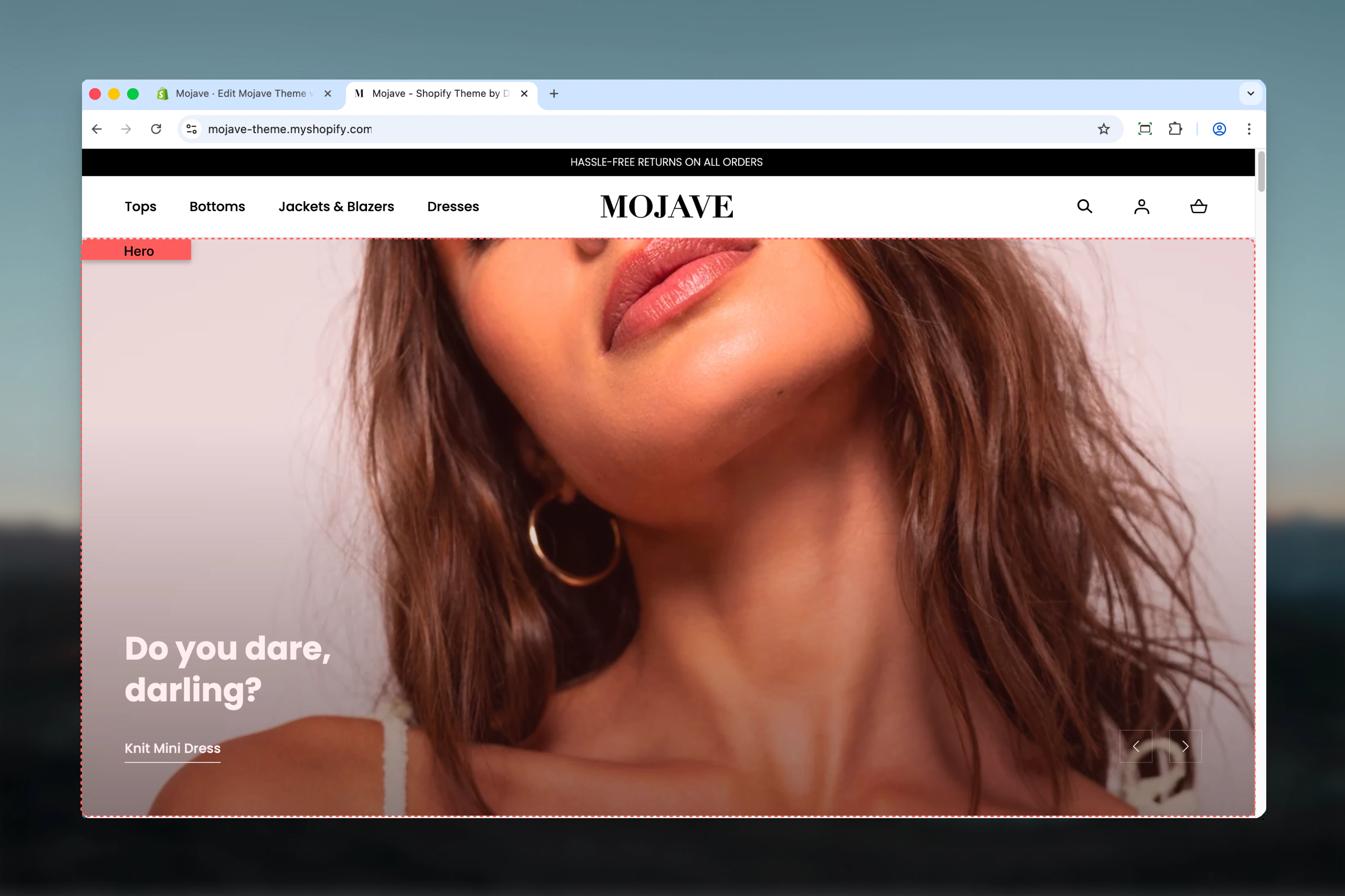
# Hero Banner
> Create dramatic full-width hero banners with carousel capabilities, split-screen layouts, and flexible content areas with images, videos, or solid colors
## What this section does
The **Hero** section creates powerful, attention-grabbing banners at the top of your pages. It supports:
* **Carousel functionality** with multiple rotating slides
* **Three layout modes**: 70/30 split, 50/50 split, or fullwidth
* **Dual content areas** per slide: Main (primary) and Aside (secondary)
* **Media flexibility**: Background images, embedded videos, uploaded videos, or solid colors
* **Responsive design**: Separate mobile images and mobile-first behavior
Each hero slide can feature two distinct zones (Main and Aside) with independent images, text, and calls-to-action, allowing for sophisticated split-screen storytelling or focused fullwidth messaging.
 ## Getting started
From the Theme Customizer, click **Add section** and select **Hero**
Add one or more **Hero slide** blocks (1-3 recommended). Each block represents one carousel slide
For each slide, select your layout: 70/30 (focus on one side), 50/50 (balanced), or Full-width (single dramatic banner)
Upload images for Main and Aside areas, add headings and call-to-action buttons, adjust overlay and alignment settings
## Section settings
**Range slider** — 50% to 100% (default: 100%)
Controls the height of all hero slides in the carousel.
* **100%** (default): Full viewport height for maximum impact
* **75-90%**: Prominent but allows content below to peek through
* **50-70%**: More compact hero that doesn't dominate the page
Applies to all slides in the carousel.
**Checkbox** (default: unchecked)
Automatically rotates through hero slides without user interaction.
* Checked: Slides auto-advance based on autoplay interval
* Unchecked: Users must click navigation arrows to change slides
**Accessibility consideration**: Autoplay can be distracting. Use sparingly and keep intervals long (7+ seconds).
**Range slider** — 3 to 10 seconds (default: 5)
Controls how long each slide displays before auto-advancing to the next.
* **3-4 seconds**: Very fast, only for minimal content
* **5-6 seconds**: Standard speed for most content
* **7-10 seconds**: Slower pace for text-heavy or complex slides
Only applies when autoplay is enabled. Minimum 7 seconds recommended for readability.
**Checkbox** (default: checked)
Shows/hides navigation arrows that users click to manually advance slides.
* Checked: Arrows visible for manual control
* Unchecked: No arrows (rely on autoplay or dots)
Recommended to stay enabled unless using very slow autoplay.
## Block types
### Hero slide block
Add **Hero slide** blocks to create individual carousel slides. Each slide has two potential content areas: Main (primary) and Aside (secondary).
**Dropdown** (default: 70/30)
Controls the screen split ratio between Main and Aside areas:
* **70/30** — Main occupies 70% width, Aside occupies 30%
* **50/50** — Equal split for balanced dual messaging
* **Full-width** — Main only (100% width), Aside settings ignored
**When to use each**:
* **70/30**: Primary content focus with secondary callout
* **50/50**: Side-by-side product comparison or dual campaigns
* **Full-width**: Single, dramatic hero statement without distraction
**Checkbox** (default: unchecked)
Reverses the positions of Main and Aside areas:
* Unchecked: Main on left, Aside on right
* Checked: Aside on left, Main on right
Only applies to 70/30 and 50/50 layouts. Has no effect on Full-width.
Use flip to create visual variety when featuring multiple slides or when layout direction serves your content better.
**Range slider** — 0% to 100% (step: 10%, default: 50%)
Controls the darkness of the Main area overlay placed over background images/videos.
* **0%**: No overlay, full image/video brightness (text must be readable)
* **30-50%**: Moderate overlay for readability while keeping image visible
* **70-100%**: Heavy overlay for maximum text contrast
Adjust based on background image brightness and text color. Darker images need less overlay.
**Dropdown** (default: Bottom)
Positions text vertically within the Main area:
* **Top**: Text at top of Main area
* **Center**: Text centered vertically
* **Bottom**: Text at bottom (classic hero style)
Bottom placement creates grounded, stable hero banners. Center works for minimal content.
**Dropdown** (default: Start/Left)
Positions text horizontally within the Main area:
* **Start** (Left): Left-aligned text
* **Center**: Centered text
* **End** (Right): Right-aligned text
Left alignment is most common. Center works best with Full-width layouts and short text.
**Checkbox** (default: unchecked)
Adds a decorative horizontal line element to the Main area for visual accent.
**Image picker** — Background image for Main area
* **Recommended sizes**:
* Full-width layout: 2880x1400px
* 50/50 layout: 1440x1400px
* 70/30 layout: 2000x1400px
* Serves as background for Main area
* Overlay opacity controls darkness
**Mobile image** (optional)
* **Recommended sizes**:
* Full-width: 720x1500px
* 50/50: 720x760px
* 70/30: 720x1000px
* Optimized for vertical mobile display
* If empty, desktop image is used
Always upload mobile images for portrait-oriented displays that showcase your content better on phones.
**Video URL field** — Embed YouTube or Vimeo video as Main background
* Accepts: YouTube and Vimeo URLs
* Recommended aspect ratio: 16:9
* Replaces image when provided
* Videos loop automatically and are muted
Use for brand videos, product demos, or lifestyle content that adds motion to your hero.
**Video file upload** — Upload video file as Main background
* Upload video directly (MP4 recommended)
* Recommended aspect ratio: 16:9
* Replaces image when provided
* Videos loop automatically
Use self-hosted videos for full control over quality and performance.
**Checkbox** (default: unchecked)
Replaces all media (images/videos) with a solid color background from your theme colors.
* Checked: Uses plain\_background\_color setting
* Unchecked: Uses image/video
Useful for text-heavy hero banners, minimalist designs, or when image/video isn't needed.
**Plain background color** — Dropdown (default: Alternative)
* **Main**: Primary theme color
* **Accent**: Accent theme color
* **Alternative**: Alternative theme color
Only applies when "Enable plain background" is checked.
**Textarea** (default: "Highlight an\nimage banner")
Main heading text for the hero banner. Supports line breaks (press Enter for multi-line).
Keep concise (1-2 lines) for maximum impact and readability over images.
**Link text** (text, default: "Shop all")
* CTA button/link text
**Link URL** (URL, default: /collections)
* Destination for the CTA
Common destinations: collection pages, new arrivals, sale pages, product pages.
**Checkbox** (default: unchecked)
Makes the entire Main area image/video clickable using the Link URL.
* Checked: Clicking anywhere on Main background navigates to Link URL
* Unchecked: Only the Link text/button is clickable
Useful for creating large, tappable hero banners on mobile.
**Link type** (dropdown, default: Link)
* **Link**: Text link with underline
* **Button**: Full button element
**Link style** (dropdown, default: Primary) — Only applies when Link type is "Button"
* **Primary**: Primary button style from theme
* **Secondary**: Secondary button style from theme
Use buttons for high-priority CTAs, links for subtle navigation.
**Dropdown** (default: Center)
Positions text horizontally within the Aside area:
* **Start** (Left): Left-aligned text
* **Center**: Centered text (most common for Aside)
* **End** (Right): Right-aligned text
Center alignment is typical for Aside as it's usually a secondary, smaller area.
**Range slider** — 0% to 100% (step: 10%, default: 100%)
Controls the darkness of the Aside area overlay (similar to Main overlay opacity).
* **0%**: No overlay
* **50%**: Moderate overlay
* **100%**: Full overlay (default for Aside)
Aside typically has heavier overlay (100%) for better text readability in smaller space.
**Checkbox** (default: unchecked)
Adds a decorative horizontal line to the Aside area.
**Image picker** — Background image for Aside area
* **Recommended sizes**:
* 50/50 layout: 1440x1400px
* 70/30 layout: 980x1400px
* Serves as background for Aside area
**Mobile image** (optional)
* **Recommended sizes**:
* 50/50: 720x760px
* 70/30: 720x420px
* Mobile-specific Aside background
Aside area is **hidden on mobile devices**. Aside images only display on desktop/tablet.
**Heading** (textarea, default: "Image banner")
* Main heading for Aside area
* Keep shorter than Main heading
**Subheading** (textarea, default: "Give customers details...")
* Supporting text for Aside area
* Provides context or additional details
**Link text** (text, default: "Shop all")
* CTA text for Aside area
**Link URL** (URL, default: /collections)
* Destination for Aside CTA
Can link to different destination than Main area for dual CTAs.
**Link type** (dropdown, default: Link)
* **Link**: Text link with underline
* **Button**: Full button element
**Link style** (dropdown, default: Primary)
* **Primary**: Primary button style
* **Secondary**: Secondary button style
Independent from Main area link styling—allows for different button styles per area.
## Best practices
Use 1-3 hero slides maximum. Too many slides dilute messaging and reduce engagement. One dramatic slide often outperforms carousels.
Use 70/30 for primary content focus, 50/50 for balanced dual messaging, and Full-width for dramatic single statements.
Always provide mobile-specific images optimized for portrait orientation. Desktop images often crop poorly on mobile.
If using autoplay, set interval to 7+ seconds minimum so users can read content. Faster rotation is disorienting.
Use short, looping videos (10-15 seconds) that are muted. Keep file sizes under 5MB for performance.
Adjust overlay opacity based on image brightness. Dim images need less overlay (20-40%), bright images need more (60-80%).
Keep hero headings to 1-2 lines maximum. Shorter text has more visual impact and is more readable over images.
Remember: Aside area is hidden on mobile. Ensure Main area alone communicates your key message effectively.
## Common use cases
**Homepage hero** — Single fullwidth slide with dramatic imagery and primary CTA to drive visitors into your store
**Campaign promotion** — 70/30 layout with large product image on Main side and promotional text + CTA on Aside
**Product launches** — Carousel with 2-3 slides showcasing different features or colorways of a new product
**Seasonal campaigns** — 50/50 split with seasonal imagery on one side and promotional messaging on the other
**Video storytelling** — Fullwidth layout with brand video background and overlaid heading/CTA
**Dual promotions** — 50/50 layout featuring two different collections or categories with separate CTAs, to promote multiple offerings simultaneously
## Layout behavior
**Desktop/Tablet**:
* **70/30**: Main takes 70% width, Aside takes 30%
* **50/50**: Equal 50/50 split
* **Full-width**: Main spans 100%, Aside hidden
* Flip setting reverses Main/Aside positions
**Mobile** (all layouts):
* Main area displays at 100% width
* **Aside area is completely hidden**
* Main image mobile-specific if provided, otherwise desktop image used
* Content stacks vertically below hero image
**Carousel navigation**:
* Arrows appear on left/right edges (if enabled)
* Dots/indicators appear at bottom center
* Autoplay rotates slides automatically (if enabled)
## Layout comparison
| Layout | Main Width | Aside Width | Best For | Mobile Behavior |
| -------------- | ---------- | ----------- | --------------------------------- | ---------------- |
| **70/30** | 70% | 30% | Primary focus + secondary callout | Main only (100%) |
| **50/50** | 50% | 50% | Balanced dual messaging | Main only (100%) |
| **Full-width** | 100% | Hidden | Single dramatic statement | Main only (100%) |
## Media priority
When multiple media types are configured for Main or Aside, they're applied in this priority order:
1. **Plain background** (if enabled) — overrides all media
2. **Video file** (if uploaded) — overrides external video and images
3. **External video** (if provided) — overrides images
4. **Image** (if uploaded) — fallback media type
## Related sections
* **Featured Collection** — Split-screen section featuring collection with products
* **Images with Text** — Editorial content sections with image/text combinations
* **Banner Fullwidth** — Simpler fullwidth banner without carousel capabilities
## Getting started
From the Theme Customizer, click **Add section** and select **Hero**
Add one or more **Hero slide** blocks (1-3 recommended). Each block represents one carousel slide
For each slide, select your layout: 70/30 (focus on one side), 50/50 (balanced), or Full-width (single dramatic banner)
Upload images for Main and Aside areas, add headings and call-to-action buttons, adjust overlay and alignment settings
## Section settings
**Range slider** — 50% to 100% (default: 100%)
Controls the height of all hero slides in the carousel.
* **100%** (default): Full viewport height for maximum impact
* **75-90%**: Prominent but allows content below to peek through
* **50-70%**: More compact hero that doesn't dominate the page
Applies to all slides in the carousel.
**Checkbox** (default: unchecked)
Automatically rotates through hero slides without user interaction.
* Checked: Slides auto-advance based on autoplay interval
* Unchecked: Users must click navigation arrows to change slides
**Accessibility consideration**: Autoplay can be distracting. Use sparingly and keep intervals long (7+ seconds).
**Range slider** — 3 to 10 seconds (default: 5)
Controls how long each slide displays before auto-advancing to the next.
* **3-4 seconds**: Very fast, only for minimal content
* **5-6 seconds**: Standard speed for most content
* **7-10 seconds**: Slower pace for text-heavy or complex slides
Only applies when autoplay is enabled. Minimum 7 seconds recommended for readability.
**Checkbox** (default: checked)
Shows/hides navigation arrows that users click to manually advance slides.
* Checked: Arrows visible for manual control
* Unchecked: No arrows (rely on autoplay or dots)
Recommended to stay enabled unless using very slow autoplay.
## Block types
### Hero slide block
Add **Hero slide** blocks to create individual carousel slides. Each slide has two potential content areas: Main (primary) and Aside (secondary).
**Dropdown** (default: 70/30)
Controls the screen split ratio between Main and Aside areas:
* **70/30** — Main occupies 70% width, Aside occupies 30%
* **50/50** — Equal split for balanced dual messaging
* **Full-width** — Main only (100% width), Aside settings ignored
**When to use each**:
* **70/30**: Primary content focus with secondary callout
* **50/50**: Side-by-side product comparison or dual campaigns
* **Full-width**: Single, dramatic hero statement without distraction
**Checkbox** (default: unchecked)
Reverses the positions of Main and Aside areas:
* Unchecked: Main on left, Aside on right
* Checked: Aside on left, Main on right
Only applies to 70/30 and 50/50 layouts. Has no effect on Full-width.
Use flip to create visual variety when featuring multiple slides or when layout direction serves your content better.
**Range slider** — 0% to 100% (step: 10%, default: 50%)
Controls the darkness of the Main area overlay placed over background images/videos.
* **0%**: No overlay, full image/video brightness (text must be readable)
* **30-50%**: Moderate overlay for readability while keeping image visible
* **70-100%**: Heavy overlay for maximum text contrast
Adjust based on background image brightness and text color. Darker images need less overlay.
**Dropdown** (default: Bottom)
Positions text vertically within the Main area:
* **Top**: Text at top of Main area
* **Center**: Text centered vertically
* **Bottom**: Text at bottom (classic hero style)
Bottom placement creates grounded, stable hero banners. Center works for minimal content.
**Dropdown** (default: Start/Left)
Positions text horizontally within the Main area:
* **Start** (Left): Left-aligned text
* **Center**: Centered text
* **End** (Right): Right-aligned text
Left alignment is most common. Center works best with Full-width layouts and short text.
**Checkbox** (default: unchecked)
Adds a decorative horizontal line element to the Main area for visual accent.
**Image picker** — Background image for Main area
* **Recommended sizes**:
* Full-width layout: 2880x1400px
* 50/50 layout: 1440x1400px
* 70/30 layout: 2000x1400px
* Serves as background for Main area
* Overlay opacity controls darkness
**Mobile image** (optional)
* **Recommended sizes**:
* Full-width: 720x1500px
* 50/50: 720x760px
* 70/30: 720x1000px
* Optimized for vertical mobile display
* If empty, desktop image is used
Always upload mobile images for portrait-oriented displays that showcase your content better on phones.
**Video URL field** — Embed YouTube or Vimeo video as Main background
* Accepts: YouTube and Vimeo URLs
* Recommended aspect ratio: 16:9
* Replaces image when provided
* Videos loop automatically and are muted
Use for brand videos, product demos, or lifestyle content that adds motion to your hero.
**Video file upload** — Upload video file as Main background
* Upload video directly (MP4 recommended)
* Recommended aspect ratio: 16:9
* Replaces image when provided
* Videos loop automatically
Use self-hosted videos for full control over quality and performance.
**Checkbox** (default: unchecked)
Replaces all media (images/videos) with a solid color background from your theme colors.
* Checked: Uses plain\_background\_color setting
* Unchecked: Uses image/video
Useful for text-heavy hero banners, minimalist designs, or when image/video isn't needed.
**Plain background color** — Dropdown (default: Alternative)
* **Main**: Primary theme color
* **Accent**: Accent theme color
* **Alternative**: Alternative theme color
Only applies when "Enable plain background" is checked.
**Textarea** (default: "Highlight an\nimage banner")
Main heading text for the hero banner. Supports line breaks (press Enter for multi-line).
Keep concise (1-2 lines) for maximum impact and readability over images.
**Link text** (text, default: "Shop all")
* CTA button/link text
**Link URL** (URL, default: /collections)
* Destination for the CTA
Common destinations: collection pages, new arrivals, sale pages, product pages.
**Checkbox** (default: unchecked)
Makes the entire Main area image/video clickable using the Link URL.
* Checked: Clicking anywhere on Main background navigates to Link URL
* Unchecked: Only the Link text/button is clickable
Useful for creating large, tappable hero banners on mobile.
**Link type** (dropdown, default: Link)
* **Link**: Text link with underline
* **Button**: Full button element
**Link style** (dropdown, default: Primary) — Only applies when Link type is "Button"
* **Primary**: Primary button style from theme
* **Secondary**: Secondary button style from theme
Use buttons for high-priority CTAs, links for subtle navigation.
**Dropdown** (default: Center)
Positions text horizontally within the Aside area:
* **Start** (Left): Left-aligned text
* **Center**: Centered text (most common for Aside)
* **End** (Right): Right-aligned text
Center alignment is typical for Aside as it's usually a secondary, smaller area.
**Range slider** — 0% to 100% (step: 10%, default: 100%)
Controls the darkness of the Aside area overlay (similar to Main overlay opacity).
* **0%**: No overlay
* **50%**: Moderate overlay
* **100%**: Full overlay (default for Aside)
Aside typically has heavier overlay (100%) for better text readability in smaller space.
**Checkbox** (default: unchecked)
Adds a decorative horizontal line to the Aside area.
**Image picker** — Background image for Aside area
* **Recommended sizes**:
* 50/50 layout: 1440x1400px
* 70/30 layout: 980x1400px
* Serves as background for Aside area
**Mobile image** (optional)
* **Recommended sizes**:
* 50/50: 720x760px
* 70/30: 720x420px
* Mobile-specific Aside background
Aside area is **hidden on mobile devices**. Aside images only display on desktop/tablet.
**Heading** (textarea, default: "Image banner")
* Main heading for Aside area
* Keep shorter than Main heading
**Subheading** (textarea, default: "Give customers details...")
* Supporting text for Aside area
* Provides context or additional details
**Link text** (text, default: "Shop all")
* CTA text for Aside area
**Link URL** (URL, default: /collections)
* Destination for Aside CTA
Can link to different destination than Main area for dual CTAs.
**Link type** (dropdown, default: Link)
* **Link**: Text link with underline
* **Button**: Full button element
**Link style** (dropdown, default: Primary)
* **Primary**: Primary button style
* **Secondary**: Secondary button style
Independent from Main area link styling—allows for different button styles per area.
## Best practices
Use 1-3 hero slides maximum. Too many slides dilute messaging and reduce engagement. One dramatic slide often outperforms carousels.
Use 70/30 for primary content focus, 50/50 for balanced dual messaging, and Full-width for dramatic single statements.
Always provide mobile-specific images optimized for portrait orientation. Desktop images often crop poorly on mobile.
If using autoplay, set interval to 7+ seconds minimum so users can read content. Faster rotation is disorienting.
Use short, looping videos (10-15 seconds) that are muted. Keep file sizes under 5MB for performance.
Adjust overlay opacity based on image brightness. Dim images need less overlay (20-40%), bright images need more (60-80%).
Keep hero headings to 1-2 lines maximum. Shorter text has more visual impact and is more readable over images.
Remember: Aside area is hidden on mobile. Ensure Main area alone communicates your key message effectively.
## Common use cases
**Homepage hero** — Single fullwidth slide with dramatic imagery and primary CTA to drive visitors into your store
**Campaign promotion** — 70/30 layout with large product image on Main side and promotional text + CTA on Aside
**Product launches** — Carousel with 2-3 slides showcasing different features or colorways of a new product
**Seasonal campaigns** — 50/50 split with seasonal imagery on one side and promotional messaging on the other
**Video storytelling** — Fullwidth layout with brand video background and overlaid heading/CTA
**Dual promotions** — 50/50 layout featuring two different collections or categories with separate CTAs, to promote multiple offerings simultaneously
## Layout behavior
**Desktop/Tablet**:
* **70/30**: Main takes 70% width, Aside takes 30%
* **50/50**: Equal 50/50 split
* **Full-width**: Main spans 100%, Aside hidden
* Flip setting reverses Main/Aside positions
**Mobile** (all layouts):
* Main area displays at 100% width
* **Aside area is completely hidden**
* Main image mobile-specific if provided, otherwise desktop image used
* Content stacks vertically below hero image
**Carousel navigation**:
* Arrows appear on left/right edges (if enabled)
* Dots/indicators appear at bottom center
* Autoplay rotates slides automatically (if enabled)
## Layout comparison
| Layout | Main Width | Aside Width | Best For | Mobile Behavior |
| -------------- | ---------- | ----------- | --------------------------------- | ---------------- |
| **70/30** | 70% | 30% | Primary focus + secondary callout | Main only (100%) |
| **50/50** | 50% | 50% | Balanced dual messaging | Main only (100%) |
| **Full-width** | 100% | Hidden | Single dramatic statement | Main only (100%) |
## Media priority
When multiple media types are configured for Main or Aside, they're applied in this priority order:
1. **Plain background** (if enabled) — overrides all media
2. **Video file** (if uploaded) — overrides external video and images
3. **External video** (if provided) — overrides images
4. **Image** (if uploaded) — fallback media type
## Related sections
* **Featured Collection** — Split-screen section featuring collection with products
* **Images with Text** — Editorial content sections with image/text combinations
* **Banner Fullwidth** — Simpler fullwidth banner without carousel capabilities