> ## Documentation Index
> Fetch the complete documentation index at: https://docs.digifist.com/llms.txt
> Use this file to discover all available pages before exploring further.
# Images with Text
> Create editorial-style content sections with flexible layouts combining images, text, product cards, and interactive product dots
## What this section does
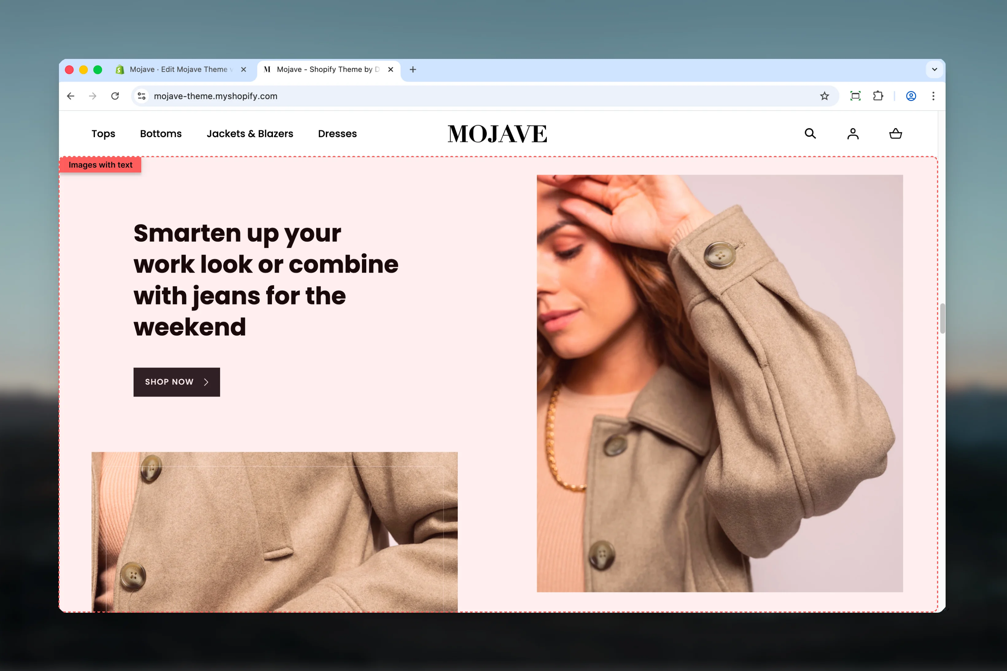
The **Images with text** section creates sophisticated, magazine-style layouts that combine:
* Two media areas (Primary and Secondary) with images or product cards
* Text content with heading, body text, button, and link
* Interactive **product dots** that overlay on images (up to 3 per image)
* Two layout styles: **Columns** (side-by-side) or **Rows** (stacked)
* Fullwidth or contained layouts
This versatile section is perfect for brand storytelling, lookbook-style presentations, category introductions, or any content that benefits from visual+text combinations.
 ## Getting started
From the Theme Customizer, click **Add section** and select **Images with text**
Add images to **Primary media** and **Secondary media** areas (1200x1370px recommended)
Fill in heading, content text, button/link, and choose your layout style (Columns or Rows)
Enable product dots, then add **Primary product dot** or **Secondary product dot** blocks to create interactive hotspots on your images
## Section settings
**Checkbox** (default: unchecked)
Controls section container width:
* Unchecked: Section contained within standard page width
* Checked: Section spans full browser width (edge-to-edge)
Fullwidth creates more dramatic, immersive presentations.
**Checkbox** (default: unchecked)
Reverses the order of media and text content:
* Unchecked: Default arrangement
* Checked: Flipped arrangement
Use to create visual variety when stacking multiple sections.
**Dropdown** (default: Columns)
Controls the layout structure:
* **Columns**: Media and text side-by-side (desktop)
* **Rows**: Media and text stacked vertically
**Columns** is most common for split-screen editorial layouts. **Rows** works for sequential storytelling.
**Desktop** (default: Default) and **Mobile** (default: Compact)
Controls vertical spacing above and below the section:
* **Default**: Standard spacing
* **Medium**: Moderate spacing
* **Compact**: Minimal spacing
* **None**: No spacing
**Textarea** (default: "Images with text")
Main heading for the section. Keep concise (3-7 words) for maximum impact.
**Textarea** (default: "Pair text with an image to focus on your chosen product, collection, or blog post...")
Body text that provides details, descriptions, or storytelling. Can be multiple paragraphs.
**Button label** (text, default: "Shop all")
* Primary CTA text displayed as button
**Button URL** (URL, default: /collections)
* Destination for the button
Buttons create prominent CTAs. Leave empty if not needed.
**Link text** (text, default: "Shop all")
* Secondary CTA text displayed as text link
**Link URL** (URL, default: /collections)
* Destination for the text link
Links provide subtle, secondary navigation. Can be used with or without button.
**Image picker** — Upload primary image
* Recommended size: 1200x1370px
* Typically the larger or more prominent image in thelayout
**Image link URL** (optional)
* Makes the entire primary image clickable
* Links to specified URL when image is clicked
**Image picker** — Upload secondary image
* Recommended size: 1200x1370px
* Typically the smaller or secondary image in the layout
**Image link URL** (optional)
* Makes the entire secondary image clickable
**Enable border effect for image** — Checkbox (default: checked)
* Adds decorative border effect to secondary image only
* Info: "This setting apply only on secondary media"
**Checkbox** (default: unchecked)
Enables interactive product hotspot dots that overlay on images:
* When checked: Product dot blocks can be added (see Block types)
* When unchecked: Product dot blocks are hidden
* Info: "These settings apply on both media"
Product dots create "shop the look" style interactive images where customers can click on products within lifestyle imagery.
## Block types
### Primary product dot
**Limit: 3 blocks**
**Product picker** — Select product to display in hotspot
When clicked, displays a quick view popup of the selected product.
**Range slider** — 0% to 100% (default: 25%)
Horizontal position of the dot on the **primary image**:
* 0% = Far left edge
* 50% = Center
* 100% = Far right edge
**Range slider** — 0% to 100% (default: 25%)
Vertical position of the dot on the **primary image**:
* 0% = Top edge
* 50% = Middle
* 100% = Bottom edge
**Add up to 3 primary product dots** to place multiple products on the primary image.
### Secondary product dot
**Limit: 3 blocks**
Identical to Primary product dot, but places hotspots on the **secondary image** instead.
Same configuration as Primary product dot, but applied to the secondary image.
**Add up to 3 secondary product dots** to place multiple products on the secondary image.
## Best practices
Use Columns style for classic split-screen editorial layouts with images on one side, text on other. Most versatile option.
Use Rows style when you want sequential, stacked presentation—ideal for step-by-step narratives or vertically-focused designs.
Use 1-2 product dots per image maximum. Too many dots create visual clutter and decision paralysis.
Upload images at 1200x1370px for sharp display. Use lifestyle photography that tells a story and shows products in context.
When stacking multiple sections, alternate flip setting to create flowing, magazine-style layouts that prevent monotony.
The border effect only applies to secondary images—use it to differentiate or highlight that image within the layout.
Use button for primary CTA, text link for secondary navigation. Or use just one based on hierarchy needs.
Enable fullwidth for showcase-style sections that should dominate the page. Disable for sections within broader content flows.
## Common use cases
**Lookbook/Shop the look** — Enable product dots on lifestyle images to create interactive "shop the look" sections where customers click dots to view products
**Brand storytelling** — Use columns layout with brand imagery and text to tell your brand story, mission, or values
**Category introduction** — Place at top of collection pages with category imagery and descriptive text
**Feature highlights** — Showcase product features or benefits with supporting imagery in rows layout
**Editorial content** — Create magazine-style content sections with high-quality photography and formatted text
**Product comparisons** — Use two images side-by-side with text comparing products or highlighting differences
## Layout behavior
**Desktop - Columns style**:
* Media and text arranged side-by-side
* Flip setting controls which side each appears on
* Primary and secondary media can be images or product cards
**Desktop - Rows style**:
* All content stacks vertically
* Media, then text, in sequential order
* Flip may affect stacking order
**Mobile (all styles)**:
* Always stacks vertically
* Typically: Primary media → Secondary media → Text content
* Flip setting may not affect mobile layout
**Product dots**:
* Clickable hotspots overlaid on images
* Show product quickview popup on click or hover
* Position controlled by X/Y percentage values
* Up to 6 total dots (3 primary + 3 secondary)
## Product dots feature
The **product dots** feature creates interactive "shop the look" style sections:
1. **Enable product dots** in section settings
2. Add **Primary product dot** blocks for dots on primary image (max 3)
3. Add **Secondary product dot** blocks for dots on secondary image (max 3)
4. For each dot:
* Select a product
* Set X position (horizontal: 0-100%)
* Set Y position (vertical: 0-100%)
5. Dots appear as clickable hotspots on images
6. Clicking dot shows product quick view popup
**Best for**: Lifestyle imagery where products are visible in context (e.g., styled room, model wearing outfit, table setting with products).
## Related sections
* **Featured Collection** — Similar split-screen layout for collection promotion
* **Hero** — Dramatic banners with background images and text overlays
* **Multi Column Text** — Text-focused content in multiple columns
* **Banner Fullwidth** — Simpler fullwidth promotional banners
## Getting started
From the Theme Customizer, click **Add section** and select **Images with text**
Add images to **Primary media** and **Secondary media** areas (1200x1370px recommended)
Fill in heading, content text, button/link, and choose your layout style (Columns or Rows)
Enable product dots, then add **Primary product dot** or **Secondary product dot** blocks to create interactive hotspots on your images
## Section settings
**Checkbox** (default: unchecked)
Controls section container width:
* Unchecked: Section contained within standard page width
* Checked: Section spans full browser width (edge-to-edge)
Fullwidth creates more dramatic, immersive presentations.
**Checkbox** (default: unchecked)
Reverses the order of media and text content:
* Unchecked: Default arrangement
* Checked: Flipped arrangement
Use to create visual variety when stacking multiple sections.
**Dropdown** (default: Columns)
Controls the layout structure:
* **Columns**: Media and text side-by-side (desktop)
* **Rows**: Media and text stacked vertically
**Columns** is most common for split-screen editorial layouts. **Rows** works for sequential storytelling.
**Desktop** (default: Default) and **Mobile** (default: Compact)
Controls vertical spacing above and below the section:
* **Default**: Standard spacing
* **Medium**: Moderate spacing
* **Compact**: Minimal spacing
* **None**: No spacing
**Textarea** (default: "Images with text")
Main heading for the section. Keep concise (3-7 words) for maximum impact.
**Textarea** (default: "Pair text with an image to focus on your chosen product, collection, or blog post...")
Body text that provides details, descriptions, or storytelling. Can be multiple paragraphs.
**Button label** (text, default: "Shop all")
* Primary CTA text displayed as button
**Button URL** (URL, default: /collections)
* Destination for the button
Buttons create prominent CTAs. Leave empty if not needed.
**Link text** (text, default: "Shop all")
* Secondary CTA text displayed as text link
**Link URL** (URL, default: /collections)
* Destination for the text link
Links provide subtle, secondary navigation. Can be used with or without button.
**Image picker** — Upload primary image
* Recommended size: 1200x1370px
* Typically the larger or more prominent image in thelayout
**Image link URL** (optional)
* Makes the entire primary image clickable
* Links to specified URL when image is clicked
**Image picker** — Upload secondary image
* Recommended size: 1200x1370px
* Typically the smaller or secondary image in the layout
**Image link URL** (optional)
* Makes the entire secondary image clickable
**Enable border effect for image** — Checkbox (default: checked)
* Adds decorative border effect to secondary image only
* Info: "This setting apply only on secondary media"
**Checkbox** (default: unchecked)
Enables interactive product hotspot dots that overlay on images:
* When checked: Product dot blocks can be added (see Block types)
* When unchecked: Product dot blocks are hidden
* Info: "These settings apply on both media"
Product dots create "shop the look" style interactive images where customers can click on products within lifestyle imagery.
## Block types
### Primary product dot
**Limit: 3 blocks**
**Product picker** — Select product to display in hotspot
When clicked, displays a quick view popup of the selected product.
**Range slider** — 0% to 100% (default: 25%)
Horizontal position of the dot on the **primary image**:
* 0% = Far left edge
* 50% = Center
* 100% = Far right edge
**Range slider** — 0% to 100% (default: 25%)
Vertical position of the dot on the **primary image**:
* 0% = Top edge
* 50% = Middle
* 100% = Bottom edge
**Add up to 3 primary product dots** to place multiple products on the primary image.
### Secondary product dot
**Limit: 3 blocks**
Identical to Primary product dot, but places hotspots on the **secondary image** instead.
Same configuration as Primary product dot, but applied to the secondary image.
**Add up to 3 secondary product dots** to place multiple products on the secondary image.
## Best practices
Use Columns style for classic split-screen editorial layouts with images on one side, text on other. Most versatile option.
Use Rows style when you want sequential, stacked presentation—ideal for step-by-step narratives or vertically-focused designs.
Use 1-2 product dots per image maximum. Too many dots create visual clutter and decision paralysis.
Upload images at 1200x1370px for sharp display. Use lifestyle photography that tells a story and shows products in context.
When stacking multiple sections, alternate flip setting to create flowing, magazine-style layouts that prevent monotony.
The border effect only applies to secondary images—use it to differentiate or highlight that image within the layout.
Use button for primary CTA, text link for secondary navigation. Or use just one based on hierarchy needs.
Enable fullwidth for showcase-style sections that should dominate the page. Disable for sections within broader content flows.
## Common use cases
**Lookbook/Shop the look** — Enable product dots on lifestyle images to create interactive "shop the look" sections where customers click dots to view products
**Brand storytelling** — Use columns layout with brand imagery and text to tell your brand story, mission, or values
**Category introduction** — Place at top of collection pages with category imagery and descriptive text
**Feature highlights** — Showcase product features or benefits with supporting imagery in rows layout
**Editorial content** — Create magazine-style content sections with high-quality photography and formatted text
**Product comparisons** — Use two images side-by-side with text comparing products or highlighting differences
## Layout behavior
**Desktop - Columns style**:
* Media and text arranged side-by-side
* Flip setting controls which side each appears on
* Primary and secondary media can be images or product cards
**Desktop - Rows style**:
* All content stacks vertically
* Media, then text, in sequential order
* Flip may affect stacking order
**Mobile (all styles)**:
* Always stacks vertically
* Typically: Primary media → Secondary media → Text content
* Flip setting may not affect mobile layout
**Product dots**:
* Clickable hotspots overlaid on images
* Show product quickview popup on click or hover
* Position controlled by X/Y percentage values
* Up to 6 total dots (3 primary + 3 secondary)
## Product dots feature
The **product dots** feature creates interactive "shop the look" style sections:
1. **Enable product dots** in section settings
2. Add **Primary product dot** blocks for dots on primary image (max 3)
3. Add **Secondary product dot** blocks for dots on secondary image (max 3)
4. For each dot:
* Select a product
* Set X position (horizontal: 0-100%)
* Set Y position (vertical: 0-100%)
5. Dots appear as clickable hotspots on images
6. Clicking dot shows product quick view popup
**Best for**: Lifestyle imagery where products are visible in context (e.g., styled room, model wearing outfit, table setting with products).
## Related sections
* **Featured Collection** — Similar split-screen layout for collection promotion
* **Hero** — Dramatic banners with background images and text overlays
* **Multi Column Text** — Text-focused content in multiple columns
* **Banner Fullwidth** — Simpler fullwidth promotional banners