> ## Documentation Index
> Fetch the complete documentation index at: https://docs.digifist.com/llms.txt
> Use this file to discover all available pages before exploring further.
# Marquees
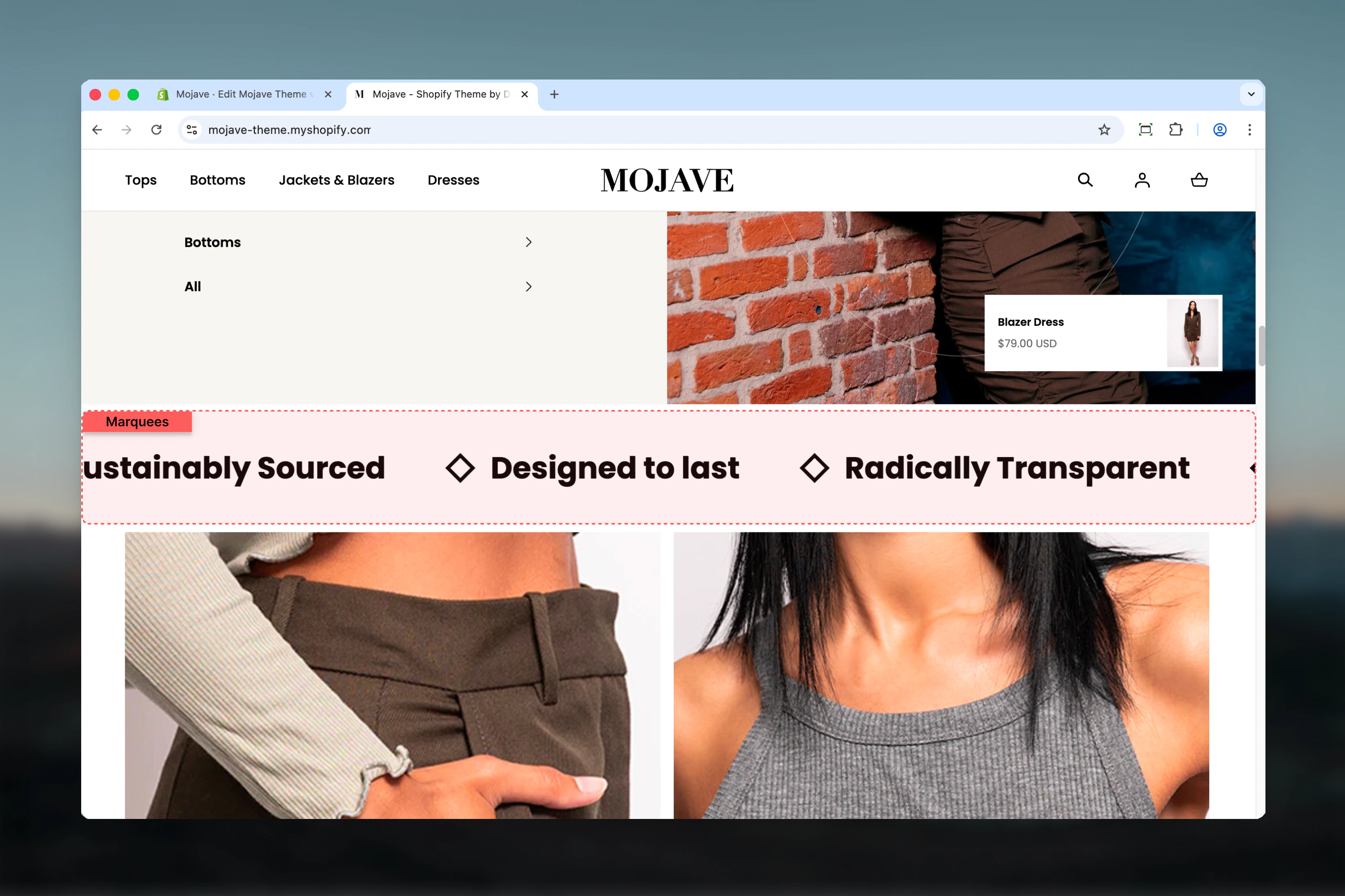
> Create animated scrolling text banners with optional icons and links, perfect for announcements, trust badges, or promotional messaging
## What this section does
The **Marquees** section creates horizontally scrolling text banners with continuous animation, perfect for announcements, trust indicators, or repeated messaging. Features include:
* **Unlimited text items** with optional icons and links
* **Continuous horizontal scrolling** animation (or static display)
* **Adjustable animation speed**: 1-10 (slower to faster)
* **Element sizing**: Control text/icon size (1-6 scale)
* **Element spacing**: Control distance between items
* **Four background colors**: Body, Main, Accent, Alternative
* Fullwidth default container (or contained)
* Desktop/mobile spacing controls
Perfect for announcements, shipping offers, trust badges, brand values, promotional messaging, or any content that benefits from continuous visibility.
 ## Getting started
From the Theme Customizer, click **Add section** and select **Marquees**
Click **Add Text item** block. Each block creates one scrolling element. Add 3-8 items for optimal marquee effect.
Enable animation and adjust speed (1-10) and element size/spacing for desired visual impact
Upload icons (images) for each item to create visual interest and brand recognition
## Section settings
**Checkbox** (default: checked)
Controls whether marquee items scroll horizontally:
* Checked: Items scroll continuously from right to left (default)
* Unchecked: Items display statically (no animation)
**Info**: "Enable to animate the marquees."
Disable for static trust badges or features. Enable for announcements and promotional content.
**Range**: 1-10 (default: 5)
Controls the scrolling speed:
* **1**: Fastest scrolling
* **5**: Medium speed (default, balanced)
* **10**: Slowest scrolling
**Info**: "The higher the number, the slower the animation."
Higher numbers = SLOWER animation. Adjust based on text length and readability needs.
**Range**: 1-6 (default: 1)
Controls the size of text and icons on desktop/tablet:
* **1**: Smallest (default)
* **3**: Medium
* **6**: Largest
**Info**: "Desktop and tablet only. Mobile will be set automatically."
Larger sizes create more prominent banners. Smaller sizes work for subtle trust indicators.
**Range**: 0-6 (step: 0.4, default: 4.8)
Controls the horizontal distance between marquee items on desktop/tablet:
* **0**: No spacing (items touching)
* **4.8**: Default spacing
* **6**: Maximum spacing
**Info**: "Desktop and tablet only."
More spacing creates breathing room. Less spacing creates a denser, more continuous effect.
**Dropdown** (default: Body)
Section background color:
* **Body**: Default body background (default)
* **Main**: Primary theme color
* **Accent**: Accent theme color
* **Alternative**: Alternative theme color
Choose contrasting colors for visibility. Accent/Main work well for promotional marquees. Body for subtle trust badges.
**Desktop** (default: Default) and **Mobile** (default: Compact)
Vertical spacing above and below the section:
* **Default**: Standard spacing
* **Medium**: Moderate spacing
* **Compact**: Minimal spacing
* **None**: No spacing
Mobile options: Default, Compact, None.
**Dropdown** (default: Default)
Controls directional vertical spacing (both desktop and mobile):
* **Default**: Spacing both top and bottom (default)
* **Top none**: No spacing at top, spacing at bottom
* **Bottom none**: No spacing at bottom, spacing at top
**Info**: "Use this setting if you do not want any space at the top or bottom. For desktop and mobile."
Use to attach marquee flush to adjacent sections (e.g., below header or above footer).
**Dropdown** (default: Fullwidth)
Container width for the section:
* **Page**: Standard page width
* **Narrow**: Medium width
* **Fullwidth**: Edge-to-edge (default)
Fullwidth (default) creates maximum marquee impact and continuous edge-to-edge scrolling.
## Block: Text item
**Type**: item (unlimited blocks)
Each block creates one marquee element with optional icon and link.
**Image picker** (optional)
Custom icon/image displayed before the text:
* Use small icons (50x50px to 100x100px recommended)
* Common: trust badges, logos, icons, emojis
* Scales based on Element size setting
Icons add visual interest and brand recognition. Leave blank for text-only marquee items.
**Text field** (required)
The text content for this marquee item.
Examples:
* "Free Shipping on Orders \$50+"
* "Trusted by 10,000+ Customers"
* "Made in USA"
* "30-Day Money Back Guarantee"
Keep concise (3-8 words) for readability during scroll.
**URL field** (optional)
Makes the entire marquee item clickable:
* Links to collection, product, page, or external URL
* Entire item (icon + text) becomes clickable area
Use for promotional messaging that drives action (e.g., "Flash Sale - Shop Now" → /collections/sale).
## Best practices
Too few items (1-2) creates obvious repetition. 3-8 items creates seamless continuous scrolling without repetitive feel.
Keep all items similar text length. Mixed short/long creates uneven rhythm and awkward spacing during scrolling.
Set speed 4-6 for announcements (readable). Use 1-3 for ambient effects or repeated branding (faster).
Use icons for trust badges (checkmark, shield) or brand elements. Consistent icon style across all items.
Keep default Fullwidth setting. Contained marquees feel cramped and lose the continuous scroll effect.
Use Accent or Main background for promotional marquees to stand out. Body for subtle trust indicators.
Use "Spacing - Vertical: Bottom none" when placing marquee immediately above footer for seamless design.
Don't make all items clickable. Reserve links for promotional items that drive specific actions.
## Common use cases
**Announcement banner** — Below header, fullwidth, Main/Accent background: "Free Shipping Today Only • Flash Sale 50% Off • Limited Time Offer"
**Trust indicators** — Above footer, Body background, static (no animation): "100% Secure Checkout • Free Returns • 24/7 Support • Made in USA"
**Shipping offers** — Homepage or cart page: "Free Shipping \$50+ • Express Delivery Available • Ships Within 24 Hours"
**Brand values** — About page or homepage: "Sustainable Materials • Ethically Made • Carbon Neutral • Give Back Program"
**Product features** — PLP/Collection pages: "Waterproof • Lifetime Warranty • Machine Washable • Vegan Leather"
**Social proof** — Homepage: "Trusted by 10K+ Customers • 5-Star Rated • Featured in \[Magazine] • Award Winning"
## Layout behavior
**Desktop - Animation enabled**:
* Items scroll continuously from right to left
* Seamless loop (last item connects to first)
* Speed controlled by Animation speed setting (1-10)
* Items repeat to fill viewport width
* Hover: Animation pauses (optional theme behavior)
**Desktop - Animation disabled**:
* Items display statically in horizontal row
* No scrolling or movement
* Useful for static trust badges or features
**Mobile**:
* Same scrolling behavior as desktop
* Element size auto-adjusts for mobile (smaller)
* Element spacing can differ from desktop
* Always fullwidth regardless of Section width setting
**Scrolling mechanics**:
* Infinite loop: Content duplicates to create seamless scroll
* No start/end: Continuous cycle
* Consistent speed throughout
## Content guidelines
**Heading text**:
* 3-8 words ideal for readability
* Use action words for promotional content ("Shop Now", "Save Today")
* Use trust language for badges ("Guaranteed", "Certified", "Trusted")
* ALL CAPS optional for emphasis (use sparingly)
* Avoid punctuation except essential symbols (%, \$, +)
**Icon selection**:
* Small, simple icons (50x50 to 100x100px)
* Consistent style across all items (all line icons or all filled)
* High contrast with background
* SVG format preferred—upload as PNG if needed with transparent background
**Item variety**:
* Mix related content: "Free Shipping" + "Easy Returns" + "Secure Checkout"
* Group thematically: All shipping offers OR all trust badges OR all brand values
* Avoid mixing unrelated topics (shipping + social proof + product features)
## Customization tips
**For announcement banner (below header)**:
* Enable animation, speed 5-6
* Background: Accent (high contrast)
* Section width: Fullwidth
* Spacing vertical: Top none (flush with header)
* Content: Promotional offers with links
**For trust indicator bar (above footer)**:
* Disable animation (static display)
* Background: Body (subtle)
* Element size: 2-3 (prominent but not overwhelming)
* Small icons (shields, checkmarks, badges)
* Content: Security, support, quality guarantees
**For product feature tags**:
* Enable animation, speed 4 (readable)
* Background: Alternative or Accent
* Element size: 1-2 (compact)
* No icons (text-only)
* Content: Product features and benefits
**For brand storytelling**:
* Enable animation, speed 7-8 (slow, readable)
* Background: Main
* Element size: 4-5 (large, statement-making)
* Brand logo icons
* Content: Brand values and mission
## Related sections
* **Announcement Bar** (structural) — Header-attached announcement (often above header)
* **Rich Text** — Static text content alternative without animation
* **Content Tiles** — Grid-based content displays
* **Trust Indicators** — Dedicated trust badge section (if available in theme)
## Technical notes
**Infinite scroll mechanism**: Marquee duplicates content multiple times to create seamless loop. As items scroll off-screen left, identical items appear from right.
**Animation performance**: CSS-based animation for smooth 60fps performance. Hardware accelerated on modern browsers.
**Pause on hover**: Theme may include pause-on-hover behavior for accessibility and readability. Users can hover to read content before it scrolls away.
**Mobile auto-sizing**: Element size setting only affects desktop/tablet. Mobile automatically scales down to fit screen, typically 50-70% of desktop size.
**Accessibility**: Ensure animation speed allows readable content. Consider providing static version or pause control for users with motion sensitivity. Screen readers read content linearly regardless of animation.
**Speed calculation**: Speed represents animation duration multiplier. Higher number = longer duration = slower movement. Speed 10 is approximately 10x slower than speed 1.
**Item repetition**: Section automatically calculates how many times to duplicate items based on viewport width and animation state. Typically duplicates 2-3 times for seamless infinite effect.
## Getting started
From the Theme Customizer, click **Add section** and select **Marquees**
Click **Add Text item** block. Each block creates one scrolling element. Add 3-8 items for optimal marquee effect.
Enable animation and adjust speed (1-10) and element size/spacing for desired visual impact
Upload icons (images) for each item to create visual interest and brand recognition
## Section settings
**Checkbox** (default: checked)
Controls whether marquee items scroll horizontally:
* Checked: Items scroll continuously from right to left (default)
* Unchecked: Items display statically (no animation)
**Info**: "Enable to animate the marquees."
Disable for static trust badges or features. Enable for announcements and promotional content.
**Range**: 1-10 (default: 5)
Controls the scrolling speed:
* **1**: Fastest scrolling
* **5**: Medium speed (default, balanced)
* **10**: Slowest scrolling
**Info**: "The higher the number, the slower the animation."
Higher numbers = SLOWER animation. Adjust based on text length and readability needs.
**Range**: 1-6 (default: 1)
Controls the size of text and icons on desktop/tablet:
* **1**: Smallest (default)
* **3**: Medium
* **6**: Largest
**Info**: "Desktop and tablet only. Mobile will be set automatically."
Larger sizes create more prominent banners. Smaller sizes work for subtle trust indicators.
**Range**: 0-6 (step: 0.4, default: 4.8)
Controls the horizontal distance between marquee items on desktop/tablet:
* **0**: No spacing (items touching)
* **4.8**: Default spacing
* **6**: Maximum spacing
**Info**: "Desktop and tablet only."
More spacing creates breathing room. Less spacing creates a denser, more continuous effect.
**Dropdown** (default: Body)
Section background color:
* **Body**: Default body background (default)
* **Main**: Primary theme color
* **Accent**: Accent theme color
* **Alternative**: Alternative theme color
Choose contrasting colors for visibility. Accent/Main work well for promotional marquees. Body for subtle trust badges.
**Desktop** (default: Default) and **Mobile** (default: Compact)
Vertical spacing above and below the section:
* **Default**: Standard spacing
* **Medium**: Moderate spacing
* **Compact**: Minimal spacing
* **None**: No spacing
Mobile options: Default, Compact, None.
**Dropdown** (default: Default)
Controls directional vertical spacing (both desktop and mobile):
* **Default**: Spacing both top and bottom (default)
* **Top none**: No spacing at top, spacing at bottom
* **Bottom none**: No spacing at bottom, spacing at top
**Info**: "Use this setting if you do not want any space at the top or bottom. For desktop and mobile."
Use to attach marquee flush to adjacent sections (e.g., below header or above footer).
**Dropdown** (default: Fullwidth)
Container width for the section:
* **Page**: Standard page width
* **Narrow**: Medium width
* **Fullwidth**: Edge-to-edge (default)
Fullwidth (default) creates maximum marquee impact and continuous edge-to-edge scrolling.
## Block: Text item
**Type**: item (unlimited blocks)
Each block creates one marquee element with optional icon and link.
**Image picker** (optional)
Custom icon/image displayed before the text:
* Use small icons (50x50px to 100x100px recommended)
* Common: trust badges, logos, icons, emojis
* Scales based on Element size setting
Icons add visual interest and brand recognition. Leave blank for text-only marquee items.
**Text field** (required)
The text content for this marquee item.
Examples:
* "Free Shipping on Orders \$50+"
* "Trusted by 10,000+ Customers"
* "Made in USA"
* "30-Day Money Back Guarantee"
Keep concise (3-8 words) for readability during scroll.
**URL field** (optional)
Makes the entire marquee item clickable:
* Links to collection, product, page, or external URL
* Entire item (icon + text) becomes clickable area
Use for promotional messaging that drives action (e.g., "Flash Sale - Shop Now" → /collections/sale).
## Best practices
Too few items (1-2) creates obvious repetition. 3-8 items creates seamless continuous scrolling without repetitive feel.
Keep all items similar text length. Mixed short/long creates uneven rhythm and awkward spacing during scrolling.
Set speed 4-6 for announcements (readable). Use 1-3 for ambient effects or repeated branding (faster).
Use icons for trust badges (checkmark, shield) or brand elements. Consistent icon style across all items.
Keep default Fullwidth setting. Contained marquees feel cramped and lose the continuous scroll effect.
Use Accent or Main background for promotional marquees to stand out. Body for subtle trust indicators.
Use "Spacing - Vertical: Bottom none" when placing marquee immediately above footer for seamless design.
Don't make all items clickable. Reserve links for promotional items that drive specific actions.
## Common use cases
**Announcement banner** — Below header, fullwidth, Main/Accent background: "Free Shipping Today Only • Flash Sale 50% Off • Limited Time Offer"
**Trust indicators** — Above footer, Body background, static (no animation): "100% Secure Checkout • Free Returns • 24/7 Support • Made in USA"
**Shipping offers** — Homepage or cart page: "Free Shipping \$50+ • Express Delivery Available • Ships Within 24 Hours"
**Brand values** — About page or homepage: "Sustainable Materials • Ethically Made • Carbon Neutral • Give Back Program"
**Product features** — PLP/Collection pages: "Waterproof • Lifetime Warranty • Machine Washable • Vegan Leather"
**Social proof** — Homepage: "Trusted by 10K+ Customers • 5-Star Rated • Featured in \[Magazine] • Award Winning"
## Layout behavior
**Desktop - Animation enabled**:
* Items scroll continuously from right to left
* Seamless loop (last item connects to first)
* Speed controlled by Animation speed setting (1-10)
* Items repeat to fill viewport width
* Hover: Animation pauses (optional theme behavior)
**Desktop - Animation disabled**:
* Items display statically in horizontal row
* No scrolling or movement
* Useful for static trust badges or features
**Mobile**:
* Same scrolling behavior as desktop
* Element size auto-adjusts for mobile (smaller)
* Element spacing can differ from desktop
* Always fullwidth regardless of Section width setting
**Scrolling mechanics**:
* Infinite loop: Content duplicates to create seamless scroll
* No start/end: Continuous cycle
* Consistent speed throughout
## Content guidelines
**Heading text**:
* 3-8 words ideal for readability
* Use action words for promotional content ("Shop Now", "Save Today")
* Use trust language for badges ("Guaranteed", "Certified", "Trusted")
* ALL CAPS optional for emphasis (use sparingly)
* Avoid punctuation except essential symbols (%, \$, +)
**Icon selection**:
* Small, simple icons (50x50 to 100x100px)
* Consistent style across all items (all line icons or all filled)
* High contrast with background
* SVG format preferred—upload as PNG if needed with transparent background
**Item variety**:
* Mix related content: "Free Shipping" + "Easy Returns" + "Secure Checkout"
* Group thematically: All shipping offers OR all trust badges OR all brand values
* Avoid mixing unrelated topics (shipping + social proof + product features)
## Customization tips
**For announcement banner (below header)**:
* Enable animation, speed 5-6
* Background: Accent (high contrast)
* Section width: Fullwidth
* Spacing vertical: Top none (flush with header)
* Content: Promotional offers with links
**For trust indicator bar (above footer)**:
* Disable animation (static display)
* Background: Body (subtle)
* Element size: 2-3 (prominent but not overwhelming)
* Small icons (shields, checkmarks, badges)
* Content: Security, support, quality guarantees
**For product feature tags**:
* Enable animation, speed 4 (readable)
* Background: Alternative or Accent
* Element size: 1-2 (compact)
* No icons (text-only)
* Content: Product features and benefits
**For brand storytelling**:
* Enable animation, speed 7-8 (slow, readable)
* Background: Main
* Element size: 4-5 (large, statement-making)
* Brand logo icons
* Content: Brand values and mission
## Related sections
* **Announcement Bar** (structural) — Header-attached announcement (often above header)
* **Rich Text** — Static text content alternative without animation
* **Content Tiles** — Grid-based content displays
* **Trust Indicators** — Dedicated trust badge section (if available in theme)
## Technical notes
**Infinite scroll mechanism**: Marquee duplicates content multiple times to create seamless loop. As items scroll off-screen left, identical items appear from right.
**Animation performance**: CSS-based animation for smooth 60fps performance. Hardware accelerated on modern browsers.
**Pause on hover**: Theme may include pause-on-hover behavior for accessibility and readability. Users can hover to read content before it scrolls away.
**Mobile auto-sizing**: Element size setting only affects desktop/tablet. Mobile automatically scales down to fit screen, typically 50-70% of desktop size.
**Accessibility**: Ensure animation speed allows readable content. Consider providing static version or pause control for users with motion sensitivity. Screen readers read content linearly regardless of animation.
**Speed calculation**: Speed represents animation duration multiplier. Higher number = longer duration = slower movement. Speed 10 is approximately 10x slower than speed 1.
**Item repetition**: Section automatically calculates how many times to duplicate items based on viewport width and animation state. Typically duplicates 2-3 times for seamless infinite effect.