> ## Documentation Index
> Fetch the complete documentation index at: https://docs.digifist.com/llms.txt
> Use this file to discover all available pages before exploring further.
# Multi Column Text
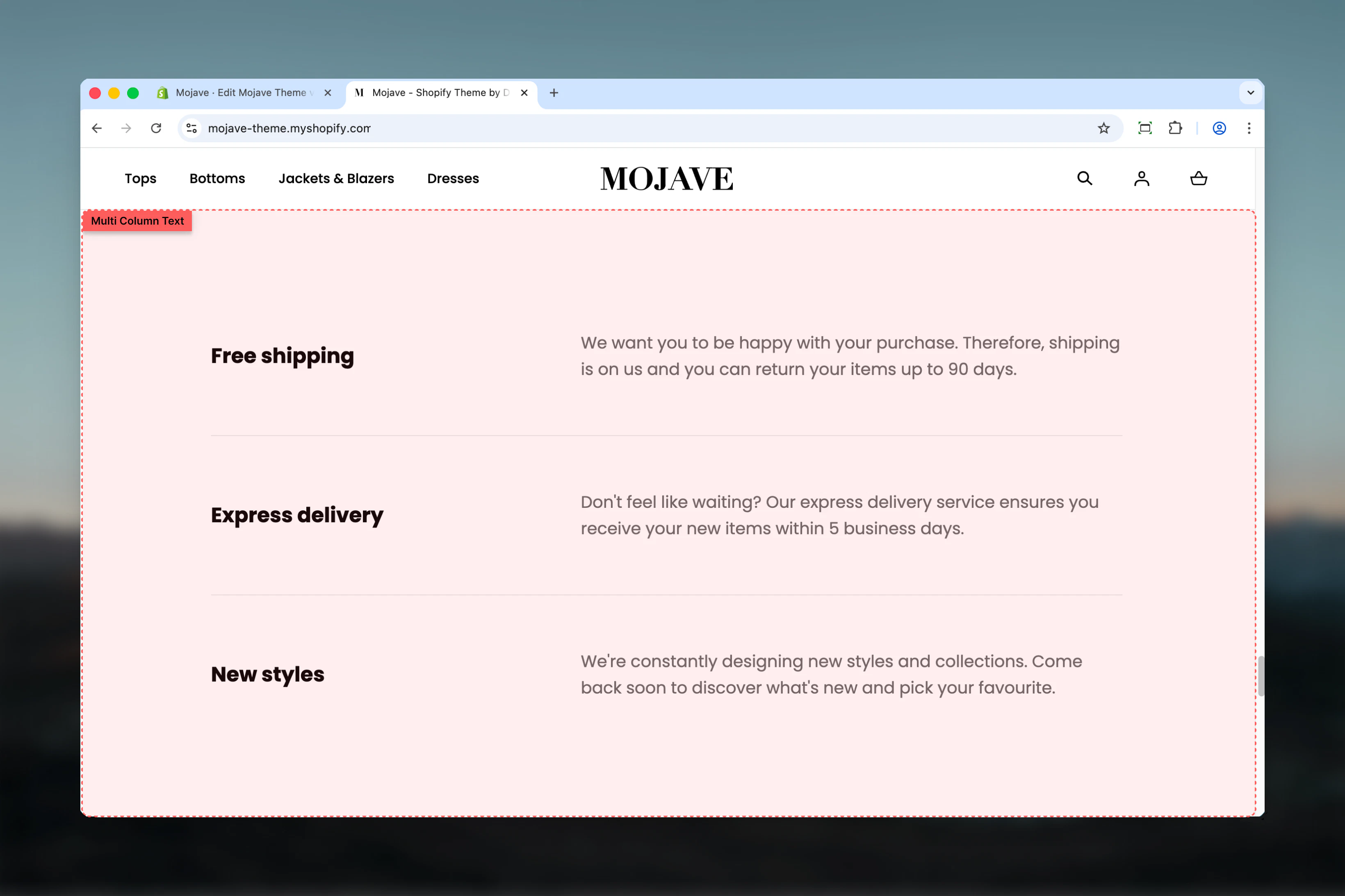
> Organize content into side-by-side columns with three layout styles: List, Columns, and Boxes for editorial layouts and feature highlights
## What this section does
The **Multi column text** section organizes content into side-by-side columns, perfect for feature comparisons, benefits, services, or any content that benefits from visual organization. Features include:
* **Up to 4 content columns** with independent text and links
* **Three layout styles**: List (stacked), Columns (equal-width side-by-side), Boxes (outlined cards)
* **Section heading** above all columns
* Optional fullwidth container
* Individual links per column
* Responsive design (stacks on mobile)
Perfect for about pages, service descriptions, feature highlights, benefits, or any editorial content that benefits from multi-column organization.
 ## Getting started
From the Theme Customizer, click **Add section** and select **Multi column text**
Add a heading that describes the content (e.g., "Why Choose Us", "Our Services")
Select layout style: List (vertical), Columns (side-by-side), or Boxes (card-style)
Add 2-4 content blocks. Each becomes one column. Configure heading, text, and optional link per block.
## Section settings
**Checkbox** (default: unchecked)
Controls section container width:
* Unchecked: Section contained within standard page width
* Checked: Section spans full browser width (edge-to-edge)
Fullwidth provides more horizontal space for columns and creates more visual impact.
**Textarea** (optional)
Main section heading displayed above all columns.
Examples: "Why Shop With Us", "Our Core Services", "What We Offer", "Benefits", "Features"
Leave blank for no section heading.
**Dropdown** (default: List)
Controls how columns are displayed:
* **List**: Columns stack vertically (one below the other) on all screen sizes
* **Columns**: Side-by-side equal-width columns on desktop, stack on mobile
* **Boxes**: Card-style layout with borders/backgrounds, side-by-side on desktop
**List** is best for sequential content (steps, processes). **Columns** for equal-weight features. **Boxes** for emphasized, distinct features.
**Desktop** (default: Default) and **Mobile** (default: Compact)
Controls vertical spacing above and below the section:
* **Default**: Standard spacing
* **Medium**: Moderate spacing
* **Compact**: Minimal spacing
* **None**: No spacing
Mobile has fewer options (Default, Compact, None).
## Block: Content
**Type**: content (limit: 4 blocks)
Each block creates one column with heading, text, and optional link.
**Text field** (default: "Column")
Column title/heading displayed prominently at top of each column.
Examples: "Free Shipping", "24/7 Support", "Quality Guaranteed", "Easy Returns"
Keep concise (2-4 words) for quick scanning.
**Textarea** (default: "Pair text with an image to focus on your chosen product, collection, or blog post. Add details on availability, style, or even provide a review.")
Main body text for the column:
* Plain text only (no rich text formatting)
* 2-4 sentences recommended
* Describe feature, benefit, or service
Focus on customer benefit ("Ships in 24 hours") rather than feature ("We have fast shipping").
**Link text** (text field, optional)
* Label for the link (e.g., "Learn more", "View all", "Shop now")
**Link URL** (URL field, optional)
* Destination for the link
Link is only displayed if both Link text and Link URL are provided. Use to direct users to related pages, collections, or policies.
## Best practices
4 is the maximum. Use 3 columns for balanced design, 2 for detailed content, 4 for concise features. Avoid single column (use Rich Text instead).
Keep all columns similar in length and structure. If one has 3 sentences, all should have \~3 sentences. Creates visual harmony.
Use "Boxes" layout for important, distinct features. The card-style design draws more attention than plain columns.
Use "List" layout when order matters (steps, processes, timelines). Side-by-side columns imply equal importance.
Write about customer benefits, not company features. "Get support 24/7" instead of "We offer 24/7 support".
Column headings should be 2-4 words. They're not sentences. "Free Shipping" not "We Offer Free Shipping".
Either all columns have links or none do. Inconsistent links create unbalanced design and confuse users.
Enable fullwidth for homepage features or hero content. Contained width works better for About pages or supporting content.
## Common use cases
**Homepage trust indicators** — 3-4 columns highlighting key benefits: Free Shipping, Easy Returns, Secure Checkout, 24/7 Support
**About page services** — Company services or specialties with brief descriptions and links to service pages
**Product features** — Key product benefits or features on PDP or landing pages (3-4 main selling points)
**Process/How it works** — Step-by-step process using List layout (1. Shop, 2. Customize, 3. Deliver, 4. Enjoy)
**Support options** — Different support channels or resources (Live Chat, Email, Phone, Help Center) with links
**Content categories** — Homepage content navigation (Shop, Collections, About, Blog) with descriptions
## Layout behavior
**Desktop - Columns layout**:
* 2 blocks: 2 equal-width columns side-by-side
* 3 blocks: 3 equal-width columns side-by-side
* 4 blocks: 4 equal-width columns side-by-side
* Even spacing between columns
* Section heading centered above columns (if present)
**Desktop - Boxes layout**:
* Same column arrangement as Columns
* Each column has border/background (card appearance)
* More visual separation than Columns layout
* Slightly more padding inside each box
**Desktop - List layout**:
* All columns stack vertically (one below the other)
* Full width for each item
* Best for sequential/ordered content
**Mobile (all layouts)**:
* Always stacks vertically (List behavior)
* One column takes full width
* Order: First block → Second block → Third block → Fourth block
* Layout setting only affects desktop display
## Content guidelines
**Column heading**:
* 2-4 words ideal
* Front-load important keywords
* Use title case
* Examples: "Free Returns", "Quality Assurance", "Expert Support"
**Column text**:
* 2-4 sentences (40-80 words)
* Start with the benefit
* Avoid jargon and complexity
* Focus on "you" language (customer-centric)
* Example: "Get your order in 2-3 business days with free standard shipping. No minimum purchase required."
**Links**:
* Use descriptive link text: "View shipping policy" not "Click here"
* Link to relevant pages: policies, collections, product pages
* Consistent link text across columns if possible ("Learn more" for all)
## Customization tips
**For trust/credibility (homepage)**:
* Layout: Columns or Boxes
* 3-4 blocks with icons or emoji in headings (optional)
* No links (just pure trust signals)
* Heading: "Why Shop With Us", "Our Promise", "Customer Benefits"
**For services/about page**:
* Layout: Columns
* 2-3 blocks with detailed text (4-5 sentences)
* Links to dedicated service pages
* Heading: "What We Do", "Our Services", "Capabilities"
**For process/steps**:
* Layout: List
* 3-4 blocks numbered in headings ("1. Choose", "2. Customize", "3. Receive")
* No links needed
* Heading: "How It Works", "Our Process", "Easy as 1-2-3"
**For feature comparison**:
* Layout: Boxes
* 3-4 blocks highlighting distinct features
* Link to product pages or feature details
* Heading: "Feature Highlights", "What's Included", "Benefits"
## Related sections
* **Content Tiles** — Similar multi-column layout with image + text combinations
* **Rich Text** — Single-column alternative for non-divided content
* **Accordions** — Collapsible alternative for lengthy content in limited space
* **Featured Collections Links** — Visual multi-column with collection focus
## Technical notes
**4-block limit**: Maximum 4 content blocks allowed. This ensures design integrity across screen sizes. More than 4 creates overcrowding.
**Mobile stacking**: All layouts become vertical (List behavior) on mobile regardless of desktop setting. This ensures readability on small screens.
**Plain text only**: Text field doesn't support rich text formatting. This maintains visual consistency across columns. Use links for emphasis/navigation.
**Responsive columns**: With Columns/Boxes layout, columns automatically adjust width: 2 columns = 50% each, 3 columns = 33% each, 4 columns = 25% each on desktop.
## Getting started
From the Theme Customizer, click **Add section** and select **Multi column text**
Add a heading that describes the content (e.g., "Why Choose Us", "Our Services")
Select layout style: List (vertical), Columns (side-by-side), or Boxes (card-style)
Add 2-4 content blocks. Each becomes one column. Configure heading, text, and optional link per block.
## Section settings
**Checkbox** (default: unchecked)
Controls section container width:
* Unchecked: Section contained within standard page width
* Checked: Section spans full browser width (edge-to-edge)
Fullwidth provides more horizontal space for columns and creates more visual impact.
**Textarea** (optional)
Main section heading displayed above all columns.
Examples: "Why Shop With Us", "Our Core Services", "What We Offer", "Benefits", "Features"
Leave blank for no section heading.
**Dropdown** (default: List)
Controls how columns are displayed:
* **List**: Columns stack vertically (one below the other) on all screen sizes
* **Columns**: Side-by-side equal-width columns on desktop, stack on mobile
* **Boxes**: Card-style layout with borders/backgrounds, side-by-side on desktop
**List** is best for sequential content (steps, processes). **Columns** for equal-weight features. **Boxes** for emphasized, distinct features.
**Desktop** (default: Default) and **Mobile** (default: Compact)
Controls vertical spacing above and below the section:
* **Default**: Standard spacing
* **Medium**: Moderate spacing
* **Compact**: Minimal spacing
* **None**: No spacing
Mobile has fewer options (Default, Compact, None).
## Block: Content
**Type**: content (limit: 4 blocks)
Each block creates one column with heading, text, and optional link.
**Text field** (default: "Column")
Column title/heading displayed prominently at top of each column.
Examples: "Free Shipping", "24/7 Support", "Quality Guaranteed", "Easy Returns"
Keep concise (2-4 words) for quick scanning.
**Textarea** (default: "Pair text with an image to focus on your chosen product, collection, or blog post. Add details on availability, style, or even provide a review.")
Main body text for the column:
* Plain text only (no rich text formatting)
* 2-4 sentences recommended
* Describe feature, benefit, or service
Focus on customer benefit ("Ships in 24 hours") rather than feature ("We have fast shipping").
**Link text** (text field, optional)
* Label for the link (e.g., "Learn more", "View all", "Shop now")
**Link URL** (URL field, optional)
* Destination for the link
Link is only displayed if both Link text and Link URL are provided. Use to direct users to related pages, collections, or policies.
## Best practices
4 is the maximum. Use 3 columns for balanced design, 2 for detailed content, 4 for concise features. Avoid single column (use Rich Text instead).
Keep all columns similar in length and structure. If one has 3 sentences, all should have \~3 sentences. Creates visual harmony.
Use "Boxes" layout for important, distinct features. The card-style design draws more attention than plain columns.
Use "List" layout when order matters (steps, processes, timelines). Side-by-side columns imply equal importance.
Write about customer benefits, not company features. "Get support 24/7" instead of "We offer 24/7 support".
Column headings should be 2-4 words. They're not sentences. "Free Shipping" not "We Offer Free Shipping".
Either all columns have links or none do. Inconsistent links create unbalanced design and confuse users.
Enable fullwidth for homepage features or hero content. Contained width works better for About pages or supporting content.
## Common use cases
**Homepage trust indicators** — 3-4 columns highlighting key benefits: Free Shipping, Easy Returns, Secure Checkout, 24/7 Support
**About page services** — Company services or specialties with brief descriptions and links to service pages
**Product features** — Key product benefits or features on PDP or landing pages (3-4 main selling points)
**Process/How it works** — Step-by-step process using List layout (1. Shop, 2. Customize, 3. Deliver, 4. Enjoy)
**Support options** — Different support channels or resources (Live Chat, Email, Phone, Help Center) with links
**Content categories** — Homepage content navigation (Shop, Collections, About, Blog) with descriptions
## Layout behavior
**Desktop - Columns layout**:
* 2 blocks: 2 equal-width columns side-by-side
* 3 blocks: 3 equal-width columns side-by-side
* 4 blocks: 4 equal-width columns side-by-side
* Even spacing between columns
* Section heading centered above columns (if present)
**Desktop - Boxes layout**:
* Same column arrangement as Columns
* Each column has border/background (card appearance)
* More visual separation than Columns layout
* Slightly more padding inside each box
**Desktop - List layout**:
* All columns stack vertically (one below the other)
* Full width for each item
* Best for sequential/ordered content
**Mobile (all layouts)**:
* Always stacks vertically (List behavior)
* One column takes full width
* Order: First block → Second block → Third block → Fourth block
* Layout setting only affects desktop display
## Content guidelines
**Column heading**:
* 2-4 words ideal
* Front-load important keywords
* Use title case
* Examples: "Free Returns", "Quality Assurance", "Expert Support"
**Column text**:
* 2-4 sentences (40-80 words)
* Start with the benefit
* Avoid jargon and complexity
* Focus on "you" language (customer-centric)
* Example: "Get your order in 2-3 business days with free standard shipping. No minimum purchase required."
**Links**:
* Use descriptive link text: "View shipping policy" not "Click here"
* Link to relevant pages: policies, collections, product pages
* Consistent link text across columns if possible ("Learn more" for all)
## Customization tips
**For trust/credibility (homepage)**:
* Layout: Columns or Boxes
* 3-4 blocks with icons or emoji in headings (optional)
* No links (just pure trust signals)
* Heading: "Why Shop With Us", "Our Promise", "Customer Benefits"
**For services/about page**:
* Layout: Columns
* 2-3 blocks with detailed text (4-5 sentences)
* Links to dedicated service pages
* Heading: "What We Do", "Our Services", "Capabilities"
**For process/steps**:
* Layout: List
* 3-4 blocks numbered in headings ("1. Choose", "2. Customize", "3. Receive")
* No links needed
* Heading: "How It Works", "Our Process", "Easy as 1-2-3"
**For feature comparison**:
* Layout: Boxes
* 3-4 blocks highlighting distinct features
* Link to product pages or feature details
* Heading: "Feature Highlights", "What's Included", "Benefits"
## Related sections
* **Content Tiles** — Similar multi-column layout with image + text combinations
* **Rich Text** — Single-column alternative for non-divided content
* **Accordions** — Collapsible alternative for lengthy content in limited space
* **Featured Collections Links** — Visual multi-column with collection focus
## Technical notes
**4-block limit**: Maximum 4 content blocks allowed. This ensures design integrity across screen sizes. More than 4 creates overcrowding.
**Mobile stacking**: All layouts become vertical (List behavior) on mobile regardless of desktop setting. This ensures readability on small screens.
**Plain text only**: Text field doesn't support rich text formatting. This maintains visual consistency across columns. Use links for emphasis/navigation.
**Responsive columns**: With Columns/Boxes layout, columns automatically adjust width: 2 columns = 50% each, 3 columns = 33% each, 4 columns = 25% each on desktop.