> ## Documentation Index
> Fetch the complete documentation index at: https://docs.digifist.com/llms.txt
> Use this file to discover all available pages before exploring further.
# Newsletter
> Collect email subscribers with a split-screen newsletter signup section featuring customizable styling, optional image, and integrated email form
## What this section does
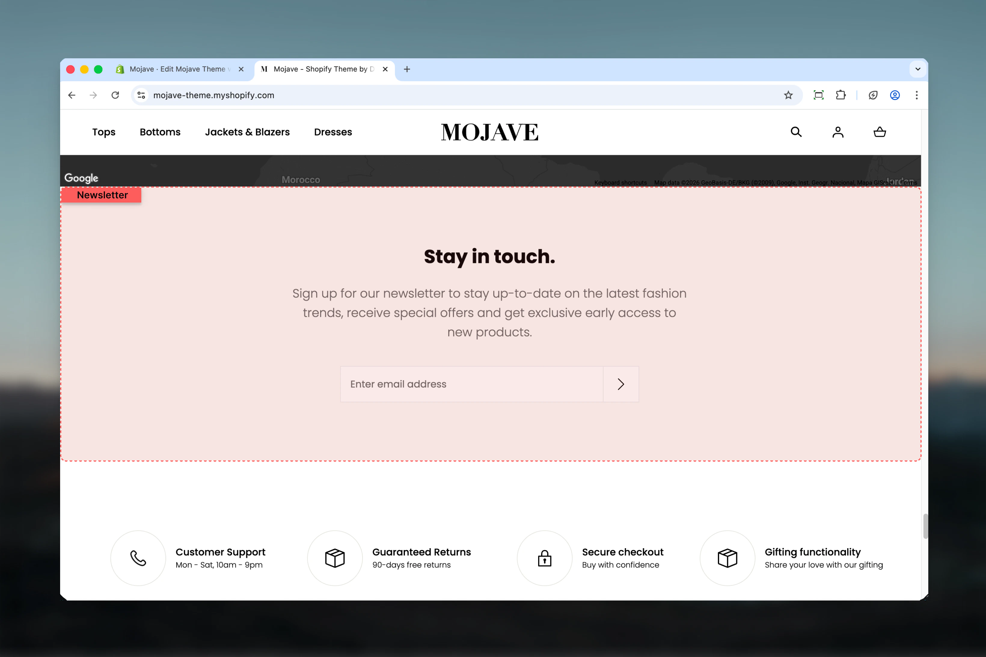
The **Newsletter sign up** section creates an attractive email collection point with:
* Split-screen layout with email form and optional promotional image
* Two style variations: light (main style) or dark (accent colors)
* Integrated with Shopify's customer email collection system
* Customizable heading and rich text content
Perfect for homepage footers, landing pages, or anywhere you want to grow your email list.
 ## Getting started
From the Theme Customizer, click **Add section** and select **Newsletter sign up**
Add your heading (e.g., "Subscribe to our emails") and supporting content explaining the value of subscribing
Select Light or Dark style, optionally upload an image, and adjust layout settings (flip, center, spacing)
## Section settings
**Dropdown** (default: Main style / Light)
Controls the color scheme of the newsletter section:
* **Main style** (Light): Uses primary theme colors with light background
* **Accent colors** (Dark): Uses accent theme colors with darker background
Choose based on surrounding content and brand preference. Dark style creates more contrast and visual separation.
**Checkbox** (default: unchecked)
Reverses positions of form/content and image:
* Unchecked: Form on left, image on right
* Checked: Image on left, form on right
Use flip to create visual variety when stacking multiple split-screen sections.
**Checkbox** (default: unchecked)
Centers the heading and content text within the form area:
* Unchecked: Left-aligned text (default)
* Checked: Center-aligned text
Center alignment works well when no image is present or for focused, minimal designs.
**Textarea** (default: "Subscribe to our emails")
Main heading for the newsletter section. Keep concise and action-oriented (e.g., "Join our list", "Get updates").
**Rich text editor** (default: "Be the first to know about new collections and exclusive offers.")
Supporting text that explains the value of subscribing. Can include:
* Benefits of subscribing (early access, exclusive offers, etc.)
* Frequency of emails
* Privacy assurance
Use rich text formatting (bold, lists) to highlight key benefits.
**Image picker** (optional)
Promotional image displayed beside the email signup form.
* Recommended size: 1440x1200px
* Use lifestyle imagery, product photos, or brand graphics
* If empty, form spans full width (no split-screen)
**Image Height** — Range slider: 50-100% (default: 100%)
* Controls height of image relative to section height
* 100% = image fills full section height
* Lower values create shorter images
**Dropdown** (default: Default)
Controls vertical spacing above and below the section on desktop:
* **Default**: Standard spacing
* **Medium**: Moderate spacing
* **Compact**: Minimal spacing
* **None**: No spacing
Default spacing works for most placements. Use None when newsletter section should flow seamlessly with surrounding content.
**Dropdown** (default: Compact)
Controls vertical spacing above and below the section on mobile:
* **Default**: Standard mobile spacing
* **Compact**: Reduced spacing (recommended for mobile economy)
* **None**: No spacing
## Best practices
Clearly explain why visitors should subscribe: early access, exclusive discounts, style tips, etc. Value proposition drives signups.
Upload lifestyle or product photography at 1440x1200px that represents your brand and appeals to your target audience.
Use Dark (accent colors) style when placing newsletter section between product sections or on light backgrounds for visual break.
If skipping the image, enable Center text for a focused, minimal newsletter signup that doesn't feel off-balance.
Limit heading to 3-5 words and content to 1-2 sentences. Overly long copy reduces signup rates.
Most effective when placed near page bottom (but above footer) where visitors have engaged with content and are ready to commit.
When stacking multiple split-screen sections, alternate flip setting to create flowing, magazine-style layouts.
Include brief privacy assurance in content ("We respect your privacy") to increase trust and signup rates.
## Common use cases
**Homepage email collection** — Place near bottom of homepage to capture engaged visitors before they leave
**Landing page lead generation** — Feature prominently on campaign landing pages to build targeted email lists
**Post-purchase signup** — Add to thank you pages to convert customers into subscribers for future marketing
**Blog sidebar** — Integrate into blog layouts to convert content readers into email subscribers
**Exit intent replacement** — Static alternative to popup modals for less intrusive email collection
## Layout behavior
**Desktop**:
* When image is present: Split-screen with form/content on one side, image on other (controlled by flip)
* When no image: Form/content spans full width
* Email input and submit button display horizontal inline
**Mobile**:
* Always stacks vertically: image at top (if present), then heading, content, and email form
* Flip setting does not affect mobile layout
* Email form remains horizontal inline
**Form functionality**:
* Email input with placeholder text
* Submit button
* Success message displays after submission
* Integrates with Shopify customer email collection
## Email collection integration
The newsletter section automatically integrates with:
* **Shopify Customer Privacy API** — Complies with privacy regulations
* **Customer accepts marketing** checkbox (if required by region)
* **Shopify's email marketing** apps (e.g., Shopify Email)
* **Third-party email providers** via app integrations
Collected emails appear in **Customers > Accepts marketing** in your Shopify admin.
## Related sections
* **Newsletter Modal** — Popup version of newsletter signup
* **Footer** — Footer often includes simpler inline newsletter signup
* **Multi Column Text** — Can include newsletter signup via custom blocks
## Getting started
From the Theme Customizer, click **Add section** and select **Newsletter sign up**
Add your heading (e.g., "Subscribe to our emails") and supporting content explaining the value of subscribing
Select Light or Dark style, optionally upload an image, and adjust layout settings (flip, center, spacing)
## Section settings
**Dropdown** (default: Main style / Light)
Controls the color scheme of the newsletter section:
* **Main style** (Light): Uses primary theme colors with light background
* **Accent colors** (Dark): Uses accent theme colors with darker background
Choose based on surrounding content and brand preference. Dark style creates more contrast and visual separation.
**Checkbox** (default: unchecked)
Reverses positions of form/content and image:
* Unchecked: Form on left, image on right
* Checked: Image on left, form on right
Use flip to create visual variety when stacking multiple split-screen sections.
**Checkbox** (default: unchecked)
Centers the heading and content text within the form area:
* Unchecked: Left-aligned text (default)
* Checked: Center-aligned text
Center alignment works well when no image is present or for focused, minimal designs.
**Textarea** (default: "Subscribe to our emails")
Main heading for the newsletter section. Keep concise and action-oriented (e.g., "Join our list", "Get updates").
**Rich text editor** (default: "Be the first to know about new collections and exclusive offers.")
Supporting text that explains the value of subscribing. Can include:
* Benefits of subscribing (early access, exclusive offers, etc.)
* Frequency of emails
* Privacy assurance
Use rich text formatting (bold, lists) to highlight key benefits.
**Image picker** (optional)
Promotional image displayed beside the email signup form.
* Recommended size: 1440x1200px
* Use lifestyle imagery, product photos, or brand graphics
* If empty, form spans full width (no split-screen)
**Image Height** — Range slider: 50-100% (default: 100%)
* Controls height of image relative to section height
* 100% = image fills full section height
* Lower values create shorter images
**Dropdown** (default: Default)
Controls vertical spacing above and below the section on desktop:
* **Default**: Standard spacing
* **Medium**: Moderate spacing
* **Compact**: Minimal spacing
* **None**: No spacing
Default spacing works for most placements. Use None when newsletter section should flow seamlessly with surrounding content.
**Dropdown** (default: Compact)
Controls vertical spacing above and below the section on mobile:
* **Default**: Standard mobile spacing
* **Compact**: Reduced spacing (recommended for mobile economy)
* **None**: No spacing
## Best practices
Clearly explain why visitors should subscribe: early access, exclusive discounts, style tips, etc. Value proposition drives signups.
Upload lifestyle or product photography at 1440x1200px that represents your brand and appeals to your target audience.
Use Dark (accent colors) style when placing newsletter section between product sections or on light backgrounds for visual break.
If skipping the image, enable Center text for a focused, minimal newsletter signup that doesn't feel off-balance.
Limit heading to 3-5 words and content to 1-2 sentences. Overly long copy reduces signup rates.
Most effective when placed near page bottom (but above footer) where visitors have engaged with content and are ready to commit.
When stacking multiple split-screen sections, alternate flip setting to create flowing, magazine-style layouts.
Include brief privacy assurance in content ("We respect your privacy") to increase trust and signup rates.
## Common use cases
**Homepage email collection** — Place near bottom of homepage to capture engaged visitors before they leave
**Landing page lead generation** — Feature prominently on campaign landing pages to build targeted email lists
**Post-purchase signup** — Add to thank you pages to convert customers into subscribers for future marketing
**Blog sidebar** — Integrate into blog layouts to convert content readers into email subscribers
**Exit intent replacement** — Static alternative to popup modals for less intrusive email collection
## Layout behavior
**Desktop**:
* When image is present: Split-screen with form/content on one side, image on other (controlled by flip)
* When no image: Form/content spans full width
* Email input and submit button display horizontal inline
**Mobile**:
* Always stacks vertically: image at top (if present), then heading, content, and email form
* Flip setting does not affect mobile layout
* Email form remains horizontal inline
**Form functionality**:
* Email input with placeholder text
* Submit button
* Success message displays after submission
* Integrates with Shopify customer email collection
## Email collection integration
The newsletter section automatically integrates with:
* **Shopify Customer Privacy API** — Complies with privacy regulations
* **Customer accepts marketing** checkbox (if required by region)
* **Shopify's email marketing** apps (e.g., Shopify Email)
* **Third-party email providers** via app integrations
Collected emails appear in **Customers > Accepts marketing** in your Shopify admin.
## Related sections
* **Newsletter Modal** — Popup version of newsletter signup
* **Footer** — Footer often includes simpler inline newsletter signup
* **Multi Column Text** — Can include newsletter signup via custom blocks