> ## Documentation Index
> Fetch the complete documentation index at: https://docs.digifist.com/llms.txt
> Use this file to discover all available pages before exploring further.
# Rich Text (SEO Content)
> Create focused content blocks with headings, rich text, and optional links for editorial content, brand storytelling, or informational sections
## What this section does
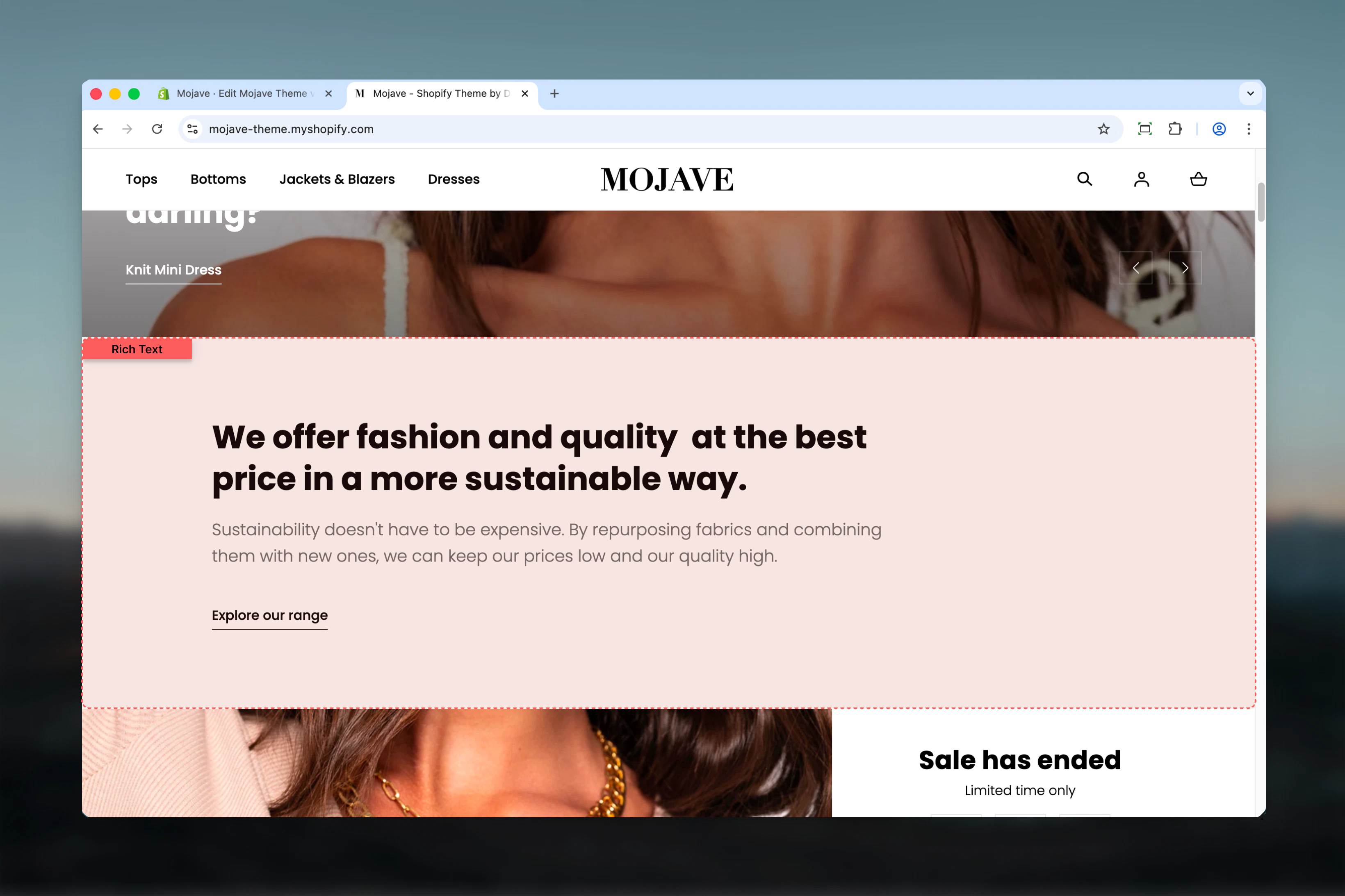
The **Rich Text** section creates clean, focused content blocks perfect for editorial content, brand storytelling, FAQs, or any text-heavy pages. It supports:
* Heading (optional, limit 1)
* Rich text content with formatting (optional, limit 1)
* Link/CTA (optional, limit 1)
This minimalist section is ideal for About pages, Store Policy pages, brand story sections, or anywhere you need clean, readable text content without distractions.
 ## Getting started
From the Theme Customizer, click **Add section** and select **Richtext**
Add **Heading**, **Content**, and/or **Link** blocks as needed (each limited to 1 per section)
Set text alignment, adjust max width and section width, and configure spacing for your page design
## Section settings
**Dropdown** (default: Center)
Controls horizontal alignment of all text content in the section:
* **Start** (Left): Left-aligned text
* **Center**: Centered text (default, works well for focused content)
* **End** (Right): Right-aligned text
Center alignment is most common for rich text sections as it creates a focused, editorial feel.
**Dropdown** (default: Wide)
Controls the maximum width of the text content area:
* **Default**: Narrower, more focused reading width (optimal for readability)
* **Wide**: Wider content area for more expansive text
**Default** width is recommended for long-form content as it keeps line length optimal for reading (\~60-80 characters per line).
**Dropdown** (default: Full)
Controls the overall section container width:
* **Narrow**: Tighter container (medium width)
* **Full**: Full-width container (edge-to-edge)
**Best practices**:
* Use **Narrow** with center alignment for focused, editorial content
* Use **Full** when Rich Text is part of a broader page layout
**Checkbox** (default: unchecked)
Adds a decorative element (typically a small graphic or line) to enhance the visual appeal of the section.
**Dropdown** (default: Compact)
Controls vertical spacing above and below the section on desktop:
* **Default**: Standard spacing
* **Medium**: Moderate spacing
* **Compact**: Minimal spacing (recommended for text sections)
* **None**: No spacing for seamless layouts
**Dropdown** (default: Default)
Controls vertical spacing above and below the section on mobile:
* **Default**: Standard mobile spacing (recommended)
* **Compact**: Reduced spacing
* **None**: No spacing
## Block types
### Heading block
**Limit: 1 per section**
**Textarea** (default: "Talk about your brand")
Main heading for the rich text section. Supports multiple lines.
Keep concise (3-7 words) for section headings.
### Content block
**Limit: 1 per section**
**Rich text editor** (default: "Share information about your brand...")
Full-featured rich text content with formatting options:
* **Bold** and *italic* text
* Headings (H1-H6)
* Bullet and numbered lists
* Links
* Paragraphs
Use for long-form content, brand stories, product descriptions, or any formatted text.
### Link block
**Limit: 1 per section**
**Text field** (default: "Shop all")
Text displayed for the call-to-action link.
**URL field** (default: /collections)
Destination URL for the CTA link.
Common destinations: collection pages, product pages, other content pages, external links.
## Best practices
Use Default max width (not Wide) for long-form content. Shorter line lengths (\~60-80 characters) improve readability.
Center-aligned text works best for standalone rich text sections. Use left alignment when rich text is part of a larger layout.
Add exactly one Heading, one Content, and one Link block for complete sections. Each block is optional but limited to 1.
Use Content block formatting (bold, lists, headings) to break up long text and guide readers through your content.
Combine Narrow section width with Center text alignment for highly focused, editorial-style content display.
Use Compact spacing (default) for text sections that should flow naturally without excessive whitespace.
Not every rich text section needs a CTA link. Skip the Link block for pure informational content.
Enable decoration for special sections (About, Brand Story) but keep it off for utilitarian content (Policies, FAQs).
## Common use cases
**About page** — Tell your brand story with a heading, rich formatted content, and a link to learn more or shop
**Policy pages** — Display shipping, return, or privacy policies in clean, readable format
**FAQ sections** — Create question-and-answer content with rich text formatting
**Homepage brand story** — Add editorial content blocks between product sections to build brand narrative
**Landing page copy** — Provide detailed product, campaign, or collection information in formatted text
**Informational blocks** — Add context, details, or instructions anywhere on your site with clean typography
## Layout behavior
**All screen sizes**:
* Content spans max width (Default or Wide) within section width (Narrow or Full)
* Text alignment (center/left/right) applies to all blocks
* Blocks stack vertically in this order: Heading → Content → Link
**Desktop**:
* Full rich text formatting visible
* Optimal line length maintained by max width setting
**Mobile**:
* Responsive text sizing for mobile readability
* Maintains alignment and max width proportionally
## Content structure
Typical rich text section includes (all optional):
1. **Heading block** (1 max): Section title
2. **Content block** (1 max): Formatted body text
3. **Link block** (1 max): CTA link at bottom
You can use any combination—heading only, content only, or all three blocks together.
## Related sections
* **Multi Column Text** — Rich text content spread across multiple columns
* **Accordions** — Collapsible rich text content for FAQs or long content
* **Images with Text** — Rich text combined with images in layout
## Getting started
From the Theme Customizer, click **Add section** and select **Richtext**
Add **Heading**, **Content**, and/or **Link** blocks as needed (each limited to 1 per section)
Set text alignment, adjust max width and section width, and configure spacing for your page design
## Section settings
**Dropdown** (default: Center)
Controls horizontal alignment of all text content in the section:
* **Start** (Left): Left-aligned text
* **Center**: Centered text (default, works well for focused content)
* **End** (Right): Right-aligned text
Center alignment is most common for rich text sections as it creates a focused, editorial feel.
**Dropdown** (default: Wide)
Controls the maximum width of the text content area:
* **Default**: Narrower, more focused reading width (optimal for readability)
* **Wide**: Wider content area for more expansive text
**Default** width is recommended for long-form content as it keeps line length optimal for reading (\~60-80 characters per line).
**Dropdown** (default: Full)
Controls the overall section container width:
* **Narrow**: Tighter container (medium width)
* **Full**: Full-width container (edge-to-edge)
**Best practices**:
* Use **Narrow** with center alignment for focused, editorial content
* Use **Full** when Rich Text is part of a broader page layout
**Checkbox** (default: unchecked)
Adds a decorative element (typically a small graphic or line) to enhance the visual appeal of the section.
**Dropdown** (default: Compact)
Controls vertical spacing above and below the section on desktop:
* **Default**: Standard spacing
* **Medium**: Moderate spacing
* **Compact**: Minimal spacing (recommended for text sections)
* **None**: No spacing for seamless layouts
**Dropdown** (default: Default)
Controls vertical spacing above and below the section on mobile:
* **Default**: Standard mobile spacing (recommended)
* **Compact**: Reduced spacing
* **None**: No spacing
## Block types
### Heading block
**Limit: 1 per section**
**Textarea** (default: "Talk about your brand")
Main heading for the rich text section. Supports multiple lines.
Keep concise (3-7 words) for section headings.
### Content block
**Limit: 1 per section**
**Rich text editor** (default: "Share information about your brand...")
Full-featured rich text content with formatting options:
* **Bold** and *italic* text
* Headings (H1-H6)
* Bullet and numbered lists
* Links
* Paragraphs
Use for long-form content, brand stories, product descriptions, or any formatted text.
### Link block
**Limit: 1 per section**
**Text field** (default: "Shop all")
Text displayed for the call-to-action link.
**URL field** (default: /collections)
Destination URL for the CTA link.
Common destinations: collection pages, product pages, other content pages, external links.
## Best practices
Use Default max width (not Wide) for long-form content. Shorter line lengths (\~60-80 characters) improve readability.
Center-aligned text works best for standalone rich text sections. Use left alignment when rich text is part of a larger layout.
Add exactly one Heading, one Content, and one Link block for complete sections. Each block is optional but limited to 1.
Use Content block formatting (bold, lists, headings) to break up long text and guide readers through your content.
Combine Narrow section width with Center text alignment for highly focused, editorial-style content display.
Use Compact spacing (default) for text sections that should flow naturally without excessive whitespace.
Not every rich text section needs a CTA link. Skip the Link block for pure informational content.
Enable decoration for special sections (About, Brand Story) but keep it off for utilitarian content (Policies, FAQs).
## Common use cases
**About page** — Tell your brand story with a heading, rich formatted content, and a link to learn more or shop
**Policy pages** — Display shipping, return, or privacy policies in clean, readable format
**FAQ sections** — Create question-and-answer content with rich text formatting
**Homepage brand story** — Add editorial content blocks between product sections to build brand narrative
**Landing page copy** — Provide detailed product, campaign, or collection information in formatted text
**Informational blocks** — Add context, details, or instructions anywhere on your site with clean typography
## Layout behavior
**All screen sizes**:
* Content spans max width (Default or Wide) within section width (Narrow or Full)
* Text alignment (center/left/right) applies to all blocks
* Blocks stack vertically in this order: Heading → Content → Link
**Desktop**:
* Full rich text formatting visible
* Optimal line length maintained by max width setting
**Mobile**:
* Responsive text sizing for mobile readability
* Maintains alignment and max width proportionally
## Content structure
Typical rich text section includes (all optional):
1. **Heading block** (1 max): Section title
2. **Content block** (1 max): Formatted body text
3. **Link block** (1 max): CTA link at bottom
You can use any combination—heading only, content only, or all three blocks together.
## Related sections
* **Multi Column Text** — Rich text content spread across multiple columns
* **Accordions** — Collapsible rich text content for FAQs or long content
* **Images with Text** — Rich text combined with images in layout