> ## Documentation Index
> Fetch the complete documentation index at: https://docs.digifist.com/llms.txt
> Use this file to discover all available pages before exploring further.
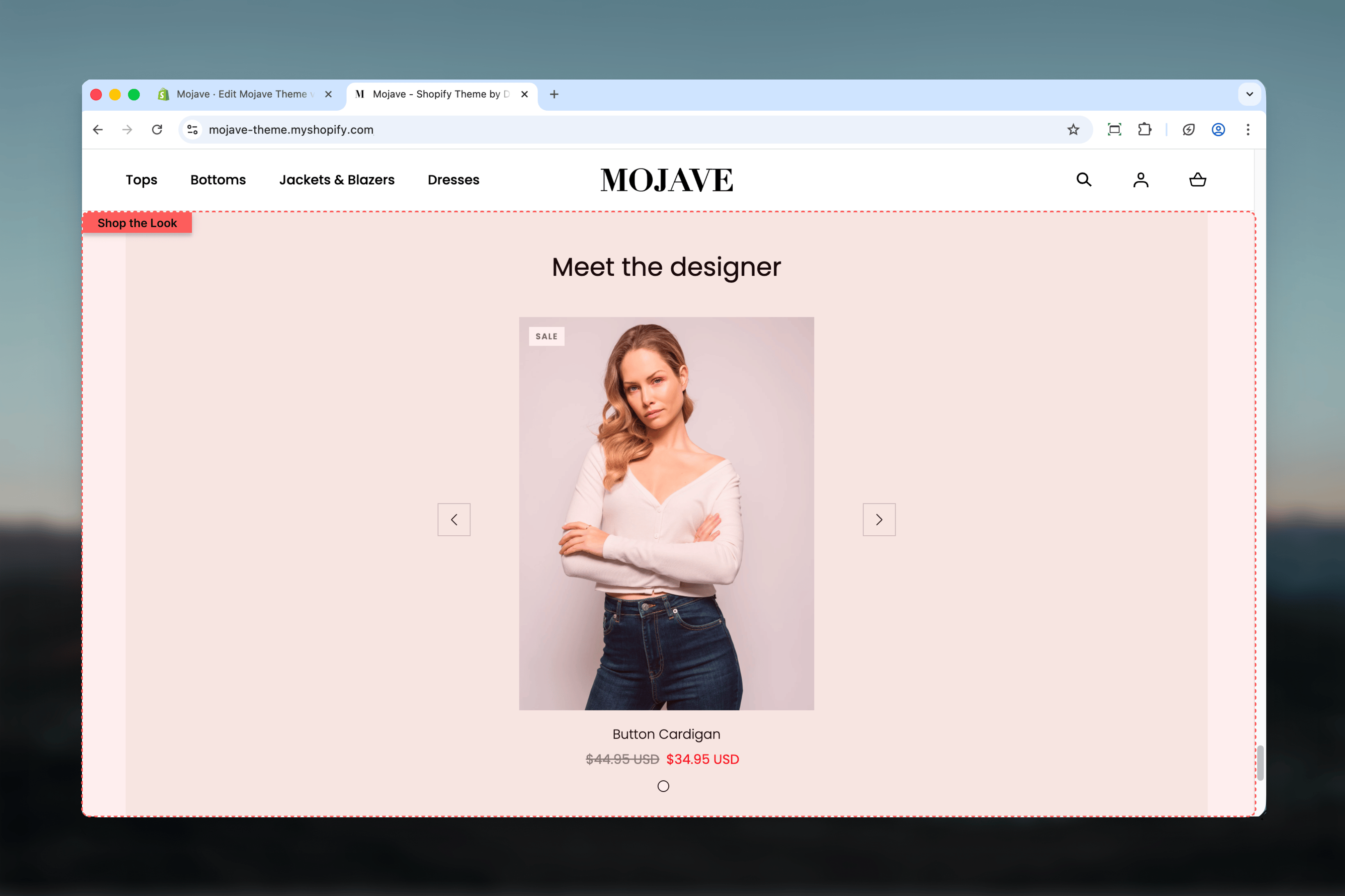
# Shop the Look
> Create interactive lifestyle images with clickable product hotspots, perfect for editorial styling and 'shop the look' campaigns
## What this section does
The **Shop the look** section creates a split-screen layout featuring a lifestyle image with clickable product hotspots, enabling customers to instantly shop items from styled photography. Features include:
* **Split-screen layout**: Image on one side, text content on other
* **Unlimited product hotspots** positioned via X/Y coordinates
* **Interactive dots/pins** overlay the lifestyle image
* Heading, link/CTA button
* Flip toggle to swap image/content positions
* Fullwidth or Page container options
* Responsive design (stacks on mobile)
Perfect for editorial styling, lookbook presentations, outfit showcases, room designs, or any "shop this look" campaigns.
 ## Getting started
From the Theme Customizer, click **Add section** and select **Shop the look**
Add a styled lifestyle image (1440x1200px recommended) showing products in context
Click **Add Link product** block for each product in the image. Configure product and position (X/Y coordinates).
Add heading (e.g., "Shop This Look"), link text/URL, and adjust flip/spacing settings
## Section settings
**Desktop** (default: Default) and **Mobile** (default: Compact)
Vertical spacing above and below the section:
* **Default**: Standard spacing
* **Medium**: Moderate spacing
* **Compact**: Minimal spacing
* **None**: No spacing (desktop only)
Mobile options: Default, Compact, None.
**Checkbox** (default: unchecked)
Swaps the position of image and content:
* Unchecked: Image left, content right (default)
* Checked: Content left, image right
Use flip for visual variety when stacking multiple Shop the Look sections on a page.
**Dropdown** (default: Fullwidth)
Container width:
* **Page**: Standard page width
* **Fullwidth**: Edge-to-edge (default)
Fullwidth creates more dramatic, magazine-style layouts. Page width integrates better with other contained sections.
**Textarea** (default: "Meet the designer")
Main heading for the section:
* Supports multiple lines (use Shift+Enter)
* Prominent display in content area
Examples: "Shop This Look", "Get The Look", "Style It Your Way", "Outfit Essentials"
Change default to match your use case—"Meet the designer" is a preset default but should be customized.
**Link label** (text field, default: "Show now")
* CTA button text
**Link URL** (URL field, optional)
* Button destination
Use when you want to drive users beyond individual products (e.g., link to full collection: "View Full Collection" → /collections/spring-2024).
Default text "Show now" appears to be a typo—customize to "Shop now" or your preferred CTA.
**Image picker** (required)
Lifestyle/styled photograph showing products in context:
* **Recommended size**: 1440x1200px
* **Info**: "Recommended sizes: 1440x1200px"
* Should clearly show products that will have hotspots
Use high-quality photography with products clearly visible. Lighting and composition should make product identification easy.
## Block: Link product
**Type**: showcase\_dot (unlimited blocks)
Each block creates one clickable product hotspot positioned on the lifestyle image.
**Product picker** (required)
Select product to link from this hotspot:
* Clicking hotspot navigates to product page (PDP)
* Product info (title, price) shown in tooltip on hover
* Product must be active and published
Choose products that are clearly visible in the lifestyle image.
**Position X** (range: 0-100%, default: 25%)
* Horizontal position from left edge
* 0% = far left, 100% = far right
**Position Y** (range: 0-100%, default: 25%)
* Vertical position from top edge
* 0% = top, 100% = bottom
**Header**: "Position"
Position hotspot precisely over the product in the image. Fine-tune to ensure pin appears directly on the product.
**Example**: Jacket at top-right → X: 75%, Y: 20%
## Best practices
Use recommended 1440x1200px for optimal quality. Split-screen layout displays large—lower resolution looks pixelated.
Too few (1-2) doesn't justify the section. Too many (8+) creates visual clutter. 3-5 products creates balanced "shop the look".
Ensure products are clearly visible, well-lit, and distinguishable in lifestyle image. Avoid busy backgrounds that obscure items.
Position pins directly on products, not nearby. Accurate placement creates intuitive, trustworthy "shop this" experience.
Feature complementary products that work together. Don't just add every item in photo—select hero pieces customers should shop.
When using multiple sections, alternate flip toggle. Creates visual rhythm: left-right, right-left pattern down the page.
Use default Fullwidth for homepage or landing pages. Page width works better for PDP or mid-page styling sections.
If using multiple sections, maintain consistent photography style (lighting, angle, aesthetic) for cohesive brand experience.
## Common use cases
**Fashion lookbooks** — Complete outfit showcases with hotspots on jacket, pants, shoes, accessories (e.g., "Spring Capsule Wardrobe")
**Home decor room styling** — Styled room with hotspots on furniture, lighting, decor items (e.g., "Living Room Essentials")
**Beauty/skincare routines** — Flatlay or lifestyle shot with skincare/makeup products (e.g., "My Morning Routine")
**Product collections** — Hero image showcasing new collection with key pieces clickable (e.g., "New Arrivals - Shop Now")
**Editorial content** — Magazine-style product features with editorial photography and strategic hotspots
**Gift guides** — Curated gift selections in lifestyle context (e.g., "Holiday Gift Guide", "Gifts Under \$50")
## Layout behavior
**Desktop**:
* Split-screen: 50% image, 50% content
* Image side: Lifestyle photo with product hotspots overlaid
* Content side: Heading + link button, vertically centered
* Flip toggle swaps which side is which
* Hotspots appear as interactive dots/pins
* Hover: Product tooltip with title, price, image
**Mobile**:
* Stacks vertically: Image → Content
* Image: Full width with hotspots
* Content: Heading + button below image
* Flip setting has no effect (always image-first)
* Hotspots remain interactive (tap to view product or navigate)
**Hotspot interaction**:
* **Visual**: Small circular dot/pin on image
* **Hover (desktop)**: Tooltip popup with product card (image, title, price)
* **Click**: Navigate to product page (PDP)
* **Touch (mobile)**: Tap to show tooltip or navigate directly
## Image guidelines
**Recommended size: 1440x1200px**
* Aspect ratio: 6:5 (slightly wider than tall)
* High resolution for split-screen display—image takes 50% of screen
* Optimize: JPG, quality 80-85%, aim for \< 300KB
**Photography best practices**:
* **Clear product focus**: Products should be primary subjects, clearly visible
* **Balanced composition**: Distribute products across image area (not all clustered)
* **Even lighting**: Avoid harsh shadows that obscure products
* **Minimal busy backgrounds**: Clean, simple backgrounds let products stand out
* **Brand-consistent styling**: Matches your brand aesthetic and photography style
**Product placement in photo**:
* Products positioned with space for hotspots (not edges/corners)
* Products not overlapping significantly (each needs clear hotspot position)
* Hero product most prominent, supporting products visible but secondary
## Hotspot positioning tips
**Finding X/Y coordinates**:
1. Start with rough estimate: "Product is top-right → X: 70-80%, Y: 20-30%"
2. Preview section, adjust sliders until pin is directly on product
3. Fine-tune in 1-5% increments for precision
**Positioning challenges**:
* **Overlapping products**: Place hotspot on most prominent part of main product
* **Small accessories**: Center hotspot on item, may need slightly larger click area
* **Background products**: Use lower Y values (closer to bottom) for items further back
**Testing**:
* Preview on multiple screen sizes—hotspots may shift slightly with responsive images
* Test both hover and click behavior
* Ensure tooltips don't overlap (space hotspots adequately)
## Content strategy
**Heading text**:
* Action-oriented: "Shop This Look", "Get The Style"
* Descriptive: "Coastal Living Room", "Date Night Outfit"
* Seasonal: "Fall Favorites", "Summer Essentials"
* 2-5 words ideal
**Product selection**:
* **Hero products**: Focus on new arrivals, bestsellers, or high-margin items
* **Complement**: Choose products that work together (outfit, room set, routine)
* **Price mix**: Mix price points—include accessible and aspirational items
* **Stock awareness**: Only feature in-stock products (broken links hurt UX)
**Link/CTA usage**:
* Use link when directing to collection ("View Full Spring Collection")
* Omit link if primary action is individual product clicks via hotspots
* Link text should be specific, not generic ("Shop All Looks" vs "Click Here")
## Customization tips
**For fashion lookbook**:
* Fullwidth layout
* Lifestyle model or flatlay showing complete outfit
* 4-6 hotspots: main garments (top, bottom, outerwear) + 1-2 accessories
* Heading: "Get The Look", "Outfit Inspiration"
* No link button (focus on product hotspots)
**For home decor**:
* Page width for contained look
* Styled room photography (living room, bedroom, etc.)
* 3-5 hotspots: furniture, lighting, decor pieces
* Heading: "\[Room Name] Essentials", "Shop This Space"
* Link: "View Full Collection" → room category
**For product launch**:
* Fullwidth for impact
* Hero product photography with supporting items
* 3 hotspots: main product + 2 complementary
* Heading: "New Arrival", "Just Launched"
* Link: "Explore New Collection"
**For gift guide**:
* Multiple sections stacked, alternating flip
* Themed photography per section (budget, recipient, occasion)
* 3-4 products per section
* Heading: "Gifts Under \$50", "For Him", "Stocking Stuffers"
* Link: Corresponding gift guide collection page
## Related sections
* **Images with Text** — Similar split-screen but with separate primary/secondary image areas
* **Featured Collections Links** — Multi-collection showcase with product tiles
* **Banner - Fullwidth** — Fullwidth promotional banners with optional hotspots
* **Content Tiles** — Grid-based product/content tiles without hotspot functionality
## Technical notes
**Unlimited hotspots**: No block limit—add as many product hotspots as needed. However, 3-6 recommended for optimal UX.
**Hotspot positioning**: Uses absolute CSS positioning with percentage-based coordinates. Responsive images may cause slight shifting—test across devices.
**Product data**: Hotspot tooltips pull live product data (title, price, image) from Shopify. Product changes reflect automatically.
**Mobile hotspot behavior**: Theme-dependent—some themes show tooltips on tap, others navigate directly to PDP. Test mobile behavior.
**Image focal point**: Shopify's focal point setting affects how image crops on different screen sizes. Set focal point to ensure products remain visible.
**Link vs. hotspots**: Section link/button is optional—many implementations skip it and rely solely on product hotspots for interaction.
**Flip implementation**: Flip toggle uses CSS flexbox order or transform to swap positions without reloading. Instant visual change in editor.
## Getting started
From the Theme Customizer, click **Add section** and select **Shop the look**
Add a styled lifestyle image (1440x1200px recommended) showing products in context
Click **Add Link product** block for each product in the image. Configure product and position (X/Y coordinates).
Add heading (e.g., "Shop This Look"), link text/URL, and adjust flip/spacing settings
## Section settings
**Desktop** (default: Default) and **Mobile** (default: Compact)
Vertical spacing above and below the section:
* **Default**: Standard spacing
* **Medium**: Moderate spacing
* **Compact**: Minimal spacing
* **None**: No spacing (desktop only)
Mobile options: Default, Compact, None.
**Checkbox** (default: unchecked)
Swaps the position of image and content:
* Unchecked: Image left, content right (default)
* Checked: Content left, image right
Use flip for visual variety when stacking multiple Shop the Look sections on a page.
**Dropdown** (default: Fullwidth)
Container width:
* **Page**: Standard page width
* **Fullwidth**: Edge-to-edge (default)
Fullwidth creates more dramatic, magazine-style layouts. Page width integrates better with other contained sections.
**Textarea** (default: "Meet the designer")
Main heading for the section:
* Supports multiple lines (use Shift+Enter)
* Prominent display in content area
Examples: "Shop This Look", "Get The Look", "Style It Your Way", "Outfit Essentials"
Change default to match your use case—"Meet the designer" is a preset default but should be customized.
**Link label** (text field, default: "Show now")
* CTA button text
**Link URL** (URL field, optional)
* Button destination
Use when you want to drive users beyond individual products (e.g., link to full collection: "View Full Collection" → /collections/spring-2024).
Default text "Show now" appears to be a typo—customize to "Shop now" or your preferred CTA.
**Image picker** (required)
Lifestyle/styled photograph showing products in context:
* **Recommended size**: 1440x1200px
* **Info**: "Recommended sizes: 1440x1200px"
* Should clearly show products that will have hotspots
Use high-quality photography with products clearly visible. Lighting and composition should make product identification easy.
## Block: Link product
**Type**: showcase\_dot (unlimited blocks)
Each block creates one clickable product hotspot positioned on the lifestyle image.
**Product picker** (required)
Select product to link from this hotspot:
* Clicking hotspot navigates to product page (PDP)
* Product info (title, price) shown in tooltip on hover
* Product must be active and published
Choose products that are clearly visible in the lifestyle image.
**Position X** (range: 0-100%, default: 25%)
* Horizontal position from left edge
* 0% = far left, 100% = far right
**Position Y** (range: 0-100%, default: 25%)
* Vertical position from top edge
* 0% = top, 100% = bottom
**Header**: "Position"
Position hotspot precisely over the product in the image. Fine-tune to ensure pin appears directly on the product.
**Example**: Jacket at top-right → X: 75%, Y: 20%
## Best practices
Use recommended 1440x1200px for optimal quality. Split-screen layout displays large—lower resolution looks pixelated.
Too few (1-2) doesn't justify the section. Too many (8+) creates visual clutter. 3-5 products creates balanced "shop the look".
Ensure products are clearly visible, well-lit, and distinguishable in lifestyle image. Avoid busy backgrounds that obscure items.
Position pins directly on products, not nearby. Accurate placement creates intuitive, trustworthy "shop this" experience.
Feature complementary products that work together. Don't just add every item in photo—select hero pieces customers should shop.
When using multiple sections, alternate flip toggle. Creates visual rhythm: left-right, right-left pattern down the page.
Use default Fullwidth for homepage or landing pages. Page width works better for PDP or mid-page styling sections.
If using multiple sections, maintain consistent photography style (lighting, angle, aesthetic) for cohesive brand experience.
## Common use cases
**Fashion lookbooks** — Complete outfit showcases with hotspots on jacket, pants, shoes, accessories (e.g., "Spring Capsule Wardrobe")
**Home decor room styling** — Styled room with hotspots on furniture, lighting, decor items (e.g., "Living Room Essentials")
**Beauty/skincare routines** — Flatlay or lifestyle shot with skincare/makeup products (e.g., "My Morning Routine")
**Product collections** — Hero image showcasing new collection with key pieces clickable (e.g., "New Arrivals - Shop Now")
**Editorial content** — Magazine-style product features with editorial photography and strategic hotspots
**Gift guides** — Curated gift selections in lifestyle context (e.g., "Holiday Gift Guide", "Gifts Under \$50")
## Layout behavior
**Desktop**:
* Split-screen: 50% image, 50% content
* Image side: Lifestyle photo with product hotspots overlaid
* Content side: Heading + link button, vertically centered
* Flip toggle swaps which side is which
* Hotspots appear as interactive dots/pins
* Hover: Product tooltip with title, price, image
**Mobile**:
* Stacks vertically: Image → Content
* Image: Full width with hotspots
* Content: Heading + button below image
* Flip setting has no effect (always image-first)
* Hotspots remain interactive (tap to view product or navigate)
**Hotspot interaction**:
* **Visual**: Small circular dot/pin on image
* **Hover (desktop)**: Tooltip popup with product card (image, title, price)
* **Click**: Navigate to product page (PDP)
* **Touch (mobile)**: Tap to show tooltip or navigate directly
## Image guidelines
**Recommended size: 1440x1200px**
* Aspect ratio: 6:5 (slightly wider than tall)
* High resolution for split-screen display—image takes 50% of screen
* Optimize: JPG, quality 80-85%, aim for \< 300KB
**Photography best practices**:
* **Clear product focus**: Products should be primary subjects, clearly visible
* **Balanced composition**: Distribute products across image area (not all clustered)
* **Even lighting**: Avoid harsh shadows that obscure products
* **Minimal busy backgrounds**: Clean, simple backgrounds let products stand out
* **Brand-consistent styling**: Matches your brand aesthetic and photography style
**Product placement in photo**:
* Products positioned with space for hotspots (not edges/corners)
* Products not overlapping significantly (each needs clear hotspot position)
* Hero product most prominent, supporting products visible but secondary
## Hotspot positioning tips
**Finding X/Y coordinates**:
1. Start with rough estimate: "Product is top-right → X: 70-80%, Y: 20-30%"
2. Preview section, adjust sliders until pin is directly on product
3. Fine-tune in 1-5% increments for precision
**Positioning challenges**:
* **Overlapping products**: Place hotspot on most prominent part of main product
* **Small accessories**: Center hotspot on item, may need slightly larger click area
* **Background products**: Use lower Y values (closer to bottom) for items further back
**Testing**:
* Preview on multiple screen sizes—hotspots may shift slightly with responsive images
* Test both hover and click behavior
* Ensure tooltips don't overlap (space hotspots adequately)
## Content strategy
**Heading text**:
* Action-oriented: "Shop This Look", "Get The Style"
* Descriptive: "Coastal Living Room", "Date Night Outfit"
* Seasonal: "Fall Favorites", "Summer Essentials"
* 2-5 words ideal
**Product selection**:
* **Hero products**: Focus on new arrivals, bestsellers, or high-margin items
* **Complement**: Choose products that work together (outfit, room set, routine)
* **Price mix**: Mix price points—include accessible and aspirational items
* **Stock awareness**: Only feature in-stock products (broken links hurt UX)
**Link/CTA usage**:
* Use link when directing to collection ("View Full Spring Collection")
* Omit link if primary action is individual product clicks via hotspots
* Link text should be specific, not generic ("Shop All Looks" vs "Click Here")
## Customization tips
**For fashion lookbook**:
* Fullwidth layout
* Lifestyle model or flatlay showing complete outfit
* 4-6 hotspots: main garments (top, bottom, outerwear) + 1-2 accessories
* Heading: "Get The Look", "Outfit Inspiration"
* No link button (focus on product hotspots)
**For home decor**:
* Page width for contained look
* Styled room photography (living room, bedroom, etc.)
* 3-5 hotspots: furniture, lighting, decor pieces
* Heading: "\[Room Name] Essentials", "Shop This Space"
* Link: "View Full Collection" → room category
**For product launch**:
* Fullwidth for impact
* Hero product photography with supporting items
* 3 hotspots: main product + 2 complementary
* Heading: "New Arrival", "Just Launched"
* Link: "Explore New Collection"
**For gift guide**:
* Multiple sections stacked, alternating flip
* Themed photography per section (budget, recipient, occasion)
* 3-4 products per section
* Heading: "Gifts Under \$50", "For Him", "Stocking Stuffers"
* Link: Corresponding gift guide collection page
## Related sections
* **Images with Text** — Similar split-screen but with separate primary/secondary image areas
* **Featured Collections Links** — Multi-collection showcase with product tiles
* **Banner - Fullwidth** — Fullwidth promotional banners with optional hotspots
* **Content Tiles** — Grid-based product/content tiles without hotspot functionality
## Technical notes
**Unlimited hotspots**: No block limit—add as many product hotspots as needed. However, 3-6 recommended for optimal UX.
**Hotspot positioning**: Uses absolute CSS positioning with percentage-based coordinates. Responsive images may cause slight shifting—test across devices.
**Product data**: Hotspot tooltips pull live product data (title, price, image) from Shopify. Product changes reflect automatically.
**Mobile hotspot behavior**: Theme-dependent—some themes show tooltips on tap, others navigate directly to PDP. Test mobile behavior.
**Image focal point**: Shopify's focal point setting affects how image crops on different screen sizes. Set focal point to ensure products remain visible.
**Link vs. hotspots**: Section link/button is optional—many implementations skip it and rely solely on product hotspots for interaction.
**Flip implementation**: Flip toggle uses CSS flexbox order or transform to swap positions without reloading. Instant visual change in editor.