> ## Documentation Index
> Fetch the complete documentation index at: https://docs.digifist.com/llms.txt
> Use this file to discover all available pages before exploring further.
# Testimonials
> Display customer reviews and testimonials in a carousel format with star ratings, customizable styling, and flexible layout options
## What this section does
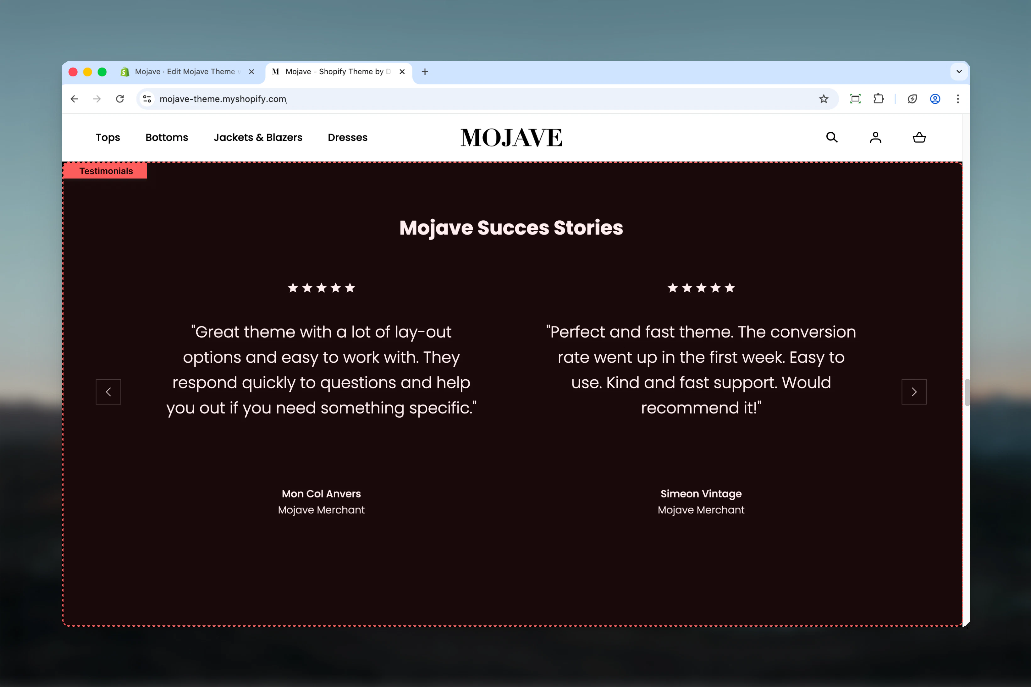
The **Testimonials** section showcases customer reviews and social proof with:
* **Carousel/slider** displaying 1 or 2 reviews at once (desktop)
* **Star ratings** (1-5 stars)
* Author name and role/title
* Three style variations: Main, Light, or Dark
* Optional heading and CTA link
Perfect for building trust, showcasing customer satisfaction, and providing social proof on homepages, product pages, or landing pages.
 ## Getting started
From the Theme Customizer, click **Add section** and select **Testimonials**
Add multiple **Review** blocks (typically 3-6 reviews). Each block represents one customer testimonial.
For each review, set star rating, add review text, and include author name and role
Select style (Main/Light/Dark), set reviews showing at once (1 or 2), and add optional heading/link
## Section settings
**Dropdown** (default: Dark)
Controls the color scheme and background of the testimonials section:
* **Main**: Uses primary theme colors with main background
* **Light**: Light background with dark text
* **Dark**: Dark background with light text (default)
**Dark** creates the most contrast and draws attention. **Light** blends with light pages. **Main** matches your brand colors.
**Dropdown** (default: Two) — **Desktop only**
Controls how many review cards display simultaneously on desktop:
* **One**: Single review card (centered, focused)
* **Two**: Two review cards side-by-side (default)
Mobile always displays one review at a time regardless of this setting.
**When to use One**: Longer reviews, more prominent display, focused attention
**When to use Two**: Shorter reviews, show more social proof at once, dynamic layout
**Text field** (default: "Reviews heading")
Main heading displayed above the reviews carousel. Use to introduce testimonials section.
Examples: "What Our Customers Say", "Trusted by Thousands", "Customer Reviews"
**Link text** (text, default: "Reviews link")
* CTA text displayed below reviews
**Link URL** (URL, default: /collections/all)
* Destination for the CTA link
Common destinations: Reviews page, all products, specific collection, external review platform (Trustpilot, etc.)
**Dropdown** (default: Default)
Controls vertical spacing above and below the section on desktop:
* **Default**: Standard spacing
* **Medium**: Moderate spacing
* **Compact**: Minimal spacing
**Dropdown** (default: Compact)
Controls vertical spacing above and below the section on mobile:
* **Default**: Standard mobile spacing
* **Compact**: Reduced spacing (recommended)
## Block types
### Review block
**No limit** — Add as many review blocks as needed
**Range slider** — 1 to 5 stars (default: 4)
Number of stars to display for this review. Shows filled star icons based on rating.
**Recommendation**: Mix ratings (mostly 4-5 stars with occasional 3 stars) for authenticity. All 5-star reviews can look fake.
**Textarea** (default: ""Lorem ipsum dolor sit amet consectetur adipisicing elit..."")
The actual review text/testimonial content from the customer.
**Best practices**:
* Keep to 2-4 sentences for readability
* Include specific details (product names, results, experiences)
* Use customer's actual language (including minor grammar quirks adds authenticity)
* Highlight benefits, outcomes, or emotional responses
**Text field** (default: "Author name")
Name of the reviewer/customer. Can be full name or first name + last initial for privacy.
Examples: "Sarah Johnson", "Michael T.", "Emma K."
**Text field** (default: "Author role")
Optional additional context about the reviewer—role, location, or descriptor.
Examples: "Verified Buyer", "New York, NY", "Repeat Customer", "Fashion Blogger"
Adding location or "Verified Buyer" increases trust and credibility.
**How to add reviews**:
1. Click **Add block** → Select **Review**
2. Set star count, add review text, author name, and role
3. Repeat for each testimonial (typically 3-6 reviews)
4. Reviews rotate in carousel in the order blocks are arranged
## Best practices
Always use genuine customer feedback. Authenticity builds trust—fake reviews damage credibility and may violate regulations.
Include mostly 4-5 star reviews with occasional 3-star reviews for authenticity. All 5-star reviews appear suspicious.
Limit reviews to 2-4 sentences (50-100 words). Shorter reviews are more readable and allow customers to scan multiple testimonials.
Add 3-6 review blocks for optimal carousel length. Too few (1-2) lacks impact, too many (10+) becomes overwhelming.
Prioritize reviews that mention specific products, features, or outcomes over vague praise like "Great product!"
Use author role to add credibility: "Verified Buyer", location, or customer type. This builds trust and relatability.
Use Dark style (default) when placing testimonials between light sections to create visual separation and draw attention.
Always include a link to view all reviews (review platform, collection page, or dedicated reviews page) for customers wanting more social proof.
## Common use cases
**Homepage social proof** — Place testimonials section on homepage (often near bottom) to build trust before visitors make purchase decisions
**Post-product sections** — Add below product sections or featured products to reinforce purchase intent with social validation
**Landing page credibility** — Include on campaign landing pages to overcome skepticism and increase conversion rates
**About page validation** — Feature customer testimonials on About page to validate brand claims and build emotional connection
**Pre-footer trust builder** — Position just before footer as final trust signal before visitors leave or make decision
## Layout behavior
**Desktop**:
* **Reviews showing at once = Two**: Two review cards side-by-side in carousel
* **Reviews showing at once = One**: Single centered review card in carousel
* Navigation arrows on left/right for manual browsing
* Dots/indicators at bottom showing position in carousel
**Mobile**:
* Always displays **one review at a time** regardless of desktop setting
* Full-width review card
* Swipeable carousel (touch gesture support)
* Navigation arrows and dots for browsing
**Carousel behavior**:
* Auto-rotation: None (reviews do not auto-advance)
* Manual navigation: Click arrows or swipe
* Infinite loop: Carousel loops from last review back to first
## Star rating display
Stars display as filled/unfilled icons based on rating:
* **5 stars**: 5 filled stars
* **4 stars**: 4 filled, 1 unfilled
* **3 stars**: 3 filled, 2 unfilled
* **2 stars**: 2 filled, 3 unfilled
* **1 star**: 1 filled, 4 unfilled
Star color typically matches theme accent color. Unfilled stars appear lighter/gray.
## Content guidelines
**Review text best practices**:
* Include specific product names or features mentioned
* Highlight concrete benefits or results experienced
* Keep emotional language authentic (not hyperbolic)
* Vary review length and tone across reviews
* Include minor imperfections for authenticity
**Author attribution**:
* Use real names (full names or first name + last initial)
* Add location for geographic relevance
* Include "Verified Buyer" when applicable
* Show recency when relevant ("Recent Purchase", "Long-time Customer")
## Related sections
* **Trust Indicators** — Static trust badges and certifications
* **Featured Articles** — Customer stories or long-form testimonials via blog
* **Press** — Media mentions and press coverage for additional social proof
* **Multi Column Text** — Text-based content that could include testimonials in alternative format
## Getting started
From the Theme Customizer, click **Add section** and select **Testimonials**
Add multiple **Review** blocks (typically 3-6 reviews). Each block represents one customer testimonial.
For each review, set star rating, add review text, and include author name and role
Select style (Main/Light/Dark), set reviews showing at once (1 or 2), and add optional heading/link
## Section settings
**Dropdown** (default: Dark)
Controls the color scheme and background of the testimonials section:
* **Main**: Uses primary theme colors with main background
* **Light**: Light background with dark text
* **Dark**: Dark background with light text (default)
**Dark** creates the most contrast and draws attention. **Light** blends with light pages. **Main** matches your brand colors.
**Dropdown** (default: Two) — **Desktop only**
Controls how many review cards display simultaneously on desktop:
* **One**: Single review card (centered, focused)
* **Two**: Two review cards side-by-side (default)
Mobile always displays one review at a time regardless of this setting.
**When to use One**: Longer reviews, more prominent display, focused attention
**When to use Two**: Shorter reviews, show more social proof at once, dynamic layout
**Text field** (default: "Reviews heading")
Main heading displayed above the reviews carousel. Use to introduce testimonials section.
Examples: "What Our Customers Say", "Trusted by Thousands", "Customer Reviews"
**Link text** (text, default: "Reviews link")
* CTA text displayed below reviews
**Link URL** (URL, default: /collections/all)
* Destination for the CTA link
Common destinations: Reviews page, all products, specific collection, external review platform (Trustpilot, etc.)
**Dropdown** (default: Default)
Controls vertical spacing above and below the section on desktop:
* **Default**: Standard spacing
* **Medium**: Moderate spacing
* **Compact**: Minimal spacing
**Dropdown** (default: Compact)
Controls vertical spacing above and below the section on mobile:
* **Default**: Standard mobile spacing
* **Compact**: Reduced spacing (recommended)
## Block types
### Review block
**No limit** — Add as many review blocks as needed
**Range slider** — 1 to 5 stars (default: 4)
Number of stars to display for this review. Shows filled star icons based on rating.
**Recommendation**: Mix ratings (mostly 4-5 stars with occasional 3 stars) for authenticity. All 5-star reviews can look fake.
**Textarea** (default: ""Lorem ipsum dolor sit amet consectetur adipisicing elit..."")
The actual review text/testimonial content from the customer.
**Best practices**:
* Keep to 2-4 sentences for readability
* Include specific details (product names, results, experiences)
* Use customer's actual language (including minor grammar quirks adds authenticity)
* Highlight benefits, outcomes, or emotional responses
**Text field** (default: "Author name")
Name of the reviewer/customer. Can be full name or first name + last initial for privacy.
Examples: "Sarah Johnson", "Michael T.", "Emma K."
**Text field** (default: "Author role")
Optional additional context about the reviewer—role, location, or descriptor.
Examples: "Verified Buyer", "New York, NY", "Repeat Customer", "Fashion Blogger"
Adding location or "Verified Buyer" increases trust and credibility.
**How to add reviews**:
1. Click **Add block** → Select **Review**
2. Set star count, add review text, author name, and role
3. Repeat for each testimonial (typically 3-6 reviews)
4. Reviews rotate in carousel in the order blocks are arranged
## Best practices
Always use genuine customer feedback. Authenticity builds trust—fake reviews damage credibility and may violate regulations.
Include mostly 4-5 star reviews with occasional 3-star reviews for authenticity. All 5-star reviews appear suspicious.
Limit reviews to 2-4 sentences (50-100 words). Shorter reviews are more readable and allow customers to scan multiple testimonials.
Add 3-6 review blocks for optimal carousel length. Too few (1-2) lacks impact, too many (10+) becomes overwhelming.
Prioritize reviews that mention specific products, features, or outcomes over vague praise like "Great product!"
Use author role to add credibility: "Verified Buyer", location, or customer type. This builds trust and relatability.
Use Dark style (default) when placing testimonials between light sections to create visual separation and draw attention.
Always include a link to view all reviews (review platform, collection page, or dedicated reviews page) for customers wanting more social proof.
## Common use cases
**Homepage social proof** — Place testimonials section on homepage (often near bottom) to build trust before visitors make purchase decisions
**Post-product sections** — Add below product sections or featured products to reinforce purchase intent with social validation
**Landing page credibility** — Include on campaign landing pages to overcome skepticism and increase conversion rates
**About page validation** — Feature customer testimonials on About page to validate brand claims and build emotional connection
**Pre-footer trust builder** — Position just before footer as final trust signal before visitors leave or make decision
## Layout behavior
**Desktop**:
* **Reviews showing at once = Two**: Two review cards side-by-side in carousel
* **Reviews showing at once = One**: Single centered review card in carousel
* Navigation arrows on left/right for manual browsing
* Dots/indicators at bottom showing position in carousel
**Mobile**:
* Always displays **one review at a time** regardless of desktop setting
* Full-width review card
* Swipeable carousel (touch gesture support)
* Navigation arrows and dots for browsing
**Carousel behavior**:
* Auto-rotation: None (reviews do not auto-advance)
* Manual navigation: Click arrows or swipe
* Infinite loop: Carousel loops from last review back to first
## Star rating display
Stars display as filled/unfilled icons based on rating:
* **5 stars**: 5 filled stars
* **4 stars**: 4 filled, 1 unfilled
* **3 stars**: 3 filled, 2 unfilled
* **2 stars**: 2 filled, 3 unfilled
* **1 star**: 1 filled, 4 unfilled
Star color typically matches theme accent color. Unfilled stars appear lighter/gray.
## Content guidelines
**Review text best practices**:
* Include specific product names or features mentioned
* Highlight concrete benefits or results experienced
* Keep emotional language authentic (not hyperbolic)
* Vary review length and tone across reviews
* Include minor imperfections for authenticity
**Author attribution**:
* Use real names (full names or first name + last initial)
* Add location for geographic relevance
* Include "Verified Buyer" when applicable
* Show recency when relevant ("Recent Purchase", "Long-time Customer")
## Related sections
* **Trust Indicators** — Static trust badges and certifications
* **Featured Articles** — Customer stories or long-form testimonials via blog
* **Press** — Media mentions and press coverage for additional social proof
* **Multi Column Text** — Text-based content that could include testimonials in alternative format