> ## Documentation Index
> Fetch the complete documentation index at: https://docs.digifist.com/llms.txt
> Use this file to discover all available pages before exploring further.
# Announcement bar
> Display important messages at the top or bottom of your store using the announcement bar.
The announcement bar displays site-wide messages for promotions, shipping updates, or time-sensitive information. It supports multiple display modes and countdown timers without disrupting the shopping experience.
 ## What this section controls
This section manages the content, display behavior, and device visibility of messages shown at the top or bottom of your store.
## Getting started
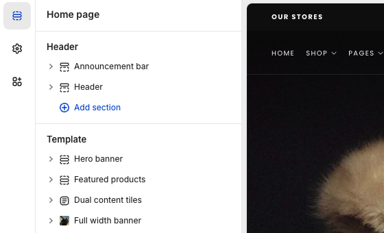
From Shopify admin, access the Theme Customizer.
The section is pre-added under the Header in the left sidebar. If removed, you can re-add it using the "Add section" button.
## What this section controls
This section manages the content, display behavior, and device visibility of messages shown at the top or bottom of your store.
## Getting started
From Shopify admin, access the Theme Customizer.
The section is pre-added under the Header in the left sidebar. If removed, you can re-add it using the "Add section" button.
 ## Display behavior
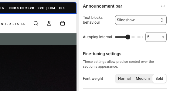
Control how announcement messages appear to visitors. This setting determines whether your text stays fixed, scrolls, or rotates through multiple messages.
Text stays fixed. Best for single, important messages that need maximum readability.
Text scrolls horizontally. Useful for longer messages or creating visual movement.
Multiple messages rotate automatically. Set the **Autoplay interval** to control timing between slides.
## Display behavior
Control how announcement messages appear to visitors. This setting determines whether your text stays fixed, scrolls, or rotates through multiple messages.
Text stays fixed. Best for single, important messages that need maximum readability.
Text scrolls horizontally. Useful for longer messages or creating visual movement.
Multiple messages rotate automatically. Set the **Autoplay interval** to control timing between slides.
 ## Key settings
### Adding messages
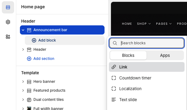
Click **Add block** and choose:
* **Text slide** - Standard announcement with optional icon
* **Localization** - Display language and currency selectors
* **Link** - Standalone call-to-action button
* **Countdown timer** - Adds urgency with time-based display
Each block includes device visibility controls to show content on desktop, mobile, or both.
## Key settings
### Adding messages
Click **Add block** and choose:
* **Text slide** - Standard announcement with optional icon
* **Localization** - Display language and currency selectors
* **Link** - Standalone call-to-action button
* **Countdown timer** - Adds urgency with time-based display
Each block includes device visibility controls to show content on desktop, mobile, or both.
 ### Typography
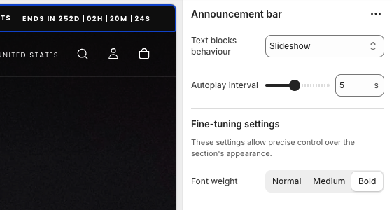
Control visual emphasis with font weight:
* **Normal** - Standard readability
* **Medium** - Subtle emphasis
* **Bold** - Maximum impact (use sparingly)
### Typography
Control visual emphasis with font weight:
* **Normal** - Standard readability
* **Medium** - Subtle emphasis
* **Bold** - Maximum impact (use sparingly)
 ## Block settings
Each block type offers unique configuration options to control how content appears and behaves across your store.
The most versatile block for displaying announcement messages with optional styling and links.
### Available settings
Enter your announcement text. Keep it concise for better mobile display.
Add a visual icon before your text to draw attention. Leave blank for text-only display.
## Block settings
Each block type offers unique configuration options to control how content appears and behaves across your store.
The most versatile block for displaying announcement messages with optional styling and links.
### Available settings
Enter your announcement text. Keep it concise for better mobile display.
Add a visual icon before your text to draw attention. Leave blank for text-only display.
 Add an optional destination URL to make the entire announcement clickable.
Display a button with custom text like "Shop now" or "Learn more" next to your message.
Add an optional destination URL to make the entire announcement clickable.
Display a button with custom text like "Shop now" or "Learn more" next to your message.
 Use text slides for promotional messages, shipping updates, or any store-wide announcements.
Display language and currency selectors for international stores.
### Available settings
Control where this selector appears:
* **Desktop** - Large screens only
* **Mobile** - Small screens only
* **Both** - All devices (recommended)
Use text slides for promotional messages, shipping updates, or any store-wide announcements.
Display language and currency selectors for international stores.
### Available settings
Control where this selector appears:
* **Desktop** - Large screens only
* **Mobile** - Small screens only
* **Both** - All devices (recommended)
 Localization blocks only appear when multiple languages or currencies are enabled in your store settings.
Standalone call-to-action button without announcement text.
### Available settings
The button text displayed to visitors. Use action-oriented phrases.
Localization blocks only appear when multiple languages or currencies are enabled in your store settings.
Standalone call-to-action button without announcement text.
### Available settings
The button text displayed to visitors. Use action-oriented phrases.
 The destination URL when the button is clicked.
Optional icon to display before the button text for visual emphasis.
Choose where this button appears: Desktop, Mobile, or Both.
Use link blocks for prominent calls-to-action like "Free Shipping" or "Sale Ends Today".
Create urgency with time-based displays that count down to a specific deadline.
### Available settings
Set when the countdown reaches zero. The timer will no longer display after this time.
The destination URL when the button is clicked.
Optional icon to display before the button text for visual emphasis.
Choose where this button appears: Desktop, Mobile, or Both.
Use link blocks for prominent calls-to-action like "Free Shipping" or "Sale Ends Today".
Create urgency with time-based displays that count down to a specific deadline.
### Available settings
Set when the countdown reaches zero. The timer will no longer display after this time.
 Message displayed before the countdown. Example: "Sale ends in"
Optional message shown after the countdown ends. Leave blank to hide the block entirely.
Control timer visibility across Desktop, Mobile, or Both devices.
Only use countdown timers for genuine deadlines. Fake urgency damages customer trust.
## Best practices
Aim for 2-5 words. Long messages get truncated on mobile.
If using slideshow, keep it to 2-3 messages maximum. Too many reduces effectiveness.
Only use countdown timers for genuine deadlines to maintain trust.
Always preview on mobile before publishing.
Autoplay interval under 5 seconds can be distracting and reduce message comprehension.
## Related guides
Configure header settings and navigation options
Message displayed before the countdown. Example: "Sale ends in"
Optional message shown after the countdown ends. Leave blank to hide the block entirely.
Control timer visibility across Desktop, Mobile, or Both devices.
Only use countdown timers for genuine deadlines. Fake urgency damages customer trust.
## Best practices
Aim for 2-5 words. Long messages get truncated on mobile.
If using slideshow, keep it to 2-3 messages maximum. Too many reduces effectiveness.
Only use countdown timers for genuine deadlines to maintain trust.
Always preview on mobile before publishing.
Autoplay interval under 5 seconds can be distracting and reduce message comprehension.
## Related guides
Configure header settings and navigation options