> ## Documentation Index
> Fetch the complete documentation index at: https://docs.digifist.com/llms.txt
> Use this file to discover all available pages before exploring further.
# Collection list page (CLP)
> Customize the layout and features of your collection list pages.
Collection list pages display a grid of collections, allowing customers to browse and shop from various collection categories. You can customize the grid layout, card appearance, pagination style, and choose between automatic or curated collection displays.
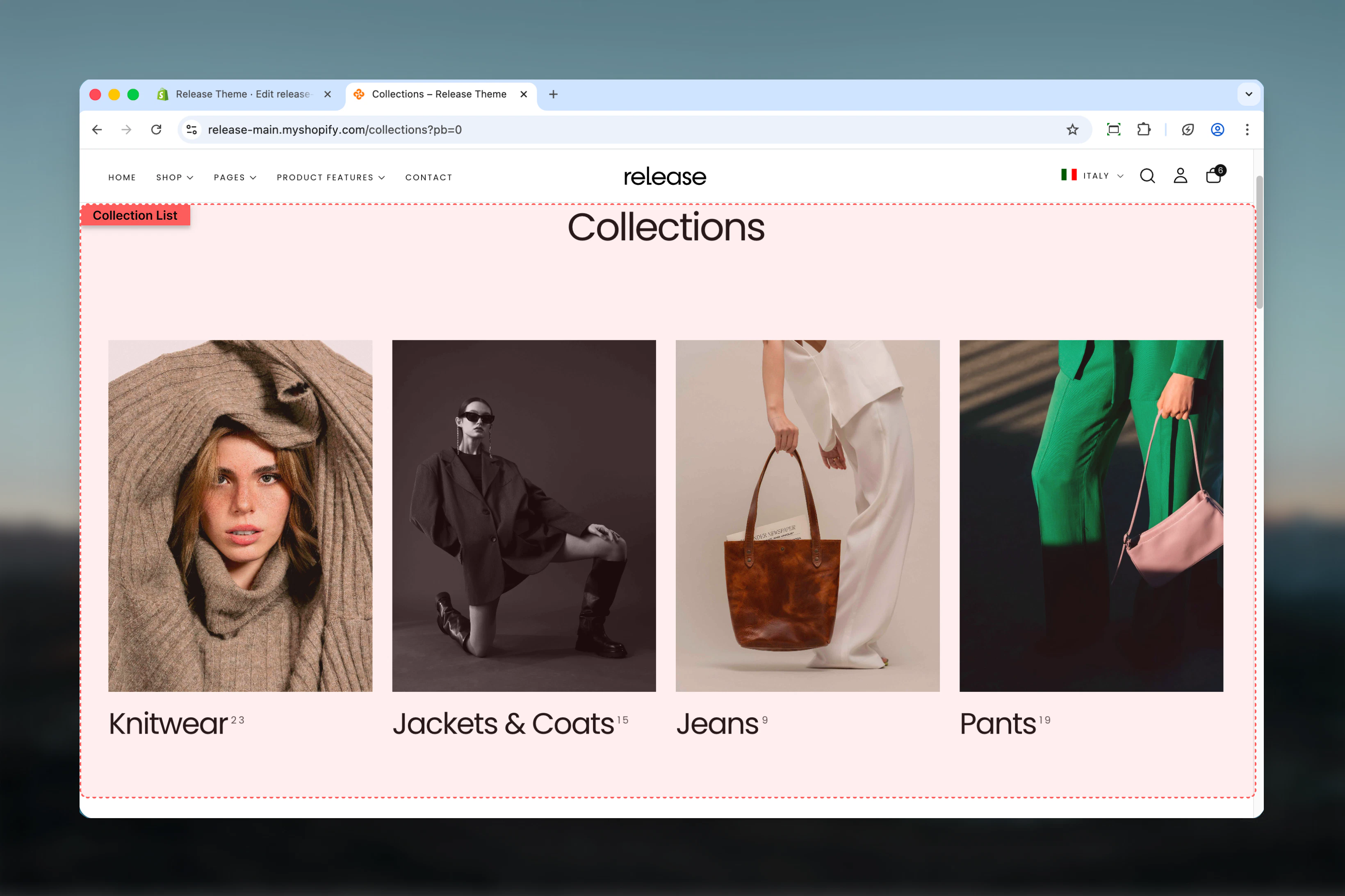 ## What this section controls
This section manages:
* **Collection grid layout** - Set items per row for desktop and mobile displays
* **Collection card styling** - Control card title style, aspect ratios, and product count display
* **Collection source** - Choose between all collections (automatic) or selected collections (manual curation)
* **Pagination** - Control pagination style, load more button, and infinity scroll
* **Section layout** - Adjust section width, color scheme, and spacing
* **Individual collection blocks** - Customize per-collection images, headings, and color schemes
## Getting started
From Shopify admin, access the Theme Customizer
In the left sidebar, find the **Collection list** section
Decide between **All collections** (automatic display) or **Selected collections** (manual curation)
Set items per row (3 or 4 columns) and card aspect ratio in the **Grid Layout** tab
Set title style and product count display in the **Card Design** tab
If using Selected mode, click **Add block** > **Collection** to manually add collections with custom styling
## Section Settings
Control which collections are displayed and how many per page.
## What this section controls
This section manages:
* **Collection grid layout** - Set items per row for desktop and mobile displays
* **Collection card styling** - Control card title style, aspect ratios, and product count display
* **Collection source** - Choose between all collections (automatic) or selected collections (manual curation)
* **Pagination** - Control pagination style, load more button, and infinity scroll
* **Section layout** - Adjust section width, color scheme, and spacing
* **Individual collection blocks** - Customize per-collection images, headings, and color schemes
## Getting started
From Shopify admin, access the Theme Customizer
In the left sidebar, find the **Collection list** section
Decide between **All collections** (automatic display) or **Selected collections** (manual curation)
Set items per row (3 or 4 columns) and card aspect ratio in the **Grid Layout** tab
Set title style and product count display in the **Card Design** tab
If using Selected mode, click **Add block** > **Collection** to manually add collections with custom styling
## Section Settings
Control which collections are displayed and how many per page.
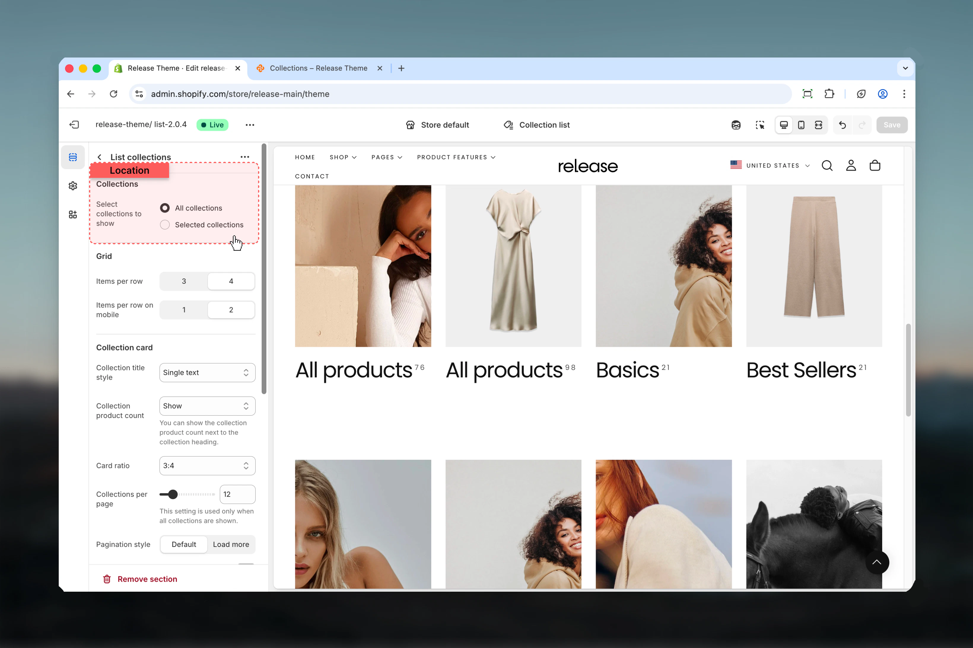 **Type:** Dropdown\
**Options:** All collections, Selected collections\
**Default:** All collections
Choose which collections to display:
* **All collections** - Automatically shows all store collections
* **Selected collections** - Only shows collections added as blocks
Use "Selected collections" to curate order, visibility, and customize individual collection cards with custom images and headings.
**Type:** Range\
**Range:** 3-50\
**Default:** 12\
**Availability:** Only applies when "All collections" is selected
Number of collections loaded before pagination appears. Higher values show more collections at once but may slow page loading.
This setting is ignored when "Selected collections" mode is active. In selected mode, only manually added collection blocks appear.
Define the grid structure and how collection cards are arranged.
**Type:** Dropdown\
**Options:** All collections, Selected collections\
**Default:** All collections
Choose which collections to display:
* **All collections** - Automatically shows all store collections
* **Selected collections** - Only shows collections added as blocks
Use "Selected collections" to curate order, visibility, and customize individual collection cards with custom images and headings.
**Type:** Range\
**Range:** 3-50\
**Default:** 12\
**Availability:** Only applies when "All collections" is selected
Number of collections loaded before pagination appears. Higher values show more collections at once but may slow page loading.
This setting is ignored when "Selected collections" mode is active. In selected mode, only manually added collection blocks appear.
Define the grid structure and how collection cards are arranged.
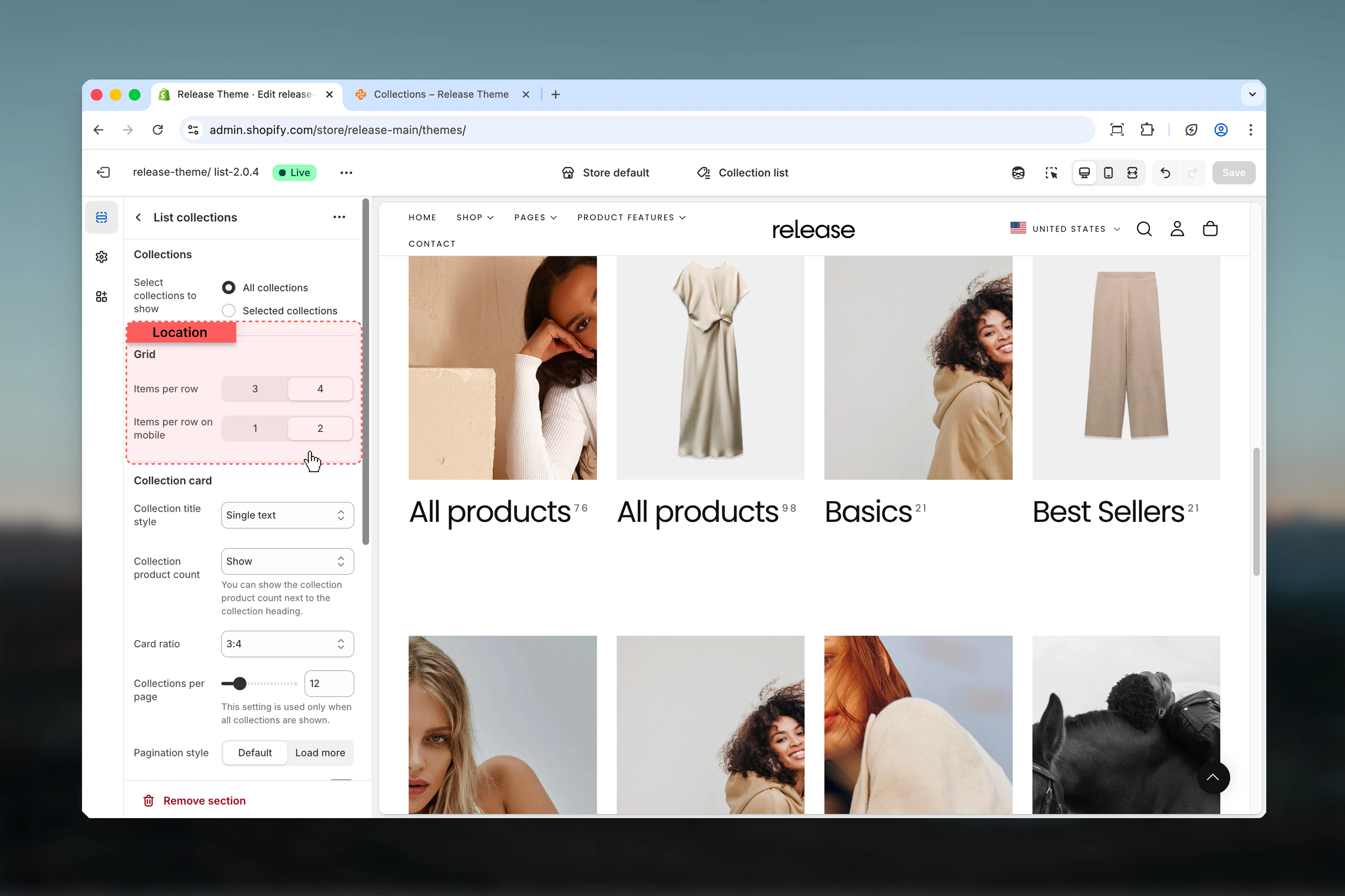 **Type:** Dropdown\
**Options:** 3, 4\
**Default:** 4
Number of collection cards per row on desktop screens.
* **3** - Larger cards with more prominent images
* **4** - More collections visible at once, efficient browsing
Use 3 columns for premium brands where large imagery matters. Use 4 columns for stores with many collections where variety is key.
**Type:** Dropdown\
**Options:** 1, 2\
**Default:** 2
Number of cards per row on mobile devices.
* **1** - Single column layout, maximum card size
* **2** - Two columns, balance between size and scrolling
Most mobile users prefer 2 columns as it allows comparison while maintaining card readability.
Control the visual appearance of individual collection cards.
**Type:** Dropdown\
**Options:** 3, 4\
**Default:** 4
Number of collection cards per row on desktop screens.
* **3** - Larger cards with more prominent images
* **4** - More collections visible at once, efficient browsing
Use 3 columns for premium brands where large imagery matters. Use 4 columns for stores with many collections where variety is key.
**Type:** Dropdown\
**Options:** 1, 2\
**Default:** 2
Number of cards per row on mobile devices.
* **1** - Single column layout, maximum card size
* **2** - Two columns, balance between size and scrolling
Most mobile users prefer 2 columns as it allows comparison while maintaining card readability.
Control the visual appearance of individual collection cards.
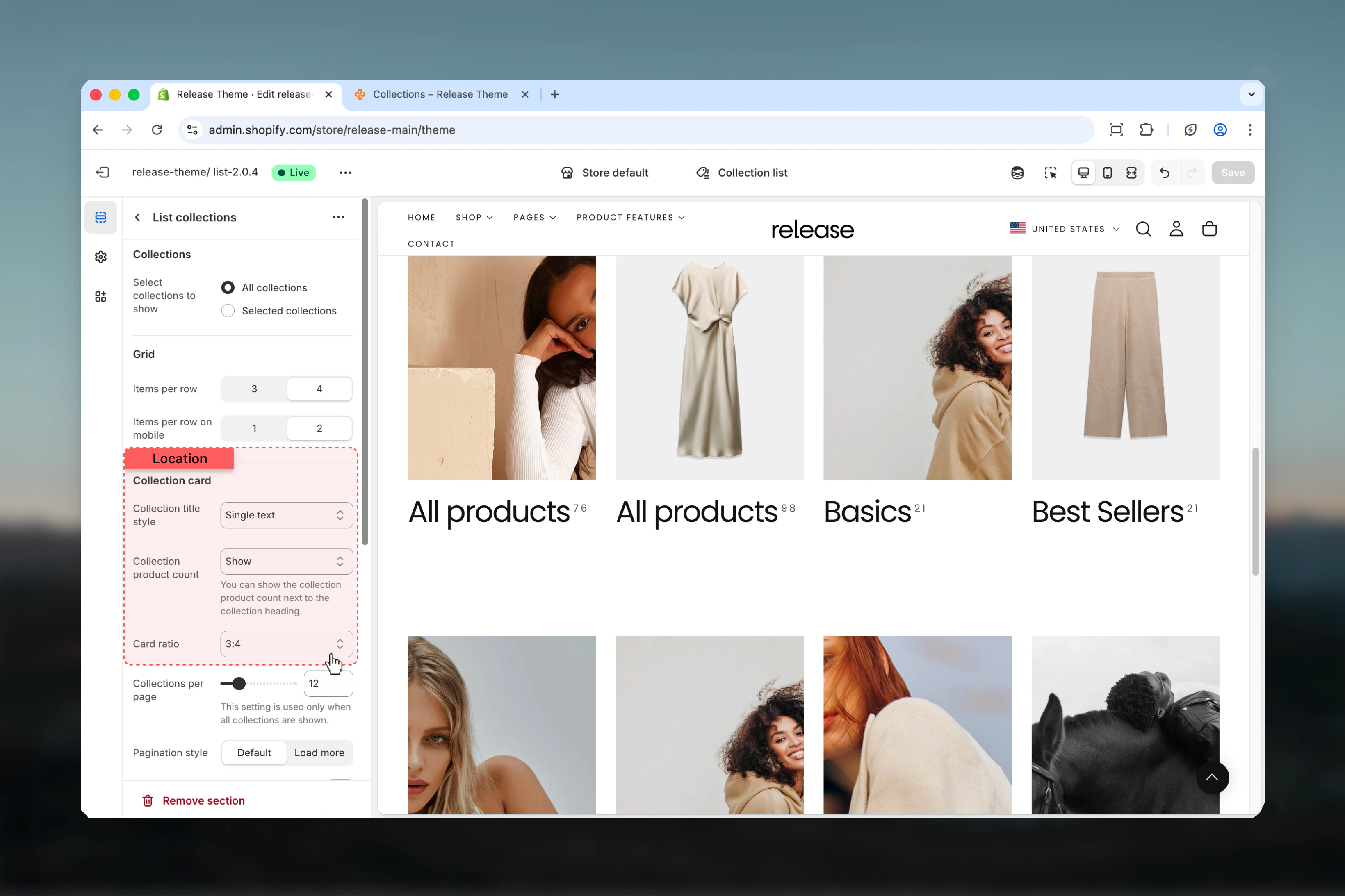 **Type:** Dropdown\
**Options:** Single text, Text with arrow\
**Default:** Single text
Visual style for collection card titles.
* **Single text** - Clean text-only display
* **Text with arrow** - Text plus arrow icon for visual cue
Text with arrow encourages clicking and signals interactivity. Single text provides a cleaner, more minimal aesthetic.
**Type:** Dropdown\
**Options:** Hide, Show, With border\
**Default:** Show
Display product count on collection cards.
* **Hide** - No product count visible
* **Show** - Display count below collection title
* **With border** - Count with decorative border accent
Product counts help customers understand collection size and make informed browsing decisions. Always show for stores with varying collection sizes.
**Type:** Dropdown\
**Options:** Auto, 1:1, 4:3, 3:2, 5:4, 16:9, 2:1, 4:1, 8:1, 3:4, 2:3, 4:5, 9:16, 1:2\
**Default:** 3:4 (Portrait)
Aspect ratio for collection images.
**Landscape ratios:**
* **1:1** - Square
* **4:3, 3:2, 5:4, 16:9, 2:1, 4:1, 8:1** - Various landscape formats
**Portrait ratios:**
* **3:4, 2:3, 4:5, 9:16, 1:2** - Various portrait formats
**Auto:** Adaptive to original image dimensions
3:4 portrait works well for most collection images and matches common product photography ratios.
Control how customers navigate through multiple pages of collections.
**Type:** Dropdown\
**Options:** Page numbers, Load more\
**Default:** Page numbers
How customers navigate through collection pages.
* **Page numbers** - Traditional pagination with numbered links (1, 2, 3...)
* **Load more** - Single button that loads additional collections inline
Pagination only applies when "All collections" mode is selected. Selected collections mode displays all added blocks without pagination.
**Type:** Toggle\
**Default:** Disabled\
**Availability:** Only when "Load more" pagination is selected
Automatically loads more collections while customer scrolls down the page, eliminating the need to click "Load more" button.
Infinity scroll works best for stores with 20+ collections. It improves mobile browsing experience by reducing interaction requirements.
Some users prefer traditional pagination for better navigation control. Test with your audience before enabling.
Control the overall section layout, width, and spacing.
**Type:** Dropdown\
**Options:** Single text, Text with arrow\
**Default:** Single text
Visual style for collection card titles.
* **Single text** - Clean text-only display
* **Text with arrow** - Text plus arrow icon for visual cue
Text with arrow encourages clicking and signals interactivity. Single text provides a cleaner, more minimal aesthetic.
**Type:** Dropdown\
**Options:** Hide, Show, With border\
**Default:** Show
Display product count on collection cards.
* **Hide** - No product count visible
* **Show** - Display count below collection title
* **With border** - Count with decorative border accent
Product counts help customers understand collection size and make informed browsing decisions. Always show for stores with varying collection sizes.
**Type:** Dropdown\
**Options:** Auto, 1:1, 4:3, 3:2, 5:4, 16:9, 2:1, 4:1, 8:1, 3:4, 2:3, 4:5, 9:16, 1:2\
**Default:** 3:4 (Portrait)
Aspect ratio for collection images.
**Landscape ratios:**
* **1:1** - Square
* **4:3, 3:2, 5:4, 16:9, 2:1, 4:1, 8:1** - Various landscape formats
**Portrait ratios:**
* **3:4, 2:3, 4:5, 9:16, 1:2** - Various portrait formats
**Auto:** Adaptive to original image dimensions
3:4 portrait works well for most collection images and matches common product photography ratios.
Control how customers navigate through multiple pages of collections.
**Type:** Dropdown\
**Options:** Page numbers, Load more\
**Default:** Page numbers
How customers navigate through collection pages.
* **Page numbers** - Traditional pagination with numbered links (1, 2, 3...)
* **Load more** - Single button that loads additional collections inline
Pagination only applies when "All collections" mode is selected. Selected collections mode displays all added blocks without pagination.
**Type:** Toggle\
**Default:** Disabled\
**Availability:** Only when "Load more" pagination is selected
Automatically loads more collections while customer scrolls down the page, eliminating the need to click "Load more" button.
Infinity scroll works best for stores with 20+ collections. It improves mobile browsing experience by reducing interaction requirements.
Some users prefer traditional pagination for better navigation control. Test with your audience before enabling.
Control the overall section layout, width, and spacing.
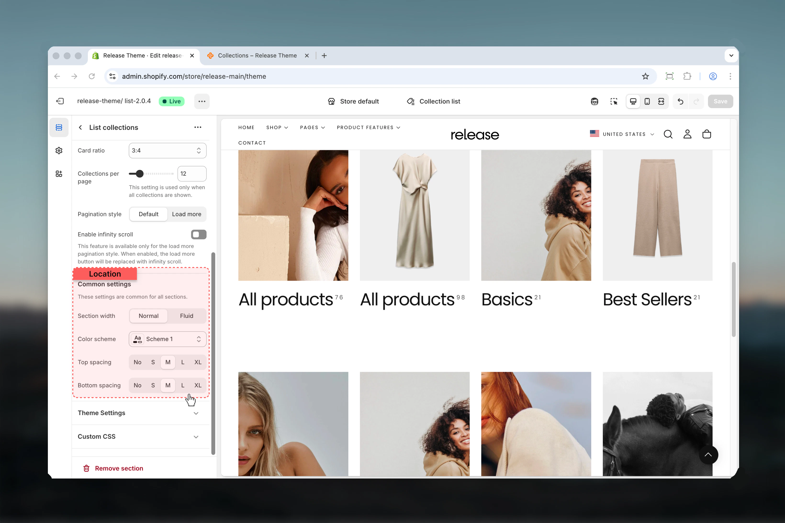 **Type:** Dropdown\
**Options:** max-w-page, max-w-fluid\
**Default:** max-w-page
Maximum width of the collections section.
* **max-w-page** - Standard container matching theme's page width
* **max-w-fluid** - Wider container utilizing more screen space
Use max-w-page for visual consistency with other pages. Use max-w-fluid for large grids where maximum visibility is beneficial.
**Type:** Dropdown\
**Default:** scheme-1
Select the color scheme for the section. Available schemes are defined in **Theme settings > Colors**.
Color scheme affects background, text, borders, and button colors throughout the section.
**Type:** Dropdown\
**Options:** No (0), S (1), M (2), L (4), XL (6)\
**Default:** M (2)
Padding above the collections section, controlling vertical space from the previous section.
**Type:** Dropdown\
**Options:** No (0), S (1), M (2), L (4), XL (6)\
**Default:** M (2)
Padding below the collections section, controlling vertical space to the next section.
Use consistent spacing (M or L) across pages for visual rhythm. Reduce to S for tighter, magazine-style layouts.
## Block Settings
### Collection Block
Add individual collections with custom styling. Only used in "Selected collections" mode. Maximum 50 blocks.
Collection blocks are only visible when "Selected collections" is chosen in the Collections tab.
**Type:** Dropdown\
**Options:** max-w-page, max-w-fluid\
**Default:** max-w-page
Maximum width of the collections section.
* **max-w-page** - Standard container matching theme's page width
* **max-w-fluid** - Wider container utilizing more screen space
Use max-w-page for visual consistency with other pages. Use max-w-fluid for large grids where maximum visibility is beneficial.
**Type:** Dropdown\
**Default:** scheme-1
Select the color scheme for the section. Available schemes are defined in **Theme settings > Colors**.
Color scheme affects background, text, borders, and button colors throughout the section.
**Type:** Dropdown\
**Options:** No (0), S (1), M (2), L (4), XL (6)\
**Default:** M (2)
Padding above the collections section, controlling vertical space from the previous section.
**Type:** Dropdown\
**Options:** No (0), S (1), M (2), L (4), XL (6)\
**Default:** M (2)
Padding below the collections section, controlling vertical space to the next section.
Use consistent spacing (M or L) across pages for visual rhythm. Reduce to S for tighter, magazine-style layouts.
## Block Settings
### Collection Block
Add individual collections with custom styling. Only used in "Selected collections" mode. Maximum 50 blocks.
Collection blocks are only visible when "Selected collections" is chosen in the Collections tab.
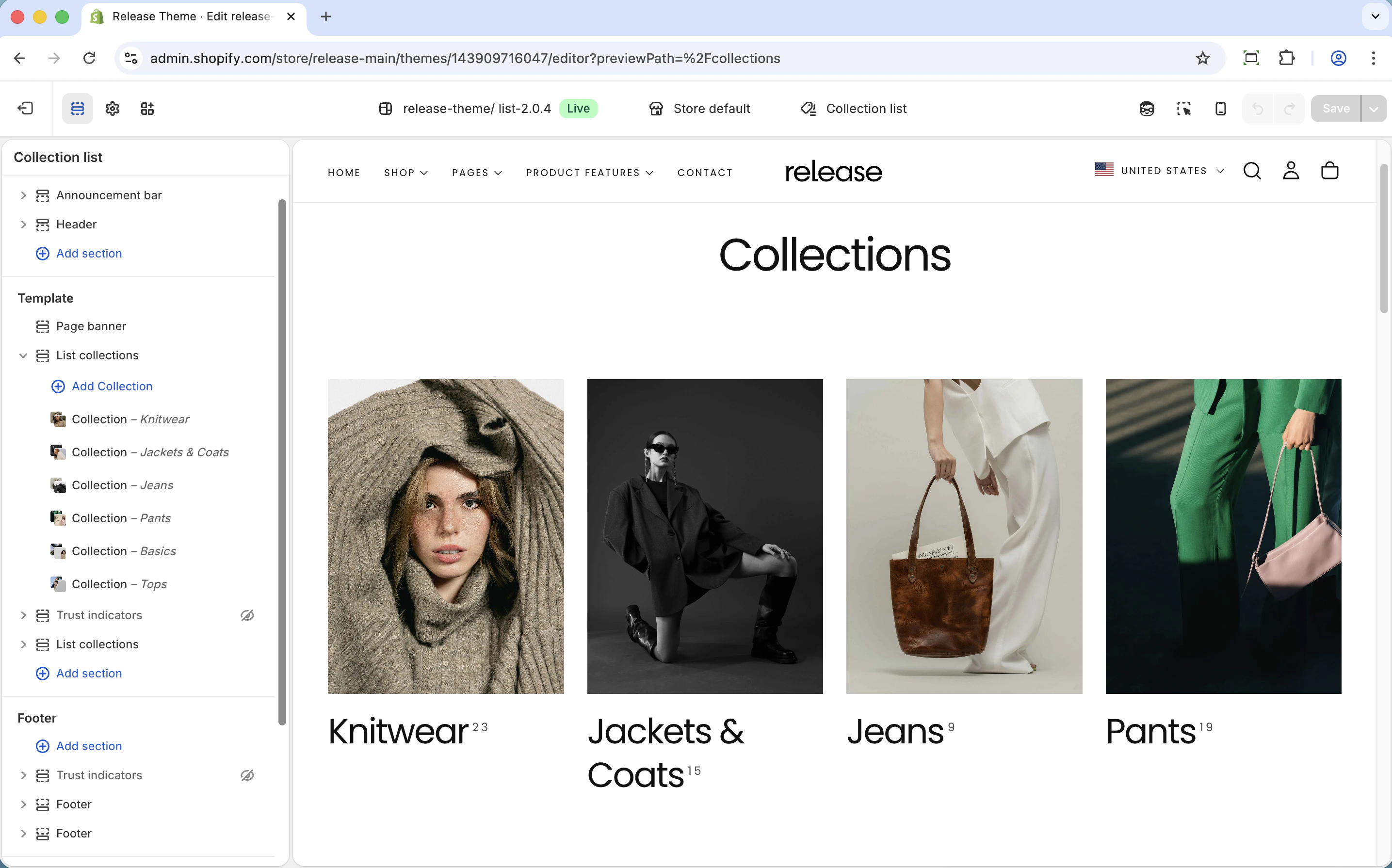 **Type:** Collection picker\
**Required:** Yes
Select which collection to display in this card position. Opens the Shopify collection selector.
**Type:** Image picker\
**Optional:** Yes
Custom image that overwrites the collection's default featured image. Use this to create consistent branding or highlight specific aspects of the collection.
Override images in blocks for consistent brand look across all collection cards, even if individual collections have varying image styles.
**Type:** Text field\
**Optional:** Yes
Custom heading that overwrites the collection's default title. Use this for marketing-friendly names or seasonal messaging.
Use custom headings for "Sale Collections" or "New Arrivals" when the actual collection name is generic.
**Type:** Dropdown\
**Options:** XS (h6), S (h5), M (h4), L (h3)\
**Default:** M (h4)
Size of collection title text. Larger headings draw more attention to priority collections.
**Type:** Text field\
**Optional:** Yes
Additional text below the main heading. Perfect for descriptive content like "New", "Sale", "Limited Time", or product count.
Use subheadings for "New", "Sale", "Limited Time" messaging to create urgency and highlight special collections.
**Type:** Dropdown\
**Default:** scheme-1
Per-collection color scheme. Allows individual cards to have different background and text colors for visual hierarchy.
Use contrasting color schemes for sale or featured collections to make them stand out in the grid.
## Common use cases
Display all store collections automatically in a standard grid.
**Configuration:**
* Collections: All collections
* Items per row: 4
* Product count: Show
* Collections per page: 12
* Pagination: Page numbers
Hand-pick specific collections in priority order for featured landing pages.
**Configuration:**
* Collections: Selected collections
* Add blocks: Priority collections first
* Custom images: Yes, for brand consistency
* Heading sizes: Vary (L for hero, M for others)
Visual merchandising with custom images and headings per collection.
**Configuration:**
* Collections: Selected collections
* Custom images: All collections
* Custom headings: Marketing-friendly names
* Subheadings: Descriptive text
Highlight sale collections with distinctive styling.
**Configuration:**
* Collections: Selected collections
* Color schemes: scheme-2 (contrast color) for sale items
* Subheadings: "Up to 50% off", "Limited time"
* Card title style: Text with arrow
Create seasonal collection pages with timely messaging.
**Configuration:**
* Collections: Selected collections
* Subheadings: "New", "Sale", "Limited Time"
* Custom images: Seasonal photography
* Heading sizes: L for featured seasonal collection
Efficiently display stores with 50+ collections.
**Configuration:**
* Collections: All collections
* Pagination style: Load more
* Enable infinity scroll: Yes
* Collections per page: 16-24
Use custom content to tell brand narrative through collections.
**Configuration:**
* Collections: Selected collections
* Custom images: Brand lifestyle photography
* Subheadings: Descriptive brand messaging
* Items per row: 3 (larger cards)
Display major collection categories like a traditional department store.
**Configuration:**
* Collections: All collections mode
* Items per row: 3 (larger card display)
* Card ratio: 4:3 landscape
* Product count: With border
## Best practices
Use 4 columns on desktop for optimal visibility and efficient browsing. This balances card size with variety, letting customers see many options at once.
3:4 portrait works well for most collection images and matches common product photography ratios. Maintain consistency across all cards for professional appearance.
Always show product counts to help customers understand collection size and make informed browsing decisions. This is especially valuable when collection sizes vary significantly.
Use "Selected collections" when you want to control order, visibility, or customize per-collection. Perfect for curated landing pages and seasonal campaigns.
Use "All collections" for stores with many collections that change frequently. This automates display and reduces manual maintenance.
Text with arrow encourages clicking and signals interactivity. Single text provides cleaner, more minimal aesthetic. Choose based on brand style.
Override images in blocks for consistent brand look across all collection cards, even when individual collections have varying image styles.
2 columns on mobile provides good balance between card size and scrolling length. Single column makes cards too large for quick browsing.
Enable infinity scroll for stores with 20+ collections to improve mobile experience. Traditional pagination works better for smaller collection counts where users want page-level control.
## Related guides
Configure individual collection page layouts and filtering
Display featured collections on homepage sections
**Type:** Collection picker\
**Required:** Yes
Select which collection to display in this card position. Opens the Shopify collection selector.
**Type:** Image picker\
**Optional:** Yes
Custom image that overwrites the collection's default featured image. Use this to create consistent branding or highlight specific aspects of the collection.
Override images in blocks for consistent brand look across all collection cards, even if individual collections have varying image styles.
**Type:** Text field\
**Optional:** Yes
Custom heading that overwrites the collection's default title. Use this for marketing-friendly names or seasonal messaging.
Use custom headings for "Sale Collections" or "New Arrivals" when the actual collection name is generic.
**Type:** Dropdown\
**Options:** XS (h6), S (h5), M (h4), L (h3)\
**Default:** M (h4)
Size of collection title text. Larger headings draw more attention to priority collections.
**Type:** Text field\
**Optional:** Yes
Additional text below the main heading. Perfect for descriptive content like "New", "Sale", "Limited Time", or product count.
Use subheadings for "New", "Sale", "Limited Time" messaging to create urgency and highlight special collections.
**Type:** Dropdown\
**Default:** scheme-1
Per-collection color scheme. Allows individual cards to have different background and text colors for visual hierarchy.
Use contrasting color schemes for sale or featured collections to make them stand out in the grid.
## Common use cases
Display all store collections automatically in a standard grid.
**Configuration:**
* Collections: All collections
* Items per row: 4
* Product count: Show
* Collections per page: 12
* Pagination: Page numbers
Hand-pick specific collections in priority order for featured landing pages.
**Configuration:**
* Collections: Selected collections
* Add blocks: Priority collections first
* Custom images: Yes, for brand consistency
* Heading sizes: Vary (L for hero, M for others)
Visual merchandising with custom images and headings per collection.
**Configuration:**
* Collections: Selected collections
* Custom images: All collections
* Custom headings: Marketing-friendly names
* Subheadings: Descriptive text
Highlight sale collections with distinctive styling.
**Configuration:**
* Collections: Selected collections
* Color schemes: scheme-2 (contrast color) for sale items
* Subheadings: "Up to 50% off", "Limited time"
* Card title style: Text with arrow
Create seasonal collection pages with timely messaging.
**Configuration:**
* Collections: Selected collections
* Subheadings: "New", "Sale", "Limited Time"
* Custom images: Seasonal photography
* Heading sizes: L for featured seasonal collection
Efficiently display stores with 50+ collections.
**Configuration:**
* Collections: All collections
* Pagination style: Load more
* Enable infinity scroll: Yes
* Collections per page: 16-24
Use custom content to tell brand narrative through collections.
**Configuration:**
* Collections: Selected collections
* Custom images: Brand lifestyle photography
* Subheadings: Descriptive brand messaging
* Items per row: 3 (larger cards)
Display major collection categories like a traditional department store.
**Configuration:**
* Collections: All collections mode
* Items per row: 3 (larger card display)
* Card ratio: 4:3 landscape
* Product count: With border
## Best practices
Use 4 columns on desktop for optimal visibility and efficient browsing. This balances card size with variety, letting customers see many options at once.
3:4 portrait works well for most collection images and matches common product photography ratios. Maintain consistency across all cards for professional appearance.
Always show product counts to help customers understand collection size and make informed browsing decisions. This is especially valuable when collection sizes vary significantly.
Use "Selected collections" when you want to control order, visibility, or customize per-collection. Perfect for curated landing pages and seasonal campaigns.
Use "All collections" for stores with many collections that change frequently. This automates display and reduces manual maintenance.
Text with arrow encourages clicking and signals interactivity. Single text provides cleaner, more minimal aesthetic. Choose based on brand style.
Override images in blocks for consistent brand look across all collection cards, even when individual collections have varying image styles.
2 columns on mobile provides good balance between card size and scrolling length. Single column makes cards too large for quick browsing.
Enable infinity scroll for stores with 20+ collections to improve mobile experience. Traditional pagination works better for smaller collection counts where users want page-level control.
## Related guides
Configure individual collection page layouts and filtering
Display featured collections on homepage sections