> ## Documentation Index
> Fetch the complete documentation index at: https://docs.digifist.com/llms.txt
> Use this file to discover all available pages before exploring further.
# Collection page (PLP)
> Customize the layout and features of your collection pages.
Collection pages (PLP) display a group of products, allowing customers to browse and shop from a curated selection. You can customize the layout, filters, sorting options, and optional promotional text cards to enhance the shopping experience.
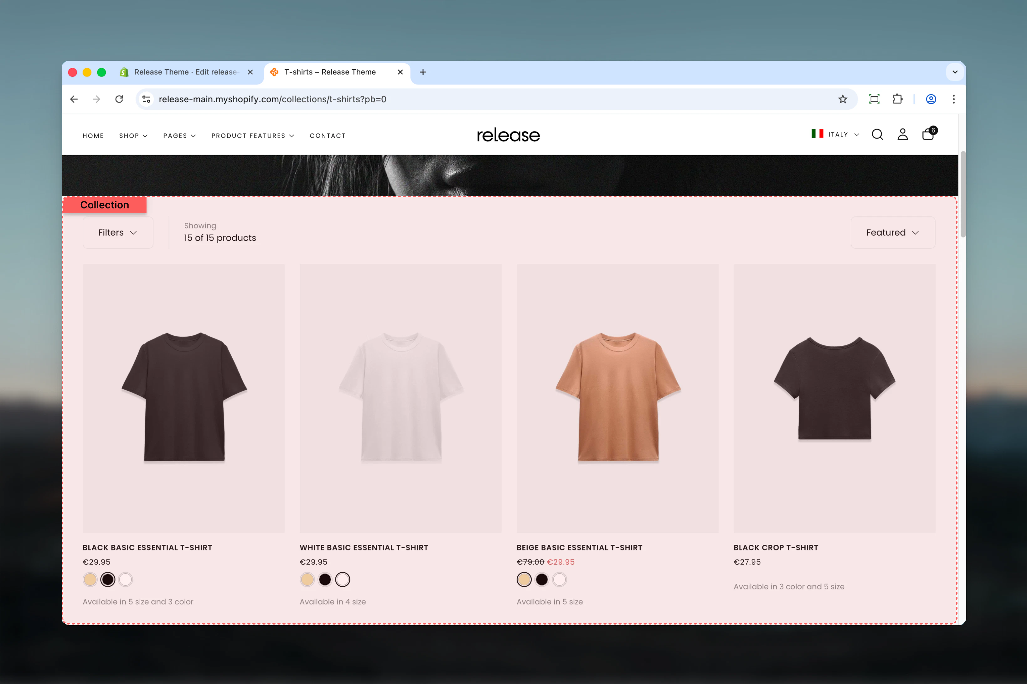 ## What this section controls
This section manages:
* **Product grid layout** - Set products per row for desktop and mobile
* **Filtering system** - Control how customers filter products (drawer, sidebar, or hidden)
* **Sorting capabilities** - Enable/disable sorting dropdown options
* **Pagination style** - Choose between traditional pagination, load more button, or infinite scroll
* **Promotional text cards** - Insert branded content within the product grid
* **Section spacing and colors** - Adjust layout width, color scheme, and spacing
## Getting started
From Shopify admin, access the Theme Customizer
In the left sidebar, click **Collections** then select **Default collection**
Adjust filter display, sorting, and product count settings in the **Utilities Bar** tab
Set products per row, pagination style, and spacing in the **Product Grid** tab
Click **Add block** > **Text card** to insert promotional cards within the product grid
## Section Settings
The utilities bar appears above the product grid, containing filters, sorting, and product count.
## What this section controls
This section manages:
* **Product grid layout** - Set products per row for desktop and mobile
* **Filtering system** - Control how customers filter products (drawer, sidebar, or hidden)
* **Sorting capabilities** - Enable/disable sorting dropdown options
* **Pagination style** - Choose between traditional pagination, load more button, or infinite scroll
* **Promotional text cards** - Insert branded content within the product grid
* **Section spacing and colors** - Adjust layout width, color scheme, and spacing
## Getting started
From Shopify admin, access the Theme Customizer
In the left sidebar, click **Collections** then select **Default collection**
Adjust filter display, sorting, and product count settings in the **Utilities Bar** tab
Set products per row, pagination style, and spacing in the **Product Grid** tab
Click **Add block** > **Text card** to insert promotional cards within the product grid
## Section Settings
The utilities bar appears above the product grid, containing filters, sorting, and product count.
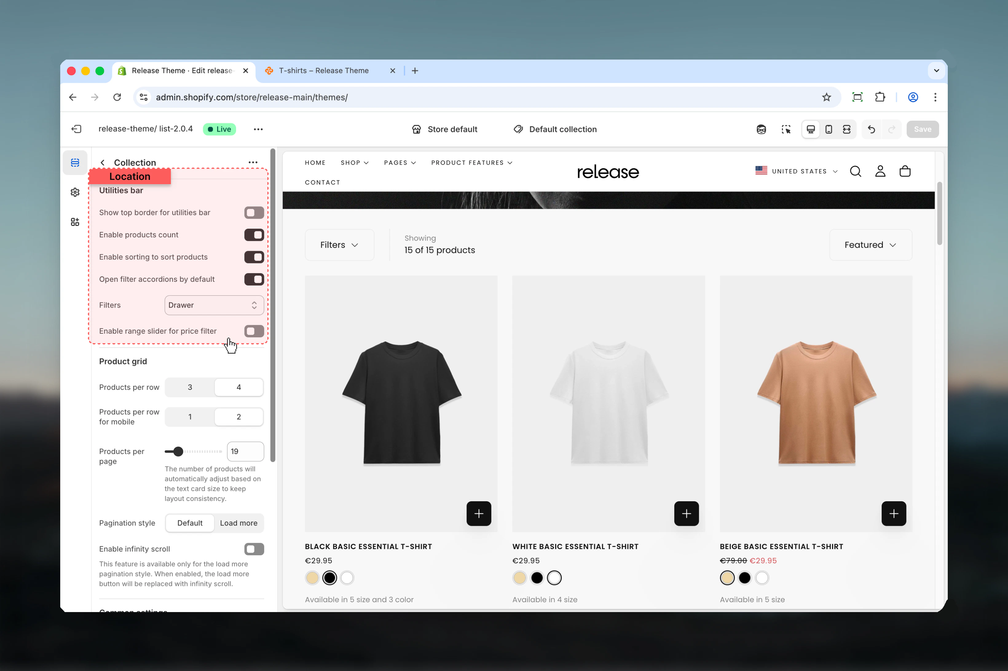 **Type:** Toggle\
**Default:** Disabled
Adds a decorative border above the utilities bar to visually separate it from the content above.
This border uses the theme's border color from your color scheme settings.
**Type:** Toggle\
**Default:** Enabled
Displays the total number of products in the collection (e.g., "24 products").
Product count helps customers understand collection size and is especially useful for large collections.
**Type:** Toggle\
**Default:** Enabled
Shows the sorting dropdown allowing customers to sort products by:
* Featured
* Best selling
* Alphabetically (A-Z)
* Alphabetically (Z-A)
* Price (low to high)
* Price (high to low)
* Date (old to new)
* Date (new to old)
**Type:** Dropdown\
**Options:** Hide, Drawer, Sidebar\
**Default:** Drawer
Choose how filters are displayed to customers:
* **Hide** - Removes all product filters
* **Drawer** - Filters slide in from the side when the "Filter" button is clicked
* **Sidebar** - Filters are always visible in a left sidebar
**Type:** Toggle\
**Default:** Disabled
Adds a decorative border above the utilities bar to visually separate it from the content above.
This border uses the theme's border color from your color scheme settings.
**Type:** Toggle\
**Default:** Enabled
Displays the total number of products in the collection (e.g., "24 products").
Product count helps customers understand collection size and is especially useful for large collections.
**Type:** Toggle\
**Default:** Enabled
Shows the sorting dropdown allowing customers to sort products by:
* Featured
* Best selling
* Alphabetically (A-Z)
* Alphabetically (Z-A)
* Price (low to high)
* Price (high to low)
* Date (old to new)
* Date (new to old)
**Type:** Dropdown\
**Options:** Hide, Drawer, Sidebar\
**Default:** Drawer
Choose how filters are displayed to customers:
* **Hide** - Removes all product filters
* **Drawer** - Filters slide in from the side when the "Filter" button is clicked
* **Sidebar** - Filters are always visible in a left sidebar
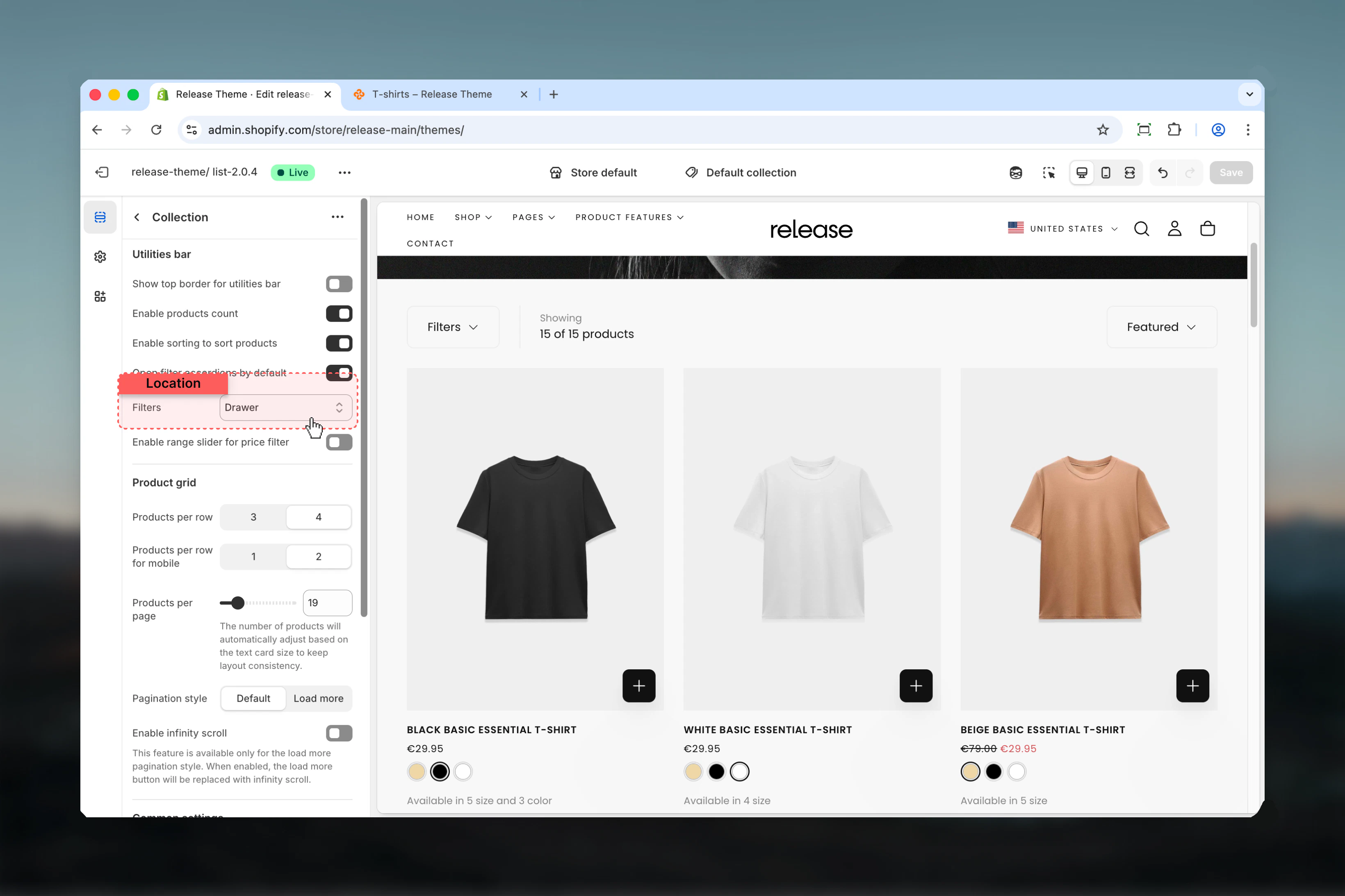 Use drawer for cleaner layouts with fewer filters, or sidebar for collections with extensive filtering needs.
**Type:** Toggle\
**Default:** Enabled
Sets all filter accordions to open when the page loads, making all filter options immediately visible.
This setting only affects desktop sidebar and drawer views. Mobile filters always start collapsed.
Advanced filtering options for collection pages.
**Type:** Dropdown\
**Options:** Hide, Drawer, Sidebar\
**Default:** Drawer
Controls the visual presentation of product filters:
* **Hide** - Completely removes filtering functionality
* **Drawer** - Filters appear in a slide-out panel, saving screen space
* **Sidebar** - Filters are permanently visible in a left column
Use drawer for cleaner layouts with fewer filters, or sidebar for collections with extensive filtering needs.
**Type:** Toggle\
**Default:** Enabled
Sets all filter accordions to open when the page loads, making all filter options immediately visible.
This setting only affects desktop sidebar and drawer views. Mobile filters always start collapsed.
Advanced filtering options for collection pages.
**Type:** Dropdown\
**Options:** Hide, Drawer, Sidebar\
**Default:** Drawer
Controls the visual presentation of product filters:
* **Hide** - Completely removes filtering functionality
* **Drawer** - Filters appear in a slide-out panel, saving screen space
* **Sidebar** - Filters are permanently visible in a left column
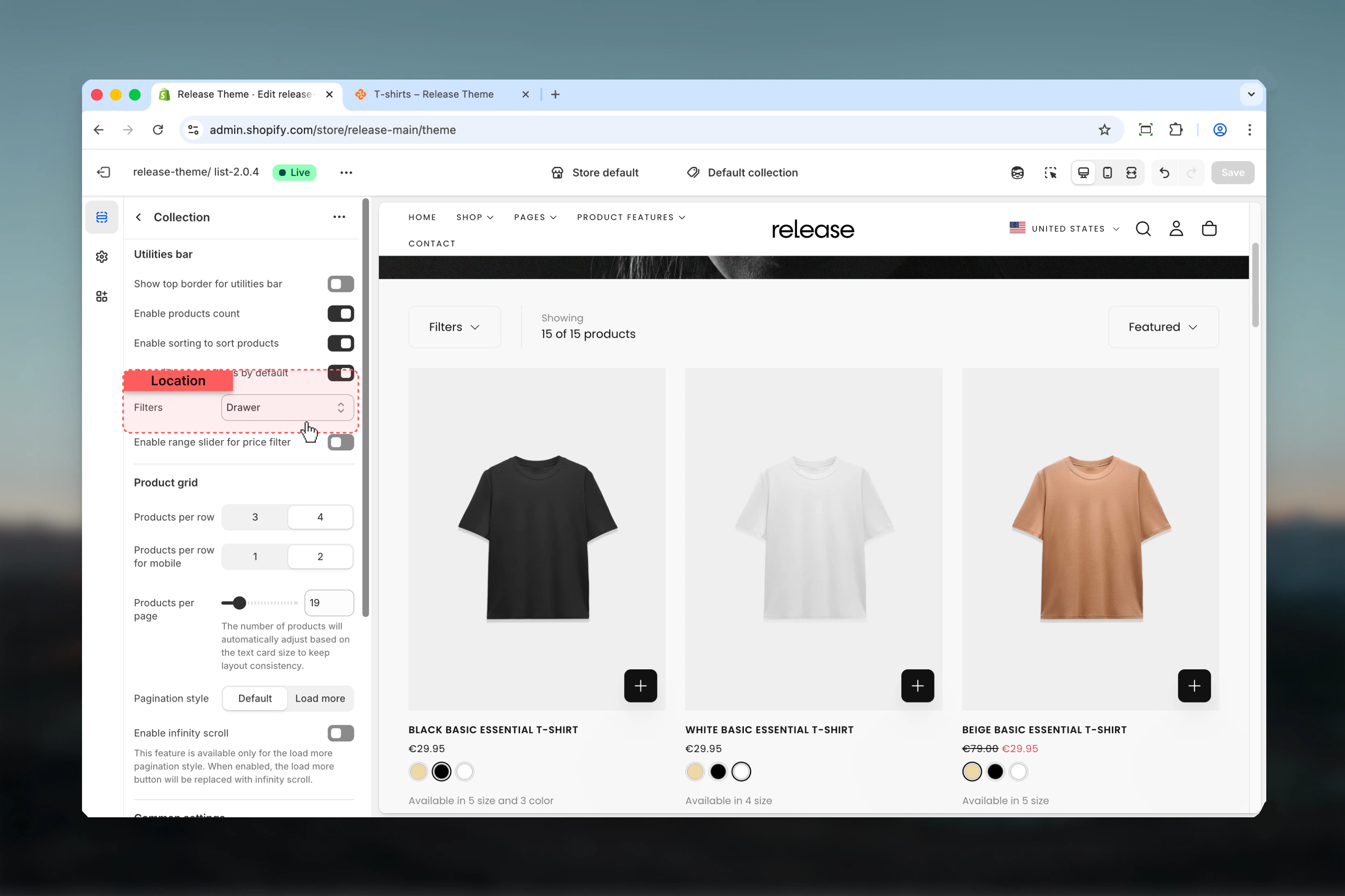 Sidebar works best for desktop collections with 5+ filter types. Drawer is ideal for mobile-first designs.
**Type:** Toggle\
**Default:** Disabled
Replaces checkbox-style price filtering with an interactive range slider allowing customers to set custom min/max price ranges.
Range slider requires JavaScript and may not work with all third-party filter apps. Test thoroughly before enabling on live stores.
Range sliders work best for collections with wide, continuous price ranges (e.g., $10-$500). Use checkboxes for narrow or discrete price bands.
Defines how products are displayed within the grid layout.
Sidebar works best for desktop collections with 5+ filter types. Drawer is ideal for mobile-first designs.
**Type:** Toggle\
**Default:** Disabled
Replaces checkbox-style price filtering with an interactive range slider allowing customers to set custom min/max price ranges.
Range slider requires JavaScript and may not work with all third-party filter apps. Test thoroughly before enabling on live stores.
Range sliders work best for collections with wide, continuous price ranges (e.g., $10-$500). Use checkboxes for narrow or discrete price bands.
Defines how products are displayed within the grid layout.
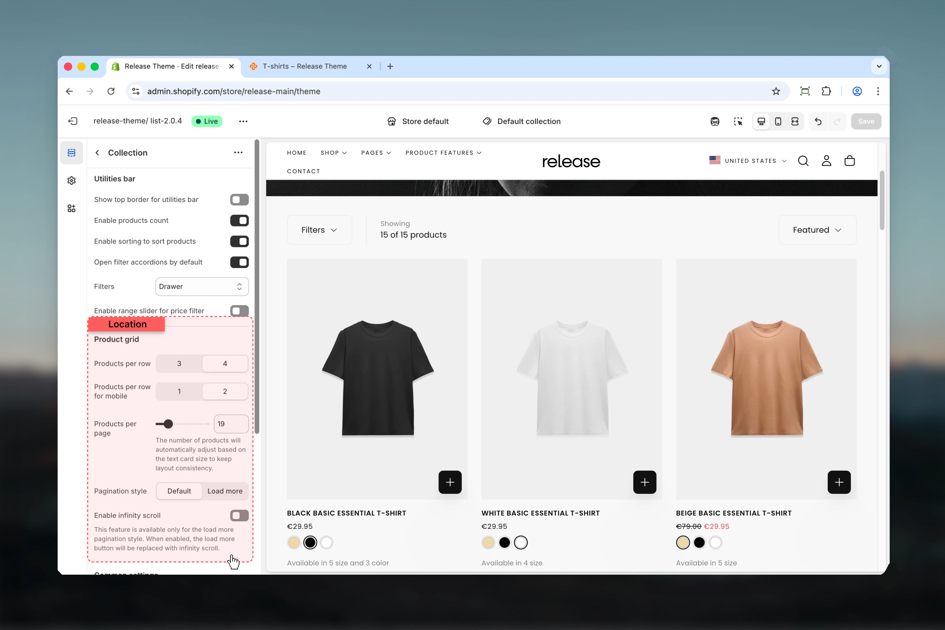 **Type:** Range\
**Options:** 3 or 4\
**Default:** 4
Number of product cards displayed in each row on desktop screens.
* **3 products** - Larger product images, more detail visible
* **4 products** - More products visible at once, efficient browsing
Use 3 columns for premium products where image quality matters. Use 4 columns for large catalogs where variety is key.
**Type:** Range\
**Options:** 1 or 2\
**Default:** 2
Number of product cards displayed per row on mobile devices.
* **1 product** - Maximum product detail on small screens
* **2 products** - Balance between detail and variety
Most mobile users prefer 2 columns as it allows comparison while maintaining readability.
**Type:** Range\
**Range:** 12-50 products\
**Default:** 16
Total number of products loaded before pagination or load more button appears.
The actual product count may adjust slightly to maintain grid consistency when text cards are inserted.
For large collections (100+ products), use lower values (12-24) to improve page load speed. For curated collections, use higher values (36-50) to show the full selection.
**Type:** Dropdown\
**Options:** Default (page numbers), Load more\
**Default:** Default
Choose how customers navigate through multiple pages of products:
* **Default** - Traditional numbered pagination (1, 2, 3...)
* **Load more** - Single button that loads more products inline
Load more creates a seamless browsing experience and works well with infinite scroll.
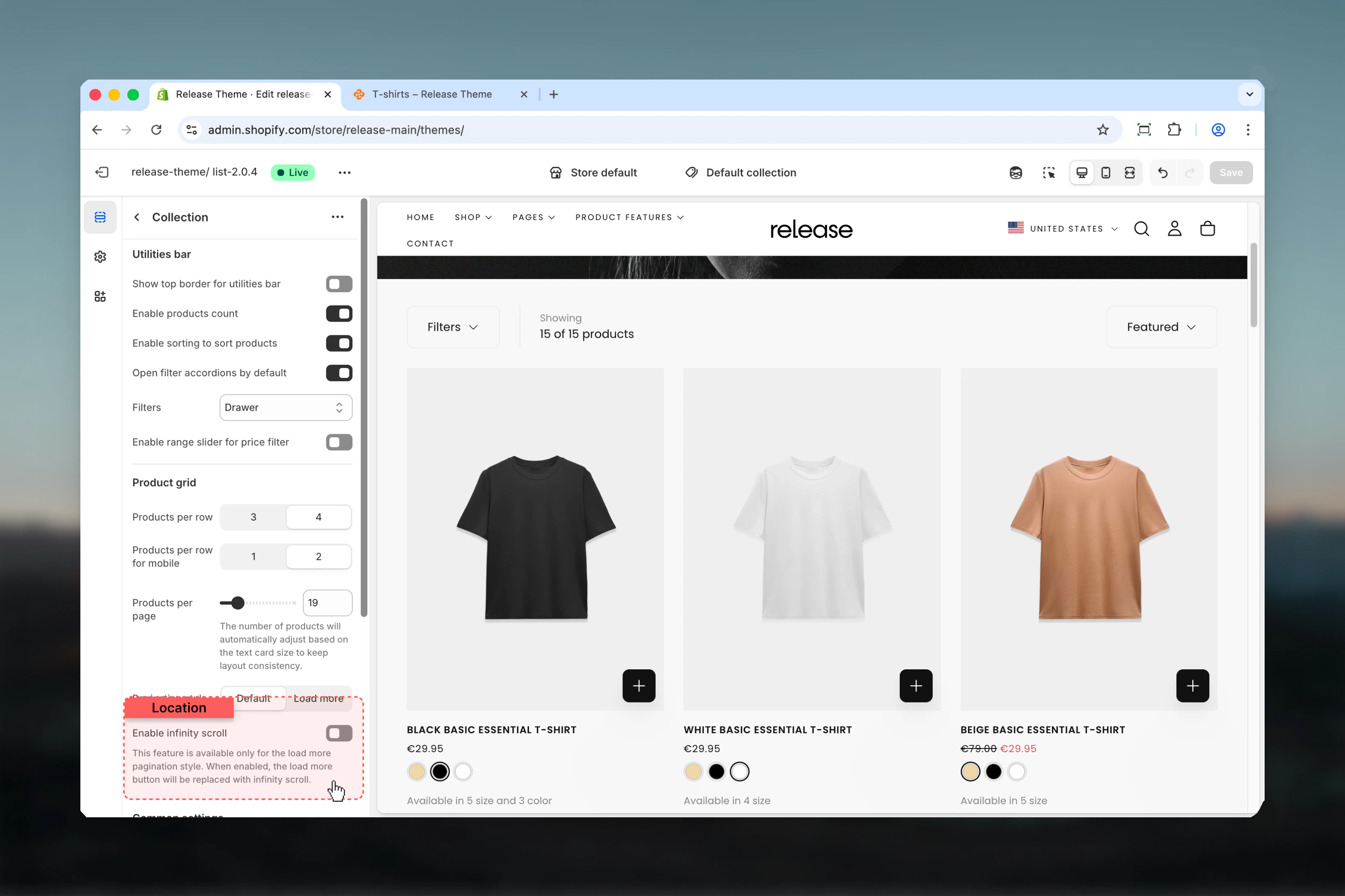
**Type:** Toggle\
**Default:** Disabled\
**Availability:** Only when "Load more" pagination is selected
Automatically load more products as the customer scrolls down the page, eliminating the need to click "Load more".
**Type:** Range\
**Options:** 3 or 4\
**Default:** 4
Number of product cards displayed in each row on desktop screens.
* **3 products** - Larger product images, more detail visible
* **4 products** - More products visible at once, efficient browsing
Use 3 columns for premium products where image quality matters. Use 4 columns for large catalogs where variety is key.
**Type:** Range\
**Options:** 1 or 2\
**Default:** 2
Number of product cards displayed per row on mobile devices.
* **1 product** - Maximum product detail on small screens
* **2 products** - Balance between detail and variety
Most mobile users prefer 2 columns as it allows comparison while maintaining readability.
**Type:** Range\
**Range:** 12-50 products\
**Default:** 16
Total number of products loaded before pagination or load more button appears.
The actual product count may adjust slightly to maintain grid consistency when text cards are inserted.
For large collections (100+ products), use lower values (12-24) to improve page load speed. For curated collections, use higher values (36-50) to show the full selection.
**Type:** Dropdown\
**Options:** Default (page numbers), Load more\
**Default:** Default
Choose how customers navigate through multiple pages of products:
* **Default** - Traditional numbered pagination (1, 2, 3...)
* **Load more** - Single button that loads more products inline
Load more creates a seamless browsing experience and works well with infinite scroll.
**Type:** Toggle\
**Default:** Disabled\
**Availability:** Only when "Load more" pagination is selected
Automatically load more products as the customer scrolls down the page, eliminating the need to click "Load more".
 Infinity scroll works best with load more pagination for large collections (50+ products). It improves mobile browsing experience significantly.
Some users prefer traditional pagination for better control. Test with your audience before enabling site-wide.
Control the overall section layout, width, and spacing.
Infinity scroll works best with load more pagination for large collections (50+ products). It improves mobile browsing experience significantly.
Some users prefer traditional pagination for better control. Test with your audience before enabling site-wide.
Control the overall section layout, width, and spacing.
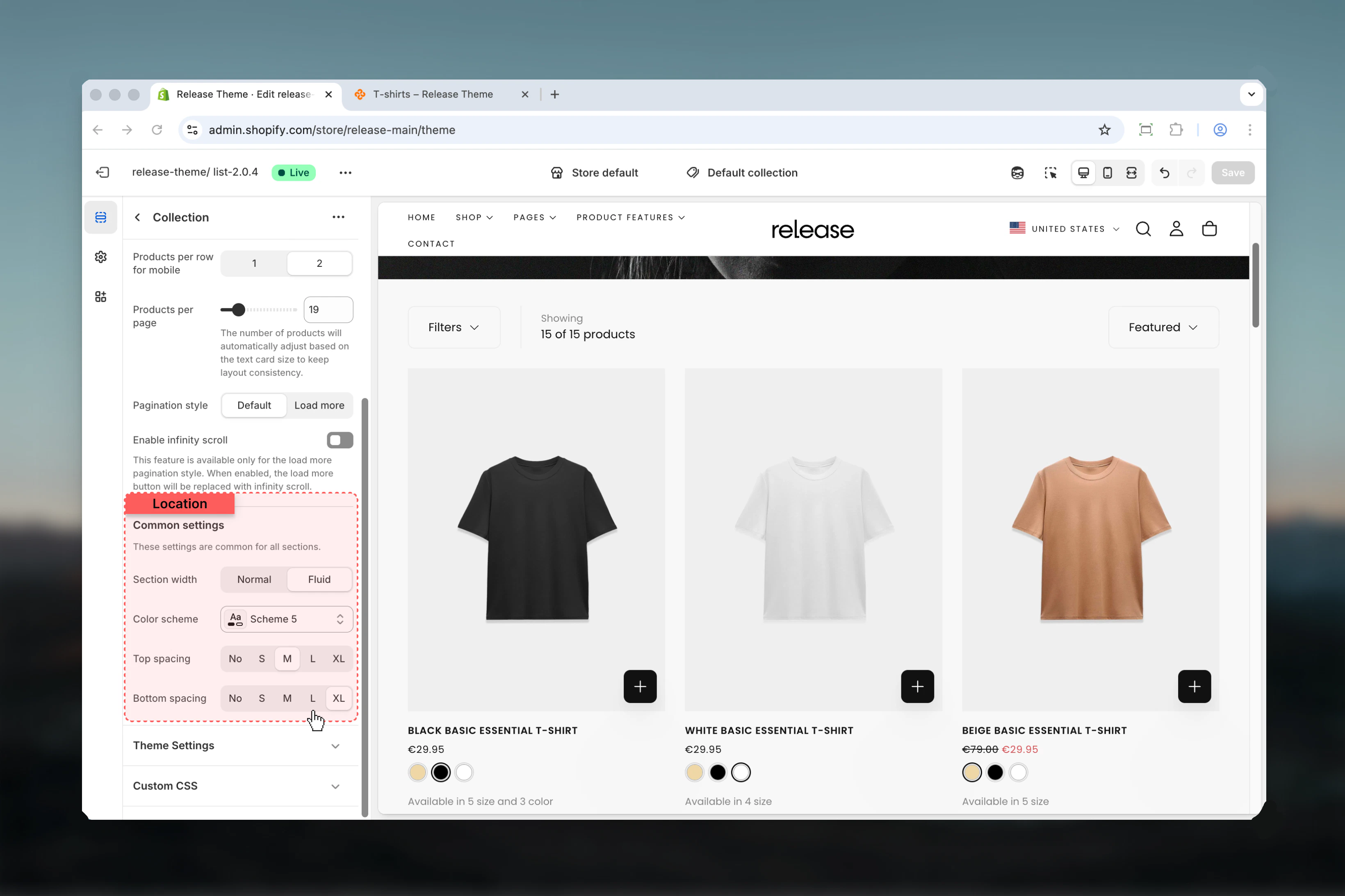 **Type:** Dropdown\
**Options:** max-w-page, max-w-fluid\
**Default:** max-w-page
Maximum width of the collection section:
* **max-w-page** - Contained width matching your theme's standard page width
* **max-w-fluid** - Full browser width, edge-to-edge layout
Use max-w-page for most collections to maintain visual consistency. Use max-w-fluid for large product grids where maximum visibility is needed.
**Type:** Dropdown\
**Default:** scheme-1
Select the color scheme for the collection section. Available schemes are defined in **Theme settings > Colors**.
Color scheme affects background, text, borders, and button colors throughout the section.
**Type:** Dropdown\
**Options:** No (0), S (1), M (2), L (4), XL (6)\
**Default:** M (2)
Padding above the collection section, controlling vertical space from the previous section.
**Type:** Dropdown\
**Options:** No (0), S (1), M (2), L (4), XL (6)\
**Default:** M (2)
Padding below the collection section, controlling vertical space to the next section.
Use consistent spacing (M or L) across collection pages for visual rhythm. Reduce spacing to S for tight, magazine-style layouts.
## Block Settings
### Text Card Block
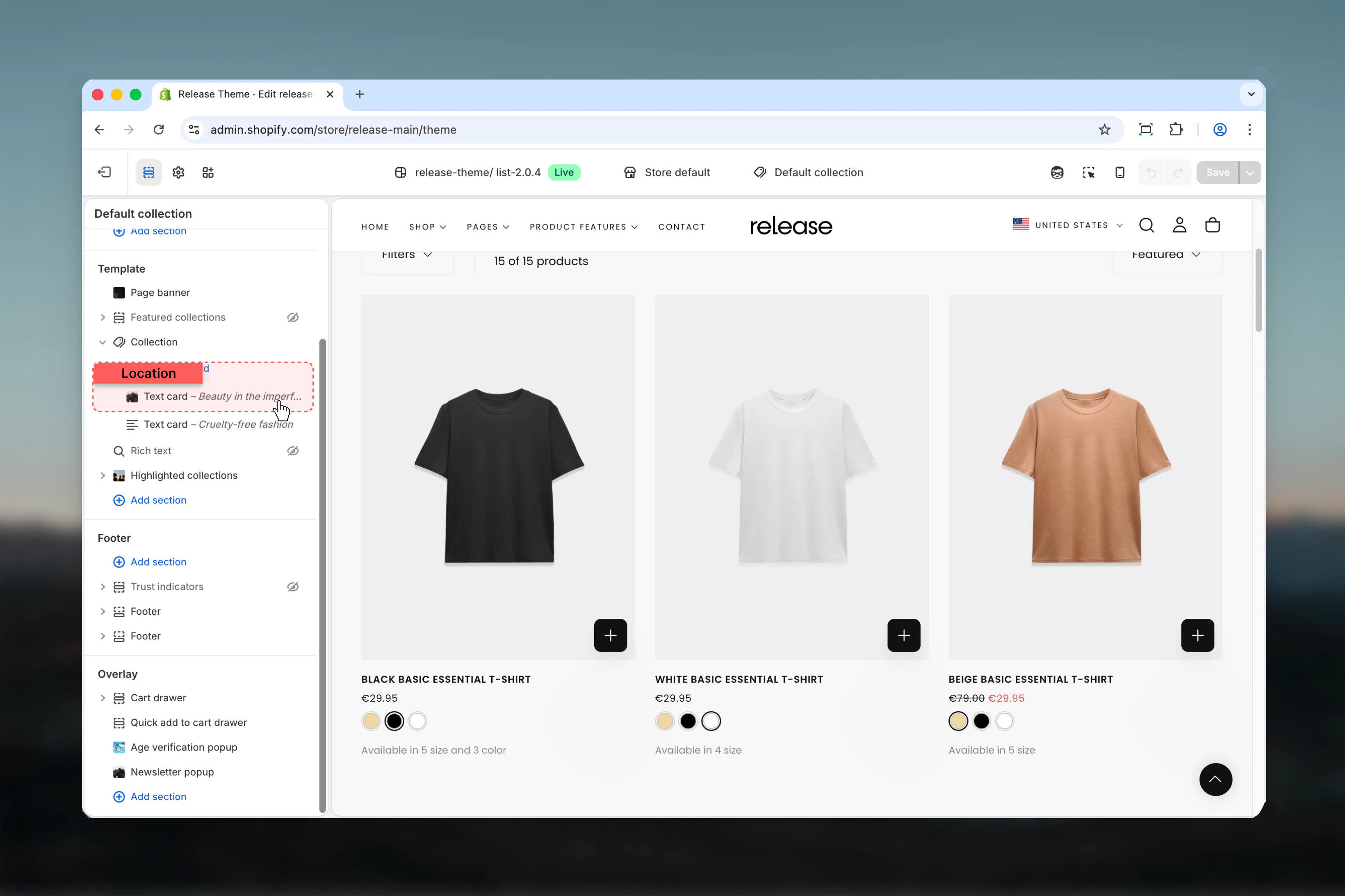
Insert promotional or informational cards within the product grid. Text cards are perfect for highlighting sales, cross-selling, or telling your brand story.
Maximum 5 text cards per collection page.
**Type:** Dropdown\
**Options:** max-w-page, max-w-fluid\
**Default:** max-w-page
Maximum width of the collection section:
* **max-w-page** - Contained width matching your theme's standard page width
* **max-w-fluid** - Full browser width, edge-to-edge layout
Use max-w-page for most collections to maintain visual consistency. Use max-w-fluid for large product grids where maximum visibility is needed.
**Type:** Dropdown\
**Default:** scheme-1
Select the color scheme for the collection section. Available schemes are defined in **Theme settings > Colors**.
Color scheme affects background, text, borders, and button colors throughout the section.
**Type:** Dropdown\
**Options:** No (0), S (1), M (2), L (4), XL (6)\
**Default:** M (2)
Padding above the collection section, controlling vertical space from the previous section.
**Type:** Dropdown\
**Options:** No (0), S (1), M (2), L (4), XL (6)\
**Default:** M (2)
Padding below the collection section, controlling vertical space to the next section.
Use consistent spacing (M or L) across collection pages for visual rhythm. Reduce spacing to S for tight, magazine-style layouts.
## Block Settings
### Text Card Block
Insert promotional or informational cards within the product grid. Text cards are perfect for highlighting sales, cross-selling, or telling your brand story.
Maximum 5 text cards per collection page.
 **Text**\
**Type:** Rich text editor\
**Default:** `
**Text**\
**Type:** Rich text editor\
**Default:** `Heading goes here
`
Rich text content for the card. Supports headings, paragraphs, bold, italic, and basic formatting.
***
**Button link**\
**Type:** URL field
Destination URL for the card button or click action.
***
**Link type**\
**Type:** Dropdown\
**Options:** Button, Card\
**Default:** Button
How the link functions:
* **Button** - Traditional button element below content
* **Card** - Entire card surface is clickable
***
**Button label**\
**Type:** Text field
Text displayed on the button. Leave empty to hide button entirely.
***
**Button style**\
**Type:** Dropdown\
**Options:** Filled, Outlined, Text\
**Default:** Text
Visual style of the button:
* **Filled** - Solid background color, high contrast
* **Outlined** - Border with transparent background
* **Text** - Text-only link style, minimal
**Position**\
**Type:** Number\
**Range:** 1-50\
**Default:** 8
Where the text card appears in the product grid. Position 1 means after the first product, position 8 means after the 7th product, etc.
If position exceeds products per page setting, the card appears at the end of the grid.
***
**Column factor**\
**Type:** Range\
**Range:** 1-4\
**Default:** 1
How many columns the card spans horizontally. 1 = single column width, 2 = double width, etc.
Column factor automatically adjusts based on "Products per row" setting. A factor of 2 on a 4-column grid creates a half-width card.
***
**Row factor**\
**Type:** Range\
**Range:** 1-4\
**Default:** 1
How many rows the card spans vertically. 1 = single row height, 2 = double height, etc.
Use column\_factor: 2 and row\_factor: 2 to create a large featured card that stands out in the grid.
**Content position**\
**Type:** Dropdown\
**Options:** Start, Center, End\
**Default:** Center
Vertical positioning of content within the card:
* **Start** - Top aligned
* **Center** - Vertically centered
* **End** - Bottom aligned
***
**Content alignment**\
**Type:** Dropdown\
**Options:** Start, Center, End\
**Default:** Center
Horizontal alignment of text:
* **Start** - Left aligned
* **Center** - Center aligned
* **End** - Right aligned
***
**Content position for mobile**\
**Type:** Dropdown\
**Options:** Start, Center, End\
**Default:** Center
Vertical positioning on mobile devices. Same options as desktop.
***
**Content alignment for mobile**\
**Type:** Dropdown\
**Options:** Start, Center, End\
**Default:** Center
Horizontal alignment on mobile. Same options as desktop.
Mobile alignment settings override desktop settings on screens smaller than 768px.
**Color scheme**\
**Type:** Dropdown\
**Default:** scheme-1
Color scheme for the text card. Available schemes match your theme's color settings.
***
**Card image**\
**Type:** Image picker
Background image for the text card. When set, text content overlays the image.
Use high-contrast images and adjust content position/alignment for optimal text readability.
## Common use cases
Insert text cards promoting "Extra 20% off" or free shipping thresholds at strategic positions (e.g., position 5 or 12) to maintain engagement throughout scrolling.
Use sidebar filters for extensive categorization (size, color, material, brand). Enable sorting and product count to help customers navigate large selections efficiently.
Enable sorting by date with default sort set to "Date (new to old)". Use 4-column grid to showcase variety. Disable filters if the collection is curated.
Large text cards (column\_factor: 2, row\_factor: 2) at position 5 featuring campaign messaging, countdown timers, or exclusive offers.
Enable range slider for price filtering on electronics, furniture, or luxury goods where customers have specific budget ranges in mind.
Use infinite scroll + load more for collections with 100+ products. Set lower products per page (16-24) to maintain fast initial load times while enabling endless browsing.
Disable filters entirely, use 3-column grid for premium product presentation. Higher products per page (36-50) to show complete curated selection without pagination.
Text card at position 1 (immediately visible) with countdown timer and "Card" link type so entire card is clickable. Use filled button style for urgency.
Multiple text cards throughout grid (positions 5, 12, 20) telling brand narrative. Use card images with overlay text, centered content alignment.
Text cards linking to complementary product collections. Position 8 or 12 after customers have seen initial products. Use "Shop accessories" or "Complete the look" messaging.
## Best practices
Use 4 products per row on desktop for balanced visibility and detail. This provides the best compromise between seeing multiple products and maintaining adequate product card size.
Use 2 columns on mobile for better product card readability. Single column makes cards too large, while 2 columns allows comparison without sacrificing detail.
Choose drawer for minimal filter collections (1-3 filters), sidebar for extensive filtering needs (5+ filters). Drawer keeps the layout clean while sidebar provides constant filter visibility.
Place cards every 8-12 products to maintain engagement without disrupting browsing flow. Too frequent placement becomes annoying, too infrequent loses impact.
Enable infinite scroll or load more for collections over 50 products to improve performance. Traditional pagination works better for smaller collections where customers want page-level control.
Use range slider only for collections with wide, continuous price ranges (e.g., $10-$500). For narrow or discrete price bands, checkbox filters are more intuitive.
Always enable product count to set customer expectations about collection size. This is especially important for filtered results where count changes dynamically.
Use column\_factor 2 and row\_factor 2 for promotional cards to make them stand out against standard product cards. Single-cell cards blend in too much.
Keep accordions open by default for collections with 3-5 key filters. For 10+ filters, collapsed is better to prevent overwhelming customers.
Use M (2) spacing for standard collections to maintain rhythm. Reduce to S (1) for featured/minimal layouts, increase to L (4) for luxury brands.
## Related guides
Configure product card display settings including image ratios, badges, and quick view
Advanced filtering and search configuration for collection pages
Display multiple collections on a list page for easier navigation