> ## Documentation Index
> Fetch the complete documentation index at: https://docs.digifist.com/llms.txt
> Use this file to discover all available pages before exploring further.
# Search
> Customize the layout and features of your search results pages.
Search pages display the results of customer searches on your store. You can customize the product grid, filtering, sorting, and pagination options to help customers find what they're looking for more easily.
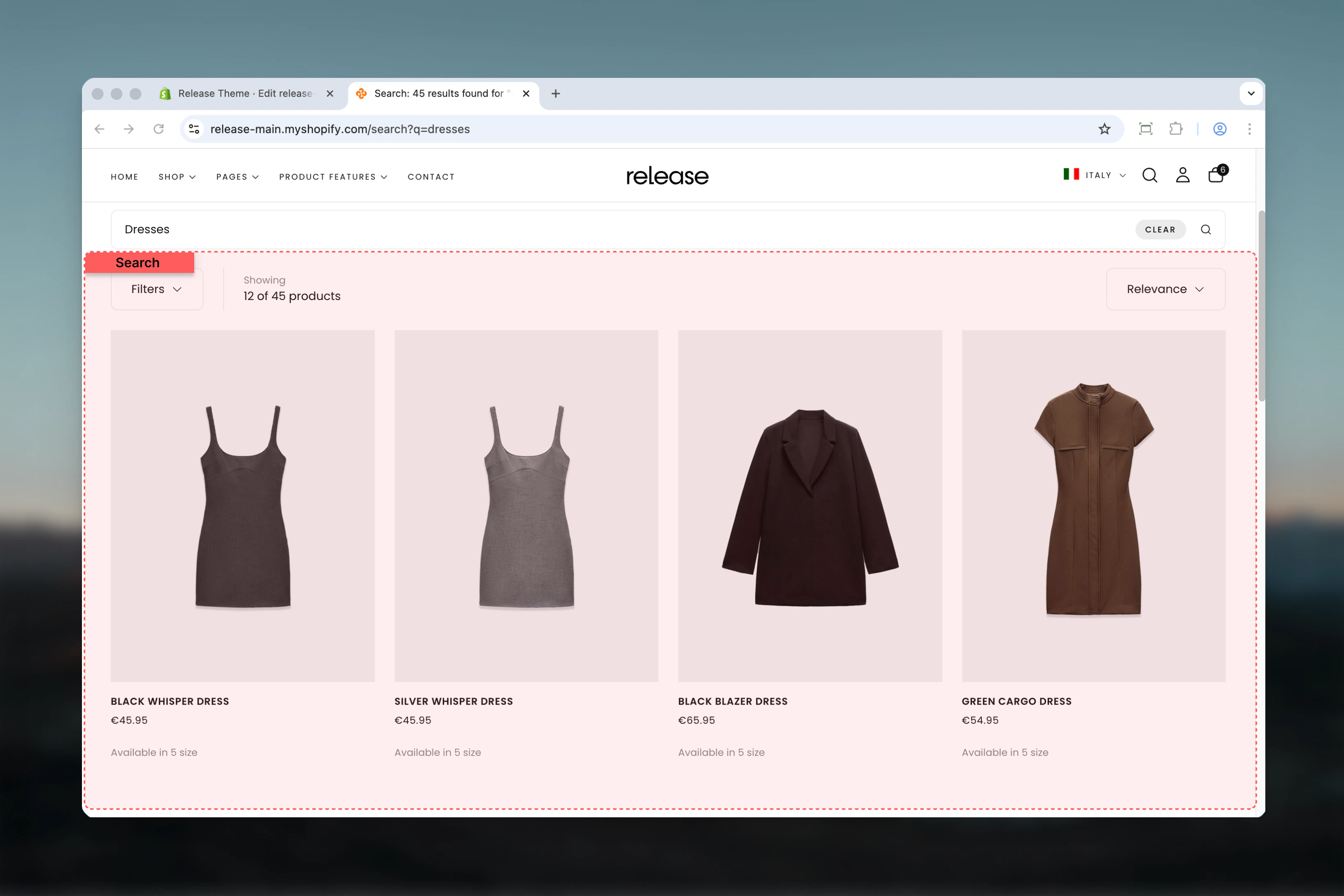 ## What this section controls
This section manages:
* **Search results product grid** - Display search results in an organized grid layout
* **Filtering system** - Control filter display (drawer only for search pages)
* **Sorting dropdown** - Enable sorting options for search results
* **Results count** - Display number of matching search results
* **Pagination** - Control pagination style, load more button, and infinity scroll
* **Section layout** - Adjust section width, color scheme, and spacing
## Getting started
From Shopify admin, access the Theme Customizer
In the left sidebar, find the **Search** section
Enable sorting, product count, and filter settings in the **Utilities Bar** tab
Set products per row (3 or 4 columns) and pagination style in the **Product Grid** tab
Set section width, color scheme, and spacing in the **Layout** tab
## Section Settings
Controls how filtering and sorting tools appear on the search results page.
## What this section controls
This section manages:
* **Search results product grid** - Display search results in an organized grid layout
* **Filtering system** - Control filter display (drawer only for search pages)
* **Sorting dropdown** - Enable sorting options for search results
* **Results count** - Display number of matching search results
* **Pagination** - Control pagination style, load more button, and infinity scroll
* **Section layout** - Adjust section width, color scheme, and spacing
## Getting started
From Shopify admin, access the Theme Customizer
In the left sidebar, find the **Search** section
Enable sorting, product count, and filter settings in the **Utilities Bar** tab
Set products per row (3 or 4 columns) and pagination style in the **Product Grid** tab
Set section width, color scheme, and spacing in the **Layout** tab
## Section Settings
Controls how filtering and sorting tools appear on the search results page.
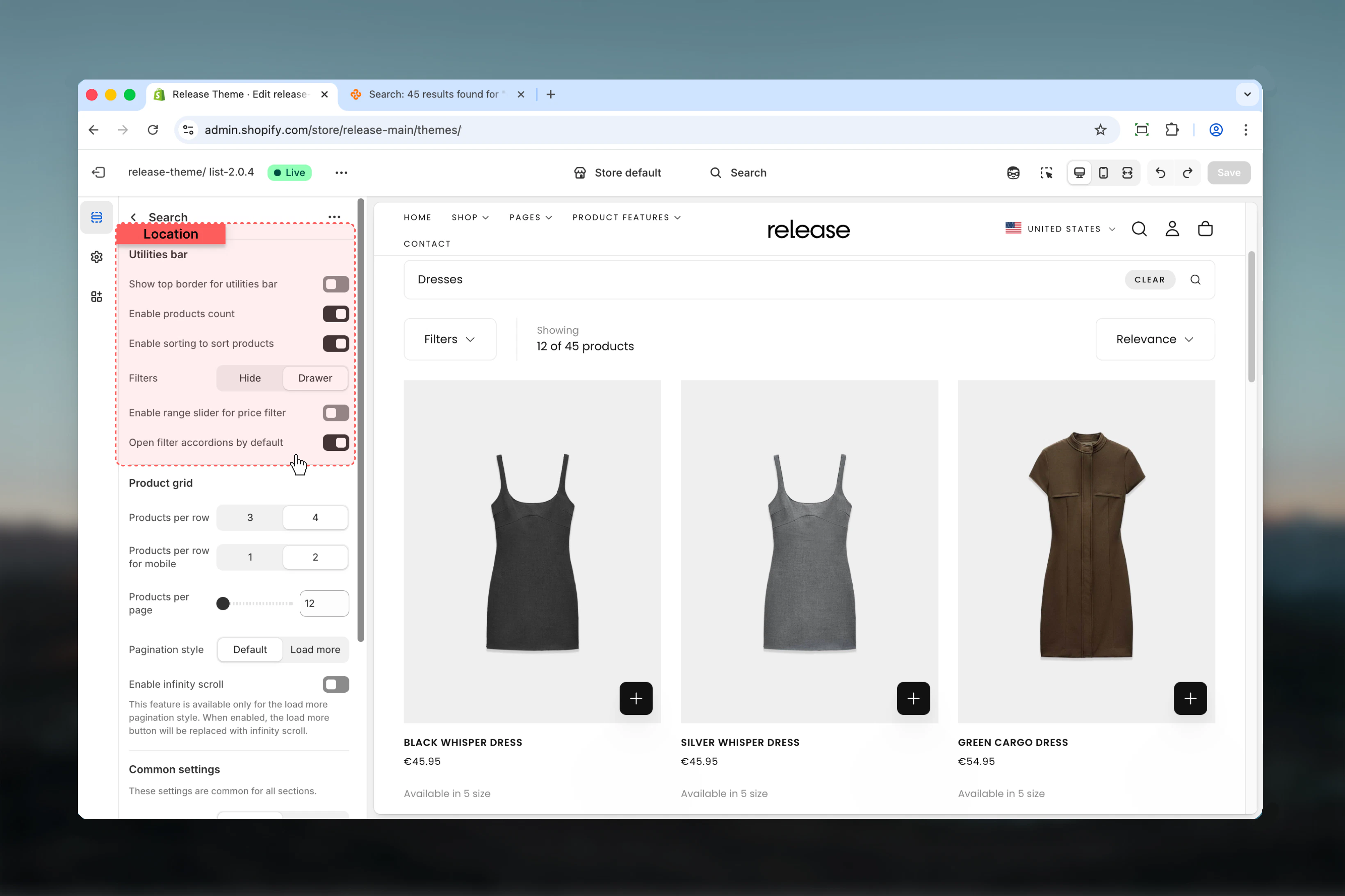 **Type:** Toggle\
**Default:** Disabled
Adds a decorative border above the search utilities bar to visually separate it from content above.
This border uses the theme's border color from your color scheme settings.
**Type:** Toggle\
**Default:** Enabled
Displays the number of search results found (e.g., "12 results found").
Product count is especially important on search pages to show customers how many results matched their query and indicates search effectiveness.
**Type:** Toggle\
**Default:** Enabled
Shows sorting dropdown for search results, allowing customers to sort by:
* Relevance (default)
* Best selling
* Alphabetically (A-Z)
* Alphabetically (Z-A)
* Price (low to high)
* Price (high to low)
* Date (old to new)
* Date (new to old)
Enable sorting to help users find relevant products quickly based on their preferences.
**Type:** Toggle\
**Default:** Enabled
Automatically expands all filter accordions in the drawer when customers open filters, making all filter options immediately visible.
This setting only affects the drawer view. Collapsed accordions require additional clicks to see filter options.
Advanced filtering options for search results.
**Type:** Toggle\
**Default:** Disabled
Adds a decorative border above the search utilities bar to visually separate it from content above.
This border uses the theme's border color from your color scheme settings.
**Type:** Toggle\
**Default:** Enabled
Displays the number of search results found (e.g., "12 results found").
Product count is especially important on search pages to show customers how many results matched their query and indicates search effectiveness.
**Type:** Toggle\
**Default:** Enabled
Shows sorting dropdown for search results, allowing customers to sort by:
* Relevance (default)
* Best selling
* Alphabetically (A-Z)
* Alphabetically (Z-A)
* Price (low to high)
* Price (high to low)
* Date (old to new)
* Date (new to old)
Enable sorting to help users find relevant products quickly based on their preferences.
**Type:** Toggle\
**Default:** Enabled
Automatically expands all filter accordions in the drawer when customers open filters, making all filter options immediately visible.
This setting only affects the drawer view. Collapsed accordions require additional clicks to see filter options.
Advanced filtering options for search results.
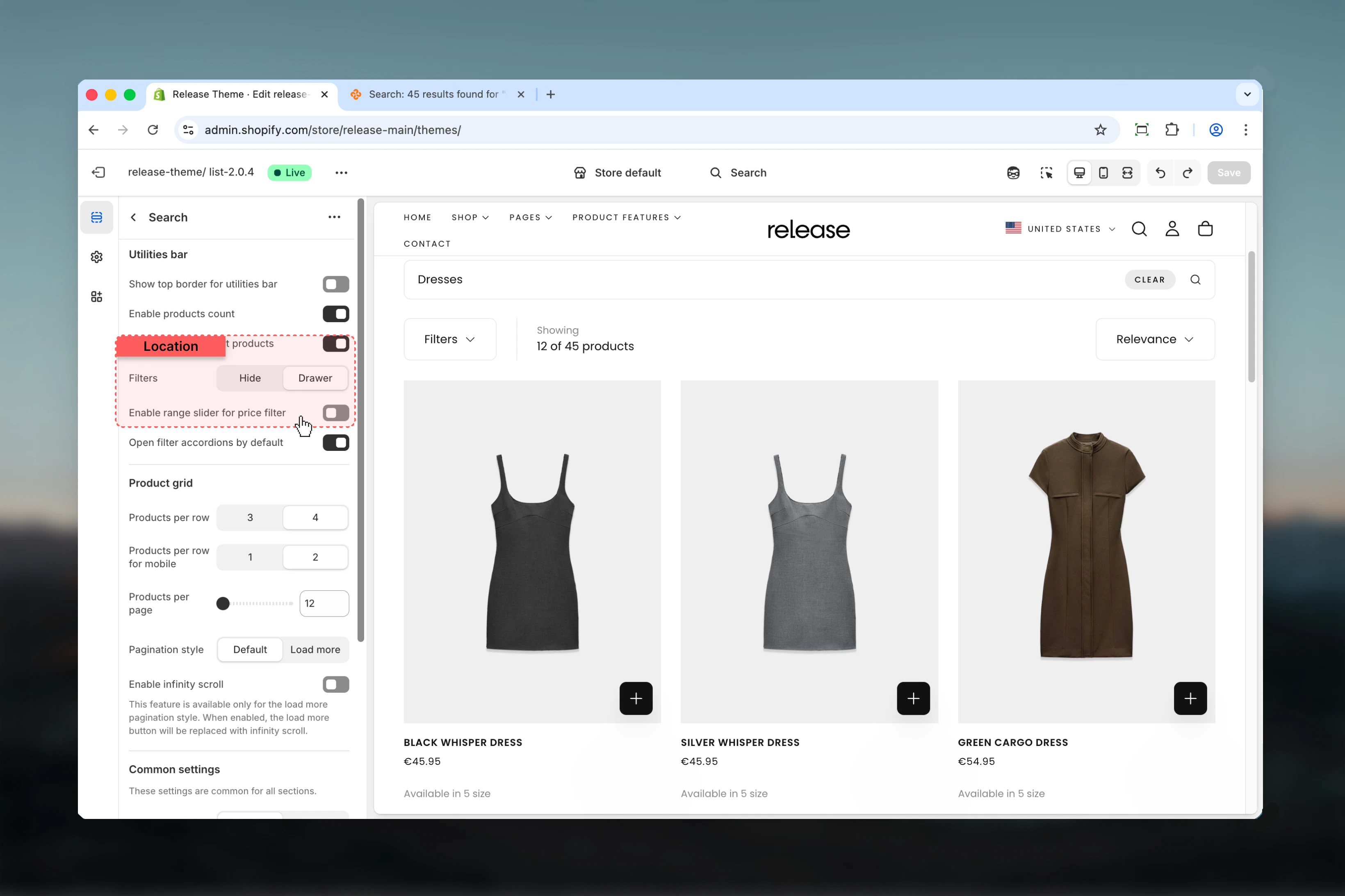 **Type:** Dropdown\
**Options:** Hide, Drawer\
**Default:** Drawer
Choose how product filters appear on search results:
* **Hide** - Removes all product filtering functionality
* **Drawer** - Filters appear in a slide-out overlay panel
Search pages only support drawer or hidden filters. Sidebar option is not available for search results to maintain a cleaner layout focused on search results.
Drawer filters provide cleaner search experience without overwhelming the page with filter options.
**Type:** Toggle\
**Default:** Disabled
Use interactive price range slider instead of checkbox-style price filtering. Allows customers to set custom minimum and maximum price values.
Range slider requires JavaScript and may not work with all third-party filter apps. Test thoroughly before enabling on live stores.
Enable range slider for catalogs with wide price ranges (e.g., $10-$500) to give customers more control over price filtering.
Defines how search result products are displayed within the grid layout.
**Type:** Dropdown\
**Options:** Hide, Drawer\
**Default:** Drawer
Choose how product filters appear on search results:
* **Hide** - Removes all product filtering functionality
* **Drawer** - Filters appear in a slide-out overlay panel
Search pages only support drawer or hidden filters. Sidebar option is not available for search results to maintain a cleaner layout focused on search results.
Drawer filters provide cleaner search experience without overwhelming the page with filter options.
**Type:** Toggle\
**Default:** Disabled
Use interactive price range slider instead of checkbox-style price filtering. Allows customers to set custom minimum and maximum price values.
Range slider requires JavaScript and may not work with all third-party filter apps. Test thoroughly before enabling on live stores.
Enable range slider for catalogs with wide price ranges (e.g., $10-$500) to give customers more control over price filtering.
Defines how search result products are displayed within the grid layout.
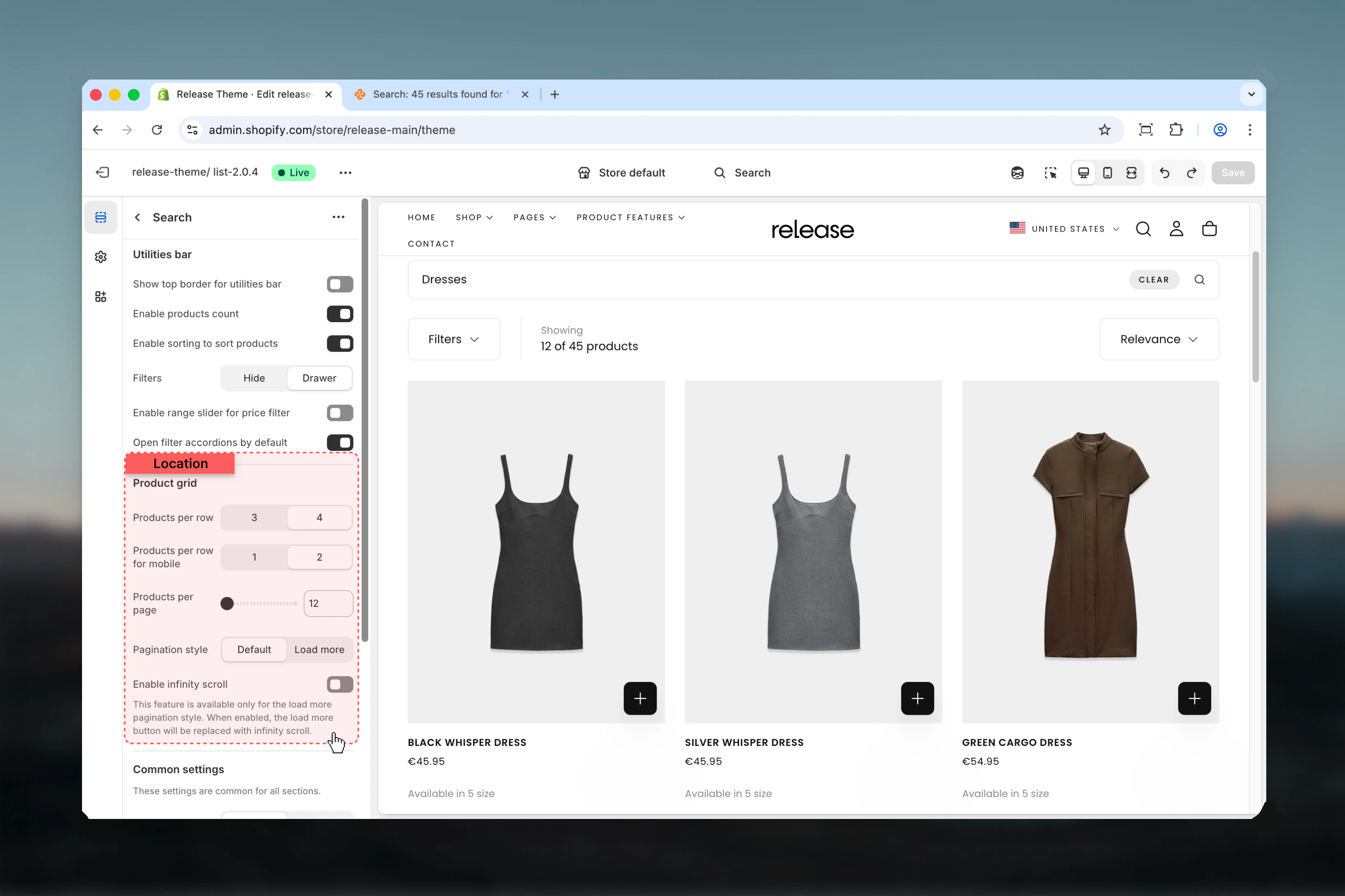 **Type:** Dropdown\
**Options:** 3, 4\
**Default:** 4
Number of product cards displayed per row on desktop screens.
* **3** - Larger product cards with more detail visible
* **4** - More results visible at once, efficient browsing
Use 4 products per row for optimal search result viewing - it provides the best balance between product detail and results density.
**Type:** Dropdown\
**Options:** 1, 2\
**Default:** 2
Number of products per row on mobile devices.
* **1** - Single column layout, maximum product detail
* **2** - Two columns, balance between detail and variety
Use 2 columns on mobile for better product visibility and comparison without excessive scrolling.
**Type:** Range\
**Range:** 12-50\
**Default:** 16
Total number of products loaded before pagination appears.
The actual product count may adjust slightly to maintain grid consistency when text cards or other blocks are inserted.
For search results with many matches, use lower values (12-16) to improve page load speed and help customers refine their search.
**Type:** Dropdown\
**Options:** Page numbers, Load more\
**Default:** Page numbers
How customers navigate through multiple pages of search results:
* **Page numbers** - Traditional numbered pagination (1, 2, 3...)
* **Load more** - Single button that loads additional results inline
Load more creates a seamless browsing experience for search results and works well with infinity scroll.
**Type:** Toggle\
**Default:** Disabled\
**Availability:** Only when "Load more" pagination is selected
Automatically loads more search results as the customer scrolls down the page, eliminating the need to click "Load more".
Infinity scroll works well for mobile search experiences with many results. It reduces friction and keeps customers engaged with search results.
Some users prefer traditional pagination for better navigation control. Test with your audience before enabling site-wide.
Control the overall section layout, width, and spacing.
**Type:** Dropdown\
**Options:** 3, 4\
**Default:** 4
Number of product cards displayed per row on desktop screens.
* **3** - Larger product cards with more detail visible
* **4** - More results visible at once, efficient browsing
Use 4 products per row for optimal search result viewing - it provides the best balance between product detail and results density.
**Type:** Dropdown\
**Options:** 1, 2\
**Default:** 2
Number of products per row on mobile devices.
* **1** - Single column layout, maximum product detail
* **2** - Two columns, balance between detail and variety
Use 2 columns on mobile for better product visibility and comparison without excessive scrolling.
**Type:** Range\
**Range:** 12-50\
**Default:** 16
Total number of products loaded before pagination appears.
The actual product count may adjust slightly to maintain grid consistency when text cards or other blocks are inserted.
For search results with many matches, use lower values (12-16) to improve page load speed and help customers refine their search.
**Type:** Dropdown\
**Options:** Page numbers, Load more\
**Default:** Page numbers
How customers navigate through multiple pages of search results:
* **Page numbers** - Traditional numbered pagination (1, 2, 3...)
* **Load more** - Single button that loads additional results inline
Load more creates a seamless browsing experience for search results and works well with infinity scroll.
**Type:** Toggle\
**Default:** Disabled\
**Availability:** Only when "Load more" pagination is selected
Automatically loads more search results as the customer scrolls down the page, eliminating the need to click "Load more".
Infinity scroll works well for mobile search experiences with many results. It reduces friction and keeps customers engaged with search results.
Some users prefer traditional pagination for better navigation control. Test with your audience before enabling site-wide.
Control the overall section layout, width, and spacing.
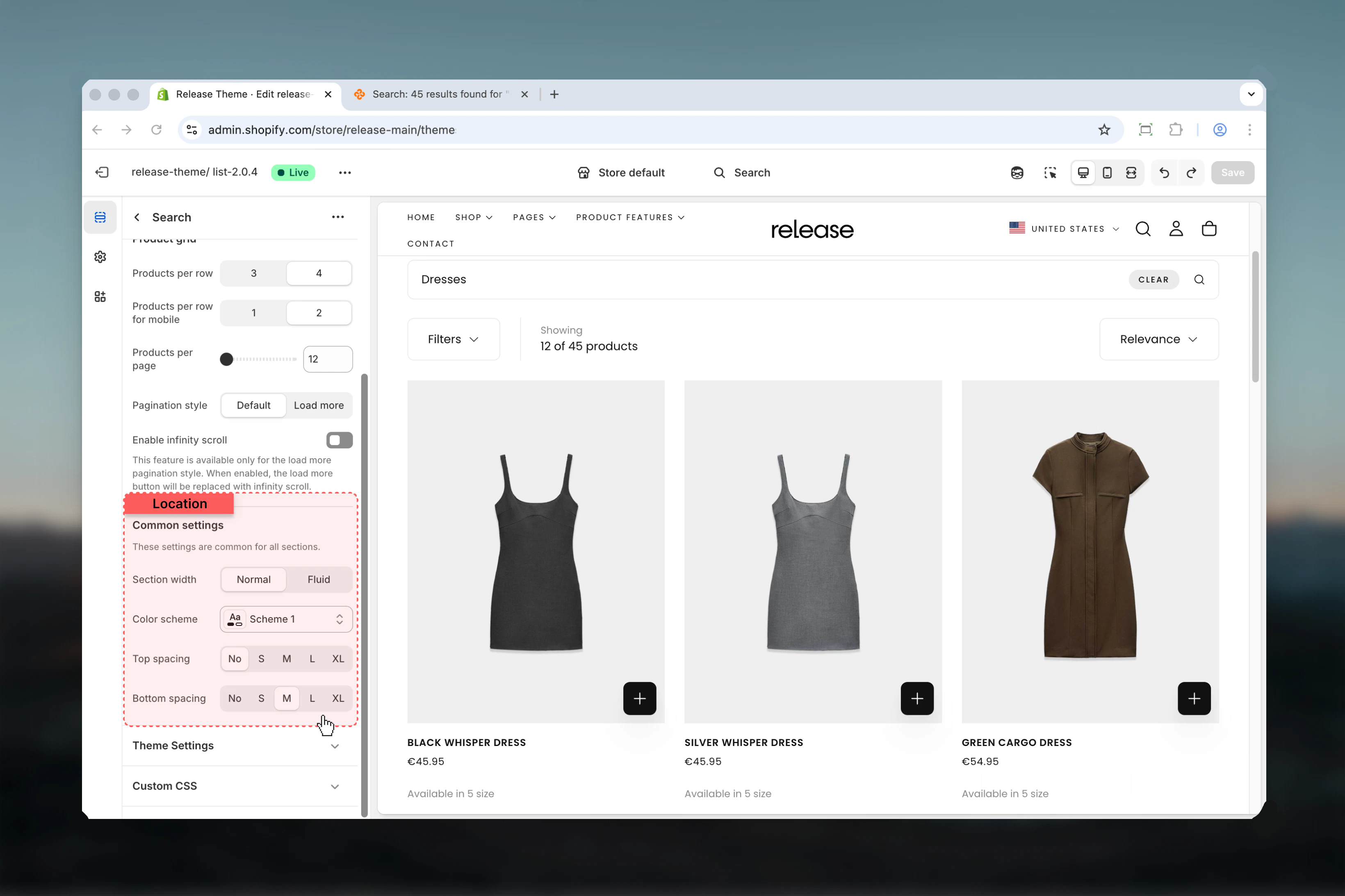 **Type:** Dropdown\
**Options:** max-w-page, max-w-fluid\
**Default:** max-w-page
Maximum width of the search section:
* **max-w-page** - Standard container matching theme's page width
* **max-w-fluid** - Wider container utilizing more screen space
Use max-w-page for visual consistency with other pages. Use max-w-fluid for large search result grids where maximum visibility is needed.
**Type:** Dropdown\
**Default:** scheme-1
Color scheme for the search section. Available schemes are defined in **Theme settings > Colors**.
Color scheme affects background, text, borders, and button colors throughout the section.
**Type:** Dropdown\
**Options:** No (0), S (1), M (2), L (4), XL (6)\
**Default:** No (0)
Padding above the search section, controlling vertical space from the previous section.
Keep top spacing minimal (0 or S) to prioritize search results and reduce scrolling before customers see results.
**Type:** Dropdown\
**Options:** No (0), S (1), M (2), L (4), XL (6)\
**Default:** M (2)
Padding below the search section, controlling vertical space to the next section.
## Common use cases
Standard search configuration for most stores.
**Configuration:**
* Enable sorting and product count
* Drawer filters
* 4-column desktop grid
* 2-column mobile grid
* Page numbers pagination
Optimized for stores with extensive inventories and many search results.
**Configuration:**
* Range slider for price filtering
* Infinity scroll enabled
* 4-column desktop / 2-column mobile
* 16-24 products per page
* All sorting options enabled
Focus on mobile-first search experience.
**Configuration:**
* Drawer filters (mobile-friendly)
* Load more pagination with infinity scroll
* 2-column mobile grid
* Sorting enabled
* Minimal top spacing
Clean, focused search for curated stores with fewer products.
**Configuration:**
* Disable filters entirely
* Focus on sorting and results count
* 3-column desktop for larger cards
* Traditional page numbers
Full-featured search for complex catalogs.
**Configuration:**
* All filters enabled in drawer
* Range slider for price
* Sorting enabled
* Visible product count
* Open filter accordions by default
Optimized for power users who want quick filtering.
**Configuration:**
* Infinity scroll enabled
* Drawer filters with open accordions
* Quick sort options
* 4-column grid for maximum results
* Minimal spacing
## Best practices
Always enable product count to show search effectiveness and help customers understand result quality. This is especially important for search pages where query quality varies.
Enable sorting to help users find relevant products quickly based on their preferences. Search results benefit from multiple sort options beyond just relevance.
Use 4 products per row for optimal search result viewing on desktop. This provides the best balance between product detail and results density.
Drawer filters provide cleaner search experience than sidebar without overwhelming the page. Search pages work best with focused, uncluttered layouts.
Use 2 columns on mobile for better product visibility and comparison. Single column creates too much scrolling for search results.
Use infinity scroll or load more for large result sets to improve browsing. This keeps customers engaged with search results without interruption.
Enable range slider for catalogs with wide price ranges for better filtering precision. This is especially useful for broad search queries.
Keep top spacing minimal (0 or S) to prioritize results and reduce scrolling before customers see search results. Time-to-results is critical for search pages.
## Related guides
Configure the search page banner section above search results
Similar filtering and layout options for collection pages
**Type:** Dropdown\
**Options:** max-w-page, max-w-fluid\
**Default:** max-w-page
Maximum width of the search section:
* **max-w-page** - Standard container matching theme's page width
* **max-w-fluid** - Wider container utilizing more screen space
Use max-w-page for visual consistency with other pages. Use max-w-fluid for large search result grids where maximum visibility is needed.
**Type:** Dropdown\
**Default:** scheme-1
Color scheme for the search section. Available schemes are defined in **Theme settings > Colors**.
Color scheme affects background, text, borders, and button colors throughout the section.
**Type:** Dropdown\
**Options:** No (0), S (1), M (2), L (4), XL (6)\
**Default:** No (0)
Padding above the search section, controlling vertical space from the previous section.
Keep top spacing minimal (0 or S) to prioritize search results and reduce scrolling before customers see results.
**Type:** Dropdown\
**Options:** No (0), S (1), M (2), L (4), XL (6)\
**Default:** M (2)
Padding below the search section, controlling vertical space to the next section.
## Common use cases
Standard search configuration for most stores.
**Configuration:**
* Enable sorting and product count
* Drawer filters
* 4-column desktop grid
* 2-column mobile grid
* Page numbers pagination
Optimized for stores with extensive inventories and many search results.
**Configuration:**
* Range slider for price filtering
* Infinity scroll enabled
* 4-column desktop / 2-column mobile
* 16-24 products per page
* All sorting options enabled
Focus on mobile-first search experience.
**Configuration:**
* Drawer filters (mobile-friendly)
* Load more pagination with infinity scroll
* 2-column mobile grid
* Sorting enabled
* Minimal top spacing
Clean, focused search for curated stores with fewer products.
**Configuration:**
* Disable filters entirely
* Focus on sorting and results count
* 3-column desktop for larger cards
* Traditional page numbers
Full-featured search for complex catalogs.
**Configuration:**
* All filters enabled in drawer
* Range slider for price
* Sorting enabled
* Visible product count
* Open filter accordions by default
Optimized for power users who want quick filtering.
**Configuration:**
* Infinity scroll enabled
* Drawer filters with open accordions
* Quick sort options
* 4-column grid for maximum results
* Minimal spacing
## Best practices
Always enable product count to show search effectiveness and help customers understand result quality. This is especially important for search pages where query quality varies.
Enable sorting to help users find relevant products quickly based on their preferences. Search results benefit from multiple sort options beyond just relevance.
Use 4 products per row for optimal search result viewing on desktop. This provides the best balance between product detail and results density.
Drawer filters provide cleaner search experience than sidebar without overwhelming the page. Search pages work best with focused, uncluttered layouts.
Use 2 columns on mobile for better product visibility and comparison. Single column creates too much scrolling for search results.
Use infinity scroll or load more for large result sets to improve browsing. This keeps customers engaged with search results without interruption.
Enable range slider for catalogs with wide price ranges for better filtering precision. This is especially useful for broad search queries.
Keep top spacing minimal (0 or S) to prioritize results and reduce scrolling before customers see search results. Time-to-results is critical for search pages.
## Related guides
Configure the search page banner section above search results
Similar filtering and layout options for collection pages