> ## Documentation Index
> Fetch the complete documentation index at: https://docs.digifist.com/llms.txt
> Use this file to discover all available pages before exploring further.
# Footer
> Customize your store's footer with menus, newsletter signup, social links, and more.
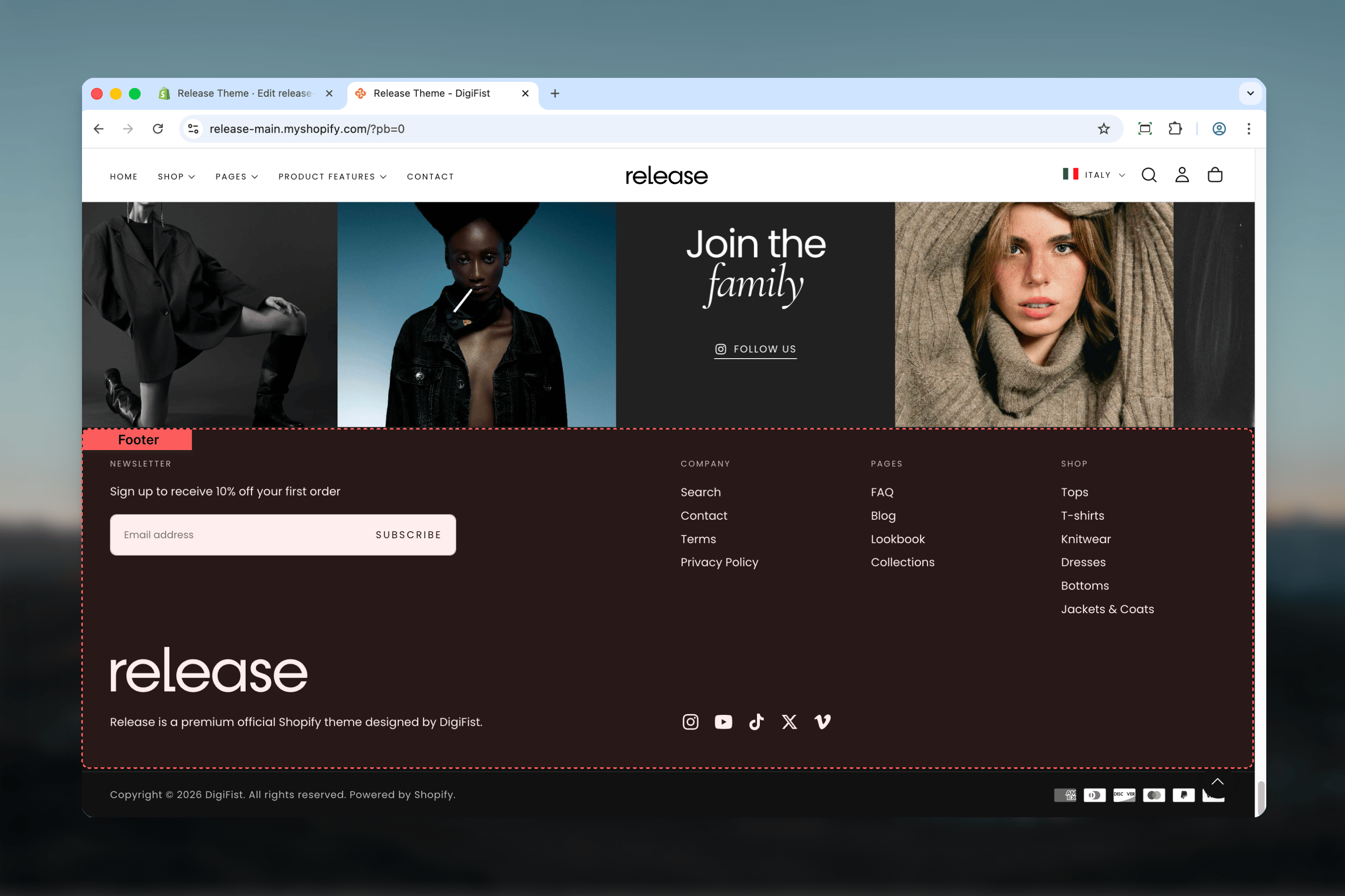
The footer section appears at the bottom of every page and provides navigation, brand information, newsletter signup, social links, and legal content. Once configured, it creates a consistent footer experience across your entire store with flexible block-based layout options.
A well-designed footer helps customers find important information, subscribe to updates, and connect with your brand across platforms.
 ## What this section controls
This section controls the layout, content, and appearance of the footer, including brand blocks, navigation menus, newsletter forms, social media links, payment icons, and custom content blocks.
## Getting started
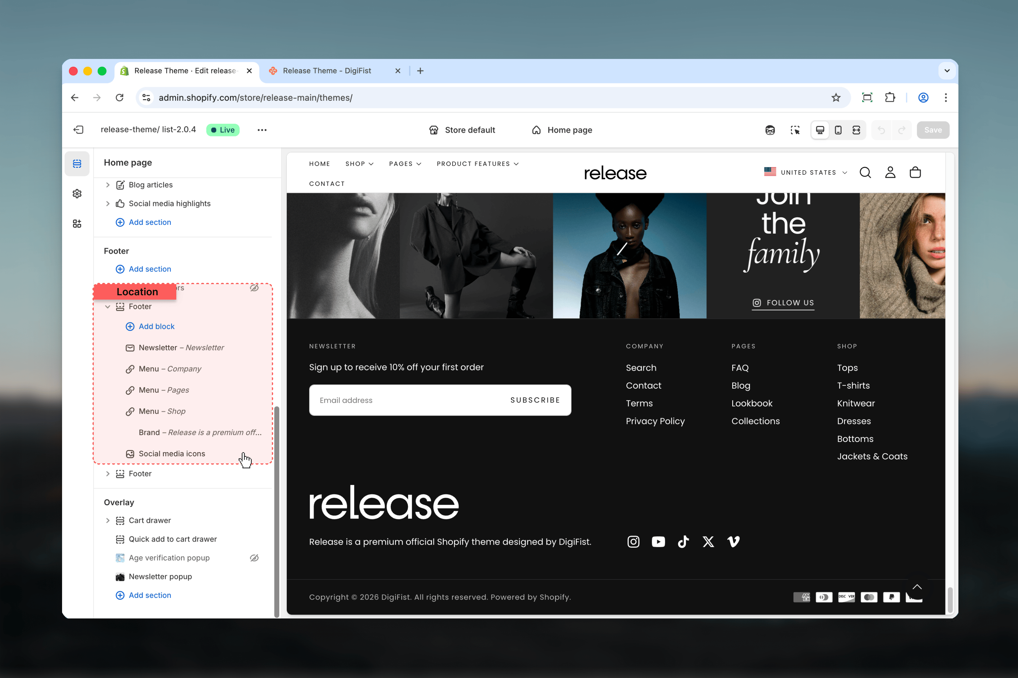
From your Shopify admin, go to **Online Store** → **Themes** → **Customize**.
Scroll to the bottom of any page or select **Footer** from the sections list in the sidebar.
Click **Add block** to add footer elements like menus, brand info, or newsletter forms.
Adjust column and row factors to control block sizing and positioning within the 6-column grid.
## What this section controls
This section controls the layout, content, and appearance of the footer, including brand blocks, navigation menus, newsletter forms, social media links, payment icons, and custom content blocks.
## Getting started
From your Shopify admin, go to **Online Store** → **Themes** → **Customize**.
Scroll to the bottom of any page or select **Footer** from the sections list in the sidebar.
Click **Add block** to add footer elements like menus, brand info, or newsletter forms.
Adjust column and row factors to control block sizing and positioning within the 6-column grid.
 ## Section settings
### Section width
Controls how wide the footer content appears on the page.
Content width matches the global page width setting with standard side margins. Creates alignment with your main content.
Content extends with minimal side margins for an edge-to-edge appearance. Provides maximum horizontal space for footer blocks.
## Section settings
### Section width
Controls how wide the footer content appears on the page.
Content width matches the global page width setting with standard side margins. Creates alignment with your main content.
Content extends with minimal side margins for an edge-to-edge appearance. Provides maximum horizontal space for footer blocks.
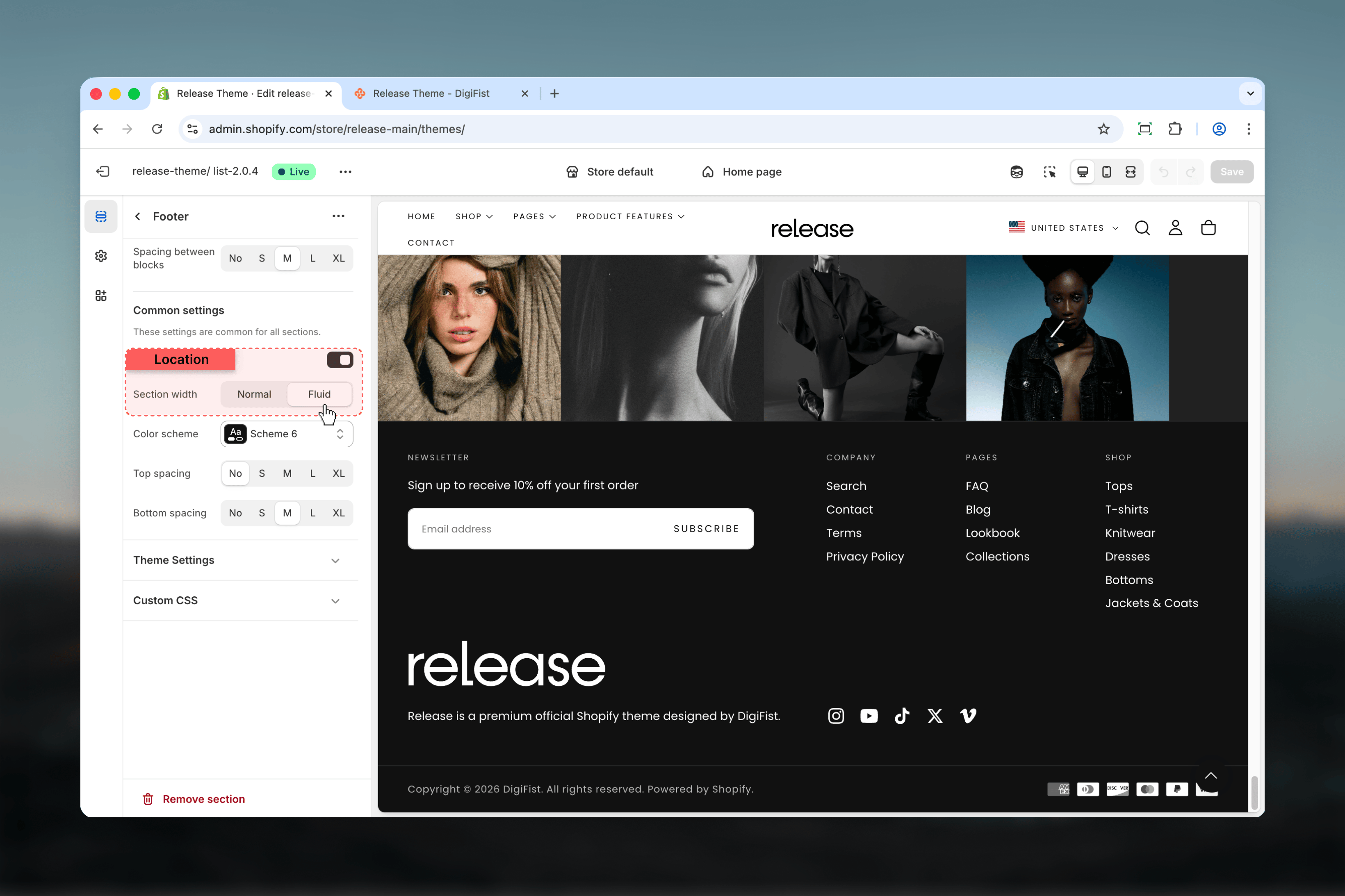 Use **Page** width to align with your main content, or **Fluid** for edge-to-edge footer designs.
### Spacing grid
Controls the space between footer blocks in the grid layout.
**Available options:** No, S, M (default), L, XL
Medium (M) spacing provides balanced separation between blocks without excessive gaps.
### Show border top
When enabled, adds a thin border line across the top of the footer to visually separate it from page content.
### Color scheme
Choose which color scheme applies to the footer.
**Available schemes:** Scheme 1, Scheme 2, Scheme 3, Inverse
Use **Page** width to align with your main content, or **Fluid** for edge-to-edge footer designs.
### Spacing grid
Controls the space between footer blocks in the grid layout.
**Available options:** No, S, M (default), L, XL
Medium (M) spacing provides balanced separation between blocks without excessive gaps.
### Show border top
When enabled, adds a thin border line across the top of the footer to visually separate it from page content.
### Color scheme
Choose which color scheme applies to the footer.
**Available schemes:** Scheme 1, Scheme 2, Scheme 3, Inverse
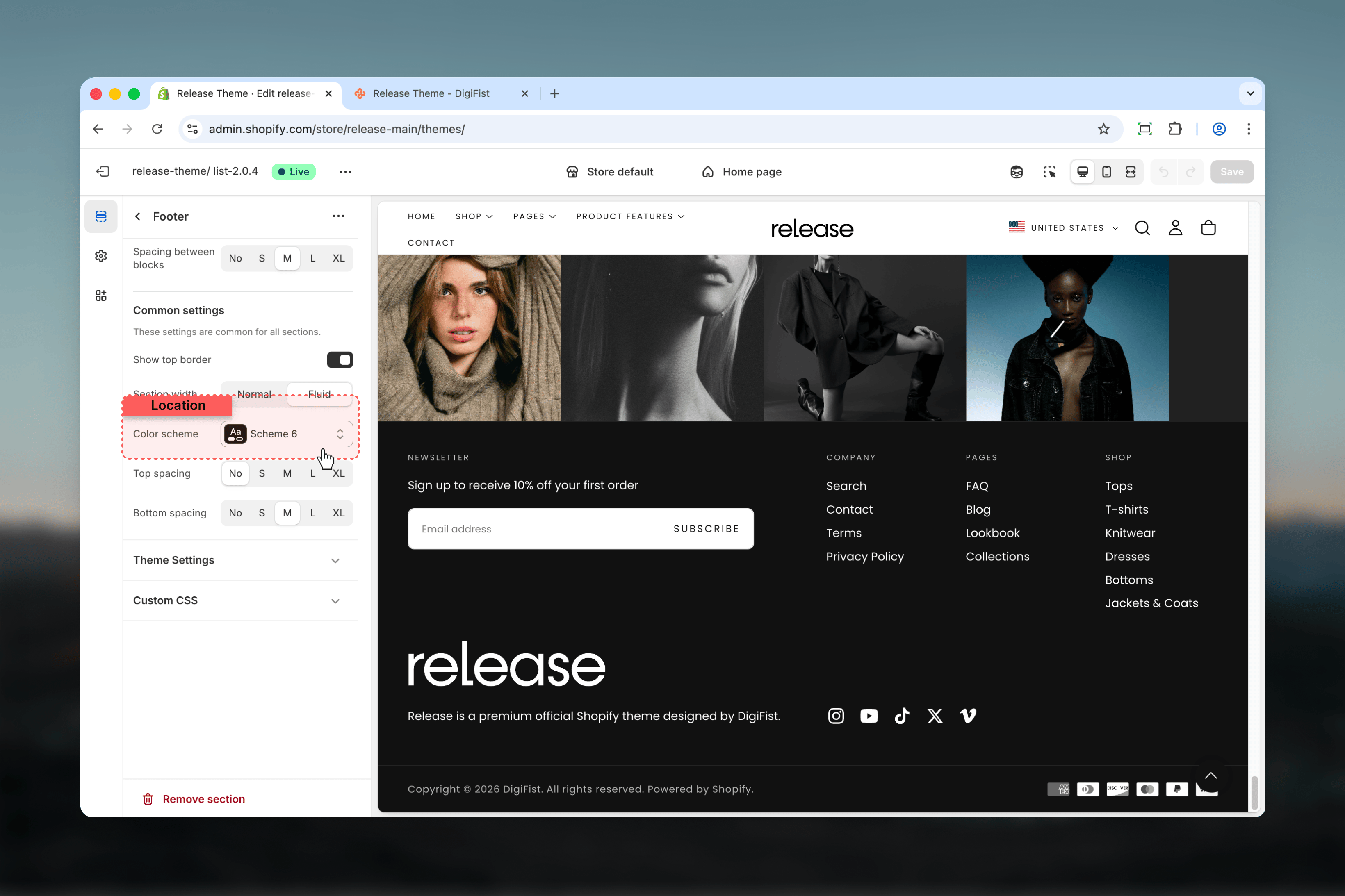 Typically use an inverse or darker scheme to differentiate the footer from main content and create visual hierarchy.
### Spacing top
Controls the padding above the footer content.
**Available options:** No, S, M (default), L, XL
### Spacing bottom
Controls the padding below the footer content.
**Available options:** No, S, M (default), L, XL
## Block types
The footer uses a flexible block-based system. Add, remove, and arrange blocks to create your ideal footer layout.
### Brand block
Displays your brand logo and description text. Only one brand block can be added.
**Logo**: Upload a PNG or JPG logo via the image picker.
**SVG code**: Paste raw SVG code for vector logo. If provided, this overrides the uploaded image and allows perfect scaling at any size.
**Logo width**: Set maximum logo width on desktop (default: 240px).
**Logo width mobile**: Set maximum logo width on mobile (default: 150px).
**Text**: Add brand description text below the logo. Supports rich text formatting.
**Default**: "Share contact information, store details, and brand content with your customers."
**Column factor**: Controls horizontal space (1-6 columns).
**Row factor**: Controls vertical space (1-6 rows).
**Content position vertical**: Aligns content within the grid cell (start, center, end).
**Content alignment**: Horizontal text alignment (start, center, end).
**Content alignment for mobile**: Separate mobile text alignment.
We recommend using column factor 2 for brand blocks to give them appropriate prominence in the footer layout.
### Rich text block
Custom HTML/text content, commonly used for copyright notices and legal disclaimers. You can add up to 2 rich text blocks.
**Heading**: Optional heading above the content.
**Text**: Content text with rich text formatting support.
**Special feature**: Type `[year]` and it automatically displays the current year.
```
Copyright ©[year] DigiFist. All rights reserved.
```
Renders as:
```
Copyright ©2026 DigiFist. All rights reserved.
```
**Column factor**: Controls horizontal space (1-6 columns).
**Row factor**: Controls vertical space (1-6 rows).
**Content position vertical**: Vertical alignment (start, center, end).
**Content alignment**: Horizontal alignment (start, center, end).
**Content alignment for mobile**: Separate mobile alignment.
### Link list block (Menu)
Displays navigation menus with links. You can add up to 6 menu blocks to organize navigation into categories.
**Menu**: Select which Shopify menu to display. Supports up to 3 levels of nested links.
**Default**: "footer" menu
**Custom title**: Optionally override the menu name with custom heading text.
**Title URL**: Make the menu heading clickable by adding a URL.
**Menu layout**:
* **Vertical** (default): Links stacked in a column
* **Horizontal**: Links displayed in a row
Typically use an inverse or darker scheme to differentiate the footer from main content and create visual hierarchy.
### Spacing top
Controls the padding above the footer content.
**Available options:** No, S, M (default), L, XL
### Spacing bottom
Controls the padding below the footer content.
**Available options:** No, S, M (default), L, XL
## Block types
The footer uses a flexible block-based system. Add, remove, and arrange blocks to create your ideal footer layout.
### Brand block
Displays your brand logo and description text. Only one brand block can be added.
**Logo**: Upload a PNG or JPG logo via the image picker.
**SVG code**: Paste raw SVG code for vector logo. If provided, this overrides the uploaded image and allows perfect scaling at any size.
**Logo width**: Set maximum logo width on desktop (default: 240px).
**Logo width mobile**: Set maximum logo width on mobile (default: 150px).
**Text**: Add brand description text below the logo. Supports rich text formatting.
**Default**: "Share contact information, store details, and brand content with your customers."
**Column factor**: Controls horizontal space (1-6 columns).
**Row factor**: Controls vertical space (1-6 rows).
**Content position vertical**: Aligns content within the grid cell (start, center, end).
**Content alignment**: Horizontal text alignment (start, center, end).
**Content alignment for mobile**: Separate mobile text alignment.
We recommend using column factor 2 for brand blocks to give them appropriate prominence in the footer layout.
### Rich text block
Custom HTML/text content, commonly used for copyright notices and legal disclaimers. You can add up to 2 rich text blocks.
**Heading**: Optional heading above the content.
**Text**: Content text with rich text formatting support.
**Special feature**: Type `[year]` and it automatically displays the current year.
```
Copyright ©[year] DigiFist. All rights reserved.
```
Renders as:
```
Copyright ©2026 DigiFist. All rights reserved.
```
**Column factor**: Controls horizontal space (1-6 columns).
**Row factor**: Controls vertical space (1-6 rows).
**Content position vertical**: Vertical alignment (start, center, end).
**Content alignment**: Horizontal alignment (start, center, end).
**Content alignment for mobile**: Separate mobile alignment.
### Link list block (Menu)
Displays navigation menus with links. You can add up to 6 menu blocks to organize navigation into categories.
**Menu**: Select which Shopify menu to display. Supports up to 3 levels of nested links.
**Default**: "footer" menu
**Custom title**: Optionally override the menu name with custom heading text.
**Title URL**: Make the menu heading clickable by adding a URL.
**Menu layout**:
* **Vertical** (default): Links stacked in a column
* **Horizontal**: Links displayed in a row
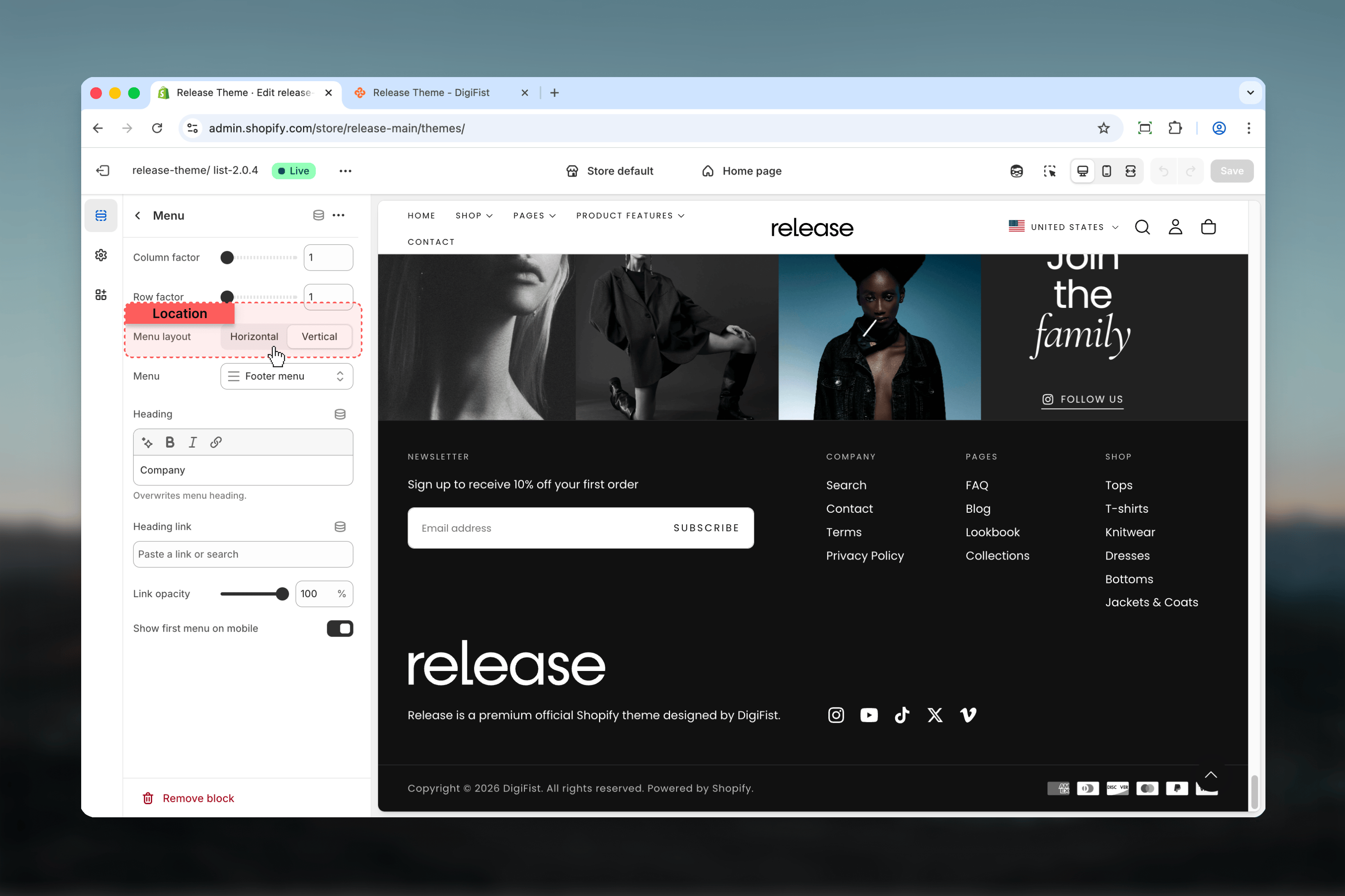 **Link opacity**: Adjust transparency of menu links (0-100%, default: 100%).
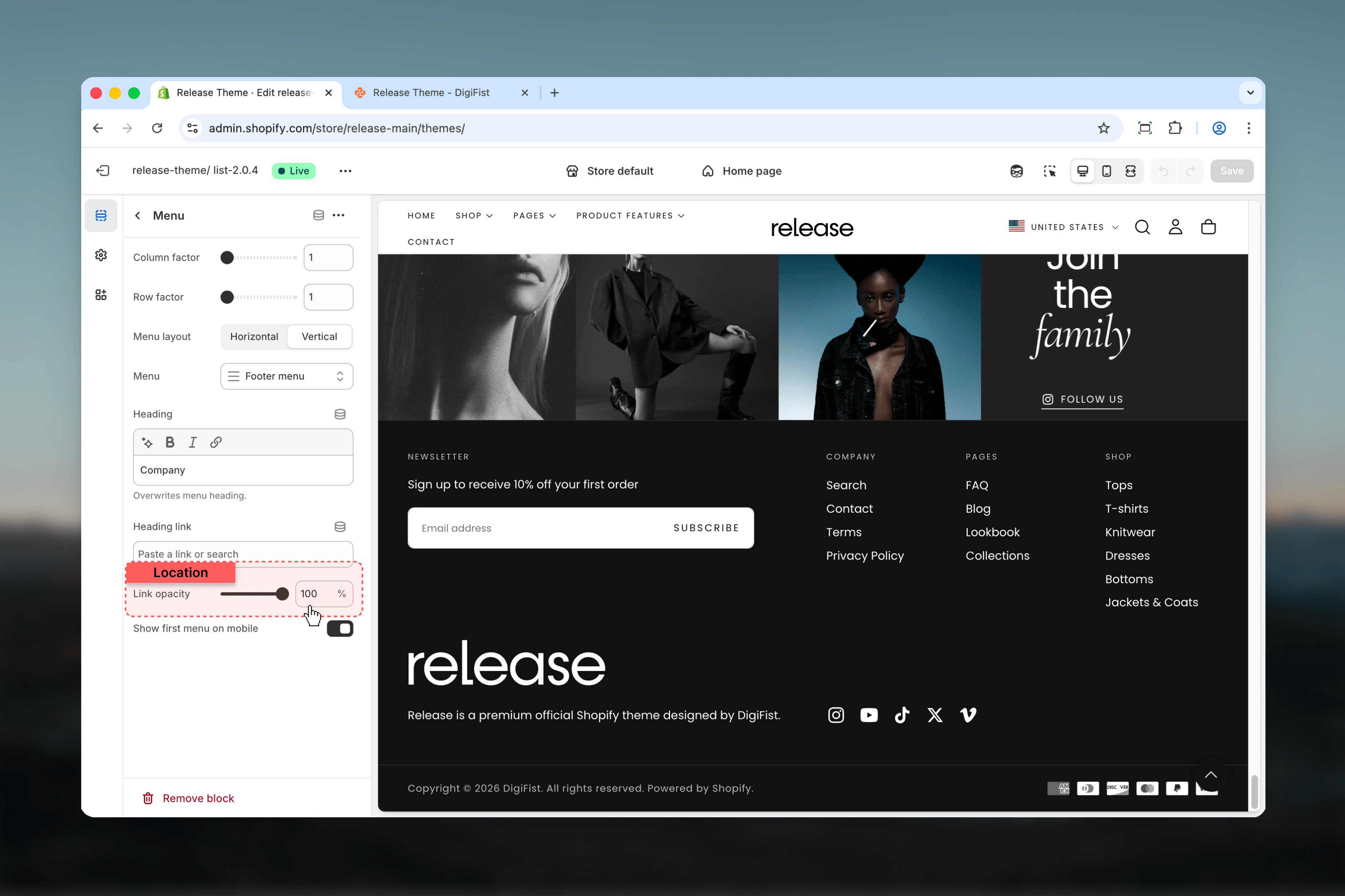 **Show first menu on mobile**: When enabled, the first menu item displays expanded on mobile devices.
Menus automatically become accordion-style collapsible sections on mobile devices for better space efficiency.
The first menu can be set to display expanded by default on mobile for immediate access to important links.
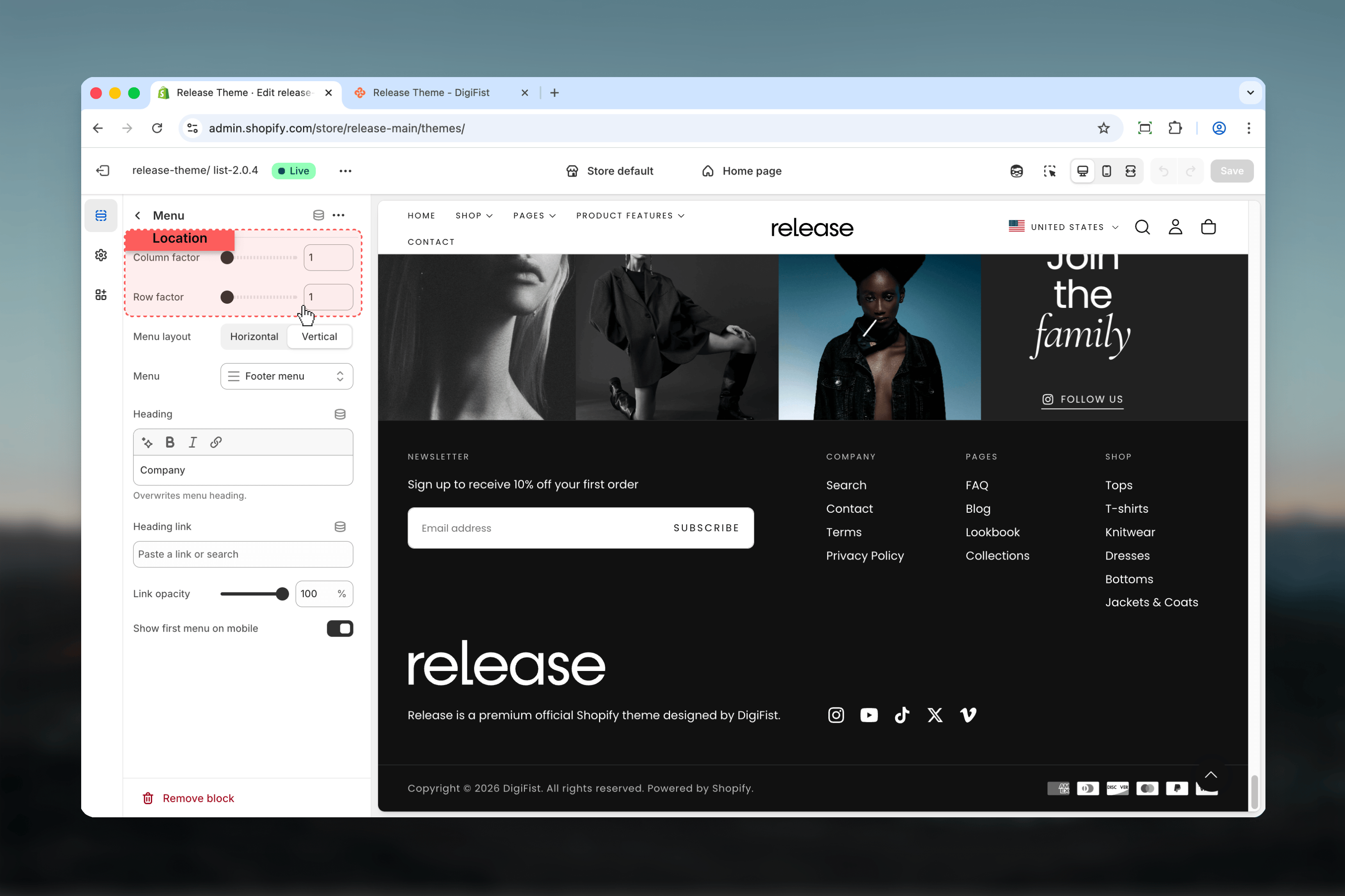
**Column factor**: Controls horizontal space (1-6 columns).
**Row factor**: Controls vertical space (1-6 rows).
**Show first menu on mobile**: When enabled, the first menu item displays expanded on mobile devices.
Menus automatically become accordion-style collapsible sections on mobile devices for better space efficiency.
The first menu can be set to display expanded by default on mobile for immediate access to important links.
**Column factor**: Controls horizontal space (1-6 columns).
**Row factor**: Controls vertical space (1-6 rows).
 Menus must be created in **Shopify admin → Navigation** before they can be selected in footer menu blocks.
### Newsletter block
Email signup form for newsletter subscriptions.
**Heading**: Newsletter section heading (default: "Newsletter").
**Text**: Optional description text explaining the newsletter benefits.
* Uses Shopify's customer newsletter subscription
* Built-in email validation
* Displays success/error messages
* GDPR compliant
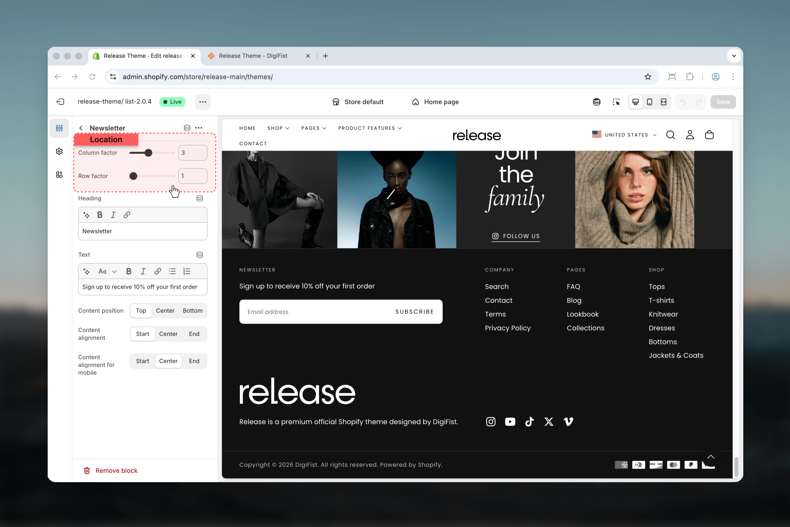
**Column factor**: Controls horizontal space (1-6 columns).
**Row factor**: Controls vertical space (1-6 rows).
Menus must be created in **Shopify admin → Navigation** before they can be selected in footer menu blocks.
### Newsletter block
Email signup form for newsletter subscriptions.
**Heading**: Newsletter section heading (default: "Newsletter").
**Text**: Optional description text explaining the newsletter benefits.
* Uses Shopify's customer newsletter subscription
* Built-in email validation
* Displays success/error messages
* GDPR compliant
**Column factor**: Controls horizontal space (1-6 columns).
**Row factor**: Controls vertical space (1-6 rows).
 **Content position vertical**: Vertical alignment (start, center, end).
**Content alignment**: Horizontal alignment (start, center, end).
**Content alignment for mobile**: Separate mobile alignment.
**Content position vertical**: Vertical alignment (start, center, end).
**Content alignment**: Horizontal alignment (start, center, end).
**Content alignment for mobile**: Separate mobile alignment.
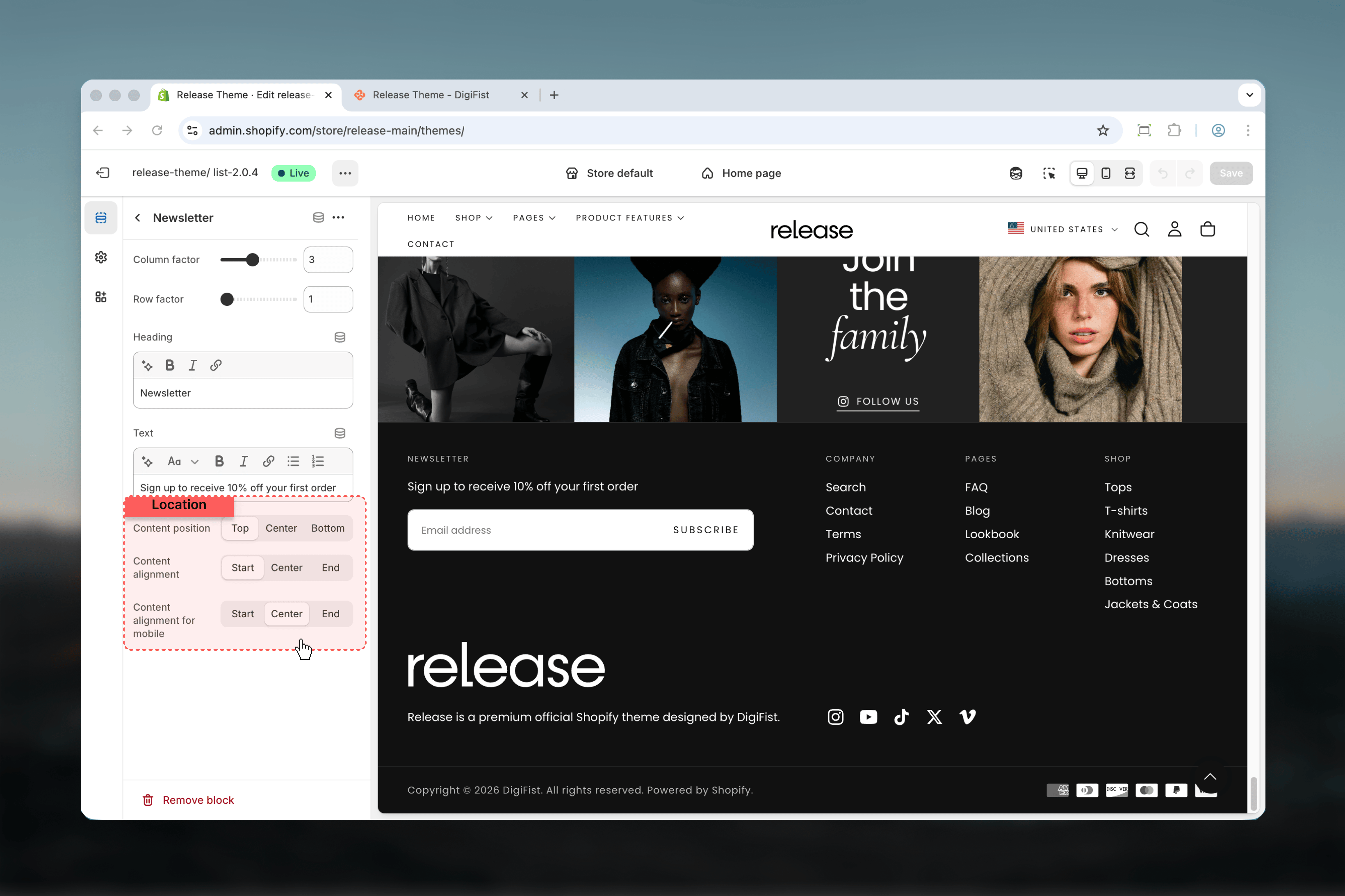 Include clear value proposition text like "Get exclusive discounts and product updates" to encourage signups.
### Social media block
Displays links to your social media profiles. Only one social media block can be added.
**Show icons**: When enabled, displays icon-only buttons. When disabled, shows text labels.
**Open in new tab**: When enabled (default), social links open in a new browser tab.
**Heading**: Optional heading above social links.
Social media URLs are set globally in [Theme settings → Social media](/themes/release/theme-settings/social-media).
The footer automatically displays icons for configured platforms including:
* Instagram
* Facebook
* TikTok
* X (Twitter)
* Pinterest
* YouTube
* LinkedIn
* Snapchat
* Vimeo
**Column factor**: Controls horizontal space (1-6 columns).
**Row factor**: Controls vertical space (1-6 rows).
**Content position vertical**: Vertical alignment (start, center, end).
**Content alignment**: Horizontal alignment (start, center, end).
**Content alignment for mobile**: Separate mobile alignment.
### Follow on Shop block
Displays "Follow on Shop" button for Shop app integration. Only one Follow on Shop block can be added.
**Shop Pay must be enabled** for customers to follow your store via the Shop app.
To enable: Go to **Shopify Settings → Payments** and activate Shop Pay.
**Column factor**: Controls horizontal space (1-6 columns).
**Row factor**: Controls vertical space (1-6 rows).
**Content position vertical**: Vertical alignment (start, center, end).
**Content alignment**: Horizontal alignment (start, center, end).
**Content alignment for mobile**: Separate mobile alignment.
### Localization block
Provides country/region and language selectors for international stores. Only one localization block can be added.
**Enable country selector**: Shows country/market selector.
**Requirements**: Shopify Markets must be configured in your admin.
To configure: Go to **Shopify Settings → Markets** and set up your target markets.
**Enable language selector**: Shows language selector.
**Requirements**: Multiple languages must be enabled in Shopify admin.
To configure: Go to **Shopify Settings → Languages** and add additional languages.
**Column factor**: Controls horizontal space (1-6 columns).
**Row factor**: Controls vertical space (1-6 rows).
**Content position vertical**: Vertical alignment (start, center, end).
**Content alignment**: Horizontal alignment (start, center, end).
**Content alignment for mobile**: Separate mobile alignment.
### Payment icons block
Displays accepted payment method icons. Only one payment icons block can be added.
Icons automatically pull from enabled payment methods in **Shopify Settings → Payments**.
The block displays icons for all active payment providers in your store.
**Custom payment types**: Add comma-separated payment method names for custom icons.
**Example**: `cash, check, bitcoin`
Custom icons appear alongside automatic payment provider icons.
**Colorful icons**:
* When enabled: Shows full-color branded payment icons
* When disabled (default): Shows grayscale/monochrome icons for a subtle appearance
**Column factor**: Controls horizontal space (1-6 columns).
**Row factor**: Controls vertical space (1-6 rows).
**Content position vertical**: Vertical alignment (start, center, end).
**Content alignment**: Horizontal alignment (start, center, end).
**Content alignment for mobile**: Separate mobile alignment.
### Spacer block
Empty space block for layout control and visual separation.
**Show on**:
* **Desktop**: Only visible on desktop screens
* **Mobile**: Only visible on mobile screens
* **Both**: Always visible on all devices
* Create visual separation between blocks
* Balance grid layout when blocks don't fill all columns
* Adjust responsive layouts for different screen sizes
* Push content to specific positions within the grid
**Column factor**: Controls horizontal space (1-6 columns).
**Row factor**: Controls vertical space (1-6 rows).
### Custom Liquid block
Insert custom Liquid code, app snippets, or advanced customizations.
**Custom Liquid**: Field for any valid Liquid code, including:
* App embeds
* Third-party widgets
* Custom functionality
* Advanced Liquid logic
**Show on**: Control visibility by device (desktop, mobile, or both).
* App integrations (reviews, chat widgets)
* Third-party service embeds
* Custom promotional content
* Dynamic content based on customer data
**Heading**: Optional heading above the custom content.
**Column factor**: Controls horizontal space (1-6 columns).
**Row factor**: Controls vertical space (1-6 rows).
**Content alignment**: Horizontal alignment (start, center, end).
**Content alignment for mobile**: Separate mobile alignment.
Custom Liquid blocks require Liquid knowledge. Incorrect code may cause display issues or break the footer layout.
## Grid layout system
The footer uses a **6-column grid system**. Each block can span 1-6 columns (column factor) and 1-6 rows (row factor) to create flexible, responsive layouts.
### Column factor (1-6)
Controls how much horizontal space a block occupies:
Takes 1/6 of row width (narrowest). Ideal for compact elements like social icons or single menu columns.
Takes 1/3 of row width. Good for brand blocks, primary menus, or newsletter forms.
Takes 1/2 of row width (half). Suitable for prominent content or wide menus.
Takes 2/3 of row width. Use for featured content or multi-column menus.
Takes 5/6 of row width. Rarely used, for specific asymmetric layouts.
Takes full width. Perfect for copyright notices, disclaimers, or content that spans the entire footer.
### Row factor (1-6)
Controls vertical height and spacing for each block. Higher values create more vertical space and visual prominence.
Row factor primarily affects spacing and doesn't strictly enforce height. Content can still expand beyond the row height if needed.
### Standard footer layout
**Row 1** (total: 6 columns):
* Brand: column 2
* Menu 1: column 1
* Menu 2: column 1
* Menu 3: column 1
* Newsletter: column 1
**Row 2** (total: 6 columns):
* Copyright (Rich text): column 3
* Localization: column 1
* Social Media: column 1
* Payment Icons: column 1
### Minimal footer layout
**Row 1** (total: 6 columns):
* Brand: column 2
* Menu: column 2
* Newsletter: column 2
**Row 2** (total: 6 columns):
* Copyright (Rich text): column 6 (full width)
### E-commerce focused layout
**Row 1** (total: 6 columns):
* Menu 1: column 1
* Menu 2: column 1
* Menu 3: column 1
* Menu 4: column 1
* Newsletter: column 2
**Row 2** (total: 6 columns):
* Brand: column 2
* Social Media: column 1
* Payment Icons: column 2
* Copyright: column 1
### Vertical position (content\_position\_vertical)
Aligns content to the top of the grid cell. Best for text-heavy blocks.
Vertically centers content within the grid cell. Creates balanced visual appearance.
Aligns content to the bottom of the grid cell. Useful for baseline alignment across blocks.
### Horizontal alignment (content\_alignment)
Left-aligned content (default for most blocks). Natural reading flow for Western languages.
Center-aligned content. Creates symmetry and works well for brand blocks or standalone elements.
Right-aligned content. Useful for specific design aesthetics or RTL languages.
### Mobile-specific alignment
Most blocks support separate alignment settings for mobile devices (`content_alignment_for_mobile`) to optimize layout on small screens.
## Best practices
* **Brand first**: Place brand block in the first column for immediate recognition
* **Menus in the middle**: Use 2-4 menu blocks for organized navigation categories
* **Utilities last**: Position newsletter, social, and localization in final columns
* **Bottom row for legal**: Copyright and payment icons typically span the full width in a second row
* Distribute blocks evenly across the 6-column grid
* Typical patterns: 1+1+1+1+2 = 6, or 2+2+2 = 6
* Avoid having too many narrow blocks (all 1-column)
* Use column factors strategically for visual hierarchy
* Enable top border to create clear separation from page content
* Use a contrasting color scheme (often inverse or darker) for the footer
* Maintain consistent spacing between blocks (Medium spacing recommended)
* Match footer spacing with overall site rhythm
* Set important menus to show expanded on mobile
* Use `content_alignment_for_mobile` for better mobile layouts
* Consider spacer blocks with `show_on: mobile` for mobile-specific adjustments
* Keep mobile logo width reasonable (150px default works well)
* Keep menu link text concise and descriptive
* Use clear newsletter heading with value proposition
* Update copyright with `[year]` tag for automatic updates
* Ensure social links are configured in Theme Settings
* While 3 levels of menu nesting are supported, simpler is often better
* Limit top-level items to 5-7 per menu for clarity
* Create separate menu blocks for different topic categories
* Avoid overly complex hierarchies that confuse customers
* Use SVG logos when possible for faster loading and better scaling
* Limit the number of custom Liquid blocks to reduce complexity
* Test footer load impact with browser developer tools
* Avoid embedding heavy third-party scripts via custom Liquid unless necessary
* Create menus in **Shopify admin → Navigation** before adding link list blocks
* Configure Shopify Markets for country/language selectors
* Set up social media URLs in **Theme Settings → Social Media**
* Enable Shop Pay for "Follow on Shop" functionality
* Configure payment methods in **Shopify Settings → Payments** for payment icons
## Related guides
* [Header](/themes/release/header/header) - Configure the header navigation and layout
* [Social media](/themes/release/theme-settings/social-media) - Set up social media profile links
* [Colors](/themes/release/theme-settings/colors) - Define color schemes for the footer
* [Navigation](/essentials/navigation) - Create and manage Shopify menus
Include clear value proposition text like "Get exclusive discounts and product updates" to encourage signups.
### Social media block
Displays links to your social media profiles. Only one social media block can be added.
**Show icons**: When enabled, displays icon-only buttons. When disabled, shows text labels.
**Open in new tab**: When enabled (default), social links open in a new browser tab.
**Heading**: Optional heading above social links.
Social media URLs are set globally in [Theme settings → Social media](/themes/release/theme-settings/social-media).
The footer automatically displays icons for configured platforms including:
* Instagram
* Facebook
* TikTok
* X (Twitter)
* Pinterest
* YouTube
* LinkedIn
* Snapchat
* Vimeo
**Column factor**: Controls horizontal space (1-6 columns).
**Row factor**: Controls vertical space (1-6 rows).
**Content position vertical**: Vertical alignment (start, center, end).
**Content alignment**: Horizontal alignment (start, center, end).
**Content alignment for mobile**: Separate mobile alignment.
### Follow on Shop block
Displays "Follow on Shop" button for Shop app integration. Only one Follow on Shop block can be added.
**Shop Pay must be enabled** for customers to follow your store via the Shop app.
To enable: Go to **Shopify Settings → Payments** and activate Shop Pay.
**Column factor**: Controls horizontal space (1-6 columns).
**Row factor**: Controls vertical space (1-6 rows).
**Content position vertical**: Vertical alignment (start, center, end).
**Content alignment**: Horizontal alignment (start, center, end).
**Content alignment for mobile**: Separate mobile alignment.
### Localization block
Provides country/region and language selectors for international stores. Only one localization block can be added.
**Enable country selector**: Shows country/market selector.
**Requirements**: Shopify Markets must be configured in your admin.
To configure: Go to **Shopify Settings → Markets** and set up your target markets.
**Enable language selector**: Shows language selector.
**Requirements**: Multiple languages must be enabled in Shopify admin.
To configure: Go to **Shopify Settings → Languages** and add additional languages.
**Column factor**: Controls horizontal space (1-6 columns).
**Row factor**: Controls vertical space (1-6 rows).
**Content position vertical**: Vertical alignment (start, center, end).
**Content alignment**: Horizontal alignment (start, center, end).
**Content alignment for mobile**: Separate mobile alignment.
### Payment icons block
Displays accepted payment method icons. Only one payment icons block can be added.
Icons automatically pull from enabled payment methods in **Shopify Settings → Payments**.
The block displays icons for all active payment providers in your store.
**Custom payment types**: Add comma-separated payment method names for custom icons.
**Example**: `cash, check, bitcoin`
Custom icons appear alongside automatic payment provider icons.
**Colorful icons**:
* When enabled: Shows full-color branded payment icons
* When disabled (default): Shows grayscale/monochrome icons for a subtle appearance
**Column factor**: Controls horizontal space (1-6 columns).
**Row factor**: Controls vertical space (1-6 rows).
**Content position vertical**: Vertical alignment (start, center, end).
**Content alignment**: Horizontal alignment (start, center, end).
**Content alignment for mobile**: Separate mobile alignment.
### Spacer block
Empty space block for layout control and visual separation.
**Show on**:
* **Desktop**: Only visible on desktop screens
* **Mobile**: Only visible on mobile screens
* **Both**: Always visible on all devices
* Create visual separation between blocks
* Balance grid layout when blocks don't fill all columns
* Adjust responsive layouts for different screen sizes
* Push content to specific positions within the grid
**Column factor**: Controls horizontal space (1-6 columns).
**Row factor**: Controls vertical space (1-6 rows).
### Custom Liquid block
Insert custom Liquid code, app snippets, or advanced customizations.
**Custom Liquid**: Field for any valid Liquid code, including:
* App embeds
* Third-party widgets
* Custom functionality
* Advanced Liquid logic
**Show on**: Control visibility by device (desktop, mobile, or both).
* App integrations (reviews, chat widgets)
* Third-party service embeds
* Custom promotional content
* Dynamic content based on customer data
**Heading**: Optional heading above the custom content.
**Column factor**: Controls horizontal space (1-6 columns).
**Row factor**: Controls vertical space (1-6 rows).
**Content alignment**: Horizontal alignment (start, center, end).
**Content alignment for mobile**: Separate mobile alignment.
Custom Liquid blocks require Liquid knowledge. Incorrect code may cause display issues or break the footer layout.
## Grid layout system
The footer uses a **6-column grid system**. Each block can span 1-6 columns (column factor) and 1-6 rows (row factor) to create flexible, responsive layouts.
### Column factor (1-6)
Controls how much horizontal space a block occupies:
Takes 1/6 of row width (narrowest). Ideal for compact elements like social icons or single menu columns.
Takes 1/3 of row width. Good for brand blocks, primary menus, or newsletter forms.
Takes 1/2 of row width (half). Suitable for prominent content or wide menus.
Takes 2/3 of row width. Use for featured content or multi-column menus.
Takes 5/6 of row width. Rarely used, for specific asymmetric layouts.
Takes full width. Perfect for copyright notices, disclaimers, or content that spans the entire footer.
### Row factor (1-6)
Controls vertical height and spacing for each block. Higher values create more vertical space and visual prominence.
Row factor primarily affects spacing and doesn't strictly enforce height. Content can still expand beyond the row height if needed.
### Standard footer layout
**Row 1** (total: 6 columns):
* Brand: column 2
* Menu 1: column 1
* Menu 2: column 1
* Menu 3: column 1
* Newsletter: column 1
**Row 2** (total: 6 columns):
* Copyright (Rich text): column 3
* Localization: column 1
* Social Media: column 1
* Payment Icons: column 1
### Minimal footer layout
**Row 1** (total: 6 columns):
* Brand: column 2
* Menu: column 2
* Newsletter: column 2
**Row 2** (total: 6 columns):
* Copyright (Rich text): column 6 (full width)
### E-commerce focused layout
**Row 1** (total: 6 columns):
* Menu 1: column 1
* Menu 2: column 1
* Menu 3: column 1
* Menu 4: column 1
* Newsletter: column 2
**Row 2** (total: 6 columns):
* Brand: column 2
* Social Media: column 1
* Payment Icons: column 2
* Copyright: column 1
### Vertical position (content\_position\_vertical)
Aligns content to the top of the grid cell. Best for text-heavy blocks.
Vertically centers content within the grid cell. Creates balanced visual appearance.
Aligns content to the bottom of the grid cell. Useful for baseline alignment across blocks.
### Horizontal alignment (content\_alignment)
Left-aligned content (default for most blocks). Natural reading flow for Western languages.
Center-aligned content. Creates symmetry and works well for brand blocks or standalone elements.
Right-aligned content. Useful for specific design aesthetics or RTL languages.
### Mobile-specific alignment
Most blocks support separate alignment settings for mobile devices (`content_alignment_for_mobile`) to optimize layout on small screens.
## Best practices
* **Brand first**: Place brand block in the first column for immediate recognition
* **Menus in the middle**: Use 2-4 menu blocks for organized navigation categories
* **Utilities last**: Position newsletter, social, and localization in final columns
* **Bottom row for legal**: Copyright and payment icons typically span the full width in a second row
* Distribute blocks evenly across the 6-column grid
* Typical patterns: 1+1+1+1+2 = 6, or 2+2+2 = 6
* Avoid having too many narrow blocks (all 1-column)
* Use column factors strategically for visual hierarchy
* Enable top border to create clear separation from page content
* Use a contrasting color scheme (often inverse or darker) for the footer
* Maintain consistent spacing between blocks (Medium spacing recommended)
* Match footer spacing with overall site rhythm
* Set important menus to show expanded on mobile
* Use `content_alignment_for_mobile` for better mobile layouts
* Consider spacer blocks with `show_on: mobile` for mobile-specific adjustments
* Keep mobile logo width reasonable (150px default works well)
* Keep menu link text concise and descriptive
* Use clear newsletter heading with value proposition
* Update copyright with `[year]` tag for automatic updates
* Ensure social links are configured in Theme Settings
* While 3 levels of menu nesting are supported, simpler is often better
* Limit top-level items to 5-7 per menu for clarity
* Create separate menu blocks for different topic categories
* Avoid overly complex hierarchies that confuse customers
* Use SVG logos when possible for faster loading and better scaling
* Limit the number of custom Liquid blocks to reduce complexity
* Test footer load impact with browser developer tools
* Avoid embedding heavy third-party scripts via custom Liquid unless necessary
* Create menus in **Shopify admin → Navigation** before adding link list blocks
* Configure Shopify Markets for country/language selectors
* Set up social media URLs in **Theme Settings → Social Media**
* Enable Shop Pay for "Follow on Shop" functionality
* Configure payment methods in **Shopify Settings → Payments** for payment icons
## Related guides
* [Header](/themes/release/header/header) - Configure the header navigation and layout
* [Social media](/themes/release/theme-settings/social-media) - Set up social media profile links
* [Colors](/themes/release/theme-settings/colors) - Define color schemes for the footer
* [Navigation](/essentials/navigation) - Create and manage Shopify menus