> ## Documentation Index
> Fetch the complete documentation index at: https://docs.digifist.com/llms.txt
> Use this file to discover all available pages before exploring further.
# Contact page
> Customize the layout and features of your contact page.
The contact page provides customers with a way to reach you for inquiries, support, or feedback. It includes a customizable contact form with flexible field types, customer data binding, and optional map display for your store location.
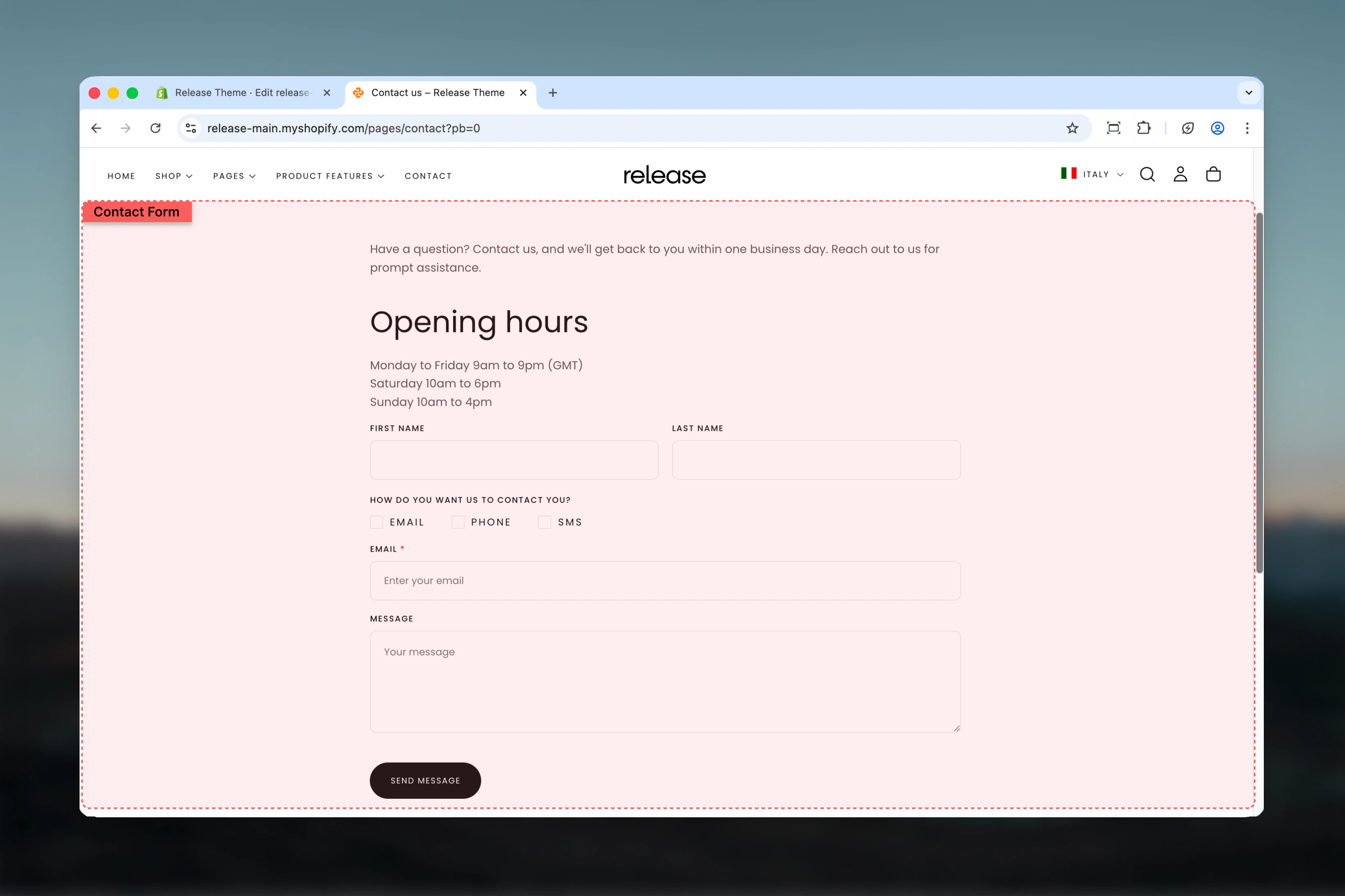 ## What this section controls
This section manages:
* **Contact form fields** - Customizable text, email, phone, checkbox, and radio fields
* **Field layout** - Control field width (full or half) and column spanning
* **Customer data binding** - Auto-fill fields for logged-in customers
* **Required field validation** - Enforce mandatory field completion
* **Form submission** - Handle form submissions and success messaging
* **Map display** - Optional Google Maps integration for store location
* **Section layout** - Adjust section width, color scheme, and spacing
## Getting started
From Shopify admin, access the Theme Customizer
In the left sidebar, click **Pages** > **Contact**
Click **Add block** > **Field** to add form input fields
Set field type, label, width, and whether it's required
Configure Google Maps API key and address to display store location
Set section width, color scheme, and spacing in the Layout tab
## Section Settings
Control the overall form layout, width, and spacing.
## What this section controls
This section manages:
* **Contact form fields** - Customizable text, email, phone, checkbox, and radio fields
* **Field layout** - Control field width (full or half) and column spanning
* **Customer data binding** - Auto-fill fields for logged-in customers
* **Required field validation** - Enforce mandatory field completion
* **Form submission** - Handle form submissions and success messaging
* **Map display** - Optional Google Maps integration for store location
* **Section layout** - Adjust section width, color scheme, and spacing
## Getting started
From Shopify admin, access the Theme Customizer
In the left sidebar, click **Pages** > **Contact**
Click **Add block** > **Field** to add form input fields
Set field type, label, width, and whether it's required
Configure Google Maps API key and address to display store location
Set section width, color scheme, and spacing in the Layout tab
## Section Settings
Control the overall form layout, width, and spacing.
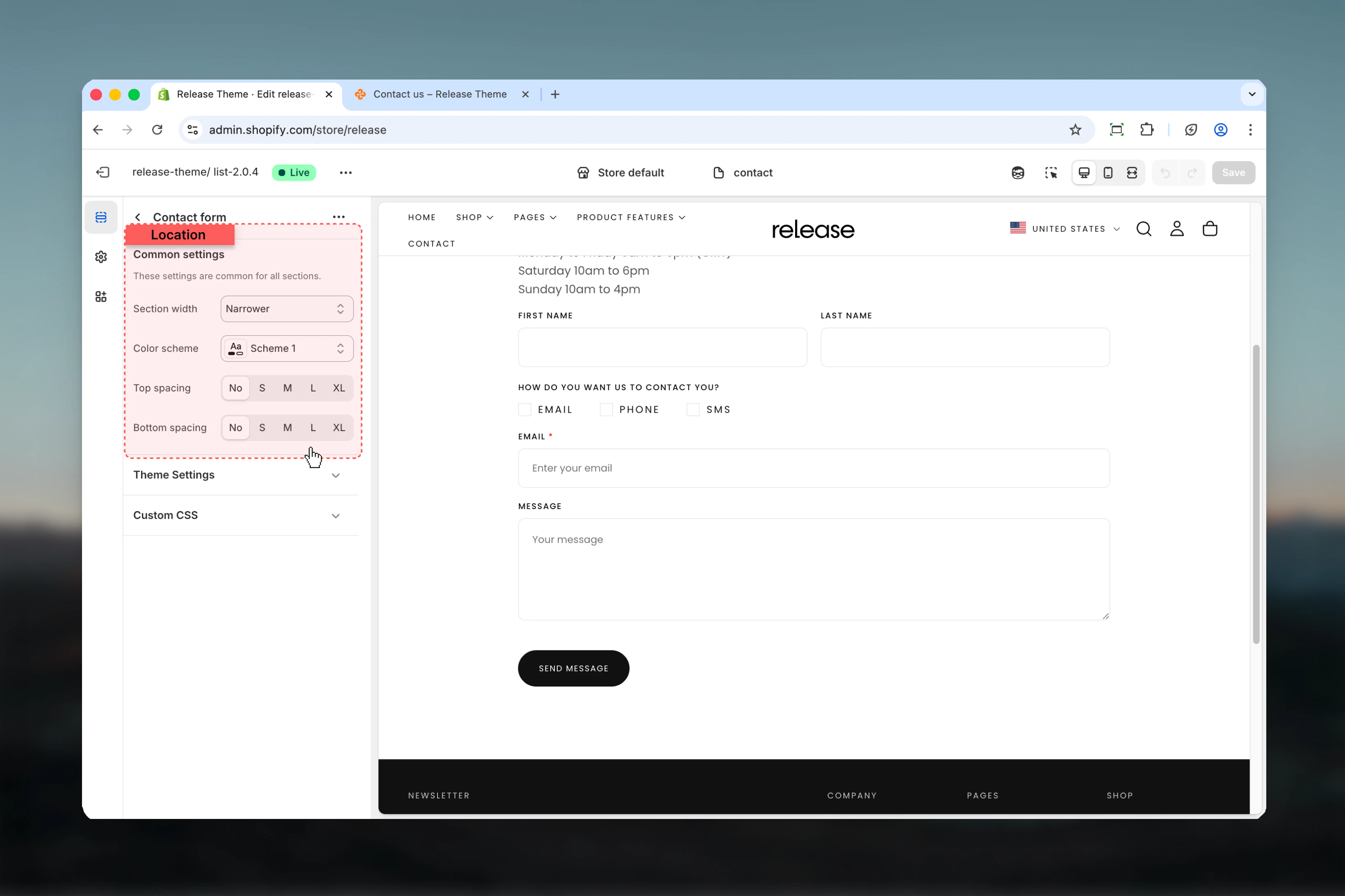 **Type:** Dropdown\
**Options:** max-w-page, max-w-narrower, max-w-fluid\
**Default:** max-w-narrower
Control the maximum width of the contact form:
* **max-w-page** - Standard container matching theme width
* **max-w-narrower** - Narrow focused layout for better readability
* **max-w-fluid** - Wider container utilizing more screen space
Narrower width improves form readability and completion rates by reducing visual noise and focusing attention on the form.
**Type:** Dropdown\
**Default:** scheme-1
Select the color scheme for the form section. Available schemes are defined in **Theme settings > Colors**.
Color scheme affects background, text, input borders, and button colors throughout the form.
**Type:** Dropdown\
**Options:** No (0), S (1), M (2), L (4), XL (6)\
**Default:** M (2)
Adjust padding above the form section, controlling vertical space from the header.
**Type:** Dropdown\
**Options:** No (0), S (1), M (2), L (4), XL (6)\
**Default:** M (2)
Adjust padding below the form section, controlling vertical space to the footer.
Optional Google Maps integration to display your store location.
**Type:** Text field\
**Required:** Yes (to enable map)
Your Google Maps API key required to display the map. Get your API key from [Google Cloud Console](https://console.cloud.google.com/).
Without a valid API key, the map will not display on the contact page.
**Type:** Text field\
**Default:** Shop address from store settings
The address to display on the map. Uses your shop address by default but can be manually overridden.
**Format:** `street, city, country/state`\
**Example:** `123 Main Street, New York, NY`
Use your full store address for accurate map positioning.
**Type:** Range slider\
**Range:** 1-20\
**Default:** 14
Controls the initial zoom level of the map. Higher values show more detail, lower values show broader area.
Zoom level 14 provides a good balance between showing surrounding area and store detail.
## Block Settings
### Field Block
Add customizable form fields to build your contact form. Each field can span full or half width and supports various input types.
Configure the fundamental properties of each form field.
**Type:** Dropdown\
**Options:** max-w-page, max-w-narrower, max-w-fluid\
**Default:** max-w-narrower
Control the maximum width of the contact form:
* **max-w-page** - Standard container matching theme width
* **max-w-narrower** - Narrow focused layout for better readability
* **max-w-fluid** - Wider container utilizing more screen space
Narrower width improves form readability and completion rates by reducing visual noise and focusing attention on the form.
**Type:** Dropdown\
**Default:** scheme-1
Select the color scheme for the form section. Available schemes are defined in **Theme settings > Colors**.
Color scheme affects background, text, input borders, and button colors throughout the form.
**Type:** Dropdown\
**Options:** No (0), S (1), M (2), L (4), XL (6)\
**Default:** M (2)
Adjust padding above the form section, controlling vertical space from the header.
**Type:** Dropdown\
**Options:** No (0), S (1), M (2), L (4), XL (6)\
**Default:** M (2)
Adjust padding below the form section, controlling vertical space to the footer.
Optional Google Maps integration to display your store location.
**Type:** Text field\
**Required:** Yes (to enable map)
Your Google Maps API key required to display the map. Get your API key from [Google Cloud Console](https://console.cloud.google.com/).
Without a valid API key, the map will not display on the contact page.
**Type:** Text field\
**Default:** Shop address from store settings
The address to display on the map. Uses your shop address by default but can be manually overridden.
**Format:** `street, city, country/state`\
**Example:** `123 Main Street, New York, NY`
Use your full store address for accurate map positioning.
**Type:** Range slider\
**Range:** 1-20\
**Default:** 14
Controls the initial zoom level of the map. Higher values show more detail, lower values show broader area.
Zoom level 14 provides a good balance between showing surrounding area and store detail.
## Block Settings
### Field Block
Add customizable form fields to build your contact form. Each field can span full or half width and supports various input types.
Configure the fundamental properties of each form field.
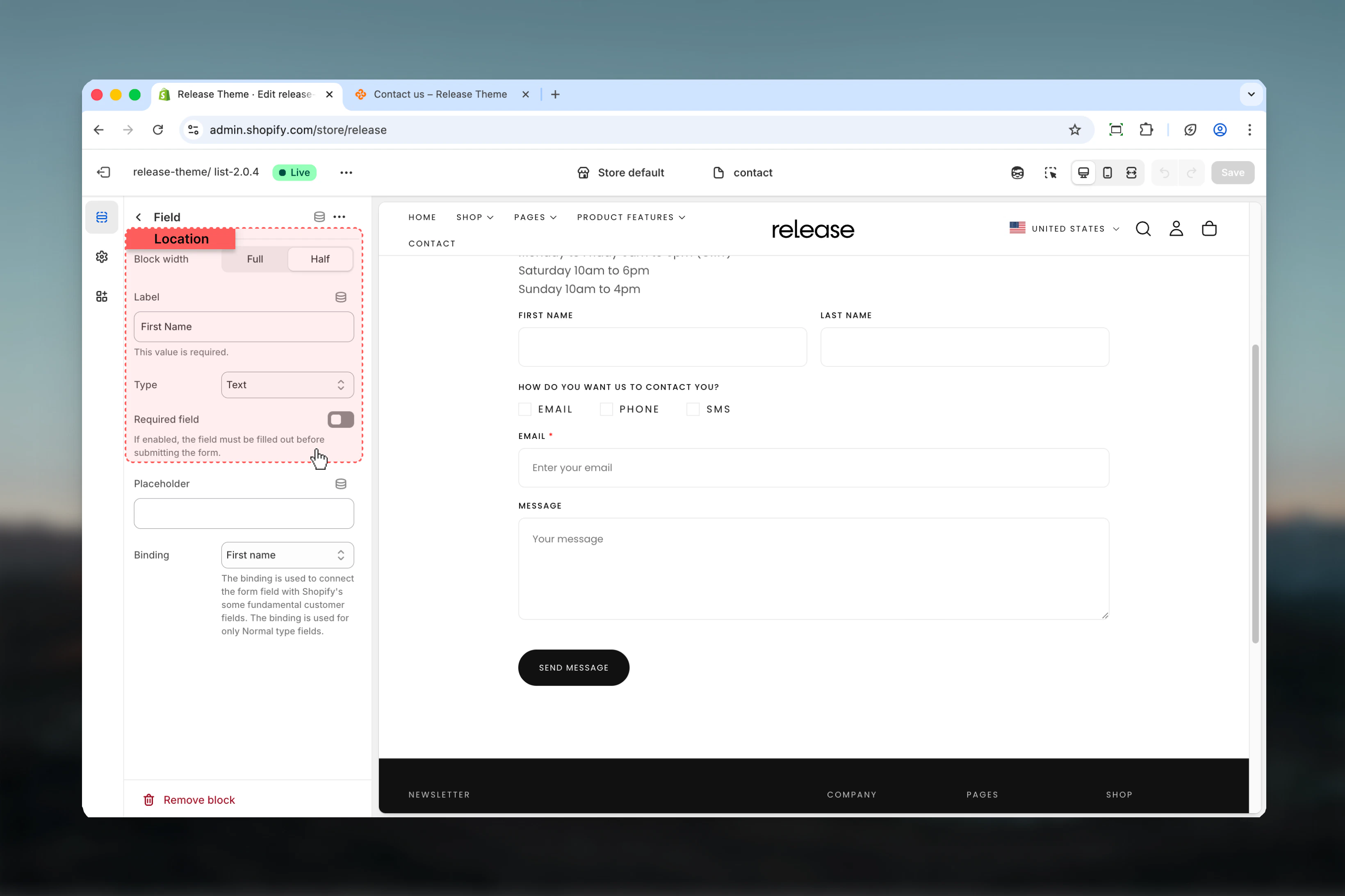 **Type:** Dropdown\
**Options:** Full width (6), Half width (3)\
**Default:** Full width
Control the width of the field:
* **Full width (6)** - Spans entire form width
* **Half width (3)** - Takes up half the row, allowing two fields side-by-side
Use half-width for related pairs like first name/last name or city/zip code to save vertical space.
**Type:** Text field\
**Default:** "Label"\
**Required:** Yes
The label text displayed above the field. This will also be used to generate the field name in form submissions.
Use clear, descriptive labels like "Full Name", "Email Address", "Phone Number" to help users understand what information to provide.
**Type:** Dropdown\
**Default:** Text
Choose the field input type:
**Input fields:**
* **Text** - Single line text input for names, subjects, etc.
* **Email** - Email address input with validation
* **Tel** - Telephone number input
**Selection fields:**
* **Checkbox** - Multiple choice checkboxes (allows multiple selections)
* **Radio** - Single choice radio buttons (allows one selection)
Checkbox fields allow multiple selections, while radio fields allow only one selection at a time.
**Type:** Toggle\
**Default:** Disabled
Mark the field as required for form submission. Customers cannot submit the form without filling required fields.
Mark name, email, and message fields as required minimum to ensure you can respond to inquiries.
Additional settings available for Text, Email, and Tel field types.
**Type:** Dropdown\
**Options:** Full width (6), Half width (3)\
**Default:** Full width
Control the width of the field:
* **Full width (6)** - Spans entire form width
* **Half width (3)** - Takes up half the row, allowing two fields side-by-side
Use half-width for related pairs like first name/last name or city/zip code to save vertical space.
**Type:** Text field\
**Default:** "Label"\
**Required:** Yes
The label text displayed above the field. This will also be used to generate the field name in form submissions.
Use clear, descriptive labels like "Full Name", "Email Address", "Phone Number" to help users understand what information to provide.
**Type:** Dropdown\
**Default:** Text
Choose the field input type:
**Input fields:**
* **Text** - Single line text input for names, subjects, etc.
* **Email** - Email address input with validation
* **Tel** - Telephone number input
**Selection fields:**
* **Checkbox** - Multiple choice checkboxes (allows multiple selections)
* **Radio** - Single choice radio buttons (allows one selection)
Checkbox fields allow multiple selections, while radio fields allow only one selection at a time.
**Type:** Toggle\
**Default:** Disabled
Mark the field as required for form submission. Customers cannot submit the form without filling required fields.
Mark name, email, and message fields as required minimum to ensure you can respond to inquiries.
Additional settings available for Text, Email, and Tel field types.
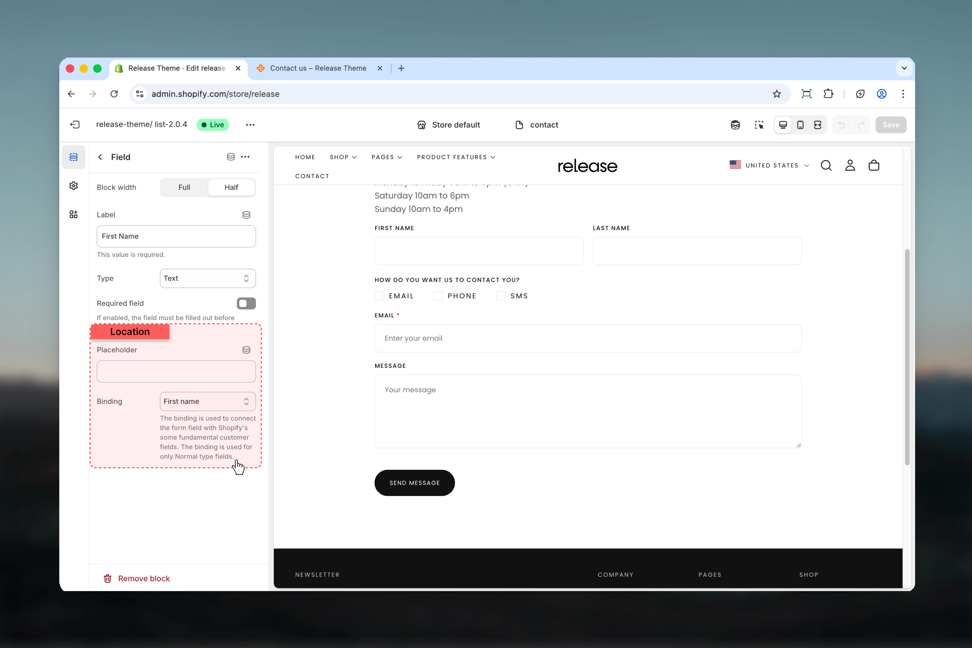 **Type:** Text field\
**Optional:** Yes
Placeholder text shown inside the field when empty. Provides hints about expected input format.
**Examples:**
* Email field: `john@example.com`
* Phone field: `+1 (555) 123-4567`
* Text field: `Enter your full name`
Use placeholders to provide format hints without cluttering the form with extra instructions.
**Type:** Dropdown\
**Default:** Custom\
**Availability:** Text, Email, and Tel fields only
Bind field to customer data for logged-in users. Auto-fills the field with customer information.
**Available options:**
* **Custom** - No binding, manual input
* **Email** - Customer email address
* **Name** - Full name
* **First name** - First name only
* **Last name** - Last name only
* **ID** - Customer ID
* **Phone** - Phone number
* **Last order** - Last order number
Use email binding for email fields to auto-fill for logged-in customers, improving form completion rates by 30-40%.
Binding only works for logged-in customers. Guest visitors must manually fill all fields.
Settings for Checkbox and Radio field types.
**Type:** Text field\
**Optional:** Yes
Placeholder text shown inside the field when empty. Provides hints about expected input format.
**Examples:**
* Email field: `john@example.com`
* Phone field: `+1 (555) 123-4567`
* Text field: `Enter your full name`
Use placeholders to provide format hints without cluttering the form with extra instructions.
**Type:** Dropdown\
**Default:** Custom\
**Availability:** Text, Email, and Tel fields only
Bind field to customer data for logged-in users. Auto-fills the field with customer information.
**Available options:**
* **Custom** - No binding, manual input
* **Email** - Customer email address
* **Name** - Full name
* **First name** - First name only
* **Last name** - Last name only
* **ID** - Customer ID
* **Phone** - Phone number
* **Last order** - Last order number
Use email binding for email fields to auto-fill for logged-in customers, improving form completion rates by 30-40%.
Binding only works for logged-in customers. Guest visitors must manually fill all fields.
Settings for Checkbox and Radio field types.
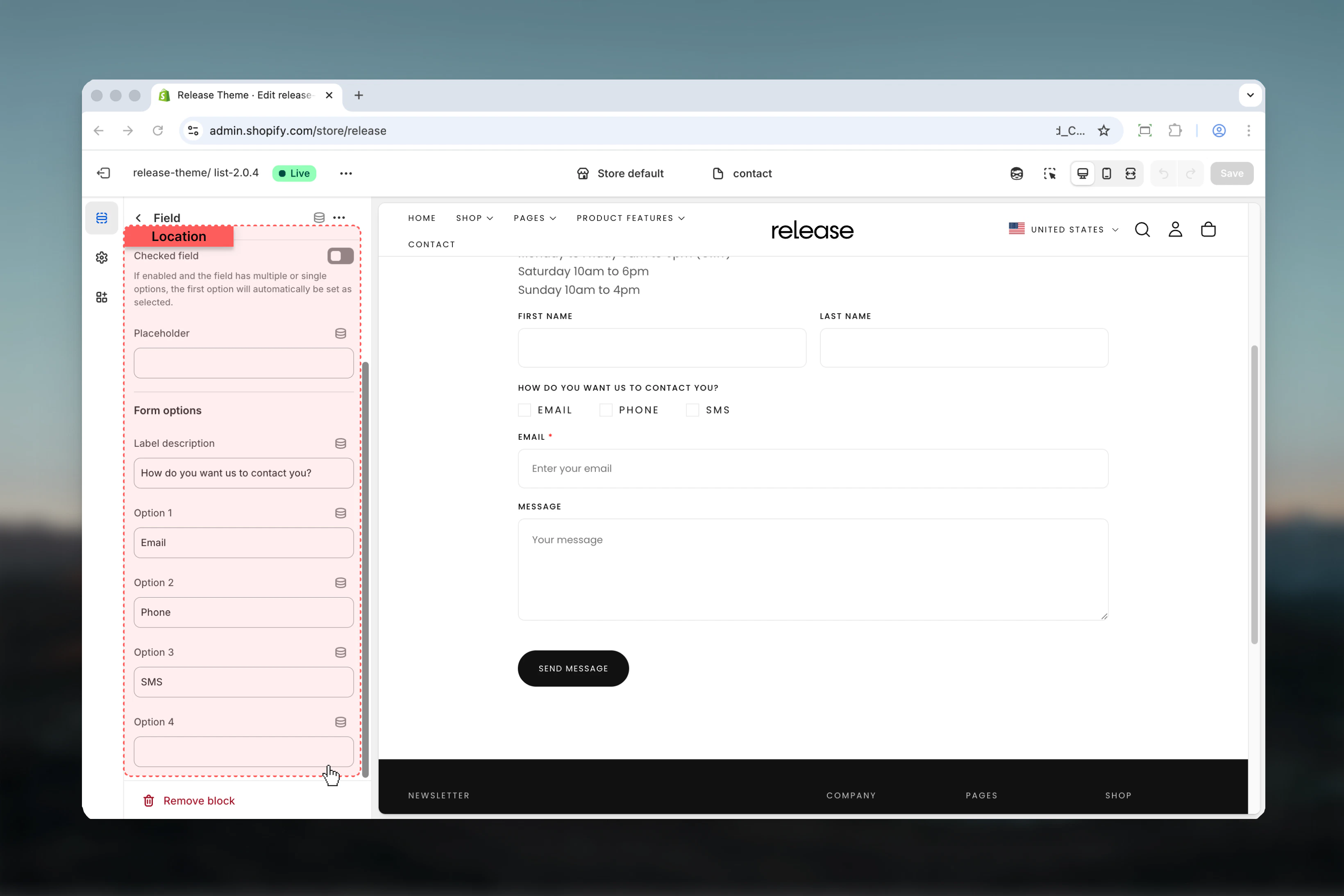 **Type:** Toggle\
**Default:** Unchecked
Set default checked state for the first checkbox/radio option.
Enable for consent checkboxes or default selections to streamline form completion.
**Type:** Text field\
**Optional:** Yes
Additional descriptive text displayed below the field label. Use to provide context or instructions.
Add descriptions like "Select all that apply" for checkboxes or "Choose one option" for radio buttons.
**Type:** Text fields (4 options)\
**Availability:** Checkbox and Radio fields only
Define up to 4 options for checkbox or radio selection:
* **Option 1** - First selectable choice
* **Option 2** - Second selectable choice
* **Option 3** - Third selectable choice
* **Option 4** - Fourth selectable choice
Leave blank to hide unused options.
For inquiry types, use options like "General Question", "Technical Support", "Billing Issue", "Partnership Inquiry".
## Common use cases
Standard contact form for general inquiries.
**Configuration:**
* Name (Text, Full width, Required)
* Email (Email, Full width, Required, Binding: Email)
* Subject (Text, Full width)
* Message (Text, Full width, Required)
Detailed form for customer support requests.
**Configuration:**
* Name (Text, Full width, Required)
* Email (Email, Full width, Required, Binding: Email)
* Order ID (Text, Full width, Binding: Last order)
* Issue type (Radio: Technical/Billing/General/Other)
* Description (Text, Full width, Required)
Simple form focused on email collection.
**Configuration:**
* Email (Email, Full width, Required, Binding: Email)
* Consent checkbox (Checkbox, Required, "I agree to receive newsletters")
Professional quote request form with detailed fields.
**Configuration:**
* First name + Last name (Text, Half width each, Required)
* Email (Email, Full width, Required, Binding: Email)
* Phone (Tel, Full width, Binding: Phone)
* Service type (Checkbox: Consulting/Development/Design/Marketing)
* Budget range (Radio: \<$5k/$5k-$10k/$10k-$25k/$25k+)
* Project details (Text, Full width, Required)
Form for business partnership opportunities.
**Configuration:**
* Company name (Text, Full width, Required)
* Contact name (Text, Full width, Required)
* Email (Email, Full width, Required, Binding: Email)
* Phone (Tel, Full width, Binding: Phone)
* Partnership type (Radio: Affiliate/Wholesale/Collaboration/Distribution)
* Message (Text, Full width, Required)
Form for specific product questions.
**Configuration:**
* Name (Text, Full width, Required)
* Email (Email, Full width, Required, Binding: Email)
* Product interest (Radio: Product A/Product B/Product C/Other)
* Quantity needed (Text, Half width)
* Timeline (Radio: Immediate/1-2 weeks/1 month/Flexible, Half width)
* Additional information (Text, Full width)
## Best practices
Use max-w-narrower (default) for better readability and completion rates. Narrower forms reduce visual noise and focus attention on form fields.
Mark name, email, and message as required minimum. Too many required fields (>5) can reduce completion rates by 30-40%.
Use half-width fields for related pairs like first name/last name or city/zip code to save vertical space and improve form flow.
Use full-width fields for message/textarea and single important fields like email to emphasize their importance.
Always bind email field to customer email for convenience. This improves form completion rates by 30-40% for logged-in users.
Follow standard flow: Name → Email → Subject/Reason → Message. Users expect this pattern and complete forms faster when it's followed.
Use placeholders to provide format hints like "[john@example.com](mailto:john@example.com)" or "+1 (555) 123-4567" without cluttering the form.
Add required checkbox for terms/privacy acceptance if legally required. Place at the end, before submit button.
Use radio buttons for predefined options like inquiry type or department. This standardizes responses and improves support routing.
Keep it short: 4-6 fields maximum for higher completion rates. Each additional field can reduce completion by 5-10%.
## Related guides
Configure newsletter signup popup for email collection
Create and customize additional pages
**Type:** Toggle\
**Default:** Unchecked
Set default checked state for the first checkbox/radio option.
Enable for consent checkboxes or default selections to streamline form completion.
**Type:** Text field\
**Optional:** Yes
Additional descriptive text displayed below the field label. Use to provide context or instructions.
Add descriptions like "Select all that apply" for checkboxes or "Choose one option" for radio buttons.
**Type:** Text fields (4 options)\
**Availability:** Checkbox and Radio fields only
Define up to 4 options for checkbox or radio selection:
* **Option 1** - First selectable choice
* **Option 2** - Second selectable choice
* **Option 3** - Third selectable choice
* **Option 4** - Fourth selectable choice
Leave blank to hide unused options.
For inquiry types, use options like "General Question", "Technical Support", "Billing Issue", "Partnership Inquiry".
## Common use cases
Standard contact form for general inquiries.
**Configuration:**
* Name (Text, Full width, Required)
* Email (Email, Full width, Required, Binding: Email)
* Subject (Text, Full width)
* Message (Text, Full width, Required)
Detailed form for customer support requests.
**Configuration:**
* Name (Text, Full width, Required)
* Email (Email, Full width, Required, Binding: Email)
* Order ID (Text, Full width, Binding: Last order)
* Issue type (Radio: Technical/Billing/General/Other)
* Description (Text, Full width, Required)
Simple form focused on email collection.
**Configuration:**
* Email (Email, Full width, Required, Binding: Email)
* Consent checkbox (Checkbox, Required, "I agree to receive newsletters")
Professional quote request form with detailed fields.
**Configuration:**
* First name + Last name (Text, Half width each, Required)
* Email (Email, Full width, Required, Binding: Email)
* Phone (Tel, Full width, Binding: Phone)
* Service type (Checkbox: Consulting/Development/Design/Marketing)
* Budget range (Radio: \<$5k/$5k-$10k/$10k-$25k/$25k+)
* Project details (Text, Full width, Required)
Form for business partnership opportunities.
**Configuration:**
* Company name (Text, Full width, Required)
* Contact name (Text, Full width, Required)
* Email (Email, Full width, Required, Binding: Email)
* Phone (Tel, Full width, Binding: Phone)
* Partnership type (Radio: Affiliate/Wholesale/Collaboration/Distribution)
* Message (Text, Full width, Required)
Form for specific product questions.
**Configuration:**
* Name (Text, Full width, Required)
* Email (Email, Full width, Required, Binding: Email)
* Product interest (Radio: Product A/Product B/Product C/Other)
* Quantity needed (Text, Half width)
* Timeline (Radio: Immediate/1-2 weeks/1 month/Flexible, Half width)
* Additional information (Text, Full width)
## Best practices
Use max-w-narrower (default) for better readability and completion rates. Narrower forms reduce visual noise and focus attention on form fields.
Mark name, email, and message as required minimum. Too many required fields (>5) can reduce completion rates by 30-40%.
Use half-width fields for related pairs like first name/last name or city/zip code to save vertical space and improve form flow.
Use full-width fields for message/textarea and single important fields like email to emphasize their importance.
Always bind email field to customer email for convenience. This improves form completion rates by 30-40% for logged-in users.
Follow standard flow: Name → Email → Subject/Reason → Message. Users expect this pattern and complete forms faster when it's followed.
Use placeholders to provide format hints like "[john@example.com](mailto:john@example.com)" or "+1 (555) 123-4567" without cluttering the form.
Add required checkbox for terms/privacy acceptance if legally required. Place at the end, before submit button.
Use radio buttons for predefined options like inquiry type or department. This standardizes responses and improves support routing.
Keep it short: 4-6 fields maximum for higher completion rates. Each additional field can reduce completion by 5-10%.
## Related guides
Configure newsletter signup popup for email collection
Create and customize additional pages