> ## Documentation Index
> Fetch the complete documentation index at: https://docs.digifist.com/llms.txt
> Use this file to discover all available pages before exploring further.
# Product groups
> Organize products into groups for better navigation and cross-selling.
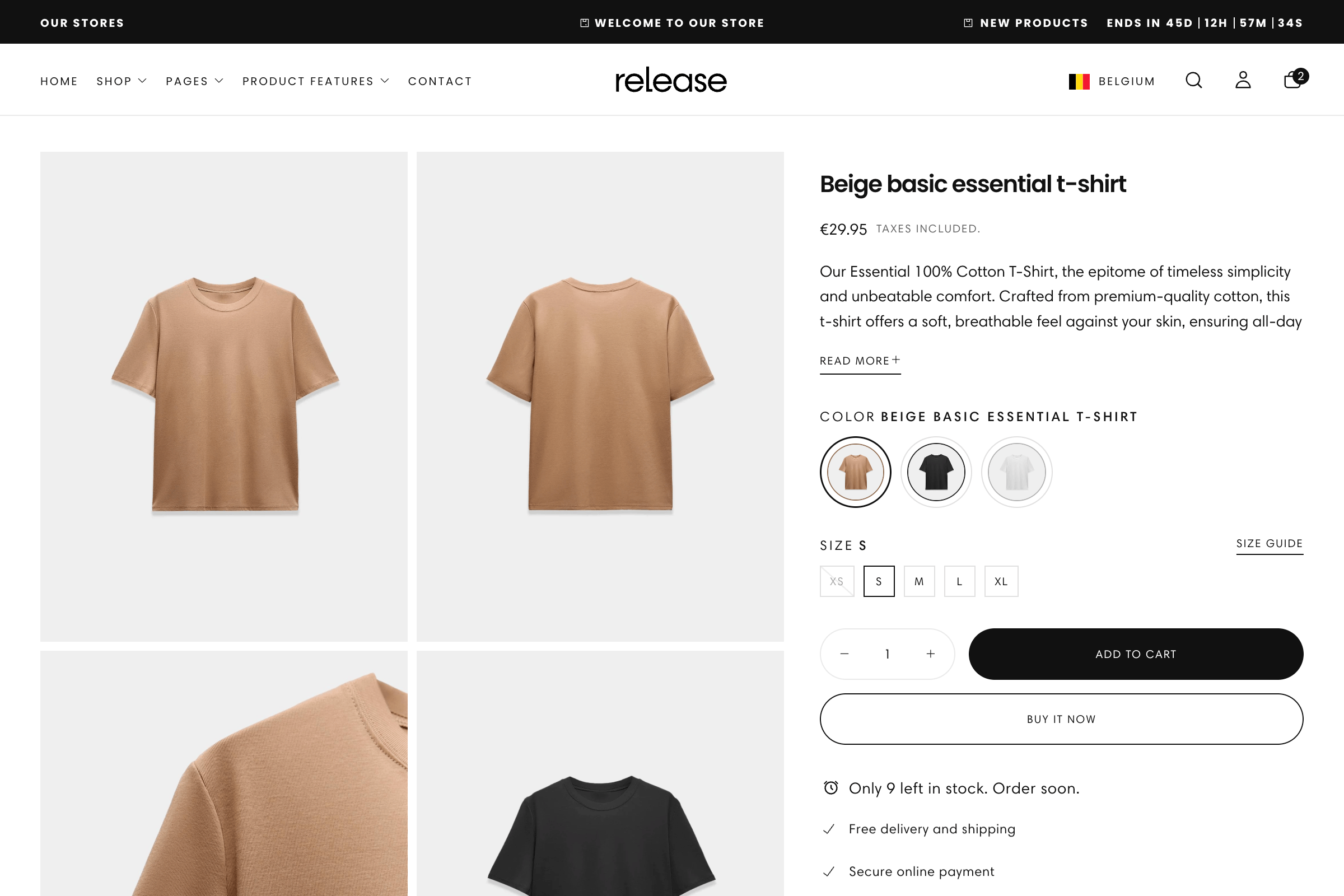
Product Groups allow you to link separate products so they behave like variants of one another. Each product maintains its own description, variants, and images while being presented as part of a unified group on product cards and pages. This creates a seamless shopping experience where customers can switch between related products without leaving the product page.
 ## What this feature controls
Product Groups manages:
* **Product linking** - Connect separate products to act as variant options
* **Navigation between products** - Allow customers to switch between grouped products
* **Display types** - Show groups as swatches, images, text, or product thumbnails
* **Metaobject integration** - Use Shopify metaobjects to define product relationships
* **Custom option values** - Set custom images or text for variant options
* **Card and page display** - Control how groups appear on product cards vs. pages
* **Native variant integration** - Works alongside standard product variants
## Getting started
Set up the metaobject structure for product groups.
1. In Shopify admin, go to **Content → Metaobjects → Add definition**
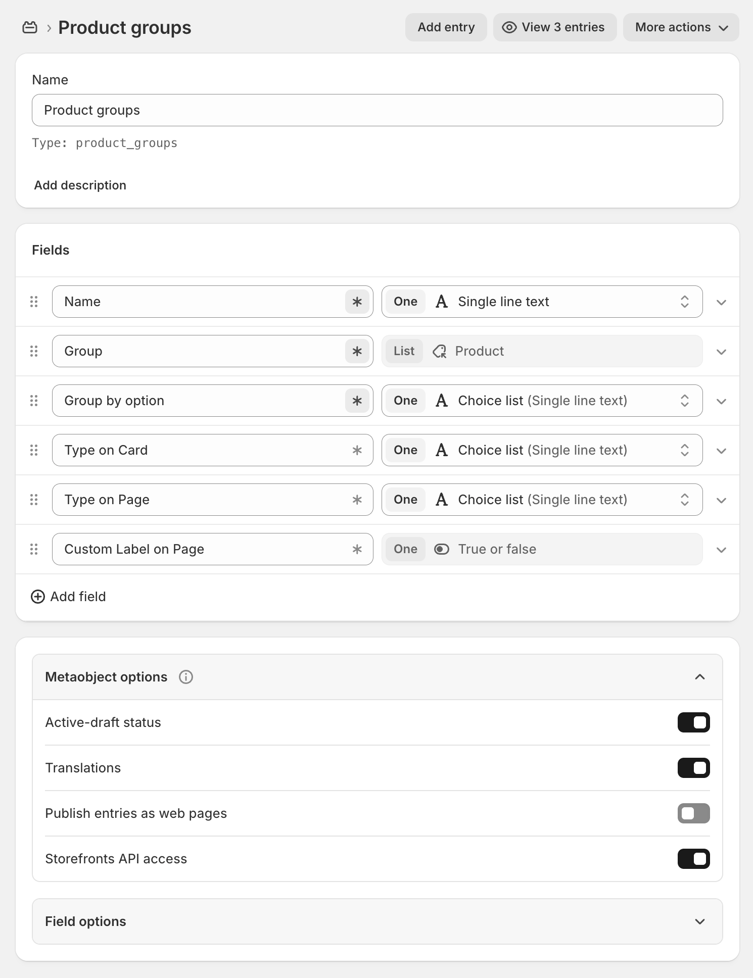
2. Create a **Product Groups** metaobject definition:
* **Name:** Product Groups
* **Handle:** `product_groups`
3. Add the following fields to the definition:
| Field Name | Handle | Type |
| :------------------- | :--------------------- | :----------------------------------- |
| Name | `name` | One : Single line text |
| Group | `group` | List : Product |
| Group by option | `group_by_option` | One : Choice list (Single line text) |
| Type on card | `type_on_card` | One : Choice list (Single line text) |
| Type on page | `type_on_page` | One : Choice list (Single line text) |
| Custom label on page | `custom_label_on_page` | One : True or false |
4. For **Group by option** field, add common options:
* Color
* Size
* Capacity
* Material
* Style
5. For **Type on card** and **Type on page** fields, add these options:
* Swatch
* Image
* Text
* Product
6. Save the definition
Field handles must be exactly as shown above. Incorrect handles will break the product groups functionality.
## What this feature controls
Product Groups manages:
* **Product linking** - Connect separate products to act as variant options
* **Navigation between products** - Allow customers to switch between grouped products
* **Display types** - Show groups as swatches, images, text, or product thumbnails
* **Metaobject integration** - Use Shopify metaobjects to define product relationships
* **Custom option values** - Set custom images or text for variant options
* **Card and page display** - Control how groups appear on product cards vs. pages
* **Native variant integration** - Works alongside standard product variants
## Getting started
Set up the metaobject structure for product groups.
1. In Shopify admin, go to **Content → Metaobjects → Add definition**
2. Create a **Product Groups** metaobject definition:
* **Name:** Product Groups
* **Handle:** `product_groups`
3. Add the following fields to the definition:
| Field Name | Handle | Type |
| :------------------- | :--------------------- | :----------------------------------- |
| Name | `name` | One : Single line text |
| Group | `group` | List : Product |
| Group by option | `group_by_option` | One : Choice list (Single line text) |
| Type on card | `type_on_card` | One : Choice list (Single line text) |
| Type on page | `type_on_page` | One : Choice list (Single line text) |
| Custom label on page | `custom_label_on_page` | One : True or false |
4. For **Group by option** field, add common options:
* Color
* Size
* Capacity
* Material
* Style
5. For **Type on card** and **Type on page** fields, add these options:
* Swatch
* Image
* Text
* Product
6. Save the definition
Field handles must be exactly as shown above. Incorrect handles will break the product groups functionality.
 Set up custom option values for images and text.
1. In Shopify admin, go to **Content → Metaobjects → Add definition**
2. Create a **Product Options Type Values** metaobject definition:
* **Name:** Product Options Type Values
* **Handle:** `product_options_type_values`
3. Add the following fields:
| Field Name | Handle | Type |
| :--------- | :------ | :--------------------- |
| Name | `name` | One : Single line text |
| Image | `image` | One : Image (File) |
| Text | `text` | One : Single line text |
4. Save the definition
This metaobject is optional. Only create it if you want custom images or text labels for your product group options.
Connect the metaobject definitions to your theme.
1. Go to **Online Store → Themes → Customize**
2. Open **Theme settings → Products**
3. Scroll to **Product Groups** section
4. Select the **Product Groups** metaobject definition you created
5. If you created it, select the **Product Options Type Values** metaobject
6. Save your changes
Add products to a group.
1. Go to **Content → Metaobjects → Product Groups → Add entry**
2. Fill in the fields:
* **Name:** Descriptive name (e.g., "T-Shirt Collection")
* **Group:** Select 2+ products to link together
* **Group by option:** Choose what differentiates them (e.g., "Color")
* **Type on card:** How to display on collection pages (e.g., "Swatch")
* **Type on page:** How to display on product pages (e.g., "Product")
* **Custom label on page:** Enable if using custom labels
3. Save the product group
Add custom images or text for option values.
1. Go to **Content → Metaobjects → Product Options Type Values → Add entry**
2. For each custom value, add:
* **Name:** Option value name (must match variant option exactly)
* **Image:** Upload custom image (for Image type display)
* **Text:** Custom text label (for Text type display)
3. Save each entry
Name must exactly match the product variant option. For example, if your product has "Navy Blue" as a color, the custom value Name must be "Navy Blue".
Verify groups appear correctly on your storefront.
1. Visit a product that's part of a group
2. Check that group options appear as configured
3. Test switching between products in the group
4. Verify display on both collection cards and product pages
## How Product Groups work
Product Groups create relationships between separate products, making them appear as different variants of the same item:
### Standard variants vs. Product Groups
**Standard variants:**
* Single product with multiple variants (e.g., one t-shirt with colors)
* All variants share same description and product details
* Limited to 3 variant options (Shopify limit)
* All managed within one product
**Product Groups:**
* Multiple separate products linked together
* Each product has its own description, images, pricing
* No limit on number of products in a group
* Each product can have its own variants too
### Display types
Product Groups can be displayed in four different ways:
**Best for:** Color variations, patterns, materials
Displays small circular or square swatches representing each product in the group. Uses Shopify's native color swatch metaobject (`shopify--color-pattern`) by default.
**When to use:**
* Color variations (Red, Blue, Black)
* Pattern variations (Striped, Solid, Checkered)
* Material swatches (Cotton, Linen, Silk)
**Appearance:**
* Small clickable swatches below product image
* Shows color or pattern visually
* Hover to preview product name
**Best for:** Style variations, design differences
Displays small thumbnail images for each product option. Can use product's main image or custom images from Product Options Type Values metaobject.
**When to use:**
* Different styles or designs
* Pattern variations needing visual display
* Products where appearance matters more than text
**Appearance:**
* Small square thumbnails
* Shows actual product or custom image
* Click to switch products
**Best for:** Size, capacity, specific names
Displays text labels for each product option. Can use product's option value or custom text from metaobject.
**When to use:**
* Size variations (Small, Medium, Large)
* Capacity options (8oz, 16oz, 32oz)
* Named variations (Classic, Premium, Deluxe)
**Appearance:**
* Text buttons or pills
* Clear readable labels
* Selected state highlighting
**Best for:** Complete product cards, related items
Displays full product cards with images and details for each product in the group.
**When to use:**
* Very different products in the group
* When customers need to see full product details
* Related product recommendations
**Appearance:**
* Full product cards in a row
* Shows image, title, price
* More visual weight than other types
### Custom option values
When you want more control over how options appear, use the Product Options Type Values metaobject:
**Without custom values:**
* Theme uses product's variant option name (e.g., "Navy Blue")
* Swatch type uses Shopify's color swatch metaobject
* Image type uses product's featured image
**With custom values:**
* **Custom images** - Upload specific images for Image type display
* **Custom text** - Use different text labels than variant names
* **Better control** - Ensure consistent appearance across products
Custom value **Name** must exactly match the product's variant option value. Matching is case-sensitive.
## Metaobject structure
### Product Groups metaobject
**Name** (`name`)
* Type: Single line text
* Purpose: Internal name for the product group
* Example: "T-Shirt Collection - Summer 2024"
**Group** (`group`)
* Type: List of Products
* Purpose: Select all products to include in this group
* Requirement: Minimum 2 products
* Example: \[Product A, Product B, Product C]
**Group by option** (`group_by_option`)
* Type: Choice list (Single line text)
* Purpose: Variant option that differentiates products
* Example: "Color", "Size", "Material"
* Must match variant option name on products
**Type on card** (`type_on_card`)
* Type: Choice list (Single line text)
* Purpose: How to display group on collection/card views
* Options: Swatch, Image, Text, Product
**Type on page** (`type_on_page`)
* Type: Choice list (Single line text)
* Purpose: How to display group on product pages
* Options: Swatch, Image, Text, Product
**Custom label on page** (`custom_label_on_page`)
* Type: True or false
* Purpose: Enable custom labels on product pages
* Default: False
* When enabled: Uses custom text from Product Options Type Values
### Product Options Type Values metaobject
**Name** (`name`)
* Type: Single line text
* Purpose: Must exactly match product variant option value
* Example: "Navy Blue" (if product has Navy Blue variant)
* Case-sensitive matching
**Image** (`image`)
* Type: Image (File)
* Purpose: Custom image for Image type display
* Recommended: 100x100px or larger
* Format: JPG, PNG, WebP
**Text** (`text`)
* Type: Single line text
* Purpose: Custom label for Text type display
* Example: Use "L" instead of "Large"
## Common use cases
Link products that differ only by color.
**Setup:**
* Group by option: "Color"
* Type on card: "Swatch"
* Type on page: "Swatch" or "Product"
* Products: Same item in different colors
**Example:**
* T-Shirt in Red, Blue, Black, White
* Each color is a separate product
* Customers switch colors without leaving page
**Benefits:**
* Each color has unique images showing actual color
* Different colors can have different inventory
* Each color product can have its own size variants
Group related products with different designs.
**Setup:**
* Group by option: "Style"
* Type on card: "Image"
* Type on page: "Product"
* Products: Different designs/patterns
**Example:**
* T-Shirt in Striped, Solid, Graphic
* Each style is separate product
* Show style options as thumbnails
**Benefits:**
* Each style has unique descriptions
* Different styles can have different prices
* Separate inventory tracking per style
Link products with different sizes or capacities.
**Setup:**
* Group by option: "Capacity"
* Type on card: "Text"
* Type on page: "Text"
* Products: Same item in different capacities
**Example:**
* Water Bottle: 16oz, 24oz, 32oz
* Candle: Small (8oz), Medium (16oz), Large (24oz)
* Each capacity is separate product
**Benefits:**
* Different capacities have different prices
* Separate descriptions explaining capacity benefits
* Independent inventory management
Group products made from different materials.
**Setup:**
* Group by option: "Material"
* Type on card: "Swatch" or "Image"
* Type on page: "Image"
* Products: Same design in different materials
**Example:**
* Bag in Leather, Canvas, Nylon
* Shirt in Cotton, Linen, Silk
* Each material is separate product
**Benefits:**
* Material-specific descriptions and care instructions
* Different materials have different prices
* Separate imagery showing material texture
Link products from the same collection or series.
**Setup:**
* Group by option: "Product"
* Type on card: "Product"
* Type on page: "Product"
* Products: Related items from same collection
**Example:**
* Jewelry Set: Necklace, Earrings, Bracelet
* Furniture Set: Chair, Sofa, Ottoman
* Show as complete product cards
**Benefits:**
* Encourage purchasing multiple items
* Show complete product information for each
* Cross-sell related products
Group standalone products that work together.
**Setup:**
* Group by option: "Type"
* Type on card: "Text"
* Type on page: "Product"
* Products: Complementary products
**Example:**
* Phone Case, Screen Protector, Charger
* Camera Body, Lens, Bag
* Each item sold separately but grouped
**Benefits:**
* Customer sees all compatible products
* Each product maintains separate pricing
* Flexible purchasing options
## Best practices
Ensure "Group by option" exactly matches the variant option name on your products. If products have "Color" option, use "Color" not "Colour" or "Colors".
All products in a group should have the same variant option structure. Don't mix products with "Color" option and products without it.
Use Swatch for colors, Image for styles, Text for sizes/capacities. Match display type to what customers need to see.
Use different display types for cards vs. pages. Example: Swatch on card, Product on page for more detail.
Group products that truly belong together. Customers should understand why these products are linked.
When using custom option images, use high-quality 100x100px+ images. Keep consistent style across all options.
Don't create groups with 20+ products. Large groups overwhelm customers. Keep to 3-8 products per group typically.
Always test switching between products in a group. Ensure images, prices, and descriptions update correctly.
Test product groups on mobile. Swatches should be large enough to tap easily. Too many options may need scrolling.
Metaobject field handles must be exact. Double-check handles when setting up. Incorrect handles break functionality.
## Technical notes
**Native swatch integration:** The theme automatically uses Shopify's native color swatch metaobject (`shopify--color-pattern`) for Swatch type display. You don't need to create custom swatches for standard colors.
**Product type display:** When using "Product" as the display type, the theme shows each product's featured image and basic information. Clicking switches to that product while staying on the product page.
**Metaobject handles are critical:** Field handles in the metaobject definitions must exactly match the specified names. The theme code looks for these specific handles. Any variation will cause product groups to fail silently.
**Combine with standard variants:** Each product in a group can still have its own standard variants. For example, products grouped by Color can each have their own Size variants.
## Related guides
Configure the product page template where groups display
Add badges to products in groups for sales or new items
Learn more about Shopify metaobjects and custom data
Understanding standard Shopify product variants
Set up custom option values for images and text.
1. In Shopify admin, go to **Content → Metaobjects → Add definition**
2. Create a **Product Options Type Values** metaobject definition:
* **Name:** Product Options Type Values
* **Handle:** `product_options_type_values`
3. Add the following fields:
| Field Name | Handle | Type |
| :--------- | :------ | :--------------------- |
| Name | `name` | One : Single line text |
| Image | `image` | One : Image (File) |
| Text | `text` | One : Single line text |
4. Save the definition
This metaobject is optional. Only create it if you want custom images or text labels for your product group options.
Connect the metaobject definitions to your theme.
1. Go to **Online Store → Themes → Customize**
2. Open **Theme settings → Products**
3. Scroll to **Product Groups** section
4. Select the **Product Groups** metaobject definition you created
5. If you created it, select the **Product Options Type Values** metaobject
6. Save your changes
Add products to a group.
1. Go to **Content → Metaobjects → Product Groups → Add entry**
2. Fill in the fields:
* **Name:** Descriptive name (e.g., "T-Shirt Collection")
* **Group:** Select 2+ products to link together
* **Group by option:** Choose what differentiates them (e.g., "Color")
* **Type on card:** How to display on collection pages (e.g., "Swatch")
* **Type on page:** How to display on product pages (e.g., "Product")
* **Custom label on page:** Enable if using custom labels
3. Save the product group
Add custom images or text for option values.
1. Go to **Content → Metaobjects → Product Options Type Values → Add entry**
2. For each custom value, add:
* **Name:** Option value name (must match variant option exactly)
* **Image:** Upload custom image (for Image type display)
* **Text:** Custom text label (for Text type display)
3. Save each entry
Name must exactly match the product variant option. For example, if your product has "Navy Blue" as a color, the custom value Name must be "Navy Blue".
Verify groups appear correctly on your storefront.
1. Visit a product that's part of a group
2. Check that group options appear as configured
3. Test switching between products in the group
4. Verify display on both collection cards and product pages
## How Product Groups work
Product Groups create relationships between separate products, making them appear as different variants of the same item:
### Standard variants vs. Product Groups
**Standard variants:**
* Single product with multiple variants (e.g., one t-shirt with colors)
* All variants share same description and product details
* Limited to 3 variant options (Shopify limit)
* All managed within one product
**Product Groups:**
* Multiple separate products linked together
* Each product has its own description, images, pricing
* No limit on number of products in a group
* Each product can have its own variants too
### Display types
Product Groups can be displayed in four different ways:
**Best for:** Color variations, patterns, materials
Displays small circular or square swatches representing each product in the group. Uses Shopify's native color swatch metaobject (`shopify--color-pattern`) by default.
**When to use:**
* Color variations (Red, Blue, Black)
* Pattern variations (Striped, Solid, Checkered)
* Material swatches (Cotton, Linen, Silk)
**Appearance:**
* Small clickable swatches below product image
* Shows color or pattern visually
* Hover to preview product name
**Best for:** Style variations, design differences
Displays small thumbnail images for each product option. Can use product's main image or custom images from Product Options Type Values metaobject.
**When to use:**
* Different styles or designs
* Pattern variations needing visual display
* Products where appearance matters more than text
**Appearance:**
* Small square thumbnails
* Shows actual product or custom image
* Click to switch products
**Best for:** Size, capacity, specific names
Displays text labels for each product option. Can use product's option value or custom text from metaobject.
**When to use:**
* Size variations (Small, Medium, Large)
* Capacity options (8oz, 16oz, 32oz)
* Named variations (Classic, Premium, Deluxe)
**Appearance:**
* Text buttons or pills
* Clear readable labels
* Selected state highlighting
**Best for:** Complete product cards, related items
Displays full product cards with images and details for each product in the group.
**When to use:**
* Very different products in the group
* When customers need to see full product details
* Related product recommendations
**Appearance:**
* Full product cards in a row
* Shows image, title, price
* More visual weight than other types
### Custom option values
When you want more control over how options appear, use the Product Options Type Values metaobject:
**Without custom values:**
* Theme uses product's variant option name (e.g., "Navy Blue")
* Swatch type uses Shopify's color swatch metaobject
* Image type uses product's featured image
**With custom values:**
* **Custom images** - Upload specific images for Image type display
* **Custom text** - Use different text labels than variant names
* **Better control** - Ensure consistent appearance across products
Custom value **Name** must exactly match the product's variant option value. Matching is case-sensitive.
## Metaobject structure
### Product Groups metaobject
**Name** (`name`)
* Type: Single line text
* Purpose: Internal name for the product group
* Example: "T-Shirt Collection - Summer 2024"
**Group** (`group`)
* Type: List of Products
* Purpose: Select all products to include in this group
* Requirement: Minimum 2 products
* Example: \[Product A, Product B, Product C]
**Group by option** (`group_by_option`)
* Type: Choice list (Single line text)
* Purpose: Variant option that differentiates products
* Example: "Color", "Size", "Material"
* Must match variant option name on products
**Type on card** (`type_on_card`)
* Type: Choice list (Single line text)
* Purpose: How to display group on collection/card views
* Options: Swatch, Image, Text, Product
**Type on page** (`type_on_page`)
* Type: Choice list (Single line text)
* Purpose: How to display group on product pages
* Options: Swatch, Image, Text, Product
**Custom label on page** (`custom_label_on_page`)
* Type: True or false
* Purpose: Enable custom labels on product pages
* Default: False
* When enabled: Uses custom text from Product Options Type Values
### Product Options Type Values metaobject
**Name** (`name`)
* Type: Single line text
* Purpose: Must exactly match product variant option value
* Example: "Navy Blue" (if product has Navy Blue variant)
* Case-sensitive matching
**Image** (`image`)
* Type: Image (File)
* Purpose: Custom image for Image type display
* Recommended: 100x100px or larger
* Format: JPG, PNG, WebP
**Text** (`text`)
* Type: Single line text
* Purpose: Custom label for Text type display
* Example: Use "L" instead of "Large"
## Common use cases
Link products that differ only by color.
**Setup:**
* Group by option: "Color"
* Type on card: "Swatch"
* Type on page: "Swatch" or "Product"
* Products: Same item in different colors
**Example:**
* T-Shirt in Red, Blue, Black, White
* Each color is a separate product
* Customers switch colors without leaving page
**Benefits:**
* Each color has unique images showing actual color
* Different colors can have different inventory
* Each color product can have its own size variants
Group related products with different designs.
**Setup:**
* Group by option: "Style"
* Type on card: "Image"
* Type on page: "Product"
* Products: Different designs/patterns
**Example:**
* T-Shirt in Striped, Solid, Graphic
* Each style is separate product
* Show style options as thumbnails
**Benefits:**
* Each style has unique descriptions
* Different styles can have different prices
* Separate inventory tracking per style
Link products with different sizes or capacities.
**Setup:**
* Group by option: "Capacity"
* Type on card: "Text"
* Type on page: "Text"
* Products: Same item in different capacities
**Example:**
* Water Bottle: 16oz, 24oz, 32oz
* Candle: Small (8oz), Medium (16oz), Large (24oz)
* Each capacity is separate product
**Benefits:**
* Different capacities have different prices
* Separate descriptions explaining capacity benefits
* Independent inventory management
Group products made from different materials.
**Setup:**
* Group by option: "Material"
* Type on card: "Swatch" or "Image"
* Type on page: "Image"
* Products: Same design in different materials
**Example:**
* Bag in Leather, Canvas, Nylon
* Shirt in Cotton, Linen, Silk
* Each material is separate product
**Benefits:**
* Material-specific descriptions and care instructions
* Different materials have different prices
* Separate imagery showing material texture
Link products from the same collection or series.
**Setup:**
* Group by option: "Product"
* Type on card: "Product"
* Type on page: "Product"
* Products: Related items from same collection
**Example:**
* Jewelry Set: Necklace, Earrings, Bracelet
* Furniture Set: Chair, Sofa, Ottoman
* Show as complete product cards
**Benefits:**
* Encourage purchasing multiple items
* Show complete product information for each
* Cross-sell related products
Group standalone products that work together.
**Setup:**
* Group by option: "Type"
* Type on card: "Text"
* Type on page: "Product"
* Products: Complementary products
**Example:**
* Phone Case, Screen Protector, Charger
* Camera Body, Lens, Bag
* Each item sold separately but grouped
**Benefits:**
* Customer sees all compatible products
* Each product maintains separate pricing
* Flexible purchasing options
## Best practices
Ensure "Group by option" exactly matches the variant option name on your products. If products have "Color" option, use "Color" not "Colour" or "Colors".
All products in a group should have the same variant option structure. Don't mix products with "Color" option and products without it.
Use Swatch for colors, Image for styles, Text for sizes/capacities. Match display type to what customers need to see.
Use different display types for cards vs. pages. Example: Swatch on card, Product on page for more detail.
Group products that truly belong together. Customers should understand why these products are linked.
When using custom option images, use high-quality 100x100px+ images. Keep consistent style across all options.
Don't create groups with 20+ products. Large groups overwhelm customers. Keep to 3-8 products per group typically.
Always test switching between products in a group. Ensure images, prices, and descriptions update correctly.
Test product groups on mobile. Swatches should be large enough to tap easily. Too many options may need scrolling.
Metaobject field handles must be exact. Double-check handles when setting up. Incorrect handles break functionality.
## Technical notes
**Native swatch integration:** The theme automatically uses Shopify's native color swatch metaobject (`shopify--color-pattern`) for Swatch type display. You don't need to create custom swatches for standard colors.
**Product type display:** When using "Product" as the display type, the theme shows each product's featured image and basic information. Clicking switches to that product while staying on the product page.
**Metaobject handles are critical:** Field handles in the metaobject definitions must exactly match the specified names. The theme code looks for these specific handles. Any variation will cause product groups to fail silently.
**Combine with standard variants:** Each product in a group can still have its own standard variants. For example, products grouped by Color can each have their own Size variants.
## Related guides
Configure the product page template where groups display
Add badges to products in groups for sales or new items
Learn more about Shopify metaobjects and custom data
Understanding standard Shopify product variants