> ## Documentation Index
> Fetch the complete documentation index at: https://docs.digifist.com/llms.txt
> Use this file to discover all available pages before exploring further.
# Accordions
> Organize content into expandable and collapsible topics for FAQs, policies, and product details.
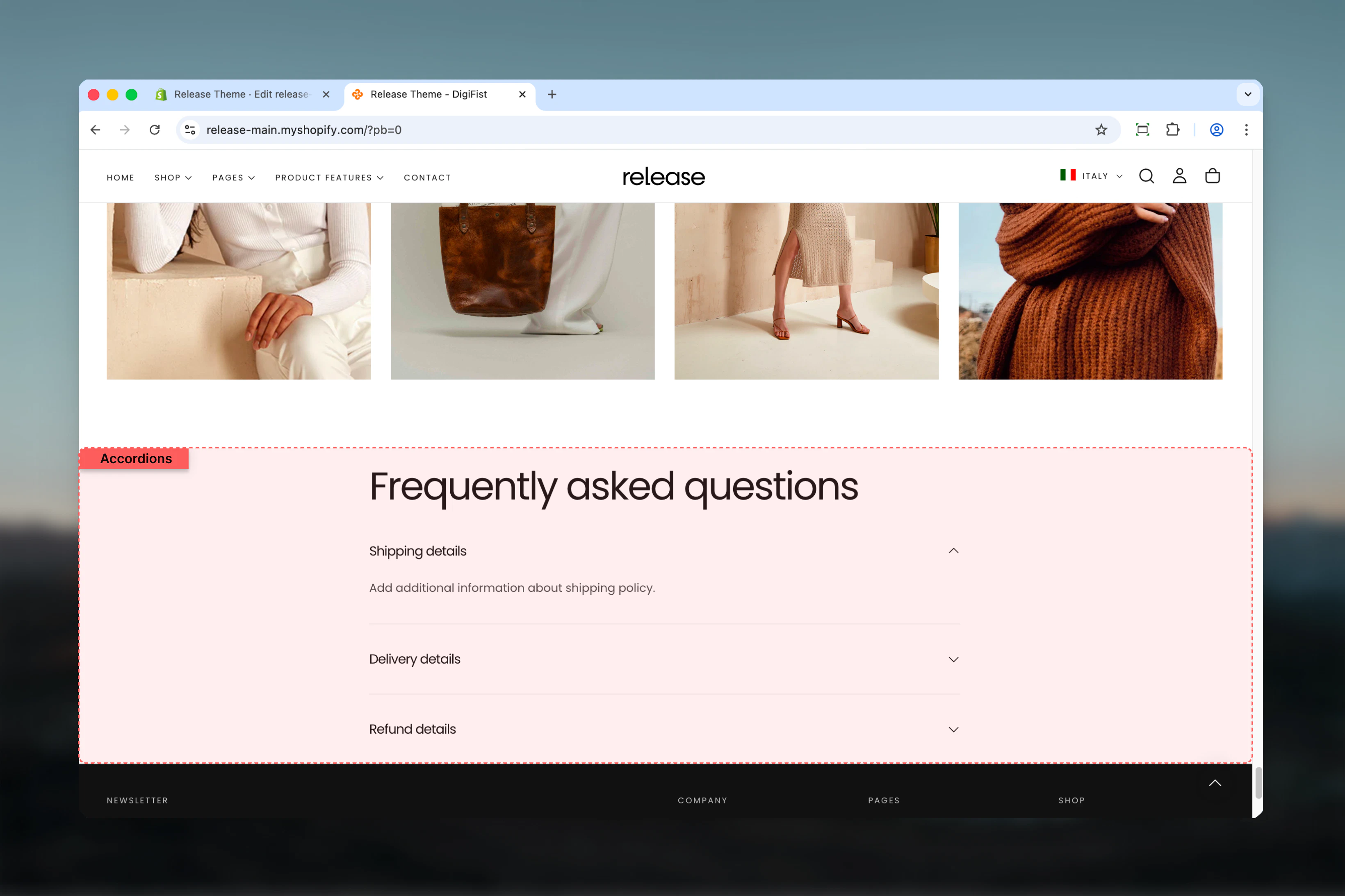
The Accordions section organizes content into expandable and collapsible topics. It is ideal for FAQs, product details, policies, or any content that benefits from progressive disclosure.
Accordions help reduce visual clutter and improve page scannability by allowing users to selectively reveal only the information they need, creating cleaner and more manageable content layouts.
 ## What this section controls
This section controls accordion-based content displays with the following capabilities:
* Expandable and collapsible content topics
* Individual topic expand/collapse functionality
* Default expanded state configuration
* Rich text or dynamic page content support
* Progressive disclosure for long-form content
* Clean, organized information architecture
## How the Accordions section works
The Accordions section uses a block-based topic system:
* Displays content in expandable accordion items
* Each topic can be opened or collapsed independently
* Content can be shown by default on page load
* Supports rich text or dynamic page content
* Helps reduce visual clutter on long pages
## Getting started
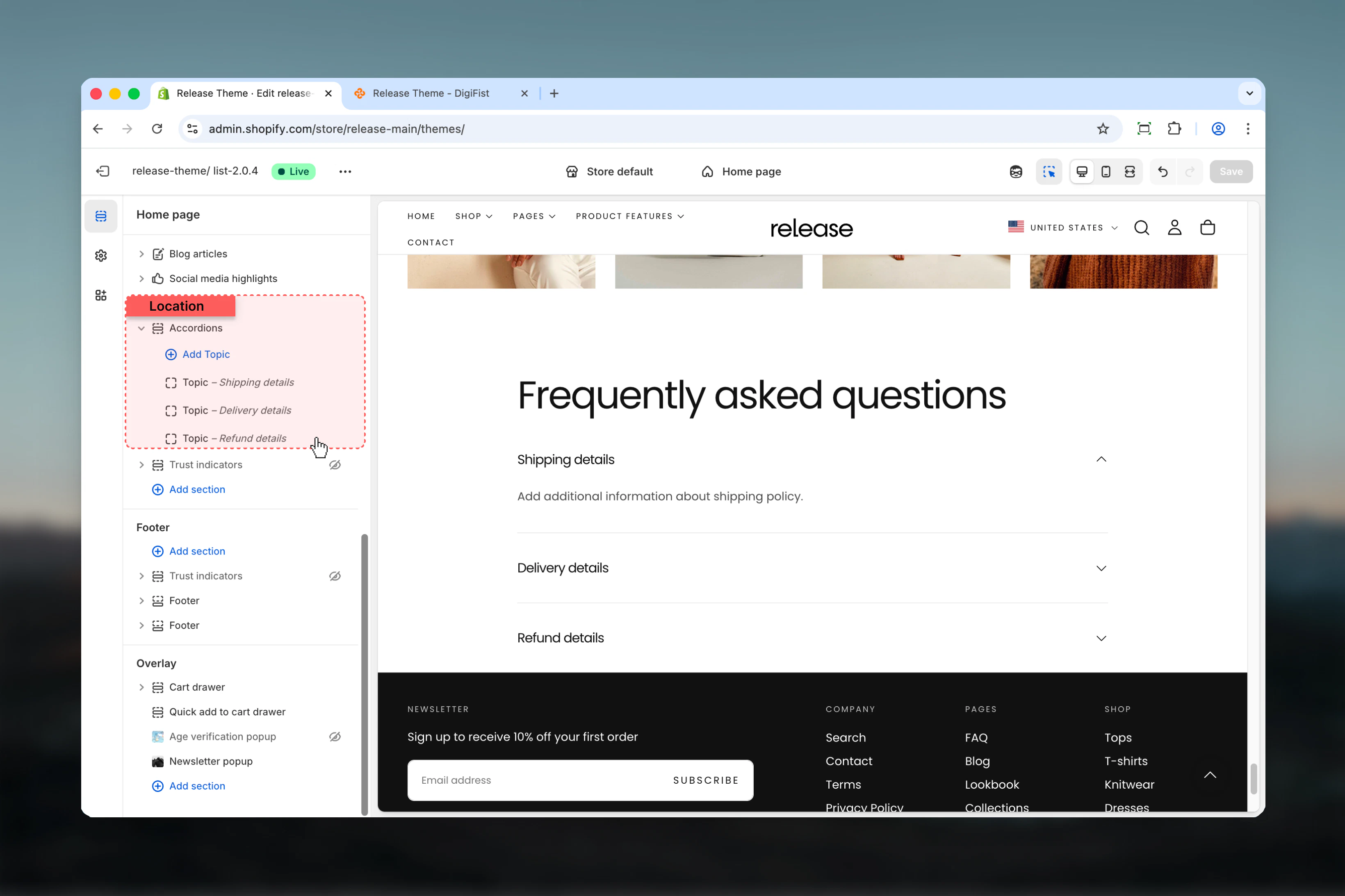
From Shopify admin, access the Theme Customizer.
Add the Accordions section to your page or template.
Click **Add Topic** to create accordion items.
Add heading and text content or connect to a page.
## What this section controls
This section controls accordion-based content displays with the following capabilities:
* Expandable and collapsible content topics
* Individual topic expand/collapse functionality
* Default expanded state configuration
* Rich text or dynamic page content support
* Progressive disclosure for long-form content
* Clean, organized information architecture
## How the Accordions section works
The Accordions section uses a block-based topic system:
* Displays content in expandable accordion items
* Each topic can be opened or collapsed independently
* Content can be shown by default on page load
* Supports rich text or dynamic page content
* Helps reduce visual clutter on long pages
## Getting started
From Shopify admin, access the Theme Customizer.
Add the Accordions section to your page or template.
Click **Add Topic** to create accordion items.
Add heading and text content or connect to a page.
 ## Section settings
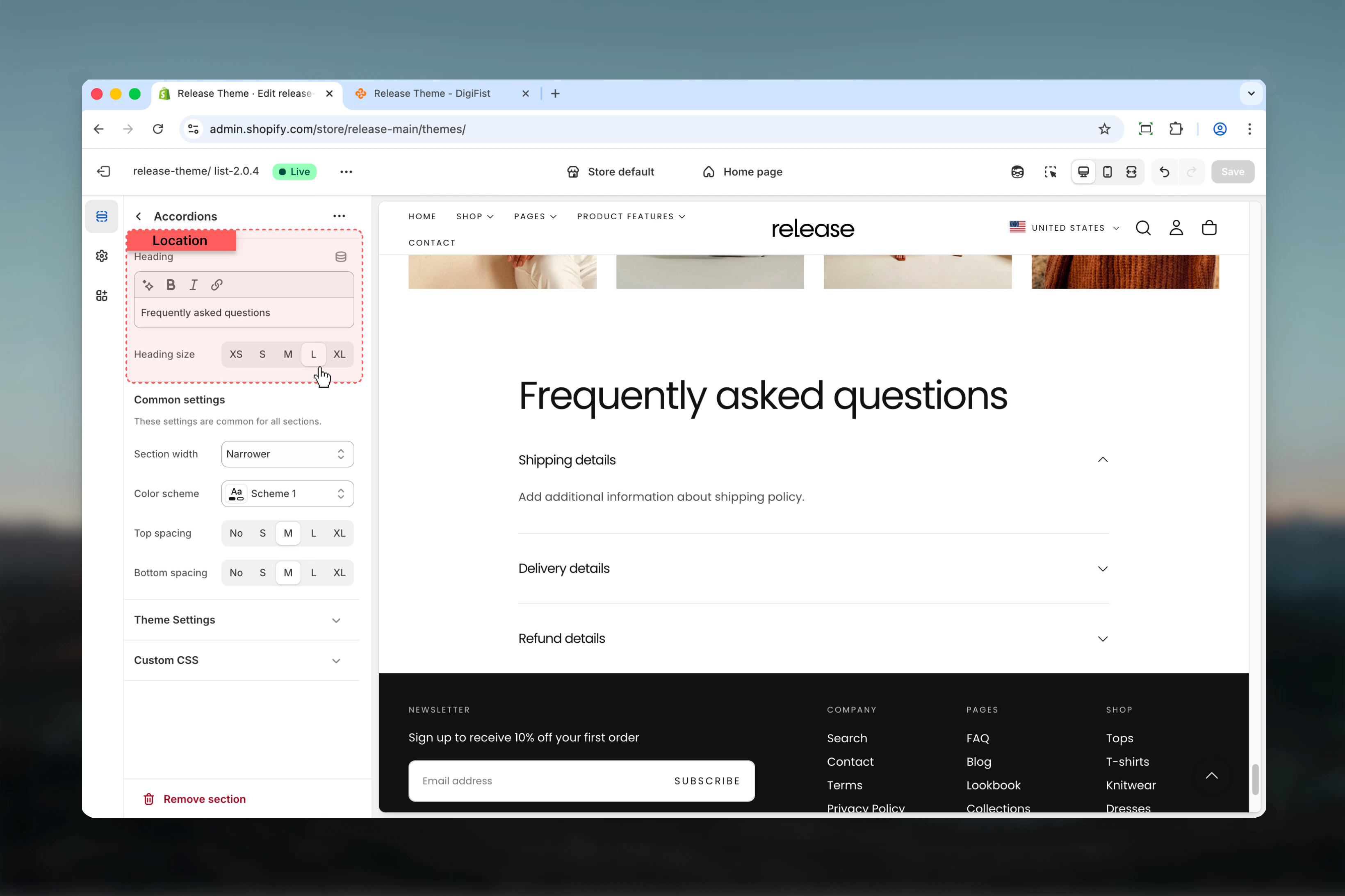
Section settings control the main heading of the accordion group.
### Heading
Main title displayed above the accordion list.
* Rich text supported (bold, italic, underline, links)
### Heading size
Controls the size of the section heading.
**Available options:** XS, S, M, L, XL
## Section settings
Section settings control the main heading of the accordion group.
### Heading
Main title displayed above the accordion list.
* Rich text supported (bold, italic, underline, links)
### Heading size
Controls the size of the section heading.
**Available options:** XS, S, M, L, XL
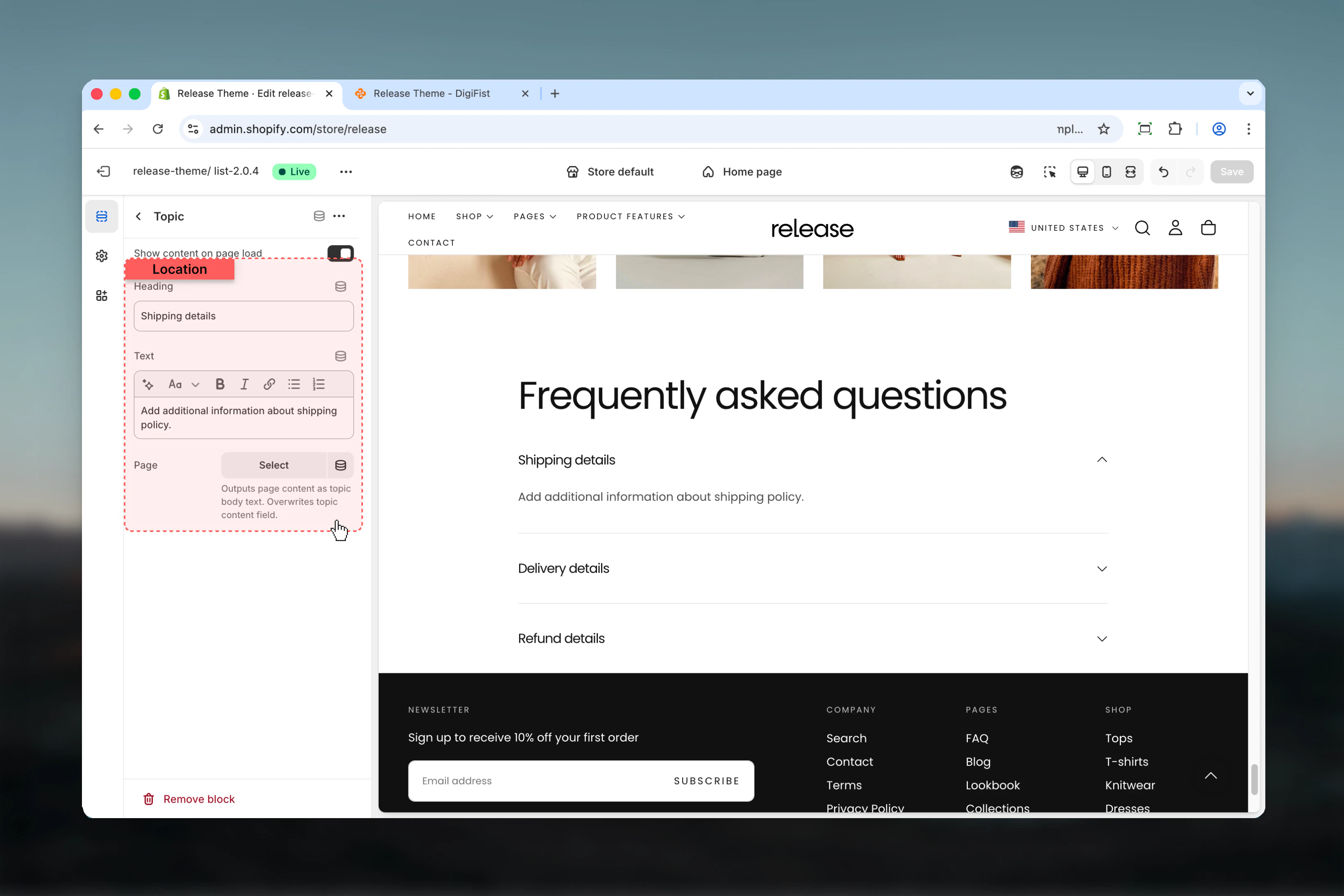
 ## Topic blocks
Topic blocks control individual accordion items. Each block represents a single accordion topic.
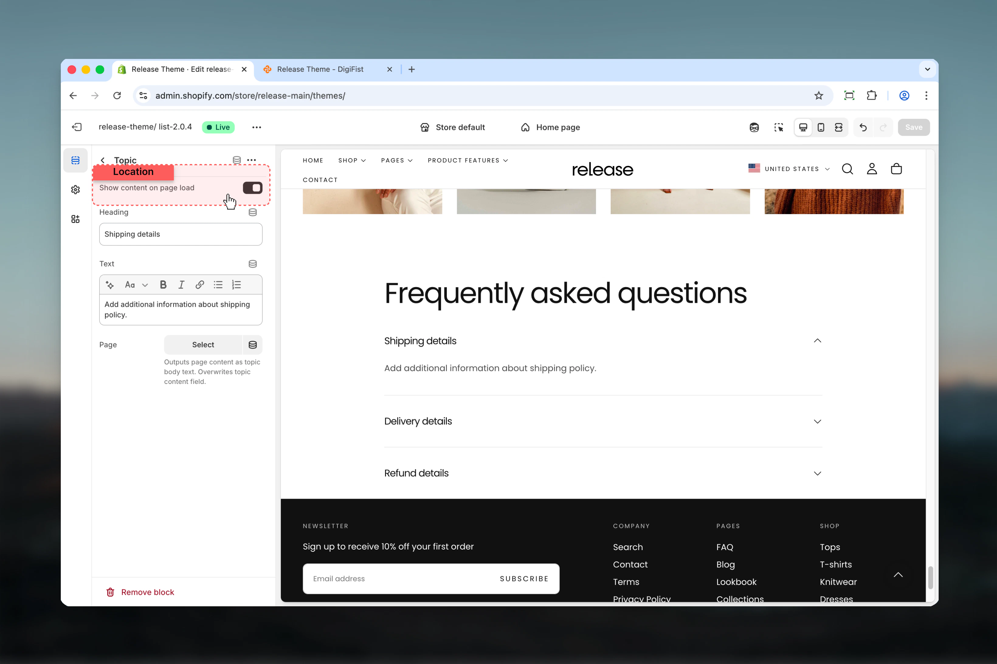
### Show content on page load
Controls whether the accordion content is visible when the page loads.
* **True:** Content is expanded by default
* **False:** Content is hidden until the user clicks the heading
## Topic blocks
Topic blocks control individual accordion items. Each block represents a single accordion topic.
### Show content on page load
Controls whether the accordion content is visible when the page loads.
* **True:** Content is expanded by default
* **False:** Content is hidden until the user clicks the heading
 ### Heading
Title of the accordion topic.
* Text input
### Text
Main content displayed when the topic is expanded.
* Rich text supported
### Page
Outputs the content of a selected Shopify page as the accordion body.
* Shopify page selector
Overwrites the Text field when selected.
Use this option to manage large or reusable content from a single page.
### Heading
Title of the accordion topic.
* Text input
### Text
Main content displayed when the topic is expanded.
* Rich text supported
### Page
Outputs the content of a selected Shopify page as the accordion body.
* Shopify page selector
Overwrites the Text field when selected.
Use this option to manage large or reusable content from a single page.
 ## Best practices
* Keep headings concise and descriptive (5-8 words maximum) for quick scanning
* Avoid opening too many topics by default to maintain clean initial page state
* Use Page content for long or frequently updated information to simplify management
* Group related topics together logically for better user experience
* Ideal for FAQs, size guides, and policy sections where users seek specific information
* Test accordion interactions on mobile to ensure smooth expand/collapse
* Consider using first topic as expanded by default to demonstrate functionality
* Order topics by importance or frequency of access
* Use consistent formatting within accordion content for professional appearance
## Common use cases
* **Frequently asked questions (FAQ)** - Answer common customer questions in organized format
* **Shipping and return policies** - Display policy details without overwhelming the page
* **Product specifications** - Show detailed technical information progressively
* **Store information** - Share operational details like hours, locations, contact methods
* **Legal or informational content** - Present terms, privacy policies, or guidelines
## Related guides
Learn about common settings shared across sections
## Best practices
* Keep headings concise and descriptive (5-8 words maximum) for quick scanning
* Avoid opening too many topics by default to maintain clean initial page state
* Use Page content for long or frequently updated information to simplify management
* Group related topics together logically for better user experience
* Ideal for FAQs, size guides, and policy sections where users seek specific information
* Test accordion interactions on mobile to ensure smooth expand/collapse
* Consider using first topic as expanded by default to demonstrate functionality
* Order topics by importance or frequency of access
* Use consistent formatting within accordion content for professional appearance
## Common use cases
* **Frequently asked questions (FAQ)** - Answer common customer questions in organized format
* **Shipping and return policies** - Display policy details without overwhelming the page
* **Product specifications** - Show detailed technical information progressively
* **Store information** - Share operational details like hours, locations, contact methods
* **Legal or informational content** - Present terms, privacy policies, or guidelines
## Related guides
Learn about common settings shared across sections