> ## Documentation Index
> Fetch the complete documentation index at: https://docs.digifist.com/llms.txt
> Use this file to discover all available pages before exploring further.
# Carousel
> Display multiple content cards in a sliding carousel format with customizable media, text, and navigation options.
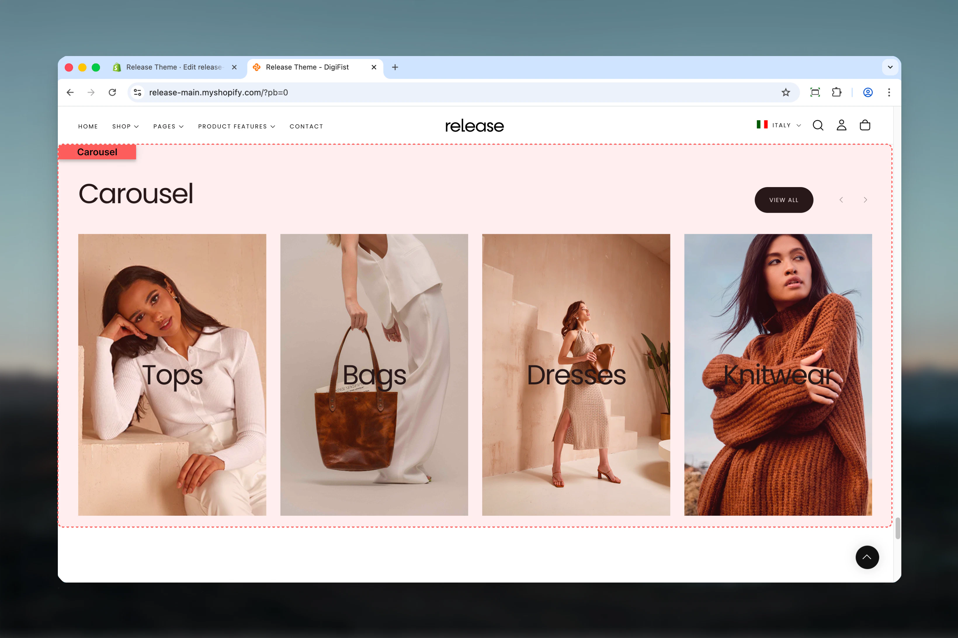
The Carousel section displays multiple content cards in a sliding carousel format. It supports images, videos, text content, and call-to-action buttons in a customizable slideshow layout.
Carousel sections are ideal for showcasing multiple pieces of content in a compact, interactive format that encourages user engagement through browsing and exploration.
 ## What this section controls
This section controls carousel displays with the following capabilities:
* Unlimited customizable card blocks
* Image, video, or external video support per card
* Desktop and mobile-specific media options
* Configurable slides per view (1-6)
* Automatic or manual slide navigation
* Flexible content positioning and alignment
* Section-level and card-level buttons
## How the Carousel section works
The Carousel section uses a block-based system:
* Displays content cards as individual carousel slides
* Supports unlimited card blocks
* Each card can contain media (images/videos), heading, text, and button
* Desktop and mobile-specific media and positioning options
* Automatic or manual slide navigation
* Fully customizable slides per view and spacing
## Getting started
From Shopify admin, access the Theme Customizer.
Add the Carousel section to your page or template.
Click **Add Card** to create carousel slides.
Add media, heading, text, and optional button for each card.
## What this section controls
This section controls carousel displays with the following capabilities:
* Unlimited customizable card blocks
* Image, video, or external video support per card
* Desktop and mobile-specific media options
* Configurable slides per view (1-6)
* Automatic or manual slide navigation
* Flexible content positioning and alignment
* Section-level and card-level buttons
## How the Carousel section works
The Carousel section uses a block-based system:
* Displays content cards as individual carousel slides
* Supports unlimited card blocks
* Each card can contain media (images/videos), heading, text, and button
* Desktop and mobile-specific media and positioning options
* Automatic or manual slide navigation
* Fully customizable slides per view and spacing
## Getting started
From Shopify admin, access the Theme Customizer.
Add the Carousel section to your page or template.
Click **Add Card** to create carousel slides.
Add media, heading, text, and optional button for each card.
 ## Section settings
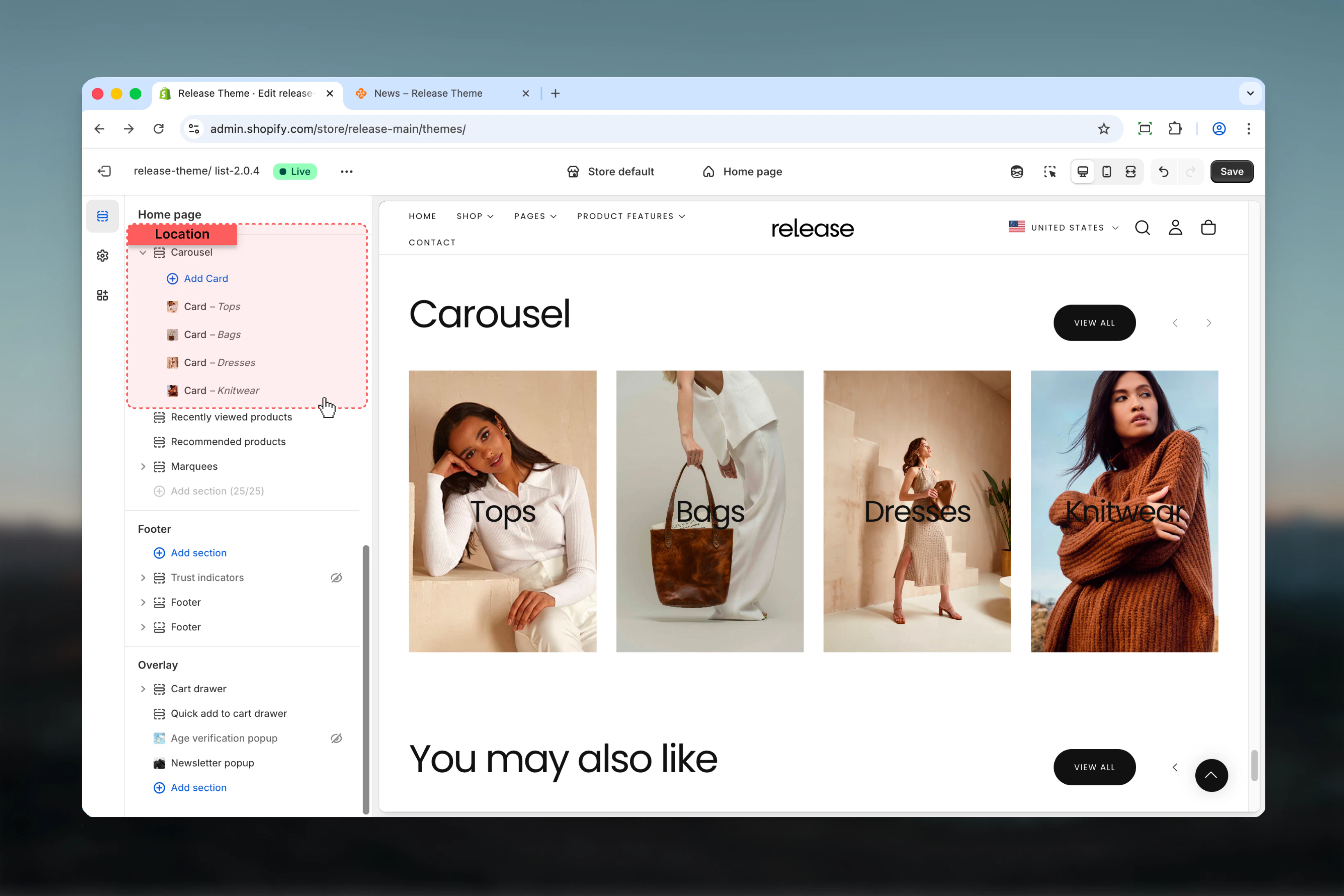
Section settings control slideshow behavior, section styling, and overall layout.
### Show navigation arrows
Displays previous/next navigation arrows.
**Options:** True / False
**Default:** True
### Slideshow autoplay interval
Controls automatic slide advancement.
**Range:** 0 – 10 seconds
* Set to `0` to disable autoplay
* Default: 0 seconds
## Section settings
Section settings control slideshow behavior, section styling, and overall layout.
### Show navigation arrows
Displays previous/next navigation arrows.
**Options:** True / False
**Default:** True
### Slideshow autoplay interval
Controls automatic slide advancement.
**Range:** 0 – 10 seconds
* Set to `0` to disable autoplay
* Default: 0 seconds
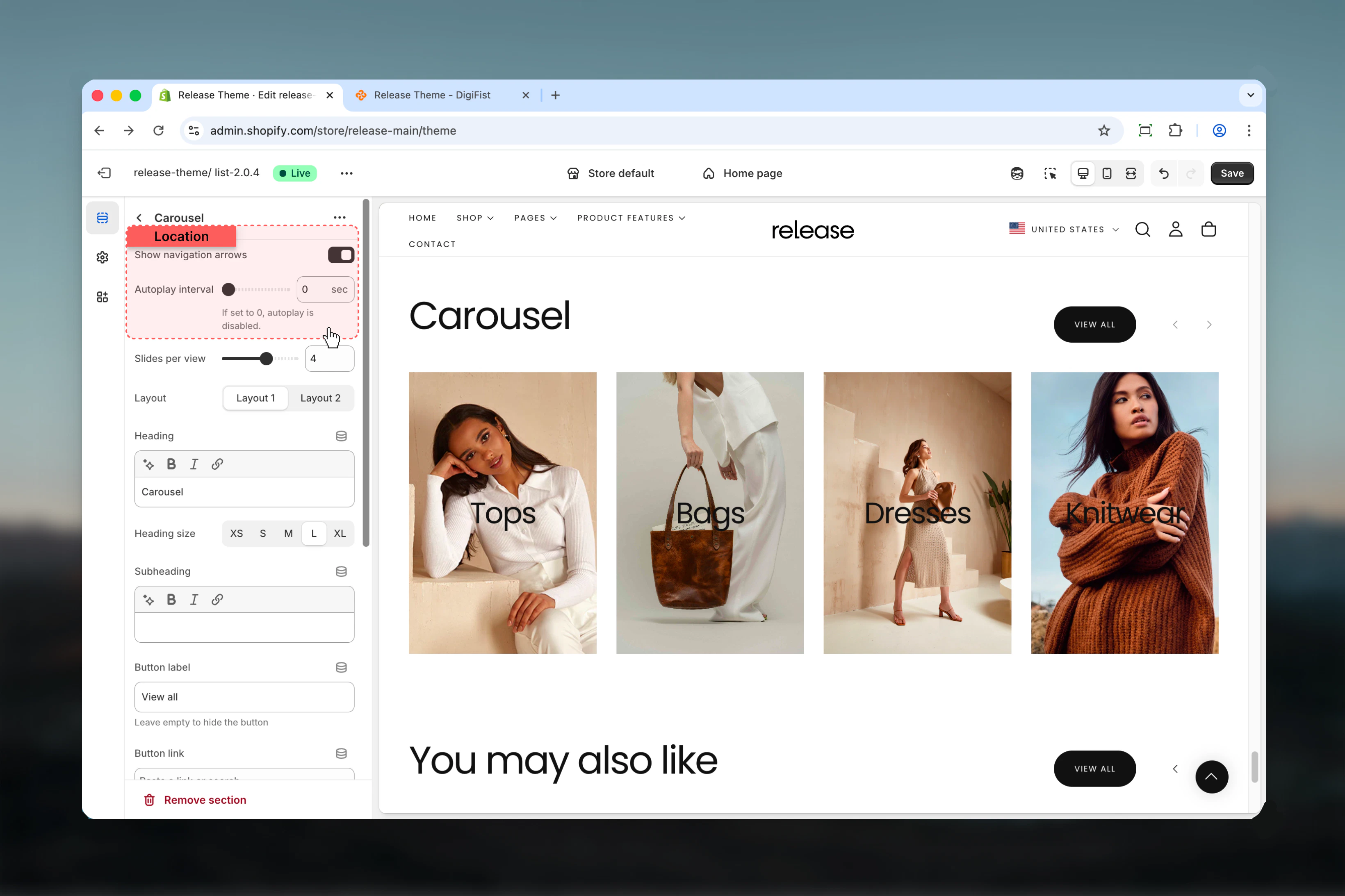 ### Slides per view
Number of slides visible at once on desktop.
**Range:** 1 – 6 slides
**Default:** 4
### Slides per view
Number of slides visible at once on desktop.
**Range:** 1 – 6 slides
**Default:** 4
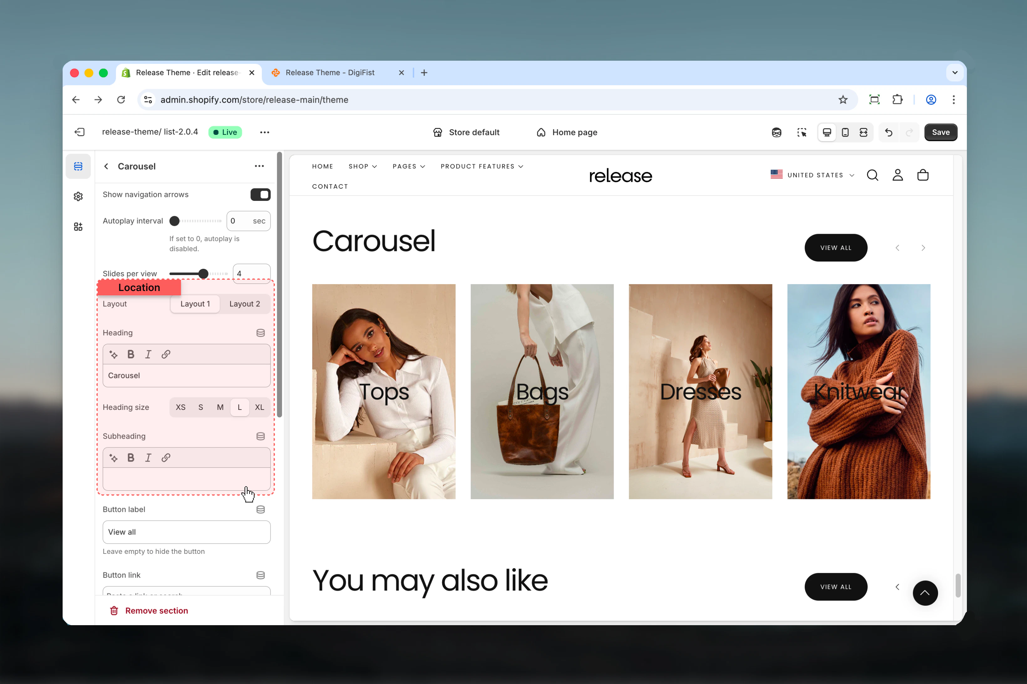
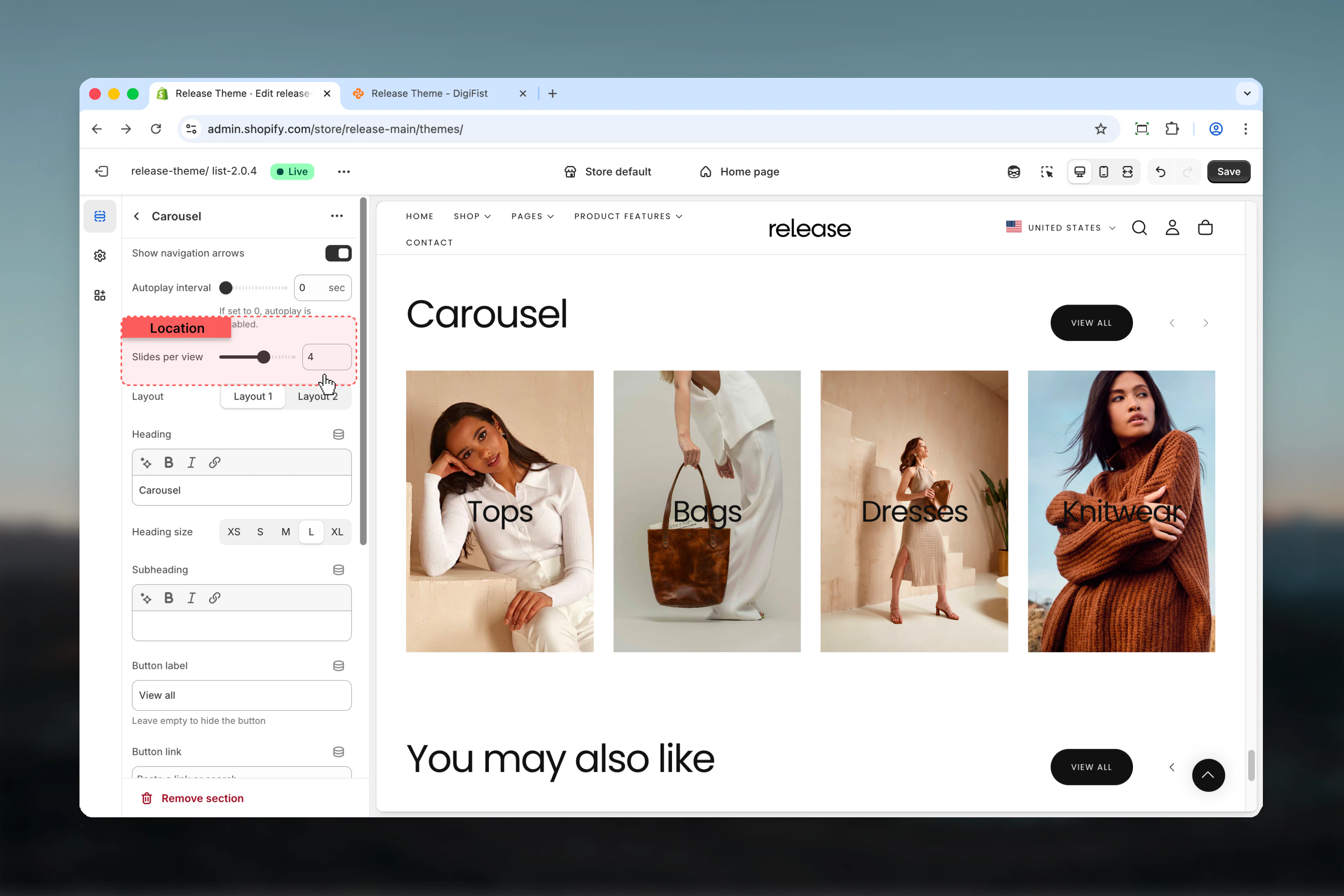 ### Layout
Controls the visual style of the carousel.
**Available options:**
* **Layout 1:** Standard carousel layout
* **Layout 2:** Alternative carousel layout
**Default:** Layout 1
### Section heading
Main title text for the section.
* Inline rich text supported (bold, italic, links)
* **Default:** "Carousel"
### Heading size
Controls the size of section heading.
**Available options:** XS, S, M, L, XL
**Default:** L
### Subheading
Optional descriptive text above the heading.
* Inline rich text supported
### Layout
Controls the visual style of the carousel.
**Available options:**
* **Layout 1:** Standard carousel layout
* **Layout 2:** Alternative carousel layout
**Default:** Layout 1
### Section heading
Main title text for the section.
* Inline rich text supported (bold, italic, links)
* **Default:** "Carousel"
### Heading size
Controls the size of section heading.
**Available options:** XS, S, M, L, XL
**Default:** L
### Subheading
Optional descriptive text above the heading.
* Inline rich text supported
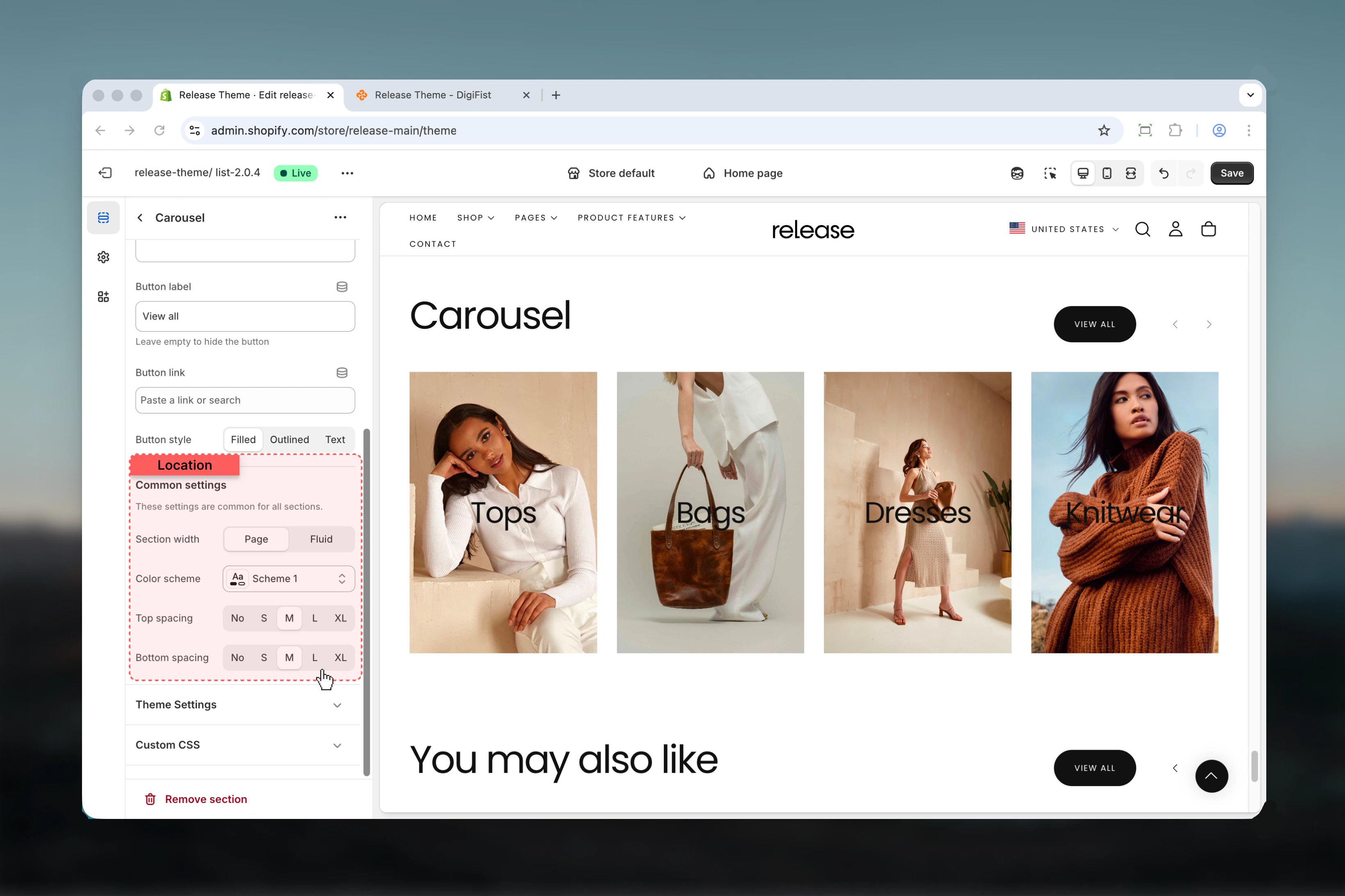
 ### Button label
Text for optional section-level button.
* Leave empty to hide
* **Default:** "View all"
### Button link
Destination URL for section button.
* Shopify URL selector
### Button style
Visual style for section button.
**Available options:**
* **Filled:** Solid background
* **Outlined:** Border only
* **Text:** Text only
**Default:** Filled
### Section width
Controls the maximum width of the carousel.
**Available options:**
* **Page:** Standard page width
* **Fluid:** Wider than page width
**Default:** Page
### Color scheme
Controls background and text colors for the section container.
* Shopify color scheme selector
* **Default:** Scheme 1
### Spacing top
Controls spacing above the section.
**Available options:** None, S, M, L, XL
**Default:** M
### Spacing bottom
Controls spacing below the section.
**Available options:** None, S, M, L, XL
**Default:** M
### Button label
Text for optional section-level button.
* Leave empty to hide
* **Default:** "View all"
### Button link
Destination URL for section button.
* Shopify URL selector
### Button style
Visual style for section button.
**Available options:**
* **Filled:** Solid background
* **Outlined:** Border only
* **Text:** Text only
**Default:** Filled
### Section width
Controls the maximum width of the carousel.
**Available options:**
* **Page:** Standard page width
* **Fluid:** Wider than page width
**Default:** Page
### Color scheme
Controls background and text colors for the section container.
* Shopify color scheme selector
* **Default:** Scheme 1
### Spacing top
Controls spacing above the section.
**Available options:** None, S, M, L, XL
**Default:** M
### Spacing bottom
Controls spacing below the section.
**Available options:** None, S, M, L, XL
**Default:** M
 ## Block settings
Block settings control individual carousel cards. Each block represents a single slide.
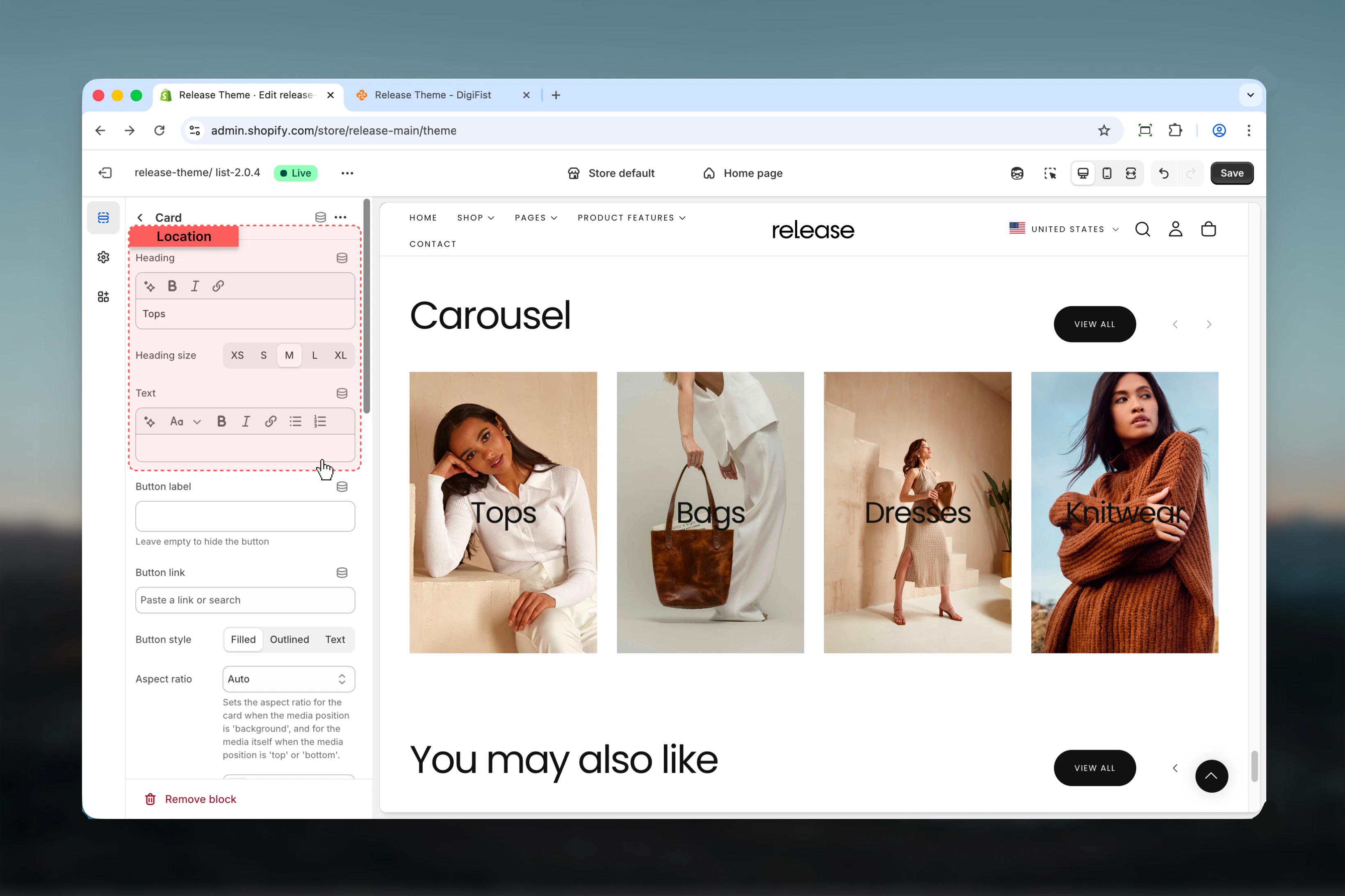
### Heading
Main title text for the card.
* Inline rich text supported (bold, italic, links)
### Heading size
Controls the size of card heading.
**Available options:** XS, S, M, L, XL
**Default:** L
### Text
Descriptive text content for the card.
* Rich text supported
## Block settings
Block settings control individual carousel cards. Each block represents a single slide.
### Heading
Main title text for the card.
* Inline rich text supported (bold, italic, links)
### Heading size
Controls the size of card heading.
**Available options:** XS, S, M, L, XL
**Default:** L
### Text
Descriptive text content for the card.
* Rich text supported
 ### Button label
Text for optional card button.
* Leave empty to hide
### Button link
Destination URL for card button.
* Shopify URL selector
### Button style
Visual style for card button.
**Available options:**
* **Filled:** Solid background
* **Outlined:** Border only
* **Text:** Text only
**Default:** Filled
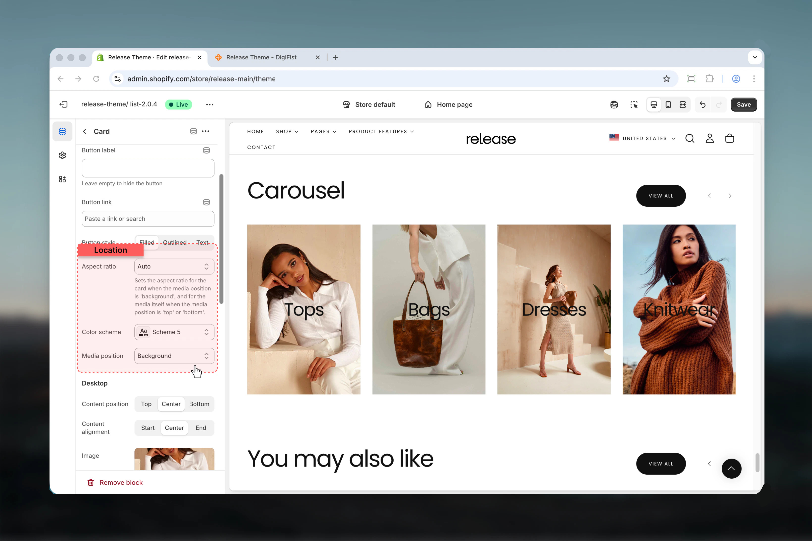
### Aspect ratio
Controls the aspect ratio for the card.
**Available options:** Auto, 1:1, 4:3, 3:4, 3:2, 2:3, 5:4, 4:5, 16:9, 9:16, 2:1, 4:1, 8:1, 1:2
**Default:** Auto
Sets the aspect ratio for the card when the media position is 'background', and for the media itself when the media position is 'top' or 'bottom'.
### Color scheme
Controls background and text colors for the card.
* Shopify color scheme selector
* **Default:** Scheme 5
### Media position
Controls where media appears relative to content.
**Available options:**
* **Top:** Media above content
* **Bottom:** Media below content
* **Background:** Media as background
**Default:** Background
### Button label
Text for optional card button.
* Leave empty to hide
### Button link
Destination URL for card button.
* Shopify URL selector
### Button style
Visual style for card button.
**Available options:**
* **Filled:** Solid background
* **Outlined:** Border only
* **Text:** Text only
**Default:** Filled
### Aspect ratio
Controls the aspect ratio for the card.
**Available options:** Auto, 1:1, 4:3, 3:4, 3:2, 2:3, 5:4, 4:5, 16:9, 9:16, 2:1, 4:1, 8:1, 1:2
**Default:** Auto
Sets the aspect ratio for the card when the media position is 'background', and for the media itself when the media position is 'top' or 'bottom'.
### Color scheme
Controls background and text colors for the card.
* Shopify color scheme selector
* **Default:** Scheme 5
### Media position
Controls where media appears relative to content.
**Available options:**
* **Top:** Media above content
* **Bottom:** Media below content
* **Background:** Media as background
**Default:** Background
 ### Spacing inner
Controls padding inside the card.
**Available options:** None, S, M, L, XL
**Default:** M
### Content position
Controls vertical alignment of content on desktop.
**Available options:** Start, Center, End
**Default:** Center
### Content alignment
Controls horizontal alignment of content on desktop.
**Available options:** Start, Center, End
**Default:** Center
### Spacing inner
Controls padding inside the card.
**Available options:** None, S, M, L, XL
**Default:** M
### Content position
Controls vertical alignment of content on desktop.
**Available options:** Start, Center, End
**Default:** Center
### Content alignment
Controls horizontal alignment of content on desktop.
**Available options:** Start, Center, End
**Default:** Center
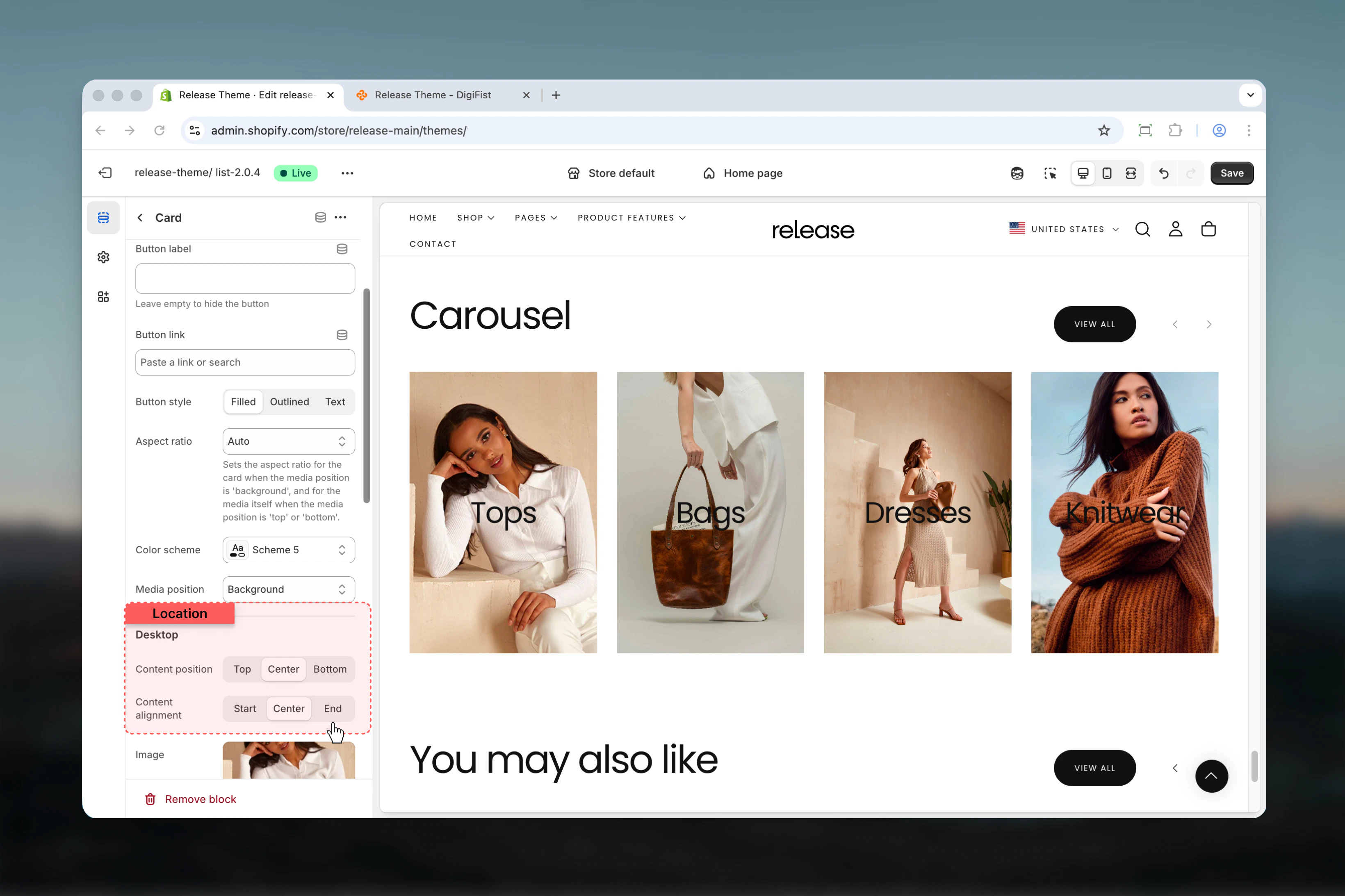 ### Image
Upload an image for the card on desktop.
* Shopify image picker
### Video
Upload a video file for the card on desktop.
* Shopify video selector
Video replaces image when set.
### Video external
Embed YouTube or Vimeo video on desktop.
* YouTube and Vimeo supported
External video takes priority over uploaded video.
### Show controls on video
Displays video player controls on desktop.
**Options:** True / False
**Default:** False
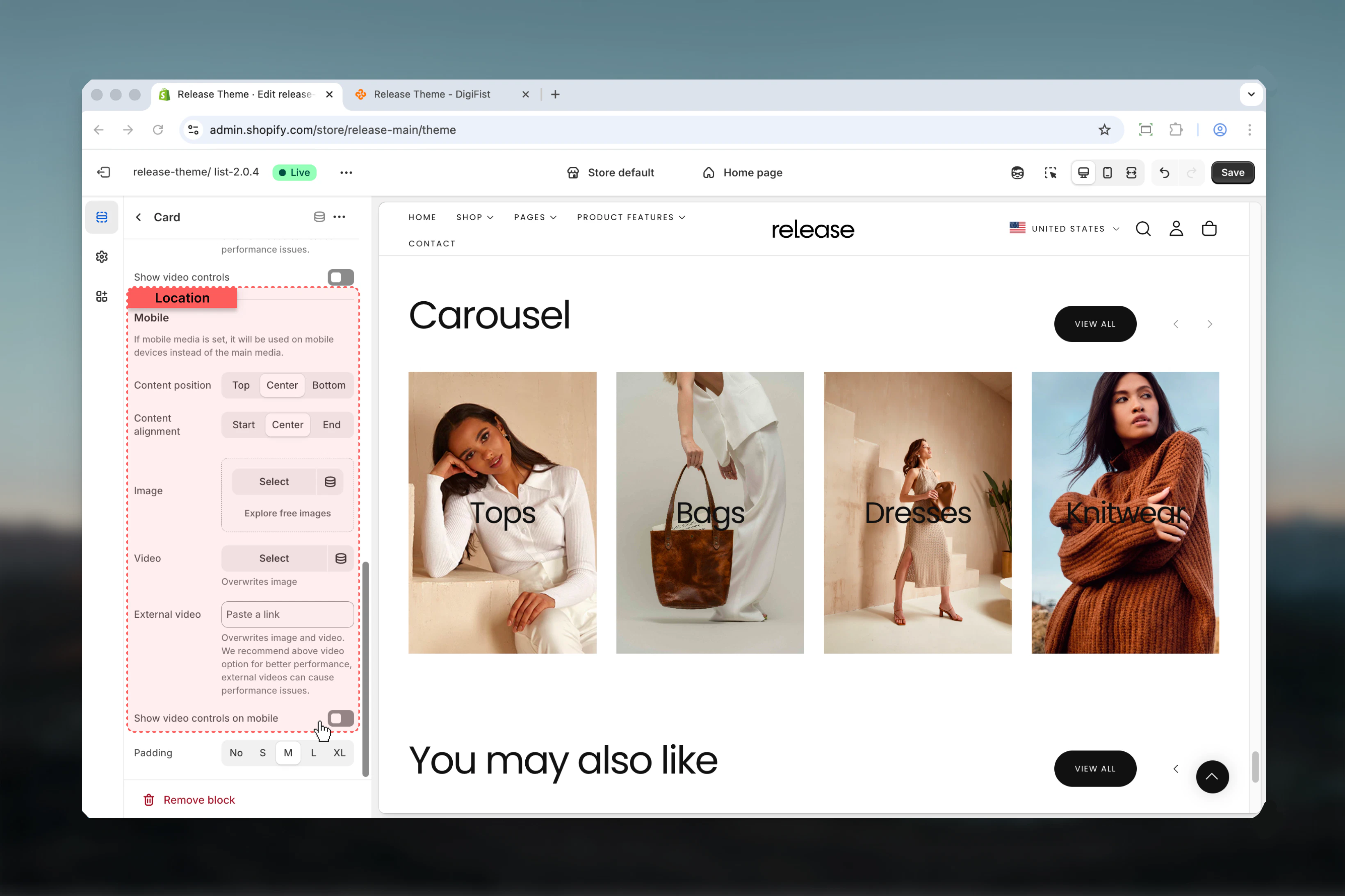
Optional mobile-specific media. If not set, desktop media will be used.
### Content position
Controls vertical alignment of content on mobile.
**Available options:** Start, Center, End
**Default:** Center
### Content alignment
Controls horizontal alignment of content on mobile.
**Available options:** Start, Center, End
**Default:** Center
### Image
Upload an image for the card on mobile.
* Shopify image picker
### Video
Upload a video file for the card on mobile.
* Shopify video selector
### Video external
Embed YouTube or Vimeo video on mobile.
* YouTube and Vimeo supported
### Show controls on video
Displays video player controls on mobile.
**Options:** True / False
**Default:** False
### Image
Upload an image for the card on desktop.
* Shopify image picker
### Video
Upload a video file for the card on desktop.
* Shopify video selector
Video replaces image when set.
### Video external
Embed YouTube or Vimeo video on desktop.
* YouTube and Vimeo supported
External video takes priority over uploaded video.
### Show controls on video
Displays video player controls on desktop.
**Options:** True / False
**Default:** False
Optional mobile-specific media. If not set, desktop media will be used.
### Content position
Controls vertical alignment of content on mobile.
**Available options:** Start, Center, End
**Default:** Center
### Content alignment
Controls horizontal alignment of content on mobile.
**Available options:** Start, Center, End
**Default:** Center
### Image
Upload an image for the card on mobile.
* Shopify image picker
### Video
Upload a video file for the card on mobile.
* Shopify video selector
### Video external
Embed YouTube or Vimeo video on mobile.
* YouTube and Vimeo supported
### Show controls on video
Displays video player controls on mobile.
**Options:** True / False
**Default:** False
 ## Best practices
* Keep card headings concise and impactful (3-6 words) for quick scanning
* Use consistent aspect ratios across all cards for visual harmony
* Limit slides per view to 3-4 for optimal readability on most screens
* Enable autoplay sparingly - consider user experience and accessibility
* Provide mobile-optimized media for better performance and composition
* Use background media position for hero-style cards with overlay content
* Test navigation arrows visibility against background colors
* Order cards by priority or narrative flow
* Use section button for "View all" or collection links
* Consider setting autoplay to 0 for content-heavy cards requiring reading time
## Common use cases
* **Product collections showcase** - Display featured products or new arrivals in a browsable format
* **Promotional banners** - Highlight multiple offers or campaigns in a single section
* **Category navigation** - Guide users to different product categories with visual cards
* **Brand storytelling** - Share brand values, features, or benefits across multiple slides
* **Customer testimonials** - Showcase reviews or customer stories with images
* **Content marketing** - Display blog posts, guides, or resources in a carousel format
## Related guides
Learn about common settings shared across sections
## Best practices
* Keep card headings concise and impactful (3-6 words) for quick scanning
* Use consistent aspect ratios across all cards for visual harmony
* Limit slides per view to 3-4 for optimal readability on most screens
* Enable autoplay sparingly - consider user experience and accessibility
* Provide mobile-optimized media for better performance and composition
* Use background media position for hero-style cards with overlay content
* Test navigation arrows visibility against background colors
* Order cards by priority or narrative flow
* Use section button for "View all" or collection links
* Consider setting autoplay to 0 for content-heavy cards requiring reading time
## Common use cases
* **Product collections showcase** - Display featured products or new arrivals in a browsable format
* **Promotional banners** - Highlight multiple offers or campaigns in a single section
* **Category navigation** - Guide users to different product categories with visual cards
* **Brand storytelling** - Share brand values, features, or benefits across multiple slides
* **Customer testimonials** - Showcase reviews or customer stories with images
* **Content marketing** - Display blog posts, guides, or resources in a carousel format
## Related guides
Learn about common settings shared across sections