> ## Documentation Index
> Fetch the complete documentation index at: https://docs.digifist.com/llms.txt
> Use this file to discover all available pages before exploring further.
# Compare Slider
> Allow customers to visually compare two images using an interactive slider for before/after showcases.
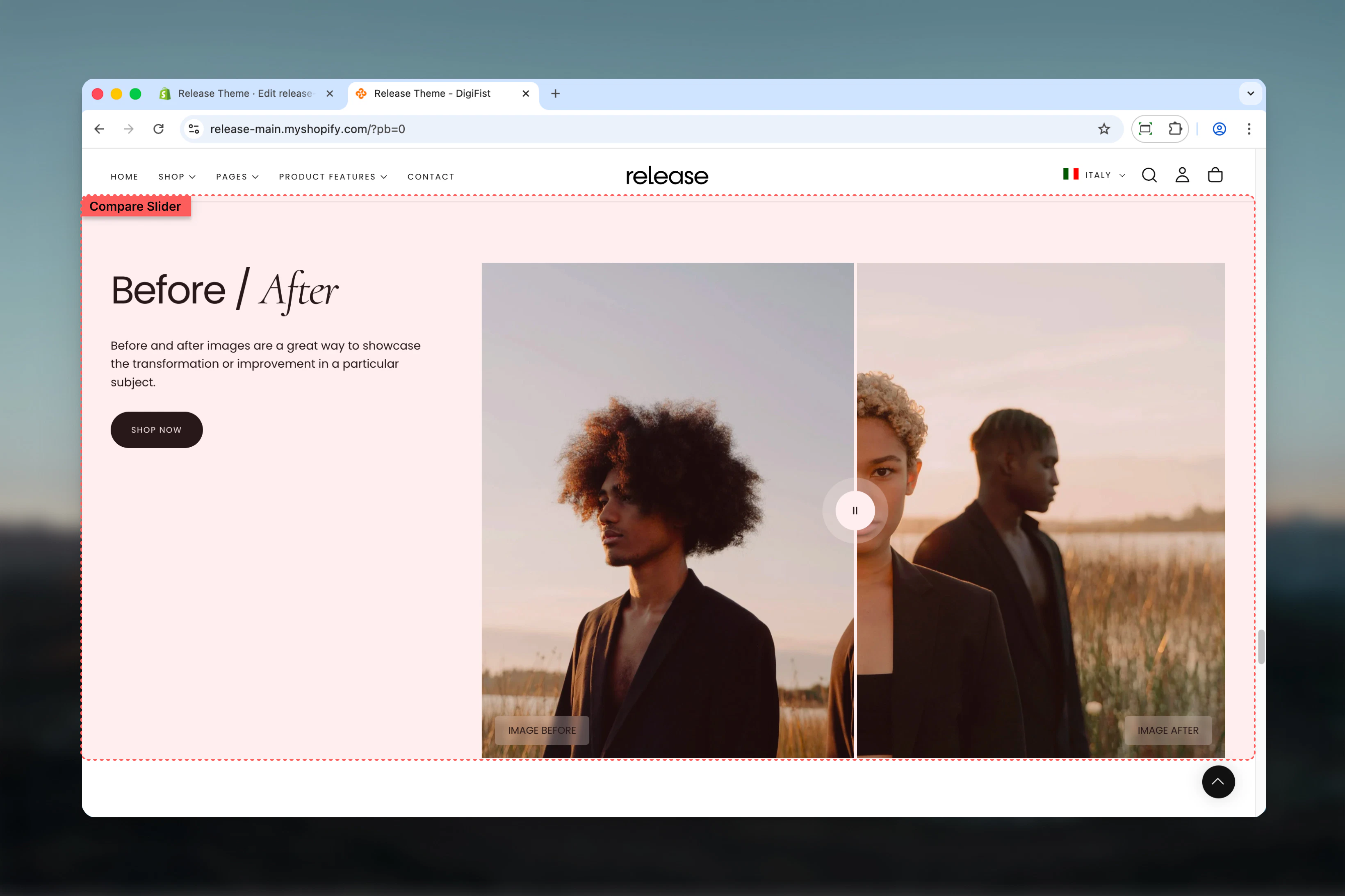
The Compare Slider section allows customers to visually compare two images using an interactive slider. It is commonly used to showcase before/after results, transformations, or product differences.
Compare sliders help demonstrate product effectiveness, quality improvements, or visual transformations through direct visual comparison, making them ideal for beauty, home improvement, and transformation-focused content.
 ## What this section controls
This section controls interactive image comparison with the following capabilities:
* Side-by-side image comparison with draggable slider
* Before and after image blocks
* Customizable labels and color schemes
* Full or constrained width layouts
* Multiple aspect ratio options
## How the Compare Slider works
The Compare Slider uses a block-based system:
* Displays two images stacked horizontally
* Users can drag the slider to compare images
* Supports up to two image blocks (Before / After)
* Works best with images that share the same dimensions and perspective
## Getting started
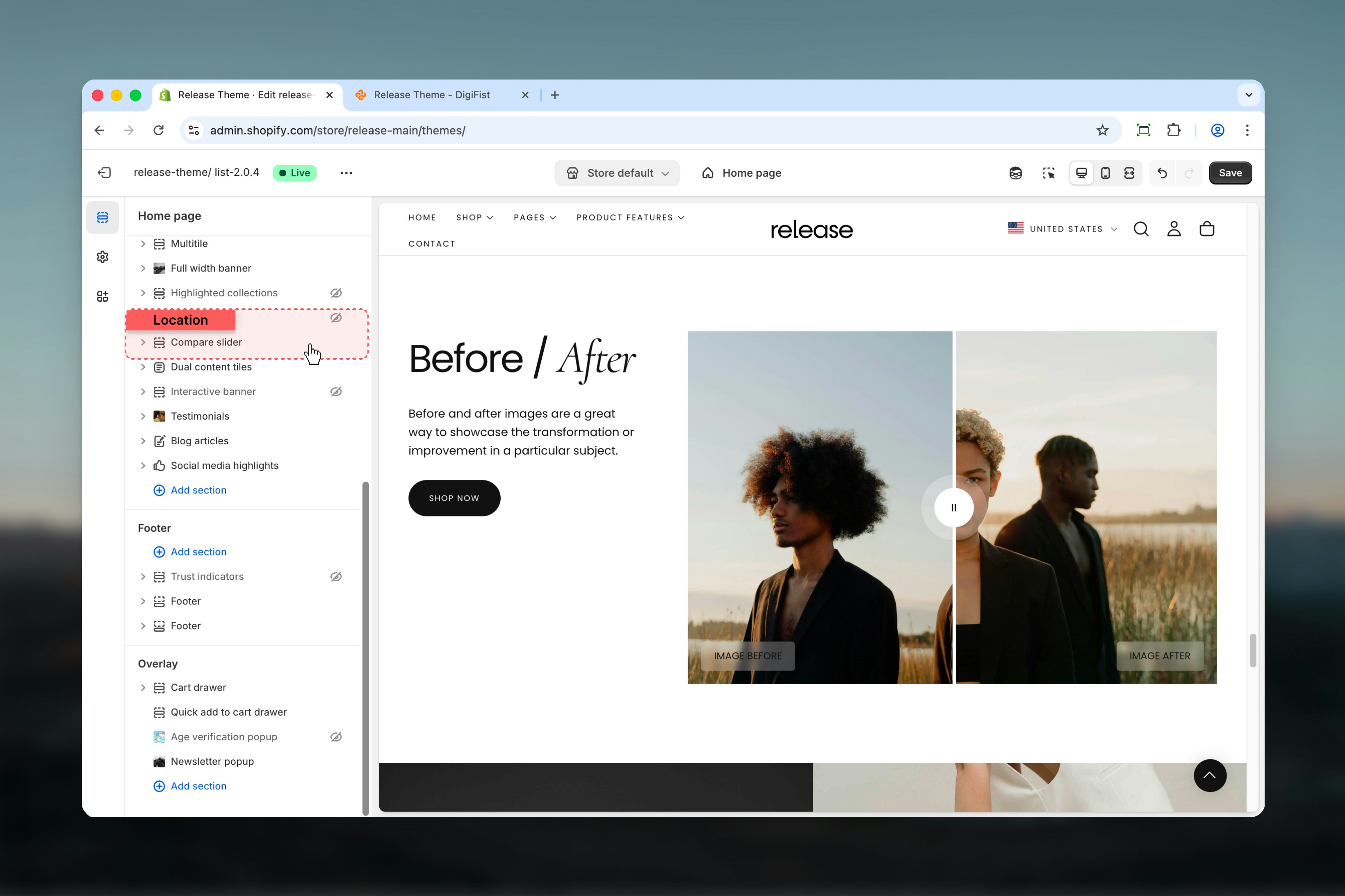
From Shopify admin, access the Theme Customizer.
Add the Compare Slider section to your page or template.
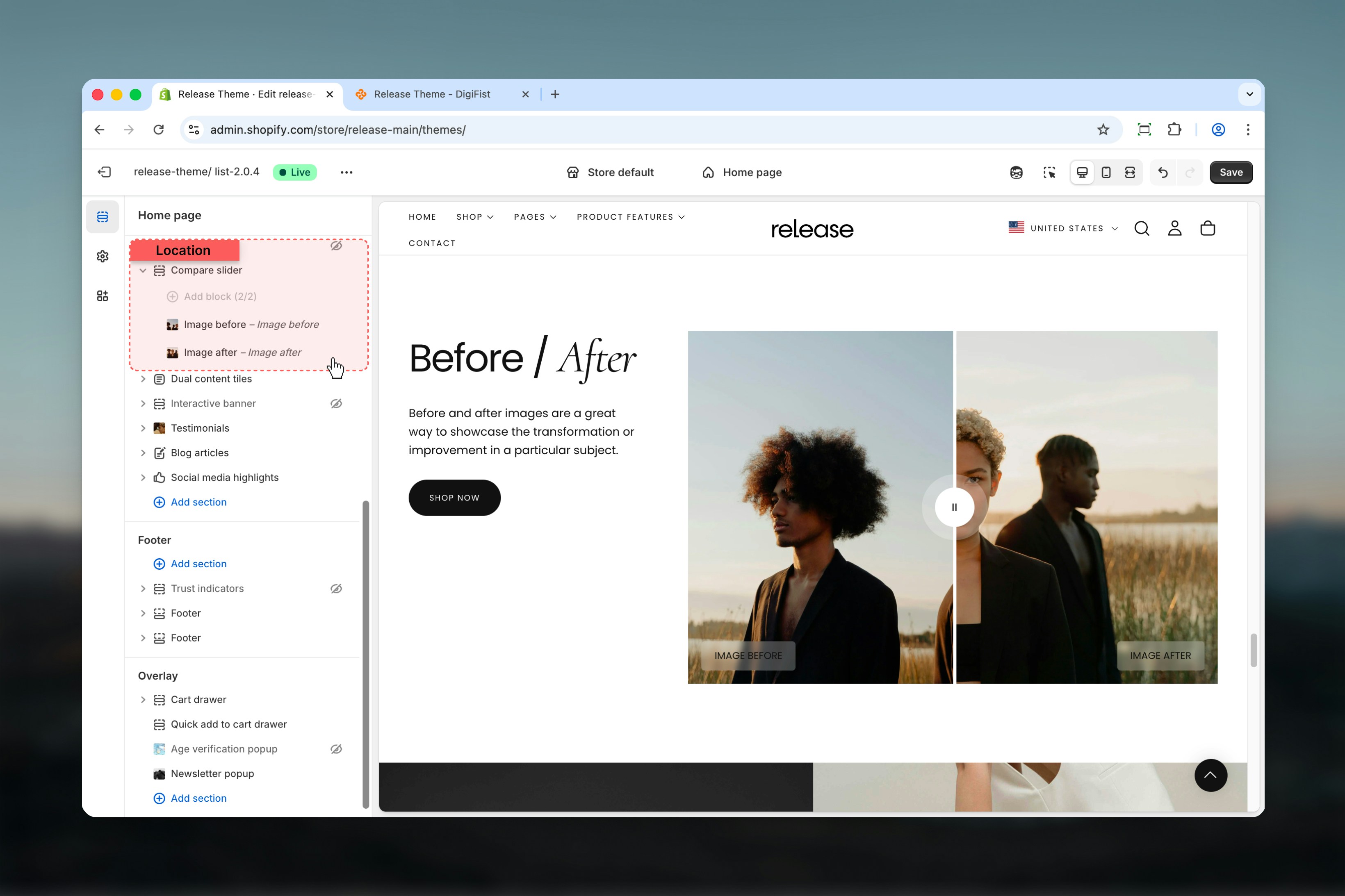
Click **Add block** to add both "Image before" and "Image after" blocks.
Upload images and configure labels and settings.
## What this section controls
This section controls interactive image comparison with the following capabilities:
* Side-by-side image comparison with draggable slider
* Before and after image blocks
* Customizable labels and color schemes
* Full or constrained width layouts
* Multiple aspect ratio options
## How the Compare Slider works
The Compare Slider uses a block-based system:
* Displays two images stacked horizontally
* Users can drag the slider to compare images
* Supports up to two image blocks (Before / After)
* Works best with images that share the same dimensions and perspective
## Getting started
From Shopify admin, access the Theme Customizer.
Add the Compare Slider section to your page or template.
Click **Add block** to add both "Image before" and "Image after" blocks.
Upload images and configure labels and settings.
 ## Section settings
Section settings control layout, text content, button behavior, and image proportions.
### Section layout
Controls the overall width of the section.
**Available options:**
* **Full:** Section spans the full width of the page
* **Shrink:** Section is constrained to the content width
## Section settings
Section settings control layout, text content, button behavior, and image proportions.
### Section layout
Controls the overall width of the section.
**Available options:**
* **Full:** Section spans the full width of the page
* **Shrink:** Section is constrained to the content width
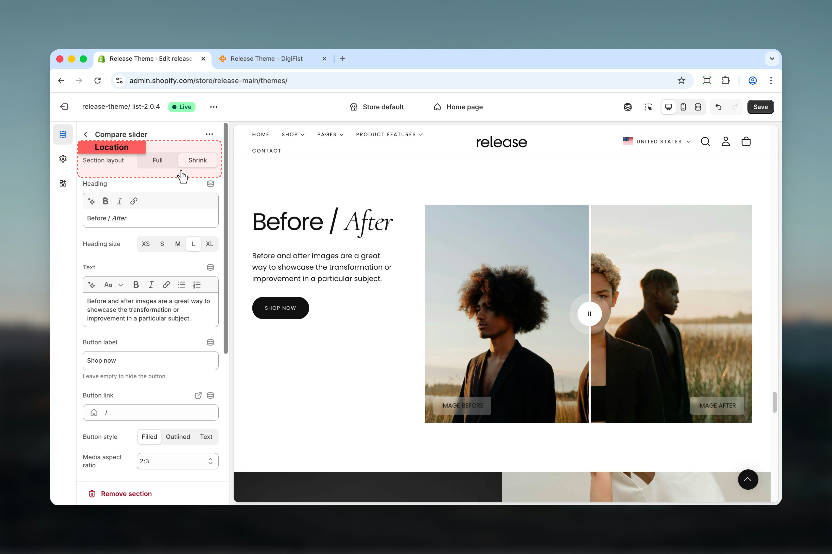 ### Heading
Main title of the section.
* Supports bold, italic, underline, and links
### Heading size
Controls the size of the heading text.
**Available options:** S, M, L, XL
### Text
Additional descriptive content displayed under the heading.
* Rich text support (paragraphs, formatting, links)
### Button label
Defines the section action button text.
Leave empty to hide the button.
### Button link
URL for the action button.
### Button style
Controls the appearance of the button.
**Available options:** Filled, Outlined, Text
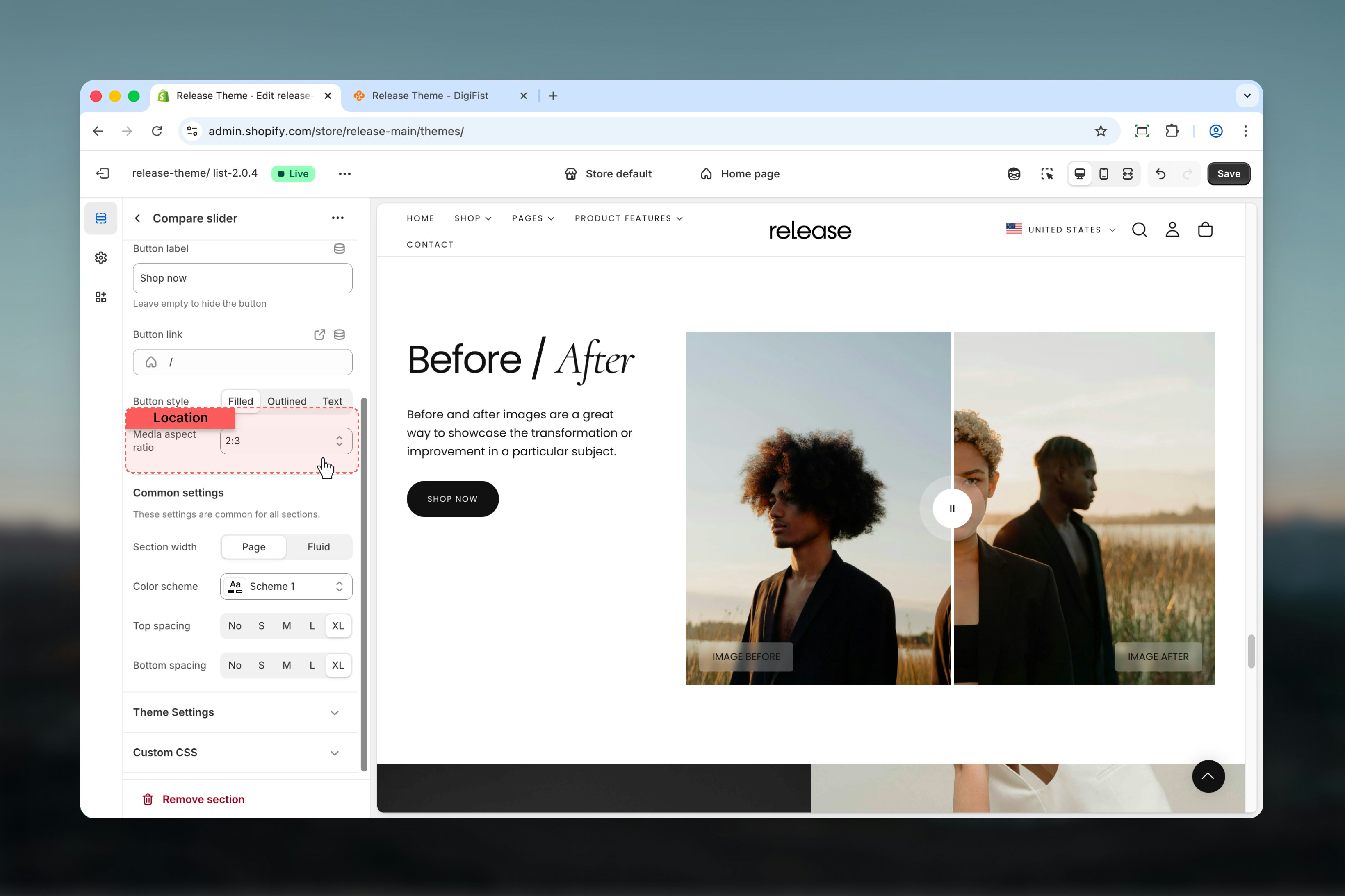
### Media aspect ratio
Controls the aspect ratio of the compared images.
**Available options:** 1:1, 2:3, 3:4, 4:5, 9:16
For the best comparison experience, both images should share the same aspect ratio and visual framing.
### Heading
Main title of the section.
* Supports bold, italic, underline, and links
### Heading size
Controls the size of the heading text.
**Available options:** S, M, L, XL
### Text
Additional descriptive content displayed under the heading.
* Rich text support (paragraphs, formatting, links)
### Button label
Defines the section action button text.
Leave empty to hide the button.
### Button link
URL for the action button.
### Button style
Controls the appearance of the button.
**Available options:** Filled, Outlined, Text
### Media aspect ratio
Controls the aspect ratio of the compared images.
**Available options:** 1:1, 2:3, 3:4, 4:5, 9:16
For the best comparison experience, both images should share the same aspect ratio and visual framing.
 ## Block settings
Block settings control individual image blocks. The Compare Slider supports a maximum of **two blocks**.
Both "Image before" and "Image after" blocks are required together for the slider to function correctly. If only one image block is added, the compare slider will not function as intended.
### Available block types
* Image before
* Image after
Both block types share the same settings.
## Block settings
Block settings control individual image blocks. The Compare Slider supports a maximum of **two blocks**.
Both "Image before" and "Image after" blocks are required together for the slider to function correctly. If only one image block is added, the compare slider will not function as intended.
### Available block types
* Image before
* Image after
Both block types share the same settings.
 ### Image
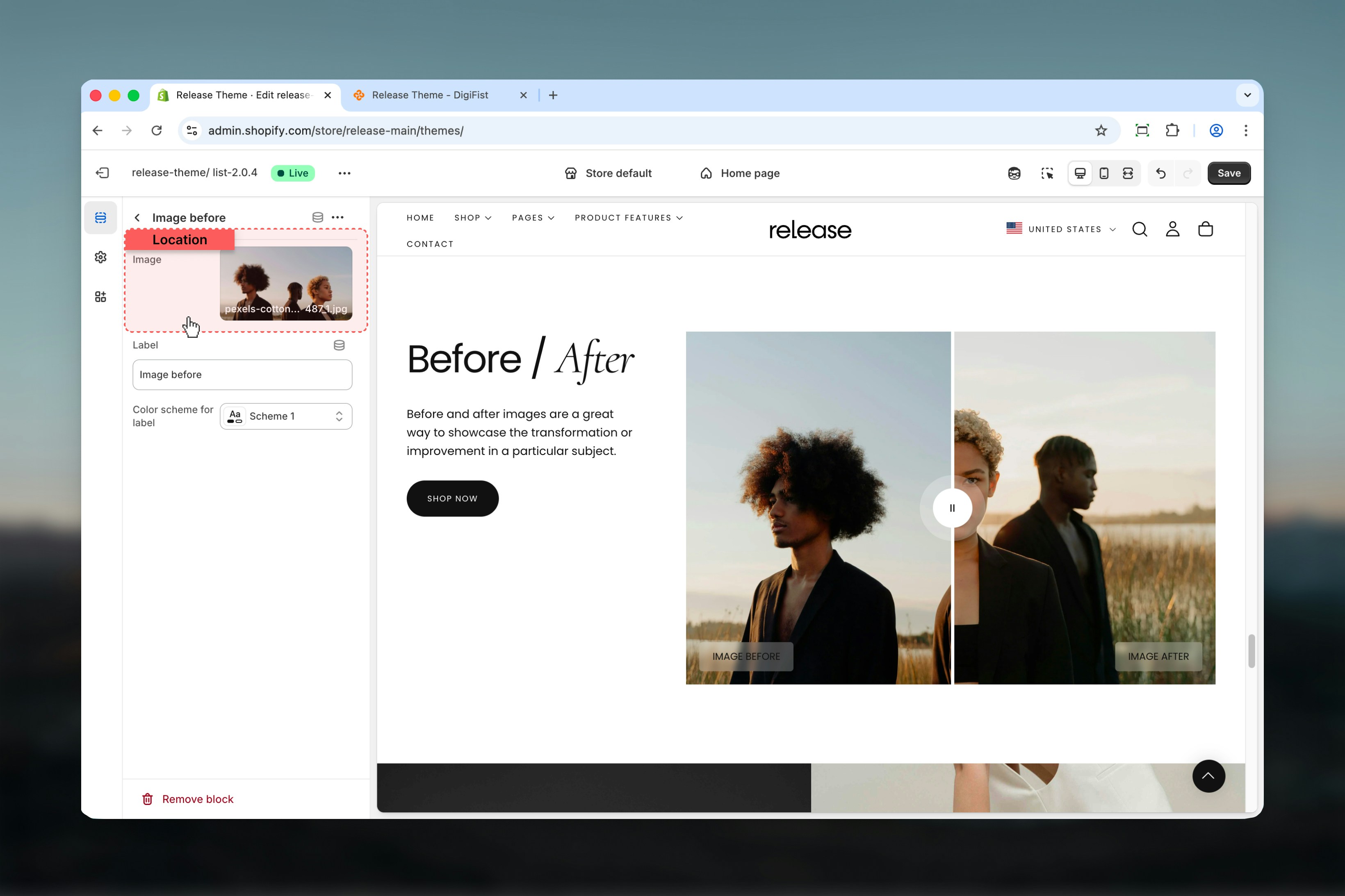
Select an image using Shopify's image selector.
**Recommended:**
* Same resolution
* Same subject framing
* Same lighting conditions
This ensures smooth and accurate comparison.
### Image
Select an image using Shopify's image selector.
**Recommended:**
* Same resolution
* Same subject framing
* Same lighting conditions
This ensures smooth and accurate comparison.
 ### Label
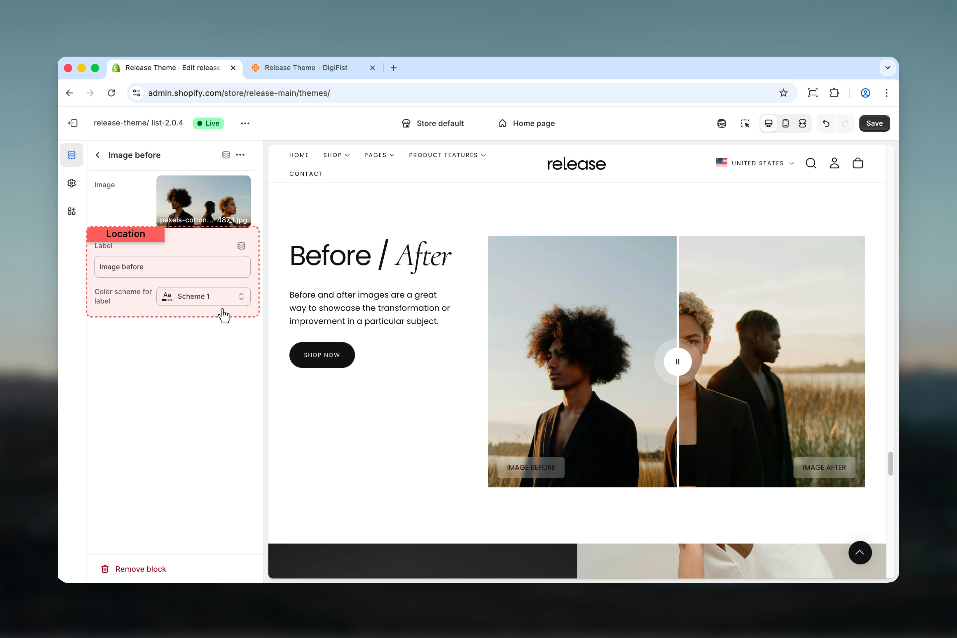
Text displayed on the image to indicate its state.
**Examples:** Before, After, Original, Edited
### Color scheme for label
Select a Shopify color scheme for the label background and text.
Use high-contrast color schemes to keep labels readable over images.
### Label
Text displayed on the image to indicate its state.
**Examples:** Before, After, Original, Edited
### Color scheme for label
Select a Shopify color scheme for the label background and text.
Use high-contrast color schemes to keep labels readable over images.
 ## Best practices
* Always use **exactly two blocks** (Before & After) for proper functionality
* Keep images aligned and visually consistent with matching dimensions and framing
* Avoid heavy text inside images to maintain focus on the comparison
* Use concise labels for clarity (single words like "Before" and "After")
* Choose aspect ratios that match your media orientation (portrait vs square)
* Ensure both images have similar lighting and perspective for accurate comparison
* Test the slider interaction on mobile devices to ensure smooth dragging
* Use high-quality images that maintain clarity when scaled
## Common use cases
* **Before / after product results** - Show product effectiveness (skincare, cleaning products)
* **Image retouching comparisons** - Demonstrate editing or enhancement services
* **Design transformations** - Showcase interior design, renovation, or styling changes
* **Feature highlights** - Compare product features or different versions
## Related guides
Learn about common settings shared across sections
## Best practices
* Always use **exactly two blocks** (Before & After) for proper functionality
* Keep images aligned and visually consistent with matching dimensions and framing
* Avoid heavy text inside images to maintain focus on the comparison
* Use concise labels for clarity (single words like "Before" and "After")
* Choose aspect ratios that match your media orientation (portrait vs square)
* Ensure both images have similar lighting and perspective for accurate comparison
* Test the slider interaction on mobile devices to ensure smooth dragging
* Use high-quality images that maintain clarity when scaled
## Common use cases
* **Before / after product results** - Show product effectiveness (skincare, cleaning products)
* **Image retouching comparisons** - Demonstrate editing or enhancement services
* **Design transformations** - Showcase interior design, renovation, or styling changes
* **Feature highlights** - Compare product features or different versions
## Related guides
Learn about common settings shared across sections