> ## Documentation Index
> Fetch the complete documentation index at: https://docs.digifist.com/llms.txt
> Use this file to discover all available pages before exploring further.
# Complete the Set
> Display product information with collapsible content blocks and optional complementary products or featured image.
The Complete the Set section combines product information with complementary product recommendations or featured imagery. It includes collapsible content blocks (description, shipping info, etc.) alongside optional product recommendations or a featured image.
This section is exclusive to product page templates and helps cross-sell related products while organizing product information efficiently.
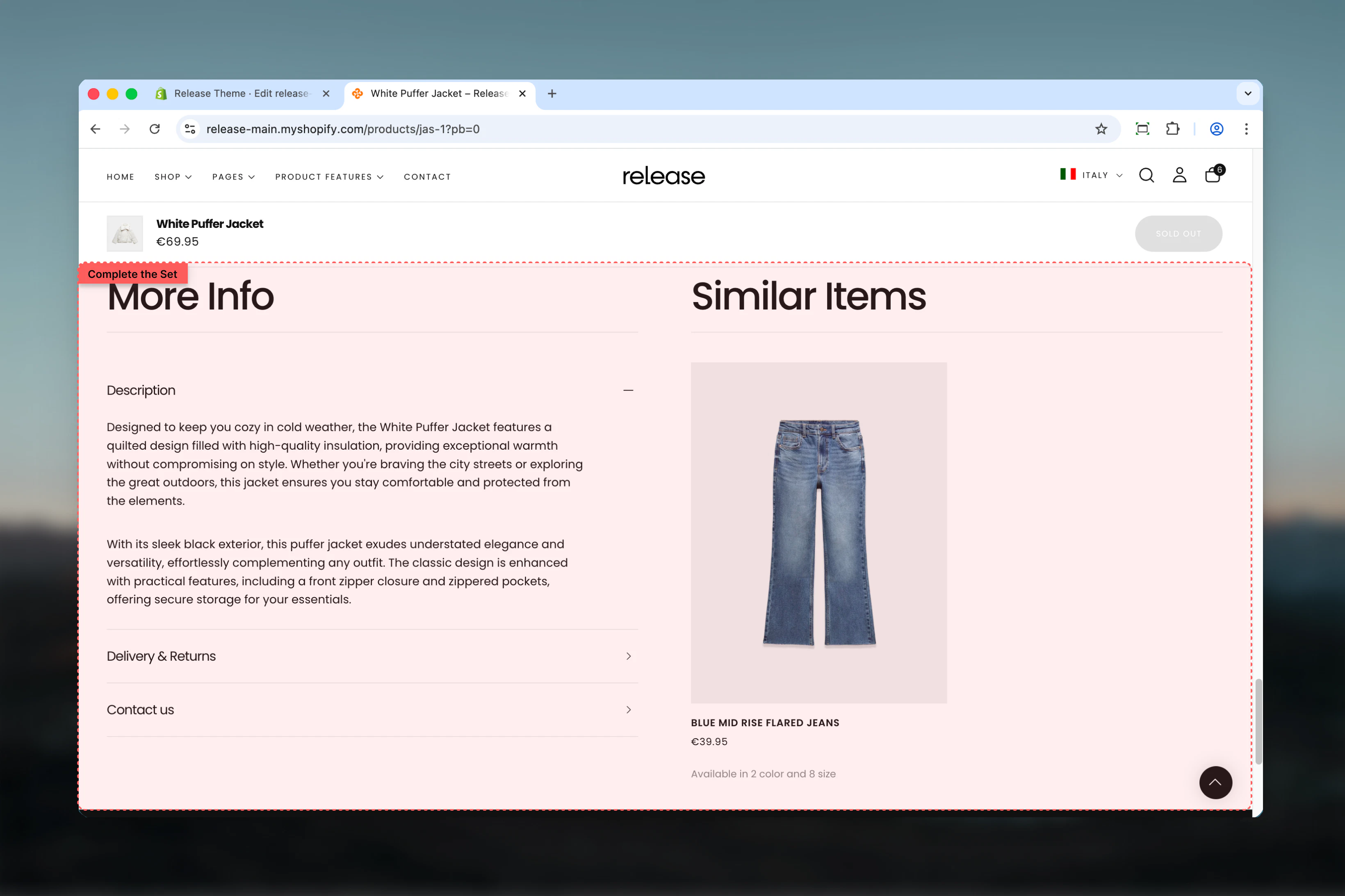 ## What this section controls
* Collapsible content blocks (description, shipping, etc.)
* Complementary product recommendations from Shopify Search & Discovery
* Optional featured image display
* Drawer or collapsible block types
* Link to page blocks
* Desktop and mobile layout flip options
## Getting started
From Shopify admin, access the Theme Customizer on a product page.
Add the section to your product template.
Select complementary products, featured image, or none.
Add collapsible blocks for description, shipping, care instructions, etc.
## What this section controls
* Collapsible content blocks (description, shipping, etc.)
* Complementary product recommendations from Shopify Search & Discovery
* Optional featured image display
* Drawer or collapsible block types
* Link to page blocks
* Desktop and mobile layout flip options
## Getting started
From Shopify admin, access the Theme Customizer on a product page.
Add the section to your product template.
Select complementary products, featured image, or none.
Add collapsible blocks for description, shipping, care instructions, etc.
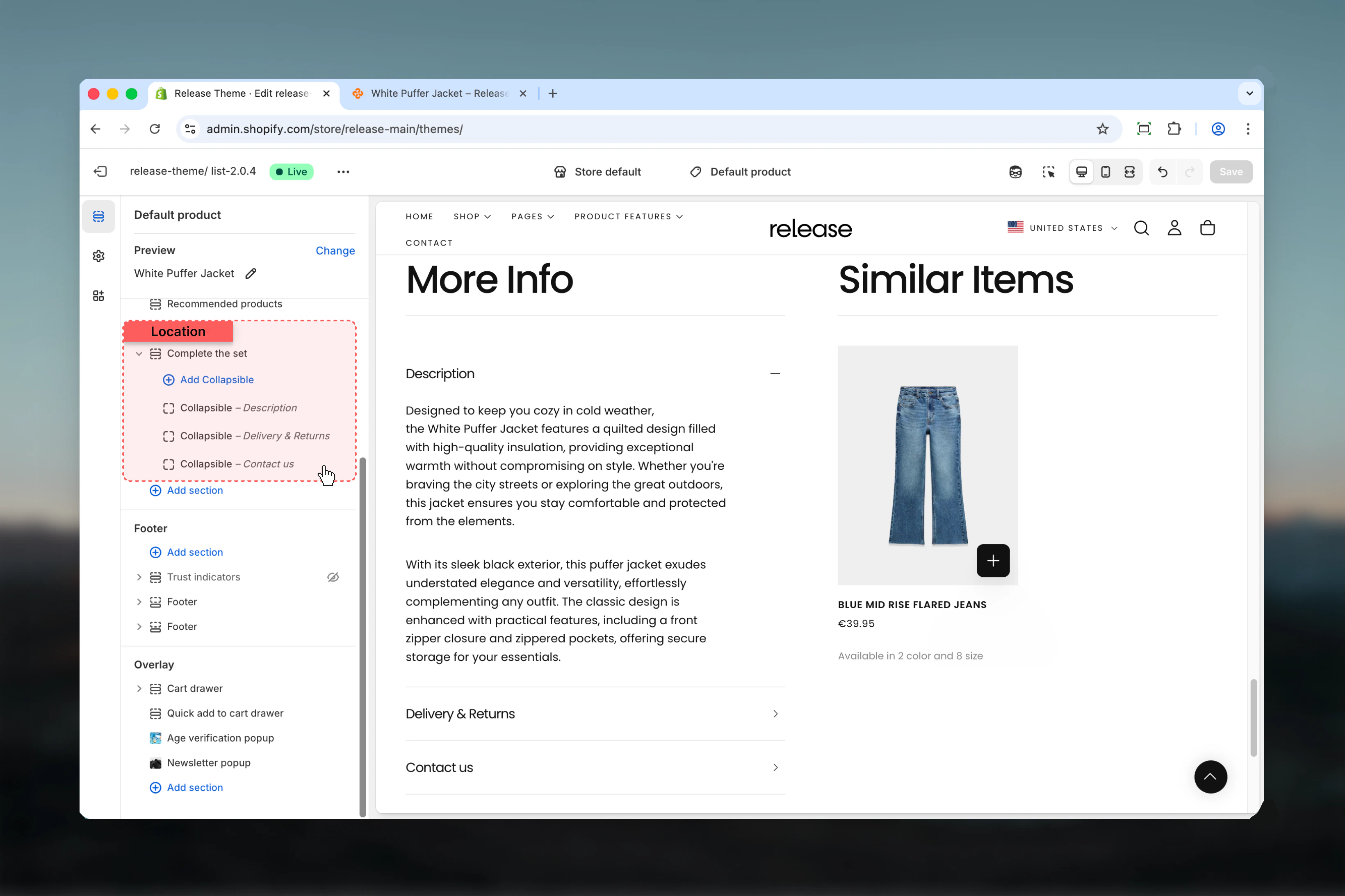 ## Section settings
### Heading
Main section heading.
* Inline rich text
* **Default:** "More info"
### Content heading
Heading for the complementary products or featured image area.
* Inline rich text
* **Default:** "Similar items"
### Heading size
Controls size of both headings.
**Available options:** XS, S, M, L, XL
**Default:** L
### Content type
Controls what appears alongside collapsible content.
**Available options:**
* **None:** Only collapsible blocks
* **Featured image:** Display a custom image
* **Complementary products:** Show product recommendations
**Default:** Complementary products
Complementary products are customizable through the Shopify Search & Discovery app. [Learn more](https://help.shopify.com/en/manual/online-store/search-and-discovery/product-recommendations)
### Featured image
Image to display when content type is "Featured image".
* Shopify image picker
### Featured image aspect ratio
Controls aspect ratio of featured image.
**Available options:** Auto, 1:1, 3:4, 4:3, 16:9
**Default:** 4:3
### Set first collapsible item opened
Opens the first collapsible block by default.
**Default:** True
Only works if the first block type is set to 'Collapsible' (not Drawer or Link).
## Section settings
### Heading
Main section heading.
* Inline rich text
* **Default:** "More info"
### Content heading
Heading for the complementary products or featured image area.
* Inline rich text
* **Default:** "Similar items"
### Heading size
Controls size of both headings.
**Available options:** XS, S, M, L, XL
**Default:** L
### Content type
Controls what appears alongside collapsible content.
**Available options:**
* **None:** Only collapsible blocks
* **Featured image:** Display a custom image
* **Complementary products:** Show product recommendations
**Default:** Complementary products
Complementary products are customizable through the Shopify Search & Discovery app. [Learn more](https://help.shopify.com/en/manual/online-store/search-and-discovery/product-recommendations)
### Featured image
Image to display when content type is "Featured image".
* Shopify image picker
### Featured image aspect ratio
Controls aspect ratio of featured image.
**Available options:** Auto, 1:1, 3:4, 4:3, 16:9
**Default:** 4:3
### Set first collapsible item opened
Opens the first collapsible block by default.
**Default:** True
Only works if the first block type is set to 'Collapsible' (not Drawer or Link).
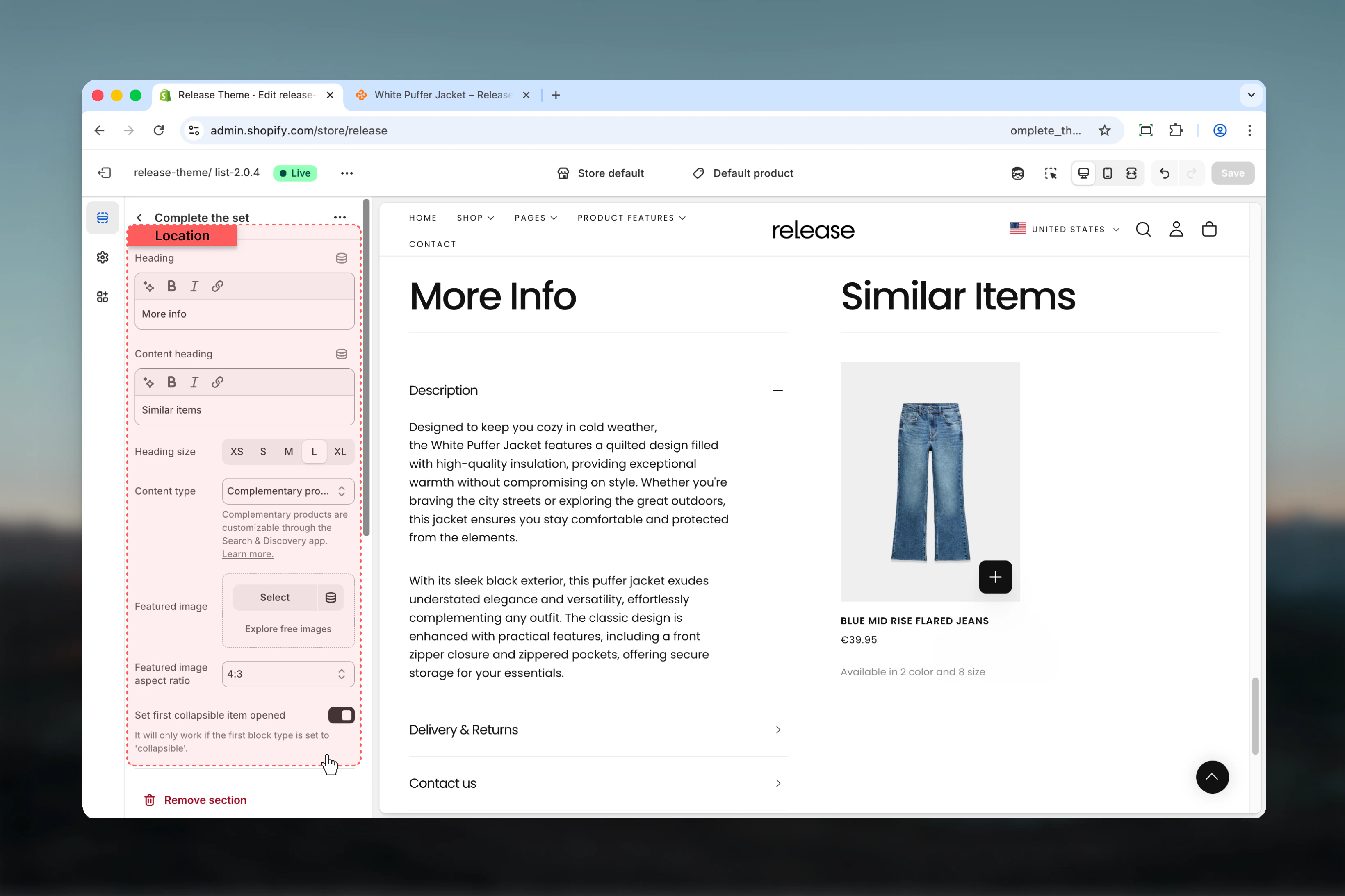 ### Flip left and right side
Swaps position of collapsible content and complementary content on desktop.
**Default:** True
### Flip top and bottom content positions on mobile
Reverses content order on mobile devices.
**Default:** True
Use layout flips to prioritize different content on desktop vs mobile.
### Flip left and right side
Swaps position of collapsible content and complementary content on desktop.
**Default:** True
### Flip top and bottom content positions on mobile
Reverses content order on mobile devices.
**Default:** True
Use layout flips to prioritize different content on desktop vs mobile.
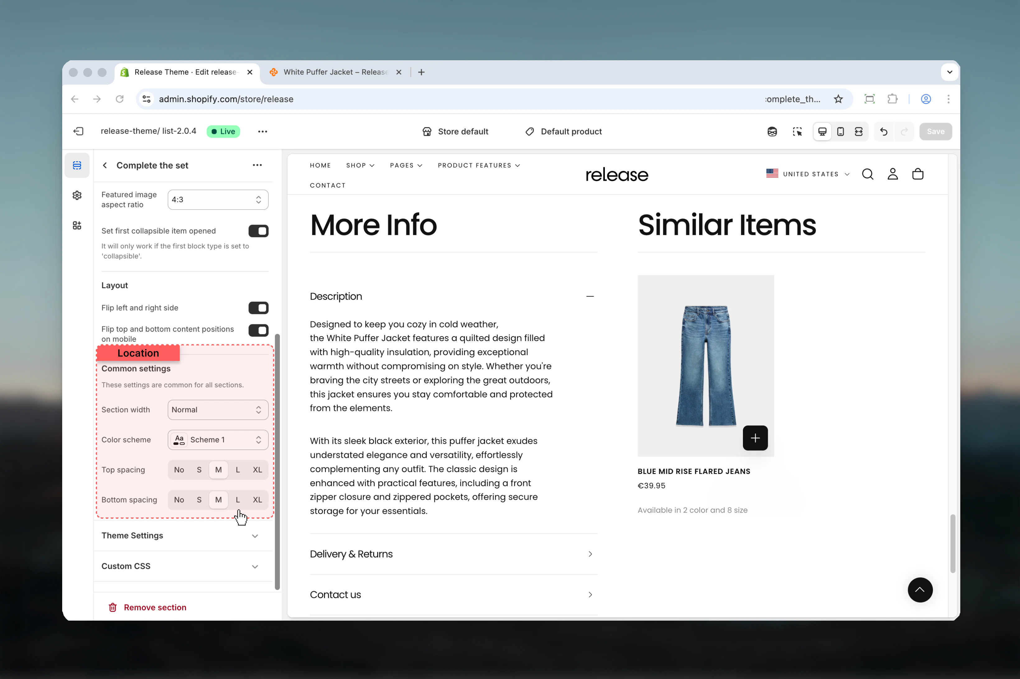
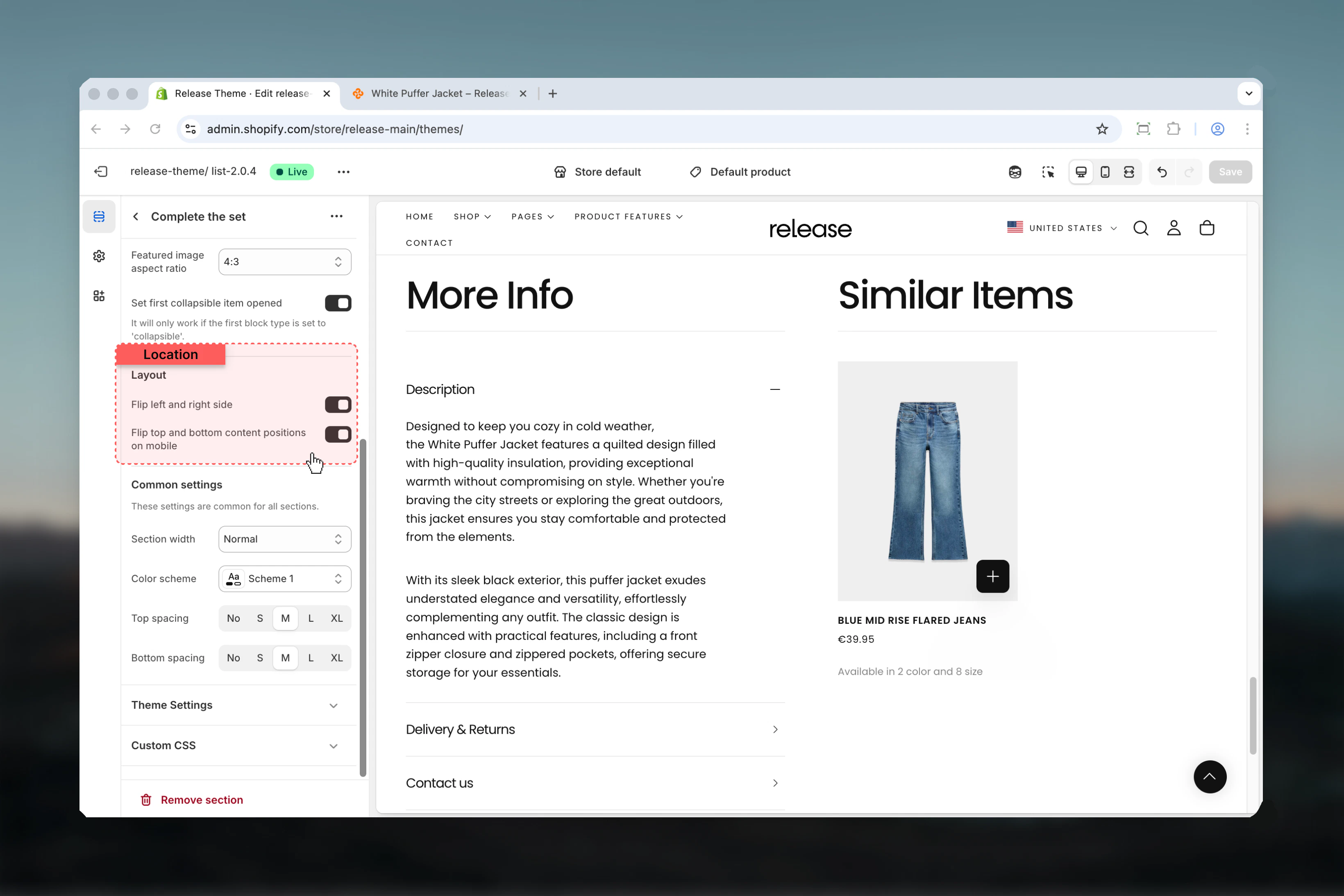 ### Section width
Maximum width of section container.
**Available options:** Narrow, Page, Fluid
**Default:** Page
### Color scheme
Background and text colors.
* Shopify color scheme selector
* **Default:** Scheme 1
### Spacing top
Space above section.
**Available options:** None, S, M, L, XL
**Default:** M
### Spacing bottom
Space below section.
**Available options:** None, S, M, L, XL
**Default:** M
### Section width
Maximum width of section container.
**Available options:** Narrow, Page, Fluid
**Default:** Page
### Color scheme
Background and text colors.
* Shopify color scheme selector
* **Default:** Scheme 1
### Spacing top
Space above section.
**Available options:** None, S, M, L, XL
**Default:** M
### Spacing bottom
Space below section.
**Available options:** None, S, M, L, XL
**Default:** M
 ## Block settings
### Collapsible Block
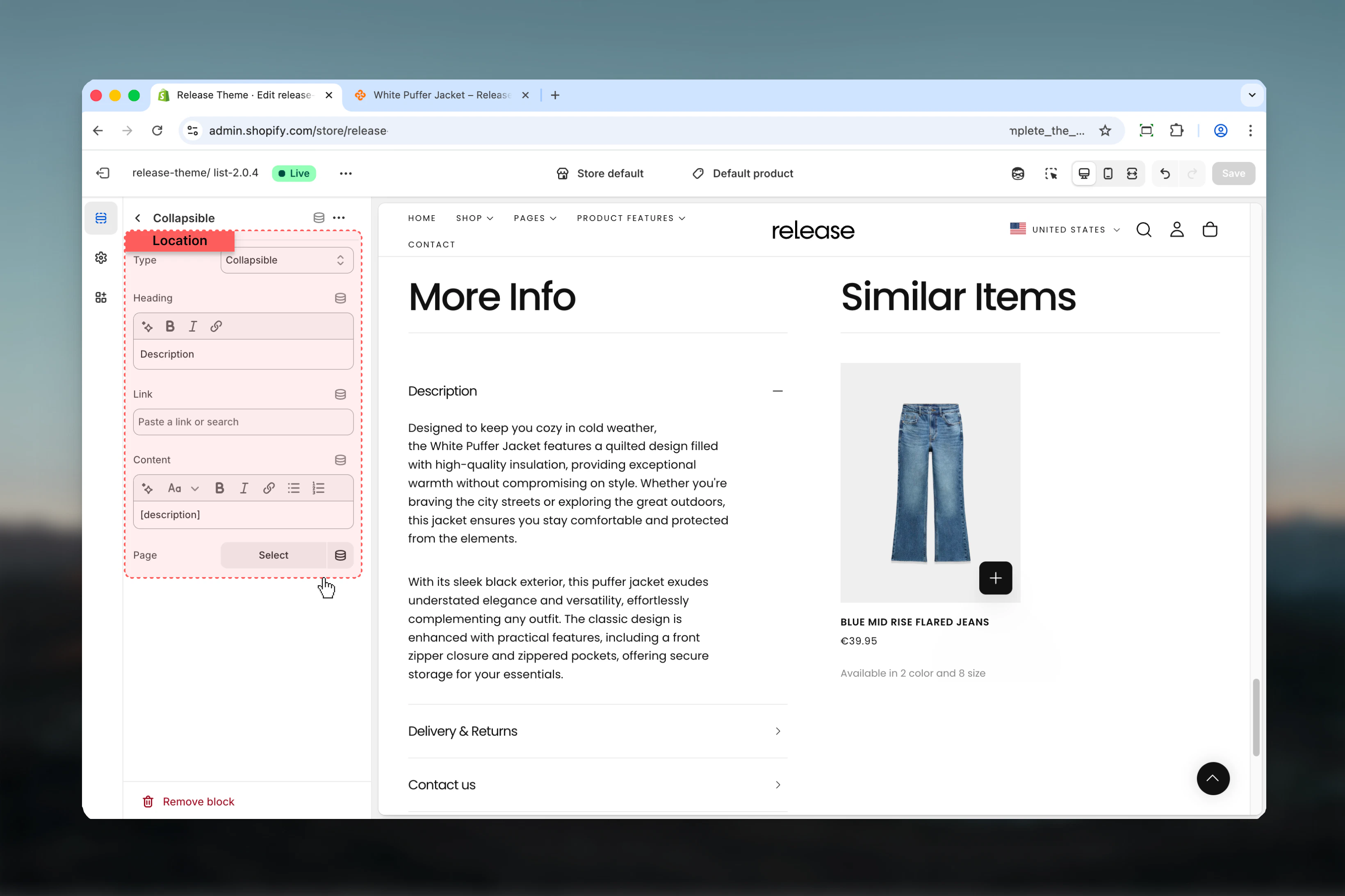
### Type
Controls how the content is displayed.
**Available options:**
* **Collapsible:** Expands/collapses inline
* **Drawer:** Opens in a slide-out drawer
* **Link to page:** Links to another page
**Default:** Collapsible
### Heading
Title for the collapsible item.
* Inline rich text
* **Default:** "Content"
### Link
URL for link type blocks.
* Shopify URL selector
### Content
Rich text content for the block.
* Rich text editor
* Use `[description]` to show product description dynamically
Use `[description]` placeholder to automatically display the product's description.
### Page
Link to a specific page for content.
* Shopify page picker
If page is selected, the content setting will be ignored.
## Block settings
### Collapsible Block
### Type
Controls how the content is displayed.
**Available options:**
* **Collapsible:** Expands/collapses inline
* **Drawer:** Opens in a slide-out drawer
* **Link to page:** Links to another page
**Default:** Collapsible
### Heading
Title for the collapsible item.
* Inline rich text
* **Default:** "Content"
### Link
URL for link type blocks.
* Shopify URL selector
### Content
Rich text content for the block.
* Rich text editor
* Use `[description]` to show product description dynamically
Use `[description]` placeholder to automatically display the product's description.
### Page
Link to a specific page for content.
* Shopify page picker
If page is selected, the content setting will be ignored.
 ## Best practices
* Use "Complementary products" content type to increase average order value
* Set first collapsible (product description) to open by default for better UX
* Use drawer type for lengthy content like shipping policies or size guides
* Use collapsible type for quick-scan information like materials or care instructions
* Place most important information (description) as first block
* Use `[description]` placeholder to keep product info synchronized
* Consider flipping mobile layout to prioritize product recommendations on smaller screens
* Link to dedicated pages for detailed policies rather than including lengthy text
* Keep collapsible headings concise (2-4 words) for better mobile experience
* Use featured image option to showcase product lifestyle or detail shots
## Common use cases
* **Product details organization** - Organize description, specs, shipping in collapsibles
* **Cross-selling** - Display complementary products to increase cart value
* **Size guides** - Use drawer type for detailed sizing information
* **Shipping policies** - Link to shipping policy page or include brief details
* **Care instructions** - Collapsible block for product care and maintenance
* **Warranty information** - Drawer for detailed warranty terms
* **Material details** - Collapsible for fabric composition or materials
* **Brand story** - Featured image option with brand imagery
## Related guides
Learn more about product page customization
Learn about common settings shared across sections
## Best practices
* Use "Complementary products" content type to increase average order value
* Set first collapsible (product description) to open by default for better UX
* Use drawer type for lengthy content like shipping policies or size guides
* Use collapsible type for quick-scan information like materials or care instructions
* Place most important information (description) as first block
* Use `[description]` placeholder to keep product info synchronized
* Consider flipping mobile layout to prioritize product recommendations on smaller screens
* Link to dedicated pages for detailed policies rather than including lengthy text
* Keep collapsible headings concise (2-4 words) for better mobile experience
* Use featured image option to showcase product lifestyle or detail shots
## Common use cases
* **Product details organization** - Organize description, specs, shipping in collapsibles
* **Cross-selling** - Display complementary products to increase cart value
* **Size guides** - Use drawer type for detailed sizing information
* **Shipping policies** - Link to shipping policy page or include brief details
* **Care instructions** - Collapsible block for product care and maintenance
* **Warranty information** - Drawer for detailed warranty terms
* **Material details** - Collapsible for fabric composition or materials
* **Brand story** - Featured image option with brand imagery
## Related guides
Learn more about product page customization
Learn about common settings shared across sections