> ## Documentation Index
> Fetch the complete documentation index at: https://docs.digifist.com/llms.txt
> Use this file to discover all available pages before exploring further.
# Dual Content Tiles
> Display two side-by-side content tiles with text, buttons, media, and optional product cards.
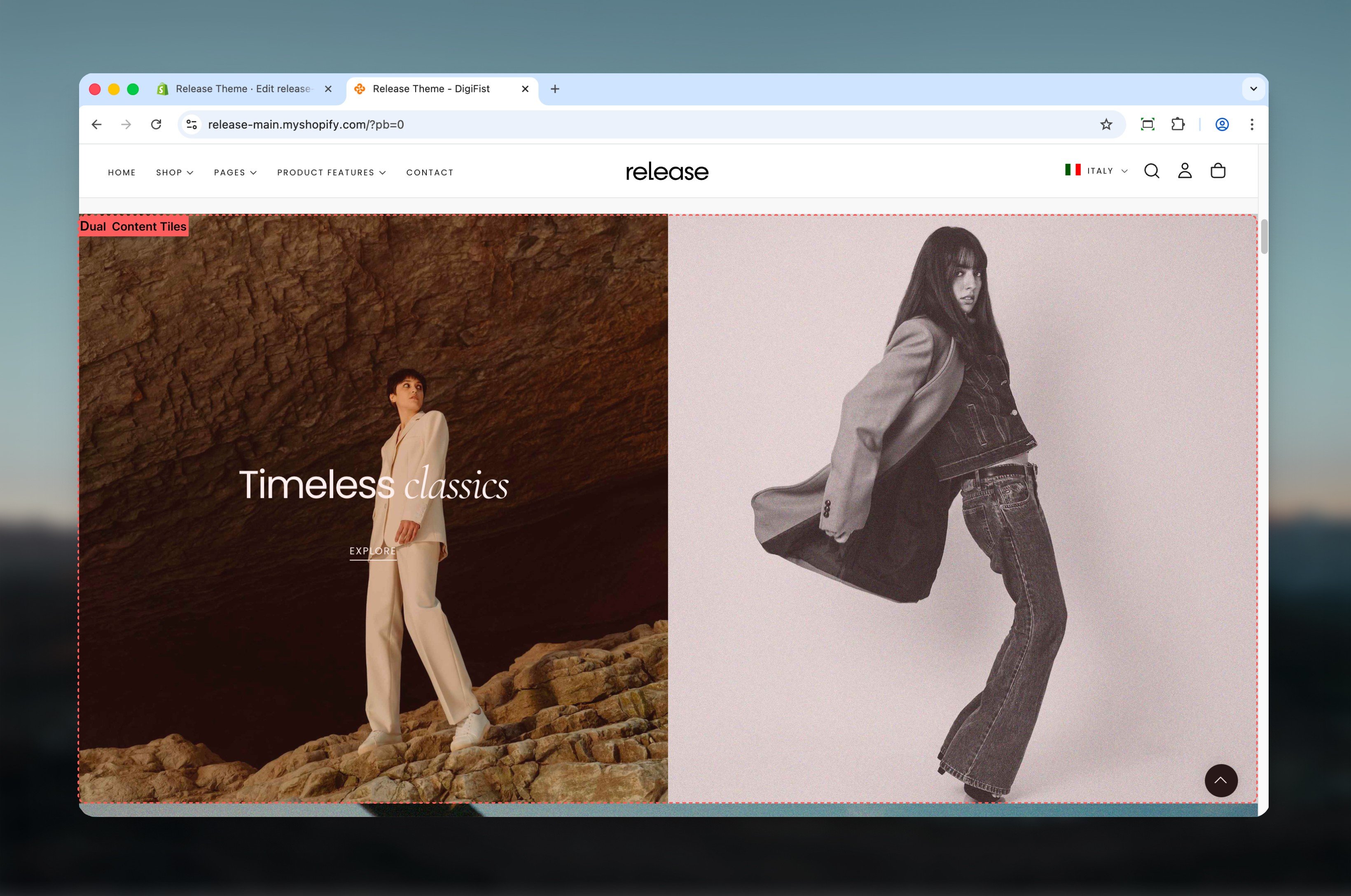
The Dual Content Tiles section displays two side-by-side content tiles. Each tile can contain text, buttons, media, and optionally a product card. This section is ideal for highlighting two related stories, campaigns, or product-focused content areas.
Dual content tiles help create balanced, visually engaging layouts that can showcase complementary products, seasonal campaigns, or editorial content in a structured format.
 ## What this section controls
This section controls dual-tile layouts with the following capabilities:
* Two side-by-side content areas with independent configuration
* Flexible tile sizing and spacing options
* Desktop and mobile-specific media and positioning
* Optional product card integration within tiles
* Rich text content with buttons and media support
## How the Dual Content Tiles section works
The Dual Content Tiles section uses a block-based system:
* The section supports a maximum of **2 tiles**
* Each tile is added as a block
* Tile sizes and alignment are controlled at the section level
* Content, media, and product behavior are controlled at the block level
## Getting started
From Shopify admin, access the Theme Customizer.
Add the Dual Content Tiles section to your page or template.
Click **Add Tile** to create content blocks (maximum 2 tiles).
Adjust section and tile settings according to your needs.
## What this section controls
This section controls dual-tile layouts with the following capabilities:
* Two side-by-side content areas with independent configuration
* Flexible tile sizing and spacing options
* Desktop and mobile-specific media and positioning
* Optional product card integration within tiles
* Rich text content with buttons and media support
## How the Dual Content Tiles section works
The Dual Content Tiles section uses a block-based system:
* The section supports a maximum of **2 tiles**
* Each tile is added as a block
* Tile sizes and alignment are controlled at the section level
* Content, media, and product behavior are controlled at the block level
## Getting started
From Shopify admin, access the Theme Customizer.
Add the Dual Content Tiles section to your page or template.
Click **Add Tile** to create content blocks (maximum 2 tiles).
Adjust section and tile settings according to your needs.
 ## Section settings
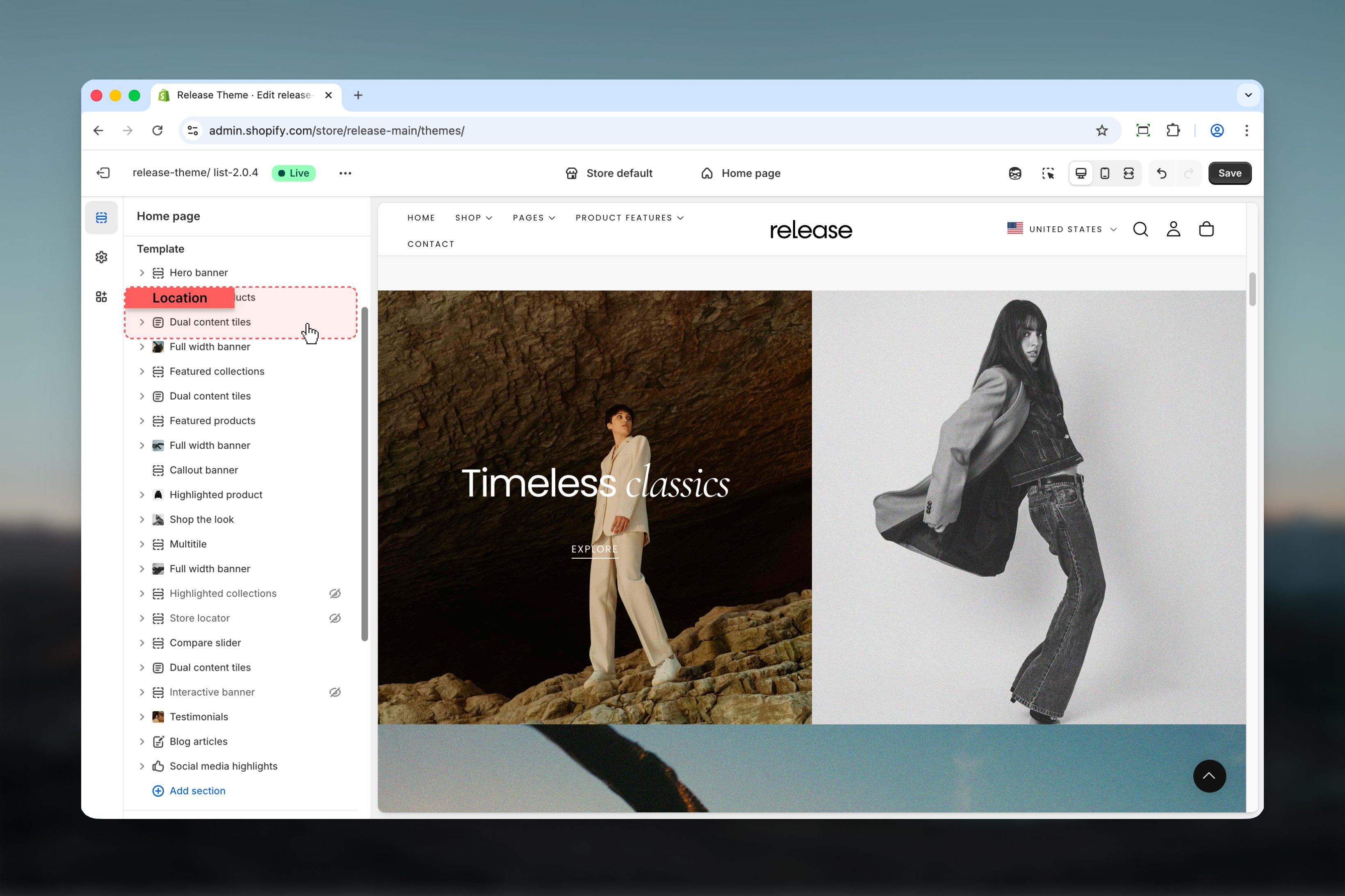
Section settings control the overall layout and behavior of both tiles.
### Section layout
Controls the spacing between the two tiles.
**Available options:**
* **Normal:** Tiles are visually separated
* **Compact:** Tiles are displayed without spacing and appear attached
### First block size
Controls the width and height of the **first tile**. The second tile is automatically adjusted based on this selection.
**Available options:** Full, Half, Large, Small
## Section settings
Section settings control the overall layout and behavior of both tiles.
### Section layout
Controls the spacing between the two tiles.
**Available options:**
* **Normal:** Tiles are visually separated
* **Compact:** Tiles are displayed without spacing and appear attached
### First block size
Controls the width and height of the **first tile**. The second tile is automatically adjusted based on this selection.
**Available options:** Full, Half, Large, Small
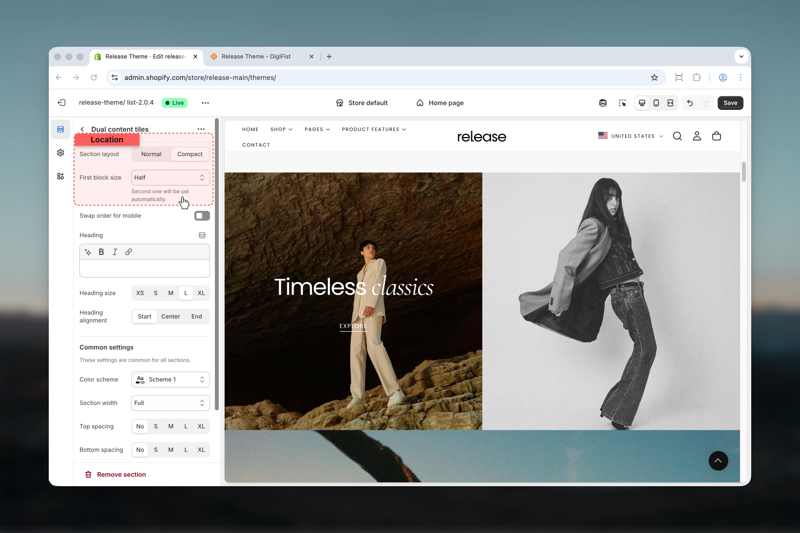 ### Swap order for mobile
Reverses the tile order on mobile devices.
**Options:** True / False
### Heading
Section-level heading displayed above the tiles.
* Supports rich text
* Allows bold, italic, underline, and links
### Heading size
Controls the size of the section heading.
**Available options:** XS, S, M, L, XL
### Heading alignment
Controls horizontal alignment of the section heading.
**Available options:** Start, Center, End
## Block settings
Block settings configure each tile independently. Each tile represents a unique content area with its own media, text, and optional product.
### Show on
Controls which devices the tile is visible on.
**Available options:** Desktop, Mobile, Both
### Swap order for mobile
Reverses the tile order on mobile devices.
**Options:** True / False
### Heading
Section-level heading displayed above the tiles.
* Supports rich text
* Allows bold, italic, underline, and links
### Heading size
Controls the size of the section heading.
**Available options:** XS, S, M, L, XL
### Heading alignment
Controls horizontal alignment of the section heading.
**Available options:** Start, Center, End
## Block settings
Block settings configure each tile independently. Each tile represents a unique content area with its own media, text, and optional product.
### Show on
Controls which devices the tile is visible on.
**Available options:** Desktop, Mobile, Both
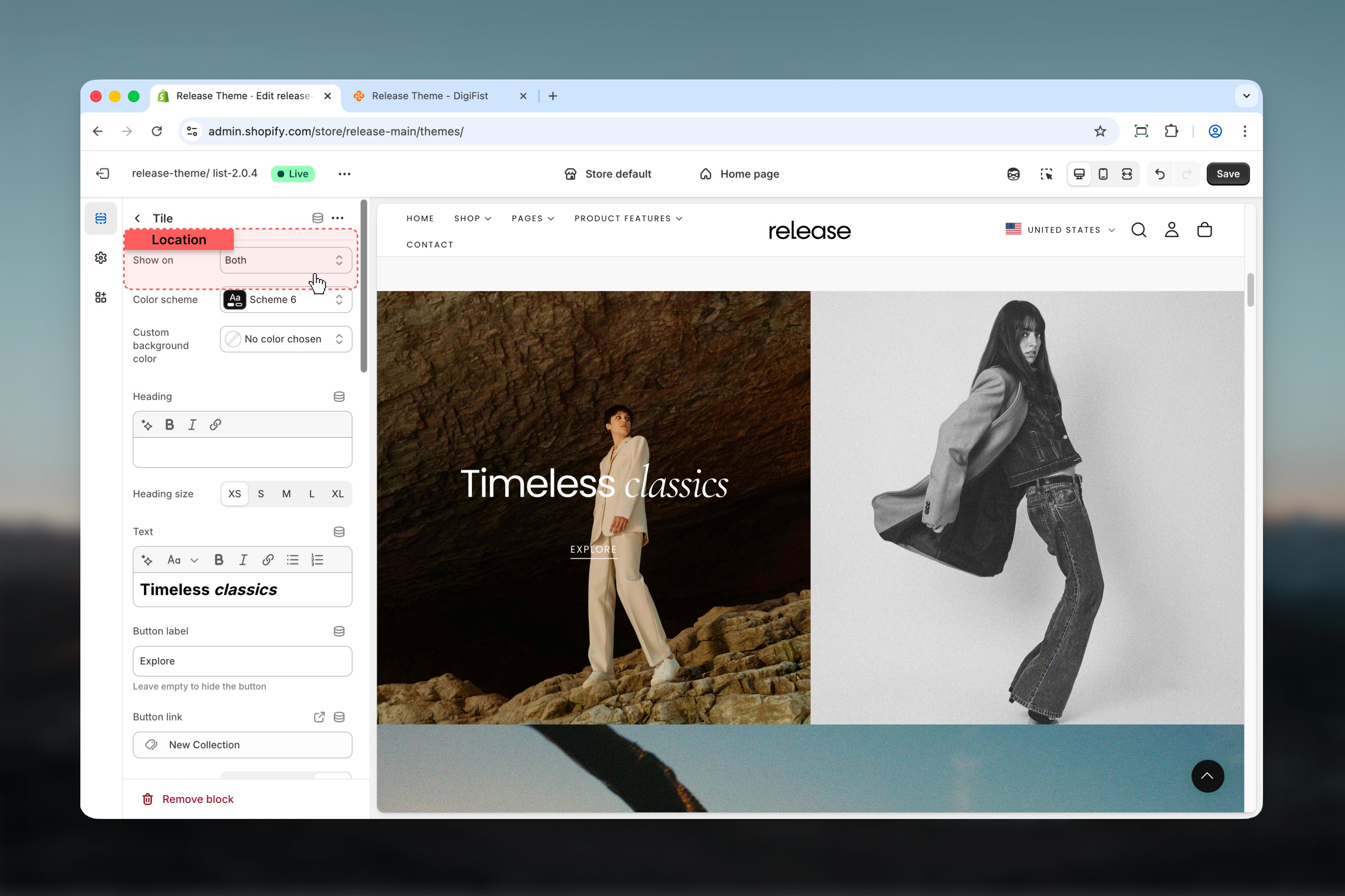 ### Color scheme
Controls background and text colors using Shopify's color scheme system.
### Custom background color
Allows selecting a custom background using a gradient color picker.
### Heading
Tile heading text.
* Supports rich text
* Allows bold, italic, underline, and links
### Heading size
Controls the size of the tile heading.
**Available options:** XS, S, M, L, XL
### Text
Main text content of the tile.
* Supports multiple text elements (paragraphs, H1–H4)
* Allows bold, italic, and links
## Button
### Button label
Defines the button label.
Leave empty to hide the button.
### Button link
Destination URL for the button.
### Button style
Controls the visual style of the button.
**Available options:** Filled, Outlined, Text
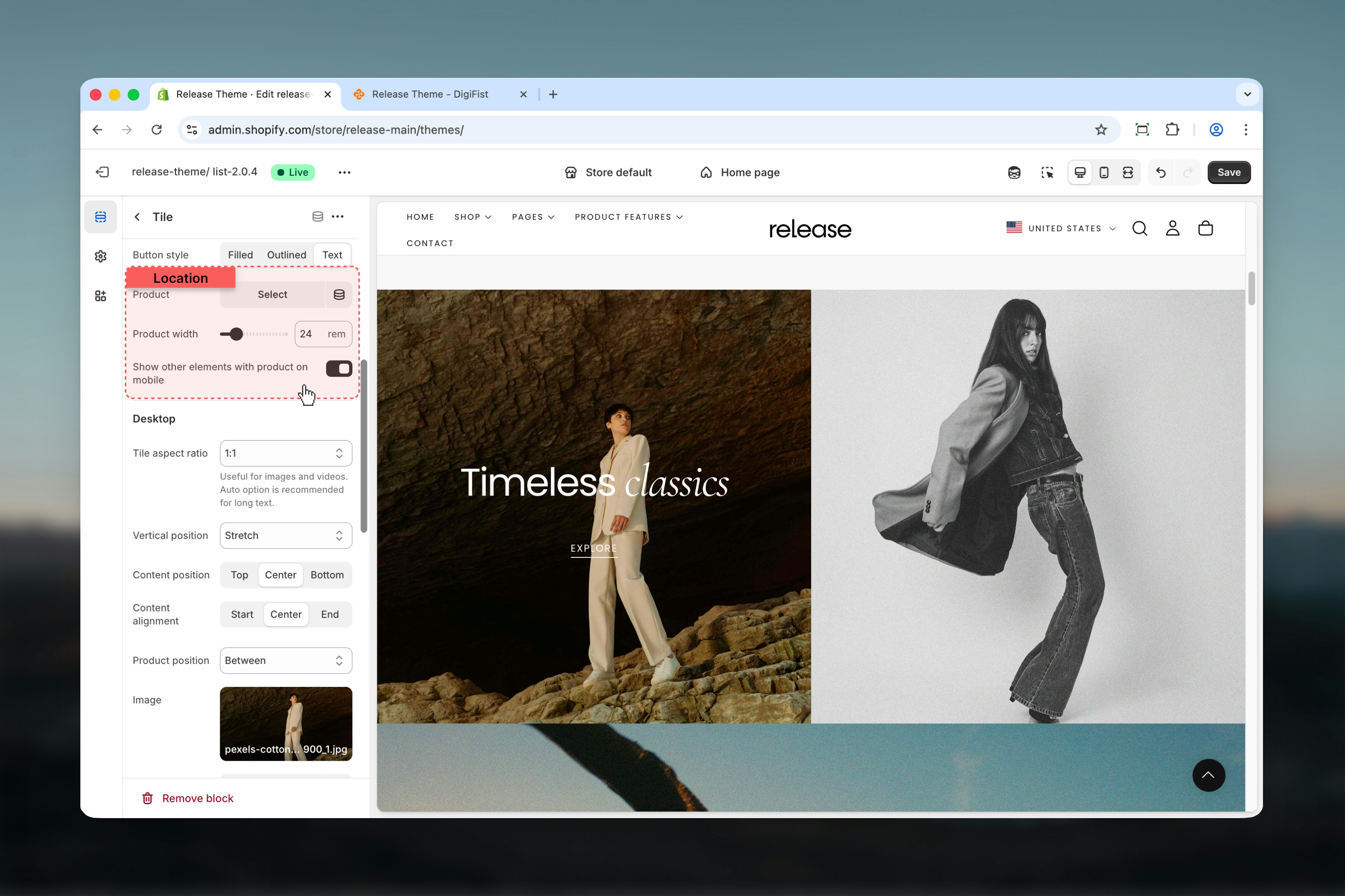
Tiles can optionally display a product card.
### Product
Select a Shopify product.
When a product is selected, a product card is displayed inside the tile.
When using a product, it is recommended to also include an image or video for better visual balance.
### Product width
Controls the width of the product card inside the tile.
**Range:** 16rem – 60rem
Increasing product width may increase tile height to preserve the product's aspect ratio.
### Show other elements with product on mobile
Controls whether non-product content is displayed on mobile.
* **Enabled:** Heading, text, and buttons are hidden on mobile
* **Disabled:** All content remains visible
**Options:** True / False
### Color scheme
Controls background and text colors using Shopify's color scheme system.
### Custom background color
Allows selecting a custom background using a gradient color picker.
### Heading
Tile heading text.
* Supports rich text
* Allows bold, italic, underline, and links
### Heading size
Controls the size of the tile heading.
**Available options:** XS, S, M, L, XL
### Text
Main text content of the tile.
* Supports multiple text elements (paragraphs, H1–H4)
* Allows bold, italic, and links
## Button
### Button label
Defines the button label.
Leave empty to hide the button.
### Button link
Destination URL for the button.
### Button style
Controls the visual style of the button.
**Available options:** Filled, Outlined, Text
Tiles can optionally display a product card.
### Product
Select a Shopify product.
When a product is selected, a product card is displayed inside the tile.
When using a product, it is recommended to also include an image or video for better visual balance.
### Product width
Controls the width of the product card inside the tile.
**Range:** 16rem – 60rem
Increasing product width may increase tile height to preserve the product's aspect ratio.
### Show other elements with product on mobile
Controls whether non-product content is displayed on mobile.
* **Enabled:** Heading, text, and buttons are hidden on mobile
* **Disabled:** All content remains visible
**Options:** True / False
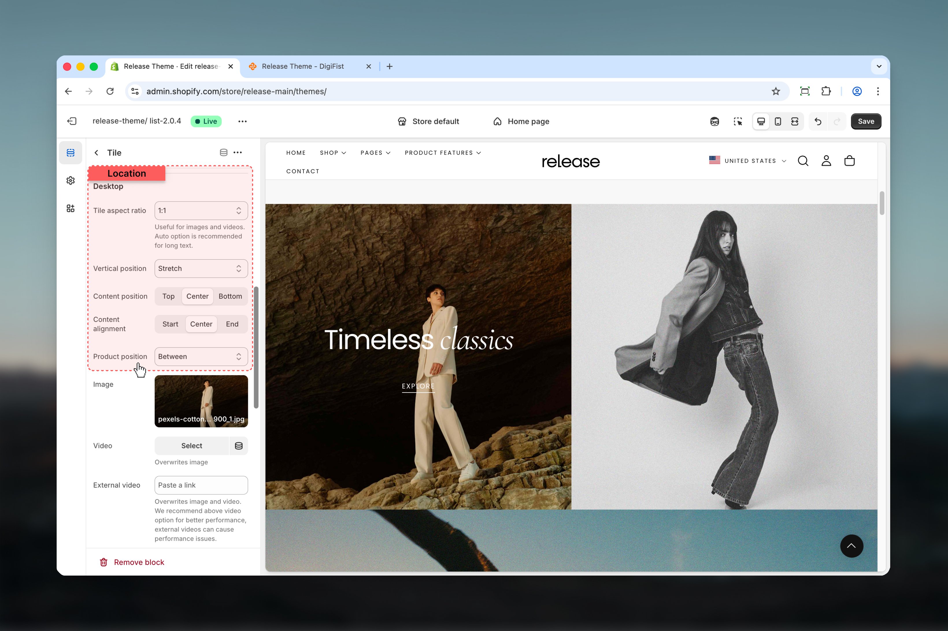
 ### Tile aspect ratio
Controls the aspect ratio of images and videos.
**Auto** is recommended when tiles contain long text.
**Available options:** Auto, Square, Portrait, Landscape
Each group includes multiple ratio presets.
### Vertical position
Controls how the tile stretches vertically.
**Available options:** Stretch, Start, Center, End
### Content position
Controls vertical positioning of content within the tile.
**Options:** Top, Center, Bottom
### Content alignment
Controls horizontal alignment of content.
**Options:** Start, Center, End
### Product position
Controls where the product appears relative to other tile content.
**Available options:** Before, Between, After
### Tile aspect ratio
Controls the aspect ratio of images and videos.
**Auto** is recommended when tiles contain long text.
**Available options:** Auto, Square, Portrait, Landscape
Each group includes multiple ratio presets.
### Vertical position
Controls how the tile stretches vertically.
**Available options:** Stretch, Start, Center, End
### Content position
Controls vertical positioning of content within the tile.
**Options:** Top, Center, Bottom
### Content alignment
Controls horizontal alignment of content.
**Options:** Start, Center, End
### Product position
Controls where the product appears relative to other tile content.
**Available options:** Before, Between, After
 ### Image
Select an image for the tile.
### Video
Select a Shopify-hosted video.
### External video
Overrides both image and video.
External videos may negatively impact performance. Shopify-hosted videos are recommended.
### Show video controls
Shows or hides video playback controls.
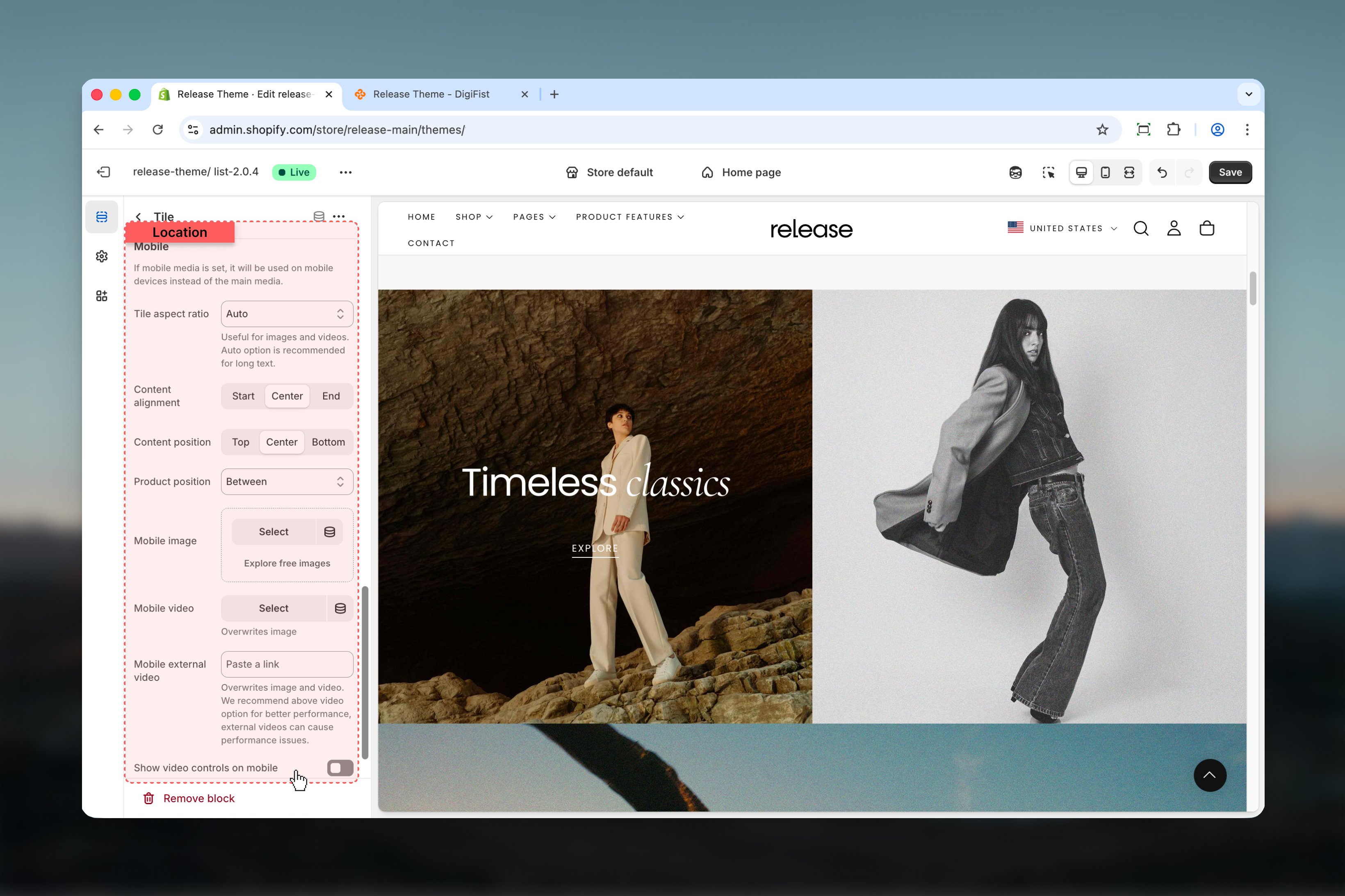
If mobile media is set, it will be used on mobile devices instead of the main media.
### Tile aspect ratio
Controls the aspect ratio of mobile images and videos.
**Available options:** Auto, Square, Portrait, Landscape
### Content position
Controls vertical positioning on mobile.
**Options:** Top, Center, Bottom
### Content alignment
Controls horizontal alignment on mobile.
**Options:** Start, Center, End
### Product position
Controls product placement on mobile.
**Options:** Before, Between, After
### Mobile image
Select an image used only on mobile devices.
### Mobile video
Select a video used only on mobile devices.
### Mobile external video
Overrides both mobile image and video.
External videos may negatively impact performance.
### Show video controls on mobile
Shows or hides video playback controls on mobile.
### Padding
Controls internal spacing of the tile on mobile.
**Available options:** No, S, M, L, XL
### Image
Select an image for the tile.
### Video
Select a Shopify-hosted video.
### External video
Overrides both image and video.
External videos may negatively impact performance. Shopify-hosted videos are recommended.
### Show video controls
Shows or hides video playback controls.
If mobile media is set, it will be used on mobile devices instead of the main media.
### Tile aspect ratio
Controls the aspect ratio of mobile images and videos.
**Available options:** Auto, Square, Portrait, Landscape
### Content position
Controls vertical positioning on mobile.
**Options:** Top, Center, Bottom
### Content alignment
Controls horizontal alignment on mobile.
**Options:** Start, Center, End
### Product position
Controls product placement on mobile.
**Options:** Before, Between, After
### Mobile image
Select an image used only on mobile devices.
### Mobile video
Select a video used only on mobile devices.
### Mobile external video
Overrides both mobile image and video.
External videos may negatively impact performance.
### Show video controls on mobile
Shows or hides video playback controls on mobile.
### Padding
Controls internal spacing of the tile on mobile.
**Available options:** No, S, M, L, XL
 ## Best practices
* Use **Compact layout** for visually continuous designs and seamless transitions
* Limit content length when using fixed aspect ratios to prevent layout issues
* Be cautious when increasing product width as it may affect tile height
* Prefer Shopify-hosted videos over external videos for better performance
* Test mobile layouts when using product-only mobile views to ensure content visibility
* Ensure tiles have similar content lengths for visual balance
* Use high-quality images that maintain clarity at various aspect ratios
* Consider color scheme contrast when placing products within tiles
## Related guides
Learn about product card configuration and styling options
Understand global theme configuration options
## Best practices
* Use **Compact layout** for visually continuous designs and seamless transitions
* Limit content length when using fixed aspect ratios to prevent layout issues
* Be cautious when increasing product width as it may affect tile height
* Prefer Shopify-hosted videos over external videos for better performance
* Test mobile layouts when using product-only mobile views to ensure content visibility
* Ensure tiles have similar content lengths for visual balance
* Use high-quality images that maintain clarity at various aspect ratios
* Consider color scheme contrast when placing products within tiles
## Related guides
Learn about product card configuration and styling options
Understand global theme configuration options