> ## Documentation Index
> Fetch the complete documentation index at: https://docs.digifist.com/llms.txt
> Use this file to discover all available pages before exploring further.
# Featured Collections
> Highlight selected collections with multiple layouts, card styles, and slideshow behaviors.
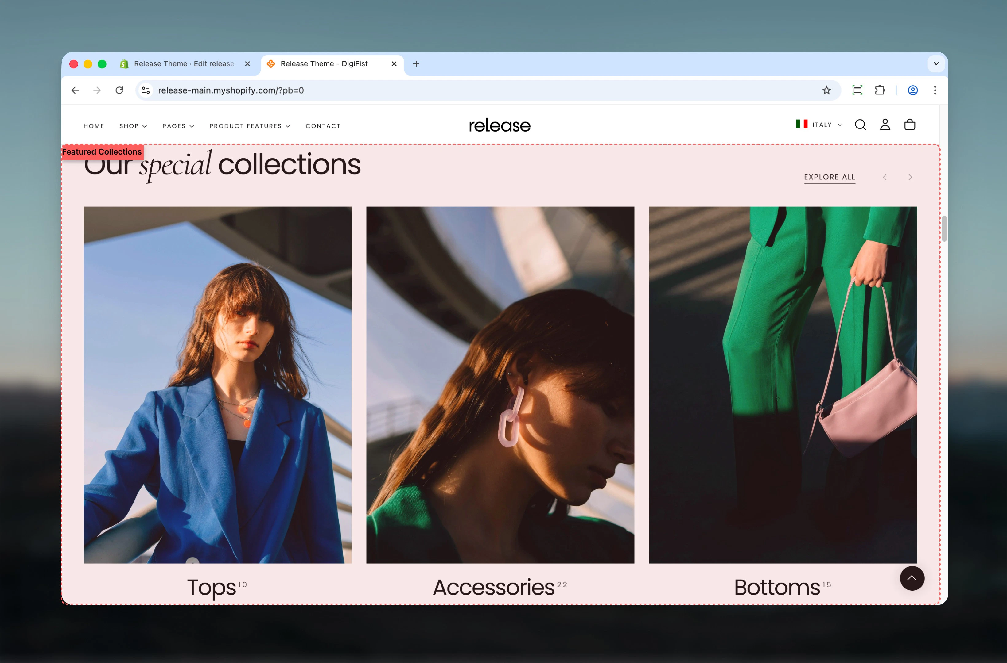
The Featured Collections section highlights selected collections in a visually engaging way. It supports multiple layouts, card styles, and slideshow behaviors to fit different merchandising needs.
Featured collections help organize products by category or theme, making it easier for customers to discover curated product sets and navigate your catalog effectively.
 ## What this section controls
This section controls collection showcase displays with the following capabilities:
* Multiple collection card layouts and styles
* Carousel behavior with customizable slides per view
* Flexible heading and button positioning
* Collection, product, or text-based card types
* Desktop and mobile-specific slideshow controls
## How the Featured Collections works
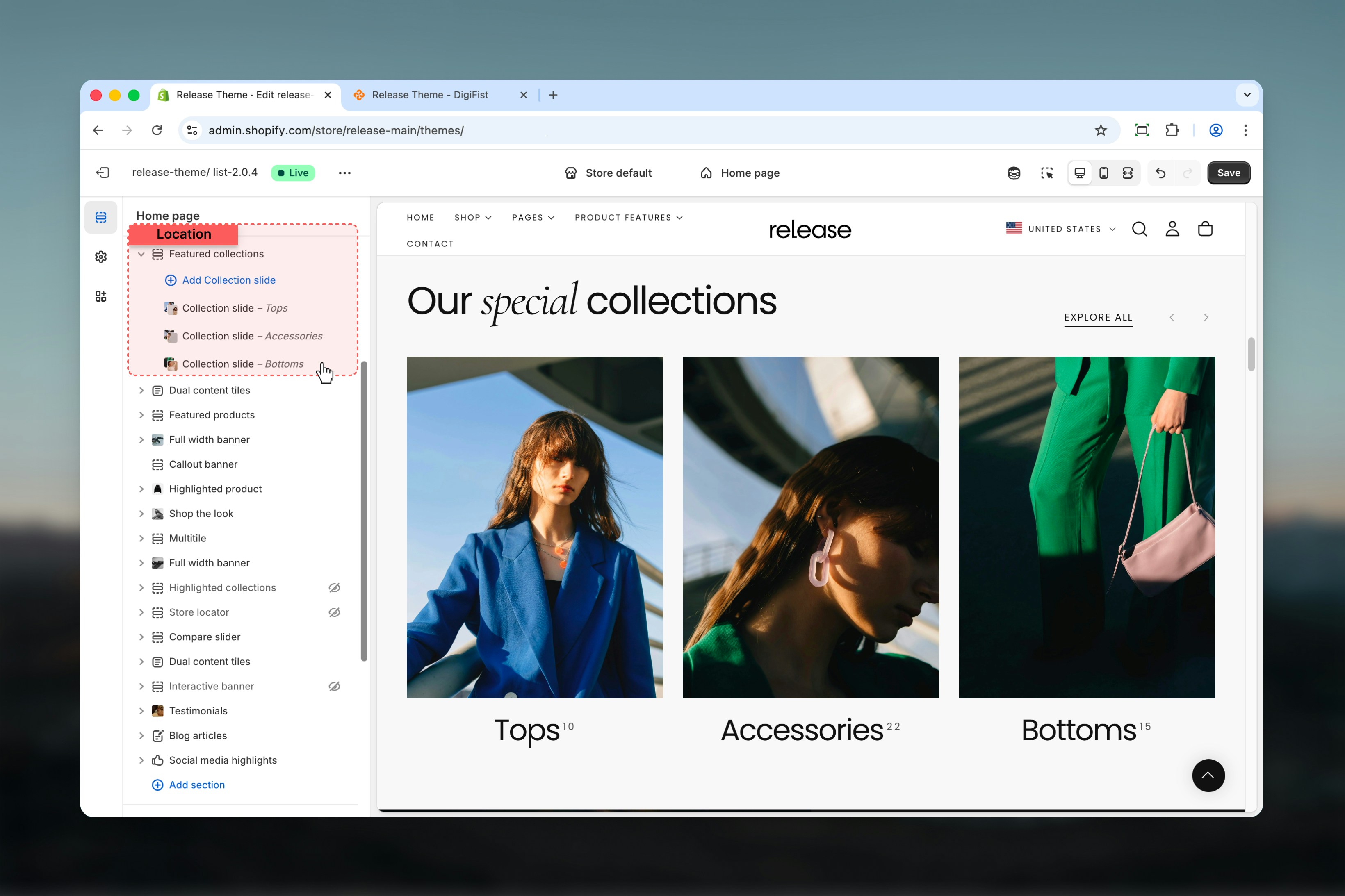
The Featured Collections uses a block-based system:
* Displays selected collections as cards
* Supports carousel behavior for better space usage
* Card appearance and content vary based on layout and card type
* Collections are added as individual slides using blocks
## Getting started
From Shopify admin, access the Theme Customizer.
Add the Featured Collections section to your page or template.
Click **Add Collection slide** to add collections to showcase.
Adjust layout, card style, and slideshow settings.
## What this section controls
This section controls collection showcase displays with the following capabilities:
* Multiple collection card layouts and styles
* Carousel behavior with customizable slides per view
* Flexible heading and button positioning
* Collection, product, or text-based card types
* Desktop and mobile-specific slideshow controls
## How the Featured Collections works
The Featured Collections uses a block-based system:
* Displays selected collections as cards
* Supports carousel behavior for better space usage
* Card appearance and content vary based on layout and card type
* Collections are added as individual slides using blocks
## Getting started
From Shopify admin, access the Theme Customizer.
Add the Featured Collections section to your page or template.
Click **Add Collection slide** to add collections to showcase.
Adjust layout, card style, and slideshow settings.
 ## Section settings
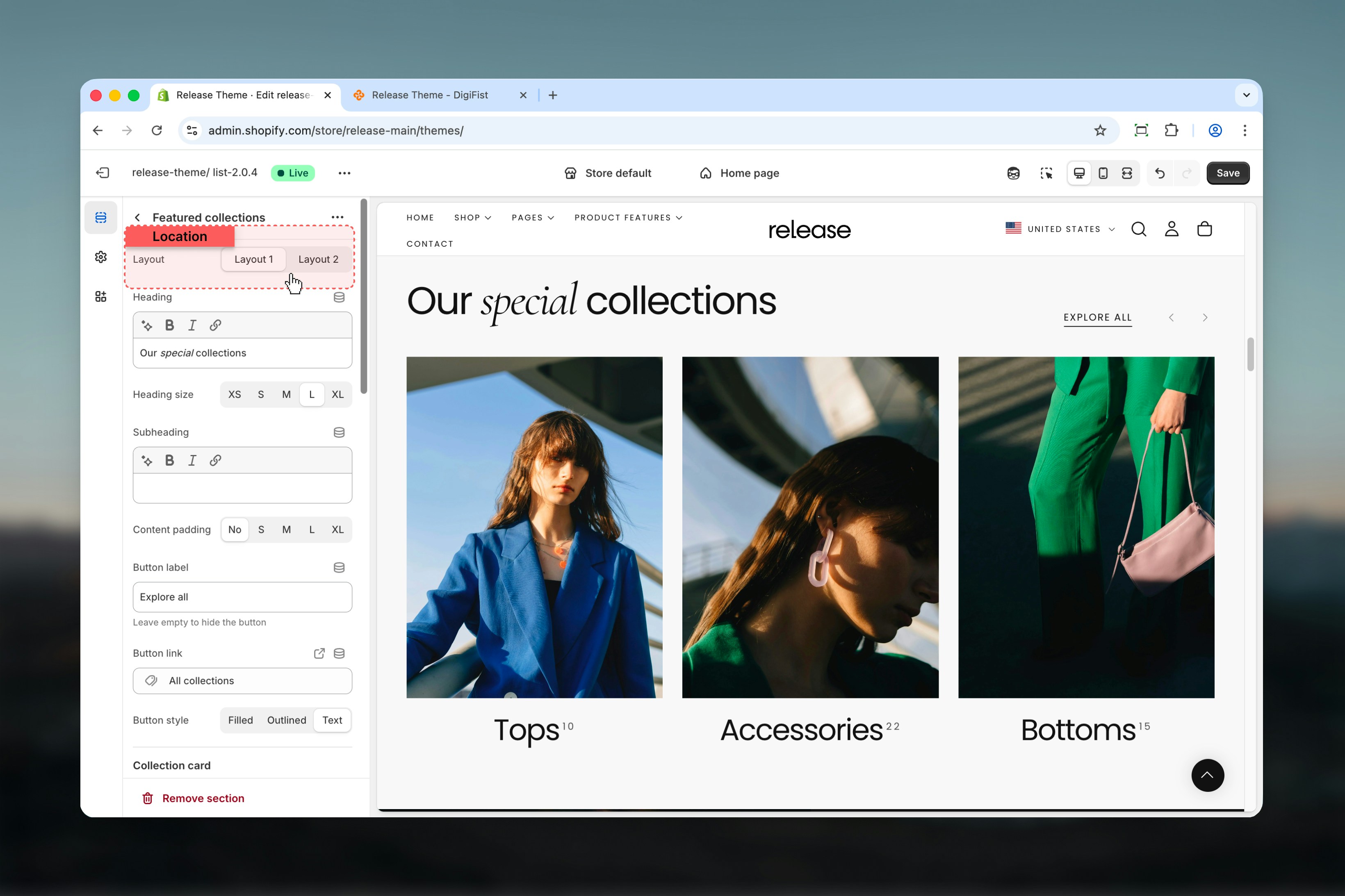
Section settings control layout, heading content, spacing, and slideshow behavior.
### Layout
Determines the positioning of:
* Header content
* Action button
* Navigation arrows
**Available options:** Layout 1, Layout 2
## Section settings
Section settings control layout, heading content, spacing, and slideshow behavior.
### Layout
Determines the positioning of:
* Header content
* Action button
* Navigation arrows
**Available options:** Layout 1, Layout 2
 ### Heading
Main section heading.
* Supports bold, italic, underline, and links
### Heading size
Controls the size of the heading text.
**Available options:** S, M, L, XL
### Subheading
Secondary text displayed below the heading.
* Supports bold, italic, underline, and links
### Content padding
Adds spacing around the content area of the section.
**Available options:** No, S, M, L, XL
### Button label
Defines the action button text.
Leave empty to hide the button.
### Button link
URL used for the section button.
### Button style
Controls the visual appearance of the button.
**Available options:** Filled, Outlined, Text
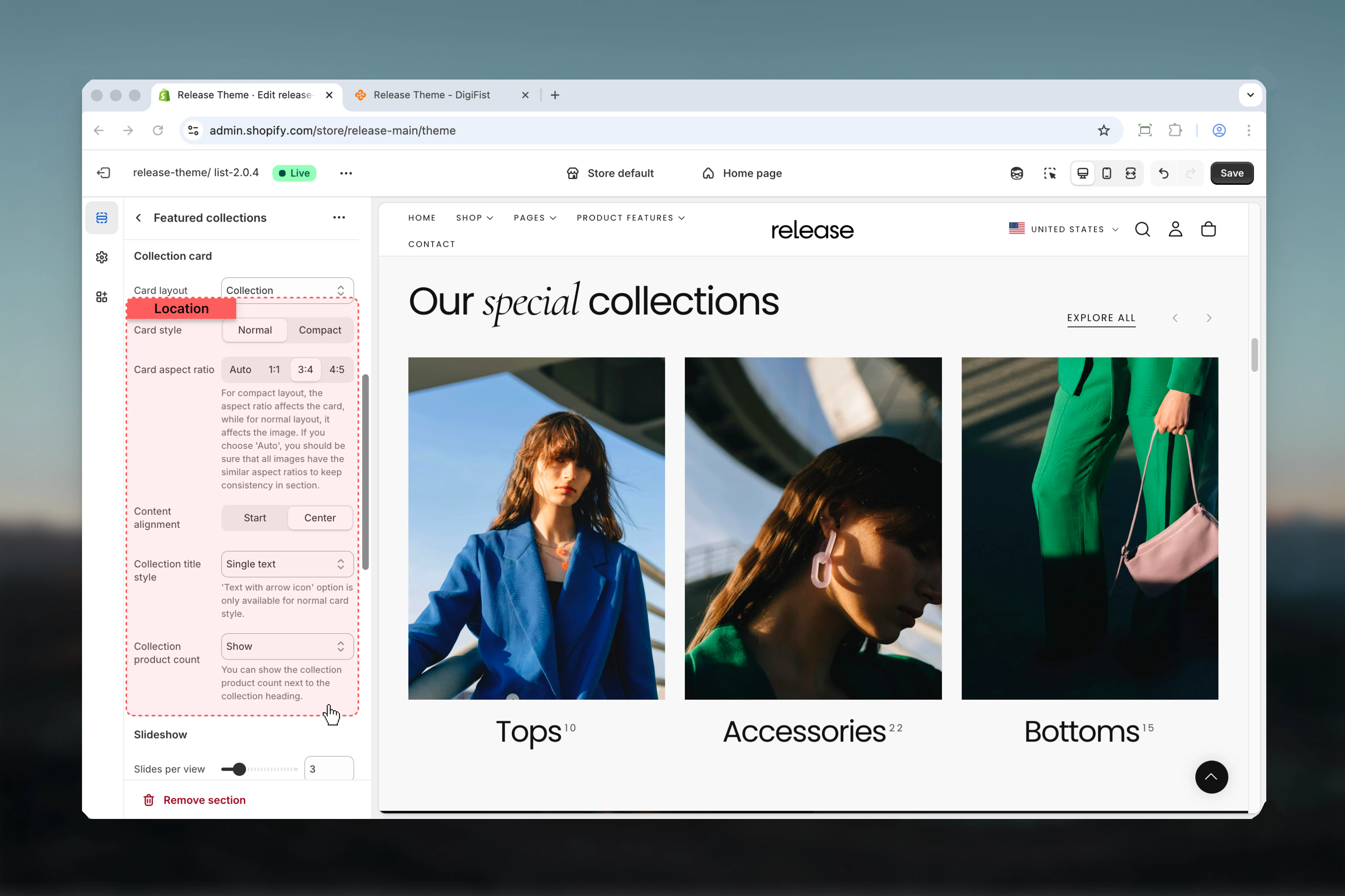
### Card layout
Defines the structure of the collection card.
**Available options:**
* **Collection:** Displays collection image and title
* **Product:** Displays products from the collection
* **Text:** Displays text-based cards without product visuals
### Heading
Main section heading.
* Supports bold, italic, underline, and links
### Heading size
Controls the size of the heading text.
**Available options:** S, M, L, XL
### Subheading
Secondary text displayed below the heading.
* Supports bold, italic, underline, and links
### Content padding
Adds spacing around the content area of the section.
**Available options:** No, S, M, L, XL
### Button label
Defines the action button text.
Leave empty to hide the button.
### Button link
URL used for the section button.
### Button style
Controls the visual appearance of the button.
**Available options:** Filled, Outlined, Text
### Card layout
Defines the structure of the collection card.
**Available options:**
* **Collection:** Displays collection image and title
* **Product:** Displays products from the collection
* **Text:** Displays text-based cards without product visuals
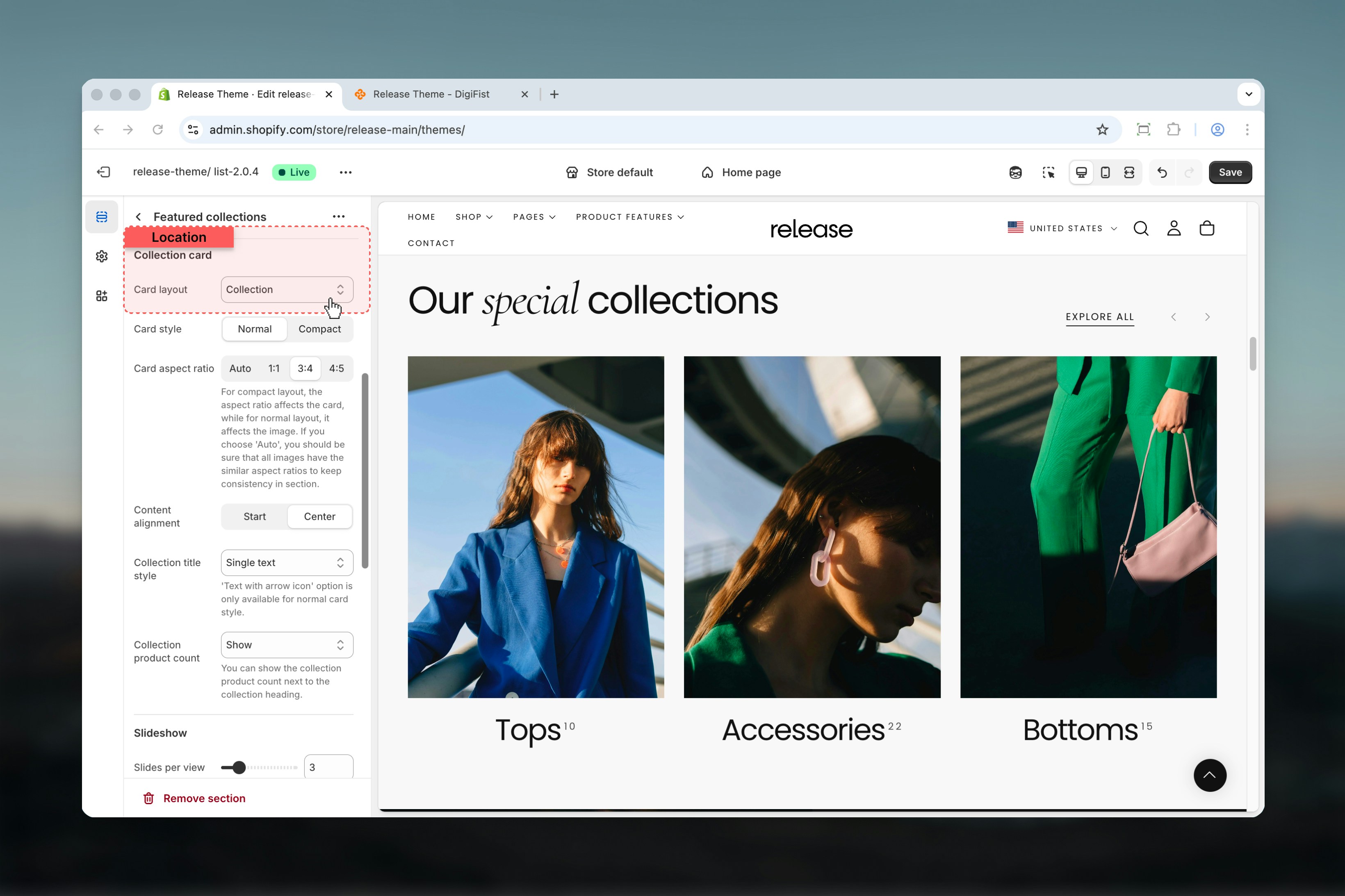 ### Card style
Controls spacing and density of the card.
**Available options:** Normal, Compact
### Card aspect ratio
Controls image or card proportions.
**Available options:** Auto, 1:1, 3:4, 4:5
For **Compact** layout, the aspect ratio affects the entire card. For **Normal** layout, it affects only the image. When using **Auto**, ensure all images have similar aspect ratios to maintain visual consistency.
### Content alignment
Aligns text content inside the card.
**Available options:** Start, Center
### Collection title style
Controls how the collection title is displayed.
**Available options:** Single Text, Text with arrow icon
The **Text with arrow icon** option is only available for **Normal** card style.
### Collection product count
Displays the number of products in the collection.
**Available options:** Hide, Show, Show with border
Product count is displayed next to the collection heading.
### Card style
Controls spacing and density of the card.
**Available options:** Normal, Compact
### Card aspect ratio
Controls image or card proportions.
**Available options:** Auto, 1:1, 3:4, 4:5
For **Compact** layout, the aspect ratio affects the entire card. For **Normal** layout, it affects only the image. When using **Auto**, ensure all images have similar aspect ratios to maintain visual consistency.
### Content alignment
Aligns text content inside the card.
**Available options:** Start, Center
### Collection title style
Controls how the collection title is displayed.
**Available options:** Single Text, Text with arrow icon
The **Text with arrow icon** option is only available for **Normal** card style.
### Collection product count
Displays the number of products in the collection.
**Available options:** Hide, Show, Show with border
Product count is displayed next to the collection heading.
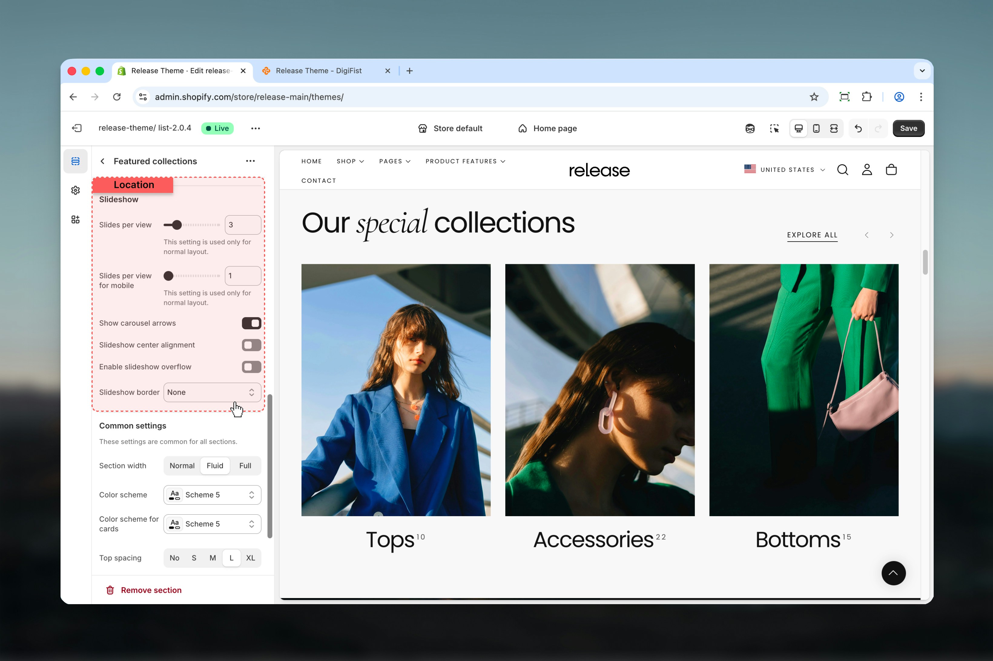
 Controls carousel behavior when collections are displayed in a slider.
### Slides per view
Number of visible slides on desktop.
**Range:** 1 – 12
Used only for **Normal** card layout.
### Slides per view for mobile
Number of visible slides on mobile devices.
**Range:** 1 – 4
Used only for **Normal** card layout.
### Show carousel arrows
Displays navigation arrows.
**Options:** True / False
### Slideshow center alignment
Centers the active slide within the carousel.
**Options:** True / False
### Enable slideshow overflow
Allows slides to overflow outside the container.
**Options:** True / False
When enabled, partially visible cards appear outside the carousel area.
### Slideshow border
Adds decorative borders to the slideshow.
**Available options:** None, Top, Bottom, Both
Controls carousel behavior when collections are displayed in a slider.
### Slides per view
Number of visible slides on desktop.
**Range:** 1 – 12
Used only for **Normal** card layout.
### Slides per view for mobile
Number of visible slides on mobile devices.
**Range:** 1 – 4
Used only for **Normal** card layout.
### Show carousel arrows
Displays navigation arrows.
**Options:** True / False
### Slideshow center alignment
Centers the active slide within the carousel.
**Options:** True / False
### Enable slideshow overflow
Allows slides to overflow outside the container.
**Options:** True / False
When enabled, partially visible cards appear outside the carousel area.
### Slideshow border
Adds decorative borders to the slideshow.
**Available options:** None, Top, Bottom, Both
 ## Block settings
Block settings control individual collection slides. Each block represents a single collection card.
### Collection
Select a collection using Shopify's collection selector.
## Block settings
Block settings control individual collection slides. Each block represents a single collection card.
### Collection
Select a collection using Shopify's collection selector.
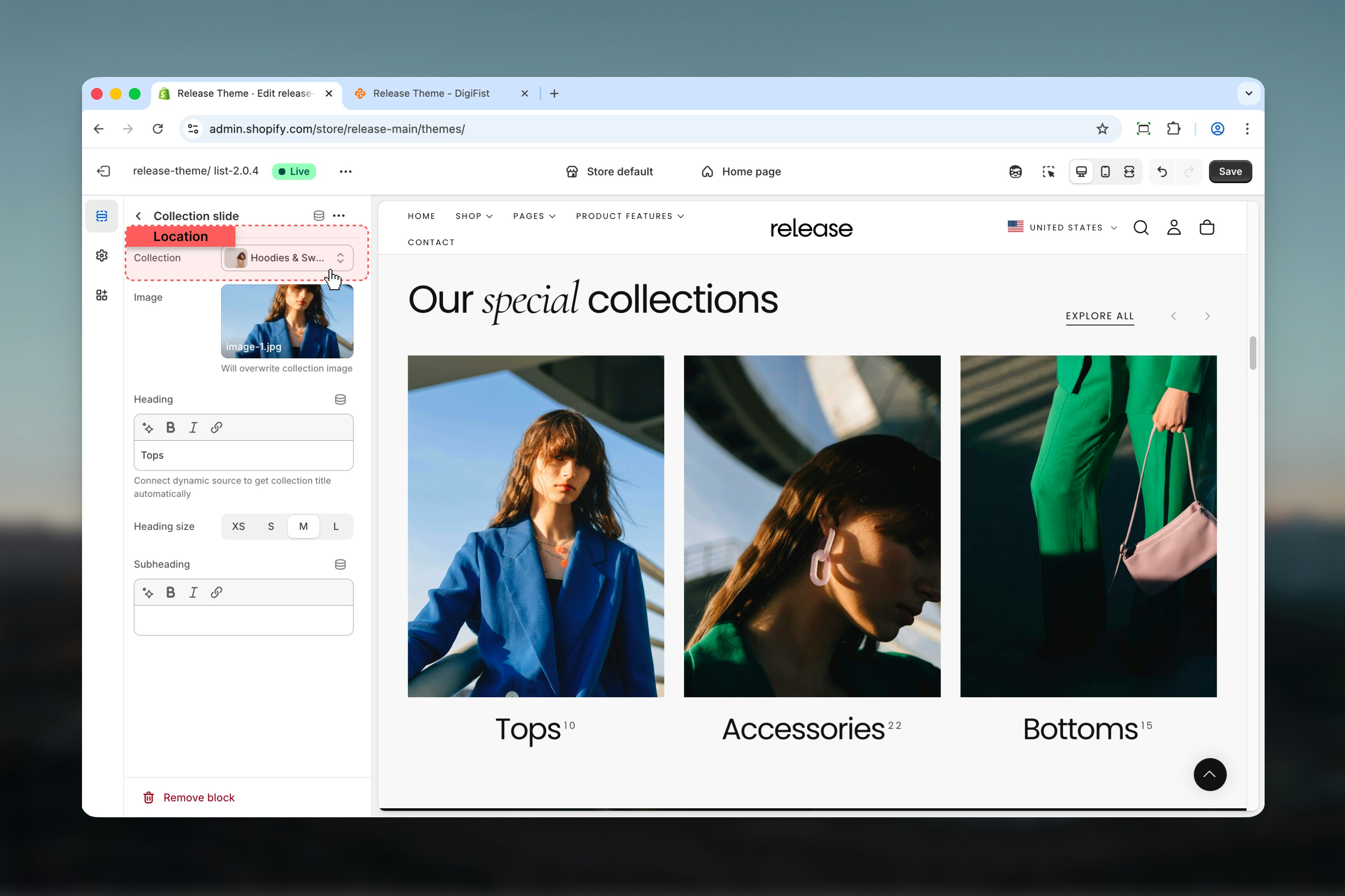 ### Image
Custom image for the collection card.
This image will overwrite the default collection image.
### Heading
Collection title text.
* Can be connected to a dynamic source to automatically use the collection title
* Supports bold, italic, underline, and links
### Heading size
Controls the size of the collection title.
**Available options:** XS, S, M, L
### Subheading
Additional descriptive text for the collection.
* Supports bold, italic, underline, and links
## Best practices
* Use **Normal card style** for image-heavy collections to showcase visual content
* Use **Compact style** for dense layouts with multiple collections to maximize space
* Keep aspect ratios consistent when using Auto to maintain visual harmony
* Limit slide count to 6-8 for better mobile usability and faster loading
* Enable overflow for a modern, editorial look that hints at more content
* Use consistent collection images across all cards for professional appearance
* Consider card layout based on content type (Collection for images, Product for actual products, Text for category navigation)
* Test slideshow navigation on mobile devices to ensure smooth interaction
## Related guides
Learn about common settings shared across sections
### Image
Custom image for the collection card.
This image will overwrite the default collection image.
### Heading
Collection title text.
* Can be connected to a dynamic source to automatically use the collection title
* Supports bold, italic, underline, and links
### Heading size
Controls the size of the collection title.
**Available options:** XS, S, M, L
### Subheading
Additional descriptive text for the collection.
* Supports bold, italic, underline, and links
## Best practices
* Use **Normal card style** for image-heavy collections to showcase visual content
* Use **Compact style** for dense layouts with multiple collections to maximize space
* Keep aspect ratios consistent when using Auto to maintain visual harmony
* Limit slide count to 6-8 for better mobile usability and faster loading
* Enable overflow for a modern, editorial look that hints at more content
* Use consistent collection images across all cards for professional appearance
* Consider card layout based on content type (Collection for images, Product for actual products, Text for category navigation)
* Test slideshow navigation on mobile devices to ensure smooth interaction
## Related guides
Learn about common settings shared across sections