> ## Documentation Index
> Fetch the complete documentation index at: https://docs.digifist.com/llms.txt
> Use this file to discover all available pages before exploring further.
# Featured Products
> Showcase selected products or collections with multiple layouts, slideshows, and tab-based grouping.
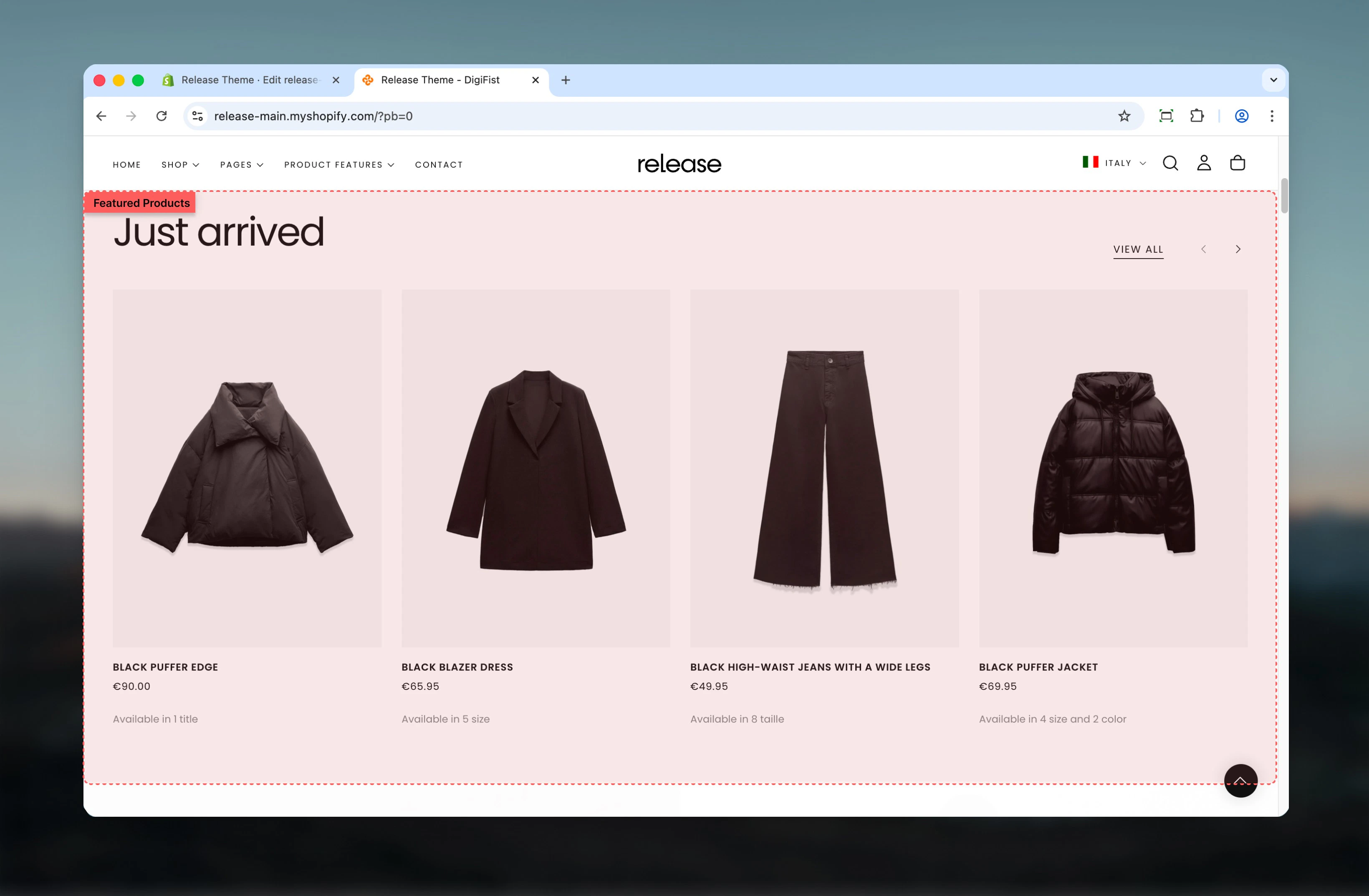
The Featured Products section showcases selected products or collections in a visually prominent layout. It supports multiple layouts, slideshows, and tab-based product grouping to display different product sets within a single section.
Featured product displays help drive conversions by highlighting curated selections, seasonal collections, or promotional items in an engaging format.
 ## What this section controls
This section controls product showcase displays with the following capabilities:
* Multiple layout options for heading and button positioning
* Product carousel with slideshow controls
* Tab-based navigation for multiple product groups
* Manual or collection-based product selection
* Optional promotional card at the end of product list
## How the Featured Products section works
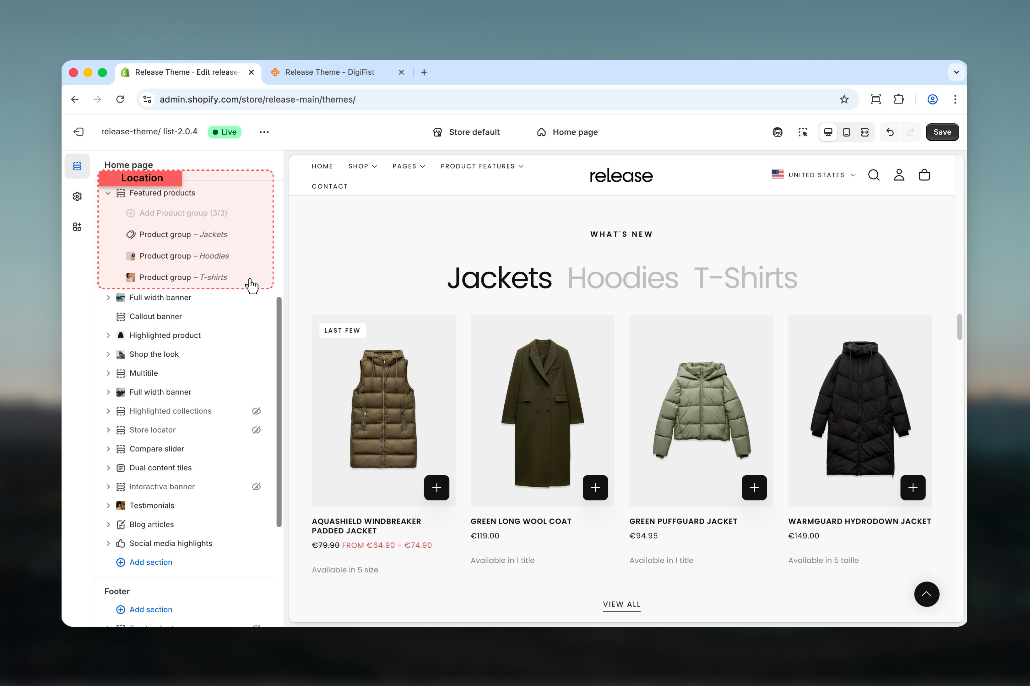
The Featured Products section uses a block-based system:
* Products are displayed using **Product group** blocks
* Each Product group represents one collection or product set
* If multiple Product group blocks are added, the section can display **tabs**
* Products can be sourced from collections, manual selections, or vendors
## Getting started
From Shopify admin, access the Theme Customizer.
Add the Featured Products section to your page or template.
Click **Add Product group** to define product sources.
Adjust section and product group settings according to your needs.
## What this section controls
This section controls product showcase displays with the following capabilities:
* Multiple layout options for heading and button positioning
* Product carousel with slideshow controls
* Tab-based navigation for multiple product groups
* Manual or collection-based product selection
* Optional promotional card at the end of product list
## How the Featured Products section works
The Featured Products section uses a block-based system:
* Products are displayed using **Product group** blocks
* Each Product group represents one collection or product set
* If multiple Product group blocks are added, the section can display **tabs**
* Products can be sourced from collections, manual selections, or vendors
## Getting started
From Shopify admin, access the Theme Customizer.
Add the Featured Products section to your page or template.
Click **Add Product group** to define product sources.
Adjust section and product group settings according to your needs.
 ## Section settings
Section settings control the overall structure, layout, and behavior of the Featured Products section.
### Layout
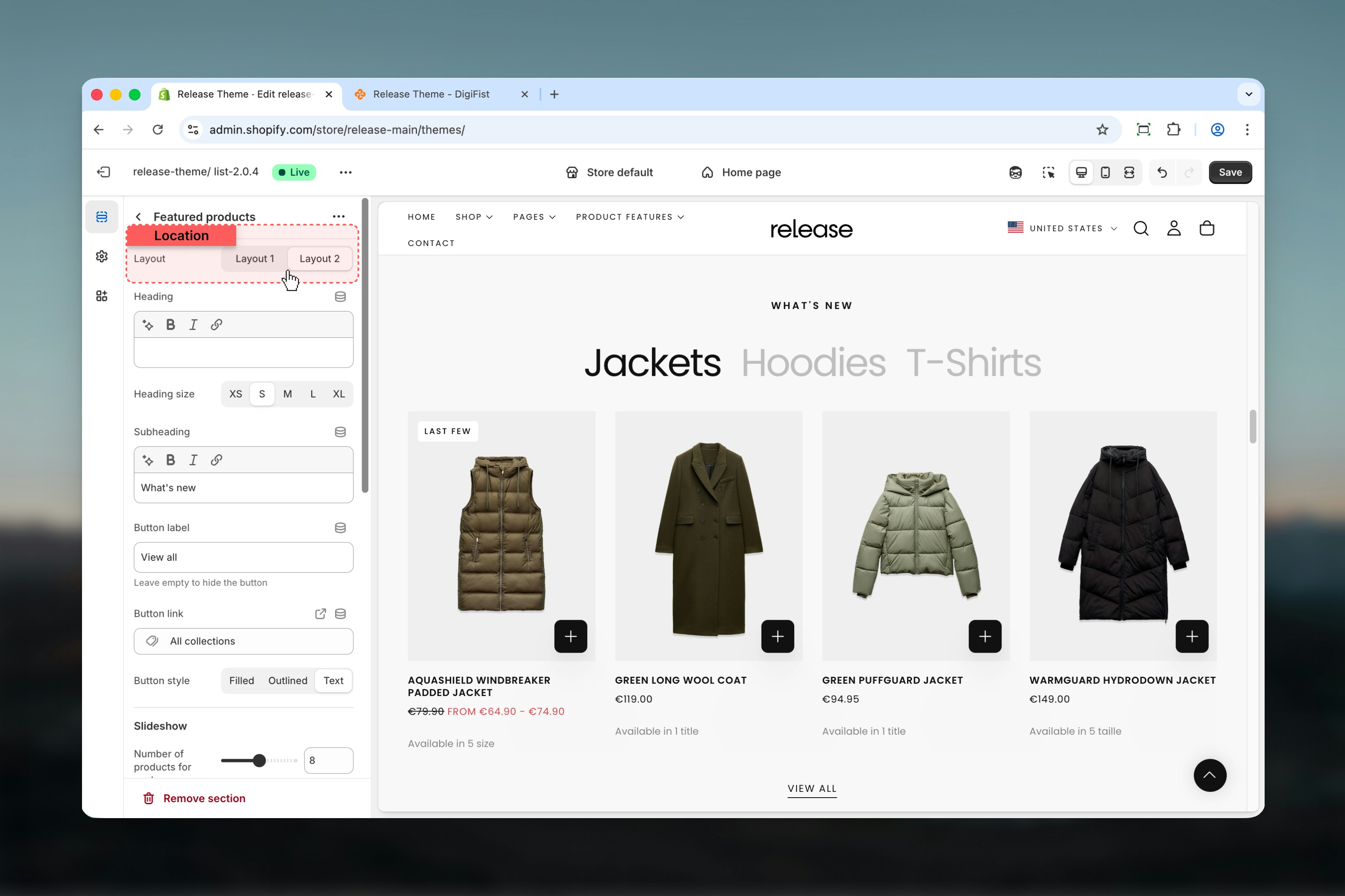
Controls the positioning of the heading and action button. Product card layouts remain the same across layouts.
**Available options:**
* **Layout 1:** Heading aligned to the start, button aligned to the end
* **Layout 2:** Heading centered, button displayed centered at the bottom of the section
## Section settings
Section settings control the overall structure, layout, and behavior of the Featured Products section.
### Layout
Controls the positioning of the heading and action button. Product card layouts remain the same across layouts.
**Available options:**
* **Layout 1:** Heading aligned to the start, button aligned to the end
* **Layout 2:** Heading centered, button displayed centered at the bottom of the section
 ### Heading
Main section heading.
* Supports rich text
* Allows bold, italic, underline, and links
### Heading size
Controls the visual size of the heading.
**Available options:** S, M, L, XL
### Subheading
Secondary text displayed below the heading.
* Supports rich text
* Allows bold, italic, underline, and links
### Button label
Defines the label of the section-level button.
Leave empty to hide the button.
### Button link
Destination URL for the section button.
### Button style
Controls the visual style of the section button.
**Available options:** Filled, Outlined, Text
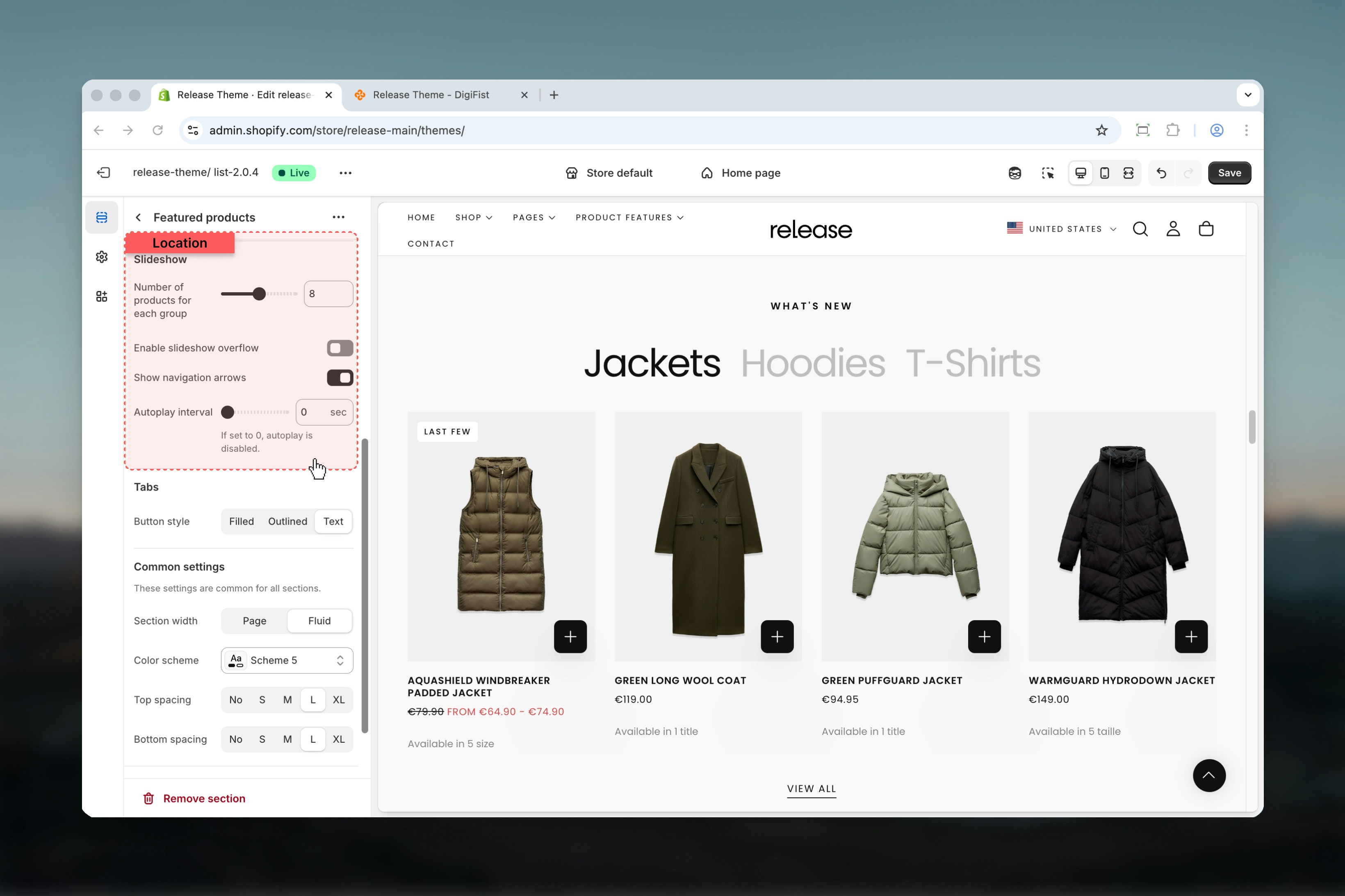
### Number of products for each group
Controls how many products are displayed per Product group.
**Range:** 4 – 12 products
### Enable slideshow overflow
When enabled, the next product partially appears outside the visible area. This creates a visual cue indicating that the carousel can be scrolled.
**Options:** True / False
### Show navigation arrows
Displays navigation arrows for the product carousel.
**Options:** True / False
### Autoplay interval
Controls automatic carousel scrolling.
**Range:** 0 – 10 seconds
* `0` disables autoplay
* Any value above `0` enables autoplay
### Heading
Main section heading.
* Supports rich text
* Allows bold, italic, underline, and links
### Heading size
Controls the visual size of the heading.
**Available options:** S, M, L, XL
### Subheading
Secondary text displayed below the heading.
* Supports rich text
* Allows bold, italic, underline, and links
### Button label
Defines the label of the section-level button.
Leave empty to hide the button.
### Button link
Destination URL for the section button.
### Button style
Controls the visual style of the section button.
**Available options:** Filled, Outlined, Text
### Number of products for each group
Controls how many products are displayed per Product group.
**Range:** 4 – 12 products
### Enable slideshow overflow
When enabled, the next product partially appears outside the visible area. This creates a visual cue indicating that the carousel can be scrolled.
**Options:** True / False
### Show navigation arrows
Displays navigation arrows for the product carousel.
**Options:** True / False
### Autoplay interval
Controls automatic carousel scrolling.
**Range:** 0 – 10 seconds
* `0` disables autoplay
* Any value above `0` enables autoplay
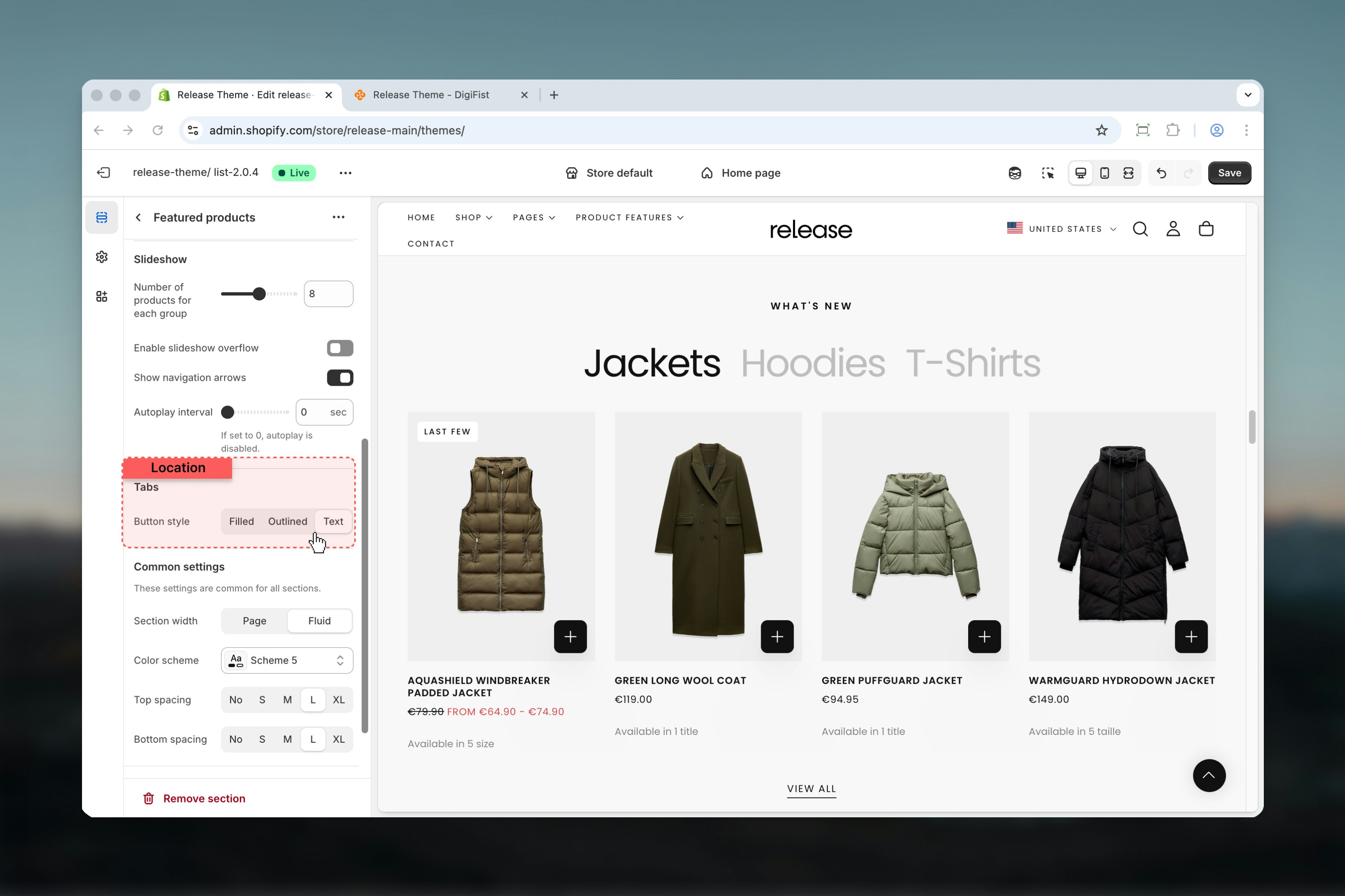
 Tabs allow multiple Product groups to be displayed within a single Featured Products section.
Tabs are only shown when more than one Product group block is active.
### How tabs work
* Each Product group becomes a tab
* The first Product group is shown by default
* Clicking another tab switches the visible product set
* A maximum of **3 Product group blocks** is supported
This allows you to showcase different collections or seasons within one section.
**Example:**
* Summer Season
* Winter Season
### Button style
Controls the visual style of tab buttons.
**Available options:** Filled, Outlined, Text
Tabs allow multiple Product groups to be displayed within a single Featured Products section.
Tabs are only shown when more than one Product group block is active.
### How tabs work
* Each Product group becomes a tab
* The first Product group is shown by default
* Clicking another tab switches the visible product set
* A maximum of **3 Product group blocks** is supported
This allows you to showcase different collections or seasons within one section.
**Example:**
* Summer Season
* Winter Season
### Button style
Controls the visual style of tab buttons.
**Available options:** Filled, Outlined, Text
 ## Block settings
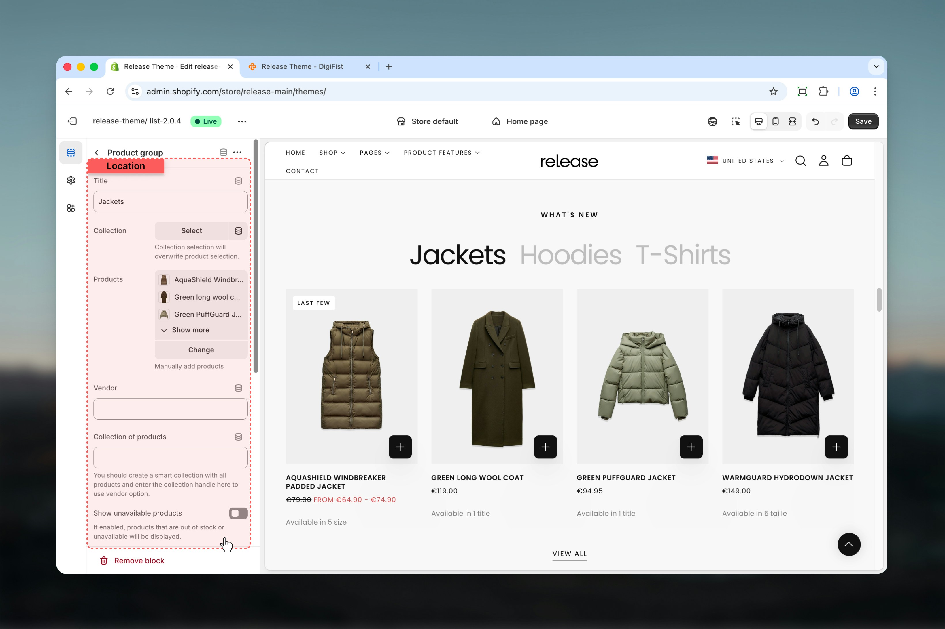
Block settings define the product source and configuration for each Product group. Each Product group represents a unique collection or product set.
### Title
Defines the tab label when multiple Product groups are used.
Plain text only.
### Collection
Select a Shopify collection.
Collection selection overrides manual product selection.
### Products
Manually select individual products.
Used when no collection is selected.
### Vendor
Displays products from a specific vendor.
* Accepts vendor names as text
* Can be connected via metafields
### Collection of products
Used together with the **Vendor** option.
Enter the handle of a smart collection containing all products. This allows vendor-based filtering to work correctly.
### Show unavailable products
Controls whether out-of-stock or unavailable products are displayed.
**Options:** True / False
## Block settings
Block settings define the product source and configuration for each Product group. Each Product group represents a unique collection or product set.
### Title
Defines the tab label when multiple Product groups are used.
Plain text only.
### Collection
Select a Shopify collection.
Collection selection overrides manual product selection.
### Products
Manually select individual products.
Used when no collection is selected.
### Vendor
Displays products from a specific vendor.
* Accepts vendor names as text
* Can be connected via metafields
### Collection of products
Used together with the **Vendor** option.
Enter the handle of a smart collection containing all products. This allows vendor-based filtering to work correctly.
### Show unavailable products
Controls whether out-of-stock or unavailable products are displayed.
**Options:** True / False
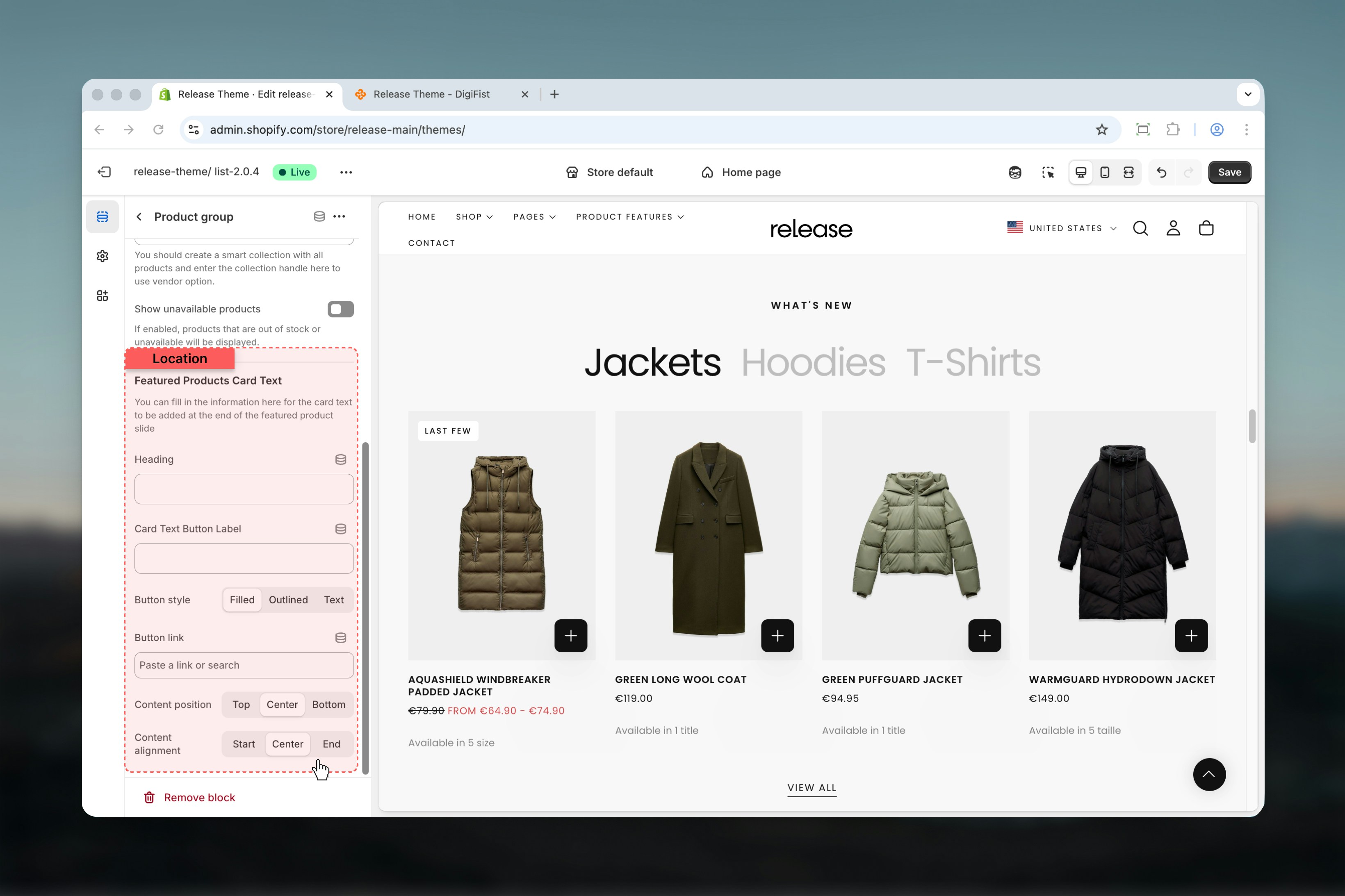
 This optional card appears at the **end of the product carousel**. It can be used for promotional messaging or calls to action.
### Heading
Card title text.
Plain text only.
### Card text button label
Label for the card button.
### Button style
Controls the visual style of the card button.
**Available options:** Filled, Outlined, Text
### Button link
Destination URL for the card button.
### Content position
Controls vertical alignment of the card content.
**Options:** Top, Center, Bottom
### Content alignment
Controls horizontal alignment of the card content.
**Options:** Start, Center, End
This optional card appears at the **end of the product carousel**. It can be used for promotional messaging or calls to action.
### Heading
Card title text.
Plain text only.
### Card text button label
Label for the card button.
### Button style
Controls the visual style of the card button.
**Available options:** Filled, Outlined, Text
### Button link
Destination URL for the card button.
### Content position
Controls vertical alignment of the card content.
**Options:** Top, Center, Bottom
### Content alignment
Controls horizontal alignment of the card content.
**Options:** Start, Center, End
 ## Best practices
* Use collections for easier product management and automatic updates
* Limit the number of tabs to 2-3 to maintain clarity and reduce cognitive load
* Enable slideshow overflow to hint at more products and encourage interaction
* Avoid autoplay for product-heavy sections to allow users to browse at their own pace
* Keep card text concise and action-focused for better conversion rates
* Test different layouts to find what works best for your store's design
* Ensure product images are high-quality and consistent in dimensions
## Related guides
Learn about product card configuration and styling options
Understand global theme configuration options
## Best practices
* Use collections for easier product management and automatic updates
* Limit the number of tabs to 2-3 to maintain clarity and reduce cognitive load
* Enable slideshow overflow to hint at more products and encourage interaction
* Avoid autoplay for product-heavy sections to allow users to browse at their own pace
* Keep card text concise and action-focused for better conversion rates
* Test different layouts to find what works best for your store's design
* Ensure product images are high-quality and consistent in dimensions
## Related guides
Learn about product card configuration and styling options
Understand global theme configuration options