> ## Documentation Index
> Fetch the complete documentation index at: https://docs.digifist.com/llms.txt
> Use this file to discover all available pages before exploring further.
# Contact Form
> Customizable contact form with flexible field types and customer data binding.
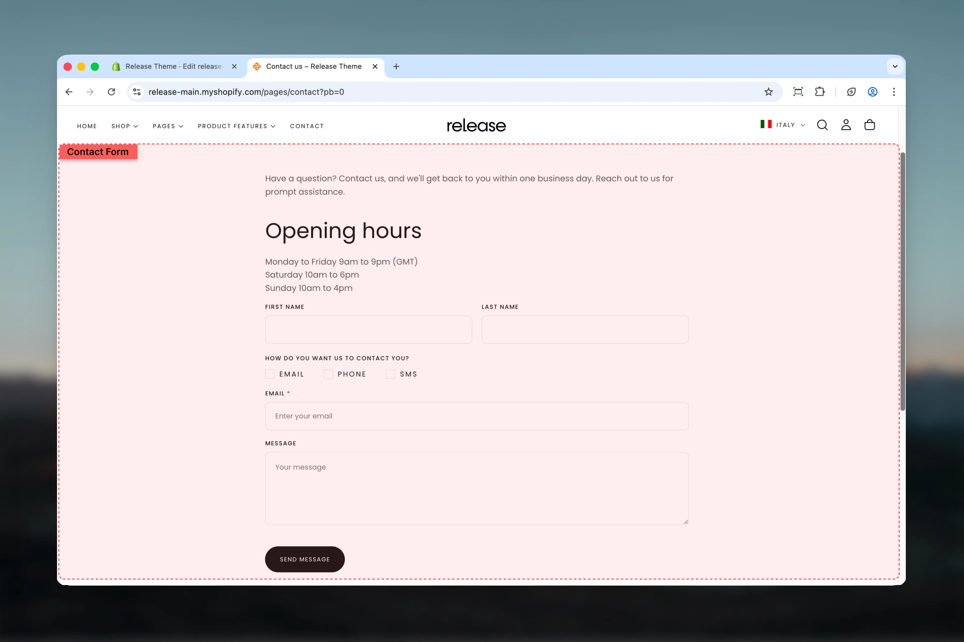
The Contact Form template (form-contact) provides a fully customizable contact form with support for various field types, customer data binding, and flexible layout options.
 ## What this section controls
* Customizable form fields (text, email, tel, checkbox, radio)
* Field layout and column spanning
* Customer data binding for logged-in users
* Required field validation
* Form submission and success messaging
## Section settings
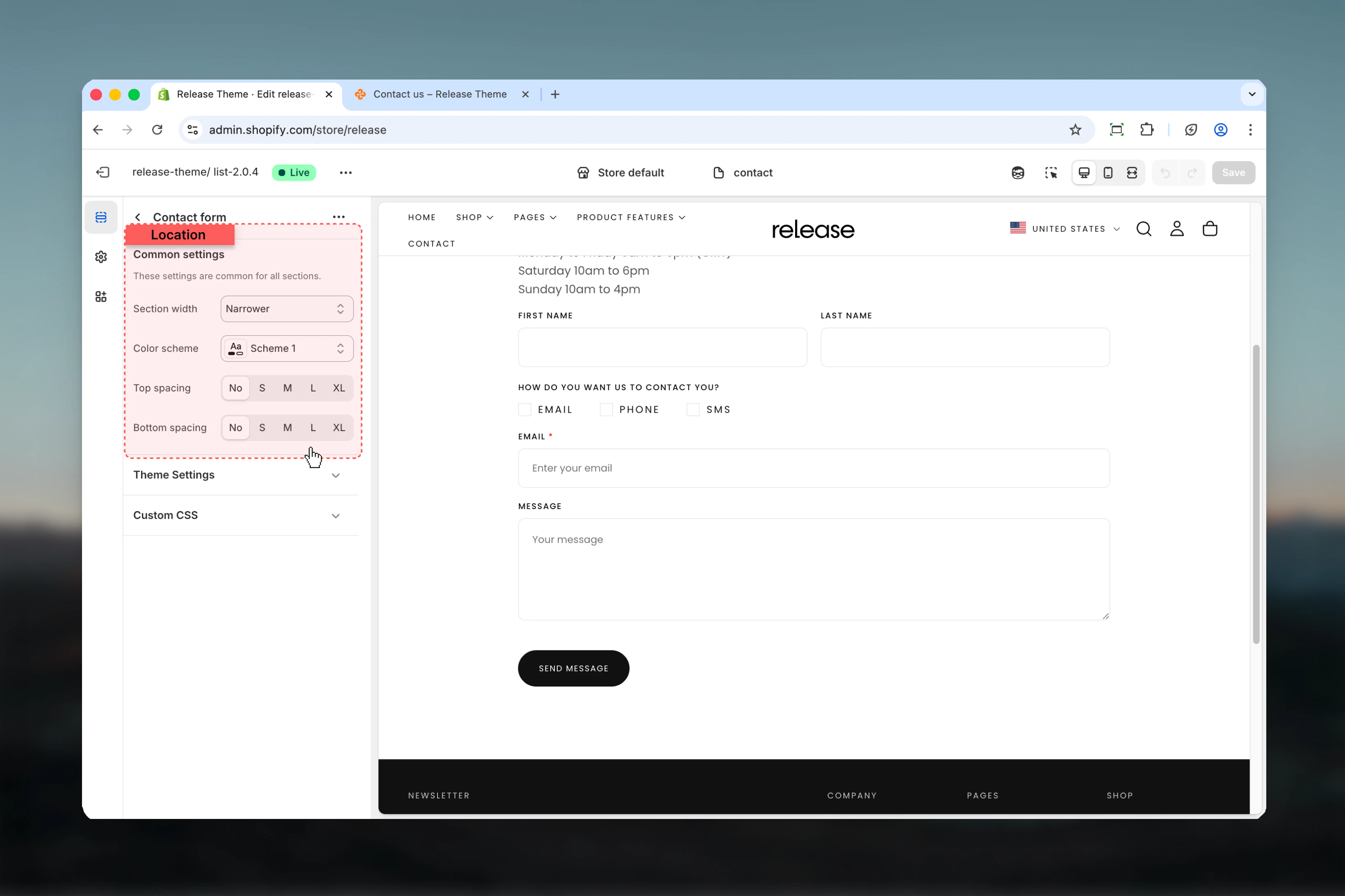
### Section width
Control the maximum width of the contact form.
**Available options:**
* **max-w-page** - Standard container
* **max-w-narrower** - Narrow focused layout
* **max-w-fluid** - Wider container
**Default:** max-w-narrower
Narrower width improves form readability and completion rates by reducing visual noise.
### Color scheme
Select the color scheme for the form section.
* **Default:** scheme-1
### Spacing top & bottom
Adjust padding above and below the form.
**Options:** No (0), S (1), M (2), L (4), XL (6)
* **Default:** M (2) for both
## What this section controls
* Customizable form fields (text, email, tel, checkbox, radio)
* Field layout and column spanning
* Customer data binding for logged-in users
* Required field validation
* Form submission and success messaging
## Section settings
### Section width
Control the maximum width of the contact form.
**Available options:**
* **max-w-page** - Standard container
* **max-w-narrower** - Narrow focused layout
* **max-w-fluid** - Wider container
**Default:** max-w-narrower
Narrower width improves form readability and completion rates by reducing visual noise.
### Color scheme
Select the color scheme for the form section.
* **Default:** scheme-1
### Spacing top & bottom
Adjust padding above and below the form.
**Options:** No (0), S (1), M (2), L (4), XL (6)
* **Default:** M (2) for both
 ## Block settings
### Field Block
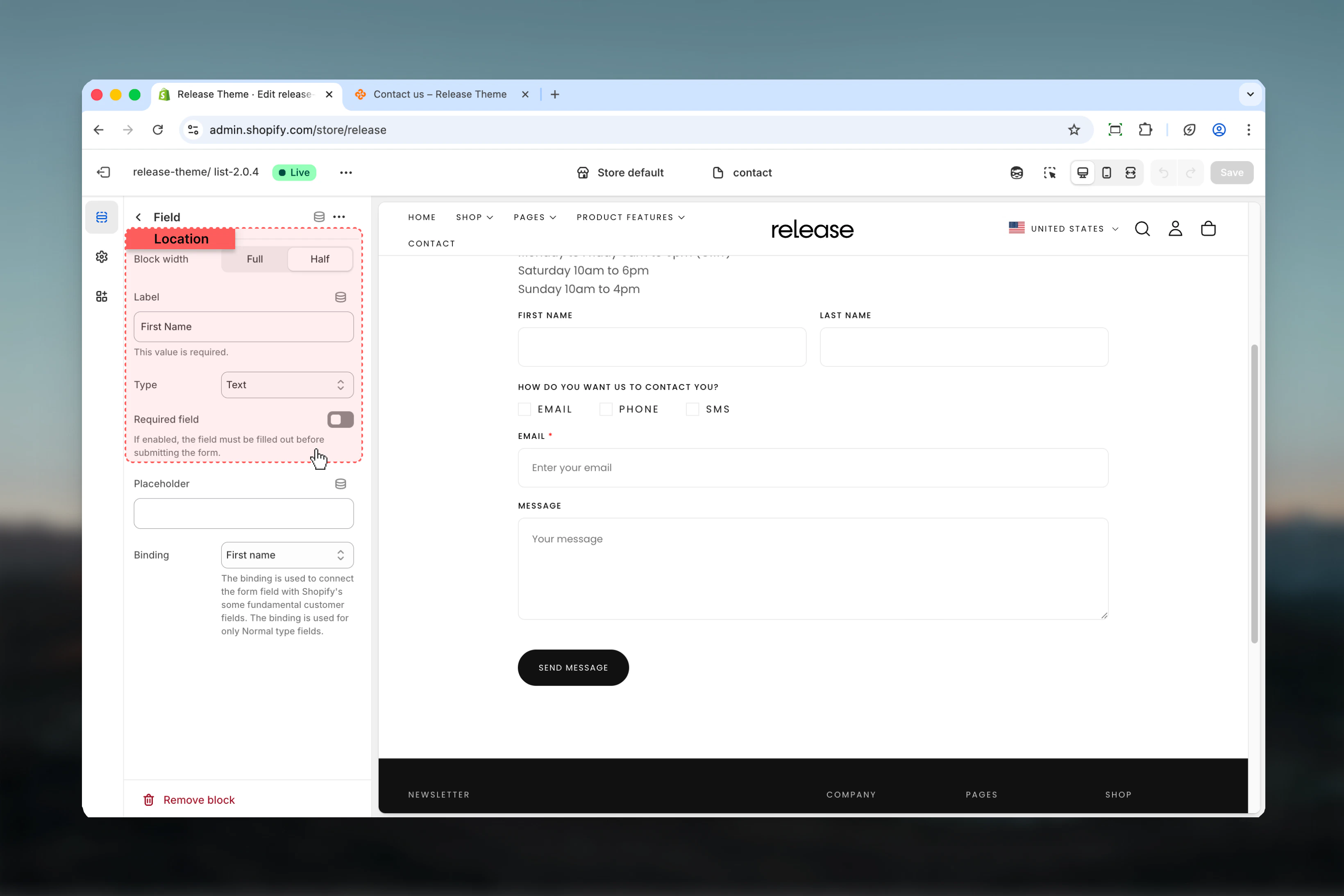
Add customizable form fields to build your contact form. Each field can span full or half width.
### Column factor
Control the width of the field.
**Available options:**
* **Full width** (6) - Spans entire form width
* **Half width** (3) - Takes up half the row
**Default:** Full width
### Heading (Label)
The label text displayed above the field.
* **Default:** "Label"
* This will be used to generate the field name
### Type
Choose the field input type.
**Input fields:**
* **Text** - Single line text input
* **Email** - Email address input
* **Tel** - Telephone number input
**Selection fields:**
* **Checkbox** - Multiple choice checkboxes
* **Radio** - Single choice radio buttons
**Default:** Text
### Required
Mark the field as required for form submission.
* **Default:** Disabled
## Block settings
### Field Block
Add customizable form fields to build your contact form. Each field can span full or half width.
### Column factor
Control the width of the field.
**Available options:**
* **Full width** (6) - Spans entire form width
* **Half width** (3) - Takes up half the row
**Default:** Full width
### Heading (Label)
The label text displayed above the field.
* **Default:** "Label"
* This will be used to generate the field name
### Type
Choose the field input type.
**Input fields:**
* **Text** - Single line text input
* **Email** - Email address input
* **Tel** - Telephone number input
**Selection fields:**
* **Checkbox** - Multiple choice checkboxes
* **Radio** - Single choice radio buttons
**Default:** Text
### Required
Mark the field as required for form submission.
* **Default:** Disabled
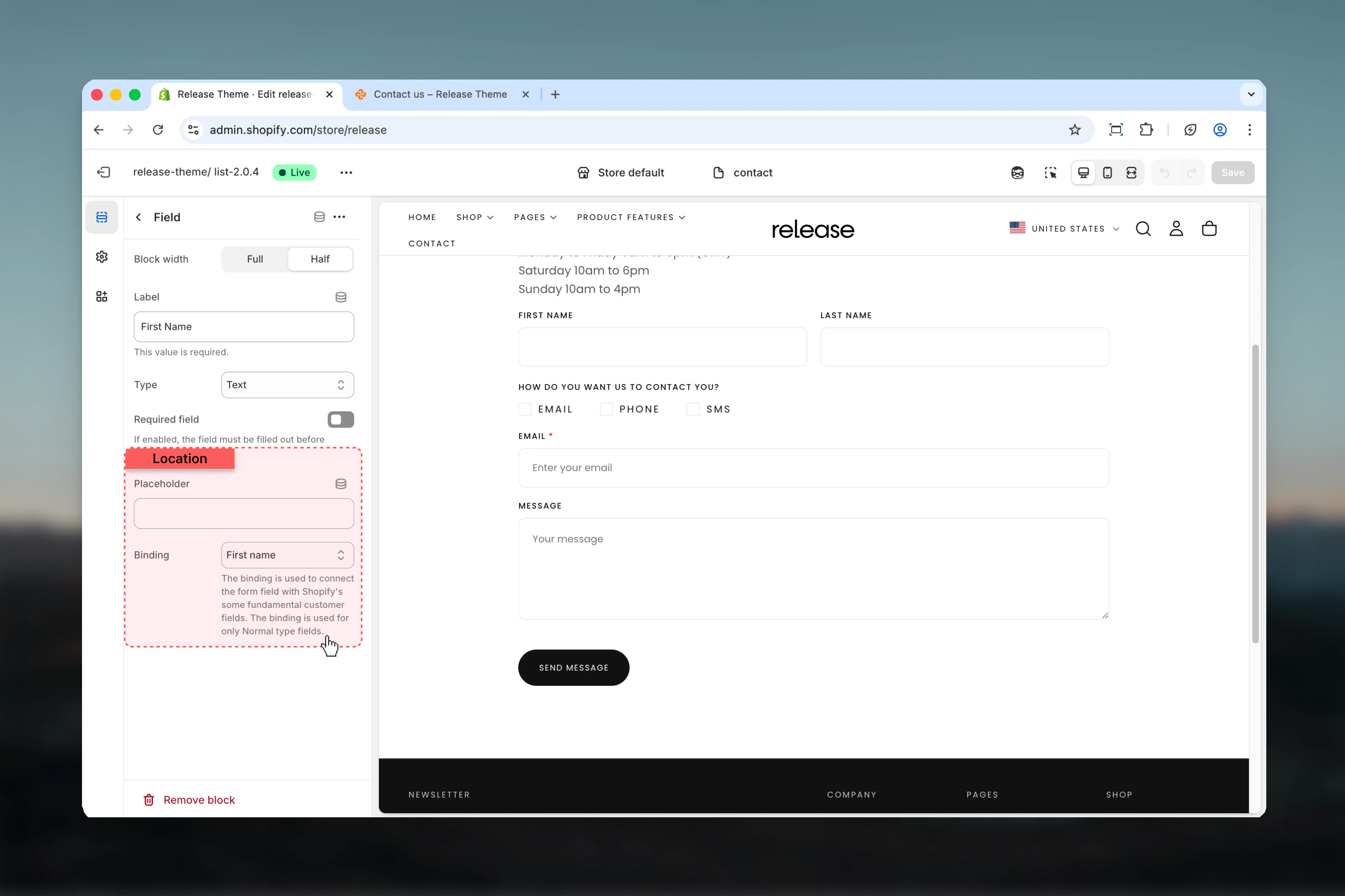
 Available for Text, Email, and Tel field types.
### Placeholder
Placeholder text shown when field is empty.
* Optional hint text for users
### Binding
Bind field to customer data for logged-in users.
**Available options:**
* **Custom** - No binding
* **Email** - Customer email
* **Name** - Full name
* **First name** - First name only
* **Last name** - Last name only
* **ID** - Customer ID
* **Phone** - Phone number
* **Last order** - Last order number
**Default:** Custom
Use email binding for email fields to auto-fill for logged-in customers, improving form completion rates.
Available for Text, Email, and Tel field types.
### Placeholder
Placeholder text shown when field is empty.
* Optional hint text for users
### Binding
Bind field to customer data for logged-in users.
**Available options:**
* **Custom** - No binding
* **Email** - Customer email
* **Name** - Full name
* **First name** - First name only
* **Last name** - Last name only
* **ID** - Customer ID
* **Phone** - Phone number
* **Last order** - Last order number
**Default:** Custom
Use email binding for email fields to auto-fill for logged-in customers, improving form completion rates.
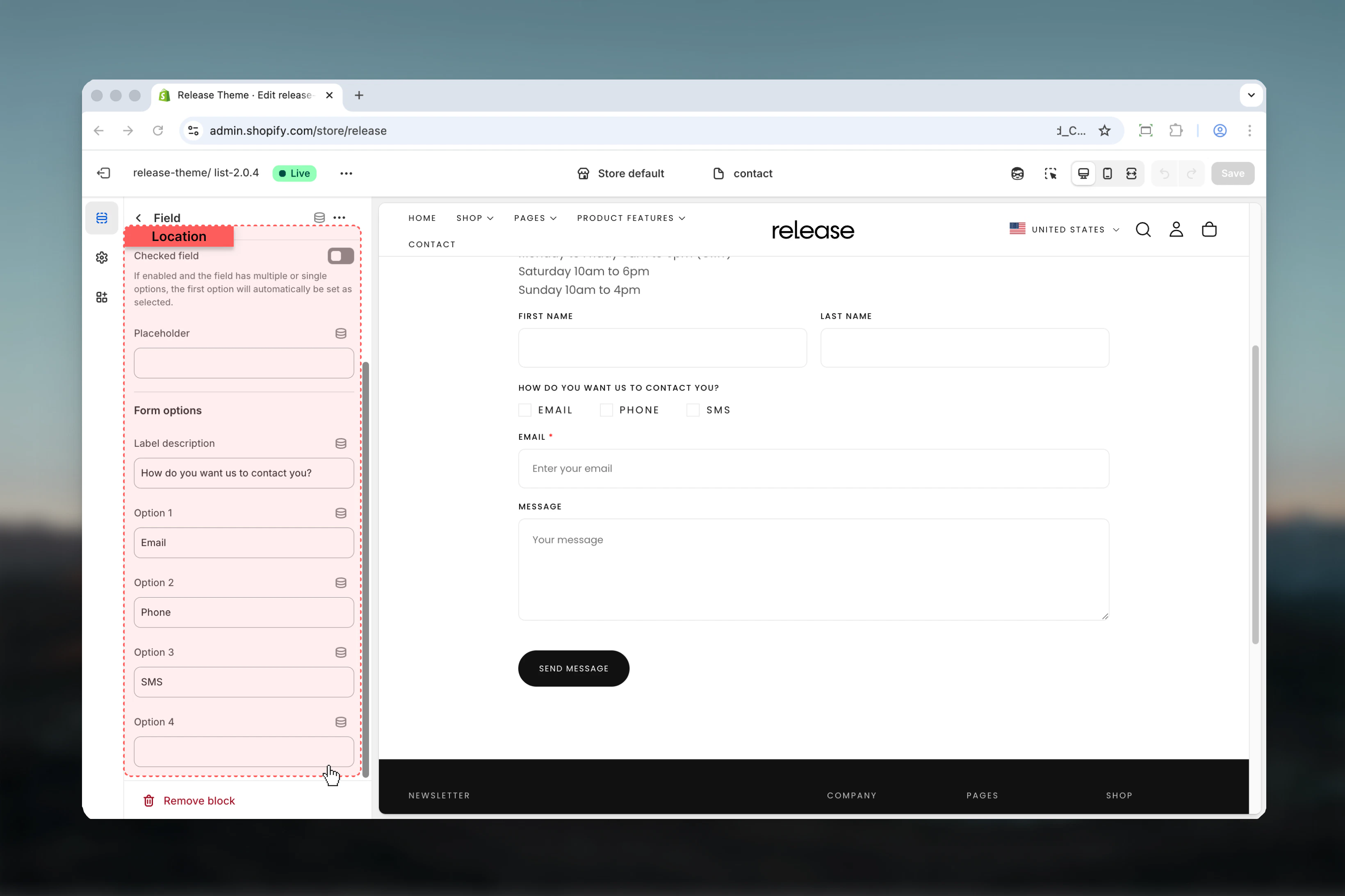
 Available for Checkbox and Radio field types.
### Checked
Set default checked state for checkbox/radio.
* **Default:** Unchecked
### Label description
Additional descriptive text for the selection field.
### Options 1-4
Define up to 4 options for checkbox or radio selection.
* Each option creates a selectable choice
* Leave blank to hide option
Checkbox fields allow multiple selections, while radio fields allow only one selection.
Available for Checkbox and Radio field types.
### Checked
Set default checked state for checkbox/radio.
* **Default:** Unchecked
### Label description
Additional descriptive text for the selection field.
### Options 1-4
Define up to 4 options for checkbox or radio selection.
* Each option creates a selectable choice
* Leave blank to hide option
Checkbox fields allow multiple selections, while radio fields allow only one selection.
 ## Best practices
* **Form width:** Use max-w-narrower (default) for better readability and completion
* **Required fields:** Mark name, email, and message as required minimum
* **Half-width fields:** Use for related pairs (first name/last name, city/zip)
* **Full-width fields:** Use for message/textarea and single important fields
* **Email binding:** Always bind email field to customer email for convenience
* **Field order:** Name → Email → Subject/Reason → Message is standard flow
* **Placeholder text:** Use to provide format hints ("[john@example.com](mailto:john@example.com)", "+1 (555) 123-4567")
* **Checkbox for consent:** Add required checkbox for terms/privacy acceptance
* **Radio for categories:** Use for predefined options (inquiry type, department)
* **Keep it short:** 4-6 fields maximum for higher completion rates
## Common use cases
* **Basic contact** - Name (text, required), Email (email, required, binding: email), Message (text, full-width, required)
* **Support inquiry** - Name, Email (binding: email), Order ID (text, binding: last\_order), Issue type (radio: Technical/Billing/General), Description
* **Newsletter signup** - Email (email, required, binding: email), Consent checkbox (required, "I agree to receive newsletters")
* **Quote request** - First name + Last name (half-width), Email, Phone (tel, binding: phone), Service type (checkbox), Budget range (radio), Details
* **Partnership inquiry** - Company name, Contact name, Email, Phone, Partnership type (radio), Message
* **Product inquiry** - Name, Email, Product interest (radio), Quantity needed, Additional information
## Related guides
Configure newsletter signup popup
Create custom pages for forms
## Best practices
* **Form width:** Use max-w-narrower (default) for better readability and completion
* **Required fields:** Mark name, email, and message as required minimum
* **Half-width fields:** Use for related pairs (first name/last name, city/zip)
* **Full-width fields:** Use for message/textarea and single important fields
* **Email binding:** Always bind email field to customer email for convenience
* **Field order:** Name → Email → Subject/Reason → Message is standard flow
* **Placeholder text:** Use to provide format hints ("[john@example.com](mailto:john@example.com)", "+1 (555) 123-4567")
* **Checkbox for consent:** Add required checkbox for terms/privacy acceptance
* **Radio for categories:** Use for predefined options (inquiry type, department)
* **Keep it short:** 4-6 fields maximum for higher completion rates
## Common use cases
* **Basic contact** - Name (text, required), Email (email, required, binding: email), Message (text, full-width, required)
* **Support inquiry** - Name, Email (binding: email), Order ID (text, binding: last\_order), Issue type (radio: Technical/Billing/General), Description
* **Newsletter signup** - Email (email, required, binding: email), Consent checkbox (required, "I agree to receive newsletters")
* **Quote request** - First name + Last name (half-width), Email, Phone (tel, binding: phone), Service type (checkbox), Budget range (radio), Details
* **Partnership inquiry** - Company name, Contact name, Email, Phone, Partnership type (radio), Message
* **Product inquiry** - Name, Email, Product interest (radio), Quantity needed, Additional information
## Related guides
Configure newsletter signup popup
Create custom pages for forms