> ## Documentation Index
> Fetch the complete documentation index at: https://docs.digifist.com/llms.txt
> Use this file to discover all available pages before exploring further.
# Full Width Banner
> Create immersive, edge-to-edge banners with flexible block-based content system.
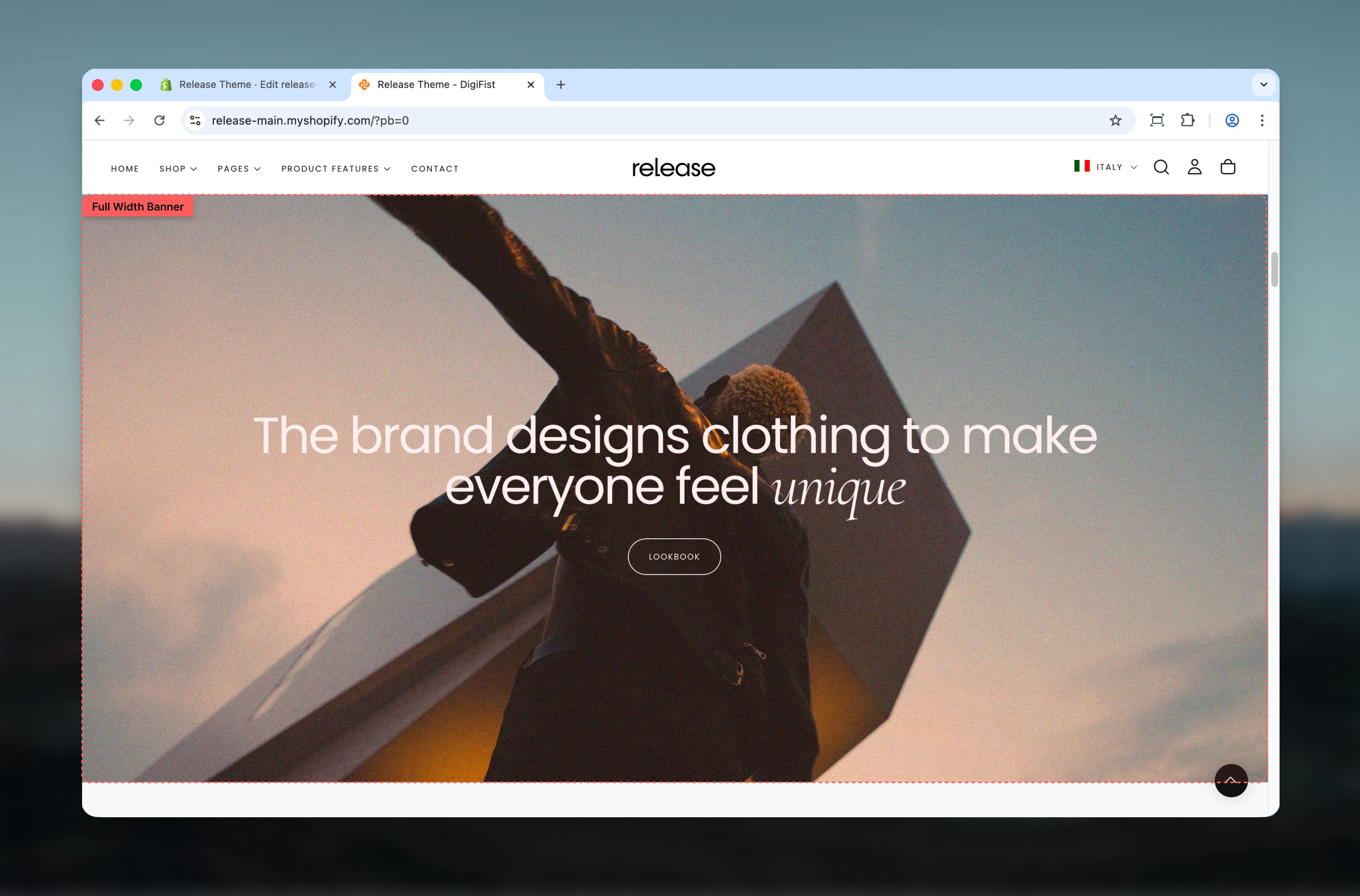
The Full Width Banner section creates immersive, edge-to-edge banners using a flexible, block-based content system. Content inside the banner is built using individual blocks, allowing precise control over structure, hierarchy, and visibility.
Full width banners help create impactful visual experiences by spanning the entire viewport width and offering flexible media positioning options with granular content control.
 ## What this section controls
This section controls full-width banner displays with the following capabilities:
* Edge-to-edge banners spanning the full viewport width
* Flexible media positioning (top, bottom, or background)
* Block-based content structure for precise control
* Desktop and mobile-specific layouts and media
* Transparent header integration when placed first on page
## How the Full Width Banner works
The Full Width Banner uses a block-based content system:
* The section spans the full width of the viewport
* Media can be positioned above, below, or behind the content
* Content is built using **blocks** instead of fixed text fields
* Desktop and mobile layouts can be configured independently
* When placed at the top of the page, the banner can enable a transparent header
## Getting started
From Shopify admin, access the Theme Customizer.
Add the Full Width Banner section to your page or template.
Click **Add block** to create heading, subheading, text, or button blocks.
Adjust section settings and media positioning according to your needs.
## What this section controls
This section controls full-width banner displays with the following capabilities:
* Edge-to-edge banners spanning the full viewport width
* Flexible media positioning (top, bottom, or background)
* Block-based content structure for precise control
* Desktop and mobile-specific layouts and media
* Transparent header integration when placed first on page
## How the Full Width Banner works
The Full Width Banner uses a block-based content system:
* The section spans the full width of the viewport
* Media can be positioned above, below, or behind the content
* Content is built using **blocks** instead of fixed text fields
* Desktop and mobile layouts can be configured independently
* When placed at the top of the page, the banner can enable a transparent header
## Getting started
From Shopify admin, access the Theme Customizer.
Add the Full Width Banner section to your page or template.
Click **Add block** to create heading, subheading, text, or button blocks.
Adjust section settings and media positioning according to your needs.
 ## Section settings
Section settings control the overall layout and media behavior of the banner.
### Enable transparent header
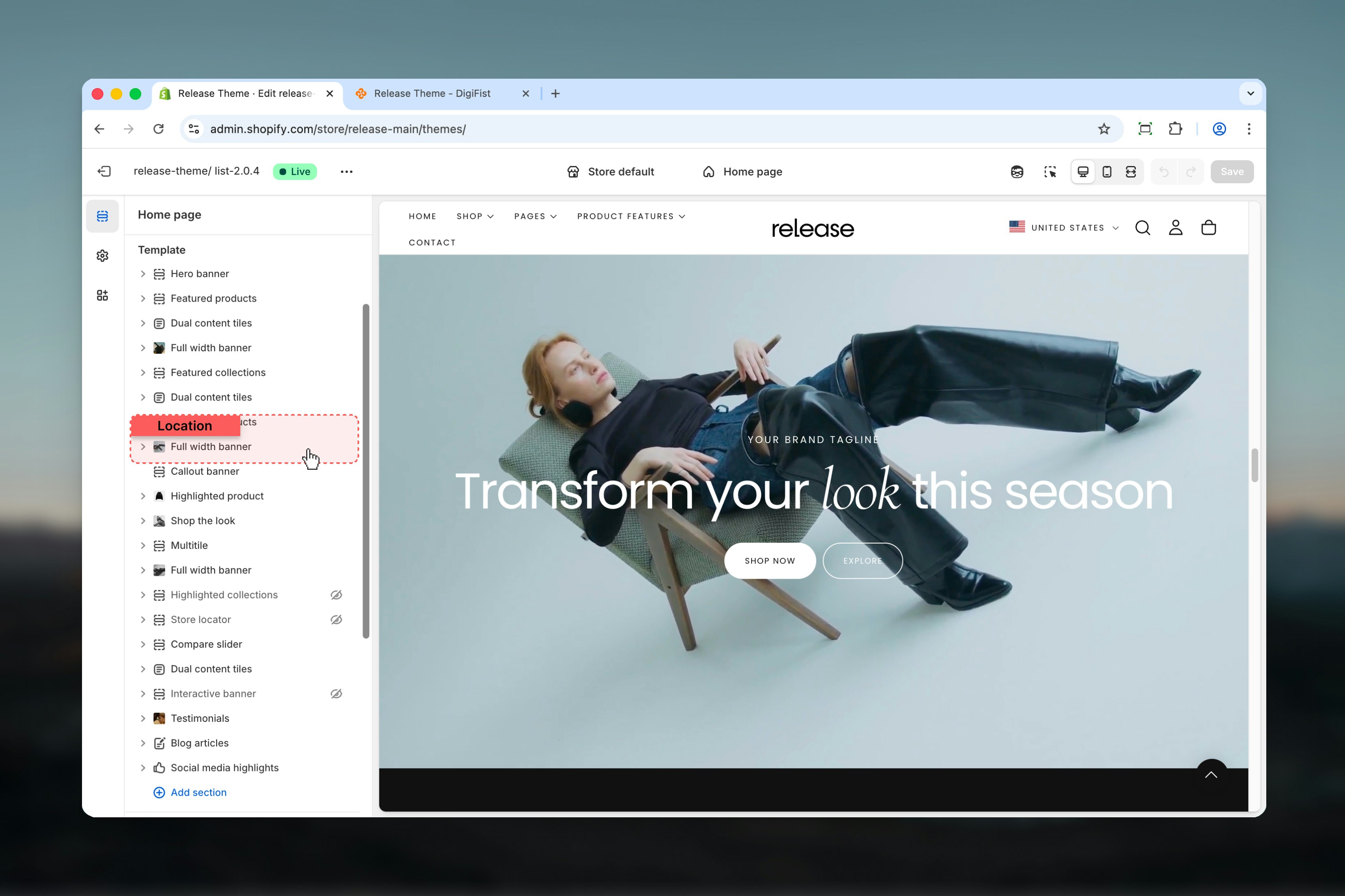
When enabled, the header becomes transparent **only if this section is the first section on the page**.
This allows the banner media to appear behind the header.
This setting only works when the section is placed first. Ensure sufficient contrast between the banner media and header navigation.
## Section settings
Section settings control the overall layout and media behavior of the banner.
### Enable transparent header
When enabled, the header becomes transparent **only if this section is the first section on the page**.
This allows the banner media to appear behind the header.
This setting only works when the section is placed first. Ensure sufficient contrast between the banner media and header navigation.
 ### Media position
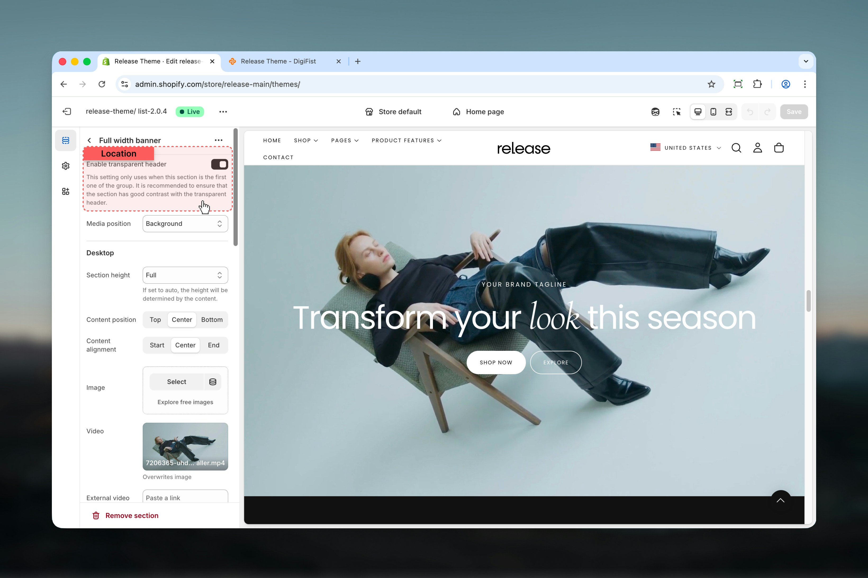
Controls where the media appears relative to the content.
**Available options:**
* **Top:** Media appears above the content
* **Bottom:** Media appears below the content
* **Background:** Media appears behind the content
### Media position
Controls where the media appears relative to the content.
**Available options:**
* **Top:** Media appears above the content
* **Bottom:** Media appears below the content
* **Background:** Media appears behind the content
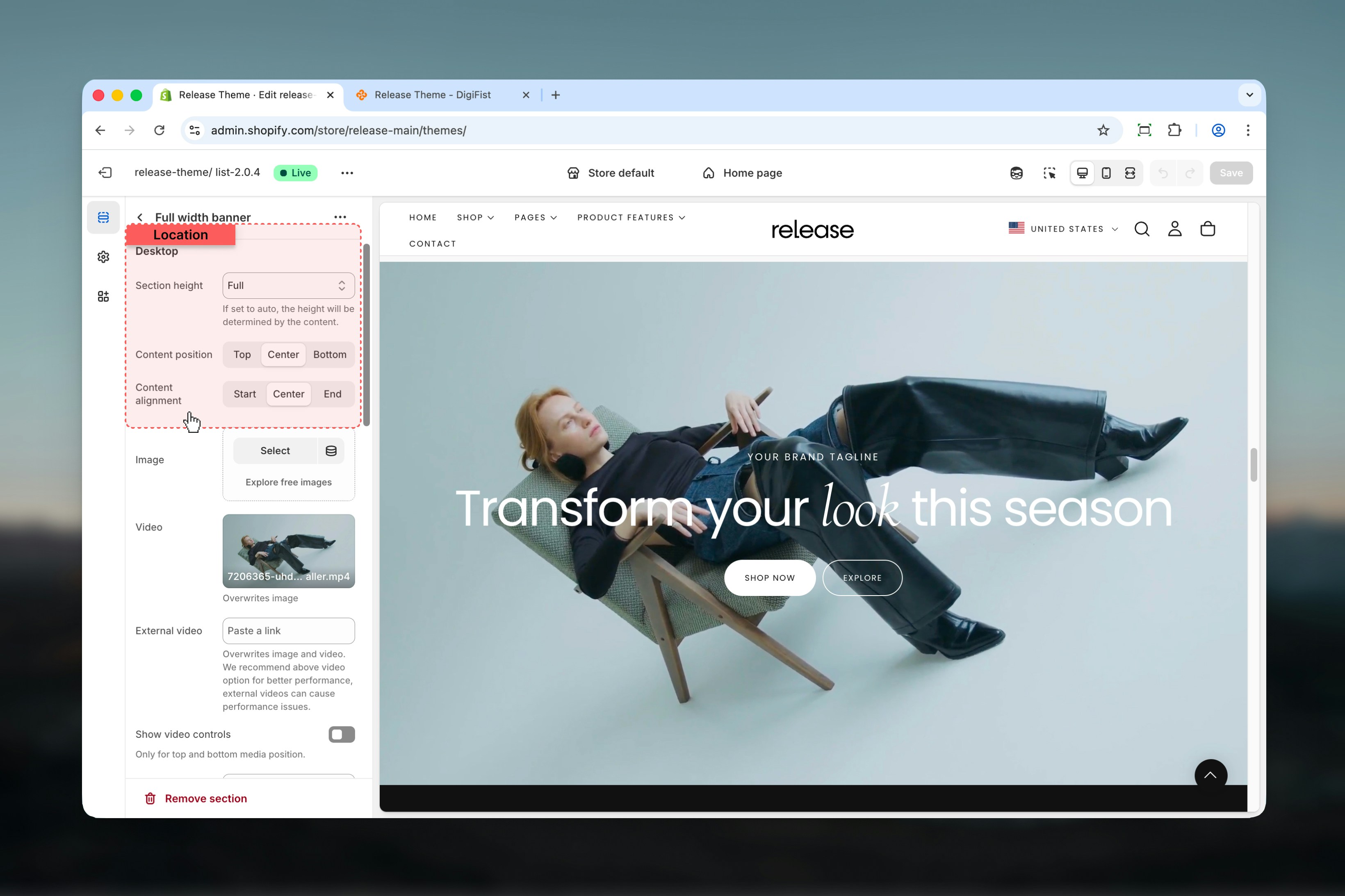
 ### Section height
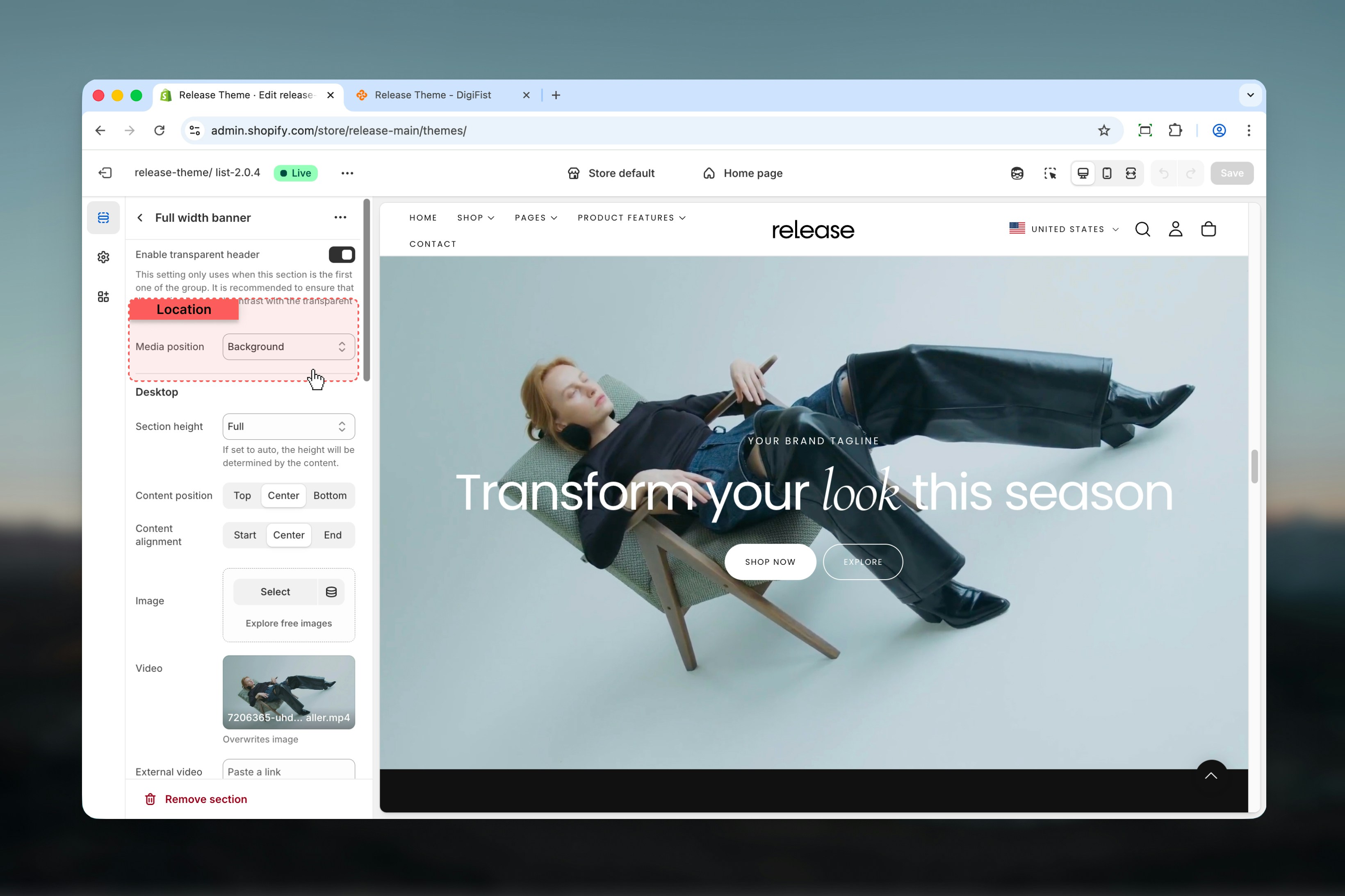
Controls the height of the banner.
**Available options:**
* **Auto:** Height is determined by content
* **Third:** One-third of the viewport height
* **Half:** Half of the viewport height
* **Full:** Full viewport height
### Vertical position
Controls how the banner content stretches vertically.
**Available options:** Stretch, Start, Center, End
### Content position
Controls vertical positioning of content.
**Options:** Top, Center, Bottom
### Content alignment
Controls horizontal alignment of content.
**Options:** Start, Center, End
### Section height
Controls the height of the banner.
**Available options:**
* **Auto:** Height is determined by content
* **Third:** One-third of the viewport height
* **Half:** Half of the viewport height
* **Full:** Full viewport height
### Vertical position
Controls how the banner content stretches vertically.
**Available options:** Stretch, Start, Center, End
### Content position
Controls vertical positioning of content.
**Options:** Top, Center, Bottom
### Content alignment
Controls horizontal alignment of content.
**Options:** Start, Center, End
 ### Image
Select an image for desktop devices.
### Video
Select a Shopify-hosted video.
### External video
Overrides both image and video.
External videos may negatively impact performance. Shopify-hosted videos are recommended.
### Show video controls
Shows or hides video playback controls.
**Options:** True / False
### Tile aspect ratio
Controls the aspect ratio of images and videos.
**Auto** is recommended when the banner contains long text.
**Available options:** Auto, Square, Portrait, Landscape
Each group includes multiple ratio presets.
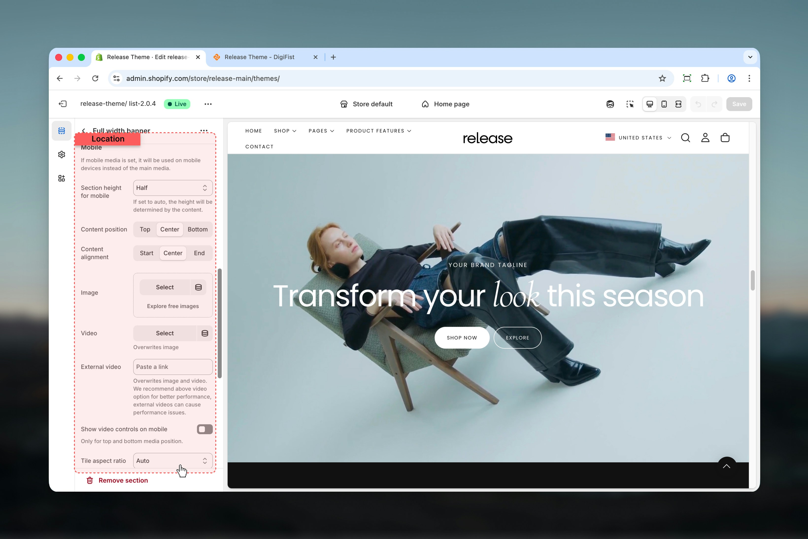
Mobile settings override desktop layout and media when defined.
### Section height for mobile
Controls the banner height on mobile devices.
**Available options:**
* **Auto:** Height is determined by content
* **Third:** One-third of the viewport height
* **Half:** Half of the viewport height
* **Full:** Full viewport height
### Vertical position
Controls vertical behavior on mobile.
**Options:** Stretch, Start, Center, End
### Content position
Controls vertical positioning on mobile.
**Options:** Top, Center, Bottom
### Content alignment
Controls horizontal alignment on mobile.
**Options:** Start, Center, End
### Image
Select an image used on mobile devices.
### Video
Select a video used on mobile devices.
### External video
Overrides both image and video on mobile.
External videos may negatively impact performance.
### Show video controls on mobile
Shows or hides video playback controls on mobile.
**Options:** True / False
### Tile aspect ratio
Controls the aspect ratio of mobile images and videos.
**Available options:** Auto, Square, Portrait, Landscape
### Image
Select an image for desktop devices.
### Video
Select a Shopify-hosted video.
### External video
Overrides both image and video.
External videos may negatively impact performance. Shopify-hosted videos are recommended.
### Show video controls
Shows or hides video playback controls.
**Options:** True / False
### Tile aspect ratio
Controls the aspect ratio of images and videos.
**Auto** is recommended when the banner contains long text.
**Available options:** Auto, Square, Portrait, Landscape
Each group includes multiple ratio presets.
Mobile settings override desktop layout and media when defined.
### Section height for mobile
Controls the banner height on mobile devices.
**Available options:**
* **Auto:** Height is determined by content
* **Third:** One-third of the viewport height
* **Half:** Half of the viewport height
* **Full:** Full viewport height
### Vertical position
Controls vertical behavior on mobile.
**Options:** Stretch, Start, Center, End
### Content position
Controls vertical positioning on mobile.
**Options:** Top, Center, Bottom
### Content alignment
Controls horizontal alignment on mobile.
**Options:** Start, Center, End
### Image
Select an image used on mobile devices.
### Video
Select a video used on mobile devices.
### External video
Overrides both image and video on mobile.
External videos may negatively impact performance.
### Show video controls on mobile
Shows or hides video playback controls on mobile.
**Options:** True / False
### Tile aspect ratio
Controls the aspect ratio of mobile images and videos.
**Available options:** Auto, Square, Portrait, Landscape
 ## Content blocks
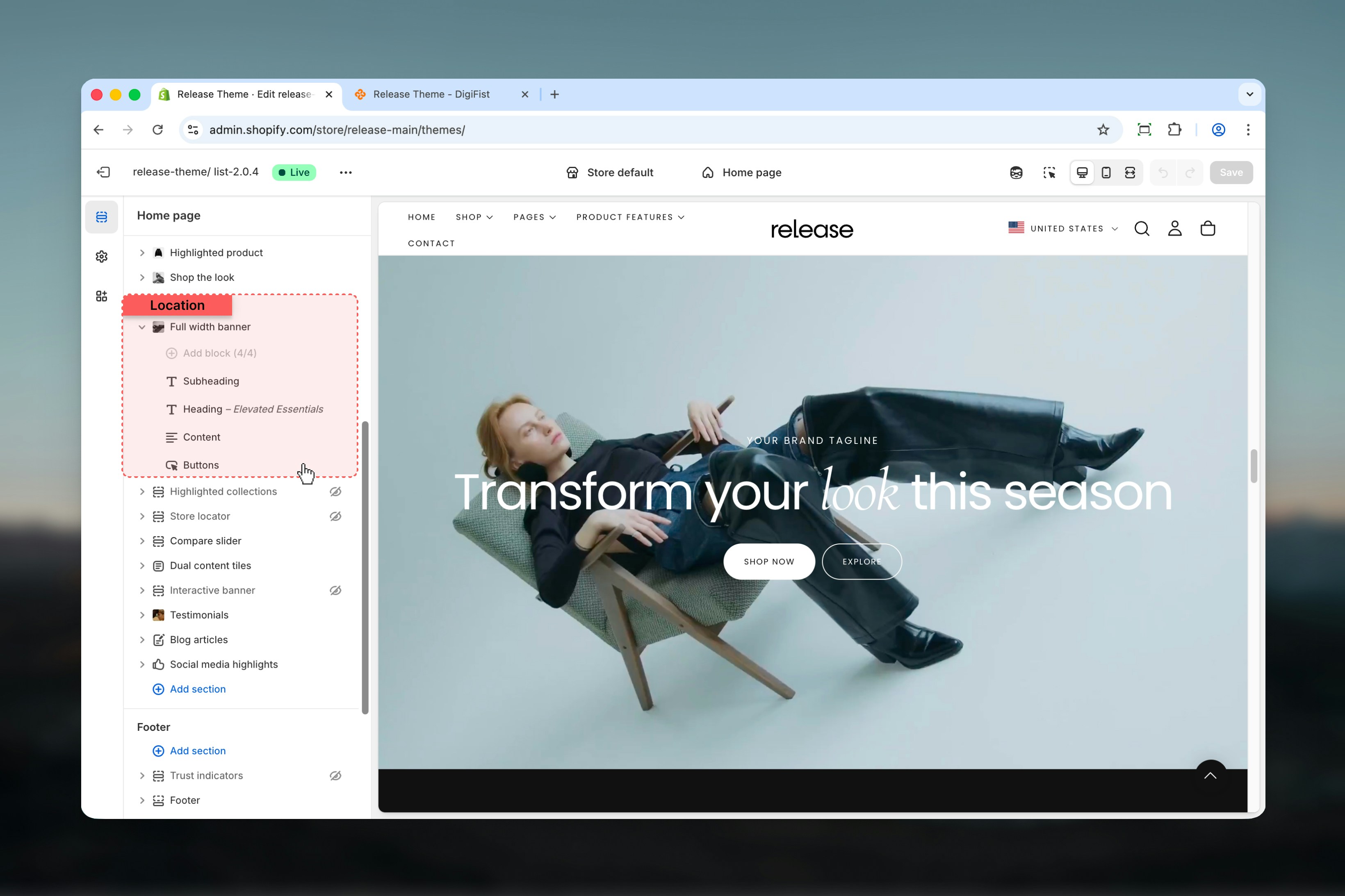
Content inside the Full Width Banner is built using blocks. Blocks can be reordered and selectively enabled per device.
Used to display a main heading inside the banner.
### Heading
Main heading text.
* Supports bold, italic, underline, and links
### Heading size
Controls the size of the heading.
**Available options:** XS, S, M, L, XL
Used for secondary text below the main heading.
### Subheading
Subheading text.
* Supports bold, italic, underline, and links
### Link
Optional URL applied to the subheading.
Used for longer descriptive text.
### Text
Rich text content.
* Supports paragraphs and headings (H1–H4)
* Allows bold, italic, and links
Used to add one or two call-to-action buttons.
### First button
* **Link:** Destination URL
* **Link type:** Button / Card
* **Label:** Text label
* **Style:** Filled, Outlined, Text
* **Color scheme:** Shopify color scheme selector
### Second button
* **Link:** Destination URL
* **Link type:** Button / Card
* **Label:** Text label
* **Style:** Filled, Outlined, Text
* **Color scheme:** Shopify color scheme selector
Displays breadcrumb navigation inside the banner.
### Show on
Controls which devices breadcrumbs are visible on.
**Available options:** Desktop, Mobile, Both
## Content blocks
Content inside the Full Width Banner is built using blocks. Blocks can be reordered and selectively enabled per device.
Used to display a main heading inside the banner.
### Heading
Main heading text.
* Supports bold, italic, underline, and links
### Heading size
Controls the size of the heading.
**Available options:** XS, S, M, L, XL
Used for secondary text below the main heading.
### Subheading
Subheading text.
* Supports bold, italic, underline, and links
### Link
Optional URL applied to the subheading.
Used for longer descriptive text.
### Text
Rich text content.
* Supports paragraphs and headings (H1–H4)
* Allows bold, italic, and links
Used to add one or two call-to-action buttons.
### First button
* **Link:** Destination URL
* **Link type:** Button / Card
* **Label:** Text label
* **Style:** Filled, Outlined, Text
* **Color scheme:** Shopify color scheme selector
### Second button
* **Link:** Destination URL
* **Link type:** Button / Card
* **Label:** Text label
* **Style:** Filled, Outlined, Text
* **Color scheme:** Shopify color scheme selector
Displays breadcrumb navigation inside the banner.
### Show on
Controls which devices breadcrumbs are visible on.
**Available options:** Desktop, Mobile, Both
 ## Best practices
* Use block order to control content hierarchy and reading flow
* Prefer **Background** media position for hero-style banners to create immersive experiences
* Avoid external videos unless necessary due to performance impact
* Use Auto height for content-heavy banners to ensure all content is visible
* Test contrast carefully when using transparent headers for navigation visibility
* Keep mobile content concise as vertical space is limited
* Use high-quality images that maintain clarity at full viewport width
* Consider load time when using full-width, high-resolution media
## Related guides
Learn about header configuration and transparent header behavior
Understand global theme configuration options
## Best practices
* Use block order to control content hierarchy and reading flow
* Prefer **Background** media position for hero-style banners to create immersive experiences
* Avoid external videos unless necessary due to performance impact
* Use Auto height for content-heavy banners to ensure all content is visible
* Test contrast carefully when using transparent headers for navigation visibility
* Keep mobile content concise as vertical space is limited
* Use high-quality images that maintain clarity at full viewport width
* Consider load time when using full-width, high-resolution media
## Related guides
Learn about header configuration and transparent header behavior
Understand global theme configuration options