> ## Documentation Index
> Fetch the complete documentation index at: https://docs.digifist.com/llms.txt
> Use this file to discover all available pages before exploring further.
# Hero Banner
> Create large, visually impactful banners with support for slideshows, images, and videos.
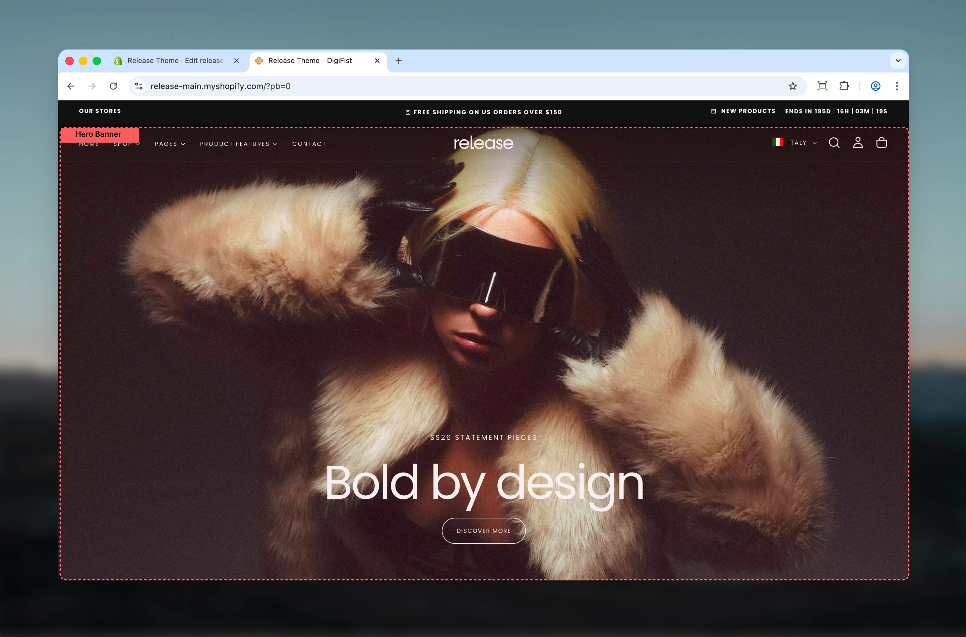
The Hero Banner section creates prominent visual displays at the top of a page. It supports static banners, slideshows, images, and videos, and can interact with the header when positioned as the first section on a page.
Hero banners help establish visual hierarchy and communicate key messages or campaigns immediately upon page load.
 ## What this section controls
This section controls large banner areas with the following capabilities:
* Visual slideshows with multiple media types
* Transparent header integration when placed first on a page
* Desktop and mobile-specific media and positioning
* Interactive elements including buttons and video controls
## How the Hero Banner works
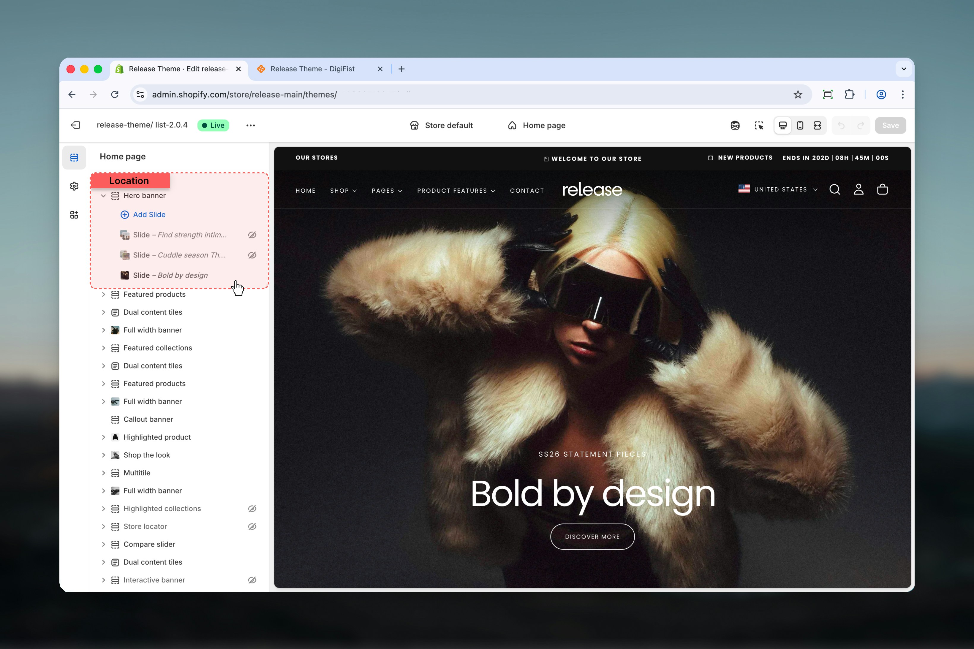
The Hero Banner uses a block-based system:
* Each **slide** is created as a block inside the Hero Banner section
* Multiple slides automatically form a **slideshow**
* When placed as the **first section on the page**, the Hero Banner can enable a transparent header
## Getting started
From Shopify admin, access the Theme Customizer.
Add the Hero Banner section to your page or template.
Click **Add Slide** to create banner content.
Adjust section and slide settings according to your needs.
## What this section controls
This section controls large banner areas with the following capabilities:
* Visual slideshows with multiple media types
* Transparent header integration when placed first on a page
* Desktop and mobile-specific media and positioning
* Interactive elements including buttons and video controls
## How the Hero Banner works
The Hero Banner uses a block-based system:
* Each **slide** is created as a block inside the Hero Banner section
* Multiple slides automatically form a **slideshow**
* When placed as the **first section on the page**, the Hero Banner can enable a transparent header
## Getting started
From Shopify admin, access the Theme Customizer.
Add the Hero Banner section to your page or template.
Click **Add Slide** to create banner content.
Adjust section and slide settings according to your needs.
 ## Section settings
Section settings control the global behavior of the Hero Banner and apply to all slides.
### Enable transparent header
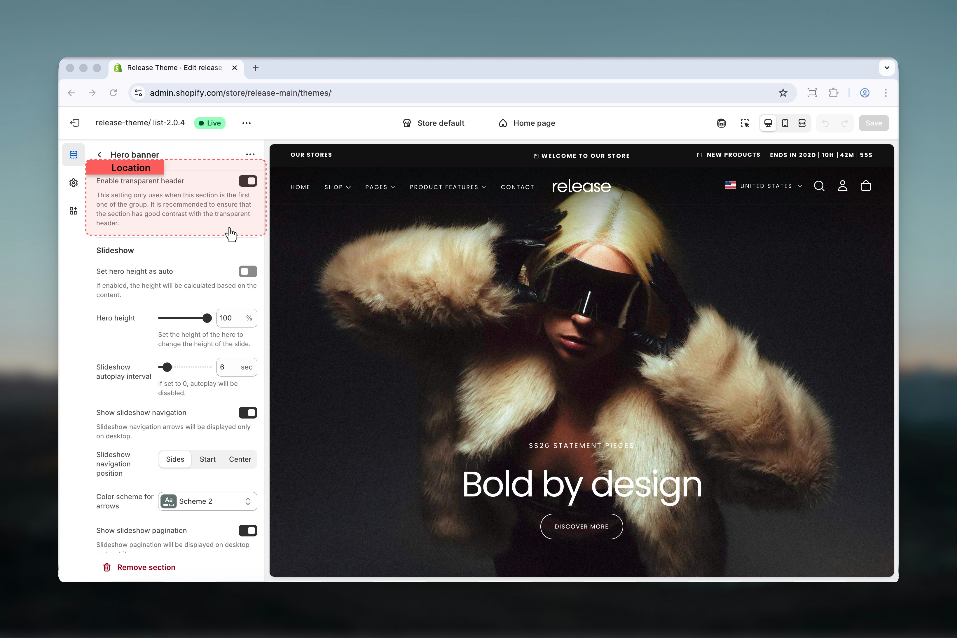
When enabled, the header becomes transparent **only if this section is the first section on the page**.
This allows the Hero Banner media to appear behind the header.
This setting is only used when this section is the first one in the page order. Ensure the banner has sufficient contrast for navigation visibility.
## Section settings
Section settings control the global behavior of the Hero Banner and apply to all slides.
### Enable transparent header
When enabled, the header becomes transparent **only if this section is the first section on the page**.
This allows the Hero Banner media to appear behind the header.
This setting is only used when this section is the first one in the page order. Ensure the banner has sufficient contrast for navigation visibility.
 ### Hero height
Controls the height of the hero section.
**Range:** 0% – 100%
### Slideshow autoplay interval
Controls how often slides change automatically.
**Range:** 0 – 60 seconds
* `0` disables autoplay
* Any value above `0` enables autoplay
### Show slideshow navigation
Displays slideshow navigation arrows on desktop devices.
Navigation arrows are not shown on mobile.
### Slideshow navigation position
Controls the position of navigation arrows.
**Available options:** Sides, Start, Center
### Color scheme for arrows
Controls the color scheme used for slideshow navigation arrows.
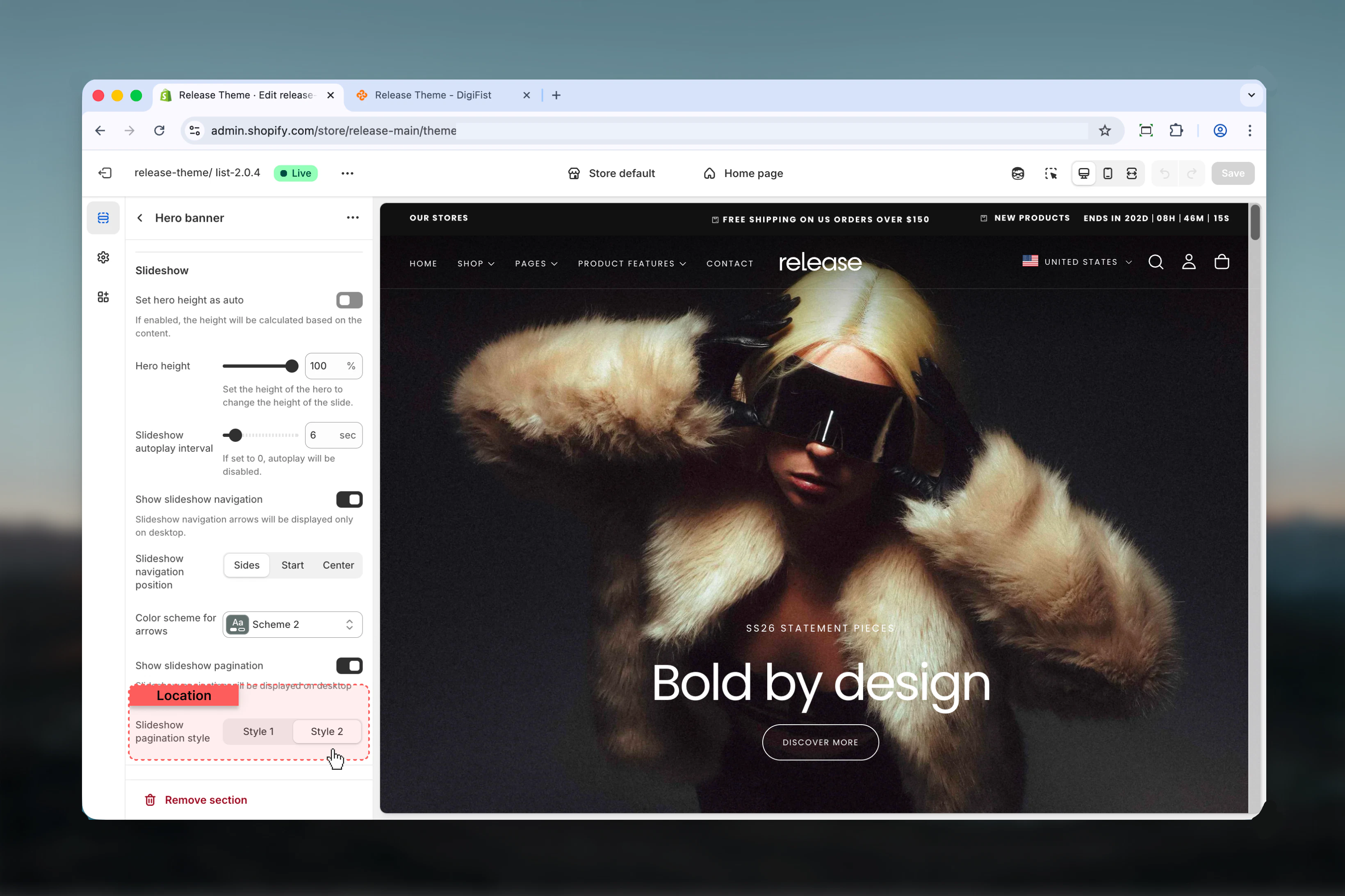
### Show slideshow pagination
Displays slideshow pagination indicators.
Pagination is visible on both desktop and mobile.
### Slideshow pagination style
Controls the visual style of pagination indicators.
**Available options:** Style 1, Style 2
### Hero height
Controls the height of the hero section.
**Range:** 0% – 100%
### Slideshow autoplay interval
Controls how often slides change automatically.
**Range:** 0 – 60 seconds
* `0` disables autoplay
* Any value above `0` enables autoplay
### Show slideshow navigation
Displays slideshow navigation arrows on desktop devices.
Navigation arrows are not shown on mobile.
### Slideshow navigation position
Controls the position of navigation arrows.
**Available options:** Sides, Start, Center
### Color scheme for arrows
Controls the color scheme used for slideshow navigation arrows.
### Show slideshow pagination
Displays slideshow pagination indicators.
Pagination is visible on both desktop and mobile.
### Slideshow pagination style
Controls the visual style of pagination indicators.
**Available options:** Style 1, Style 2
 ### Floating bar
Enables the floating bar behavior when a **Marquee section** is added directly after the Hero Banner section.
This setting has no effect unless a marquee section exists below the hero.
## Block settings
Block settings control the layout, content, and media of each individual slide. Each slide represents one banner within the hero area.
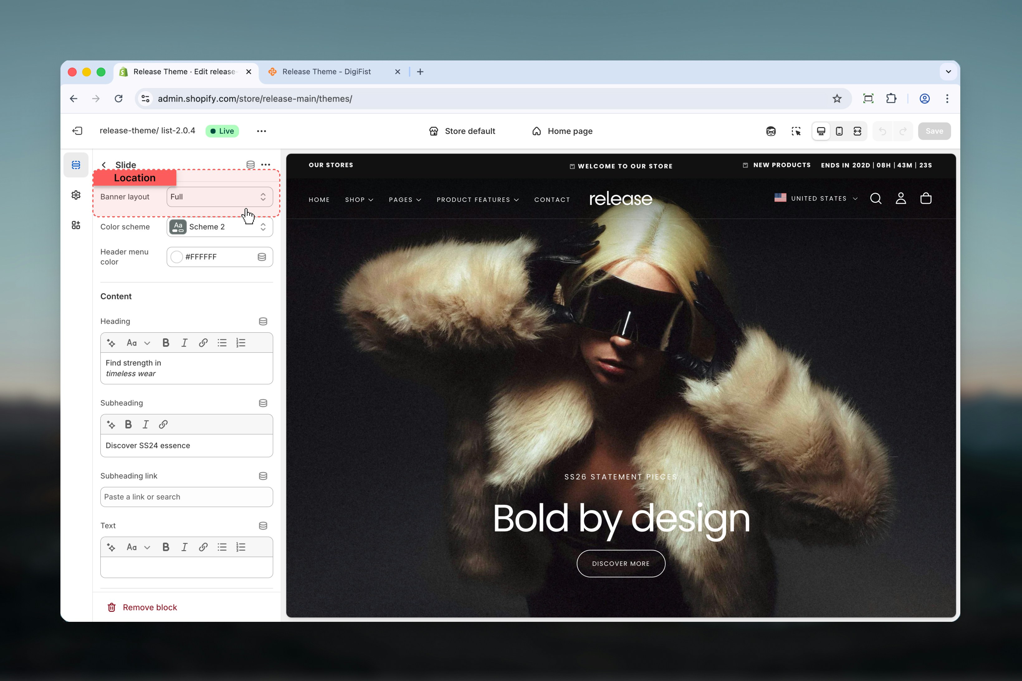
### Banner layout
Controls how content and media are distributed within the slide.
**Available options:** Full, 70 / 30, 30 / 70, Split
### Floating bar
Enables the floating bar behavior when a **Marquee section** is added directly after the Hero Banner section.
This setting has no effect unless a marquee section exists below the hero.
## Block settings
Block settings control the layout, content, and media of each individual slide. Each slide represents one banner within the hero area.
### Banner layout
Controls how content and media are distributed within the slide.
**Available options:** Full, 70 / 30, 30 / 70, Split
 ### Color scheme
Controls the background and text colors for the slide using Shopify's color scheme system.
### Header menu color
When the header is transparent, this setting controls the color of header navigation links for better contrast.
### Heading
Main heading text for the slide.
### Subheading
Secondary heading text displayed below the main heading.
### Subheading link
Optional link applied to the subheading text.
### Text
Supporting body text displayed within the slide.
## Buttons
Slides support up to two buttons.
* **Link:** Destination URL
* **Link type:** Button / Card
* **Label:** Leave empty to hide the button
* **Style:** Filled, Outlined, Text
* **Link:** Destination URL
* **Link type:** Button / Card
* **Label:** Leave empty to hide the button
* **Style:** Filled, Outlined, Text
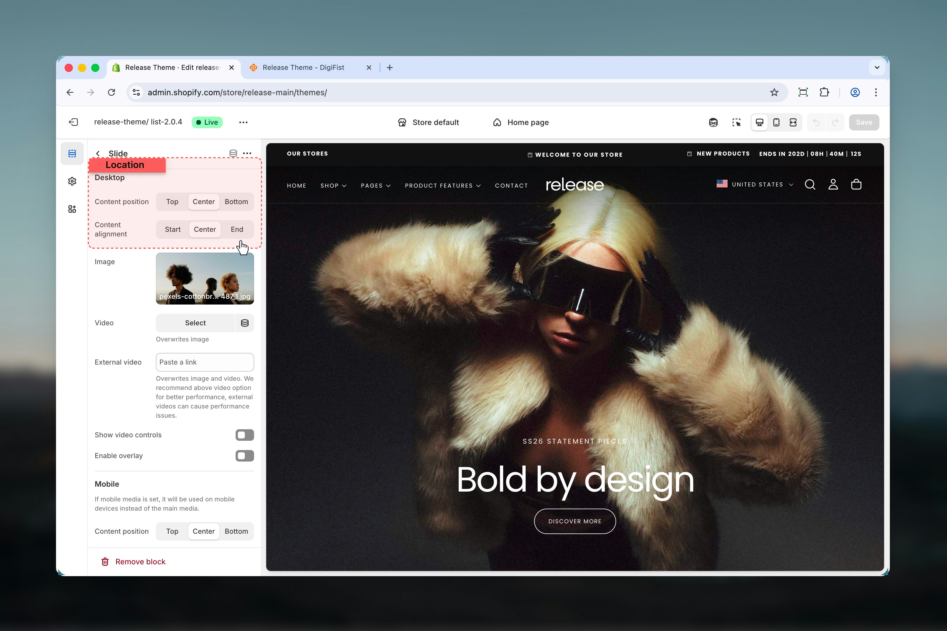
### Content position
Controls vertical alignment.
**Options:** Top, Center, Bottom
### Content alignment
Controls horizontal alignment.
**Options:** Start, Center, End
### Color scheme
Controls the background and text colors for the slide using Shopify's color scheme system.
### Header menu color
When the header is transparent, this setting controls the color of header navigation links for better contrast.
### Heading
Main heading text for the slide.
### Subheading
Secondary heading text displayed below the main heading.
### Subheading link
Optional link applied to the subheading text.
### Text
Supporting body text displayed within the slide.
## Buttons
Slides support up to two buttons.
* **Link:** Destination URL
* **Link type:** Button / Card
* **Label:** Leave empty to hide the button
* **Style:** Filled, Outlined, Text
* **Link:** Destination URL
* **Link type:** Button / Card
* **Label:** Leave empty to hide the button
* **Style:** Filled, Outlined, Text
### Content position
Controls vertical alignment.
**Options:** Top, Center, Bottom
### Content alignment
Controls horizontal alignment.
**Options:** Start, Center, End
 ### Image
Main image used for the slide on desktop.
### Video
Video file used instead of the image.
### External video
Overrides both image and video.
External videos may negatively impact performance. For best results, use the built-in video option.
### Show video controls
Shows or hides video playback controls.
### Enable overlay
Adds a visual overlay on top of the media to improve text contrast.
### Image
Main image used for the slide on desktop.
### Video
Video file used instead of the image.
### External video
Overrides both image and video.
External videos may negatively impact performance. For best results, use the built-in video option.
### Show video controls
Shows or hides video playback controls.
### Enable overlay
Adds a visual overlay on top of the media to improve text contrast.
 If mobile media is set, it will be used on mobile devices instead of the main media.
### Content position
Controls vertical alignment on mobile.
**Options:** Top, Center, Bottom
### Content alignment
Controls horizontal alignment on mobile.
**Options:** Start, Center, End
### Image
Image used for the slide on mobile devices.
### Video
Video used for the slide on mobile devices.
### External video
Overrides both image and video on mobile.
External videos may negatively impact performance.
### Show video controls
Shows or hides video playback controls on mobile.
### Enable overlay
Adds a visual overlay on mobile media.
If mobile media is set, it will be used on mobile devices instead of the main media.
### Content position
Controls vertical alignment on mobile.
**Options:** Top, Center, Bottom
### Content alignment
Controls horizontal alignment on mobile.
**Options:** Start, Center, End
### Image
Image used for the slide on mobile devices.
### Video
Video used for the slide on mobile devices.
### External video
Overrides both image and video on mobile.
External videos may negatively impact performance.
### Show video controls
Shows or hides video playback controls on mobile.
### Enable overlay
Adds a visual overlay on mobile media.
 ## Best practices
* Use the Hero Banner as the first section to enable transparent headers
* Avoid external videos unless necessary due to performance impact
* Ensure sufficient contrast when using transparent headers for navigation visibility
* Keep slide content concise for better readability and faster comprehension
* Limit the number of slides to maintain performance and prevent user fatigue
* Test mobile and desktop layouts separately to ensure optimal presentation
* Use high-quality images that maintain clarity at large sizes
## Related guides
Learn about header configuration and transparent header behavior
Understand global theme configuration options
## Best practices
* Use the Hero Banner as the first section to enable transparent headers
* Avoid external videos unless necessary due to performance impact
* Ensure sufficient contrast when using transparent headers for navigation visibility
* Keep slide content concise for better readability and faster comprehension
* Limit the number of slides to maintain performance and prevent user fatigue
* Test mobile and desktop layouts separately to ensure optimal presentation
* Use high-quality images that maintain clarity at large sizes
## Related guides
Learn about header configuration and transparent header behavior
Understand global theme configuration options