> ## Documentation Index
> Fetch the complete documentation index at: https://docs.digifist.com/llms.txt
> Use this file to discover all available pages before exploring further.
# Highlighted Collections
> Display collections with interactive image previews that change on hover for an engaging browsing experience.
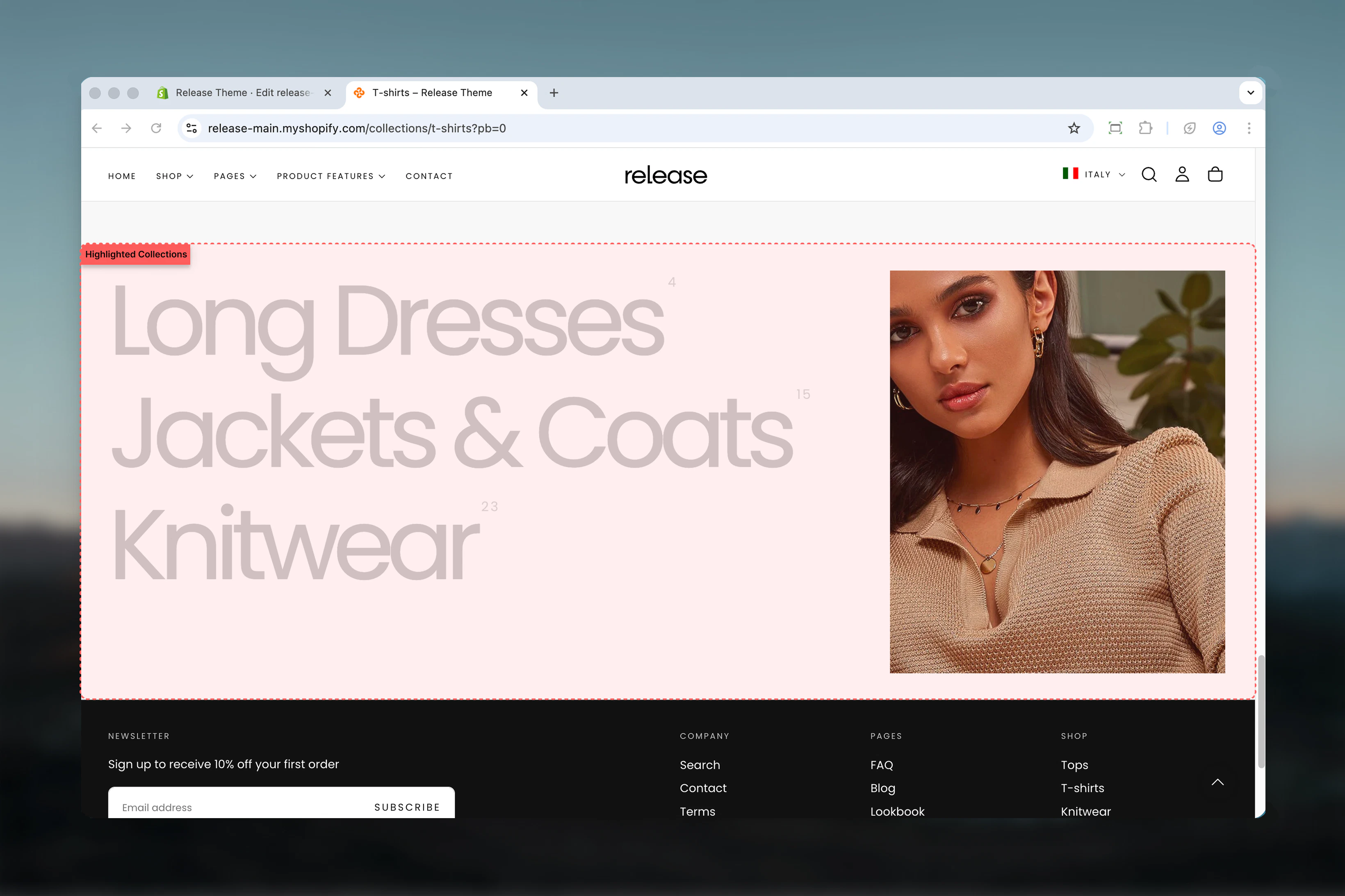
The Highlighted Collections section displays a curated list of collections with an interactive image preview. When hovering over a collection name, the corresponding collection image is displayed, creating an engaging browsing experience.
This section combines visual appeal with navigation functionality, making it ideal for showcasing your store's main collections in a premium, interactive format.
 ## What this section controls
This section controls collection displays with the following capabilities:
* Up to 12 collection items with hover-triggered images
* Interactive image preview on collection hover
* Customizable section height and title font size
* Custom collection images and titles
* Product counter display
* Mobile-specific image option
* Responsive layout with configurable width ratios
## How the Highlighted Collections section works
The Highlighted Collections section uses an interactive hover system:
* Displays up to 12 collection items in a vertical list
* Shows collection images on hover
* Collection title, custom image, and product counter support
* Separate mobile image option
* Configurable section height and title font size
* Responsive layout with mobile-specific image handling
## Getting started
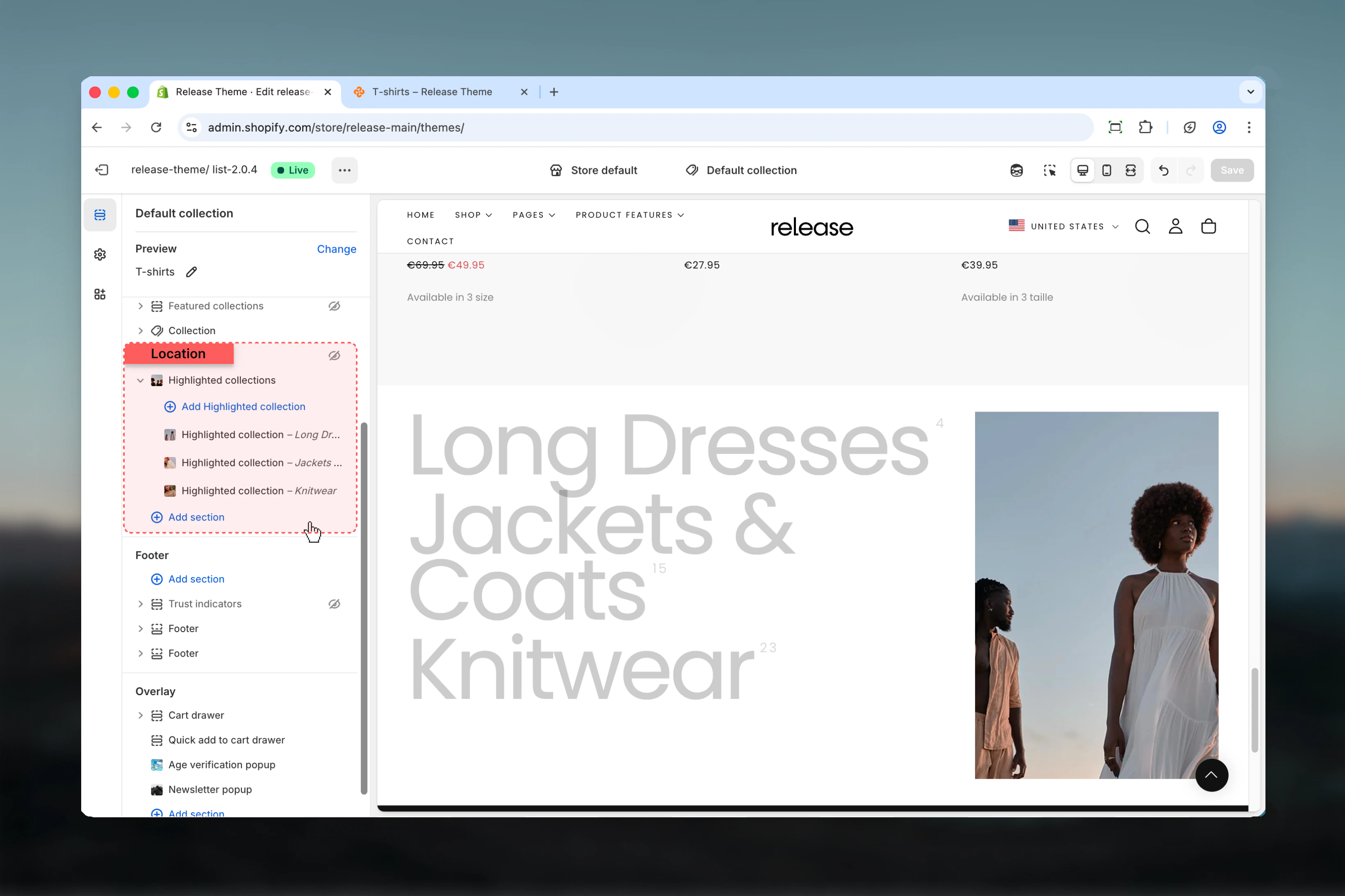
From Shopify admin, access the Theme Customizer.
Add the section to your homepage or landing page.
Click **Add Highlighted collection** to create collection items.
Select collection, add custom image if needed, and enable product counter.
## What this section controls
This section controls collection displays with the following capabilities:
* Up to 12 collection items with hover-triggered images
* Interactive image preview on collection hover
* Customizable section height and title font size
* Custom collection images and titles
* Product counter display
* Mobile-specific image option
* Responsive layout with configurable width ratios
## How the Highlighted Collections section works
The Highlighted Collections section uses an interactive hover system:
* Displays up to 12 collection items in a vertical list
* Shows collection images on hover
* Collection title, custom image, and product counter support
* Separate mobile image option
* Configurable section height and title font size
* Responsive layout with mobile-specific image handling
## Getting started
From Shopify admin, access the Theme Customizer.
Add the section to your homepage or landing page.
Click **Add Highlighted collection** to create collection items.
Select collection, add custom image if needed, and enable product counter.
 ## Section settings
Section settings control layout, sizing, and visual styling.
### Section height
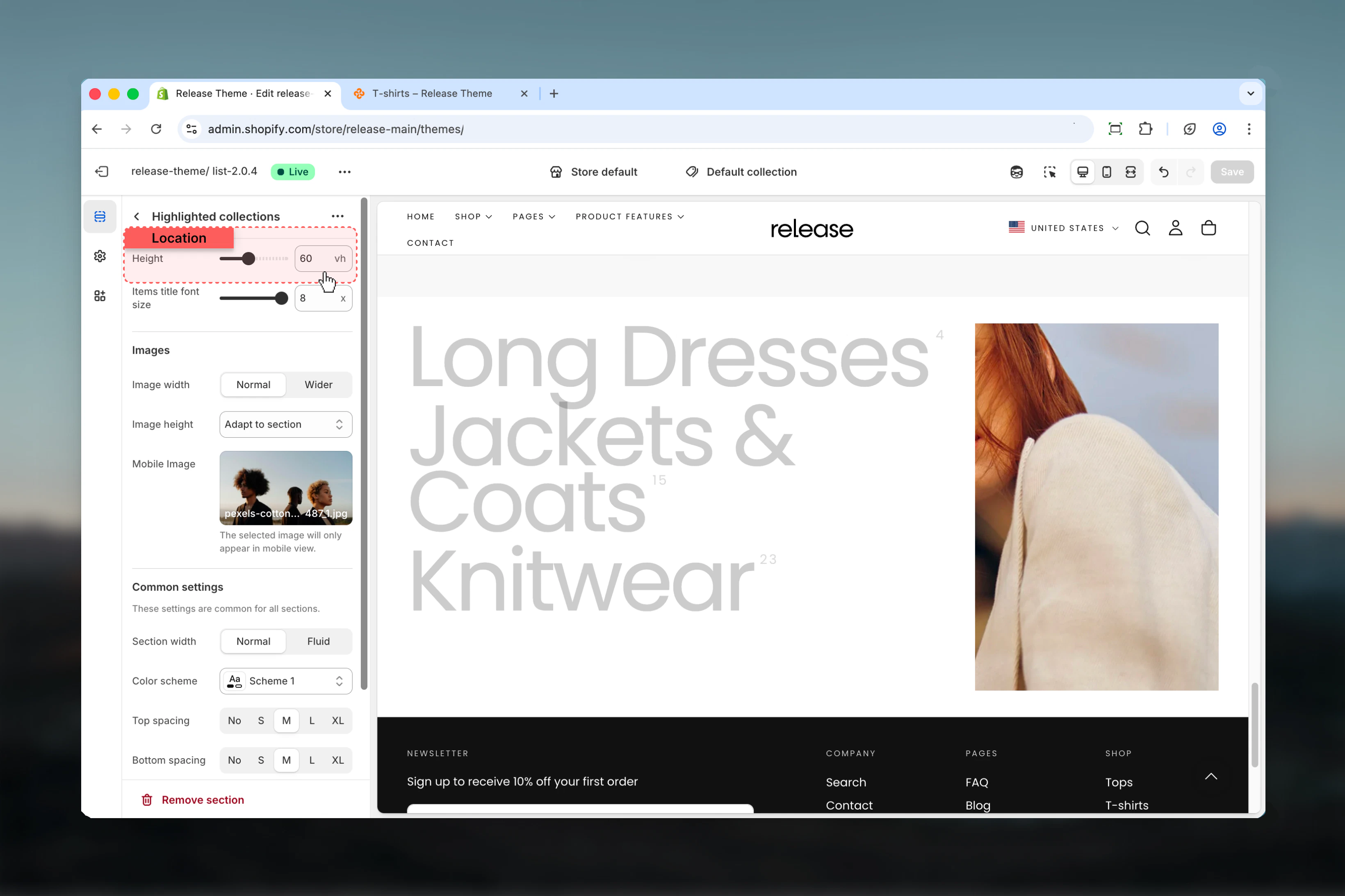
Controls the height of the section on desktop.
**Range:** 40 – 90 vh
**Default:** 60 vh
## Section settings
Section settings control layout, sizing, and visual styling.
### Section height
Controls the height of the section on desktop.
**Range:** 40 – 90 vh
**Default:** 60 vh
 ### Items title font size
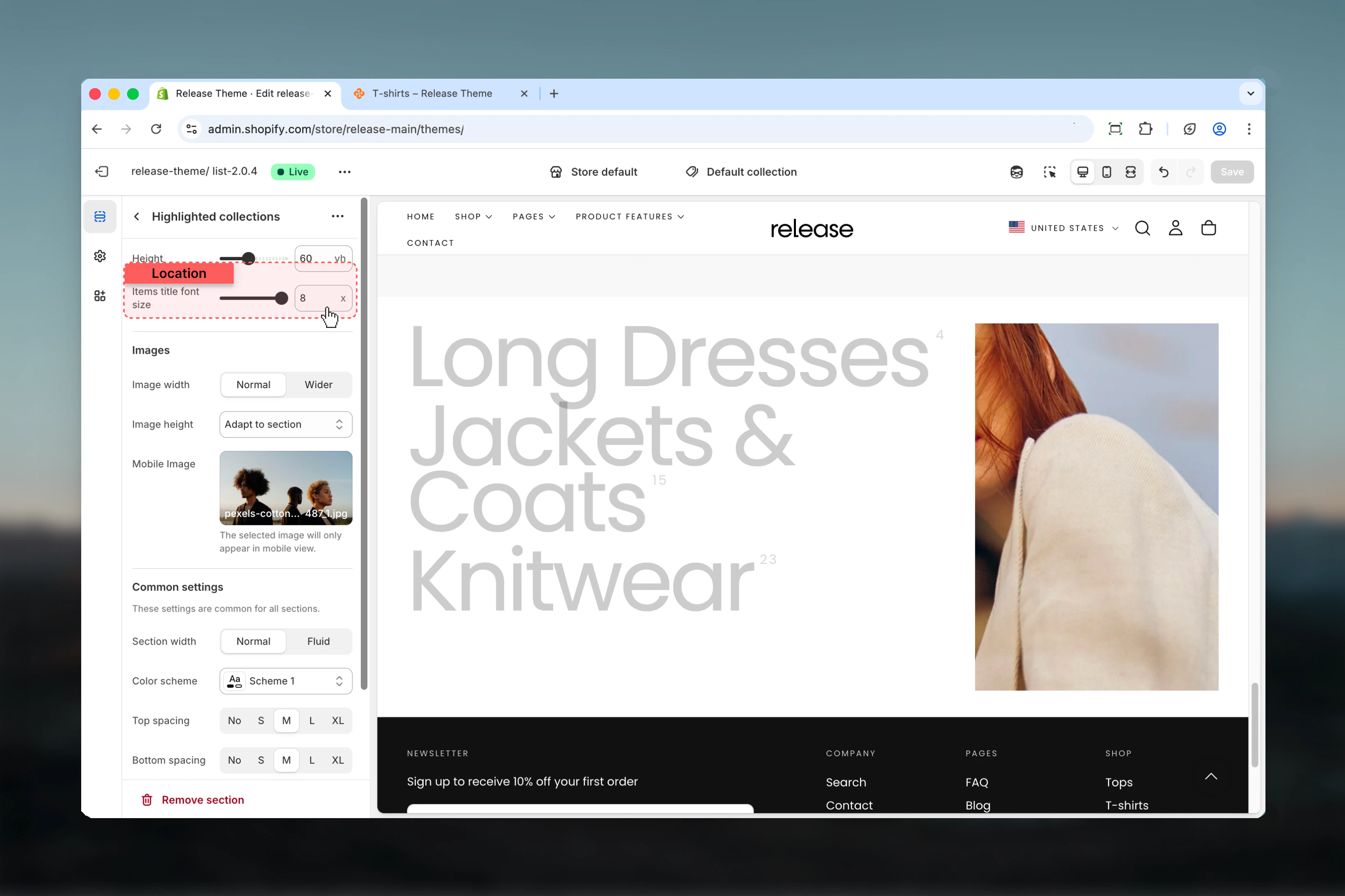
Controls the font size of collection titles.
**Range:** 5x – 8x
**Default:** 8x
The changes will only apply to desktop.
### Items title font size
Controls the font size of collection titles.
**Range:** 5x – 8x
**Default:** 8x
The changes will only apply to desktop.
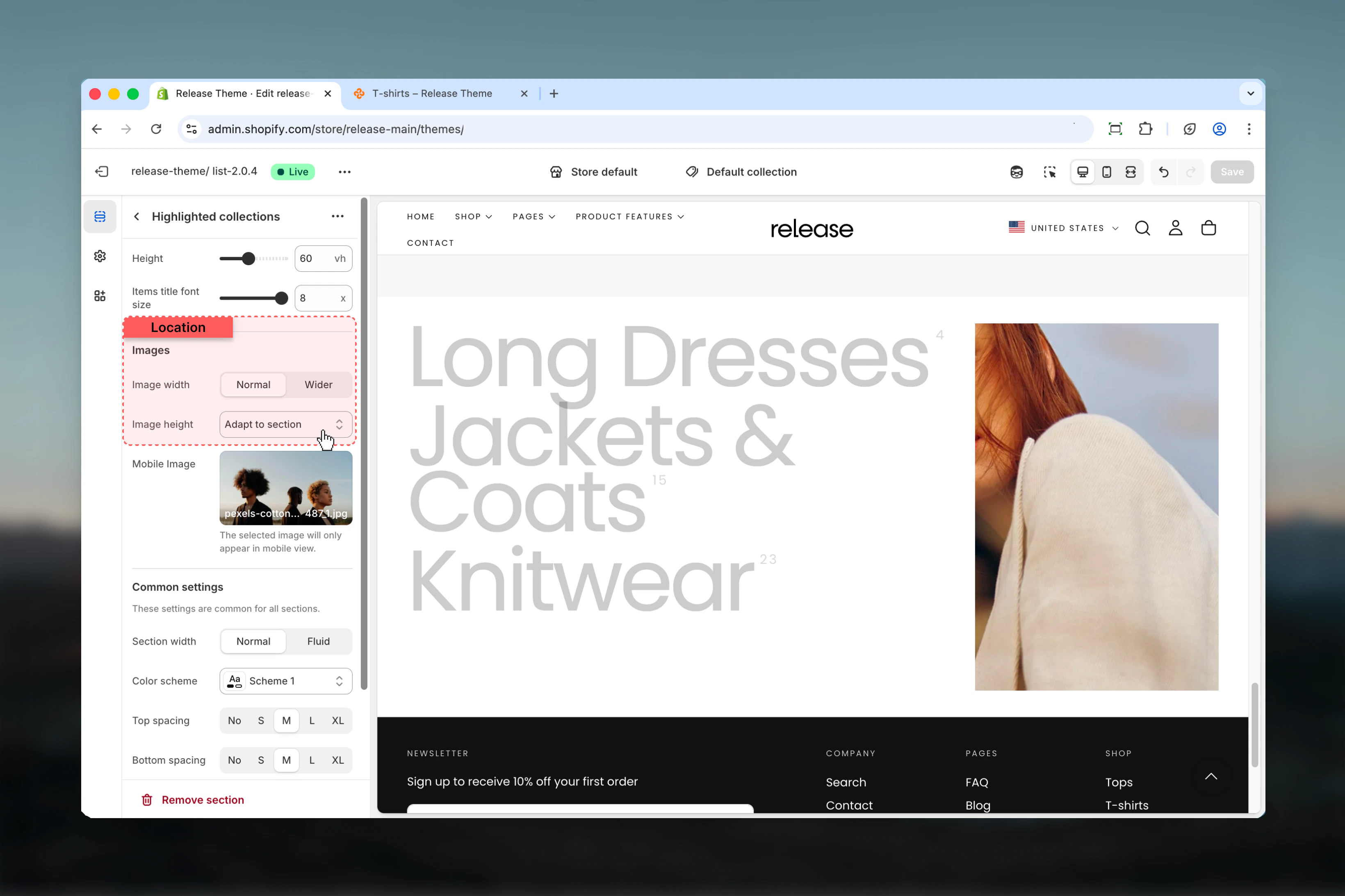
 ### Image width
Controls the width ratio between images and collection list.
**Available options:**
* **Normal:** 30% images / 70% list
* **Wider:** 40% images / 60% list
**Default:** Normal
### Image height
Controls how images adapt to the section.
**Available options:**
* **Original:** Use image's original aspect ratio
* **Adapt to section:** Stretch to fill section height
**Default:** Adapt to section
### Image width
Controls the width ratio between images and collection list.
**Available options:**
* **Normal:** 30% images / 70% list
* **Wider:** 40% images / 60% list
**Default:** Normal
### Image height
Controls how images adapt to the section.
**Available options:**
* **Original:** Use image's original aspect ratio
* **Adapt to section:** Stretch to fill section height
**Default:** Adapt to section
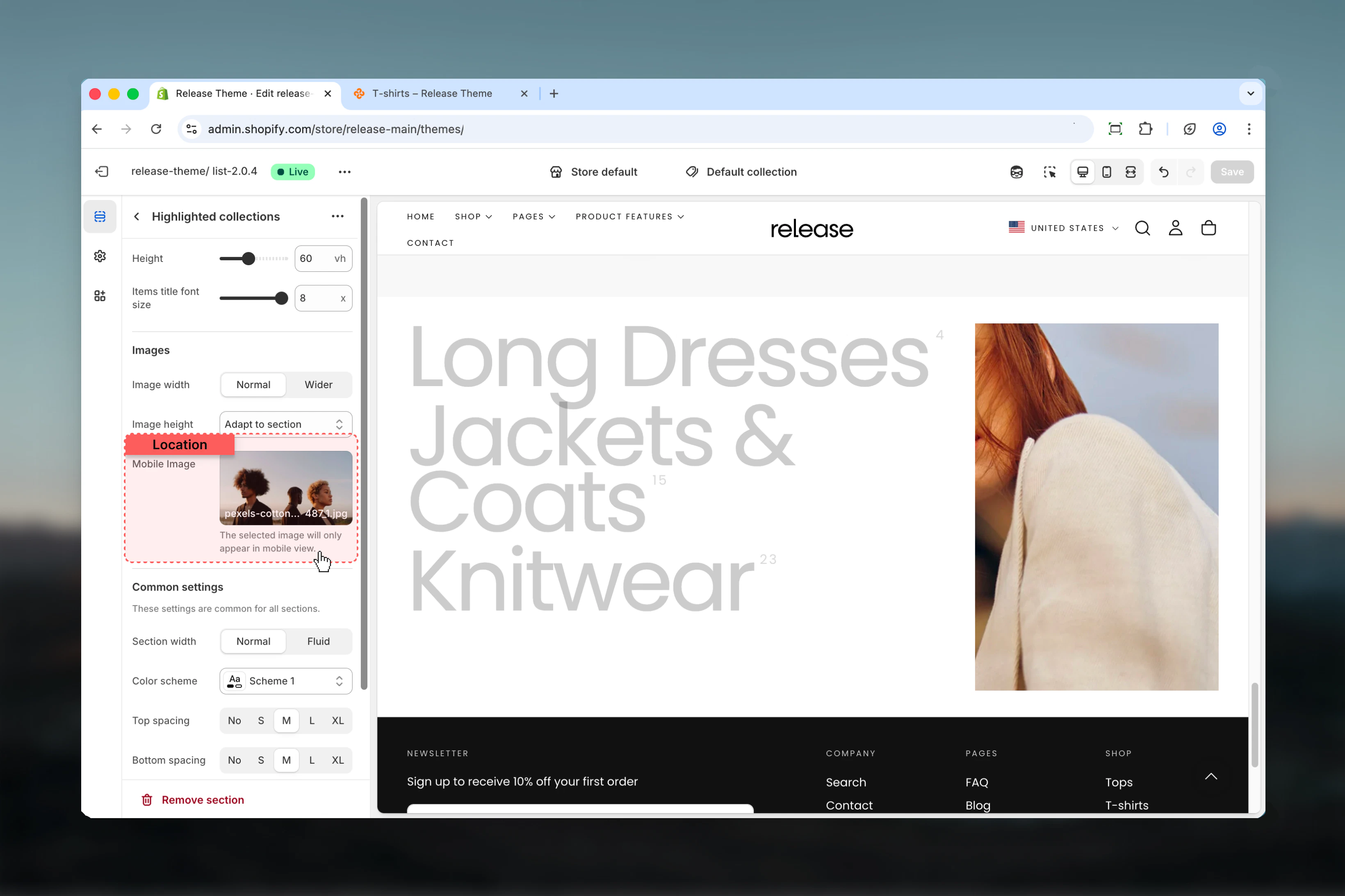
 ### Mobile Image
Upload a specific image for mobile view.
* Shopify image picker
The selected image will only appear in mobile view.
### Mobile Image
Upload a specific image for mobile view.
* Shopify image picker
The selected image will only appear in mobile view.
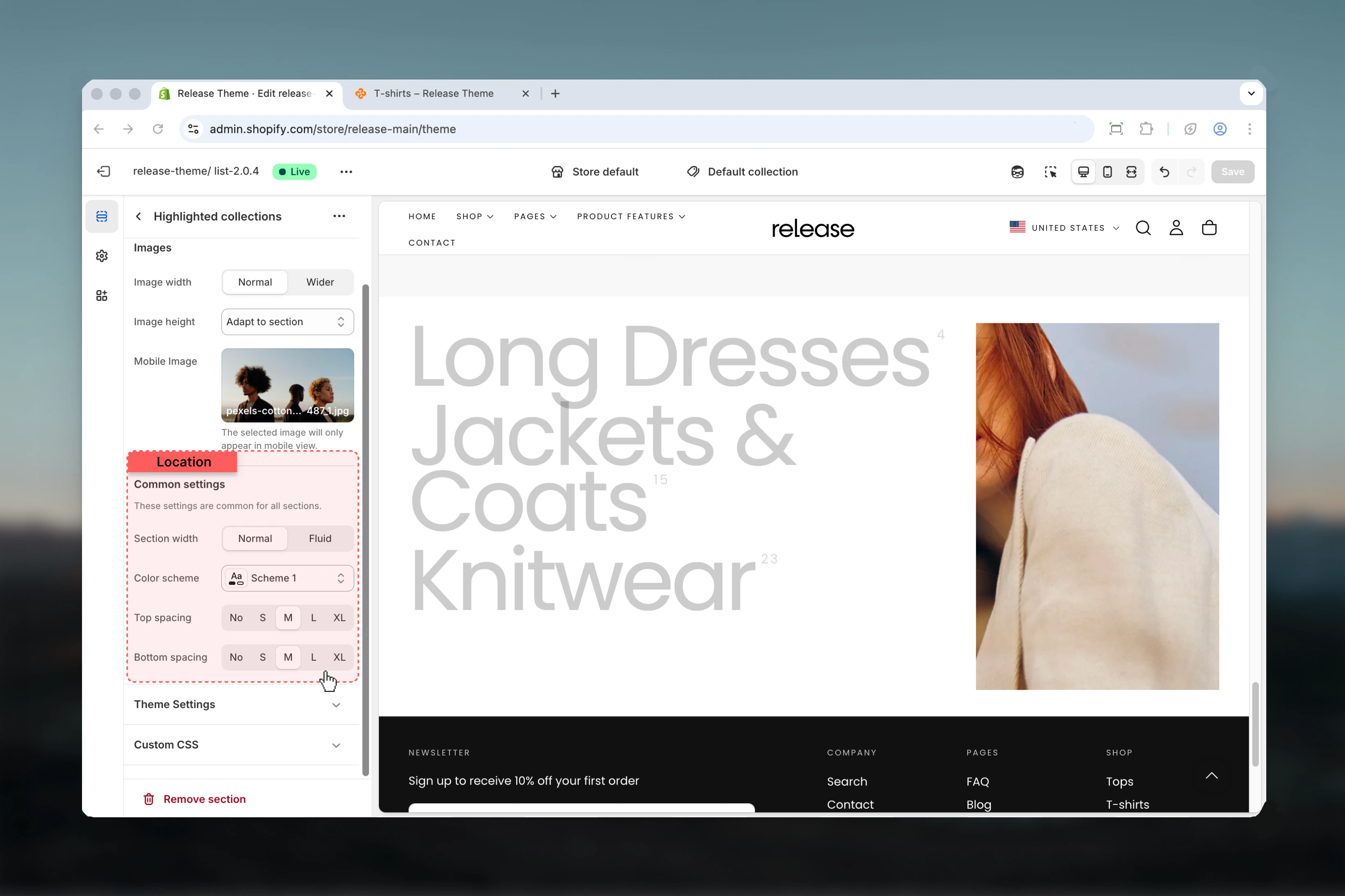
 ### Section width
Controls the maximum width of the section.
**Available options:**
* **Page:** Standard page width
* **Fluid:** Wider than page width
**Default:** Page
### Color scheme
Controls background and text colors for the section container.
* Shopify color scheme selector
* **Default:** Scheme 1
### Spacing top
Controls spacing above the section.
**Available options:** None, S, M, L, XL
**Default:** M
### Spacing bottom
Controls spacing below the section.
**Available options:** None, S, M, L, XL
**Default:** M
### Section width
Controls the maximum width of the section.
**Available options:**
* **Page:** Standard page width
* **Fluid:** Wider than page width
**Default:** Page
### Color scheme
Controls background and text colors for the section container.
* Shopify color scheme selector
* **Default:** Scheme 1
### Spacing top
Controls spacing above the section.
**Available options:** None, S, M, L, XL
**Default:** M
### Spacing bottom
Controls spacing below the section.
**Available options:** None, S, M, L, XL
**Default:** M
 ## Block settings
Block settings control individual collection items. Each block represents a single collection.
Maximum of 12 collection blocks can be added per section.
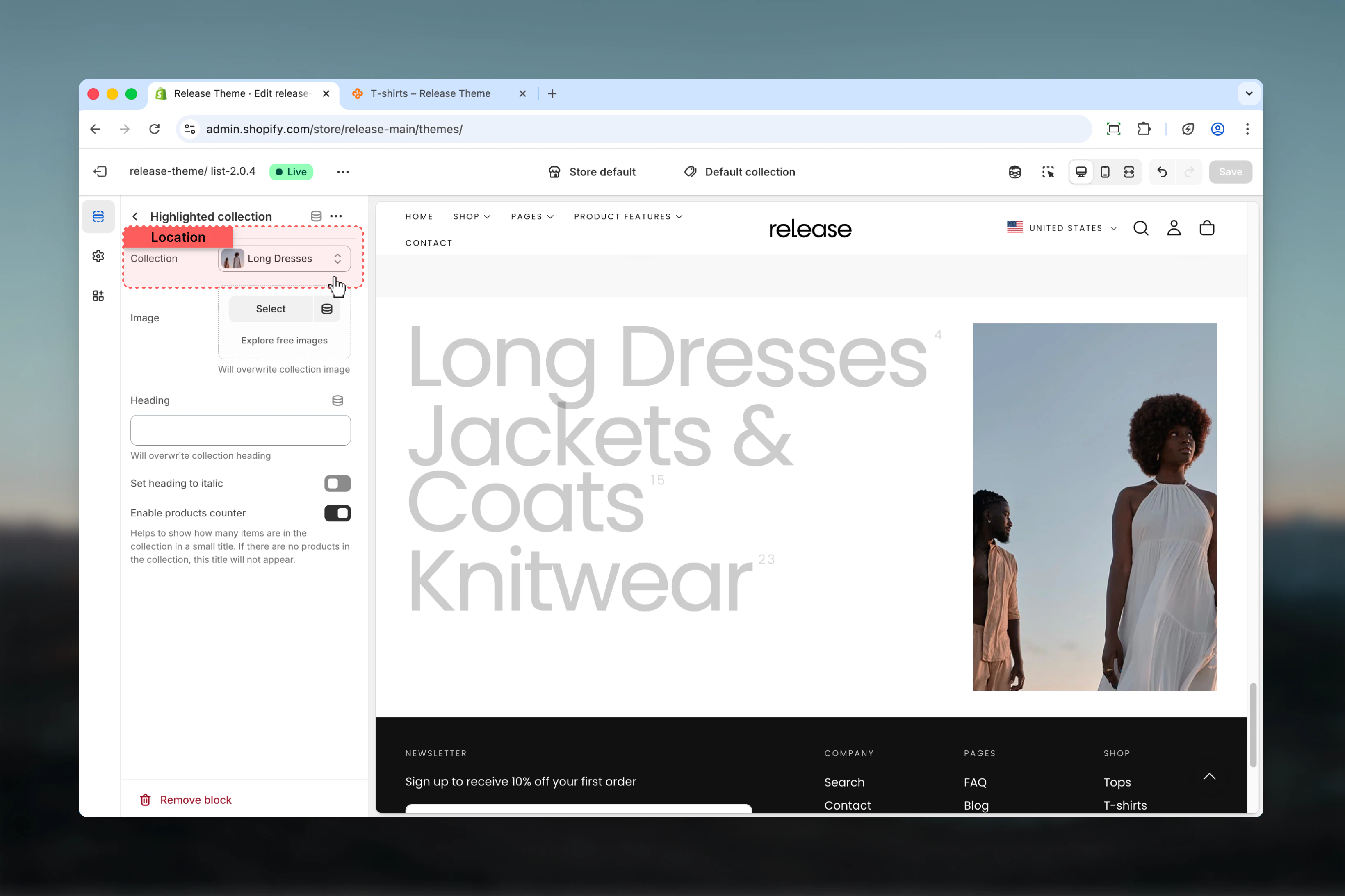
### Collection
Select a collection to display.
* Shopify collection picker
## Block settings
Block settings control individual collection items. Each block represents a single collection.
Maximum of 12 collection blocks can be added per section.
### Collection
Select a collection to display.
* Shopify collection picker
 ### Image
Upload a custom image for the collection.
* Shopify image picker
Will overwrite collection image.
### Heading
Custom heading text for the collection.
* Text input
Will overwrite collection heading.
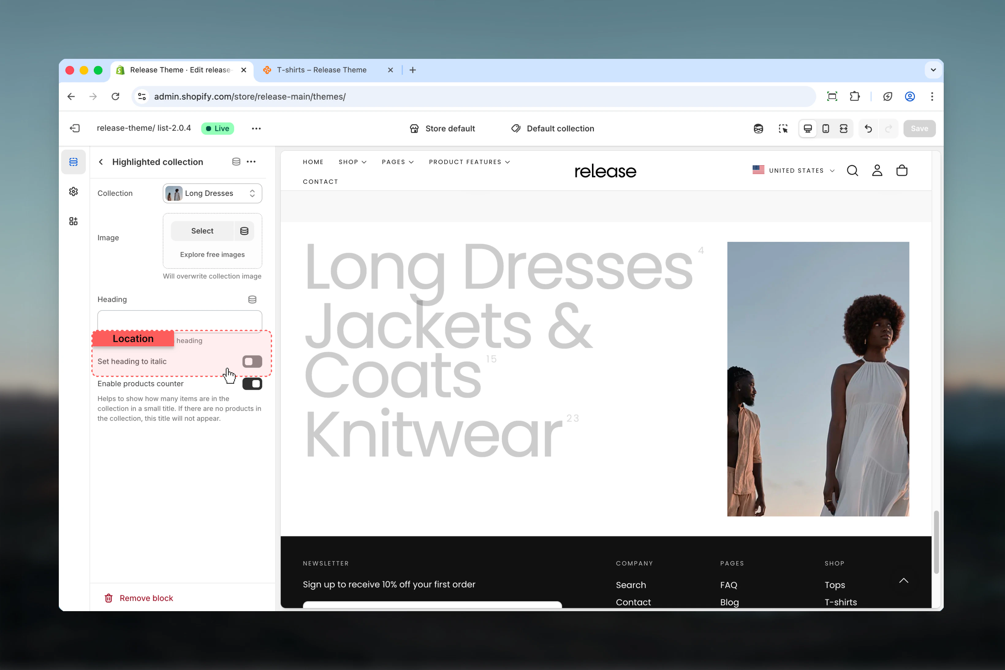
### Set heading to italic
Displays collection title in italic style.
**Options:** True / False
**Default:** False
### Image
Upload a custom image for the collection.
* Shopify image picker
Will overwrite collection image.
### Heading
Custom heading text for the collection.
* Text input
Will overwrite collection heading.
### Set heading to italic
Displays collection title in italic style.
**Options:** True / False
**Default:** False
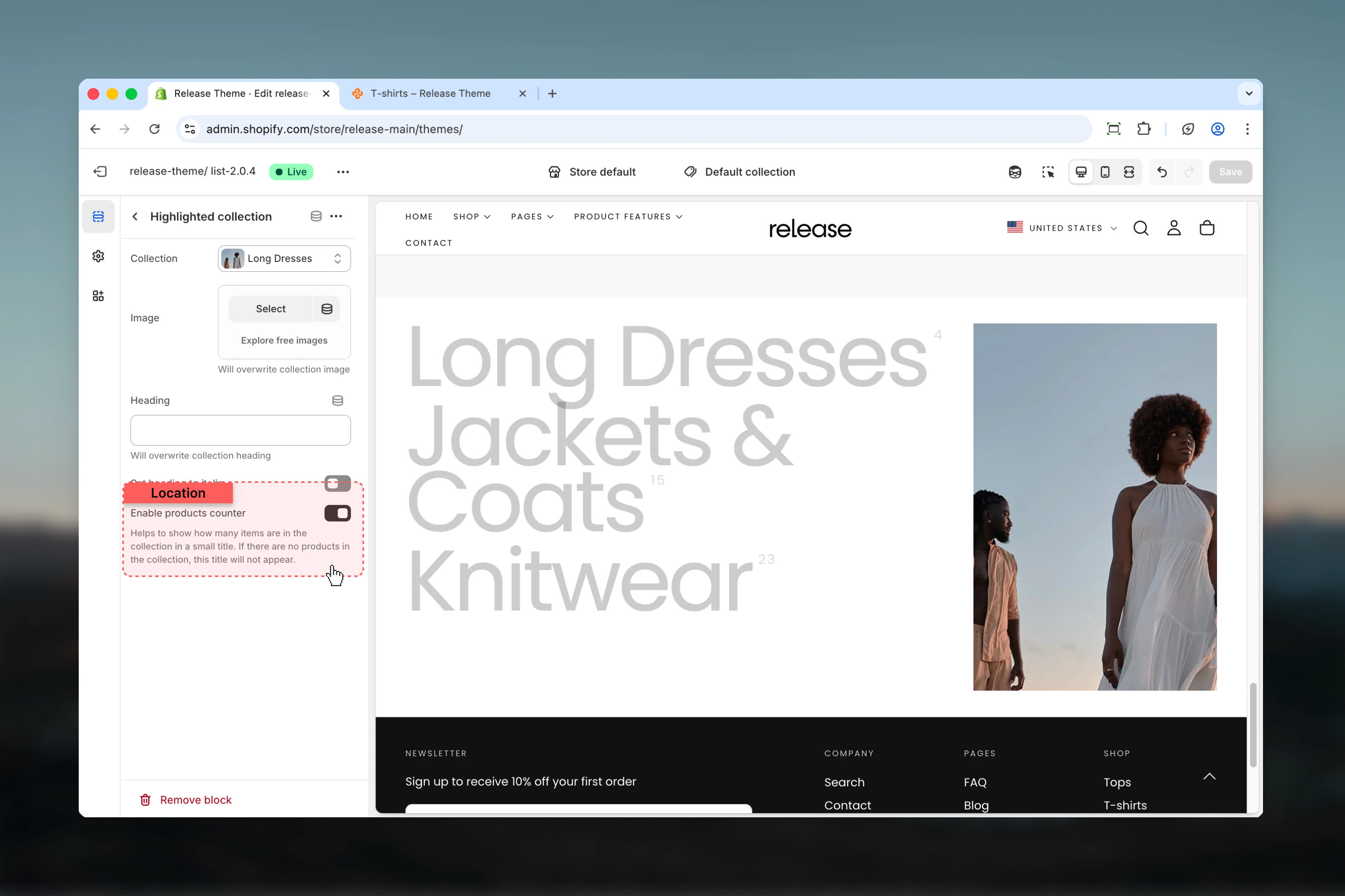
 ### Enable products counter
Shows the number of products in the collection.
**Options:** True / False
**Default:** True
Helps to show how many items are in the collection in a small superscript. If there are no products in the collection, this counter will not appear.
### Enable products counter
Shows the number of products in the collection.
**Options:** True / False
**Default:** True
Helps to show how many items are in the collection in a small superscript. If there are no products in the collection, this counter will not appear.
 ## Best practices
* Use high-quality, visually distinct images for each collection to maximize hover impact
* Keep collection titles concise (2-4 words) for quick scanning and elegant display
* Order collections by priority, popularity, or logical browsing flow
* Use consistent image styling and color palette across all collections
* Limit to 6-8 collections for optimal user experience without overwhelming
* Test hover interaction on desktop and touch behavior on mobile devices
* Provide a mobile image that represents all collections well or highlights featured collection
* Use product counter to indicate collection size and help set expectations
* Consider image width ratio based on image quality and visual importance
* Ensure sufficient color contrast for collection titles against background
## Common use cases
* **Category navigation** - Guide customers to main product categories with visual appeal
* **Seasonal collections showcase** - Highlight seasonal or themed collections
* **Brand collections** - Display collections organized by brand or designer
* **Style guides** - Showcase collections based on aesthetic, occasion, or use case
* **Featured collection highlight** - Draw attention to new or popular collections
* **Store directory** - Create a visual map of your product offerings for easy navigation
## Related guides
Learn about common settings shared across sections
## Best practices
* Use high-quality, visually distinct images for each collection to maximize hover impact
* Keep collection titles concise (2-4 words) for quick scanning and elegant display
* Order collections by priority, popularity, or logical browsing flow
* Use consistent image styling and color palette across all collections
* Limit to 6-8 collections for optimal user experience without overwhelming
* Test hover interaction on desktop and touch behavior on mobile devices
* Provide a mobile image that represents all collections well or highlights featured collection
* Use product counter to indicate collection size and help set expectations
* Consider image width ratio based on image quality and visual importance
* Ensure sufficient color contrast for collection titles against background
## Common use cases
* **Category navigation** - Guide customers to main product categories with visual appeal
* **Seasonal collections showcase** - Highlight seasonal or themed collections
* **Brand collections** - Display collections organized by brand or designer
* **Style guides** - Showcase collections based on aesthetic, occasion, or use case
* **Featured collection highlight** - Draw attention to new or popular collections
* **Store directory** - Create a visual map of your product offerings for easy navigation
## Related guides
Learn about common settings shared across sections