> ## Documentation Index
> Fetch the complete documentation index at: https://docs.digifist.com/llms.txt
> Use this file to discover all available pages before exploring further.
# Highlighted Product
> Display a single featured product with full details, media gallery, and purchase options anywhere in your theme.
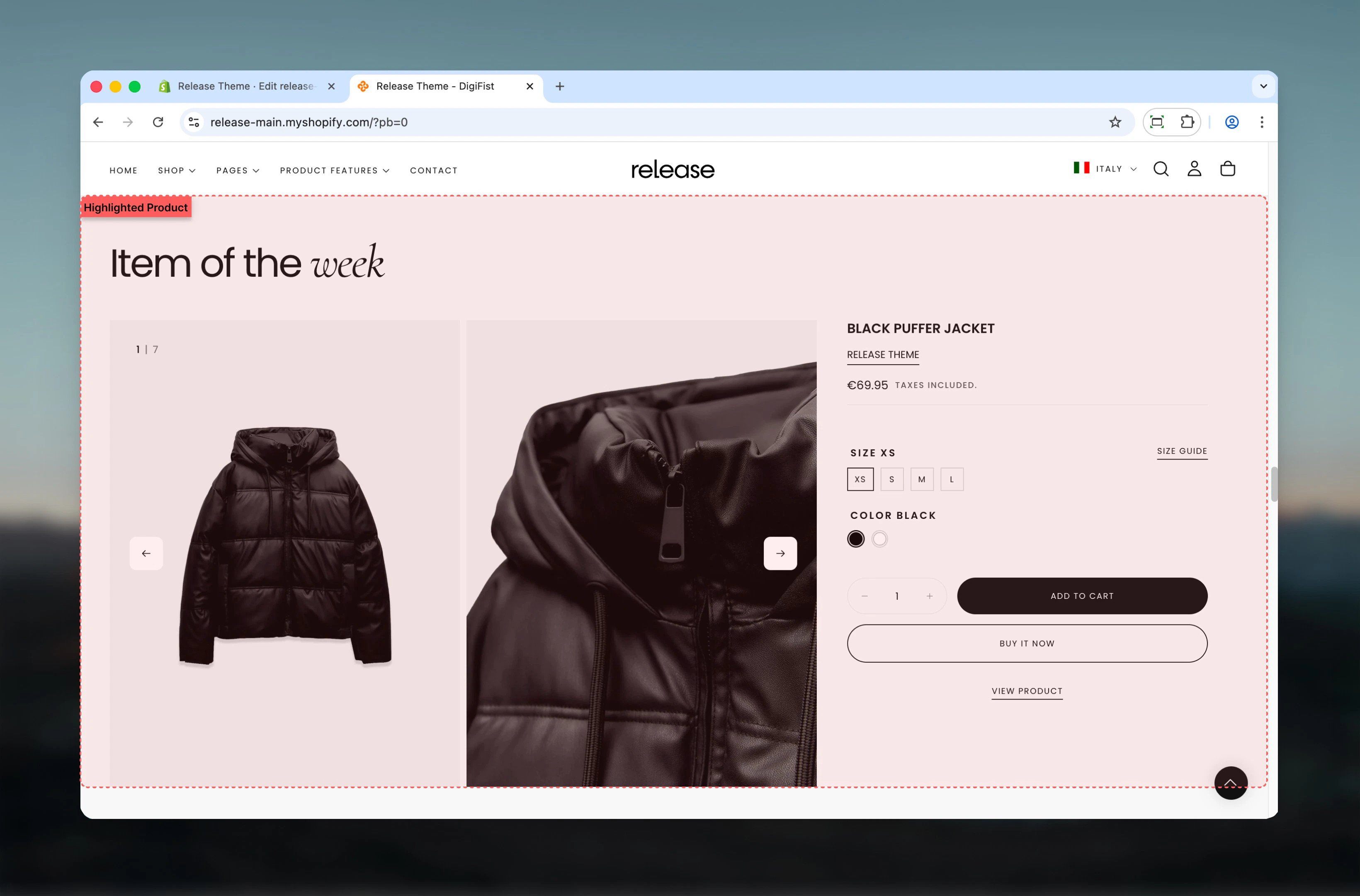
The Highlighted Product section displays a single featured product with full product details, media gallery, and purchase options. It uses the same blocks and functionality as the main product page but can be placed anywhere in your theme.
This section is perfect for showcasing featured products, bestsellers, or special promotions on any page, providing a complete shopping experience without requiring customers to navigate to the product page.
 ## What this section controls
This section controls featured product displays with the following capabilities:
* Select any product to feature
* Full media gallery with zoom and navigation
* All product page blocks available
* Customizable media display options
* Additional featured image support
* Complete purchase functionality
* Responsive mobile-optimized layout
## How the Highlighted Product section works
The Highlighted Product section displays a complete product experience:
* Select any product to feature
* Full media gallery with zoom and navigation
* All product blocks available (title, price, variants, buy buttons, etc.)
* Customizable media display and layout
* Additional featured image option
* Responsive design with mobile optimization
## Getting started
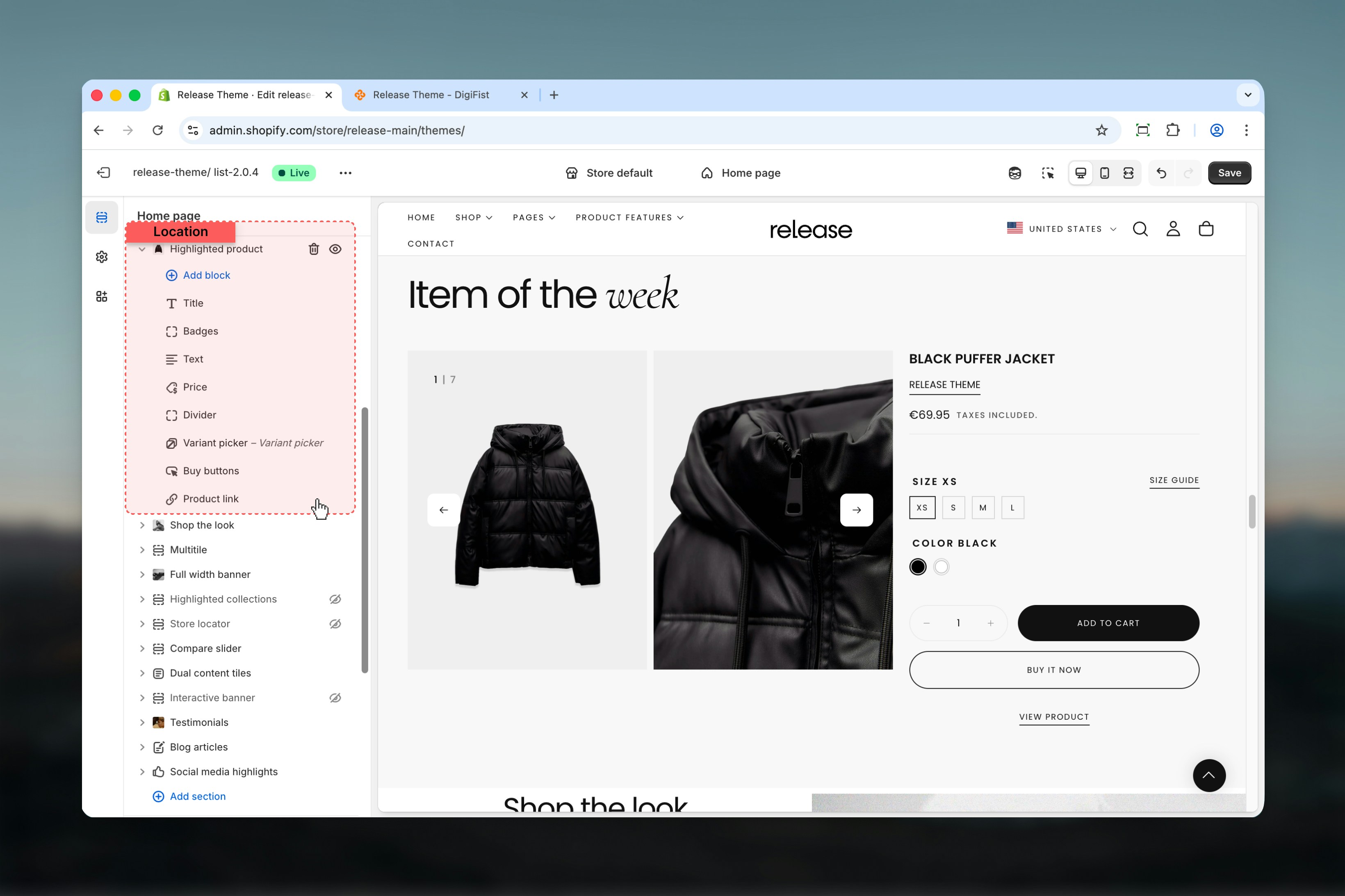
From Shopify admin, access the Theme Customizer.
Add the section to your desired page or template.
Choose the product you want to feature.
Add and arrange blocks like title, price, variant picker, and buy buttons.
## What this section controls
This section controls featured product displays with the following capabilities:
* Select any product to feature
* Full media gallery with zoom and navigation
* All product page blocks available
* Customizable media display options
* Additional featured image support
* Complete purchase functionality
* Responsive mobile-optimized layout
## How the Highlighted Product section works
The Highlighted Product section displays a complete product experience:
* Select any product to feature
* Full media gallery with zoom and navigation
* All product blocks available (title, price, variants, buy buttons, etc.)
* Customizable media display and layout
* Additional featured image option
* Responsive design with mobile optimization
## Getting started
From Shopify admin, access the Theme Customizer.
Add the section to your desired page or template.
Choose the product you want to feature.
Add and arrange blocks like title, price, variant picker, and buy buttons.
 ## Section settings
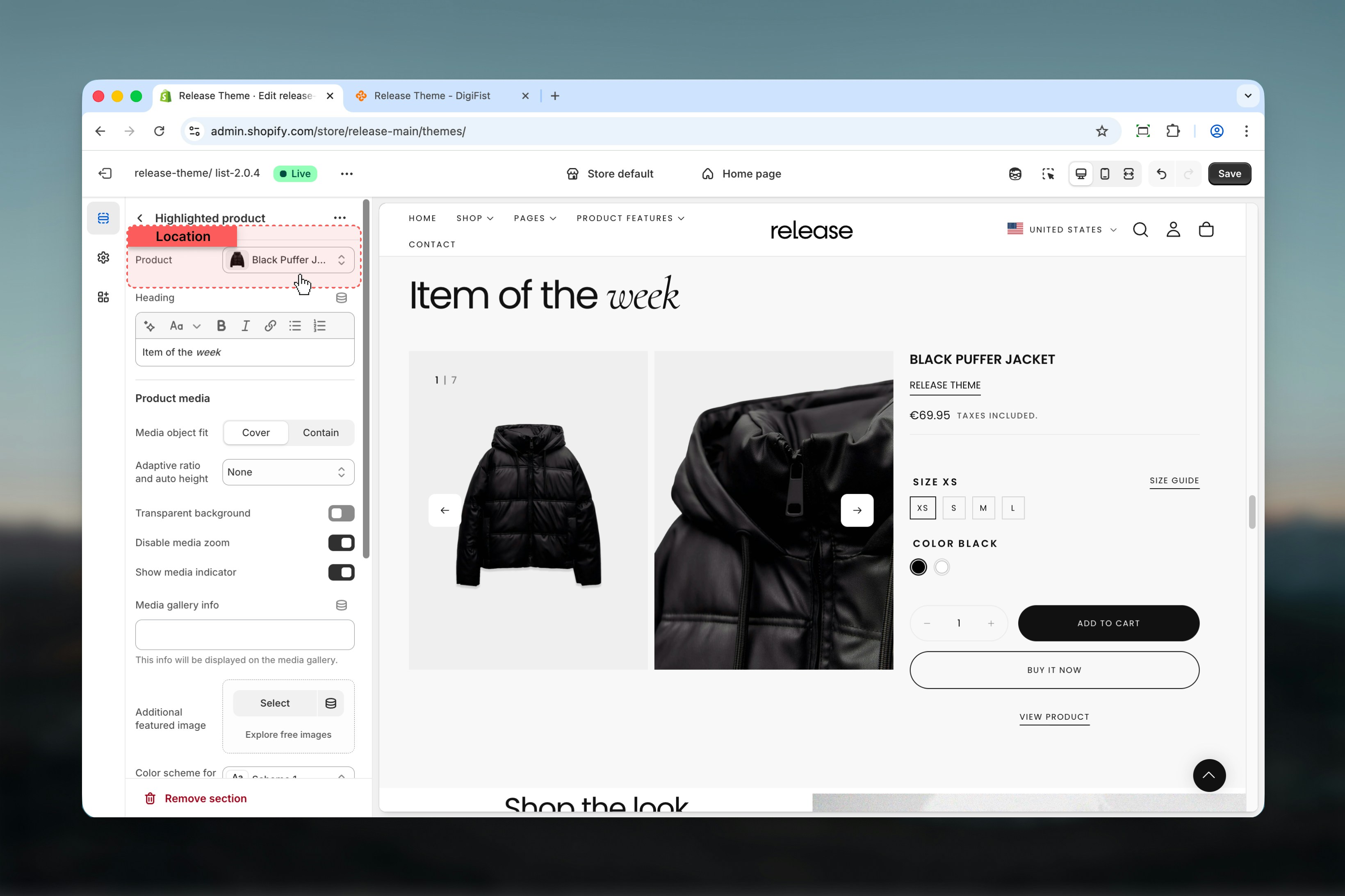
Section settings control product selection, media display, and layout options.
### Product
Select a product to display in this section.
* Shopify product picker
## Section settings
Section settings control product selection, media display, and layout options.
### Product
Select a product to display in this section.
* Shopify product picker
 ### Heading
Optional section heading above the product.
* Rich text supported
Use descriptive headings like "Product of the Week" or "Featured Item" to create context.
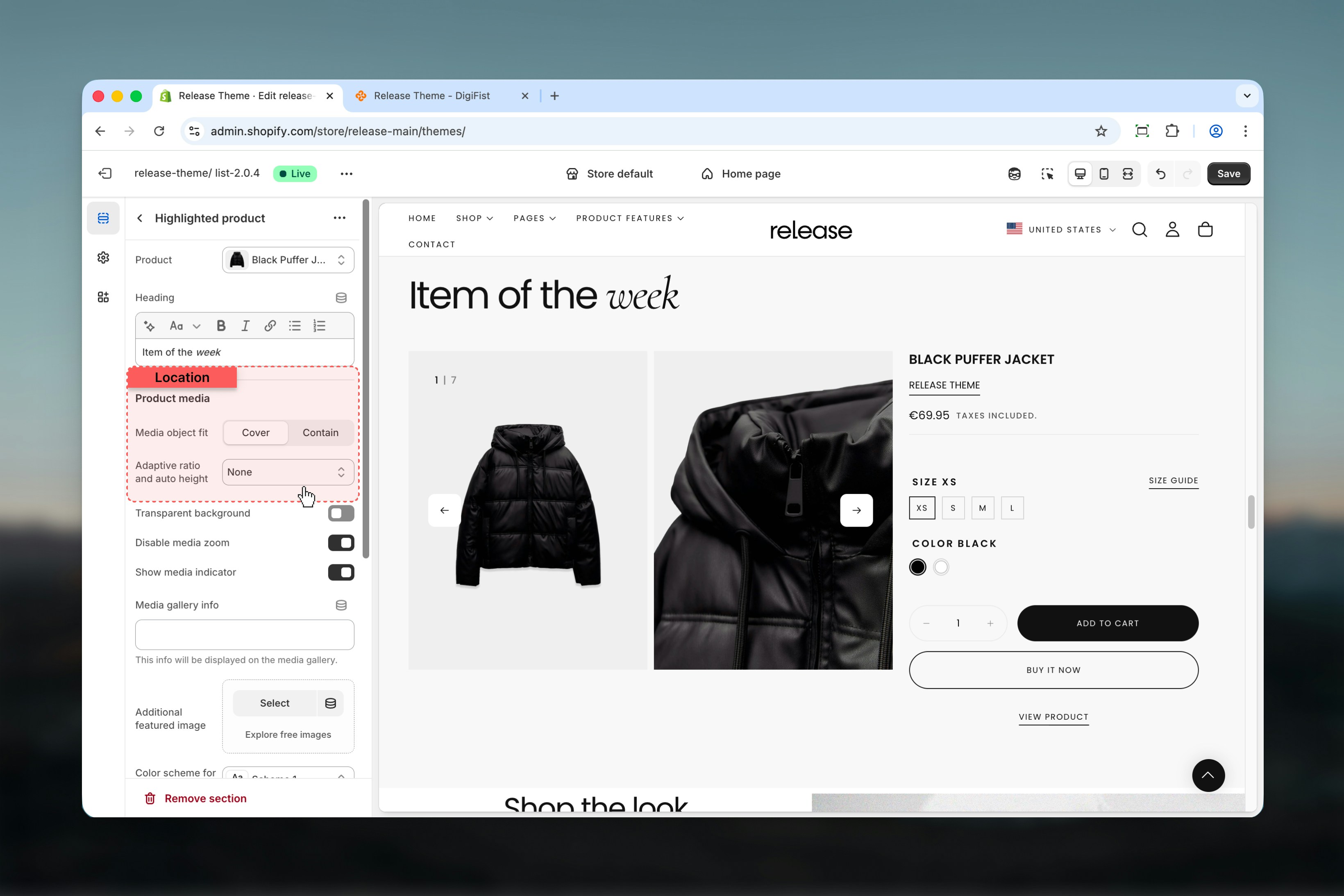
### Product media object fit
Controls how media fills the container.
**Available options:**
* **Cover:** Fill container, may crop image
* **Contain:** Fit within container, may show margins
**Default:** Cover
### Adaptive ratio and auto height
Controls how media aspect ratio is handled.
**Available options:**
* **Default:** Fixed aspect ratio
* **Adaptive ratio:** Adapts to each image's aspect ratio
* **Slider auto height:** Auto-adjust slider height per image
**Default:** Default
### Heading
Optional section heading above the product.
* Rich text supported
Use descriptive headings like "Product of the Week" or "Featured Item" to create context.
### Product media object fit
Controls how media fills the container.
**Available options:**
* **Cover:** Fill container, may crop image
* **Contain:** Fit within container, may show margins
**Default:** Cover
### Adaptive ratio and auto height
Controls how media aspect ratio is handled.
**Available options:**
* **Default:** Fixed aspect ratio
* **Adaptive ratio:** Adapts to each image's aspect ratio
* **Slider auto height:** Auto-adjust slider height per image
**Default:** Default
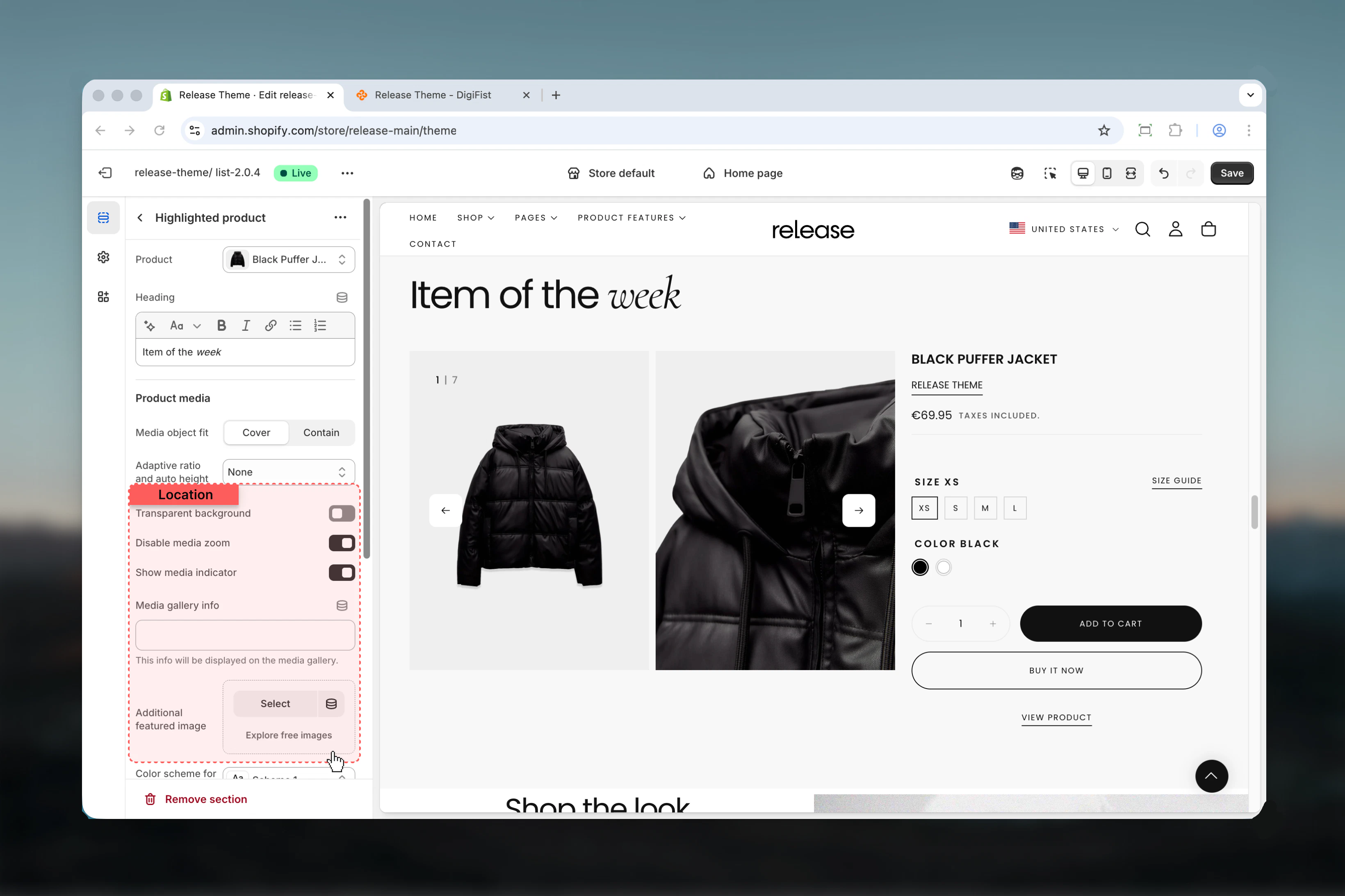
 ### Media transparent background
Removes background color from media container.
**Options:** True / False
**Default:** False
### Disable media zoom
Disables click-to-zoom lightbox functionality.
**Options:** True / False
**Default:** True
### Show media index
Displays current media position (e.g., "1/5").
**Options:** True / False
**Default:** True
### Media gallery info
Custom text displayed in media gallery.
* Text input
### Additional featured image
Upload an additional image to include in the media gallery.
* Shopify image picker
Image will be inserted after the first product image.
### Media transparent background
Removes background color from media container.
**Options:** True / False
**Default:** False
### Disable media zoom
Disables click-to-zoom lightbox functionality.
**Options:** True / False
**Default:** True
### Show media index
Displays current media position (e.g., "1/5").
**Options:** True / False
**Default:** True
### Media gallery info
Custom text displayed in media gallery.
* Text input
### Additional featured image
Upload an additional image to include in the media gallery.
* Shopify image picker
Image will be inserted after the first product image.
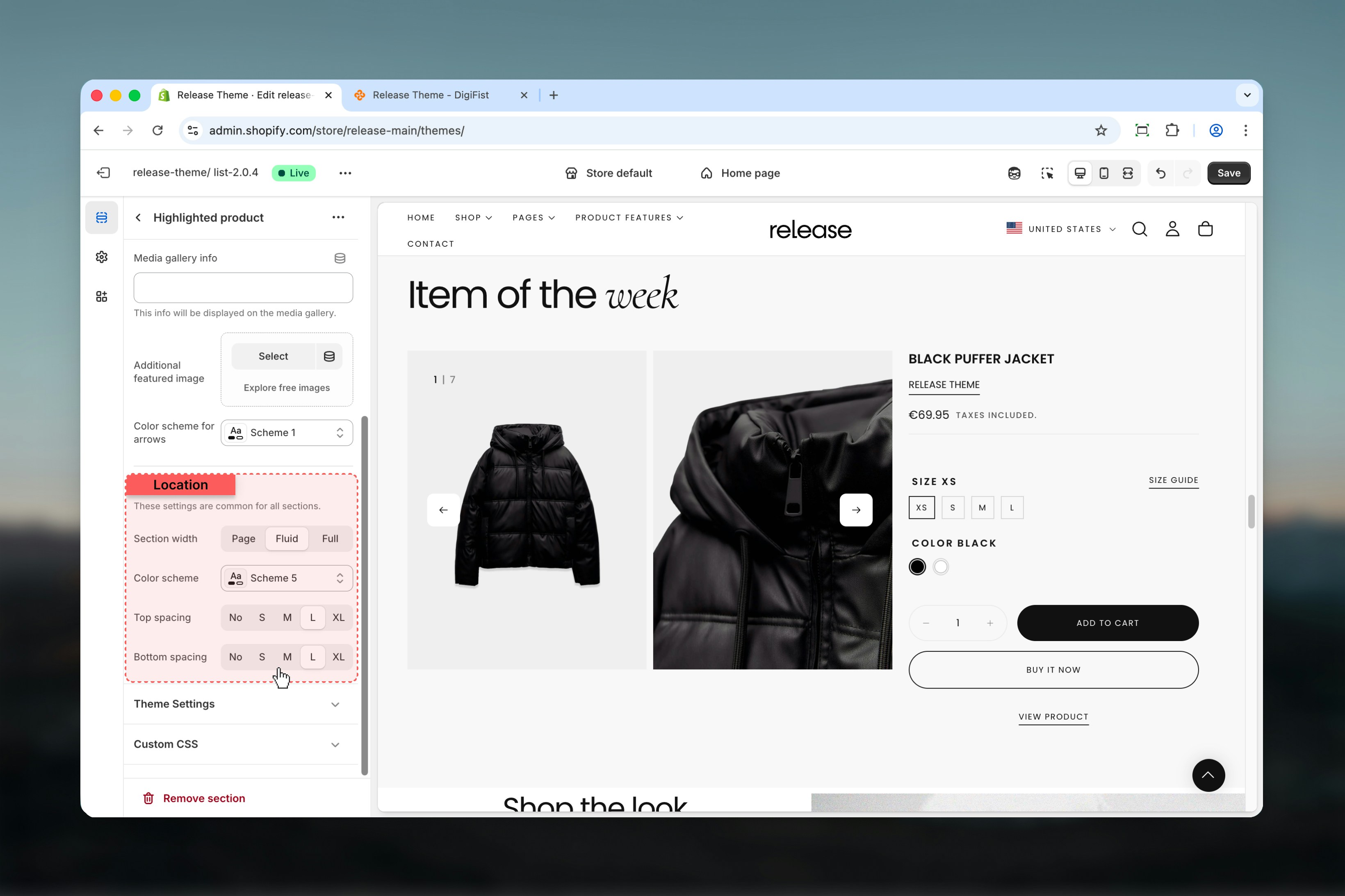
 ### Color scheme for arrows
Controls the color scheme for navigation arrows.
* Shopify color scheme selector
* **Default:** Scheme 1
### Section width
Controls the maximum width of the section.
**Available options:**
* **Page:** Standard page width
* **Fluid:** Wider than page width
* **Full:** Full viewport width
**Default:** Fluid
### Color scheme
Controls background and text colors for the section container.
* Shopify color scheme selector
* **Default:** Scheme 1
### Spacing top
Controls spacing above the section.
**Available options:** None, S, M, L, XL
**Default:** M
### Spacing bottom
Controls spacing below the section.
**Available options:** None, S, M, L, XL
**Default:** XL
### Color scheme for arrows
Controls the color scheme for navigation arrows.
* Shopify color scheme selector
* **Default:** Scheme 1
### Section width
Controls the maximum width of the section.
**Available options:**
* **Page:** Standard page width
* **Fluid:** Wider than page width
* **Full:** Full viewport width
**Default:** Fluid
### Color scheme
Controls background and text colors for the section container.
* Shopify color scheme selector
* **Default:** Scheme 1
### Spacing top
Controls spacing above the section.
**Available options:** None, S, M, L, XL
**Default:** M
### Spacing bottom
Controls spacing below the section.
**Available options:** None, S, M, L, XL
**Default:** XL
 ## Block settings
The Highlighted Product section supports all the same blocks as the main product page for complete flexibility.
* **Title** - Product title display
* **Badge** - Sale/sold out badges
* **Price** - Product price with compare-at price
* **Variant Picker** - Size/color/option selector
* **Quantity Selector** - Quantity input field
* **Buy Buttons** - Add to cart and Buy now buttons
* **Product Link** - Link to full product page
* **Text** - Custom text with vendor/type/collection links
* **Description** - Full product description
* **Icon with Text** - Feature highlights with icons
* **Collapsible Tab** - Expandable content sections
* **Divider** - Visual separator lines
* **Share** - Social sharing buttons
* **Rating** - Product reviews and rating display
* **Feature Rating** - Visual rating indicators
* **Popup** - Information popups and modals
* **Complementary Products** - Related product suggestions
* **Custom Liquid** - Custom code and functionality
For detailed block settings and configurations, refer to the [Product Page documentation](/themes/release/products/product-page).
## Best practices
* Select high-performing or strategically important products to maximize conversion impact
* Use descriptive, compelling section headings ("Product of the Week", "Staff Pick", "Limited Edition")
* Enable media zoom for products with important details or textures customers need to examine
* Add additional featured image for lifestyle shots, context, or usage demonstrations
* Include all essential blocks: title, price, variant picker, quantity selector, and buy buttons
* Test media gallery navigation on mobile devices to ensure smooth interaction
* Use collapsible tabs for lengthy product information to keep the layout clean
* Consider homepage or landing page placement for maximum visibility and engagement
* Update featured product regularly to maintain freshness and customer interest
* Use high-quality, professional product media for best presentation and credibility
## Common use cases
* **Homepage product feature** - Showcase bestseller, new arrival, or seasonal product on homepage
* **Product of the week** - Highlight rotating featured products with regular updates
* **Limited edition highlight** - Draw attention to exclusive, limited-run, or special items
* **Campaign landing pages** - Feature specific products for marketing campaigns or promotions
* **Editorial content** - Embed shoppable products within blog posts or content pages
* **Pre-launch teasing** - Display upcoming products with pre-order or notify-me options
## Related guides
Learn about product page blocks and detailed settings
Learn about common settings shared across sections
## Block settings
The Highlighted Product section supports all the same blocks as the main product page for complete flexibility.
* **Title** - Product title display
* **Badge** - Sale/sold out badges
* **Price** - Product price with compare-at price
* **Variant Picker** - Size/color/option selector
* **Quantity Selector** - Quantity input field
* **Buy Buttons** - Add to cart and Buy now buttons
* **Product Link** - Link to full product page
* **Text** - Custom text with vendor/type/collection links
* **Description** - Full product description
* **Icon with Text** - Feature highlights with icons
* **Collapsible Tab** - Expandable content sections
* **Divider** - Visual separator lines
* **Share** - Social sharing buttons
* **Rating** - Product reviews and rating display
* **Feature Rating** - Visual rating indicators
* **Popup** - Information popups and modals
* **Complementary Products** - Related product suggestions
* **Custom Liquid** - Custom code and functionality
For detailed block settings and configurations, refer to the [Product Page documentation](/themes/release/products/product-page).
## Best practices
* Select high-performing or strategically important products to maximize conversion impact
* Use descriptive, compelling section headings ("Product of the Week", "Staff Pick", "Limited Edition")
* Enable media zoom for products with important details or textures customers need to examine
* Add additional featured image for lifestyle shots, context, or usage demonstrations
* Include all essential blocks: title, price, variant picker, quantity selector, and buy buttons
* Test media gallery navigation on mobile devices to ensure smooth interaction
* Use collapsible tabs for lengthy product information to keep the layout clean
* Consider homepage or landing page placement for maximum visibility and engagement
* Update featured product regularly to maintain freshness and customer interest
* Use high-quality, professional product media for best presentation and credibility
## Common use cases
* **Homepage product feature** - Showcase bestseller, new arrival, or seasonal product on homepage
* **Product of the week** - Highlight rotating featured products with regular updates
* **Limited edition highlight** - Draw attention to exclusive, limited-run, or special items
* **Campaign landing pages** - Feature specific products for marketing campaigns or promotions
* **Editorial content** - Embed shoppable products within blog posts or content pages
* **Pre-launch teasing** - Display upcoming products with pre-order or notify-me options
## Related guides
Learn about product page blocks and detailed settings
Learn about common settings shared across sections