> ## Documentation Index
> Fetch the complete documentation index at: https://docs.digifist.com/llms.txt
> Use this file to discover all available pages before exploring further.
# Interactive Banner
> Highlight multiple key messages within a single banner area with hover-triggered slides.
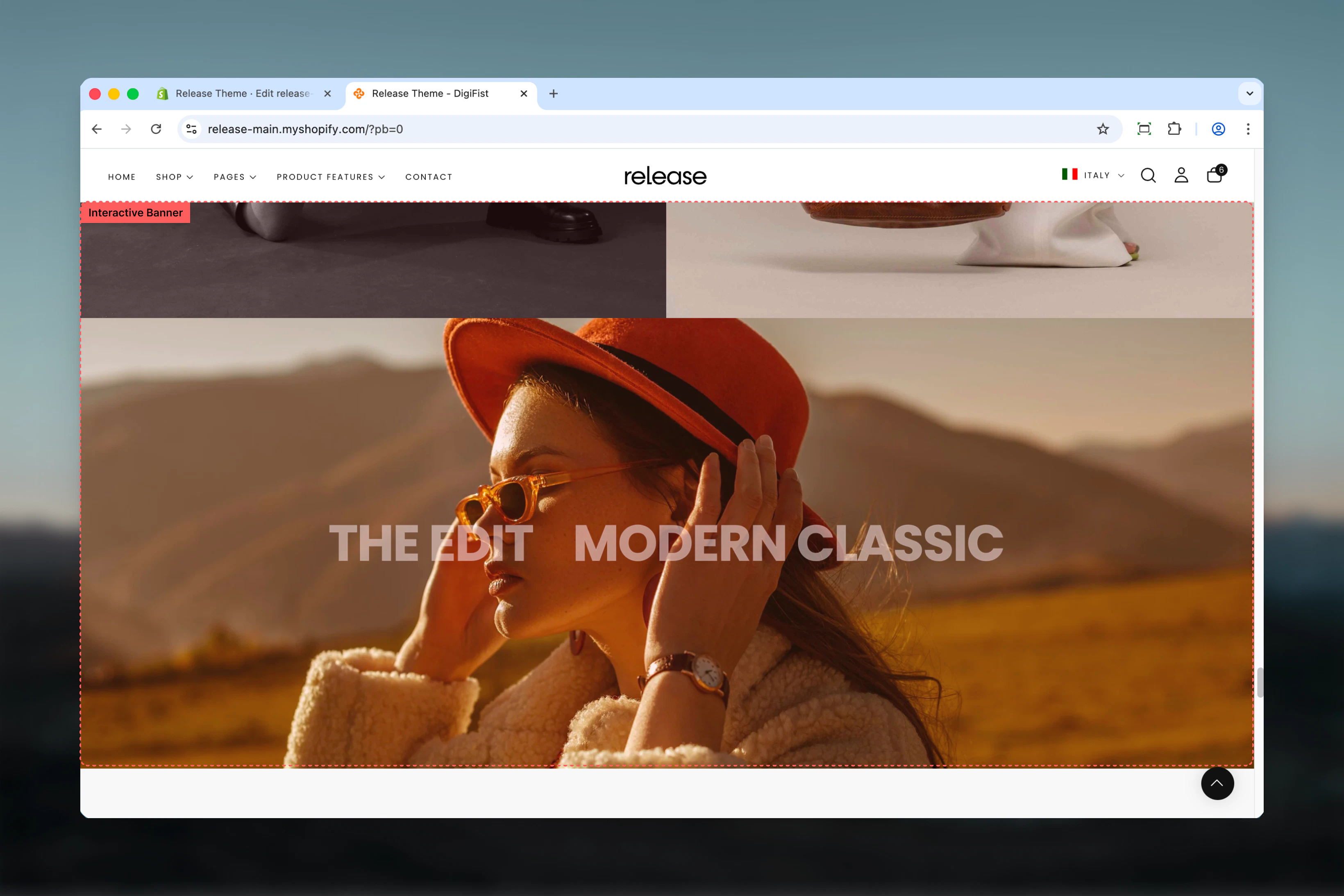
The Interactive Banner is a full-width visual section designed to highlight multiple key messages within a single banner area. It works similarly to a full width banner but allows multiple interactive slides that change on hover or click.
Each slide displays a heading that acts as both a visual trigger and a navigation point. The first slide is active by default, and up to 5 slides can be added.
Interactive banners help create engaging, dynamic experiences by allowing users to explore multiple messages or campaigns within a compact, visually striking format.
 ## What this section controls
This section controls interactive banner displays with the following capabilities:
* Multiple slides with hover-triggered media changes
* Layered headings that act as navigation triggers
* Separate desktop and mobile media configuration
* Click-through functionality with custom links
* Up to 5 slides per section
* Customizable banner height and content width
## How the Interactive Banner works
The Interactive Banner uses a block-based slide system:
* Displays multiple headings layered on top of a single banner area
* The first slide is active by default
* Hovering over a heading changes the background media with an animation
* Clicking a heading navigates to its assigned link
* Supports both images and videos
* Desktop and mobile media can be configured separately
* Maximum of **5 slides** per section
## Getting started
From Shopify admin, access the Theme Customizer.
Add the Interactive Banner section to your page or template.
Click **Add Slide** to create interactive banner states.
Upload media for each slide and assign click-through links.
## What this section controls
This section controls interactive banner displays with the following capabilities:
* Multiple slides with hover-triggered media changes
* Layered headings that act as navigation triggers
* Separate desktop and mobile media configuration
* Click-through functionality with custom links
* Up to 5 slides per section
* Customizable banner height and content width
## How the Interactive Banner works
The Interactive Banner uses a block-based slide system:
* Displays multiple headings layered on top of a single banner area
* The first slide is active by default
* Hovering over a heading changes the background media with an animation
* Clicking a heading navigates to its assigned link
* Supports both images and videos
* Desktop and mobile media can be configured separately
* Maximum of **5 slides** per section
## Getting started
From Shopify admin, access the Theme Customizer.
Add the Interactive Banner section to your page or template.
Click **Add Slide** to create interactive banner states.
Upload media for each slide and assign click-through links.
 ## Section settings
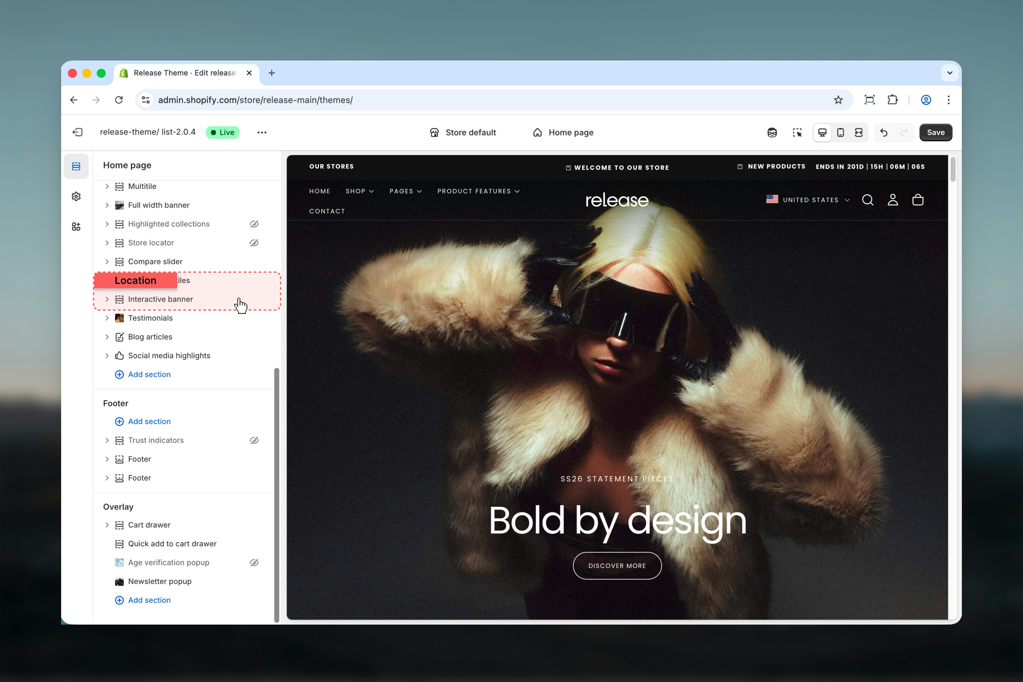
Section settings control the overall size and layout of the banner.
### Banner height for desktop
Controls the height of the banner on desktop devices.
**Range:** 20vh – 100vh
### Banner height for mobile
Controls the height of the banner on mobile devices.
**Range:** 20vh – 100vh
## Section settings
Section settings control the overall size and layout of the banner.
### Banner height for desktop
Controls the height of the banner on desktop devices.
**Range:** 20vh – 100vh
### Banner height for mobile
Controls the height of the banner on mobile devices.
**Range:** 20vh – 100vh
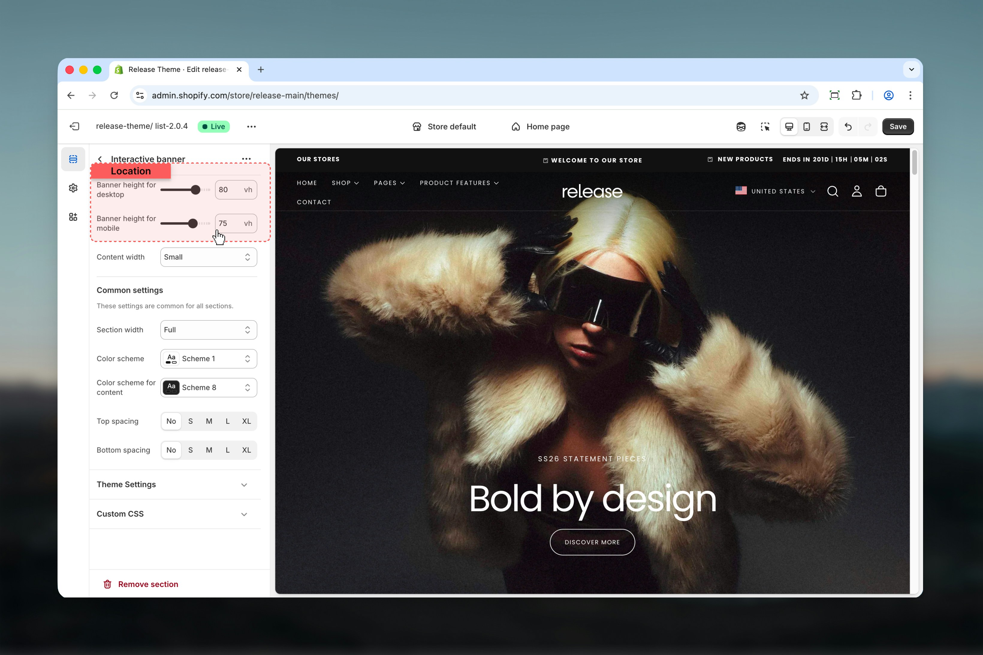 ### Content width
Controls the maximum width of the interactive heading content inside the banner.
**Available options:** Small, Narrow, Normal
### Content width
Controls the maximum width of the interactive heading content inside the banner.
**Available options:** Small, Narrow, Normal
 ## Slide settings
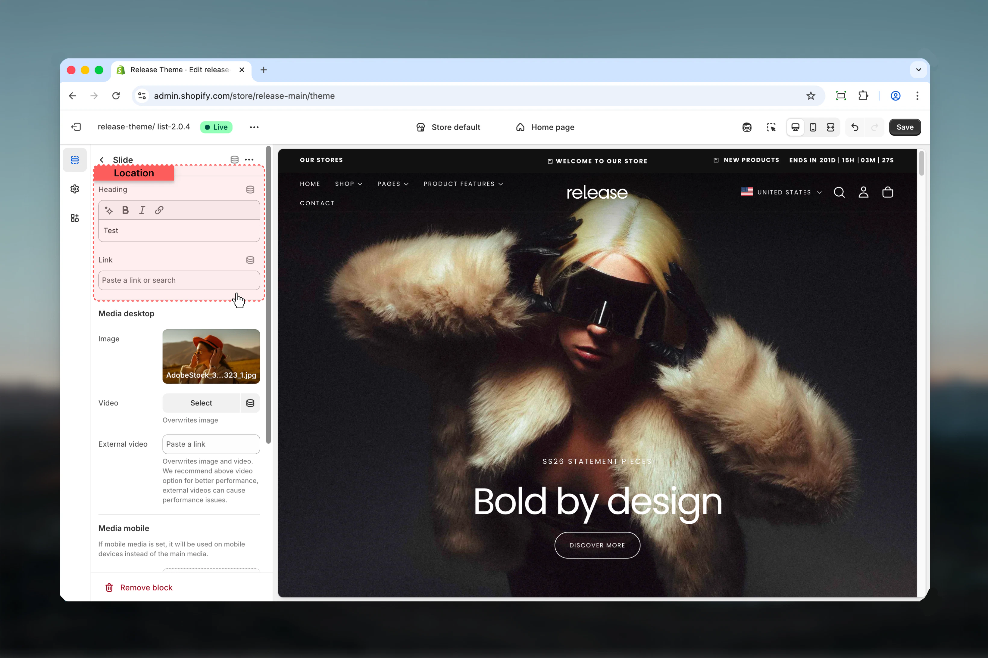
Slide settings control individual interactive slides. Each slide represents a single interactive state of the banner.
The first slide in the list is automatically active on page load.
### Heading
The visible title displayed on top of the banner.
* Rich text supported (bold, italic, underline, links)
* Acts as an interactive trigger on hover
* Acts as a navigation element on click
### Link
Defines where the user is redirected when the heading is clicked.
* Shopify URL selector
## Slide settings
Slide settings control individual interactive slides. Each slide represents a single interactive state of the banner.
The first slide in the list is automatically active on page load.
### Heading
The visible title displayed on top of the banner.
* Rich text supported (bold, italic, underline, links)
* Acts as an interactive trigger on hover
* Acts as a navigation element on click
### Link
Defines where the user is redirected when the heading is clicked.
* Shopify URL selector
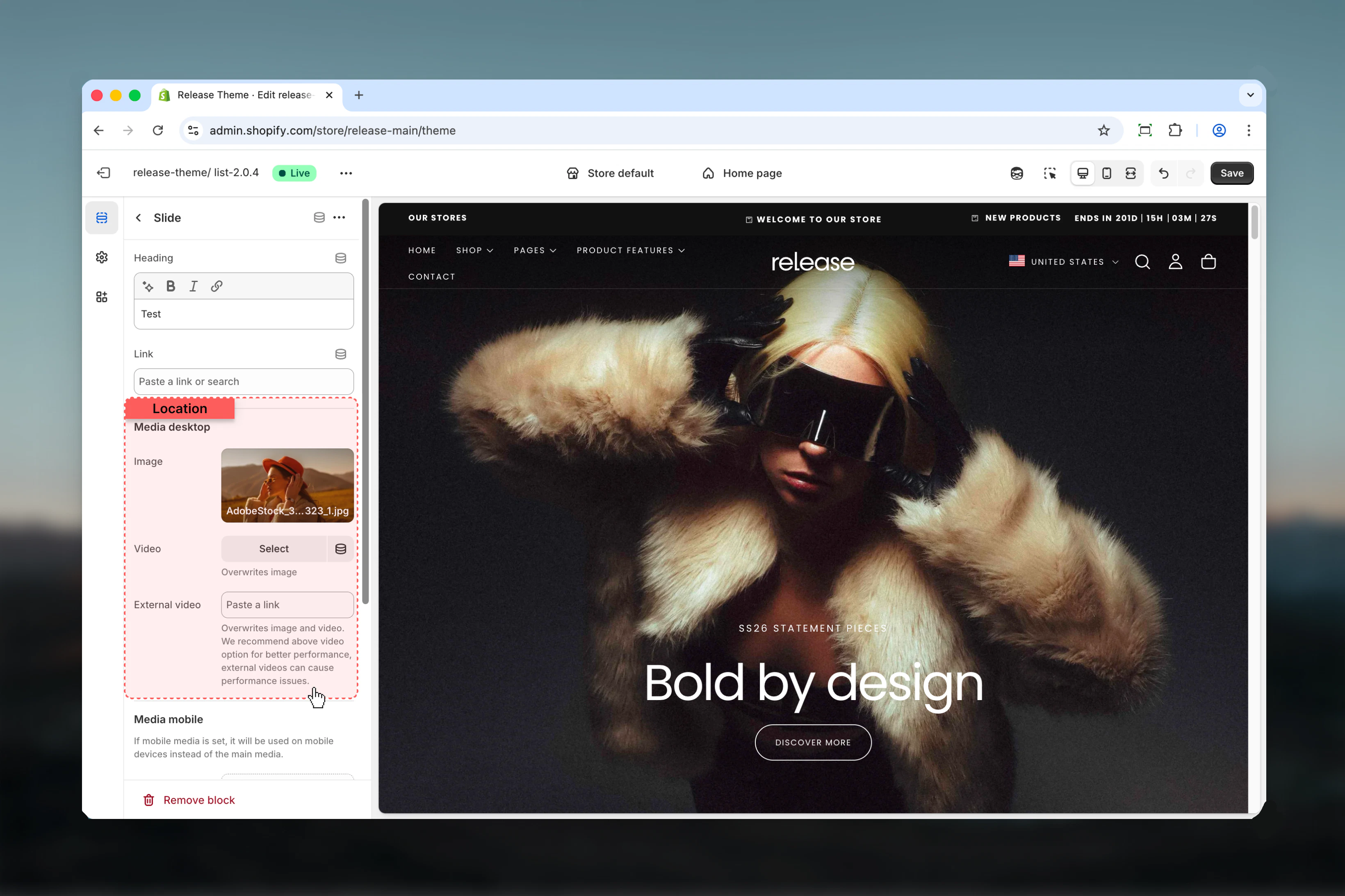
 Desktop media is used by default unless overridden by mobile media.
### Image
Primary visual for the slide.
* Shopify image selector
### Video
Optional video for the slide.
* Shopify video selector
Overwrites image if selected.
### External video
External video URL input.
* Overwrites both image and Shopify-hosted video
* Not recommended for performance-sensitive pages
Use Shopify-hosted videos whenever possible for better performance and stability.
Desktop media is used by default unless overridden by mobile media.
### Image
Primary visual for the slide.
* Shopify image selector
### Video
Optional video for the slide.
* Shopify video selector
Overwrites image if selected.
### External video
External video URL input.
* Overwrites both image and Shopify-hosted video
* Not recommended for performance-sensitive pages
Use Shopify-hosted videos whenever possible for better performance and stability.
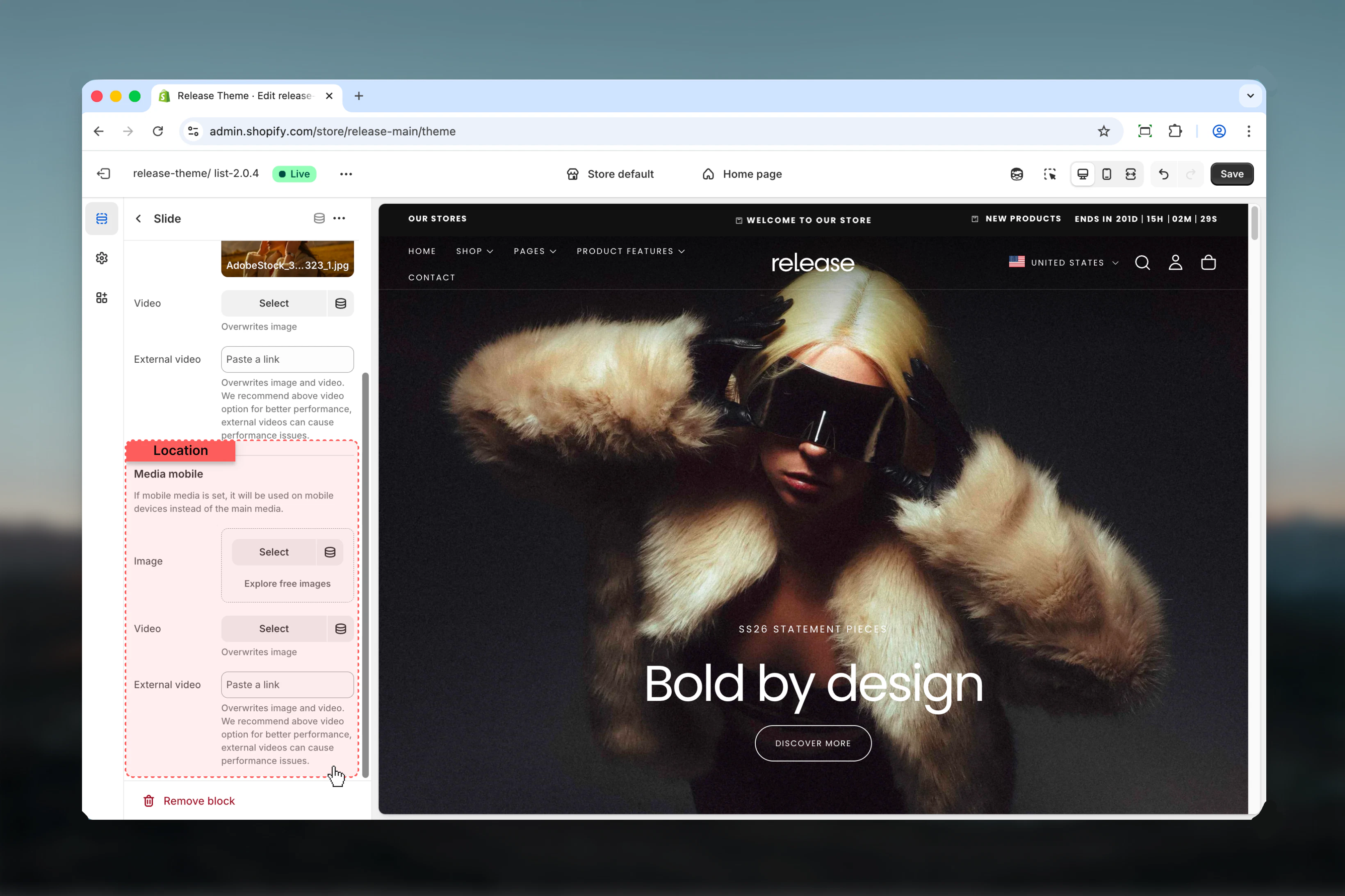
 If mobile media is set, it will be used on mobile devices instead of the desktop media.
### Mobile image
* Shopify image selector
### Mobile video
* Shopify video selector
Overwrites mobile image.
### Mobile external video
External video URL input for mobile.
* Overwrites mobile image and video
* Not recommended for performance-sensitive pages
If mobile media is set, it will be used on mobile devices instead of the desktop media.
### Mobile image
* Shopify image selector
### Mobile video
* Shopify video selector
Overwrites mobile image.
### Mobile external video
External video URL input for mobile.
* Overwrites mobile image and video
* Not recommended for performance-sensitive pages
 ## Best practices
* Keep headings short and scannable (2-5 words maximum) for quick comprehension
* Use consistent image or video styles across slides to maintain visual coherence
* Limit slides to 3–4 for better usability and to avoid overwhelming users
* Avoid external videos unless absolutely necessary due to performance impact
* Ensure sufficient contrast between headings and media for readability
* Test hover interactions on desktop to ensure smooth transitions
* Use high-quality media that maintains clarity at full width
* Consider load time when using videos for multiple slides
* Make sure headings clearly communicate the destination or value proposition
## Common use cases
* **Campaign landing headers** - Showcase multiple campaigns with interactive exploration
* **Collection highlights** - Feature different product collections with visual appeal
* **Editorial storytelling banners** - Tell brand stories through interactive narratives
* **Brand positioning sections** - Highlight key brand values or pillars
* **Seasonal or promotional hero areas** - Display time-sensitive offers with engaging visuals
## Related guides
Learn about common settings shared across sections
## Best practices
* Keep headings short and scannable (2-5 words maximum) for quick comprehension
* Use consistent image or video styles across slides to maintain visual coherence
* Limit slides to 3–4 for better usability and to avoid overwhelming users
* Avoid external videos unless absolutely necessary due to performance impact
* Ensure sufficient contrast between headings and media for readability
* Test hover interactions on desktop to ensure smooth transitions
* Use high-quality media that maintains clarity at full width
* Consider load time when using videos for multiple slides
* Make sure headings clearly communicate the destination or value proposition
## Common use cases
* **Campaign landing headers** - Showcase multiple campaigns with interactive exploration
* **Collection highlights** - Feature different product collections with visual appeal
* **Editorial storytelling banners** - Tell brand stories through interactive narratives
* **Brand positioning sections** - Highlight key brand values or pillars
* **Seasonal or promotional hero areas** - Display time-sensitive offers with engaging visuals
## Related guides
Learn about common settings shared across sections