> ## Documentation Index
> Fetch the complete documentation index at: https://docs.digifist.com/llms.txt
> Use this file to discover all available pages before exploring further.
# Marquees
> Display continuously scrolling text or product items in an animated horizontal ticker format.
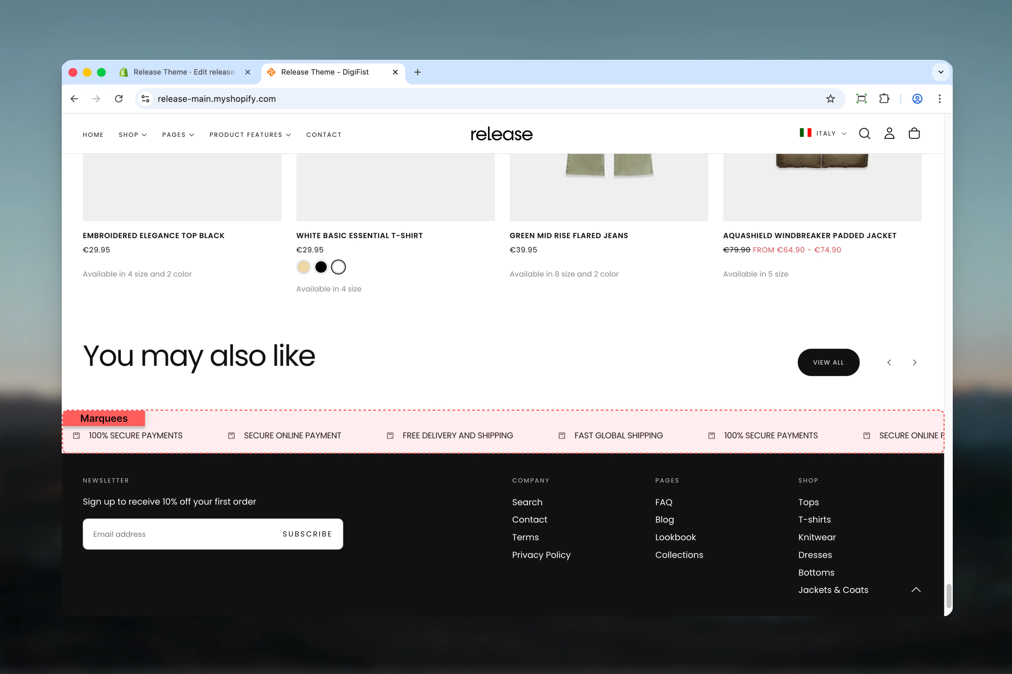
The Marquees section displays continuously scrolling text or product items with icons in a horizontal ticker format. It's perfect for highlighting key messages, promotions, or featured products in an eye-catching, animated display.
Marquees create dynamic, attention-grabbing displays that draw the eye and communicate important information or offers while maintaining a modern, engaging user experience.
 ## What this section controls
This section controls marquee displays with the following capabilities:
* Unlimited text items, product items, or countdown timers
* Continuous horizontal scroll animation
* Pause on hover functionality
* Configurable animation speed
* Icon and custom image support
* Product card integration
* Responsive element sizing
## How the Marquees section works
The Marquees section creates an infinite scrolling animation:
* Displays unlimited text items, product items, or countdown timers
* Continuous horizontal scroll animation
* Pause on hover functionality
* Configurable animation speed and element sizing
* Supports icons, custom images, and product cards
* Responsive design with mobile-specific sizing
## Getting started
From Shopify admin, access the Theme Customizer.
Add the section to your desired page or template.
Click **Add Text item** or **Add Product item** to create scrolling content.
Adjust animation speed, element size, and spacing.
## What this section controls
This section controls marquee displays with the following capabilities:
* Unlimited text items, product items, or countdown timers
* Continuous horizontal scroll animation
* Pause on hover functionality
* Configurable animation speed
* Icon and custom image support
* Product card integration
* Responsive element sizing
## How the Marquees section works
The Marquees section creates an infinite scrolling animation:
* Displays unlimited text items, product items, or countdown timers
* Continuous horizontal scroll animation
* Pause on hover functionality
* Configurable animation speed and element sizing
* Supports icons, custom images, and product cards
* Responsive design with mobile-specific sizing
## Getting started
From Shopify admin, access the Theme Customizer.
Add the section to your desired page or template.
Click **Add Text item** or **Add Product item** to create scrolling content.
Adjust animation speed, element size, and spacing.
 ## Section settings
Section settings control animation behavior, sizing, and layout.
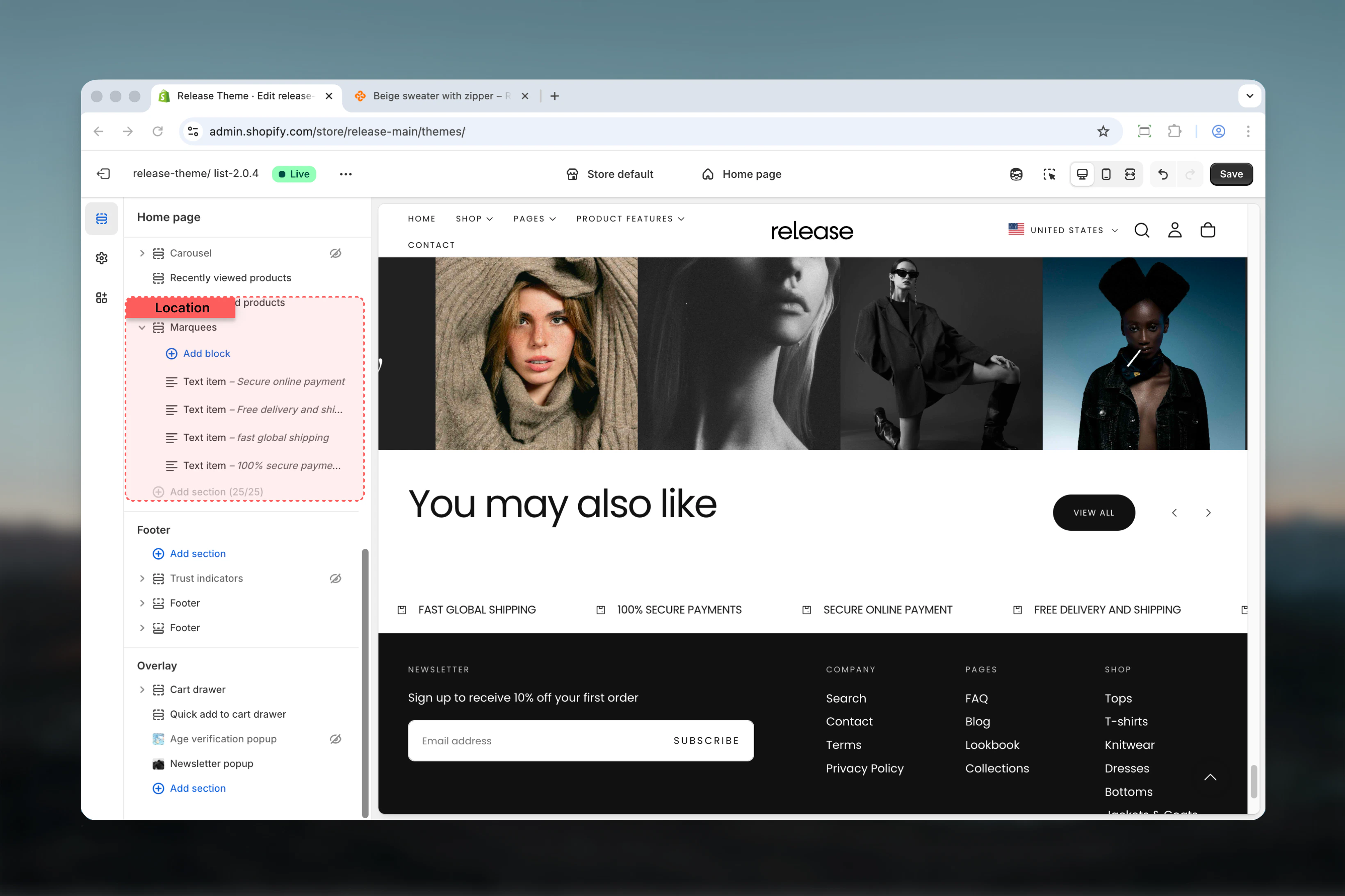
### Enable animation
Enables the scrolling animation.
**Options:** True / False
**Default:** True
Enable to animate the marquees. Disable for static display.
### Animation speed
Controls the speed of the scrolling animation.
**Range:** 1 – 10
**Default:** 5
The higher the number, the slower the animation.
## Section settings
Section settings control animation behavior, sizing, and layout.
### Enable animation
Enables the scrolling animation.
**Options:** True / False
**Default:** True
Enable to animate the marquees. Disable for static display.
### Animation speed
Controls the speed of the scrolling animation.
**Range:** 1 – 10
**Default:** 5
The higher the number, the slower the animation.
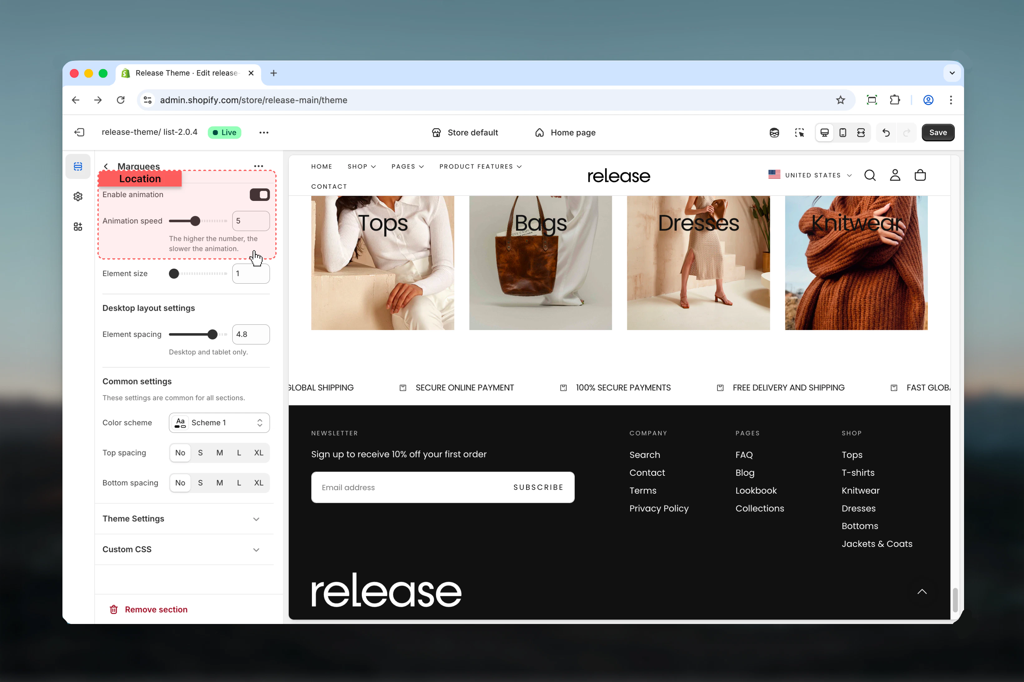 ### Element size
Controls the size of marquee items.
**Range:** 1 – 6
**Default:** 1
Desktop and tablet only. Mobile size adjusts automatically.
### Element spacing
Controls spacing between marquee items on desktop.
**Range:** 0 – 6 rem (0.4 increments)
**Default:** 4.8 rem
Desktop and tablet only. Mobile spacing adjusts automatically.
### Element size
Controls the size of marquee items.
**Range:** 1 – 6
**Default:** 1
Desktop and tablet only. Mobile size adjusts automatically.
### Element spacing
Controls spacing between marquee items on desktop.
**Range:** 0 – 6 rem (0.4 increments)
**Default:** 4.8 rem
Desktop and tablet only. Mobile spacing adjusts automatically.
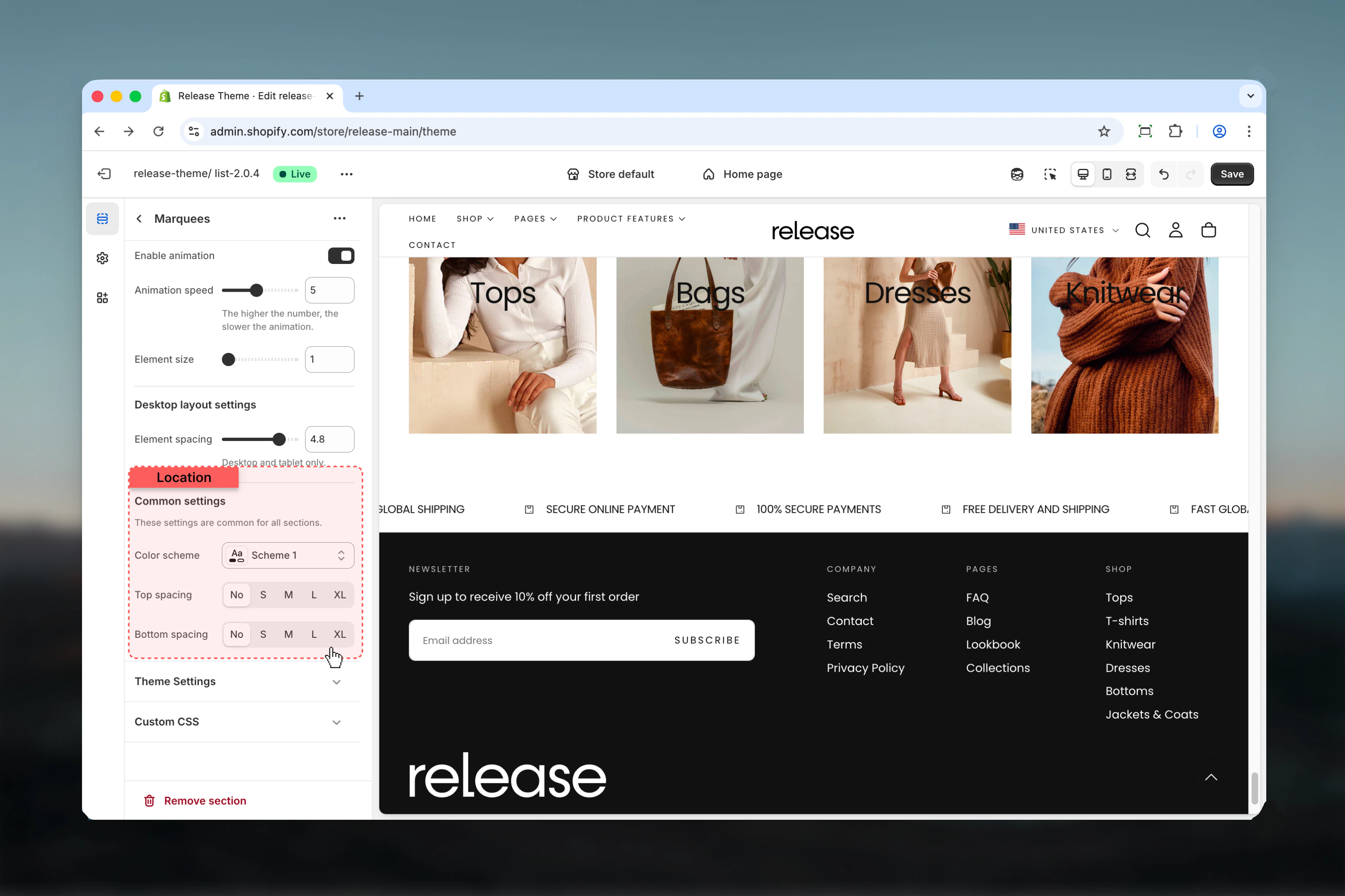
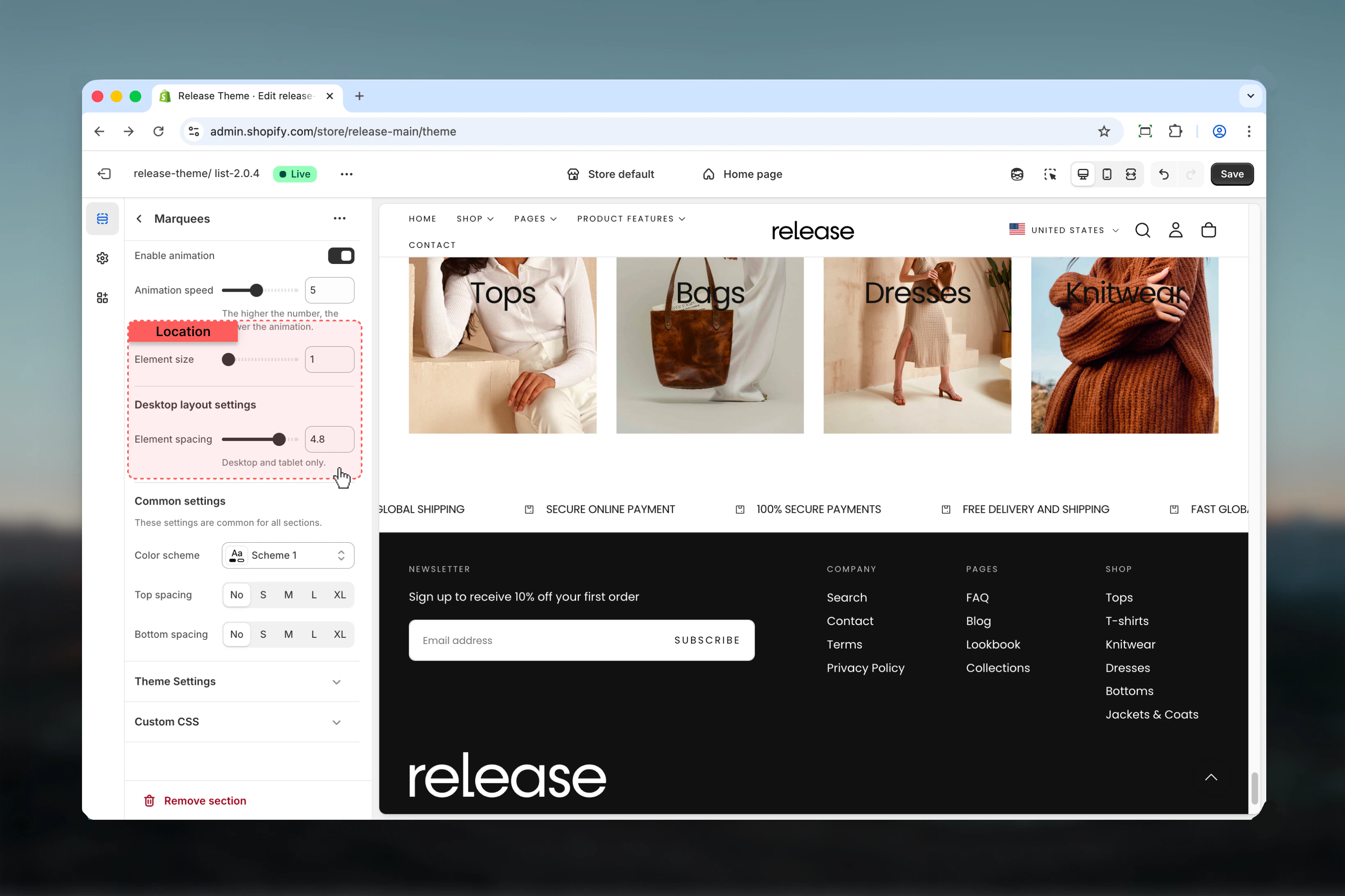 ### Color scheme
Controls background and text colors for the section container.
* Shopify color scheme selector
* **Default:** Scheme 1
### Spacing top
Controls spacing above the section.
**Available options:** None, S, M, L, XL
**Default:** None
### Spacing bottom
Controls spacing below the section.
**Available options:** None, S, M, L, XL
**Default:** None
### Color scheme
Controls background and text colors for the section container.
* Shopify color scheme selector
* **Default:** Scheme 1
### Spacing top
Controls spacing above the section.
**Available options:** None, S, M, L, XL
**Default:** None
### Spacing bottom
Controls spacing below the section.
**Available options:** None, S, M, L, XL
**Default:** None
 ## Block settings
The Marquees section supports three types of blocks for flexible content display.
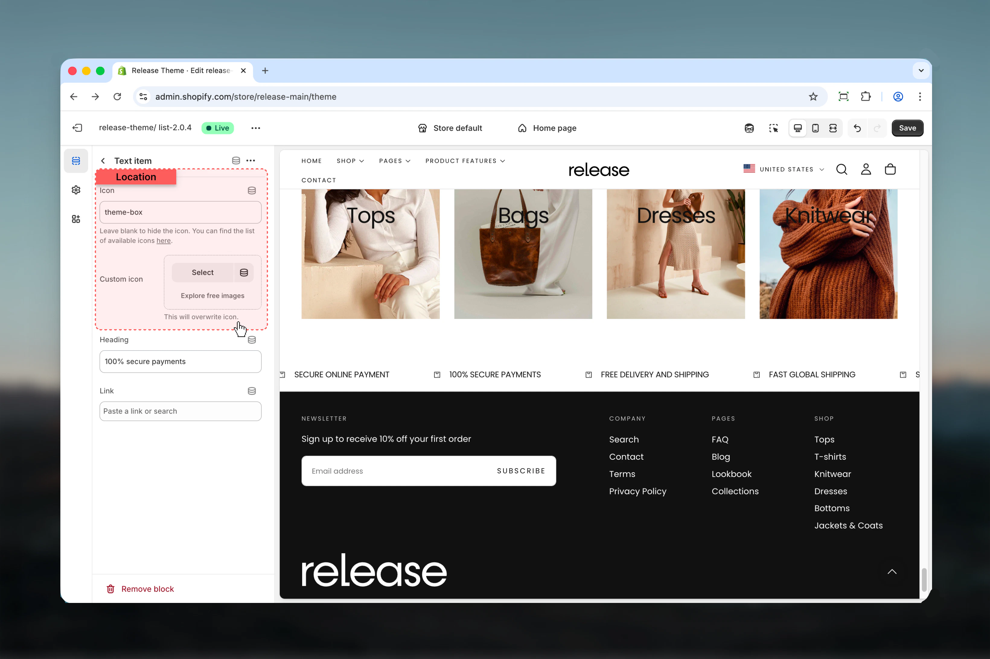
### Icon
Theme icon identifier.
* Text input
* **Default:** theme-box
See available icons in theme documentation.
### Custom icon
Upload a custom icon image.
* Shopify image picker
Overwrites theme icon when selected.
## Block settings
The Marquees section supports three types of blocks for flexible content display.
### Icon
Theme icon identifier.
* Text input
* **Default:** theme-box
See available icons in theme documentation.
### Custom icon
Upload a custom icon image.
* Shopify image picker
Overwrites theme icon when selected.
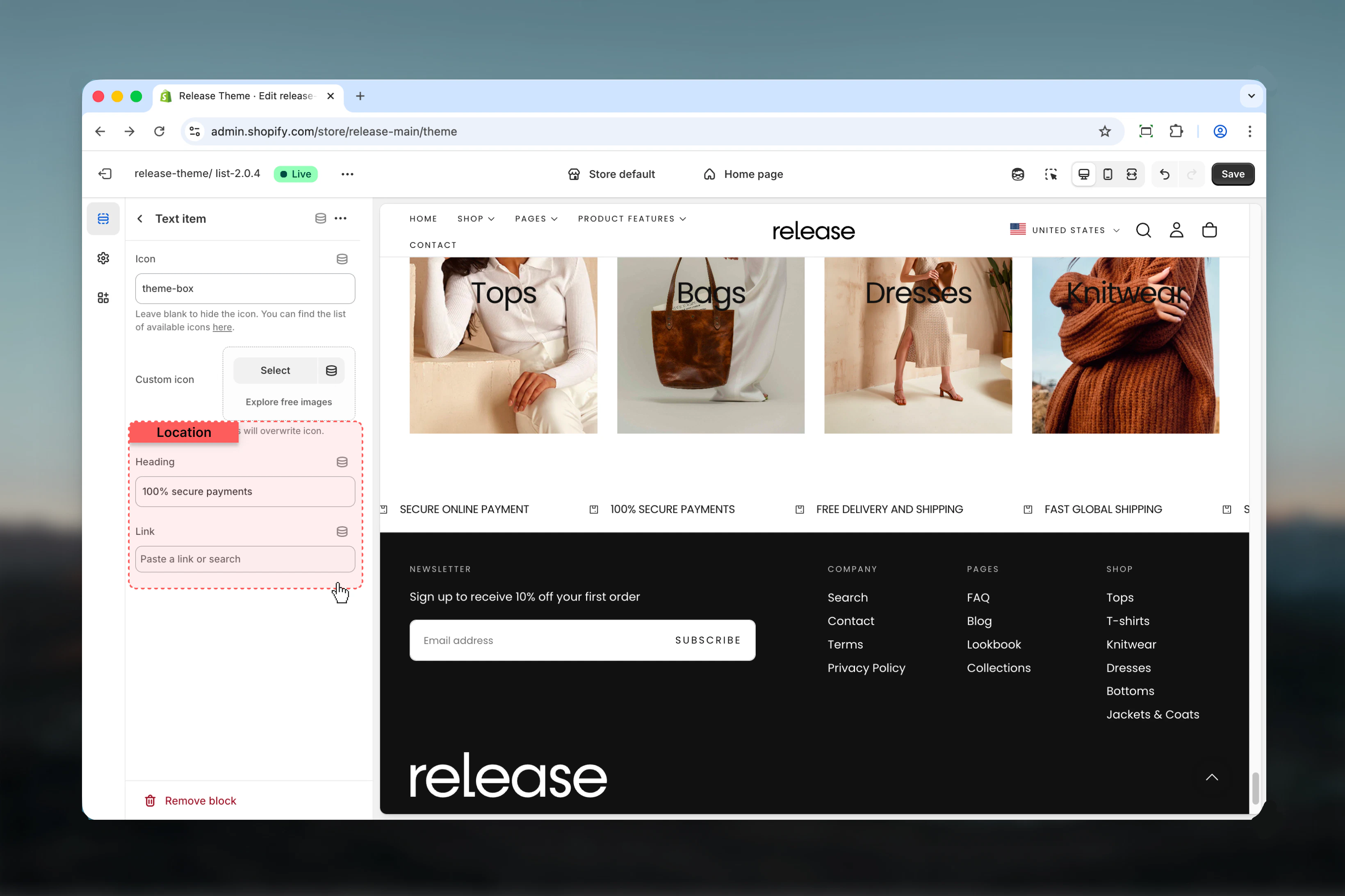
 ### Title
Heading text for the item.
* Text input
### Link
Optional link destination.
* Shopify URL selector
### Title
Heading text for the item.
* Text input
### Link
Optional link destination.
* Shopify URL selector
 ### Product
Select a product to display.
* Shopify product picker
### Product image
Custom product image.
* Shopify image picker
Overwrites product featured image.
### Product heading
Custom product title.
* Text input
Overwrites product title.
### Product
Select a product to display.
* Shopify product picker
### Product image
Custom product image.
* Shopify image picker
Overwrites product featured image.
### Product heading
Custom product title.
* Text input
Overwrites product title.
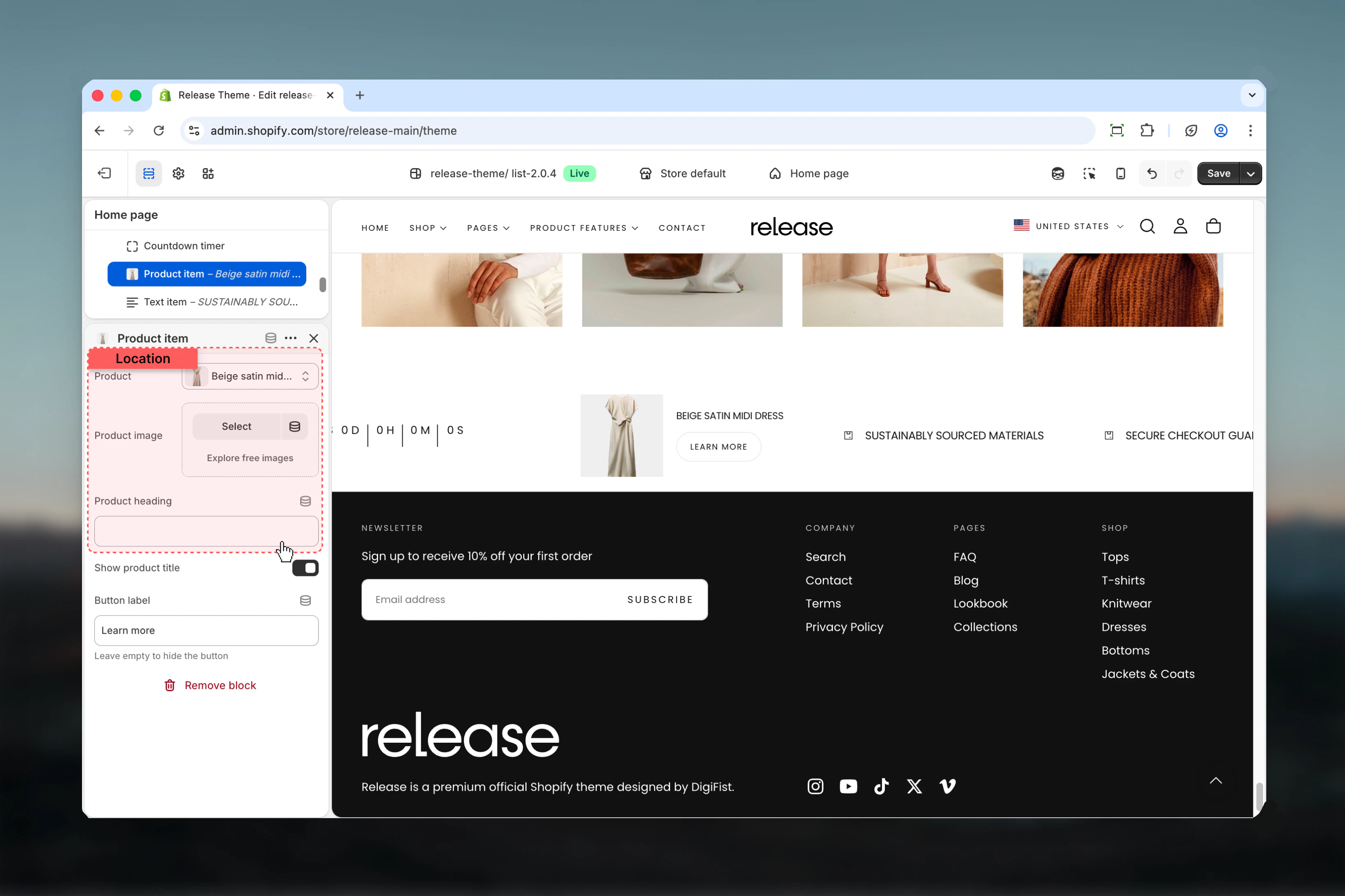 ### Show product title
Displays product title below image.
**Options:** True / False
**Default:** True
### Button label
Text for optional button.
* Text input
* Leave empty to hide
* **Default:** "Learn more"
Maximum of 1 timer block can be added per section.
### Show on
Controls where the timer is visible.
**Available options:**
* **Desktop:** Desktop only
* **Mobile:** Mobile only
* **Both:** All devices
**Default:** Desktop
### Timer date
Set the countdown target date and time.
* **Year:** Number input (Default: 2024)
* **Month:** Select January – December (Default: January)
* **Day:** Range 1 – 31 (Default: 1)
* **Hour:** Range 0 – 23 (Default: 0)
* **Minute:** Range 0 – 59 (Default: 0)
### Show product title
Displays product title below image.
**Options:** True / False
**Default:** True
### Button label
Text for optional button.
* Text input
* Leave empty to hide
* **Default:** "Learn more"
Maximum of 1 timer block can be added per section.
### Show on
Controls where the timer is visible.
**Available options:**
* **Desktop:** Desktop only
* **Mobile:** Mobile only
* **Both:** All devices
**Default:** Desktop
### Timer date
Set the countdown target date and time.
* **Year:** Number input (Default: 2024)
* **Month:** Select January – December (Default: January)
* **Day:** Range 1 – 31 (Default: 1)
* **Hour:** Range 0 – 23 (Default: 0)
* **Minute:** Range 0 – 59 (Default: 0)
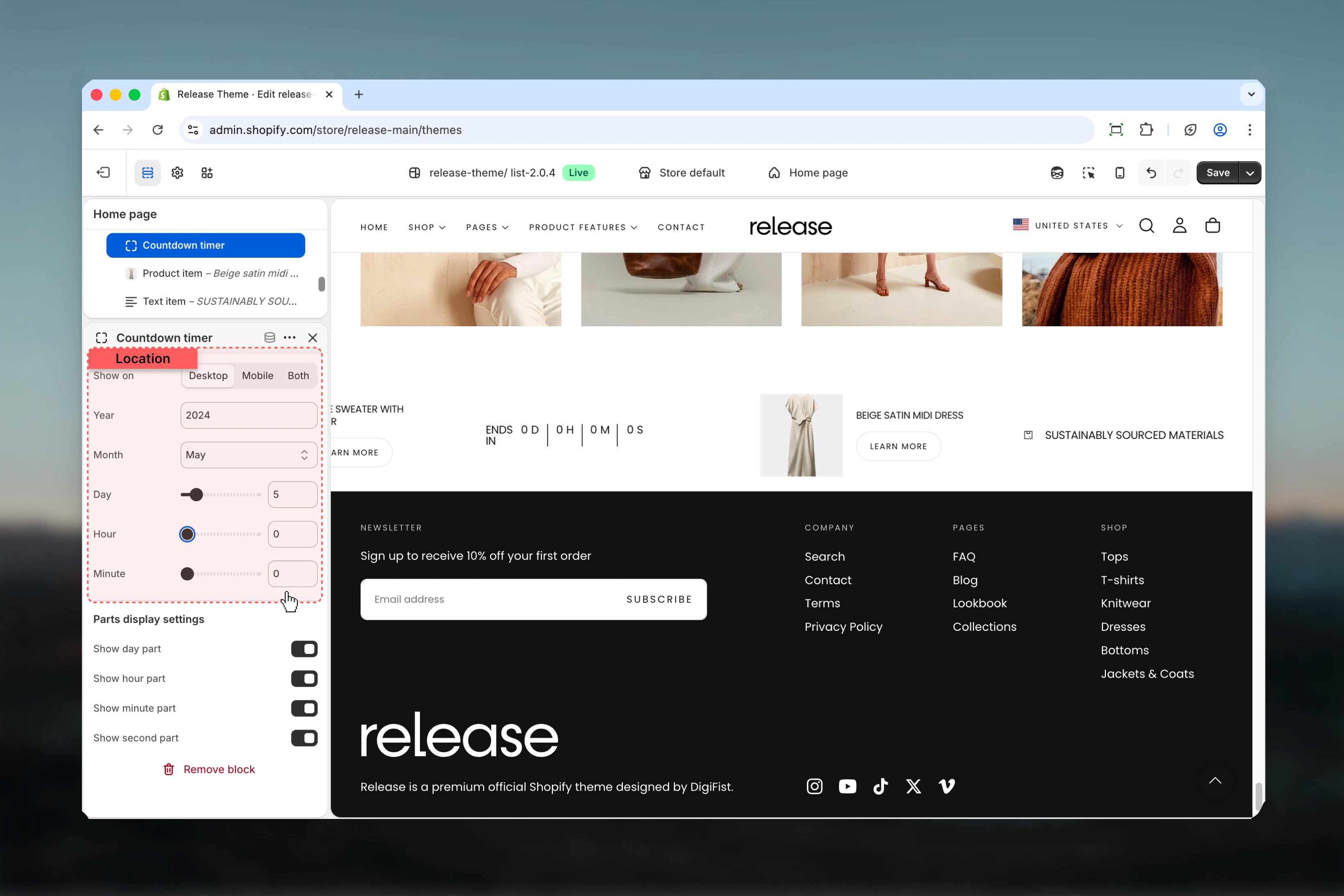 ### Parts display settings
Control which timer components are visible:
* **Show timer days** (Default: True)
* **Show timer hours** (Default: True)
* **Show timer minutes** (Default: True)
* **Show timer seconds** (Default: True)
## Best practices
* Keep text items concise (2-5 words) for quick comprehension during scrolling
* Use consistent icon styling across all items for visual harmony
* Set animation speed based on content length - slower for text-heavy items
* Test animation speed on actual devices to ensure readability during scroll
* Limit to 6-8 unique items to avoid overwhelming the animation cycle
* Use high contrast colors for text against background for readability
* Consider disabling animation for accessibility or content-heavy messages
* Product items work best with square product images for consistent display
* Use marquees for promotional messages, shipping info, or store highlights
* Place near top of page for maximum visibility and impact
## Common use cases
* **Promotional messaging** - Highlight sales, discounts, or special offers
* **Shipping and returns** - Display free shipping, easy returns, or delivery information
* **Trust indicators** - Show certifications, guarantees, warranties, or brand values
* **Featured products** - Showcase product collections or new arrivals in motion
* **Event countdown** - Display countdown to sales, launches, or special events
* **Store highlights** - Emphasize key differentiators or unique selling points
* **Announcement ticker** - Share news, updates, or important store information
## Related guides
Learn about common settings shared across sections
### Parts display settings
Control which timer components are visible:
* **Show timer days** (Default: True)
* **Show timer hours** (Default: True)
* **Show timer minutes** (Default: True)
* **Show timer seconds** (Default: True)
## Best practices
* Keep text items concise (2-5 words) for quick comprehension during scrolling
* Use consistent icon styling across all items for visual harmony
* Set animation speed based on content length - slower for text-heavy items
* Test animation speed on actual devices to ensure readability during scroll
* Limit to 6-8 unique items to avoid overwhelming the animation cycle
* Use high contrast colors for text against background for readability
* Consider disabling animation for accessibility or content-heavy messages
* Product items work best with square product images for consistent display
* Use marquees for promotional messages, shipping info, or store highlights
* Place near top of page for maximum visibility and impact
## Common use cases
* **Promotional messaging** - Highlight sales, discounts, or special offers
* **Shipping and returns** - Display free shipping, easy returns, or delivery information
* **Trust indicators** - Show certifications, guarantees, warranties, or brand values
* **Featured products** - Showcase product collections or new arrivals in motion
* **Event countdown** - Display countdown to sales, launches, or special events
* **Store highlights** - Emphasize key differentiators or unique selling points
* **Announcement ticker** - Share news, updates, or important store information
## Related guides
Learn about common settings shared across sections