> ## Documentation Index
> Fetch the complete documentation index at: https://docs.digifist.com/llms.txt
> Use this file to discover all available pages before exploring further.
# Mixed Text
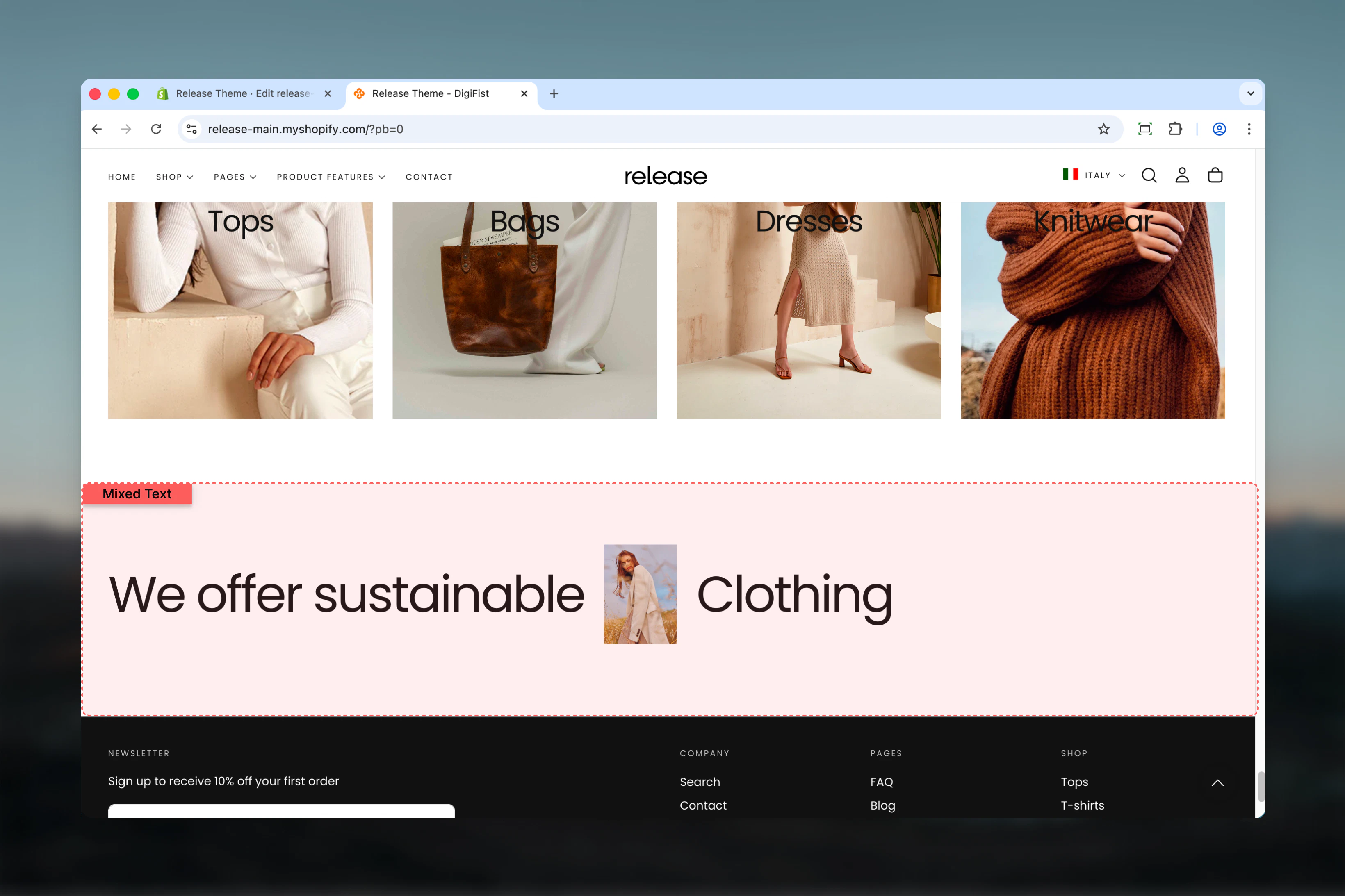
> Create dynamic typography layouts by mixing text elements and images in a flowing, inline arrangement.
The Mixed Text section creates visually interesting text compositions by combining text elements and images that flow together naturally. Each text or image block is displayed inline, allowing you to create unique, magazine-style typography layouts.
This section is perfect for creating impact headlines, brand statements, or editorial-style content where words and visuals blend seamlessly.
 ## What this section controls
This section controls mixed text and image layouts with the following capabilities:
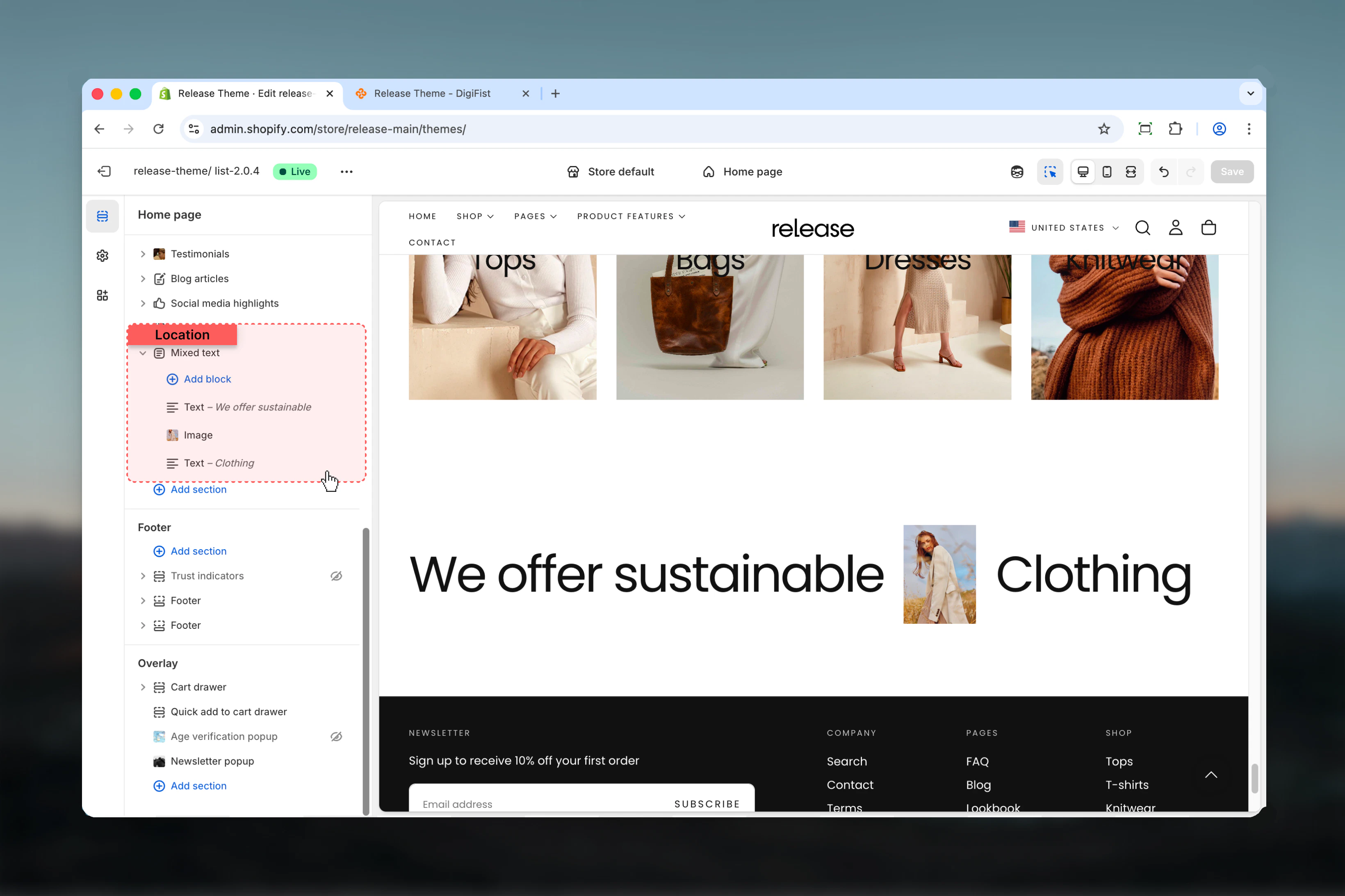
* Unlimited text and image blocks flowing inline
* Custom content width and alignment
* Rich text support with links
* Inline images between text elements
* Optional CTA button below content
* Flexible color schemes
## How the Mixed Text section works
The Mixed Text section displays content in a flowing layout:
* Add unlimited text or image blocks
* Each text block represents a word or phrase
* Images render inline with text flow
* Content wraps naturally based on width
* Optional button appears below all content
## Getting started
From Shopify admin, access the Theme Customizer.
Add the section to your desired page or template.
Click **Add Text** or **Add Image** to build your mixed layout.
Set content width, alignment, and color scheme.
## What this section controls
This section controls mixed text and image layouts with the following capabilities:
* Unlimited text and image blocks flowing inline
* Custom content width and alignment
* Rich text support with links
* Inline images between text elements
* Optional CTA button below content
* Flexible color schemes
## How the Mixed Text section works
The Mixed Text section displays content in a flowing layout:
* Add unlimited text or image blocks
* Each text block represents a word or phrase
* Images render inline with text flow
* Content wraps naturally based on width
* Optional button appears below all content
## Getting started
From Shopify admin, access the Theme Customizer.
Add the section to your desired page or template.
Click **Add Text** or **Add Image** to build your mixed layout.
Set content width, alignment, and color scheme.
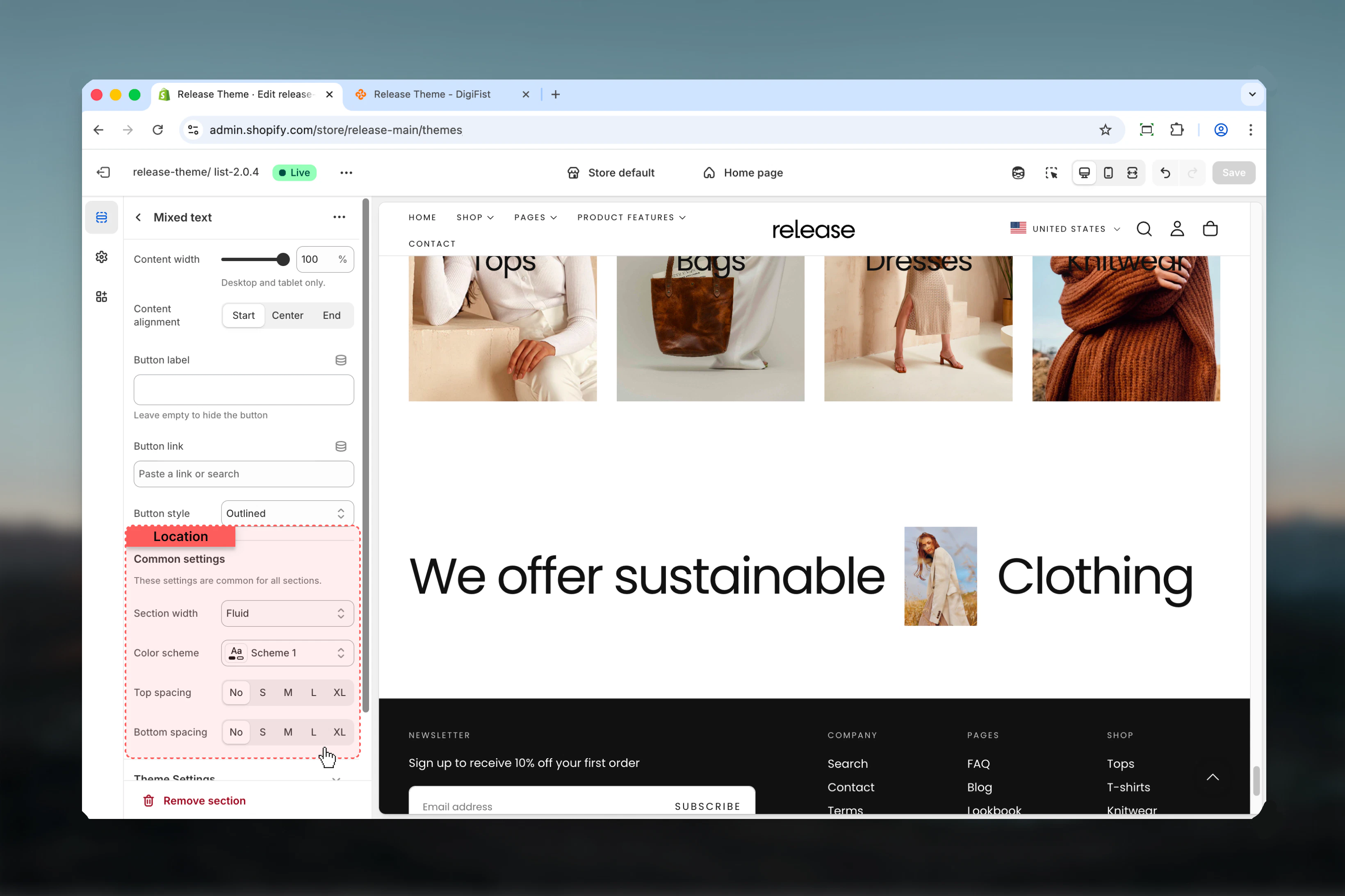
 ## Section settings
Section settings control layout, styling, and optional CTA button.
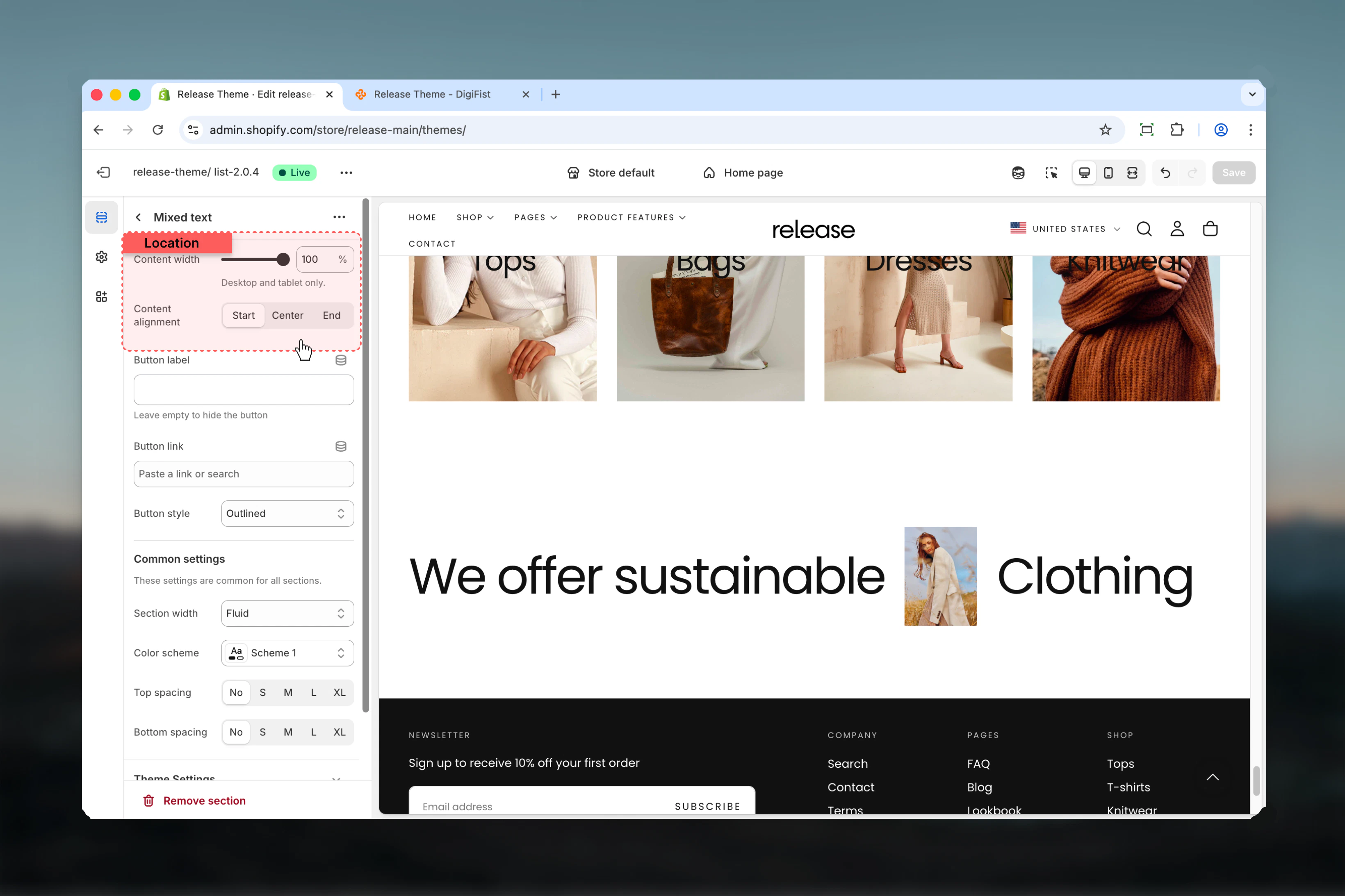
### Content width
Controls the width of content area.
**Range:** 40 – 100
**Unit:** %
**Default:** 100
This setting applies to desktop devices only.
### Content alignment
Controls horizontal and vertical alignment of all content.
**Available options:**
* **Start:** Left/top aligned
* **Center:** Center aligned
* **End:** Right/bottom aligned
**Default:** Start
## Section settings
Section settings control layout, styling, and optional CTA button.
### Content width
Controls the width of content area.
**Range:** 40 – 100
**Unit:** %
**Default:** 100
This setting applies to desktop devices only.
### Content alignment
Controls horizontal and vertical alignment of all content.
**Available options:**
* **Start:** Left/top aligned
* **Center:** Center aligned
* **End:** Right/bottom aligned
**Default:** Start
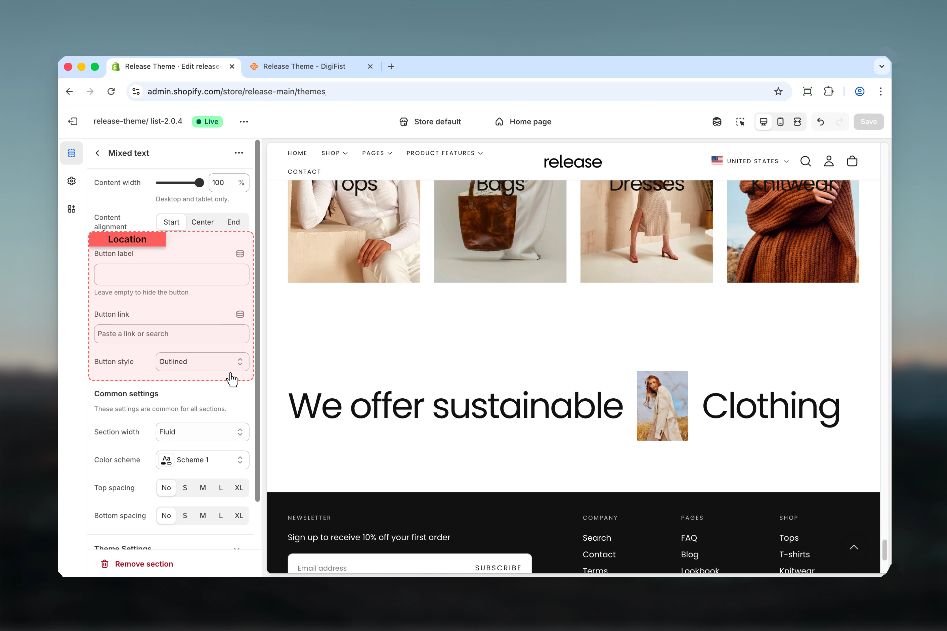
 ### Button label
Text for optional button below content.
* Leave empty to hide button
The button appears below all text and image blocks.
### Button link
Destination URL for button.
* Shopify URL selector
### Button style
Controls button visual style.
**Available options:**
* **Filled:** Solid background button
* **Outlined:** Bordered button
* **Default:** Text link style
**Default:** Outlined
### Button label
Text for optional button below content.
* Leave empty to hide button
The button appears below all text and image blocks.
### Button link
Destination URL for button.
* Shopify URL selector
### Button style
Controls button visual style.
**Available options:**
* **Filled:** Solid background button
* **Outlined:** Bordered button
* **Default:** Text link style
**Default:** Outlined
 ### Section width
Controls the maximum width of section container.
**Available options:**
* **Page:** Standard page width
* **Narrower:** Narrower than page width
* **Fluid:** Wider than page width
**Default:** Fluid
### Color scheme
Controls background and text colors for the section.
* Shopify color scheme selector
* **Default:** Scheme 1
### Spacing top
Controls spacing above the section.
**Available options:** No, S, M, L, XL
**Default:** No
### Spacing bottom
Controls spacing below the section.
**Available options:** No, S, M, L, XL
**Default:** No
### Section width
Controls the maximum width of section container.
**Available options:**
* **Page:** Standard page width
* **Narrower:** Narrower than page width
* **Fluid:** Wider than page width
**Default:** Fluid
### Color scheme
Controls background and text colors for the section.
* Shopify color scheme selector
* **Default:** Scheme 1
### Spacing top
Controls spacing above the section.
**Available options:** No, S, M, L, XL
**Default:** No
### Spacing bottom
Controls spacing below the section.
**Available options:** No, S, M, L, XL
**Default:** No
 ## Block settings
The Mixed Text section supports two types of blocks: Text and Image.
### Type
**tile**
### Name
Text
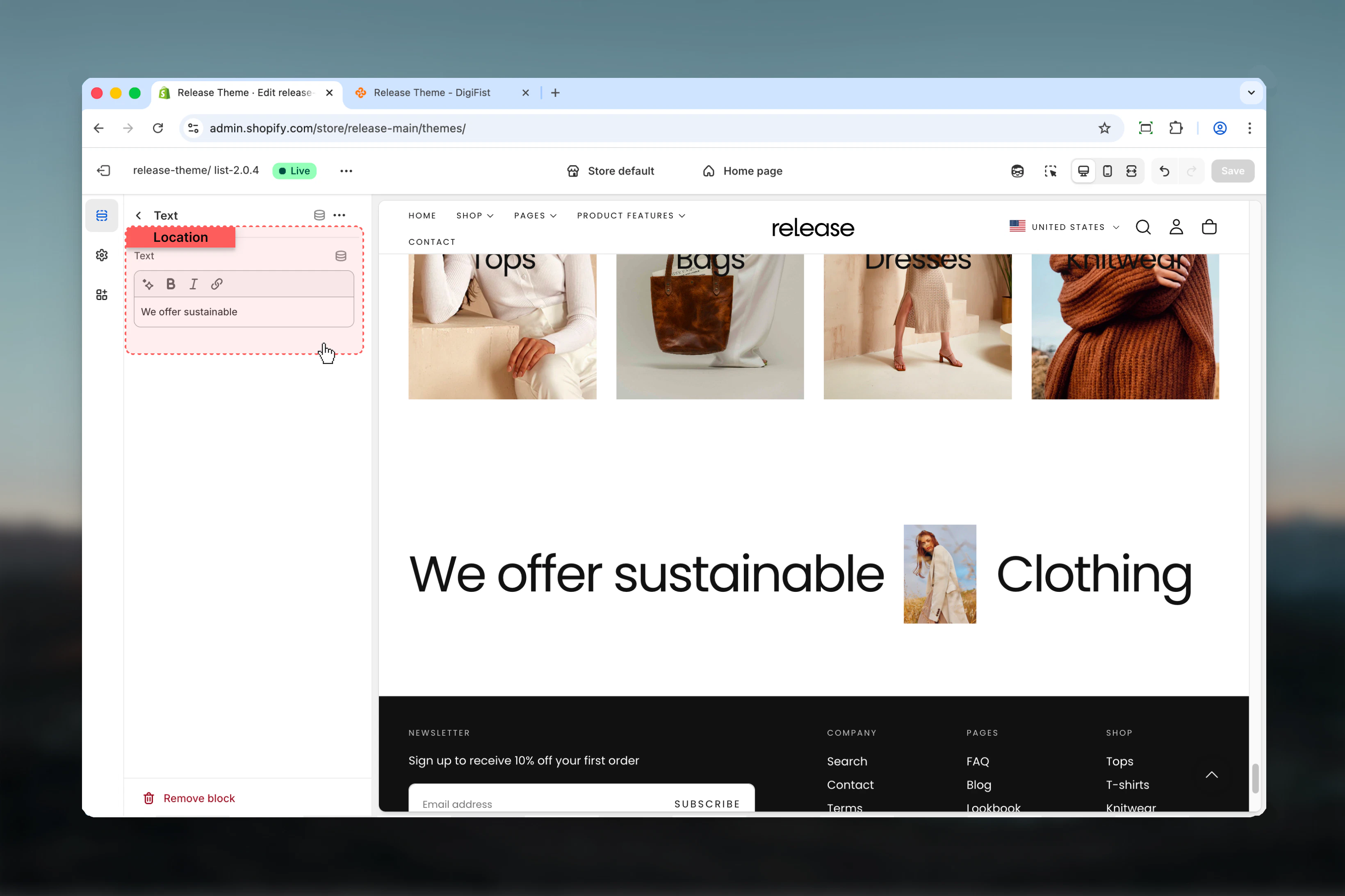
### Text
Content for this text element.
* Inline rich text supported
* Can contain links (rendered as single block)
* Each block typically contains one word or phrase
Text blocks are displayed inline with other blocks. If text contains links, it's rendered differently to preserve link functionality.
## Block settings
The Mixed Text section supports two types of blocks: Text and Image.
### Type
**tile**
### Name
Text
### Text
Content for this text element.
* Inline rich text supported
* Can contain links (rendered as single block)
* Each block typically contains one word or phrase
Text blocks are displayed inline with other blocks. If text contains links, it's rendered differently to preserve link functionality.
 ### Type
**image**
### Name
Image
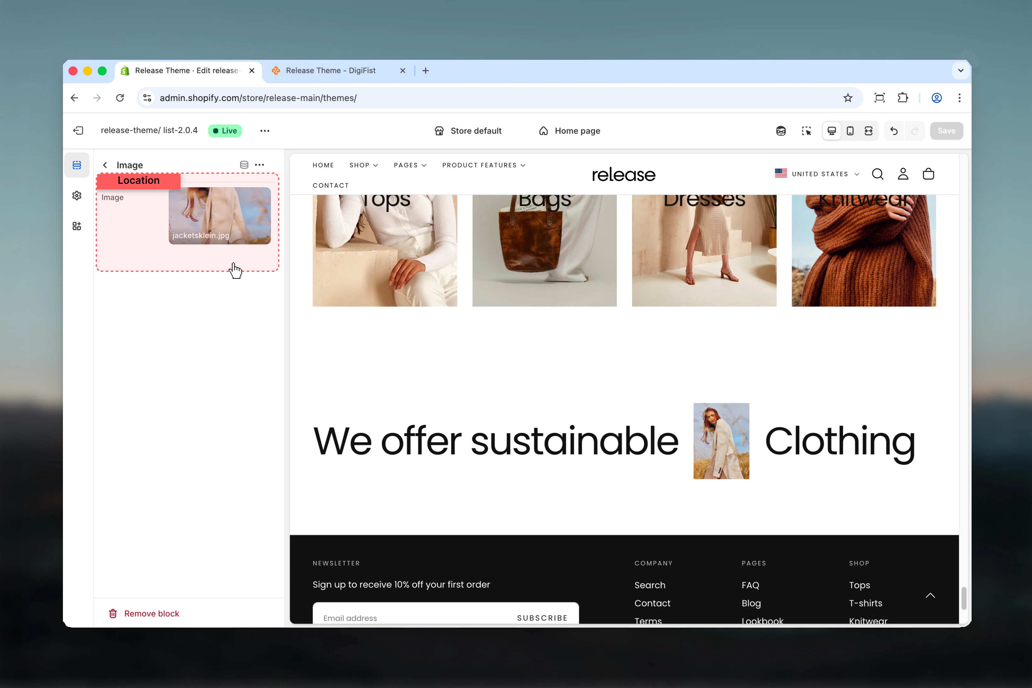
### Image
Image to display inline with text.
* Shopify image picker
* Flows with text elements
* Displays placeholder if not set
Use images to break up text and add visual interest. They flow naturally with text blocks.
### Type
**image**
### Name
Image
### Image
Image to display inline with text.
* Shopify image picker
* Flows with text elements
* Displays placeholder if not set
Use images to break up text and add visual interest. They flow naturally with text blocks.
 ## Best practices
* Use text blocks for individual words or short phrases to create flowing layouts
* Mix images between text elements to create visual rhythm and break up typography
* Keep content width at 80-100% for optimal readability on larger screens
* Use links sparingly in text blocks to maintain visual flow and avoid breaking layout
* Strategic image placement creates natural visual breaks without disrupting the reading flow
* Consider alignment based on surrounding sections for visual consistency
* Test with different color schemes to ensure proper contrast and readability
* Limit total blocks to 10-15 for optimal performance and manageable layout
* Use center alignment for impact headlines and brand statements
* Start/end alignment works better for paragraph-style mixed content
## Common use cases
* **Hero headlines** - Create bold, mixed typography for homepage hero sections
* **Brand statements** - Display company values or mission with integrated imagery
* **Campaign taglines** - Build visually striking marketing messages
* **Feature highlights** - Mix descriptive text with feature icons or images
* **Editorial layouts** - Magazine-style text compositions with inline media
* **Call-to-action sections** - Engaging CTAs with mixed text and visual elements
* **Product benefits** - List benefits with inline product images or icons
## Related guides
Learn about common settings shared across sections
## Best practices
* Use text blocks for individual words or short phrases to create flowing layouts
* Mix images between text elements to create visual rhythm and break up typography
* Keep content width at 80-100% for optimal readability on larger screens
* Use links sparingly in text blocks to maintain visual flow and avoid breaking layout
* Strategic image placement creates natural visual breaks without disrupting the reading flow
* Consider alignment based on surrounding sections for visual consistency
* Test with different color schemes to ensure proper contrast and readability
* Limit total blocks to 10-15 for optimal performance and manageable layout
* Use center alignment for impact headlines and brand statements
* Start/end alignment works better for paragraph-style mixed content
## Common use cases
* **Hero headlines** - Create bold, mixed typography for homepage hero sections
* **Brand statements** - Display company values or mission with integrated imagery
* **Campaign taglines** - Build visually striking marketing messages
* **Feature highlights** - Mix descriptive text with feature icons or images
* **Editorial layouts** - Magazine-style text compositions with inline media
* **Call-to-action sections** - Engaging CTAs with mixed text and visual elements
* **Product benefits** - List benefits with inline product images or icons
## Related guides
Learn about common settings shared across sections