> ## Documentation Index
> Fetch the complete documentation index at: https://docs.digifist.com/llms.txt
> Use this file to discover all available pages before exploring further.
# Multitile
> Create flexible grid-based layouts with customizable tiles containing media, text, products, or slideshows.
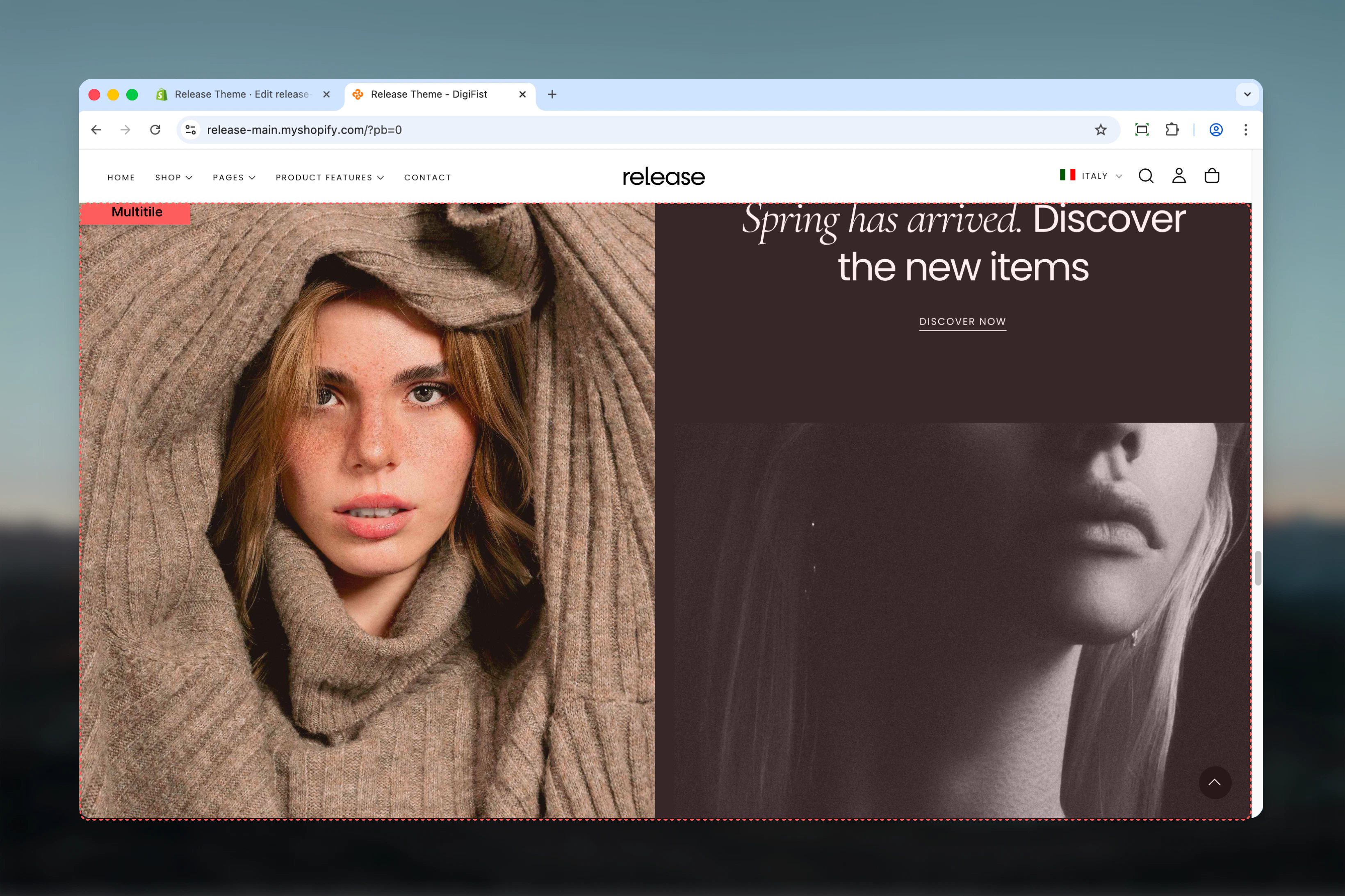
The Multitile section creates flexible grid-based layouts with customizable tiles. Each tile can contain media, text, buttons, products, or slideshows with full control over positioning, sizing, and responsive behavior.
This section provides maximum layout flexibility, allowing you to create unique, asymmetric grid designs that adapt to different screen sizes and content priorities.
 ## What this section controls
This section controls grid-based layouts with the following capabilities:
* Unlimited tile or slideshow blocks
* Custom column and row spanning per tile
* Desktop and mobile-specific visibility
* Flexible aspect ratios and spacing
* Media (images, videos), text, and button support
* Metaobject-powered slideshows
* Responsive layout reordering
## How the Multitile section works
The Multitile section uses a flexible grid system:
* Add unlimited tile or slideshow blocks
* Control column and row span for each tile
* Set custom aspect ratios and spacing
* Desktop and mobile-specific visibility
* Supports images, videos, products, and slideshows
* Reverse block order on mobile option
## Getting started
From Shopify admin, access the Theme Customizer.
Add the section to your desired page or template.
Click **Add Tile** or **Add Slideshow** to create grid items.
Set column and row factors to create your desired layout.
## What this section controls
This section controls grid-based layouts with the following capabilities:
* Unlimited tile or slideshow blocks
* Custom column and row spanning per tile
* Desktop and mobile-specific visibility
* Flexible aspect ratios and spacing
* Media (images, videos), text, and button support
* Metaobject-powered slideshows
* Responsive layout reordering
## How the Multitile section works
The Multitile section uses a flexible grid system:
* Add unlimited tile or slideshow blocks
* Control column and row span for each tile
* Set custom aspect ratios and spacing
* Desktop and mobile-specific visibility
* Supports images, videos, products, and slideshows
* Reverse block order on mobile option
## Getting started
From Shopify admin, access the Theme Customizer.
Add the section to your desired page or template.
Click **Add Tile** or **Add Slideshow** to create grid items.
Set column and row factors to create your desired layout.
 ## Section settings
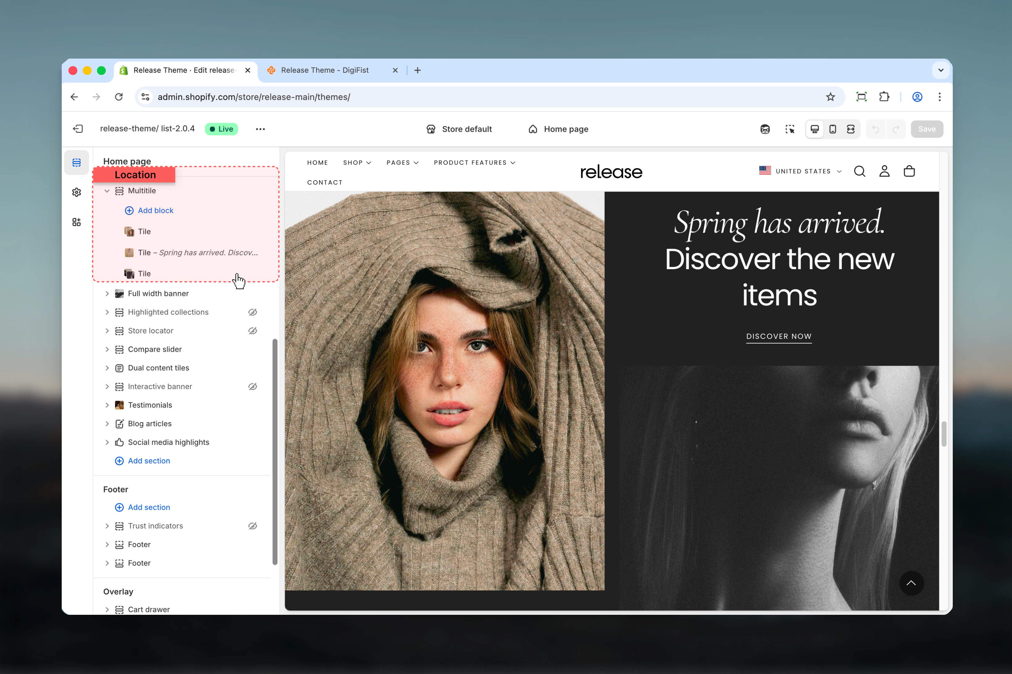
Section settings control overall layout, heading, and spacing.
### Block order mobile
Reverses the order of blocks on mobile devices.
**Options:** True / False
**Default:** False
Use this to prioritize different content on mobile vs desktop.
### Heading
Optional section heading.
* Inline rich text supported (bold, italic, links)
### Heading size
Controls the size of section heading.
**Available options:** XS, S, M, L, XL
**Default:** L
### Heading alignment
Controls horizontal alignment of heading.
**Available options:** Start, Center, End
**Default:** Start
## Section settings
Section settings control overall layout, heading, and spacing.
### Block order mobile
Reverses the order of blocks on mobile devices.
**Options:** True / False
**Default:** False
Use this to prioritize different content on mobile vs desktop.
### Heading
Optional section heading.
* Inline rich text supported (bold, italic, links)
### Heading size
Controls the size of section heading.
**Available options:** XS, S, M, L, XL
**Default:** L
### Heading alignment
Controls horizontal alignment of heading.
**Available options:** Start, Center, End
**Default:** Start
 ### Spacing tile
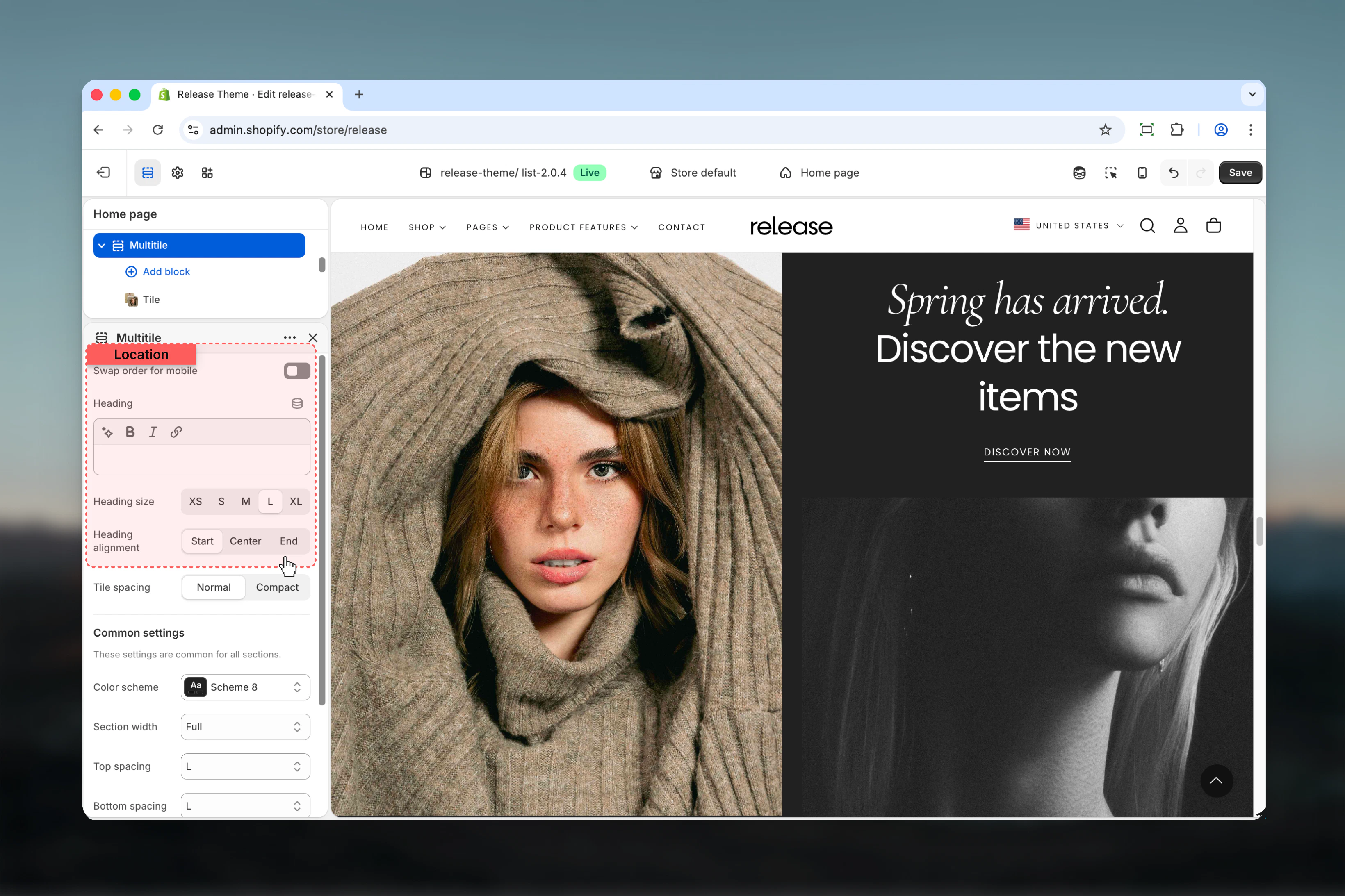
Controls spacing between tiles.
**Available options:**
* **Default:** Standard spacing
* **Compact:** No spacing between tiles
**Default:** Default
### Spacing tile
Controls spacing between tiles.
**Available options:**
* **Default:** Standard spacing
* **Compact:** No spacing between tiles
**Default:** Default
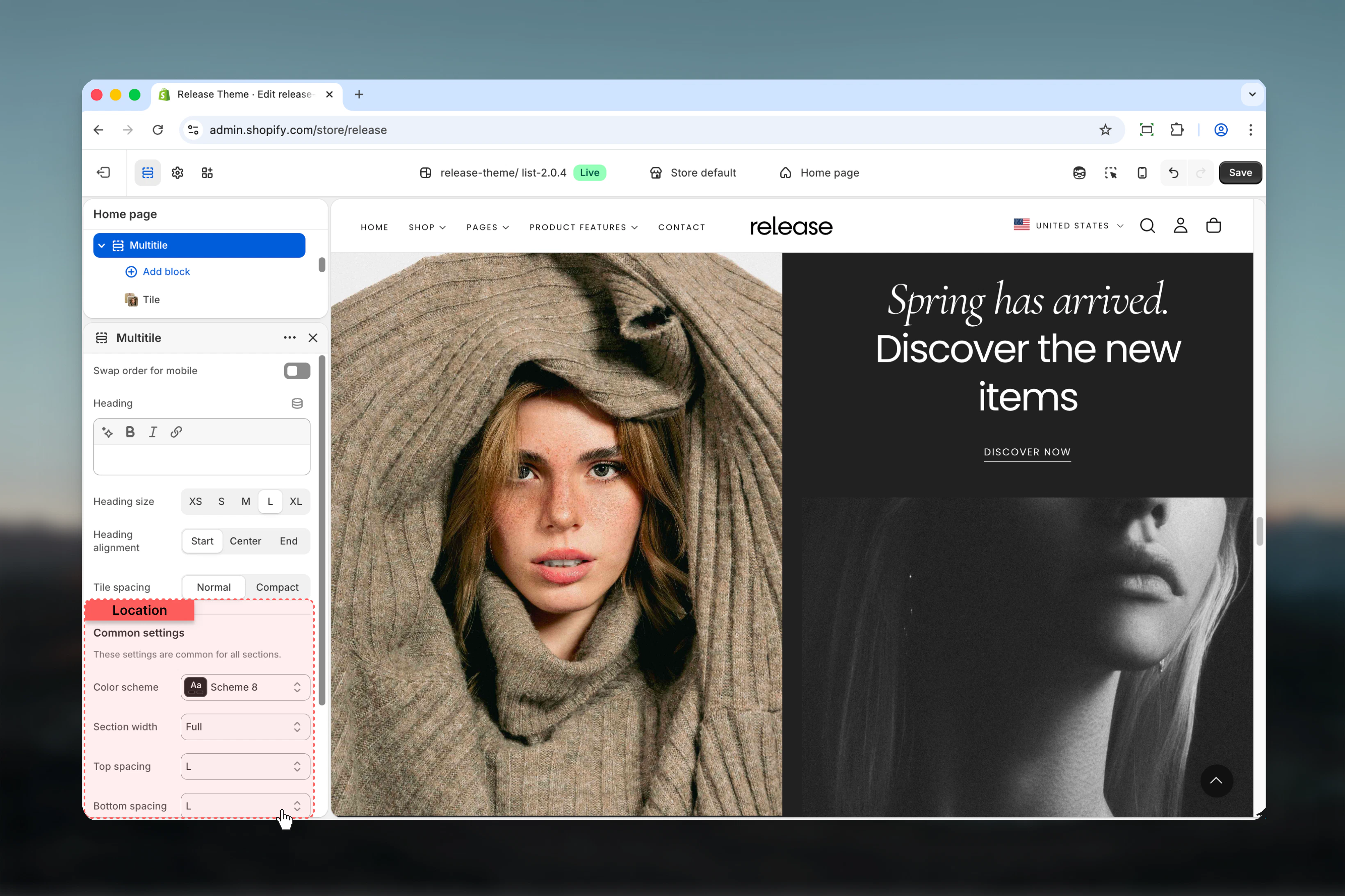
 ### Color scheme
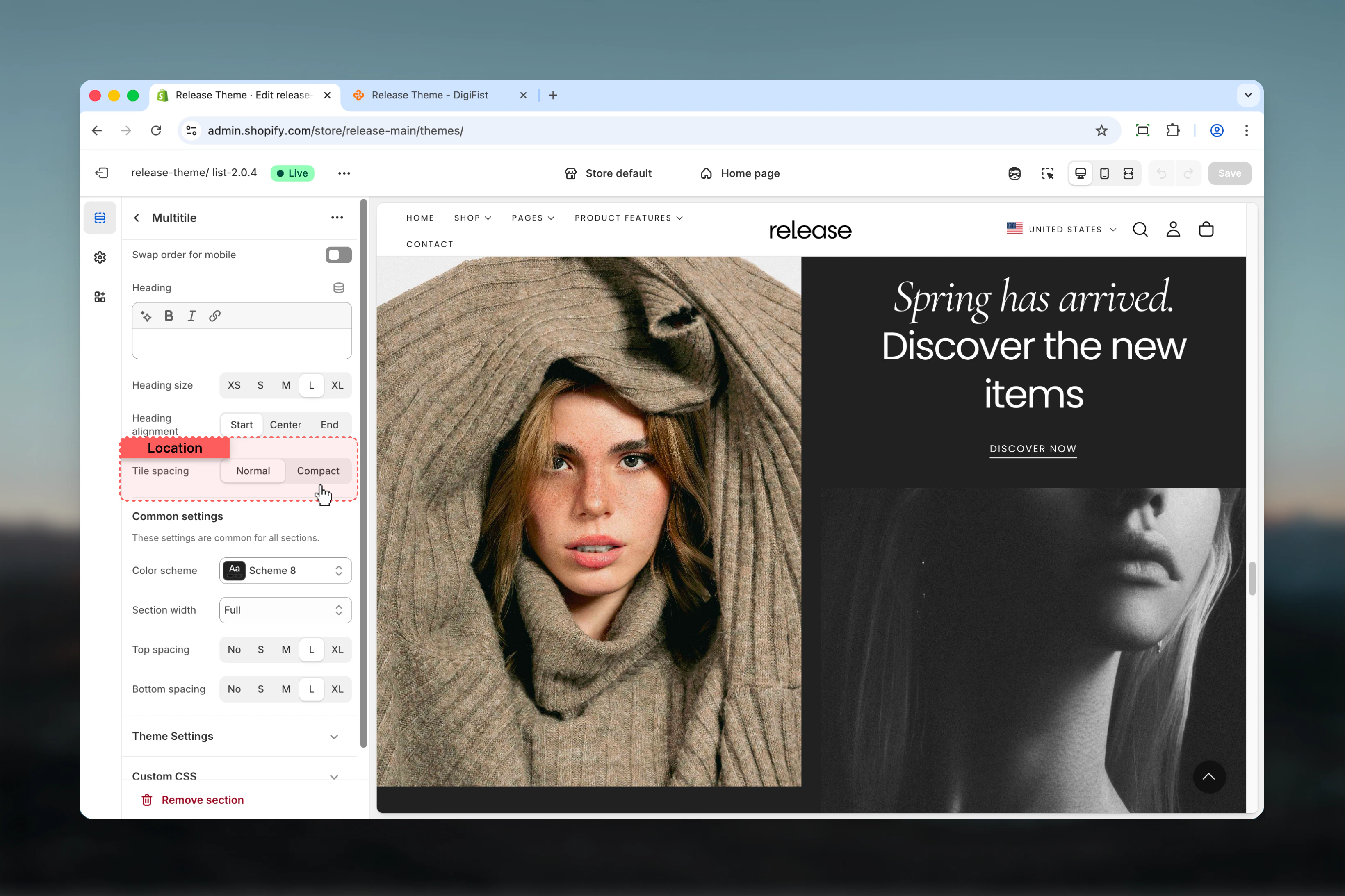
Controls background and text colors for the section container.
* Shopify color scheme selector
* **Default:** Scheme 1
### Section width
Controls the maximum width of the section.
**Available options:**
* **Page:** Standard page width
* **Narrower:** Narrower than page width
* **Fluid:** Wider than page width
* **Full:** Full viewport width
**Default:** Page
### Spacing top
Controls spacing above the section.
**Available options:** None, S, M, L, XL
**Default:** M
### Spacing bottom
Controls spacing below the section.
**Available options:** None, S, M, L, XL
**Default:** M
### Color scheme
Controls background and text colors for the section container.
* Shopify color scheme selector
* **Default:** Scheme 1
### Section width
Controls the maximum width of the section.
**Available options:**
* **Page:** Standard page width
* **Narrower:** Narrower than page width
* **Fluid:** Wider than page width
* **Full:** Full viewport width
**Default:** Page
### Spacing top
Controls spacing above the section.
**Available options:** None, S, M, L, XL
**Default:** M
### Spacing bottom
Controls spacing below the section.
**Available options:** None, S, M, L, XL
**Default:** M
 ## Block settings
The Multitile section supports two types of blocks: Tiles and Slideshows.
### Show on
Controls where the tile is visible.
**Available options:**
* **Desktop:** Desktop only
* **Mobile:** Mobile only
* **Both:** All devices
**Default:** Both
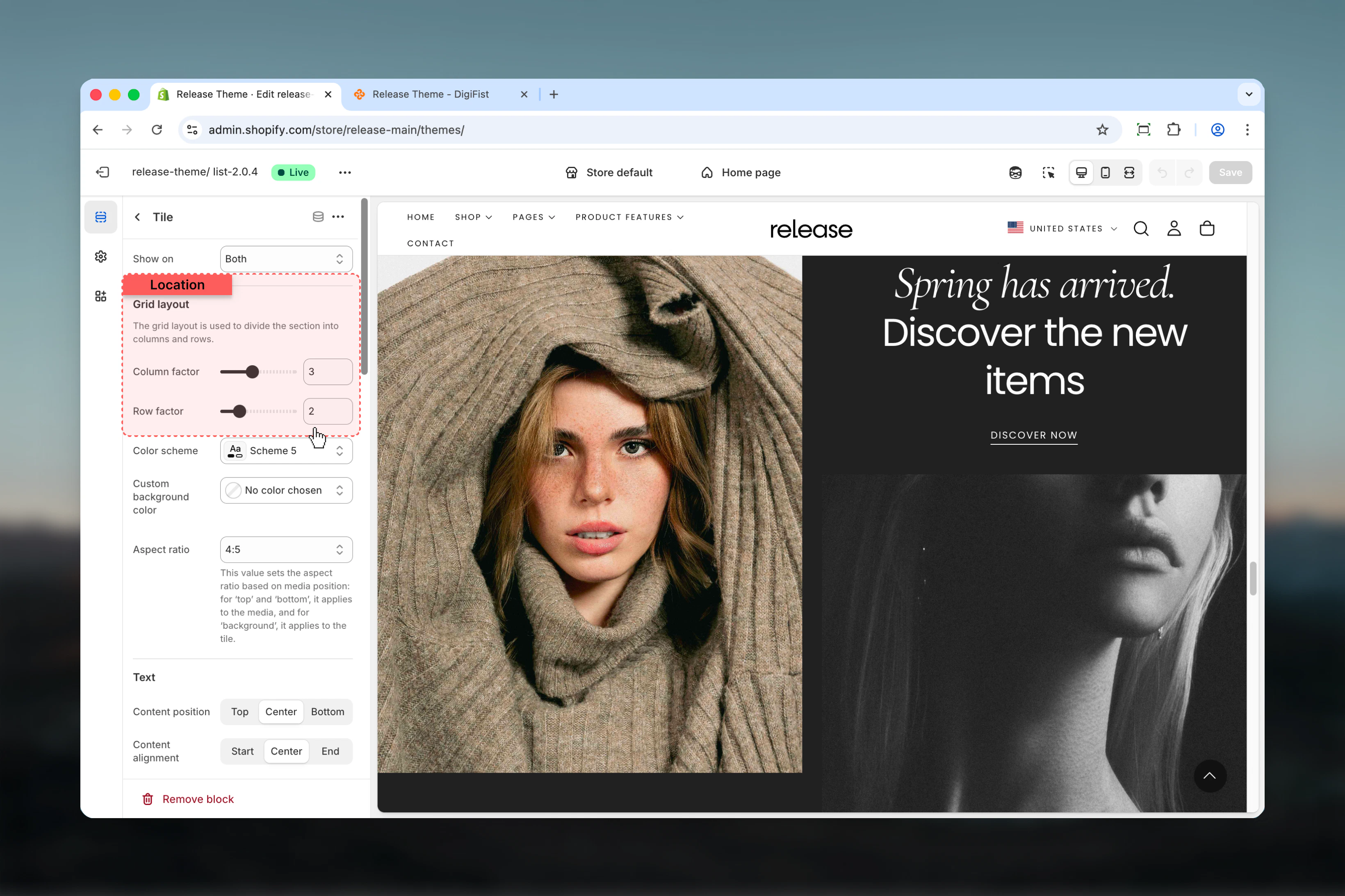
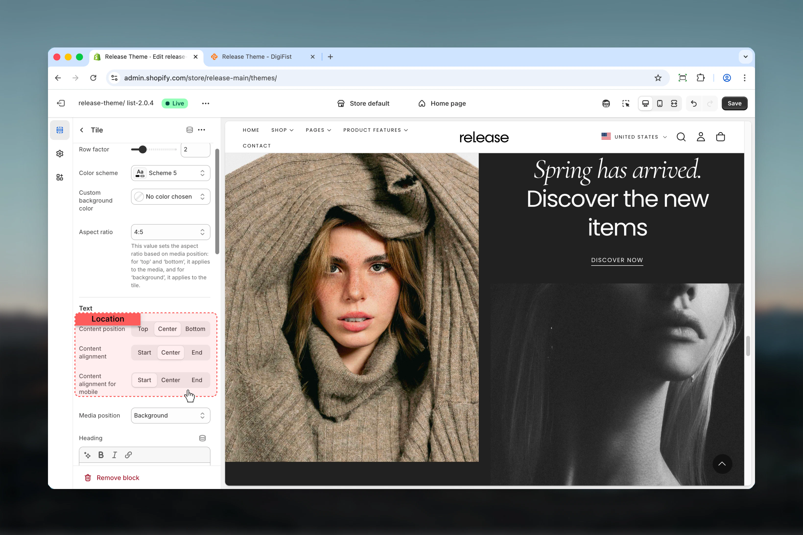
### Grid layout
**Column factor** - Number of columns the tile spans
**Range:** 1 – 6
**Default:** 1
**Row factor** - Number of rows the tile spans
**Range:** 1 – 6
**Default:** 1
Controls the tile's position and size in the grid layout.
## Block settings
The Multitile section supports two types of blocks: Tiles and Slideshows.
### Show on
Controls where the tile is visible.
**Available options:**
* **Desktop:** Desktop only
* **Mobile:** Mobile only
* **Both:** All devices
**Default:** Both
### Grid layout
**Column factor** - Number of columns the tile spans
**Range:** 1 – 6
**Default:** 1
**Row factor** - Number of rows the tile spans
**Range:** 1 – 6
**Default:** 1
Controls the tile's position and size in the grid layout.
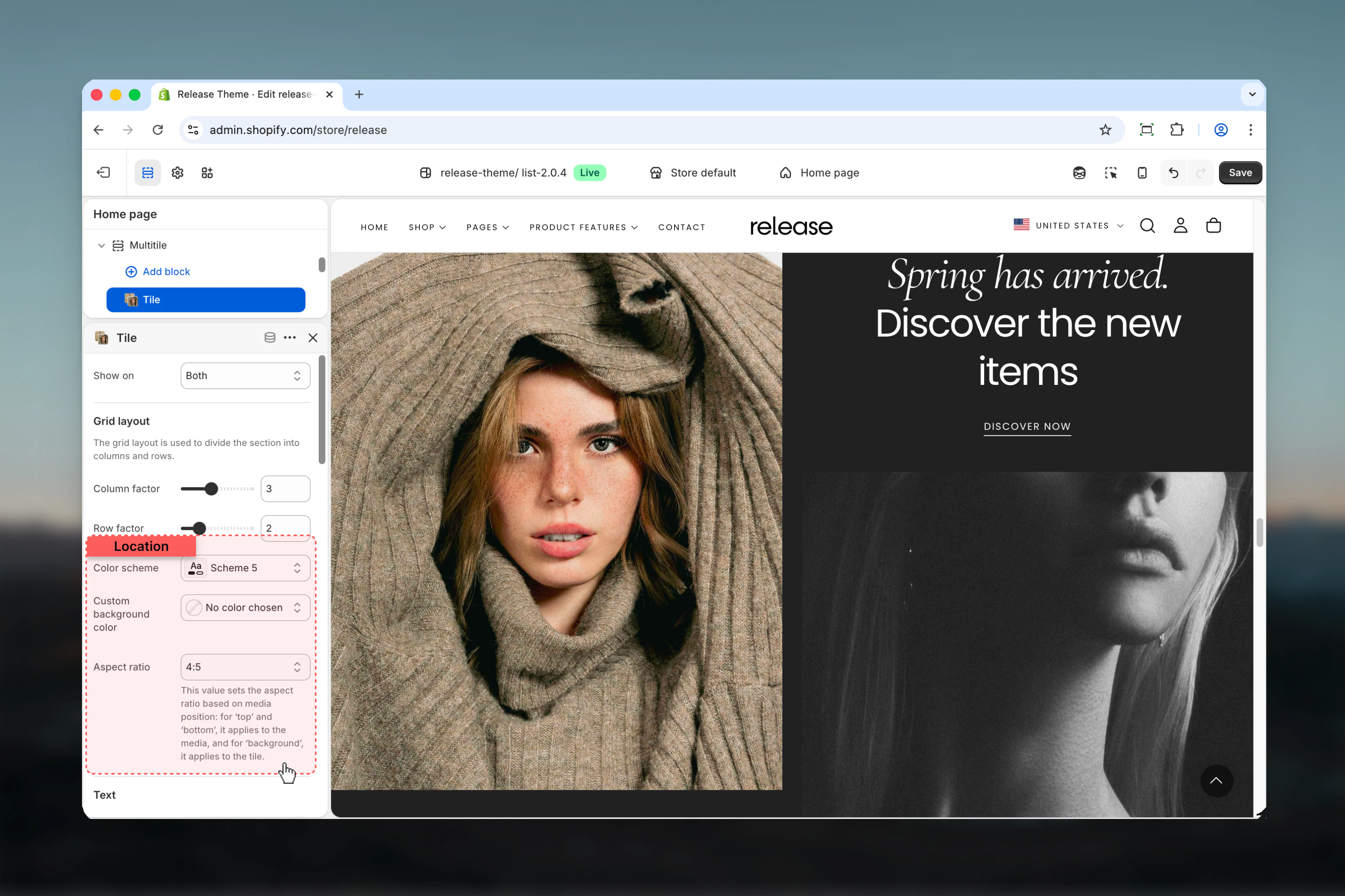
 ### Color scheme
Controls background and text colors for the tile.
* Shopify color scheme selector
* **Default:** Scheme 5
### Custom background color
Set a custom gradient background color for the tile.
* Color gradient picker
### Aspect ratio
Controls the aspect ratio of the tile.
**Available options:** Auto, Media, 1:1, 4:3, 3:4, 3:2, 2:3, 5:4, 4:5, 16:9, 9:16, 2:1, 4:1, 8:1, 1:2
**Default:** Auto
This value sets the aspect ratio based on media position: for 'top' and 'bottom', it applies to the media, and for 'background', it applies to the tile.
### Padding
Controls padding inside the tile.
**Range:** 0 – 6
**Default:** 2
### Color scheme
Controls background and text colors for the tile.
* Shopify color scheme selector
* **Default:** Scheme 5
### Custom background color
Set a custom gradient background color for the tile.
* Color gradient picker
### Aspect ratio
Controls the aspect ratio of the tile.
**Available options:** Auto, Media, 1:1, 4:3, 3:4, 3:2, 2:3, 5:4, 4:5, 16:9, 9:16, 2:1, 4:1, 8:1, 1:2
**Default:** Auto
This value sets the aspect ratio based on media position: for 'top' and 'bottom', it applies to the media, and for 'background', it applies to the tile.
### Padding
Controls padding inside the tile.
**Range:** 0 – 6
**Default:** 2
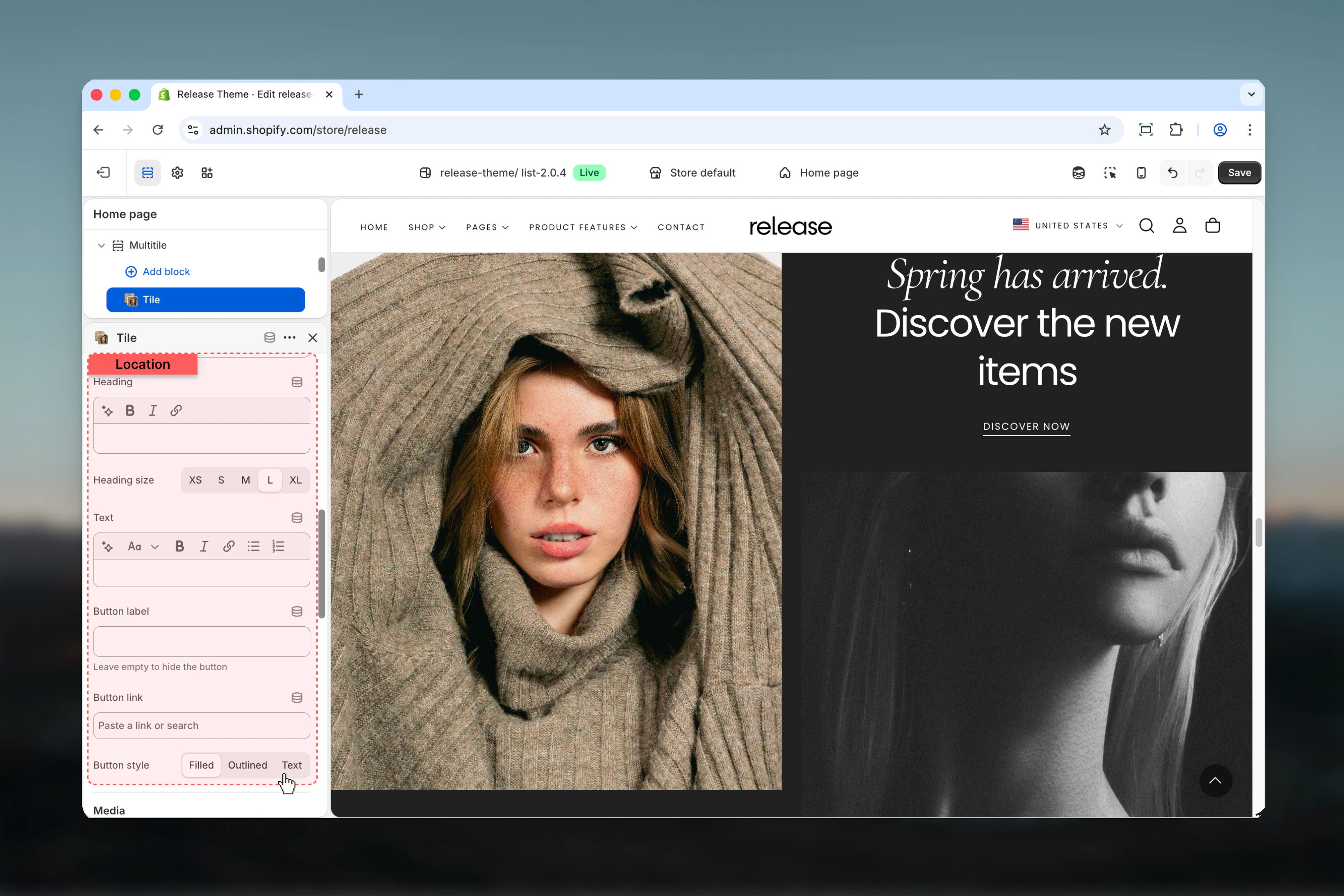
 ### Heading
Tile heading text.
* Inline rich text supported
### Heading size
**Available options:** XS, S, M, L, XL
### Text
Tile body text.
* Rich text supported
### Button label
Text for optional button.
* Leave empty to hide
### Button link
Destination URL for button.
* Shopify URL selector
### Button style
**Available options:** Filled, Outlined, Text
**Default:** Filled
### Heading
Tile heading text.
* Inline rich text supported
### Heading size
**Available options:** XS, S, M, L, XL
### Text
Tile body text.
* Rich text supported
### Button label
Text for optional button.
* Leave empty to hide
### Button link
Destination URL for button.
* Shopify URL selector
### Button style
**Available options:** Filled, Outlined, Text
**Default:** Filled
 ### Media position
Controls where media appears relative to content.
**Available options:**
* **Top:** Media above content
* **Bottom:** Media below content
* **Background:** Media as background
**Default:** Background
### Desktop media
* **Image:** Shopify image picker
* **Video:** Video file upload
* **External video:** YouTube/Vimeo URL
* **Show video controls:** Enable/disable player controls
### Mobile media
* **Image:** Mobile-specific image
* **Video:** Mobile-specific video
* **External video:** Mobile-specific external video
* **Show video controls:** Mobile player controls
Mobile media overrides desktop media when set.
### Content positioning
**Desktop:**
* Content position: Start, Center, End
* Content alignment: Start, Center, End
**Mobile:**
* Content position: Start, Center, End
* Content alignment: Start, Center, End
### Media position
Controls where media appears relative to content.
**Available options:**
* **Top:** Media above content
* **Bottom:** Media below content
* **Background:** Media as background
**Default:** Background
### Desktop media
* **Image:** Shopify image picker
* **Video:** Video file upload
* **External video:** YouTube/Vimeo URL
* **Show video controls:** Enable/disable player controls
### Mobile media
* **Image:** Mobile-specific image
* **Video:** Mobile-specific video
* **External video:** Mobile-specific external video
* **Show video controls:** Mobile player controls
Mobile media overrides desktop media when set.
### Content positioning
**Desktop:**
* Content position: Start, Center, End
* Content alignment: Start, Center, End
**Mobile:**
* Content position: Start, Center, End
* Content alignment: Start, Center, End
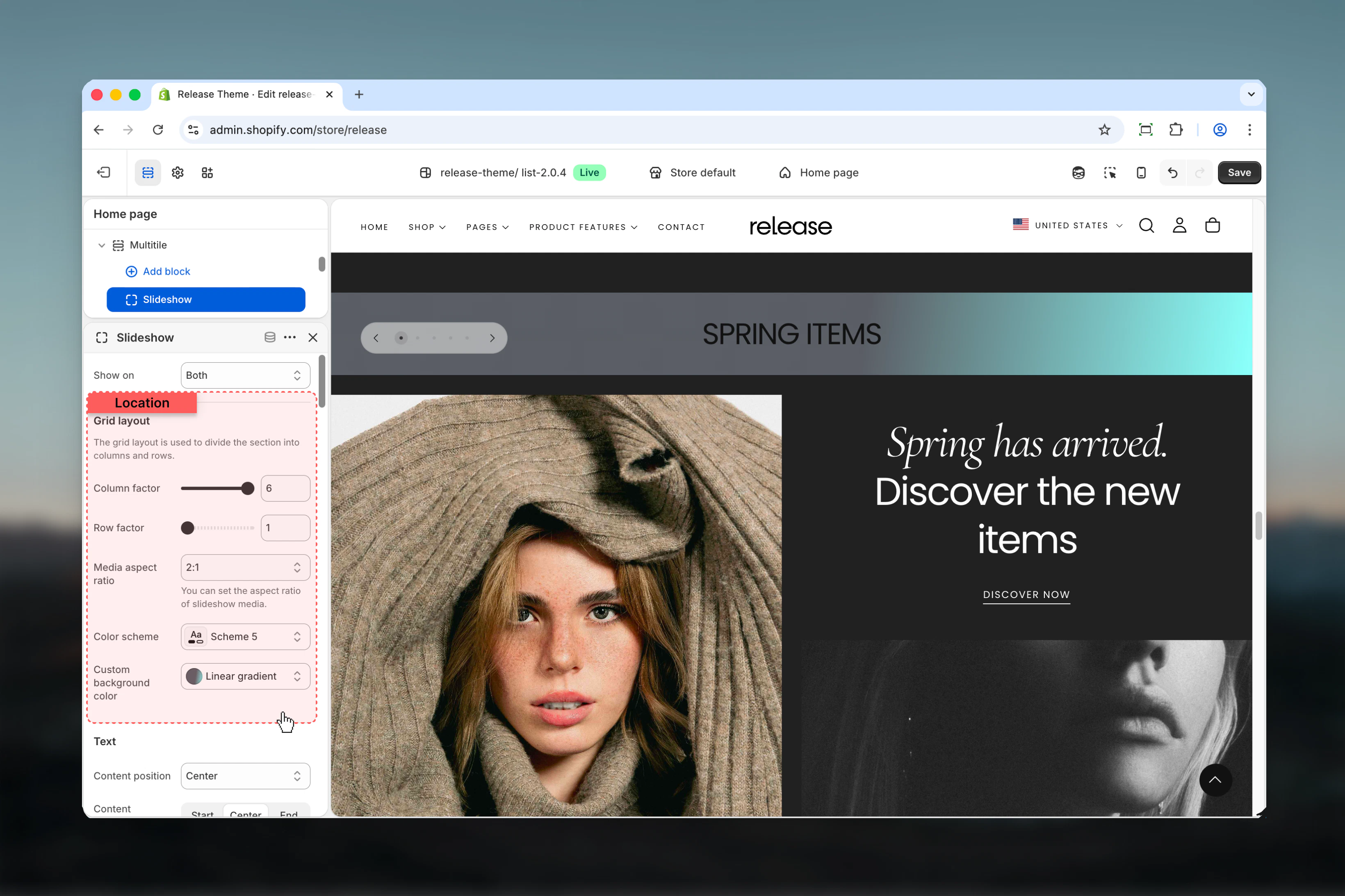
 ### Grid layout
Same as tile block (column factor, row factor)
### Media aspect ratio
Controls aspect ratio for slideshow media.
**Available options:** 1:1, 4:3, 3:4, 3:2, 2:3, 5:4, 4:5, 16:9, 9:16, 2:1, 4:1, 8:1, 1:2
**Default:** 16:9
### Source of slideshow
Controls how slideshow content is populated.
**Available options:**
* **Manual:** Add slides manually
* **Metaobject:** Pull from metaobject
**Default:** Manual
If you define a metaobject as a source, the slideshow will be populated with the media from the metaobject.
### Slideshow settings
* **Show navigation arrows:** Enable/disable navigation
* **Slideshow autoplay interval:** 0-10 seconds (0 = disabled)
### Color schemes
* **Color scheme for section**
* **Color scheme for arrows**
### Grid layout
Same as tile block (column factor, row factor)
### Media aspect ratio
Controls aspect ratio for slideshow media.
**Available options:** 1:1, 4:3, 3:4, 3:2, 2:3, 5:4, 4:5, 16:9, 9:16, 2:1, 4:1, 8:1, 1:2
**Default:** 16:9
### Source of slideshow
Controls how slideshow content is populated.
**Available options:**
* **Manual:** Add slides manually
* **Metaobject:** Pull from metaobject
**Default:** Manual
If you define a metaobject as a source, the slideshow will be populated with the media from the metaobject.
### Slideshow settings
* **Show navigation arrows:** Enable/disable navigation
* **Slideshow autoplay interval:** 0-10 seconds (0 = disabled)
### Color schemes
* **Color scheme for section**
* **Color scheme for arrows**
 ## Best practices
* Use grid layout strategically - larger tiles (2x2, 3x2) for hero content, smaller (1x1) for supporting elements
* Test grid layout on different screen sizes to ensure proper responsive behavior and avoid awkward gaps
* Use compact spacing for magazine-style layouts without gaps between tiles
* Limit column/row span to 3-4 for optimal mobile experience and readability
* Use consistent aspect ratios across similar tiles for visual harmony and professional appearance
* Desktop and mobile visibility options help create device-optimized layouts with different content priorities
* Background media position works best with overlay content and sufficient text contrast
* Use metaobject slideshows for dynamic content that updates frequently without manual changes
* Keep tile count manageable (6-12 tiles) for performance and user experience
* Use reverse mobile order to prioritize important content on smaller screens
## Common use cases
* **Homepage hero grids** - Create dynamic, magazine-style hero sections with varied content sizes
* **Product showcases** - Display products in varied sizes to emphasize featured or bestselling items
* **Content blocks** - Mix text, images, and videos in custom editorial layouts
* **Category navigation** - Visual grid of categories with varying emphasis on key categories
* **Instagram-style galleries** - Create social media-inspired grid layouts for visual storytelling
* **Feature highlights** - Showcase multiple features with mixed content types and sizes
* **Promotional campaigns** - Design custom promotional layouts with maximum flexibility
## Related guides
Learn about common settings shared across sections
## Best practices
* Use grid layout strategically - larger tiles (2x2, 3x2) for hero content, smaller (1x1) for supporting elements
* Test grid layout on different screen sizes to ensure proper responsive behavior and avoid awkward gaps
* Use compact spacing for magazine-style layouts without gaps between tiles
* Limit column/row span to 3-4 for optimal mobile experience and readability
* Use consistent aspect ratios across similar tiles for visual harmony and professional appearance
* Desktop and mobile visibility options help create device-optimized layouts with different content priorities
* Background media position works best with overlay content and sufficient text contrast
* Use metaobject slideshows for dynamic content that updates frequently without manual changes
* Keep tile count manageable (6-12 tiles) for performance and user experience
* Use reverse mobile order to prioritize important content on smaller screens
## Common use cases
* **Homepage hero grids** - Create dynamic, magazine-style hero sections with varied content sizes
* **Product showcases** - Display products in varied sizes to emphasize featured or bestselling items
* **Content blocks** - Mix text, images, and videos in custom editorial layouts
* **Category navigation** - Visual grid of categories with varying emphasis on key categories
* **Instagram-style galleries** - Create social media-inspired grid layouts for visual storytelling
* **Feature highlights** - Showcase multiple features with mixed content types and sizes
* **Promotional campaigns** - Design custom promotional layouts with maximum flexibility
## Related guides
Learn about common settings shared across sections