> ## Documentation Index
> Fetch the complete documentation index at: https://docs.digifist.com/llms.txt
> Use this file to discover all available pages before exploring further.
# Page Banner
> Create customizable hero banners for pages, collections, products, and blogs with media, text, and navigation.
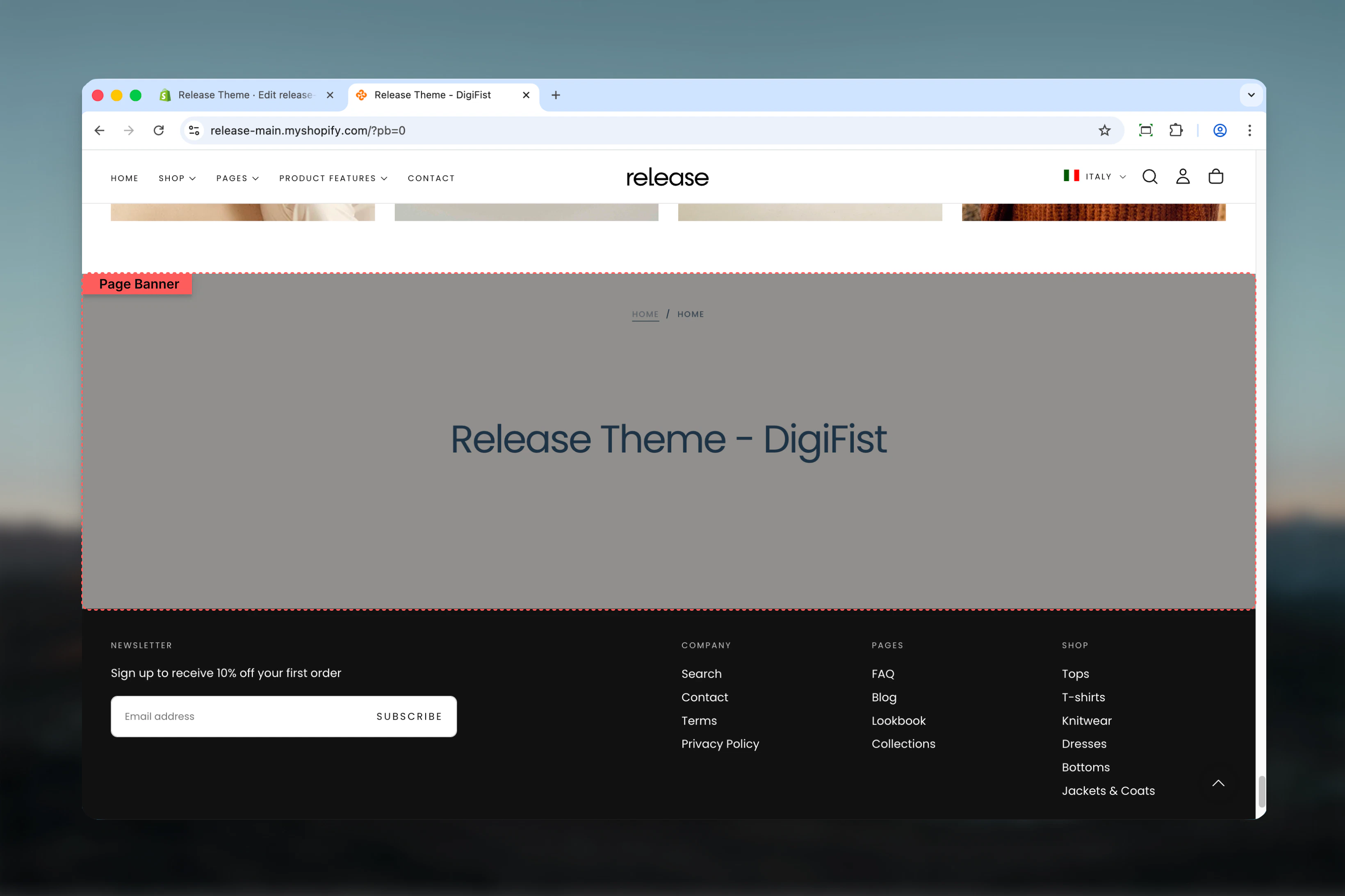
The Page Banner section creates versatile hero banners that automatically adapt to different template types (pages, collections, products, blogs). It displays titles, descriptions, media backgrounds, breadcrumbs, and optional collection navigation menus.
This section is essential for creating impactful page headers that provide context and visual appeal across your entire site.
 ## What this section controls
This section controls page hero banners with the following capabilities:
* Automatic page title display with custom overrides
* Optional default or custom descriptions
* Desktop and mobile-specific media (images, videos)
* Transparent header support
* Breadcrumb navigation
* Collection menu navigation
* Flexible content positioning and sizing
* Multiple section height options
## How the Page Banner section works
The Page Banner adapts to your template type:
* Automatically displays page/collection/product/blog title
* Shows default description or custom text
* Supports background, top, or bottom media positioning
* Can enable transparent header over background media
* Displays breadcrumbs when enabled in theme settings
* Shows collection navigation menu if configured
## Getting started
From Shopify admin, access the Theme Customizer.
Go to the page, collection, product, or blog template you want to customize.
Add the section or customize the existing one (usually first section).
Set heading, description, media, and positioning options.
## What this section controls
This section controls page hero banners with the following capabilities:
* Automatic page title display with custom overrides
* Optional default or custom descriptions
* Desktop and mobile-specific media (images, videos)
* Transparent header support
* Breadcrumb navigation
* Collection menu navigation
* Flexible content positioning and sizing
* Multiple section height options
## How the Page Banner section works
The Page Banner adapts to your template type:
* Automatically displays page/collection/product/blog title
* Shows default description or custom text
* Supports background, top, or bottom media positioning
* Can enable transparent header over background media
* Displays breadcrumbs when enabled in theme settings
* Shows collection navigation menu if configured
## Getting started
From Shopify admin, access the Theme Customizer.
Go to the page, collection, product, or blog template you want to customize.
Add the section or customize the existing one (usually first section).
Set heading, description, media, and positioning options.
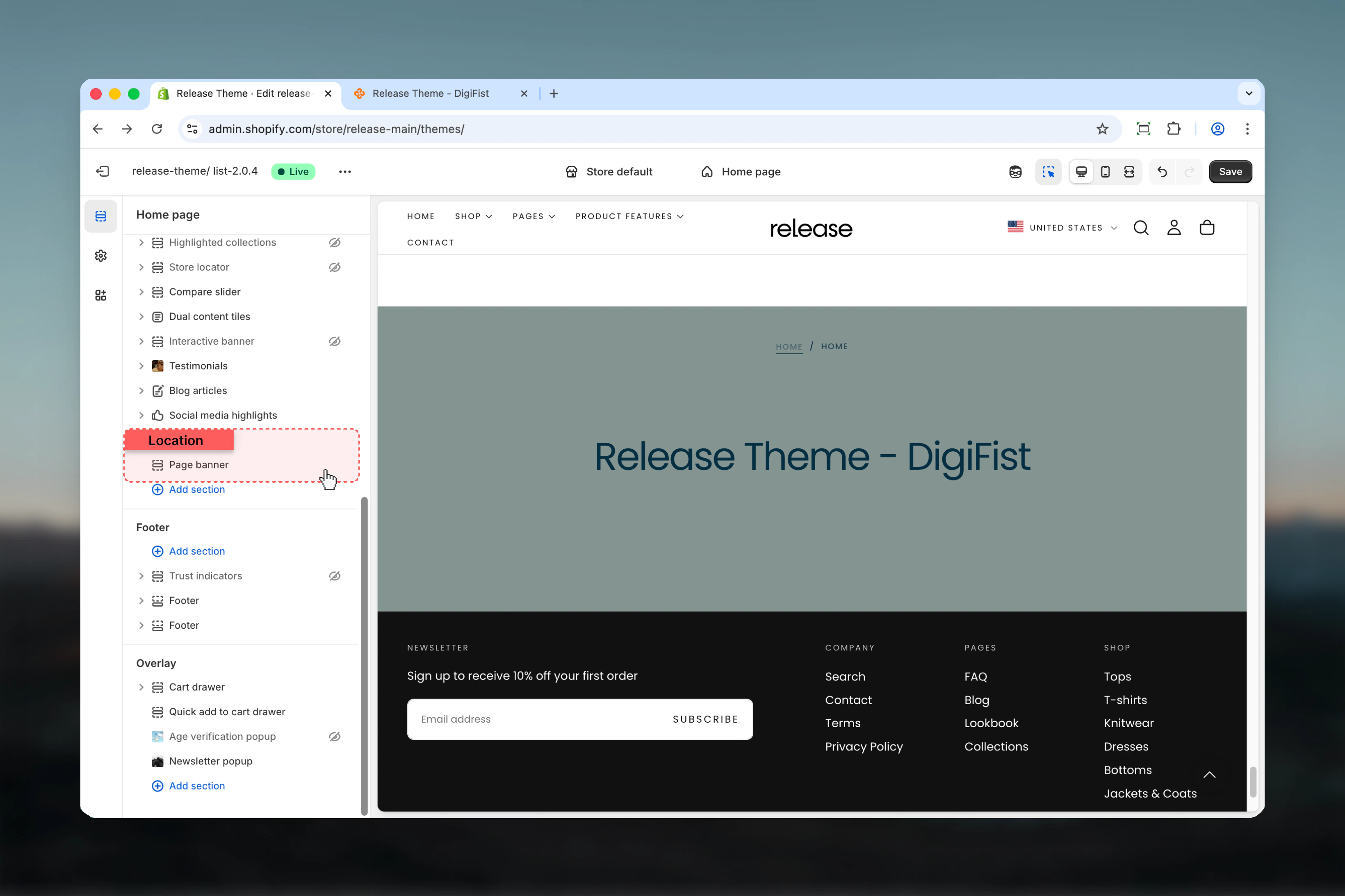 ## Section settings
### Enable transparent header
Makes header transparent over banner when using background media.
**Default:** True
Only works when media position is set to "Background". Header becomes transparent and overlays the banner.
### Heading
Custom heading text that overwrites the default page title.
* Inline rich text supported
* Leave empty to use default page title
### Heading size
Controls the size of heading text.
**Available options:** XS, S, M, L, XL
**Default:** L
### Description
Custom description text.
* Rich text supported
* Overwrites default description when set
### Show default description
Displays the default description from the current template (page/collection/product/blog).
**Default:** True
### Show on description
Controls where description is visible.
**Available options:**
* **Desktop:** Desktop only
* **Mobile:** Mobile only
* **Both:** All devices
**Default:** Desktop
## Section settings
### Enable transparent header
Makes header transparent over banner when using background media.
**Default:** True
Only works when media position is set to "Background". Header becomes transparent and overlays the banner.
### Heading
Custom heading text that overwrites the default page title.
* Inline rich text supported
* Leave empty to use default page title
### Heading size
Controls the size of heading text.
**Available options:** XS, S, M, L, XL
**Default:** L
### Description
Custom description text.
* Rich text supported
* Overwrites default description when set
### Show default description
Displays the default description from the current template (page/collection/product/blog).
**Default:** True
### Show on description
Controls where description is visible.
**Available options:**
* **Desktop:** Desktop only
* **Mobile:** Mobile only
* **Both:** All devices
**Default:** Desktop
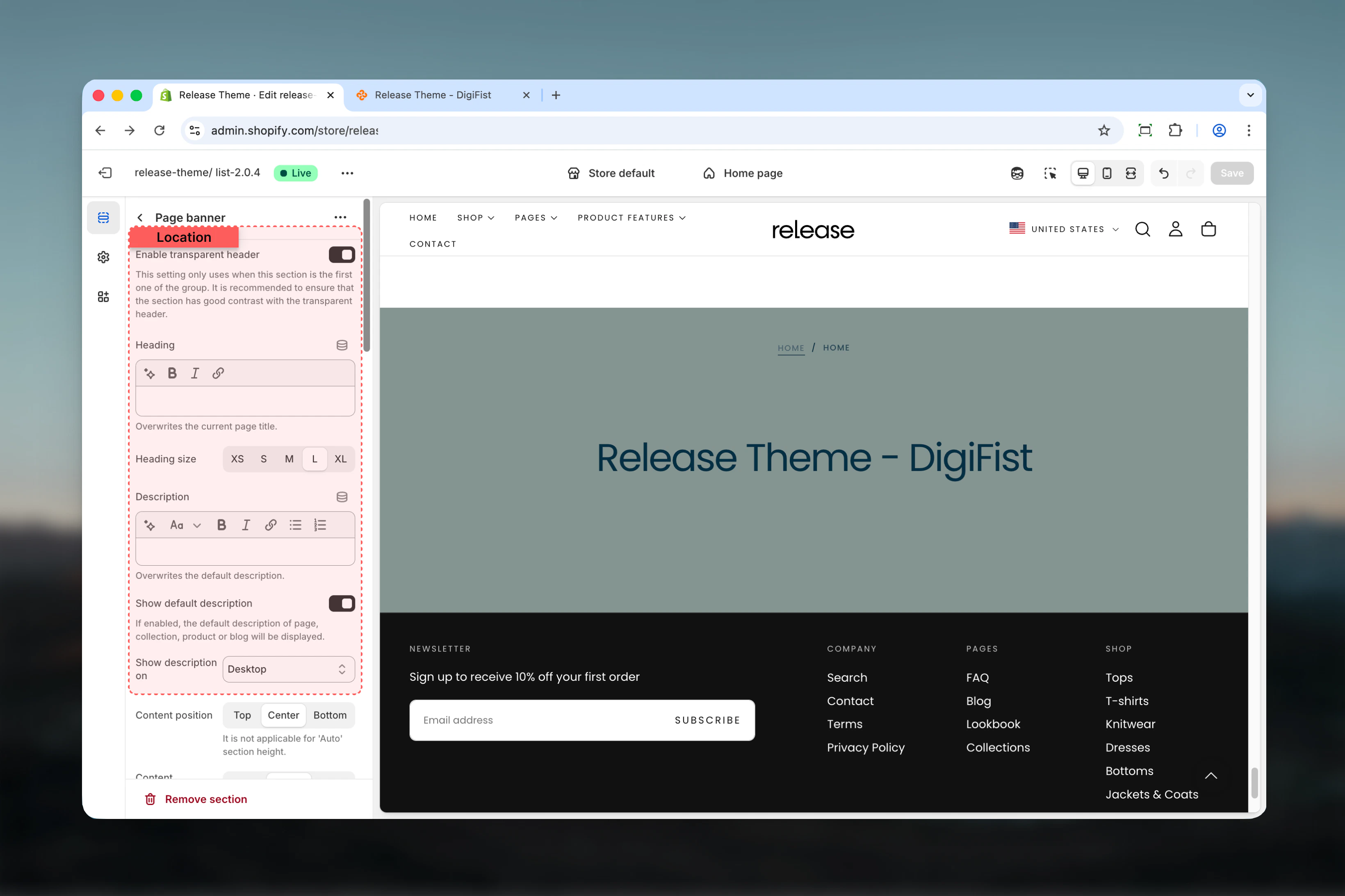 ### Content position
Controls vertical position of content within the banner.
**Available options:** Start, Center, End
**Default:** Center
Not applicable when section height is set to 'Auto'.
### Content alignment
Controls horizontal alignment of content.
**Available options:** Start, Center, End
**Default:** Center
### Media position
Controls where media appears relative to content.
**Available options:**
* **Top:** Media above content
* **Bottom:** Media below content
* **Background:** Media as background
**Default:** Background
Use 'Background' position with fixed section heights (not 'Auto') for best display. Otherwise, section height expands to cover media.
### Content position
Controls vertical position of content within the banner.
**Available options:** Start, Center, End
**Default:** Center
Not applicable when section height is set to 'Auto'.
### Content alignment
Controls horizontal alignment of content.
**Available options:** Start, Center, End
**Default:** Center
### Media position
Controls where media appears relative to content.
**Available options:**
* **Top:** Media above content
* **Bottom:** Media below content
* **Background:** Media as background
**Default:** Background
Use 'Background' position with fixed section heights (not 'Auto') for best display. Otherwise, section height expands to cover media.
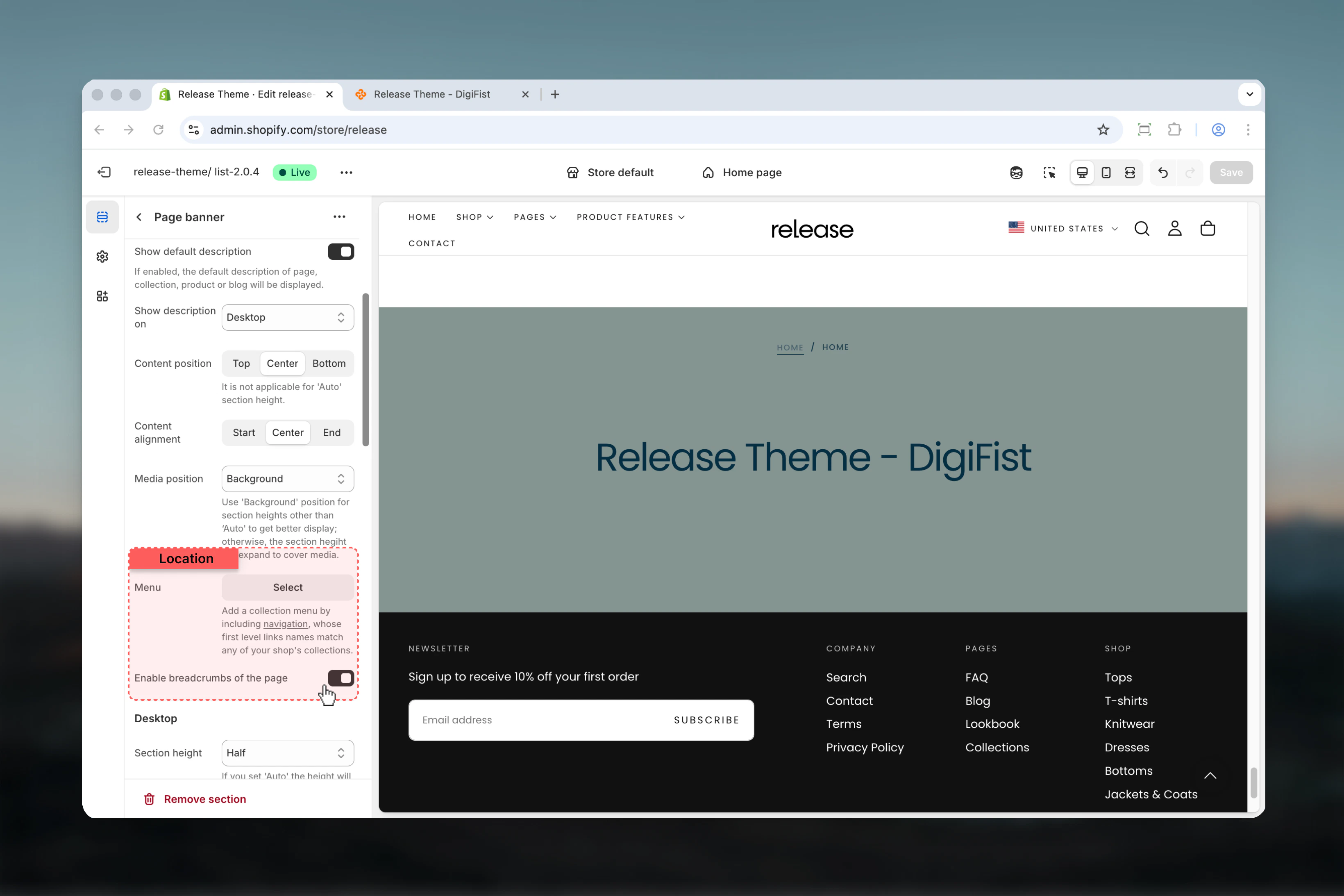
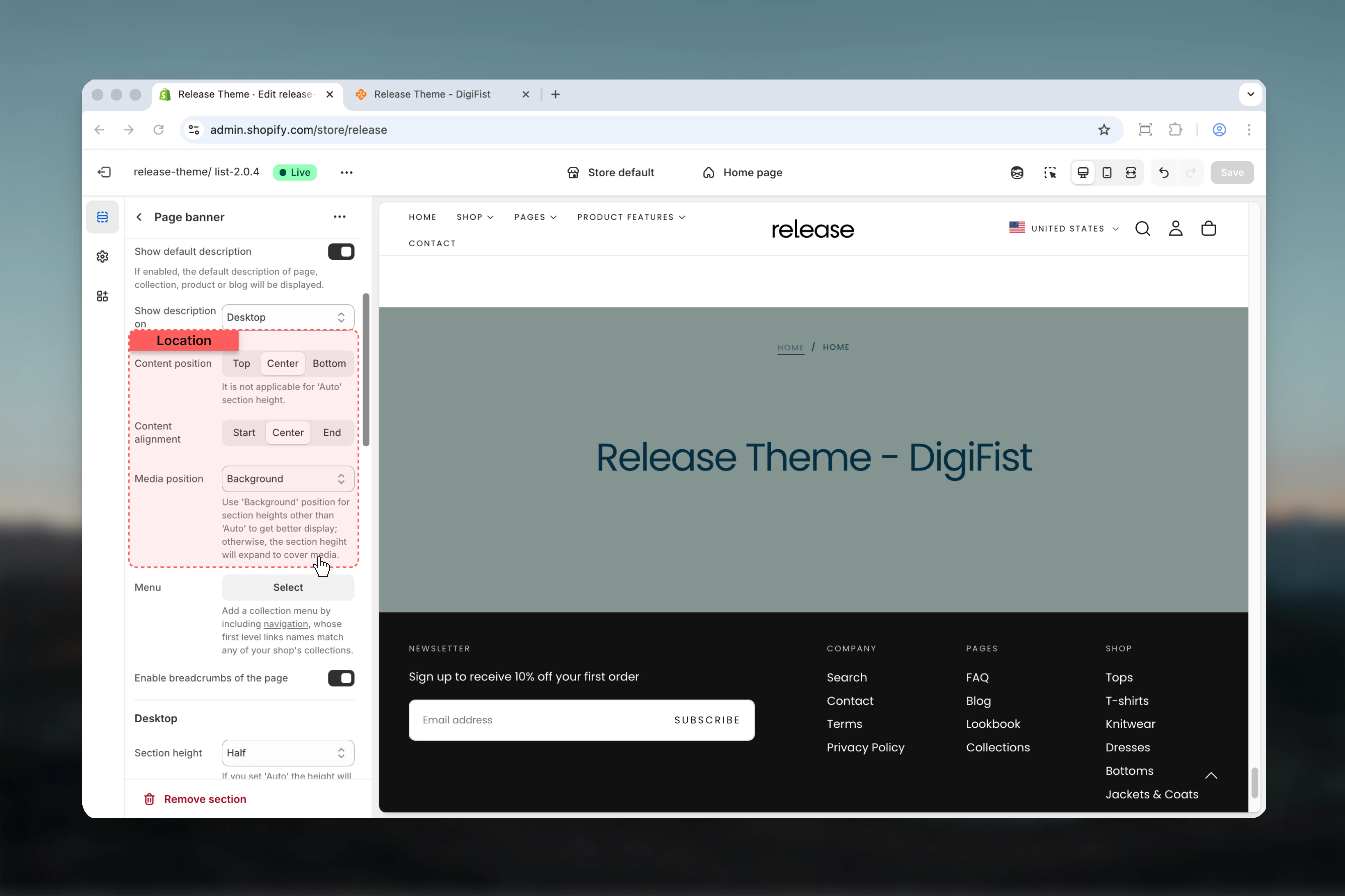 ### Menu
Link list for collection navigation menu.
* Shopify link list selector
* First level link names must match collection handles
Add a collection menu by creating navigation whose first level link names match any of your shop's collections.
### Enable breadcrumbs
Shows breadcrumb navigation on the page.
**Default:** True
Breadcrumbs must also be enabled in theme settings to appear.
### Menu
Link list for collection navigation menu.
* Shopify link list selector
* First level link names must match collection handles
Add a collection menu by creating navigation whose first level link names match any of your shop's collections.
### Enable breadcrumbs
Shows breadcrumb navigation on the page.
**Default:** True
Breadcrumbs must also be enabled in theme settings to appear.
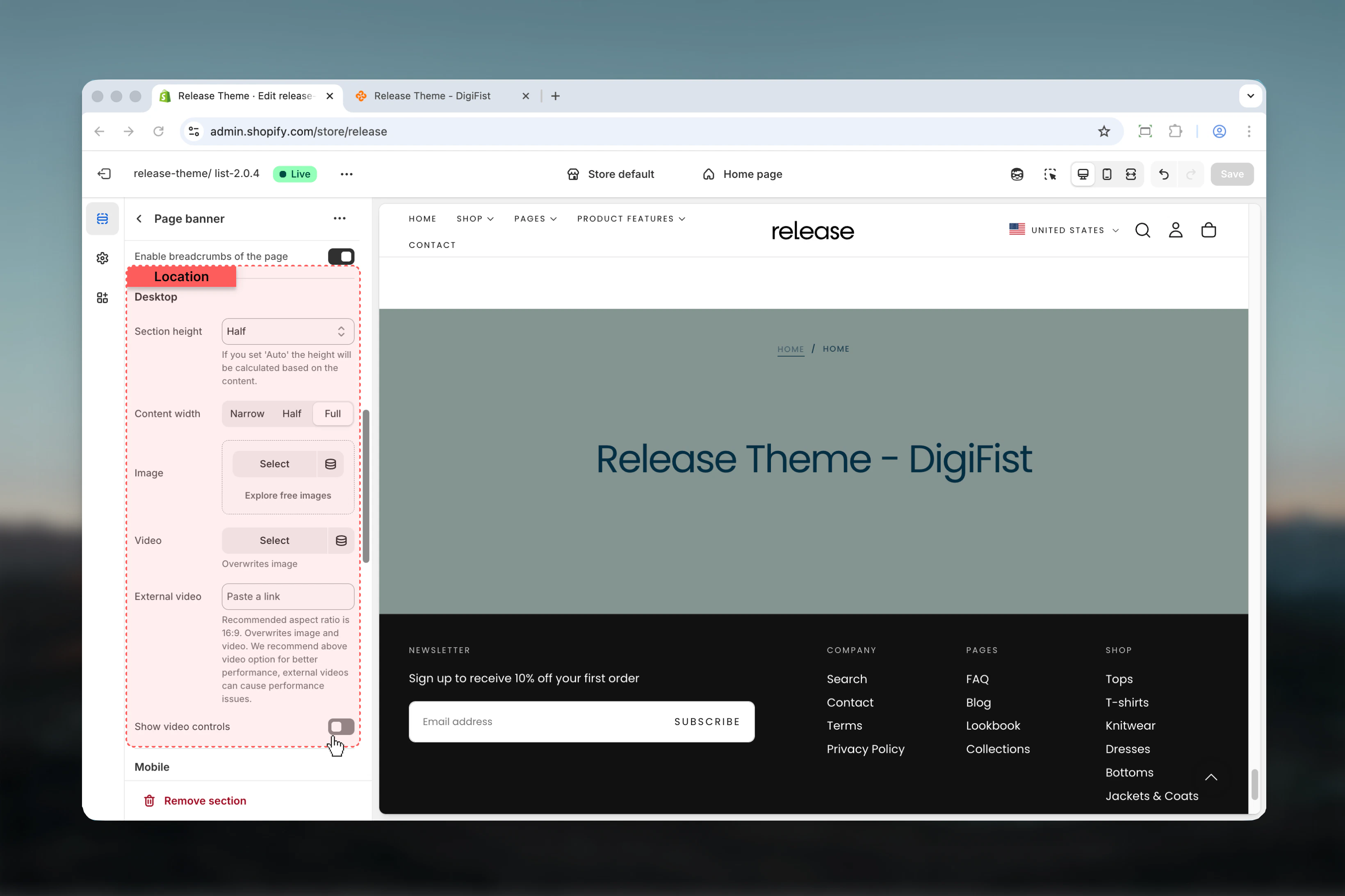
 ### Section height
Height of the section on desktop devices.
**Available options:**
* **Auto:** Based on content
* **Third:** 33% viewport height (33svh)
* **Half:** 50% viewport height (50svh)
* **Full:** 100% viewport height (100svh)
**Default:** Half (50svh)
### Content width
Maximum width of content area.
**Available options:**
* **Narrow:** 44.5rem
* **Half:** 50%
* **Full:** 100%
**Default:** Full (100%)
### Desktop media
**Image** - Shopify image picker
**Video** - Video file upload (overwrites image)
**External video** - YouTube/Vimeo URL
* Recommended aspect ratio: 16:9
* Overwrites image and video
* May cause performance issues
**Show controls on video** - Enable/disable video controls (default: false)
### Section height
Height of the section on desktop devices.
**Available options:**
* **Auto:** Based on content
* **Third:** 33% viewport height (33svh)
* **Half:** 50% viewport height (50svh)
* **Full:** 100% viewport height (100svh)
**Default:** Half (50svh)
### Content width
Maximum width of content area.
**Available options:**
* **Narrow:** 44.5rem
* **Half:** 50%
* **Full:** 100%
**Default:** Full (100%)
### Desktop media
**Image** - Shopify image picker
**Video** - Video file upload (overwrites image)
**External video** - YouTube/Vimeo URL
* Recommended aspect ratio: 16:9
* Overwrites image and video
* May cause performance issues
**Show controls on video** - Enable/disable video controls (default: false)
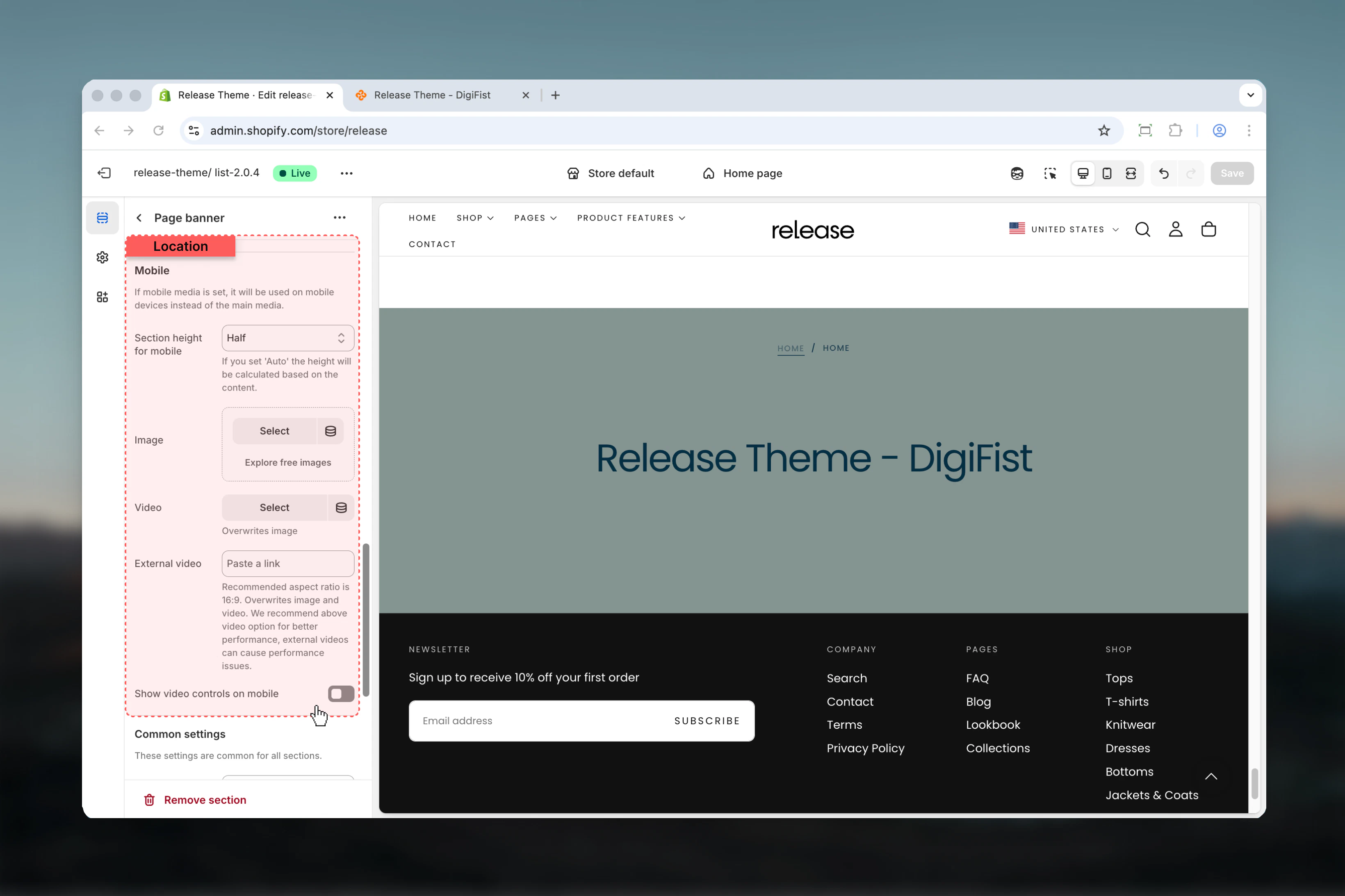
 ### Section height mobile
Height of the section on mobile devices.
**Available options:**
* **Auto:** Based on content
* **Third:** 33% viewport height (33svh)
* **Half:** 50% viewport height (50svh)
* **Full:** 100% viewport height (100svh)
**Default:** Half (50svh)
### Mobile media
**Image mobile** - Mobile-specific image
**Video mobile** - Mobile-specific video
**External video mobile** - Mobile-specific external video
**Show controls on video mobile** - Mobile video controls (default: false)
Mobile media overrides desktop media when set, allowing device-optimized visuals.
### Section height mobile
Height of the section on mobile devices.
**Available options:**
* **Auto:** Based on content
* **Third:** 33% viewport height (33svh)
* **Half:** 50% viewport height (50svh)
* **Full:** 100% viewport height (100svh)
**Default:** Half (50svh)
### Mobile media
**Image mobile** - Mobile-specific image
**Video mobile** - Mobile-specific video
**External video mobile** - Mobile-specific external video
**Show controls on video mobile** - Mobile video controls (default: false)
Mobile media overrides desktop media when set, allowing device-optimized visuals.
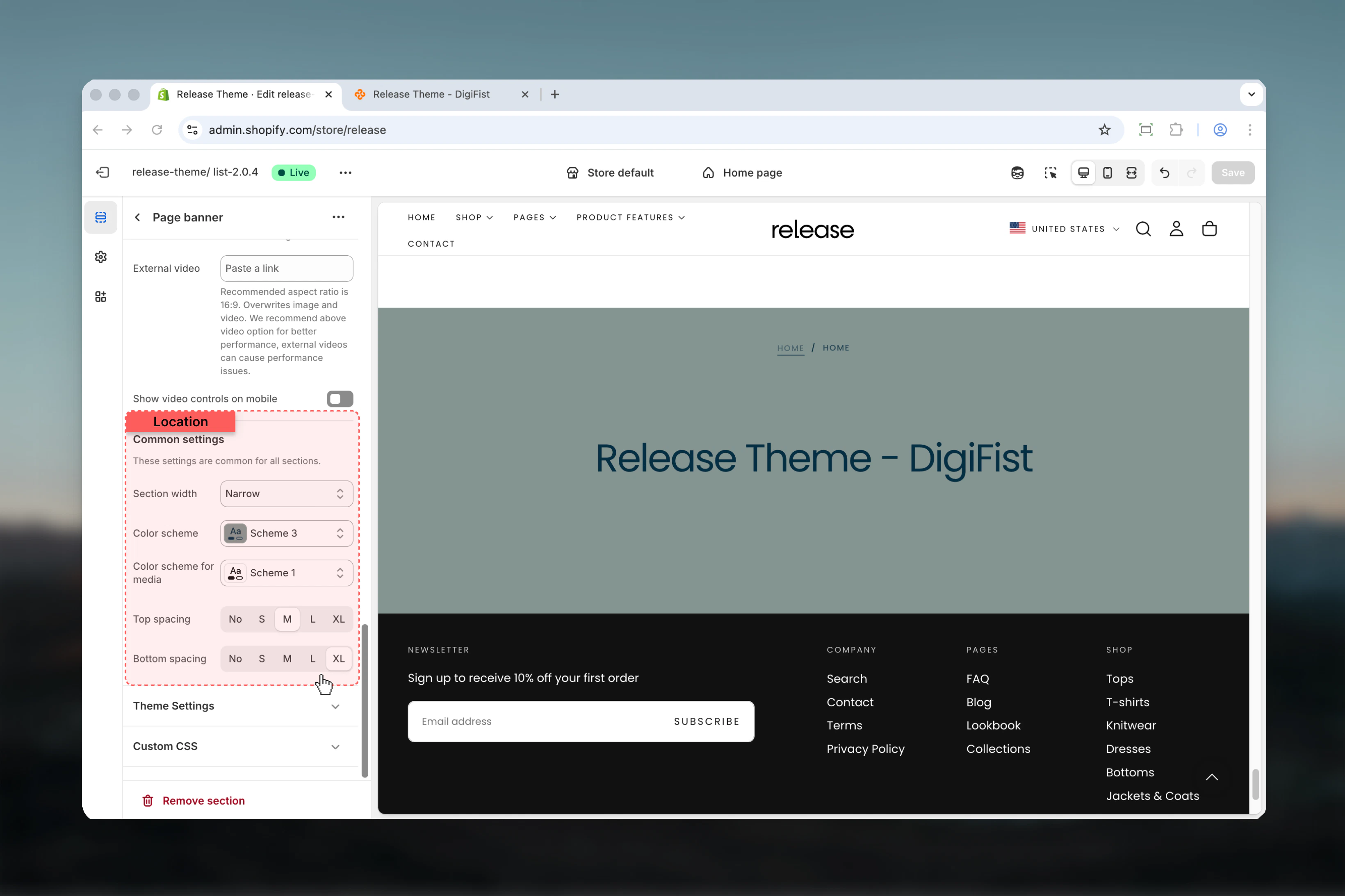
 ### Section container width
Maximum width of the section.
**Available options:** Page, Narrow, Narrower, Fluid
**Default:** Narrow
### Color scheme
Background and text colors when no media is present.
* Shopify color scheme selector
* **Default:** Scheme 3
### Color scheme for media
Colors used when media is present.
* **Default:** Scheme 1
### Spacing top
Controls spacing above the section.
**Available options:** No, S, M, L, XL
**Default:** M
### Spacing bottom
Controls spacing below the section.
**Available options:** No, S, M, L, XL
**Default:** XL
### Section container width
Maximum width of the section.
**Available options:** Page, Narrow, Narrower, Fluid
**Default:** Narrow
### Color scheme
Background and text colors when no media is present.
* Shopify color scheme selector
* **Default:** Scheme 3
### Color scheme for media
Colors used when media is present.
* **Default:** Scheme 1
### Spacing top
Controls spacing above the section.
**Available options:** No, S, M, L, XL
**Default:** M
### Spacing bottom
Controls spacing below the section.
**Available options:** No, S, M, L, XL
**Default:** XL
 ## Best practices
* Use background media position with fixed heights (50svh, 100svh) for consistent, impactful banners
* Enable transparent header on first section only for seamless design
* Keep content width at 50-100% for optimal readability across devices
* Use auto height with top/bottom media positions to avoid awkward spacing
* Provide mobile-specific media for better performance and appropriate framing
* Test transparent header with different color schemes to ensure text visibility
* Avoid external videos when possible due to performance concerns; use uploaded videos instead
* Enable breadcrumbs for improved navigation and SEO
* Match collection menu link names exactly with collection handles
* Use center alignment for hero-style banners, start alignment for content-heavy pages
## Common use cases
* **Homepage hero** - Full-height banner with transparent header
* **Collection pages** - Medium-height banner with collection title and description
* **Product category pages** - Branded banners with category information
* **Blog index pages** - Editorial-style headers with featured images
* **About/contact pages** - Custom branded headers with company imagery
* **Landing pages** - Campaign-specific banners with conversion-focused messaging
* **Store information** - Location or brand story headers
## Related guides
Learn about common settings shared across sections
## Best practices
* Use background media position with fixed heights (50svh, 100svh) for consistent, impactful banners
* Enable transparent header on first section only for seamless design
* Keep content width at 50-100% for optimal readability across devices
* Use auto height with top/bottom media positions to avoid awkward spacing
* Provide mobile-specific media for better performance and appropriate framing
* Test transparent header with different color schemes to ensure text visibility
* Avoid external videos when possible due to performance concerns; use uploaded videos instead
* Enable breadcrumbs for improved navigation and SEO
* Match collection menu link names exactly with collection handles
* Use center alignment for hero-style banners, start alignment for content-heavy pages
## Common use cases
* **Homepage hero** - Full-height banner with transparent header
* **Collection pages** - Medium-height banner with collection title and description
* **Product category pages** - Branded banners with category information
* **Blog index pages** - Editorial-style headers with featured images
* **About/contact pages** - Custom branded headers with company imagery
* **Landing pages** - Campaign-specific banners with conversion-focused messaging
* **Store information** - Location or brand story headers
## Related guides
Learn about common settings shared across sections