> ## Documentation Index
> Fetch the complete documentation index at: https://docs.digifist.com/llms.txt
> Use this file to discover all available pages before exploring further.
# Shop the Look
> Showcase products within styled images using interactive product cards and pulse dots.
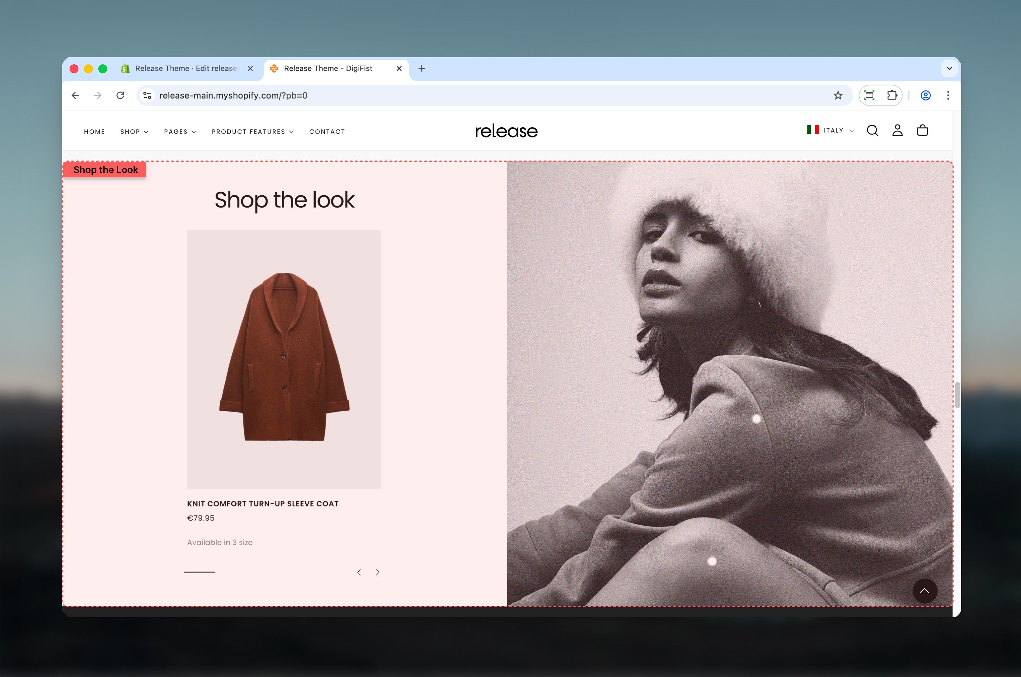
The Shop the Look section showcases products within a styled image or visual composition. It supports interactive product cards, pulse dots, and multiple layout options.
Shop the Look helps create immersive shopping experiences by connecting products to lifestyle imagery, allowing customers to discover and purchase items directly from styled visuals.
 ## What this section controls
This section controls product showcases within images with the following capabilities:
* Interactive product cards linked to visual imagery
* Pulse dot indicators for product discovery
* Dual content or full width layout options
* Desktop and mobile-specific image support
* Customizable product carousel positioning
## How the Shop the Look works
The Shop the Look uses a block-based product system:
* Products are linked to a visual using product cards or pulse dots
* Layout changes how products are displayed and interacted with
* Pulse dots allow users to discover products directly on the image
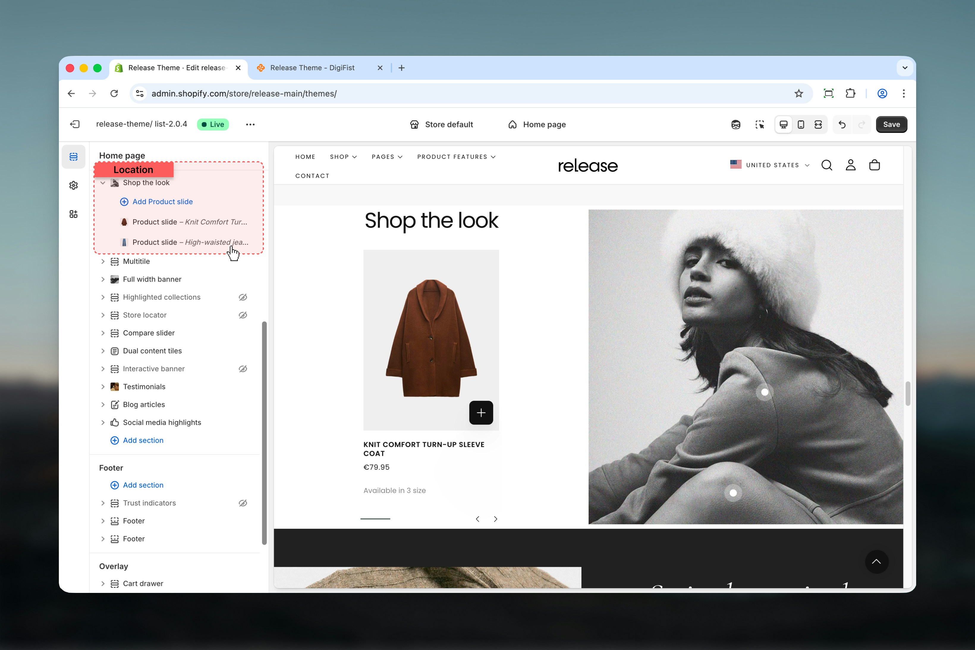
* Product slides control which products appear and where dots are placed
## Getting started
From Shopify admin, access the Theme Customizer.
Add the Shop the Look section to your page or template.
Click **Add Product slide** to link products to the image.
Select layout type and enable pulse dots if desired.
## What this section controls
This section controls product showcases within images with the following capabilities:
* Interactive product cards linked to visual imagery
* Pulse dot indicators for product discovery
* Dual content or full width layout options
* Desktop and mobile-specific image support
* Customizable product carousel positioning
## How the Shop the Look works
The Shop the Look uses a block-based product system:
* Products are linked to a visual using product cards or pulse dots
* Layout changes how products are displayed and interacted with
* Pulse dots allow users to discover products directly on the image
* Product slides control which products appear and where dots are placed
## Getting started
From Shopify admin, access the Theme Customizer.
Add the Shop the Look section to your page or template.
Click **Add Product slide** to link products to the image.
Select layout type and enable pulse dots if desired.
 ## Section settings
Section settings define the content, layout behavior, and visual presentation.
### Heading
Main heading text displayed above the section.
* Supports bold, italic, and links
### Heading size
Controls the size of the heading.
**Available options:** S, M, L, XL
### Text
Supporting text displayed below the heading.
* Supports bold, italic, and links
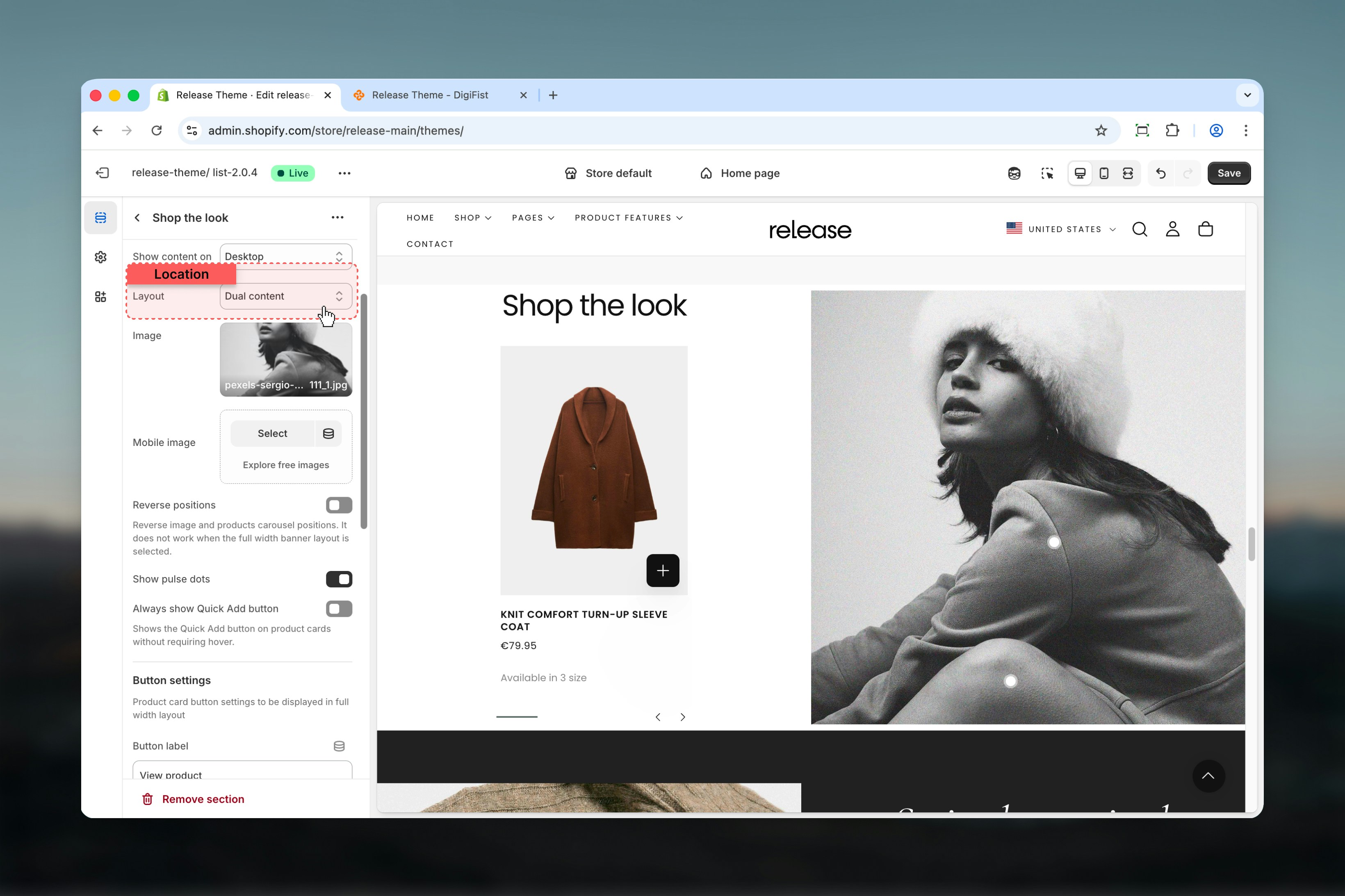
### Layout
Controls how the image and product cards are displayed.
**Available options:**
* **Dual content:** Image and product carousel are displayed side by side
* **Full width:** Image fills the section width
## Section settings
Section settings define the content, layout behavior, and visual presentation.
### Heading
Main heading text displayed above the section.
* Supports bold, italic, and links
### Heading size
Controls the size of the heading.
**Available options:** S, M, L, XL
### Text
Supporting text displayed below the heading.
* Supports bold, italic, and links
### Layout
Controls how the image and product cards are displayed.
**Available options:**
* **Dual content:** Image and product carousel are displayed side by side
* **Full width:** Image fills the section width
 ## Dual content behavior
When **Dual content** is selected:
* Products are displayed as a carousel next to the image
* The position of the product carousel depends on the **Reverse positions** setting
## Full width behavior
When **Full width** is selected:
* Image spans the full width of the section
* If **Show pulse dots** is enabled, products appear when:
* A pulse dot is hovered
* A pulse dot is clicked
In full width layout, products are revealed through pulse dot interaction only.
### Image
Main image used for the section.
Uses Shopify's image selector.
### Mobile image
Image used on mobile devices.
If a mobile image is set, it will be used on mobile instead of the main image.
### Reverse positions
Reverses the position of the image and product carousel.
* Only works when **Dual content** layout is selected
* Does not apply to **Full width** layout
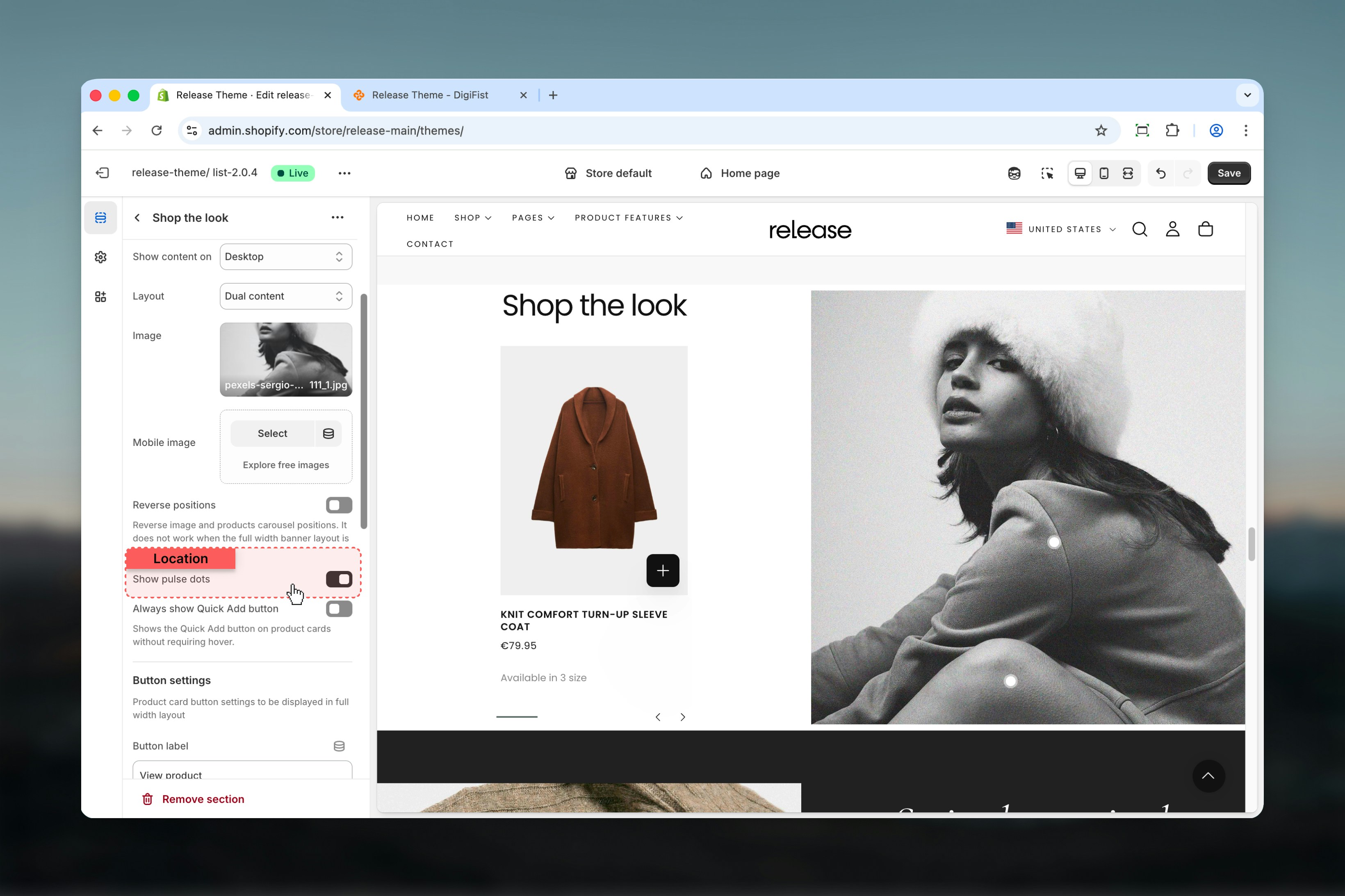
### Show pulse dots
Enables or disables pulse dots on the image.
**Options:** Enabled / Disabled
Pulse dots are interactive indicators that reveal associated products.
## Dual content behavior
When **Dual content** is selected:
* Products are displayed as a carousel next to the image
* The position of the product carousel depends on the **Reverse positions** setting
## Full width behavior
When **Full width** is selected:
* Image spans the full width of the section
* If **Show pulse dots** is enabled, products appear when:
* A pulse dot is hovered
* A pulse dot is clicked
In full width layout, products are revealed through pulse dot interaction only.
### Image
Main image used for the section.
Uses Shopify's image selector.
### Mobile image
Image used on mobile devices.
If a mobile image is set, it will be used on mobile instead of the main image.
### Reverse positions
Reverses the position of the image and product carousel.
* Only works when **Dual content** layout is selected
* Does not apply to **Full width** layout
### Show pulse dots
Enables or disables pulse dots on the image.
**Options:** Enabled / Disabled
Pulse dots are interactive indicators that reveal associated products.
 ## Button settings
Product card button settings used in **Full width** layout.
### Button label
Defines the button text displayed on product cards.
Leave empty to hide the button.
### Button style
Controls the visual style of the button.
**Available options:** Filled, Outlined, Text
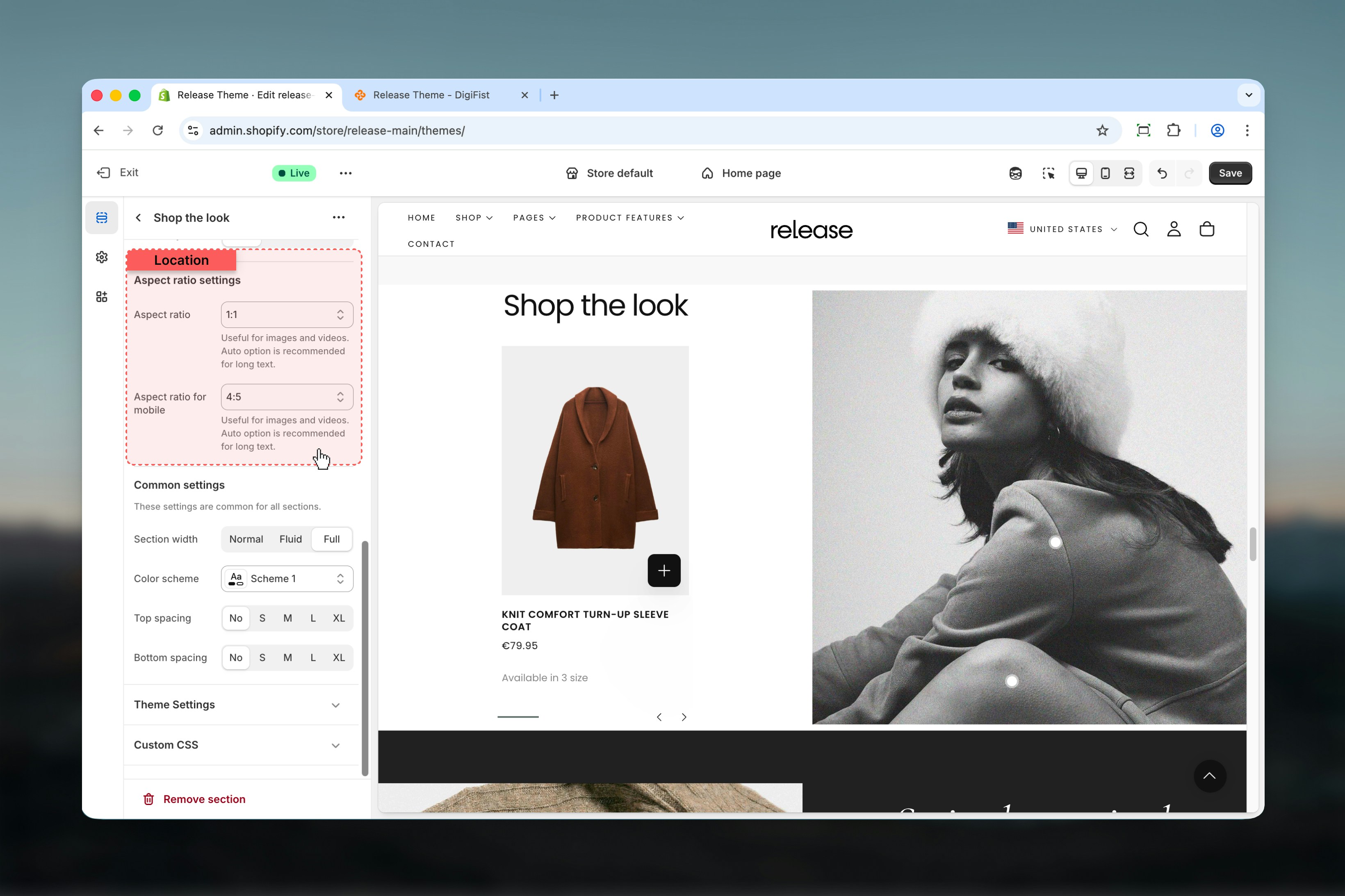
### Aspect ratio (desktop)
Controls the aspect ratio of the image or media.
Auto option is recommended for long text.
**Available options:** Auto, Square, Portrait, Landscape
### Aspect ratio for mobile
Aspect ratio used on mobile devices.
**Available options:** Auto, Square, Portrait, Landscape
## Button settings
Product card button settings used in **Full width** layout.
### Button label
Defines the button text displayed on product cards.
Leave empty to hide the button.
### Button style
Controls the visual style of the button.
**Available options:** Filled, Outlined, Text
### Aspect ratio (desktop)
Controls the aspect ratio of the image or media.
Auto option is recommended for long text.
**Available options:** Auto, Square, Portrait, Landscape
### Aspect ratio for mobile
Aspect ratio used on mobile devices.
**Available options:** Auto, Square, Portrait, Landscape
 ## Block settings
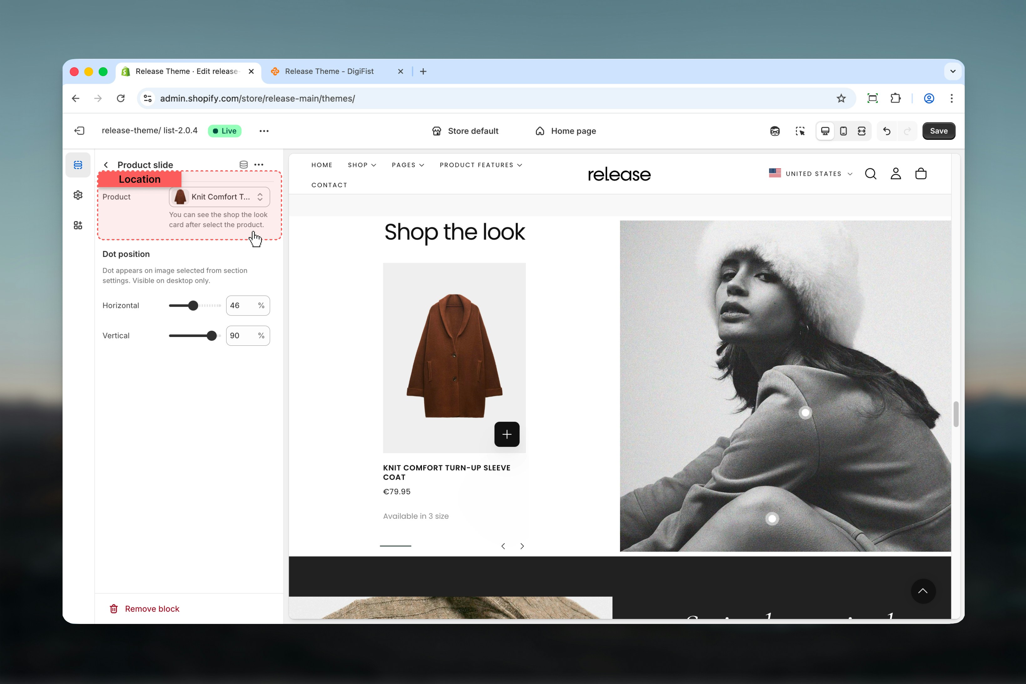
Block settings control individual product slides. Each product slide represents a single product linked to the image.
### Product
Select a product using Shopify's product selector.
Once selected, the Shop the Look product card becomes visible.
## Block settings
Block settings control individual product slides. Each product slide represents a single product linked to the image.
### Product
Select a product using Shopify's product selector.
Once selected, the Shop the Look product card becomes visible.
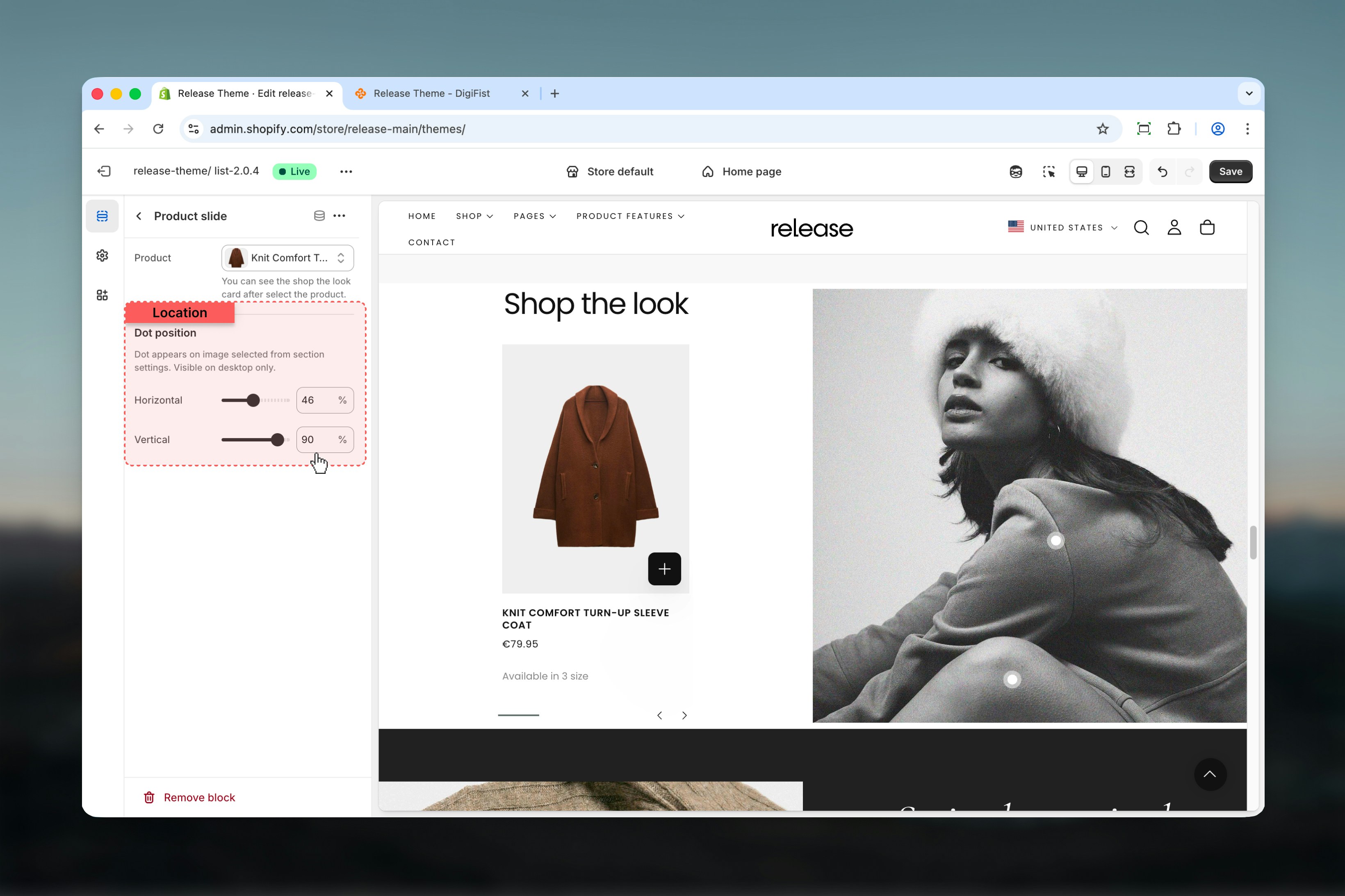
 Controls where the pulse dot appears on the image.
Pulse dots are visible on desktop only and appear on the image selected in section settings.
### Horizontal position
Sets the horizontal position of the dot.
**Range:** 1% – 100%
### Vertical position
Sets the vertical position of the dot.
**Range:** 1% – 100%
Controls where the pulse dot appears on the image.
Pulse dots are visible on desktop only and appear on the image selected in section settings.
### Horizontal position
Sets the horizontal position of the dot.
**Range:** 1% – 100%
### Vertical position
Sets the vertical position of the dot.
**Range:** 1% – 100%
 ## Best practices
* Use **Dual content** for editorial-style layouts that showcase products alongside imagery
* Use **Full width + pulse dots** for immersive shopping experiences where customers discover products
* Keep pulse dots away from edges (at least 5-10% margin) for better usability and visibility
* Always test dot positions on large screens to ensure proper placement
* Limit the number of product slides to 3-5 for clarity and to avoid overwhelming users
* Use high-quality lifestyle images that naturally showcase multiple products
* Ensure pulse dots are positioned precisely on product locations in the image
* Test mobile experience as pulse dots are desktop-only
## Related guides
Learn about common settings shared across sections
## Best practices
* Use **Dual content** for editorial-style layouts that showcase products alongside imagery
* Use **Full width + pulse dots** for immersive shopping experiences where customers discover products
* Keep pulse dots away from edges (at least 5-10% margin) for better usability and visibility
* Always test dot positions on large screens to ensure proper placement
* Limit the number of product slides to 3-5 for clarity and to avoid overwhelming users
* Use high-quality lifestyle images that naturally showcase multiple products
* Ensure pulse dots are positioned precisely on product locations in the image
* Test mobile experience as pulse dots are desktop-only
## Related guides
Learn about common settings shared across sections