> ## Documentation Index
> Fetch the complete documentation index at: https://docs.digifist.com/llms.txt
> Use this file to discover all available pages before exploring further.
# Social Media Highlights
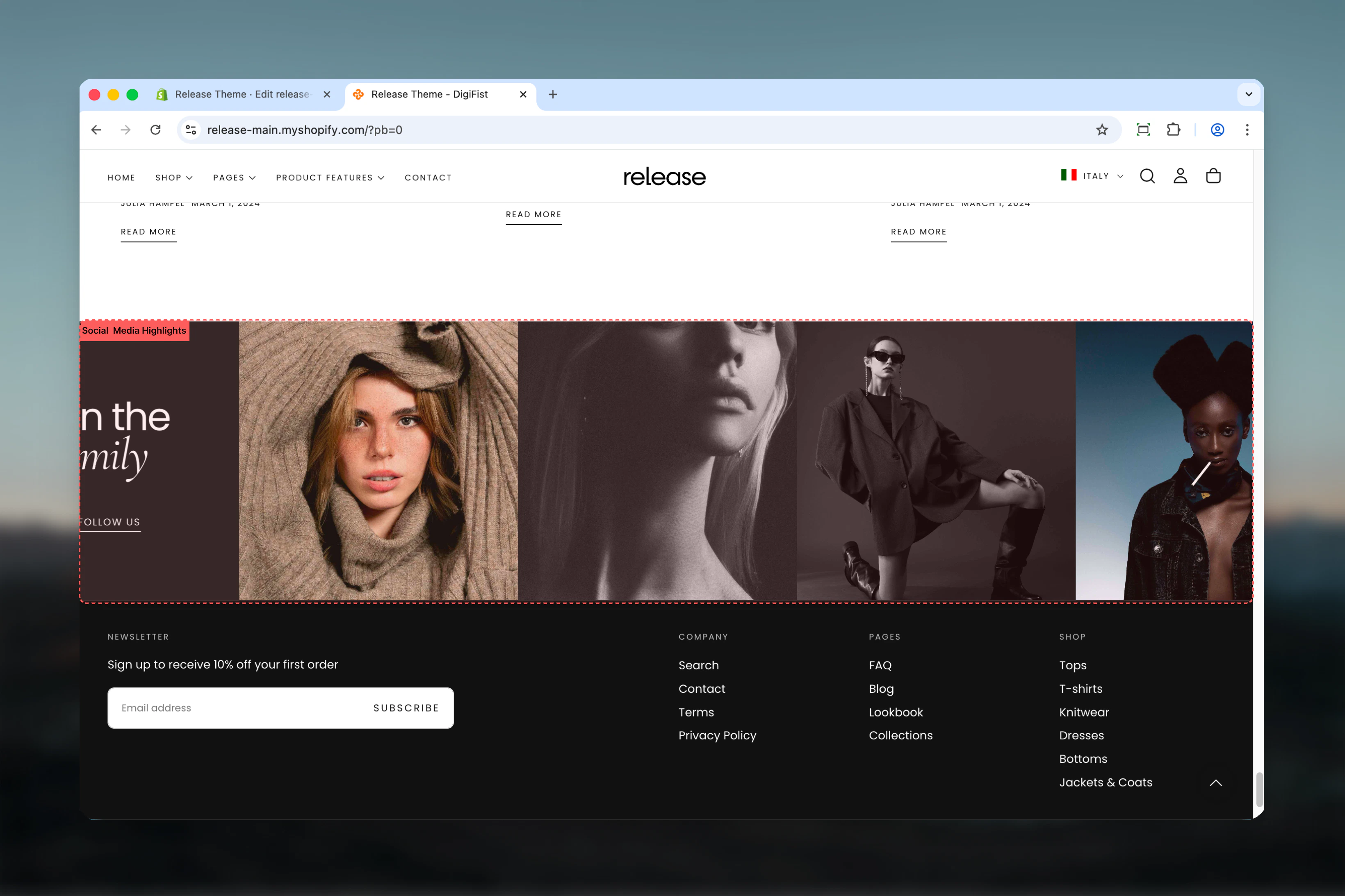
> Display Instagram or social media posts in a grid layout with customizable content card and call-to-action.
The Social Media Highlights section showcases social media posts in a grid layout alongside a content card with heading, subheading, and call-to-action button. Perfect for integrating Instagram feeds or highlighting social proof.
 ## What this section controls
* Grid or stacked layout options
* Customizable content card with heading, subheading, and button
* Media blocks with images, videos, or external videos
* Adjustable media aspect ratios
* Multiple color schemes
* Desktop and mobile column control
## Getting started
From Shopify admin, access the Theme Customizer.
Add the section to your desired page.
Set heading, subheading, and follow button with link.
Add image or video blocks for your social posts.
## Section settings
### Layout
Controls section layout style.
**Options:**
* **Simple:** Standard grid layout
* **Stacked:** Stacked layout
**Default:** Simple
### Remove desktop spacing
Removes spacing between items on desktop.
**Default:** False
*Visible only when layout is "Simple"*
### Media aspect ratio
Controls aspect ratio of media blocks.
**Options:** Auto, 1:1, 4:3, 3:4, 3:2, 2:3, 5:4, 4:5, 16:9, 9:16
**Default:** 1:1
### Heading
Main heading for content card.
* Inline rich text
* **Default:** "Join the *family*"
### Heading size
**Options:** XS, S, M, L, XL
**Default:** L
### Subheading
Optional subheading below heading.
### Button label
Text for call-to-action button.
* **Default:** "Follow us"
### Button link
Destination URL for button.
### Button style
**Options:** Filled, Outlined, Text
**Default:** Filled
### Button icon
Icon to display on button.
* **Default:** "brand-instagram"
### Content card color scheme
Background and text colors for content card.
* **Default:** Scheme 3
### Color scheme for media
Colors for media blocks.
* **Default:** Scheme 1
### Desktop columns
Number of columns on desktop (2-6).
**Default:** 3
### Mobile columns
Number of columns on mobile (1-2).
**Default:** 2
### Section width
**Options:** Page, Fluid
**Default:** Page
### Color scheme
Overall section colors.
**Default:** Scheme 1
### Spacing top/bottom
**Options:** No, S, M, L, XL
**Default:** M
## Block settings
### Media Block
* **Image:** Image picker
* **Video:** Video file
* **External video:** YouTube/Vimeo URL
* **Show video controls:** Enable/disable controls
Video and external video override image when set.
## Best practices
* Use 1:1 (square) aspect ratio for Instagram-style feeds
* Keep desktop columns at 3-4 for optimal display
* Enable mobile columns of 2 for better mobile experience
* Remove desktop spacing for seamless grid appearance
* Use brand-instagram icon for Instagram follow buttons
* Match content card color scheme with brand colors
## Common use cases
* Instagram feed display
* Social proof showcase
* User-generated content galleries
* Community highlights
* Influencer collaborations
* Brand storytelling through social posts
## Related guides
Learn about common settings shared across sections
## What this section controls
* Grid or stacked layout options
* Customizable content card with heading, subheading, and button
* Media blocks with images, videos, or external videos
* Adjustable media aspect ratios
* Multiple color schemes
* Desktop and mobile column control
## Getting started
From Shopify admin, access the Theme Customizer.
Add the section to your desired page.
Set heading, subheading, and follow button with link.
Add image or video blocks for your social posts.
## Section settings
### Layout
Controls section layout style.
**Options:**
* **Simple:** Standard grid layout
* **Stacked:** Stacked layout
**Default:** Simple
### Remove desktop spacing
Removes spacing between items on desktop.
**Default:** False
*Visible only when layout is "Simple"*
### Media aspect ratio
Controls aspect ratio of media blocks.
**Options:** Auto, 1:1, 4:3, 3:4, 3:2, 2:3, 5:4, 4:5, 16:9, 9:16
**Default:** 1:1
### Heading
Main heading for content card.
* Inline rich text
* **Default:** "Join the *family*"
### Heading size
**Options:** XS, S, M, L, XL
**Default:** L
### Subheading
Optional subheading below heading.
### Button label
Text for call-to-action button.
* **Default:** "Follow us"
### Button link
Destination URL for button.
### Button style
**Options:** Filled, Outlined, Text
**Default:** Filled
### Button icon
Icon to display on button.
* **Default:** "brand-instagram"
### Content card color scheme
Background and text colors for content card.
* **Default:** Scheme 3
### Color scheme for media
Colors for media blocks.
* **Default:** Scheme 1
### Desktop columns
Number of columns on desktop (2-6).
**Default:** 3
### Mobile columns
Number of columns on mobile (1-2).
**Default:** 2
### Section width
**Options:** Page, Fluid
**Default:** Page
### Color scheme
Overall section colors.
**Default:** Scheme 1
### Spacing top/bottom
**Options:** No, S, M, L, XL
**Default:** M
## Block settings
### Media Block
* **Image:** Image picker
* **Video:** Video file
* **External video:** YouTube/Vimeo URL
* **Show video controls:** Enable/disable controls
Video and external video override image when set.
## Best practices
* Use 1:1 (square) aspect ratio for Instagram-style feeds
* Keep desktop columns at 3-4 for optimal display
* Enable mobile columns of 2 for better mobile experience
* Remove desktop spacing for seamless grid appearance
* Use brand-instagram icon for Instagram follow buttons
* Match content card color scheme with brand colors
## Common use cases
* Instagram feed display
* Social proof showcase
* User-generated content galleries
* Community highlights
* Influencer collaborations
* Brand storytelling through social posts
## Related guides
Learn about common settings shared across sections